Building Hi-DPI (Retina) Responsive websites with Sass & Compass
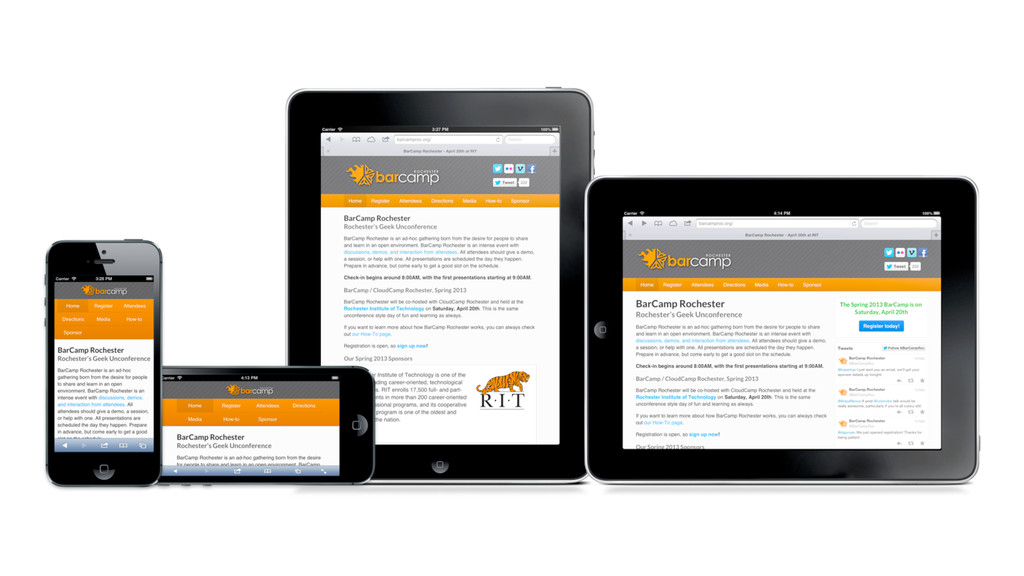
Using Sass & Compass to build Retina-enhanced, Responsive websites. An intro to the concept of Responsive design, and a brief intro to using the Susy Compass extension to build fluid Responsive layouts.
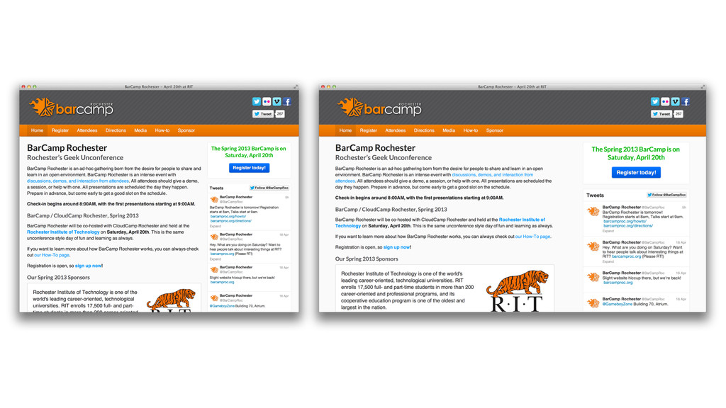
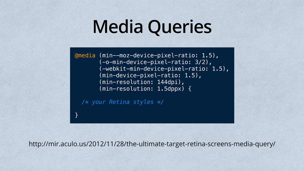
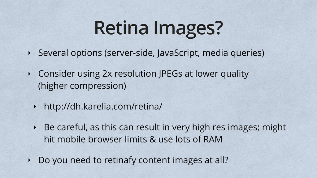
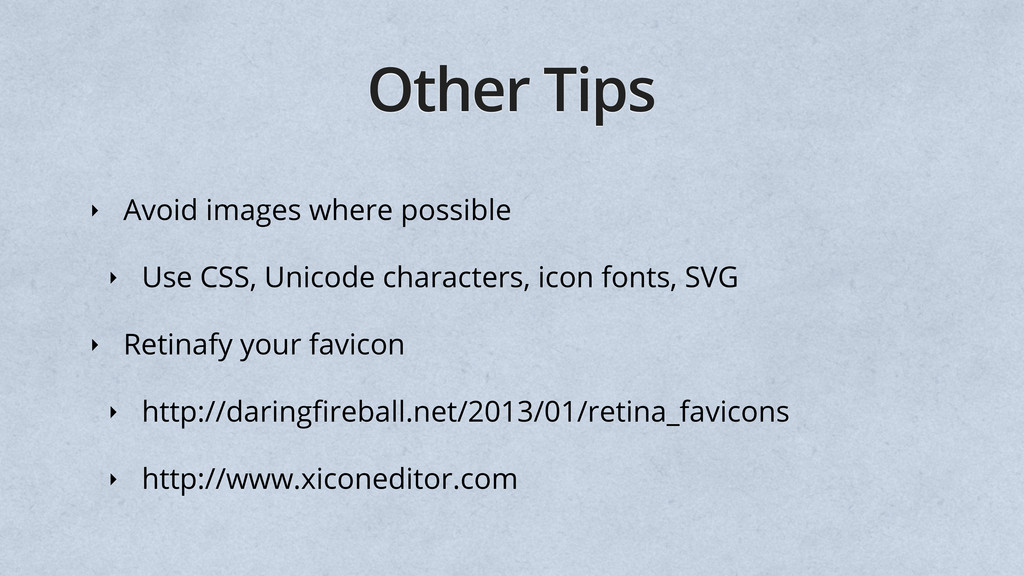
Consider using 2x resolution JPEGs at lower quality (higher compression) ‣ http://dh.karelia.com/retina/ ‣ Be careful, as this can result in very high res images; might hit mobile browser limits & use lots of RAM ‣ Do you need to retinafy content images at all?
 nathos
 keita_yoshikawa
 sony
sony
 lynteo
 teba_eleven
 nttcom
 kenichiota0711
 hikarutakase
 chiemitaki
 stmn
stmn
 karad
karad
 kumanoayumi
 destraynor
 helmedeiros
 matthewcrist
 aleyda
 honnibal
 csswizardry
 nikkihalliwell
 maggiecrowley
 axbom
axbom
 cassininazir
 lara
lara
 jeffersonlam