Upgrade to Pro — share decks privately, control downloads, hide ads and more …

Material all the things!

Material all the things!

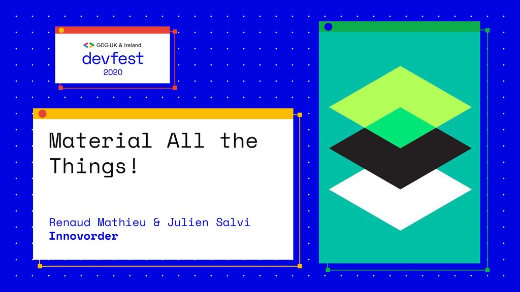
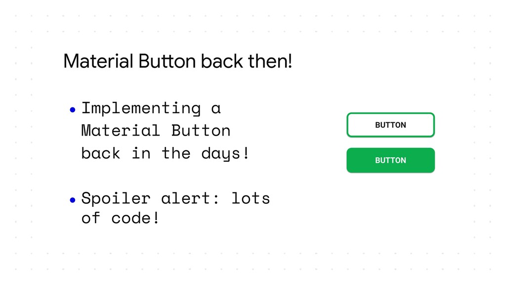
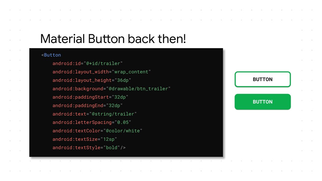
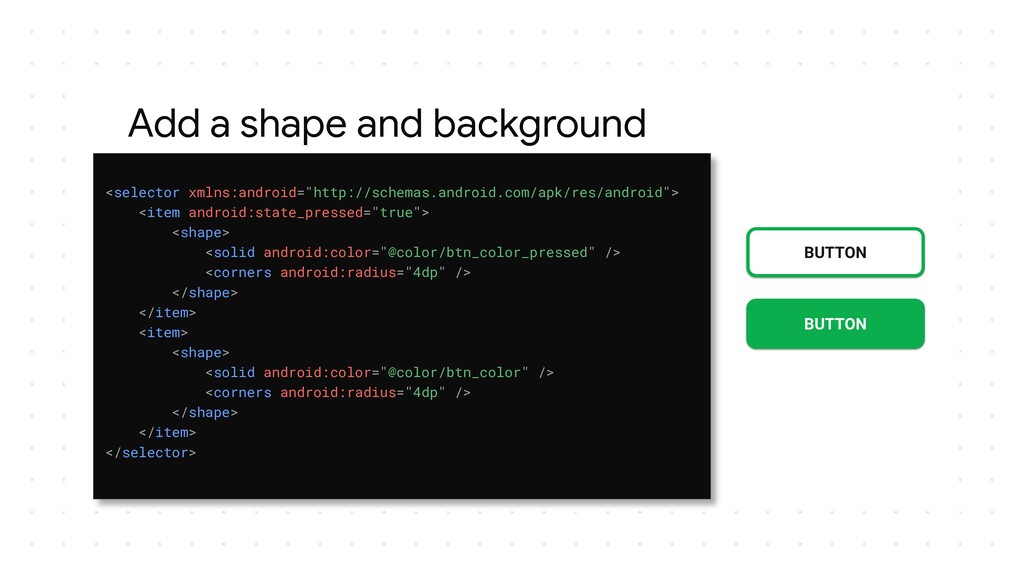
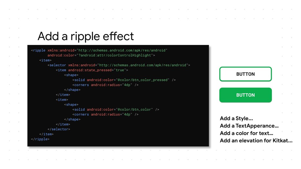
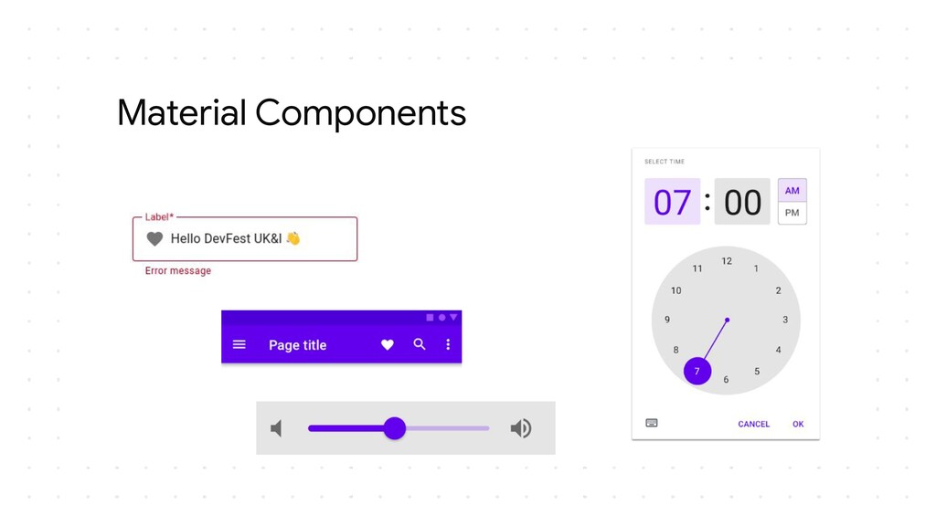
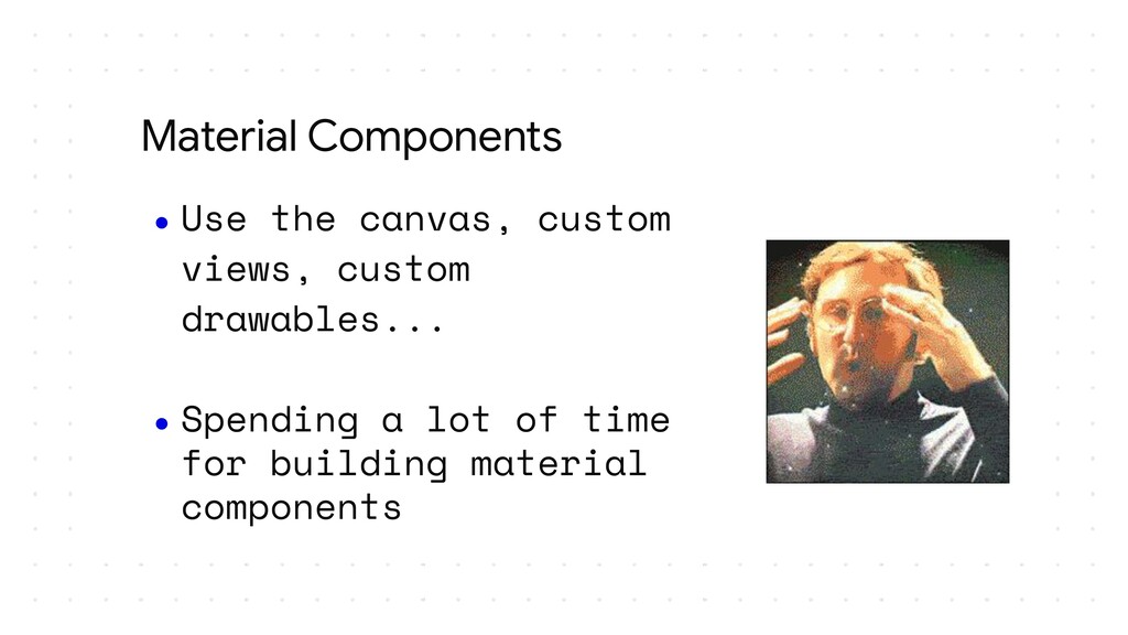
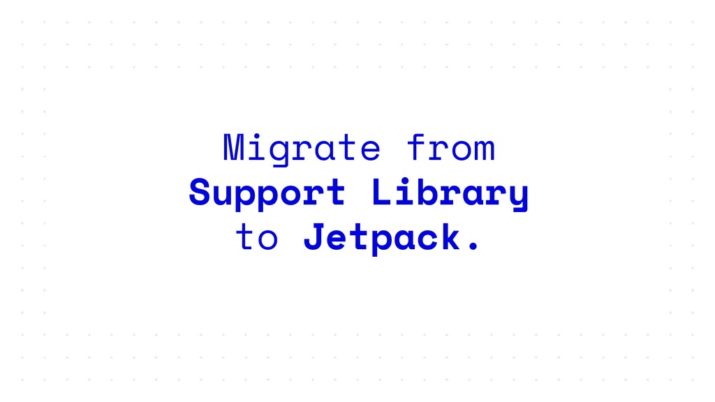
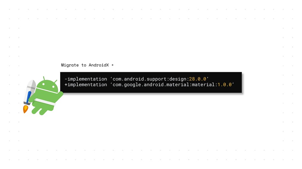
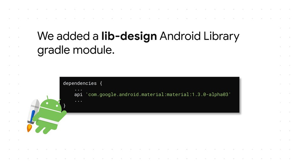
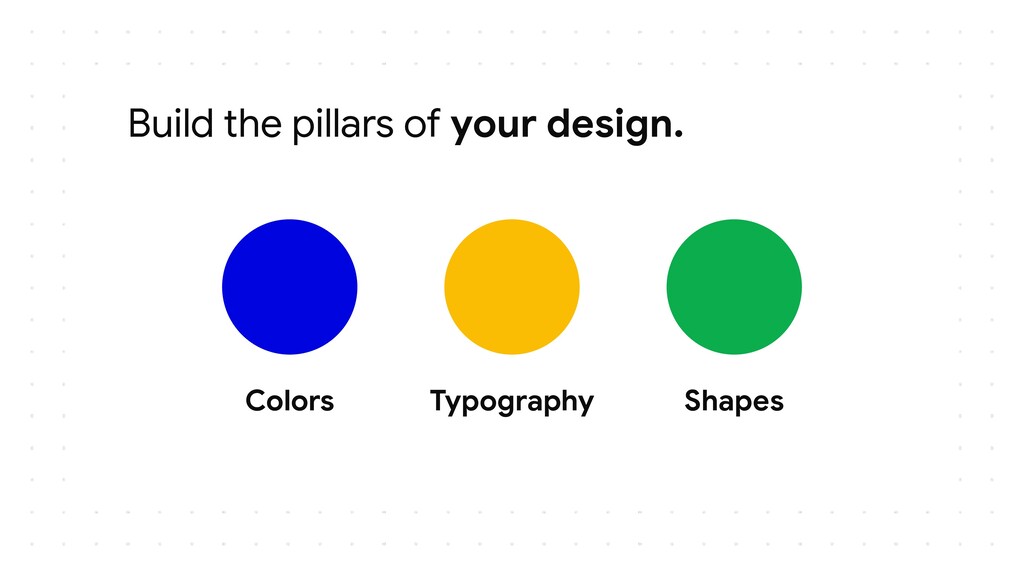
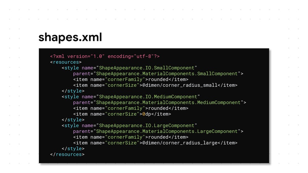
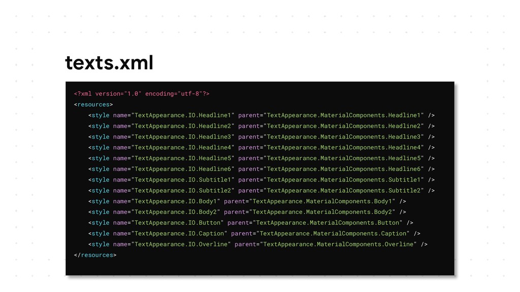
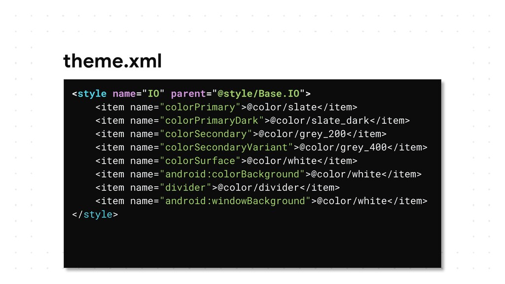
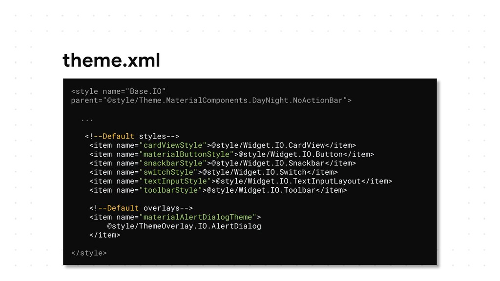
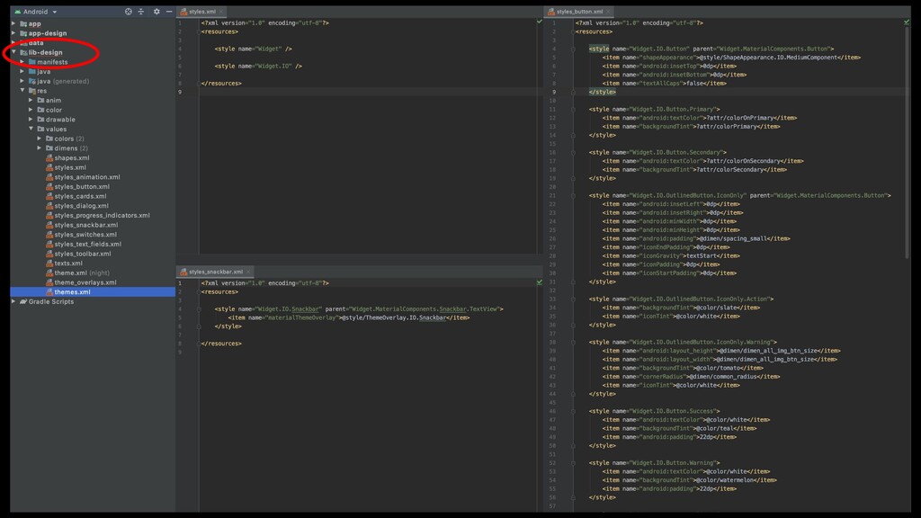
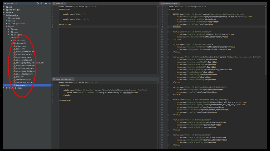
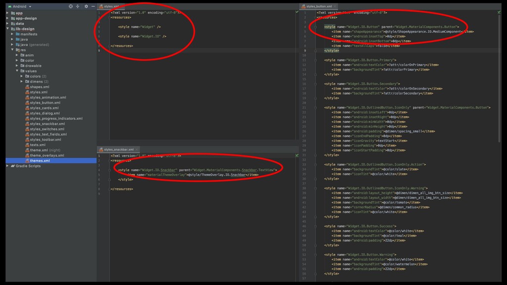
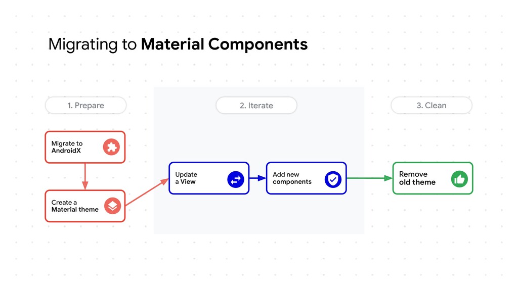
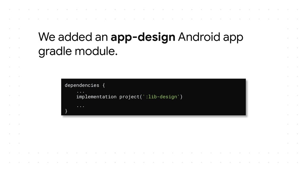
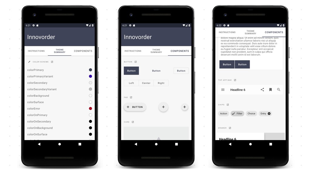
Building beautiful, usable products with Material Design might be quite long especially if your app supports old Android versions. Thanks to the Material components library, Google has finally given us the keys to fully and easily implement their design concepts.

Through this talk, we will take a deep dive into this library to see what it brings on the table (theming, motion, transition, shapes, typography…) and how to implement Material components with some live action samples.

Julien Salvi

October 17, 2020
Tweet

More Decks by Julien Salvi

Other Decks in Programming

Transcript

  1. Material Design history 2014 2016 2018 2020 2022 Design Material

    Design introduction Material Design 2 Material lib 1.3.0-alpha03 Material lib 1.0.0 Tools Material lib 1.0.0-alpha01 Suppo Design library Compose Material lib
  2. • Google provided a lot of resources for designer •

    But libraries and tools for developers were missing • Build your own components DIY! Material Design resources back then…
  3. • Implementing a Material Button back in the days! •

    Spoiler alert: lots of code! Material Button back then! BUTTON BUTTON
  4. Material Button back then! BUTTON BUTTON <Button android:id="@+id/trailer" android:layout_width="wrap_content" android:layout_height="36dp"

    android:background="@drawable/btn_trailer" android:paddingStart="32dp" android:paddingEnd="32dp" android:text="@string/trailer" android:letterSpacing="0.05" android:textColor="@color/white" android:textSize="12sp" android:textStyle="bold"/>
  5. Add a shape and background BUTTON BUTTON <selector xmlns:android="http://schemas.android.com/apk/res/android"> <item

    android:state_pressed="true"> <shape> <solid android:color="@color/btn_color_pressed" /> <corners android:radius="4dp" /> </shape> </item> <item> <shape> <solid android:color="@color/btn_color" /> <corners android:radius="4dp" /> </shape> </item> </selector>
  6. Add a Style... Add a TextApperance… Add a color for

    text… Add an elevation for Kitkat... BUTTON BUTTON <ripple xmlns:android="http://schemas.android.com/apk/res/android" android:color="?android:attr/colorControlHighlight"> <item> <selector xmlns:android="http://schemas.android.com/apk/res/android"> <item android:state_pressed="true"> <shape> <solid android:color="@color/btn_color_pressed" /> <corners android:radius="4dp" /> </shape> </item> <item> <shape> <solid android:color="@color/btn_color" /> <corners android:radius="4dp" /> </shape> </item> </selector> </item> </ripple> Add a ripple effect
  7. • Use the canvas, custom views, custom drawables... • Spending

    a lot of time for building material components Material Components
  8. We added a lib-design Android Library gradle module. dependencies {

    ... api 'com.google.android.material:material:1.3.0-alpha03' ... }
  9. colors.xml <?xml version="1.0" encoding="utf-8"?> <resources> <color name="app_icon_background">#0f2c55</color> <color name="mercury">#e2e2e2</color> <color

    name="mercury_light">#d1d1d1</color> <color name="mercury_dark">#e2e2e2</color> <color name="leaf">#689f38</color> <color name="leaf_light">#79af59</color> <color name="leaf_dark">#689f38</color> ... </resources>
  10. shapes.xml <?xml version="1.0" encoding="utf-8"?> <resources> <style name="ShapeAppearance.IO.SmallComponent" parent="ShapeAppearance.MaterialComponents.SmallComponent"> <item name="cornerFamily">rounded</item>

    <item name="cornerSize">@dimen/corner_radius_small</item> </style> <style name="ShapeAppearance.IO.MediumComponent" parent="ShapeAppearance.MaterialComponents.MediumComponent"> <item name="cornerFamily">rounded</item> <item name="cornerSize">0dp</item> </style> <style name="ShapeAppearance.IO.LargeComponent" parent="ShapeAppearance.MaterialComponents.LargeComponent"> <item name="cornerFamily">rounded</item> <item name="cornerSize">@dimen/corner_radius_large</item> </style> </resources>
  11. texts.xml <?xml version="1.0" encoding="utf-8"?> <resources> <style name="TextAppearance.IO.Headline1" parent="TextAppearance.MaterialComponents.Headline1" /> <style

    name="TextAppearance.IO.Headline2" parent="TextAppearance.MaterialComponents.Headline2" /> <style name="TextAppearance.IO.Headline3" parent="TextAppearance.MaterialComponents.Headline3" /> <style name="TextAppearance.IO.Headline4" parent="TextAppearance.MaterialComponents.Headline4" /> <style name="TextAppearance.IO.Headline5" parent="TextAppearance.MaterialComponents.Headline5" /> <style name="TextAppearance.IO.Headline6" parent="TextAppearance.MaterialComponents.Headline6" /> <style name="TextAppearance.IO.Subtitle1" parent="TextAppearance.MaterialComponents.Subtitle1" /> <style name="TextAppearance.IO.Subtitle2" parent="TextAppearance.MaterialComponents.Subtitle2" /> <style name="TextAppearance.IO.Body1" parent="TextAppearance.MaterialComponents.Body1" /> <style name="TextAppearance.IO.Body2" parent="TextAppearance.MaterialComponents.Body2" /> <style name="TextAppearance.IO.Button" parent="TextAppearance.MaterialComponents.Button" /> <style name="TextAppearance.IO.Caption" parent="TextAppearance.MaterialComponents.Caption" /> <style name="TextAppearance.IO.Overline" parent="TextAppearance.MaterialComponents.Overline" /> </resources>
  12. theme.xml <?xml version="1.0" encoding="utf-8"?> <resources> <!-- Base theme, all common

    styling here --> <style name="Base.IO" parent="@style/Theme.MaterialComponents.DayNight.NoActionBar"> <!-- Material shape attributes --> <item name="shapeAppearanceSmallComponent">@style/ShapeAppearance.IO.SmallComponent</item> <item name="shapeAppearanceMediumComponent">@style/ShapeAppearance.IO.MediumComponent</item> <item name="shapeAppearanceLargeComponent">@style/ShapeAppearance.IO.LargeComponent</item> <!--Material typo attributes--> <item name="textAppearanceHeadline1">@style/TextAppearance.IO.Headline1</item> ... <item name="textAppearanceOverline">@style/TextAppearance.IO.Overline</item </style> </resources>
  13. theme.xml <style name="IO" parent="@style/Base.IO"> <item name="colorPrimary">@color/slate</item> <item name="colorPrimaryDark">@color/slate_dark</item> <item name="colorSecondary">@color/grey_200</item>

    <item name="colorSecondaryVariant">@color/grey_400</item> <item name="colorSurface">@color/white</item> <item name="android:colorBackground">@color/white</item> <item name="divider">@color/divider</item> <item name="android:windowBackground">@color/white</item> </style>
  14. Auto-inflation /** * An extension of {@link AppCompatViewInflater} that replaces

    some framework widgets with Material * Components ones at inflation time, provided a Material Components theme is in use. */ public class MaterialComponentsViewInflater extends AppCompatViewInflater
  15. theme.xml <style name="Base.IO" parent="@style/Theme.MaterialComponents.DayNight.NoActionBar"> ... <!--Default styles--> <item name="cardViewStyle">@style/Widget.IO.CardView</item> <item

    name="materialButtonStyle">@style/Widget.IO.Button</item> <item name="snackbarStyle">@style/Widget.IO.Snackbar</item> <item name="switchStyle">@style/Widget.IO.Switch</item> <item name="textInputStyle">@style/Widget.IO.TextInputLayout</item> <item name="toolbarStyle">@style/Widget.IO.Toolbar</item> <!--Default overlays--> <item name="materialAlertDialogTheme"> @style/ThemeOverlay.IO.AlertDialog </item> </style>
  16. Migrating to Material Components Remove old theme Add new components

    Update a View Create a Material theme Migrate to AndroidX 1. Prepare 2. Iterate 3. Clean
  17. We added an app-design Android app gradle module. dependencies {

    ... implementation project(':lib-design') ... }
  18. Material Motion • Add meaningful motion to your application •

    Add nice transitions between Activities, Fragments or Views
  19. Material Motion // On Fragment A override fun onCreate(savedInstanceState: Bundle?)

    { super.onCreate(savedInstanceState) exitTransition = MaterialElevationScale(false).apply { duration = 300L } reenterTransition = MaterialElevationScale(true).apply { duration = 300L } } override fun onViewCreated(view: View, savedInstanceState: Bundle?) { super.onViewCreated(view, savedInstanceState) cover.transitionName = "unique_transition_name" name.transitionName = "another_unique_transition" }
  20. Material Motion // On Fragment B override fun onCreate(savedInstanceState: Bundle?)

    { postponeEnterTransition() // Might be useful for image transitions sharedElementEnterTransition = MaterialContainerTransform().apply { drawingViewId = R.id.nav_host_fragment duration = 300L fadeMode = MaterialContainerTransform.FADE_MODE_THROUGH interpolator = AccelerateDecelerateInterpolator() scrimColor = Color.TRANSPARENT } } override fun onViewCreated(view: View, savedInstanceState: Bundle?) { binding.backdrop.transitionName = "unique_transition_name" binding.title.transitionName = "another_unique_transition" // Load your image async then start the transition with: startPostponedEnterTransition() }
  21. Material Motion // On Fragment A navigate to Fragment B

    val extras = FragmentNavigatorExtras( cover to film.episodeId.toString(), title to film.title) val action = MoviesFragmentDirections.actionMainFragmentToMovieFragment(film) findNavController().navigate(action, extras)