Upgrade to Pro — share decks privately, control downloads, hide ads and more …

Be Kind To Your Future Self

Be Kind To Your Future Self

My front-end workflow talk from ConvergeSE 2014 with a dash of Sass & Compass

Patrick Fulton

May 02, 2014
Tweet

More Decks by Patrick Fulton

Other Decks in Technology

Transcript

  1. Start Building That Starter Kit! • Sinatra (what Bearded uses)

    • Middleman • Yeoman (roll your own generator!) • Assemble • FireShell • http://staticsitegenerators.net/ • Plain, old HTML, CSS and JS (ala HTML5 Boilerplate)
  2. Think Modularly “Atomic design is a methodology used to construct

    web design systems.” ! http://patternlab.io
  3. Code Modularly <section id="membership"> <h2 class="block-heading">Membership</h2> <div class="membership-info"> <h2 class="title">Become

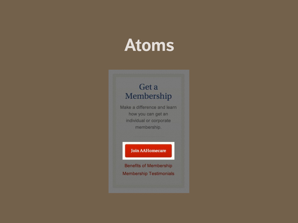
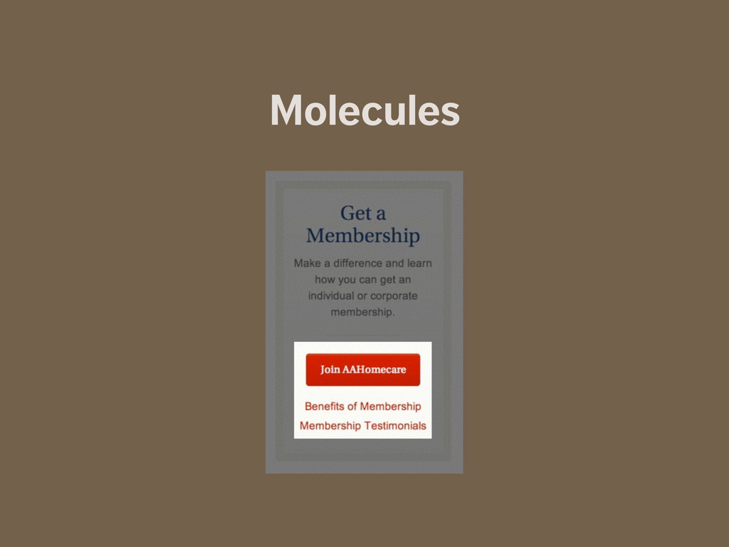
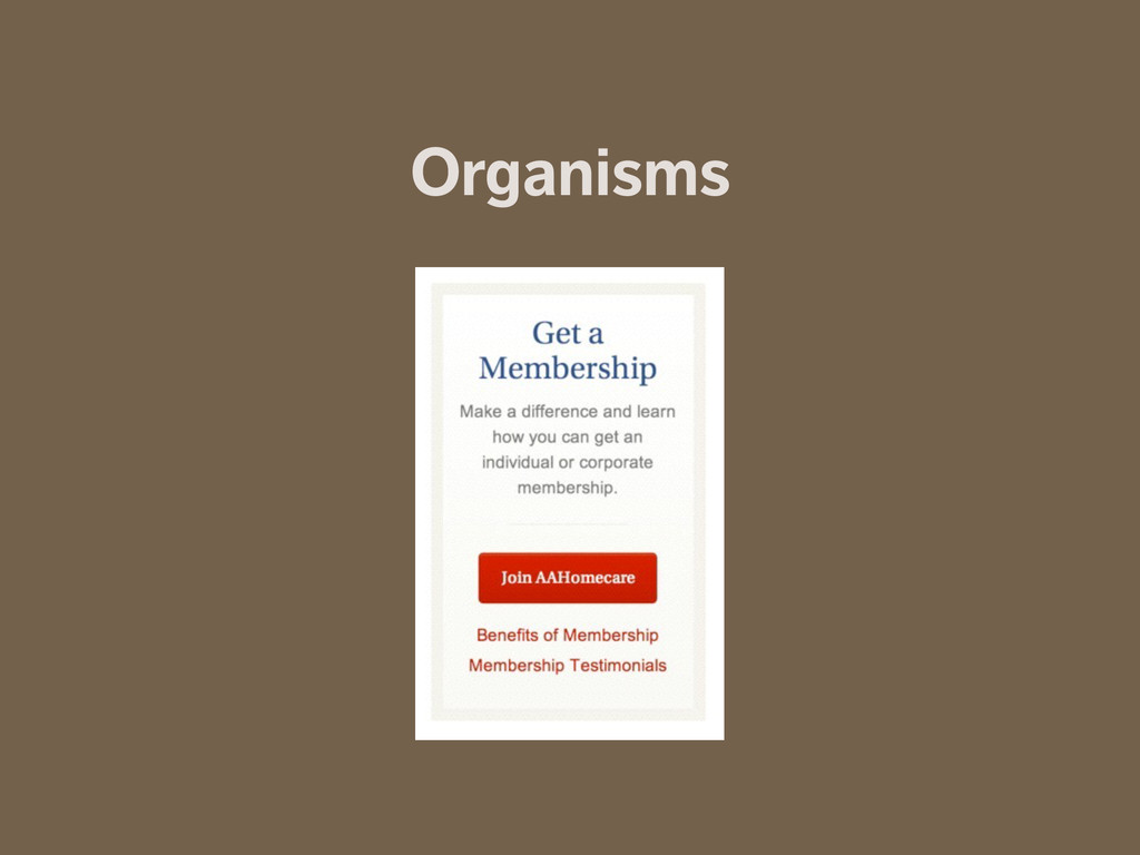
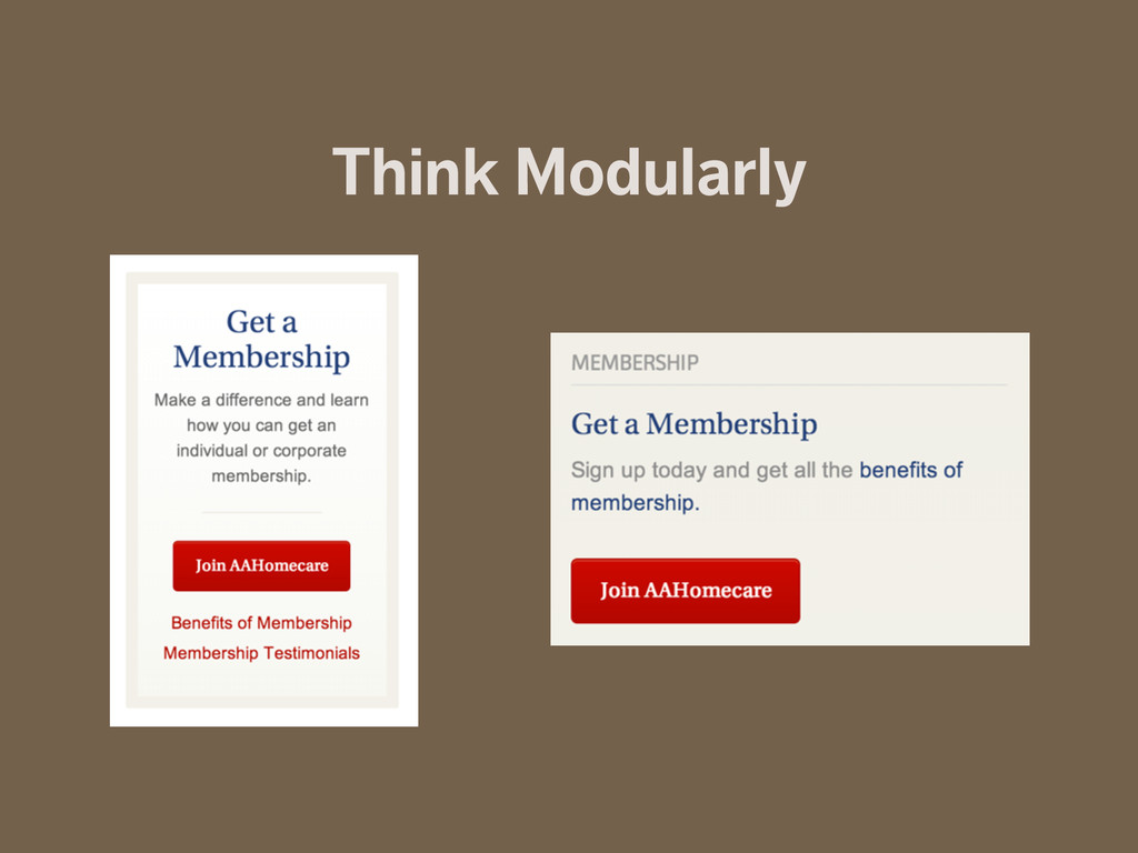
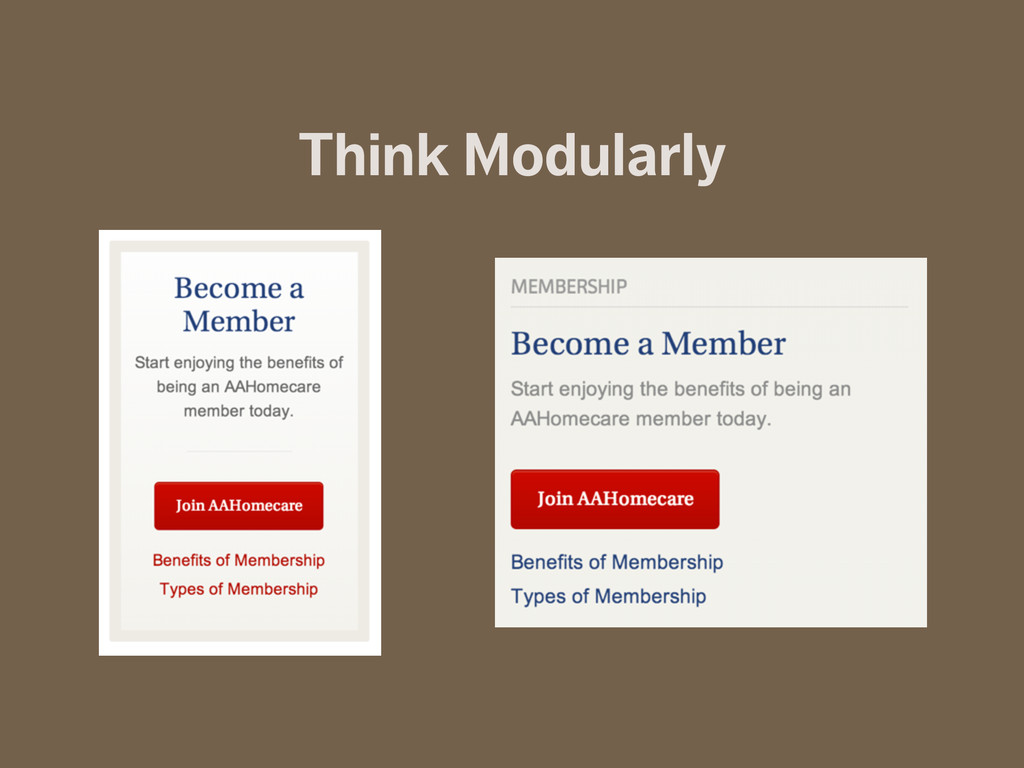
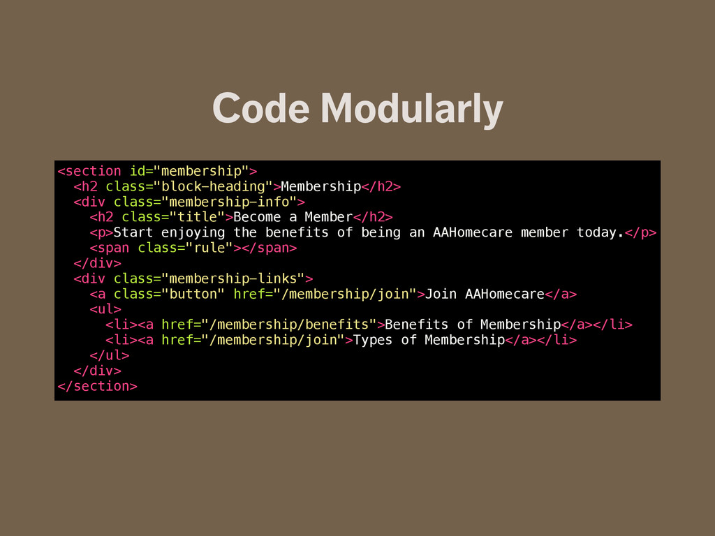
    a Member</h2> <p>Start enjoying the benefits of being an AAHomecare member today.</p> <span class="rule"></span> </div> <div class="membership-links"> <a class="button" href="/membership/join">Join AAHomecare</a> <ul> <li><a href="/membership/benefits">Benefits of Membership</a></li> <li><a href="/membership/join">Types of Membership</a></li> </ul> </div> </section>
  4. A Class By Any Other Name… .field-name-field-webinar-sources, .views-field-field-global-authors, .field-name-field-global-person-name, .field-name-field-magazine-feature,

    .views-field-created, .views-field-field-global-state, .field-name-field-global-location, .field-name-field-global-date, .views-field-field-global-date, .group-teaser-subtitle, .field-name-field-global-company, .field-name-field-global-email-address, .field-name-field-global-organization, .field-name-field-conf-venues, .views-field-field-course-type, .field-name-field-techpresentation-source, .field-name-field-global-authors, .field-name-field-global-person-profile, .field-name-field-global-people-collected { @include subtle-text; a { @include subtle-link; } .field-label { color: $heading-color; font-size: inherit; } }
  5. A Class By Any Other Name… .attribution { @include subtle-text;

    a { @include subtle-link; } .field-label { color: $heading-color; font-size: inherit; } }
  6. Mixins @mixin button { padding: 0.5em 1em; text-decoration: none; color:

    $background-color; background-color: $link-color; @include border-radius(4px); &:hover, &:focus { text-decoration: none; background-color: $link-color-hover; } }
  7. Variables $text-color: #888; $heading-color: $text-color; $text-color-subtle: lighten($text-color, 30%); ! $link-color:

    #555; $link-color-hover: darken($link-color, 15%); ! $highlight-color: #333; $highlight-color-hover: darken($highlight-color, 15%); ! $border-color: #ccc; ! $background-color: #fff; $background-color-subtle: #eee; ! $footer-color: $link-color;
  8. Grid System $gutter_width: 3.5%; $columns: 12; $column_width: 5.125%; $grid_width: ((($column_width+($gutter_width))*$columns)-

    $gutter_width); ! @mixin container($max-width: 81.25em) { width: $grid_width; margin: auto; max-width: $max-width; *zoom: 1; } ! @function column_width($num) { @return ($num * $column_width) + (($num - 1) * ($gutter_width)); } !
  9. Partials @import "lib/colors"; @import "lib/grid"; @import "lib/mediaqueries"; @import "lib/typographic-mixins"; @import

    "lib/general-mixins"; @import "lib/icons"; ! @import "general"; @import "forms"; @import "header"; @import "footer"; @import "homepage"; @import "haunts"; @import "internal"; @import "notifications"; @import "secondary-navigation"; @import "reviews";
  10. Let’s Get Organized “Clean Out Your Sass Junk Drawer” http://bit.ly/RVzto0

    http://youtu.be/EmNcD3b3ZtI ! ! See it in action: Toadstool http://bit.ly/1nQmKwX
  11. Media Queries: Old Way @media only screen and (min-width: 425px)

    { @import "layout/small"; } ! @media only screen and (min-width: 600px) { @import "layout/medium"; } ! @media only screen and (min-width: 900px) { @import "layout/large"; } ! @media only screen and (min-width: 1100px) { @import "layout/large-xl"; } ! @media only screen and (min-width: 1200px) { @import "layout/huge"; }
  12. Breakpoint: Variables // media query variables (for breakpoint) ! //

    tell Breakpoint to convert px values to em values $breakpoint-to-ems: true; ! $bp-s: 400px; $bp-m: 600px; $bp-l: 800px; $bp-xl: 960px; $bp-xxl: 1100px;
  13. Media Queries with Breakpoint .container { @include container; width: 95%;

    padding: 0 2.5%; ! @include breakpoint($bp-s) { width: 90%; padding: 0 5%; } @include breakpoint($bp-l) { width: 95%; padding: 0 2.5%; } @include breakpoint($bp-xl) { width: 100%; padding: 0; } }
  14. Media Queries with Breakpoint .primary { margin: 0 auto; width:

    90%; @include breakpoint($bp-m) { float: left; margin-right: 3.5%; width: 65%; } } ! .sidebar { margin: 0 auto; width: 90%; @include breakpoint($bp-m) { border-left: 1px #ccc solid; float: left; padding-left: 2em; width: 25%; } }
  15. Breakpoint: Compiled CSS .primary { margin: 0 auto; width: 90%;

    } ! @media (min-width: 37.5em) { .primary { float: left; margin-right: 3.5%; width: 65%; } } ! .sidebar { margin: 0 auto; width: 90%; } ! @media (min-width: 37.5em) { .sidebar { border-left: 1px #ccc solid; float: left; padding-left: 2em; width: 25%; } }
  16. Hand-offs • Need the code? HTML, CSS, and JS are

    ready to go! • Does the client have an internal team? Train them. • Document, document, document...