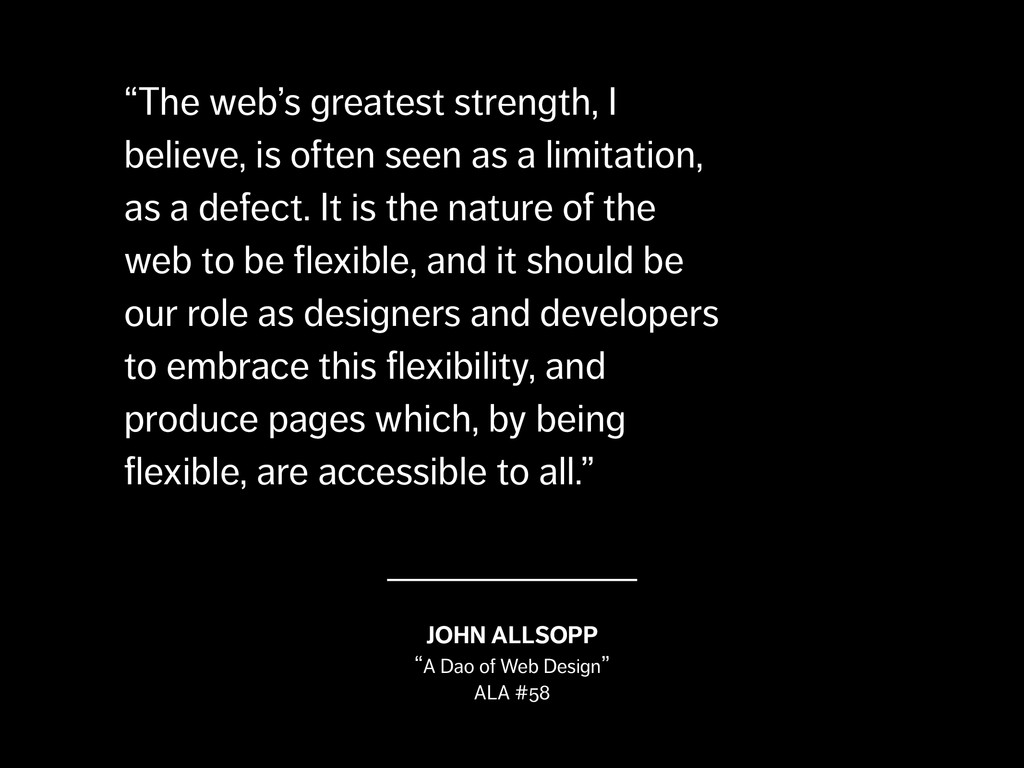
a limitation, as a defect. It is the nature of the web to be flexible, and it should be our role as designers and developers to embrace this flexibility, and produce pages which, by being flexible, are accessible to all.” JOHN ALLSOPP “A Dao of Web Design” ALA #58
a limitation, as a defect. It is the nature of the web to be flexible, and it should be our role as designers and developers to embrace this flexibility, and produce pages which, by being flexible, are accessible to all.” JOHN ALLSOPP “A Dao of Web Design” ALA #58
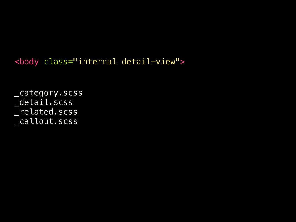
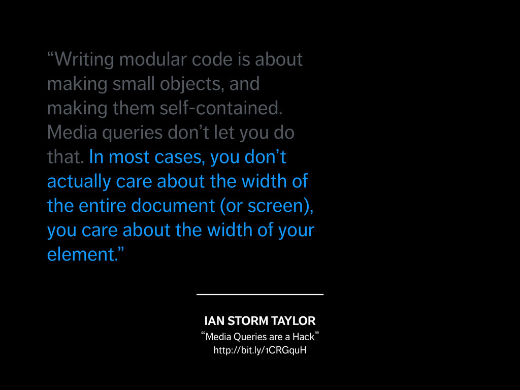
modular code is about making small objects, and making them self-contained. Media queries don’t let you do that. In most cases, you don’t actually care about the width of the entire document (or screen), you care about the width of your element.”
modular code is about making small objects, and making them self-contained. Media queries don’t let you do that. In most cases, you don’t actually care about the width of the entire document (or screen), you care about the width of your element.”
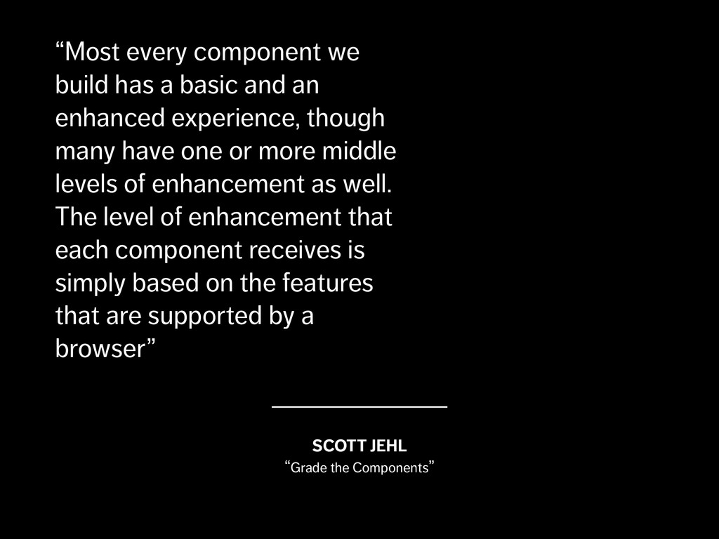
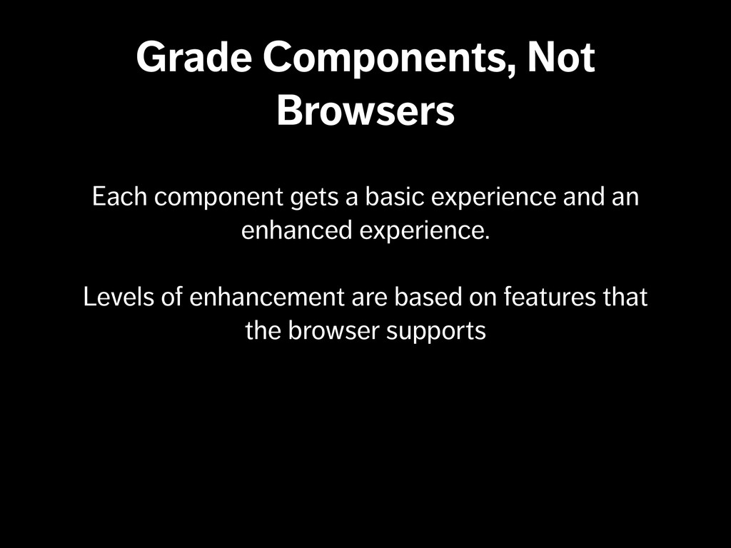
enhanced experience, though many have one or more middle levels of enhancement as well. The level of enhancement that each component receives is simply based on the features that are supported by a browser” SCOTT JEHL “Grade the Components”
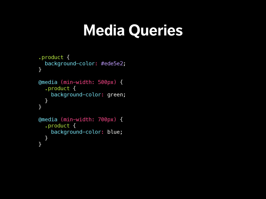
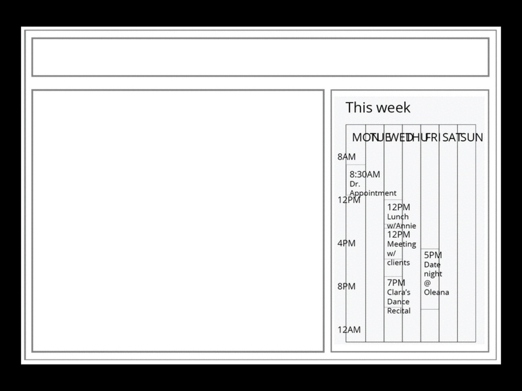
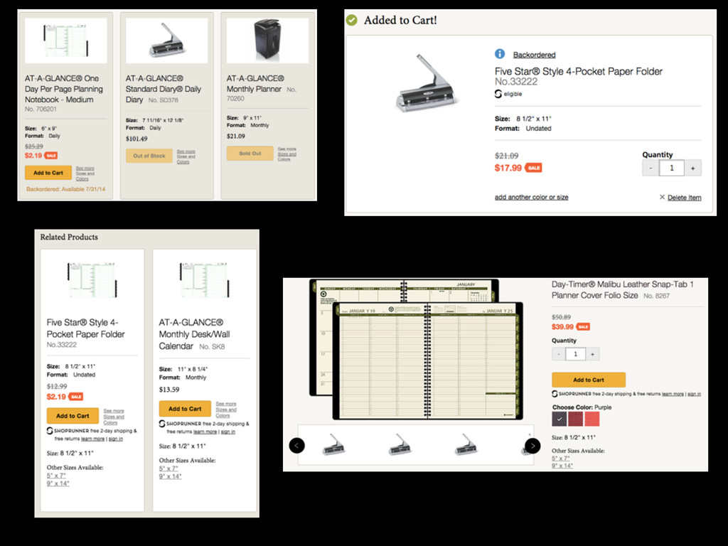
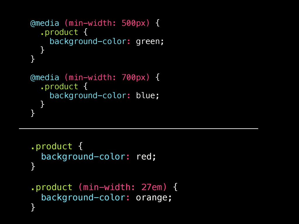
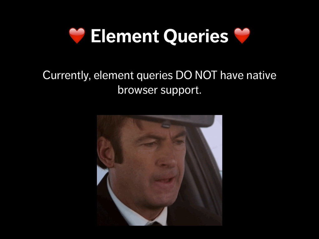
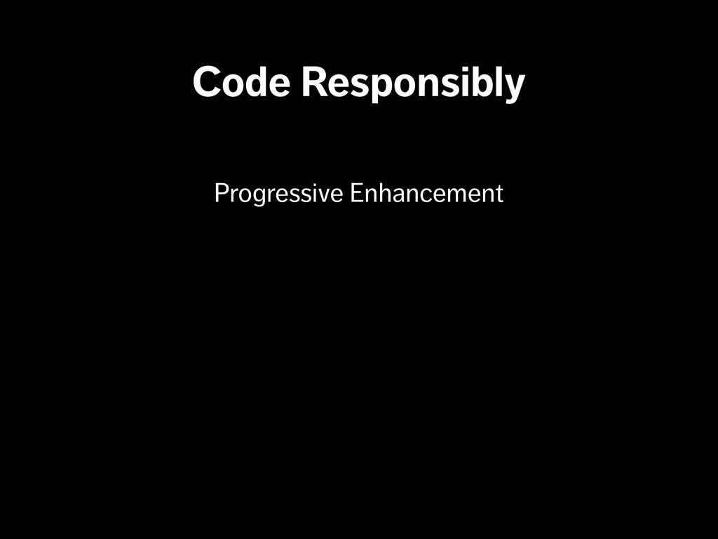
hack) •Viewport size reporting via media queries is sometimes too broad. •We can get a component’s specific context by taking advantage of element queries. •We can use element queries today with the help of polyfills & progressive enhancement.
 patrickfulton
 ming_ayami
 hiroyaonoe
 noriyukitakei
 ymty
ymty
 yanzm
yanzm
 diggymo
 eitarosuda
 oikon48
 nealle
 eller86
 moznion
 shin1988
 mza
mza
 michaelherold
 eileencodes
 sabderemane
 sonatard
 notwaldorf
 lfama
lfama
 danielanewman
 greggifford
 techseoconnect
 lynnandtonic