Upgrade to Pro — share decks privately, control downloads, hide ads and more …

Breaking up with media queries

Breaking up with media queries

Responsive Web Design ushered in one of the most fundamental shifts our industry has ever seen. Now, nearly six years since Ethan Marcott’s original article was published on A List Apart, we’ve begun to see RWD evolve. And, subsequently our processes, workflows, and tools have begun to evolve as well.

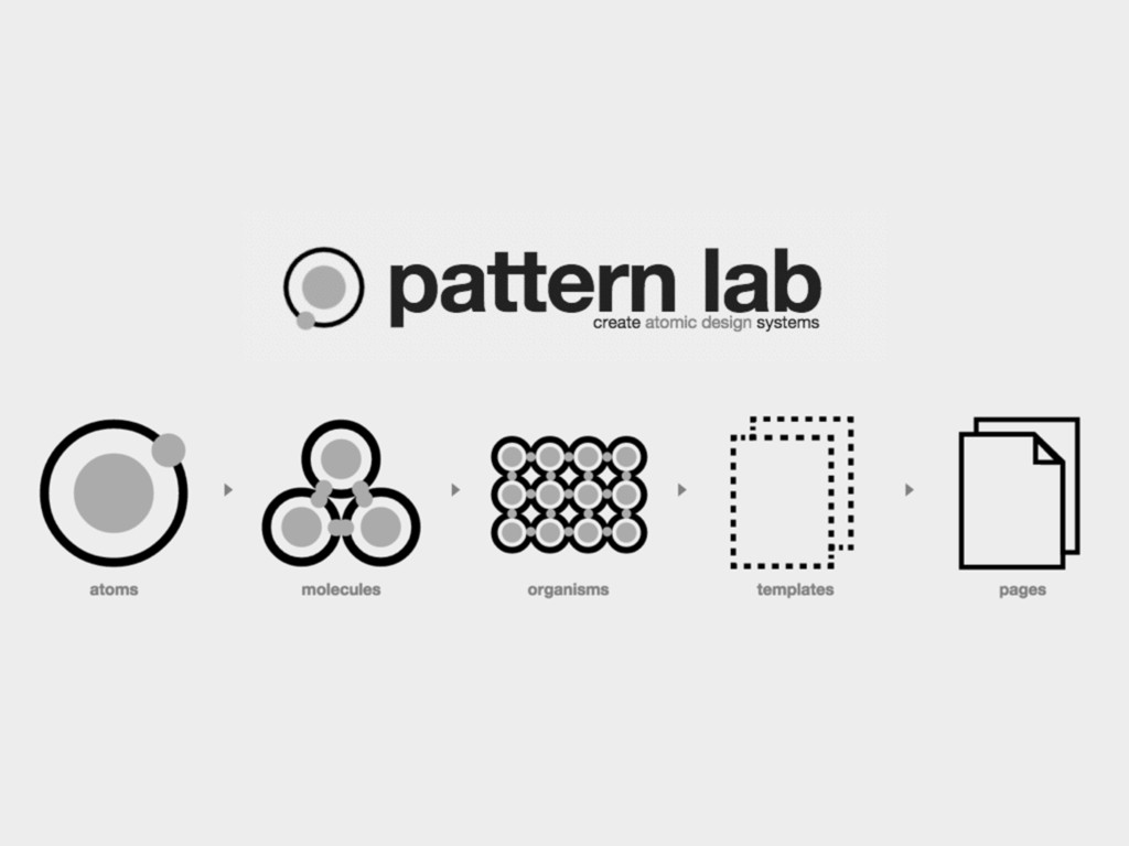
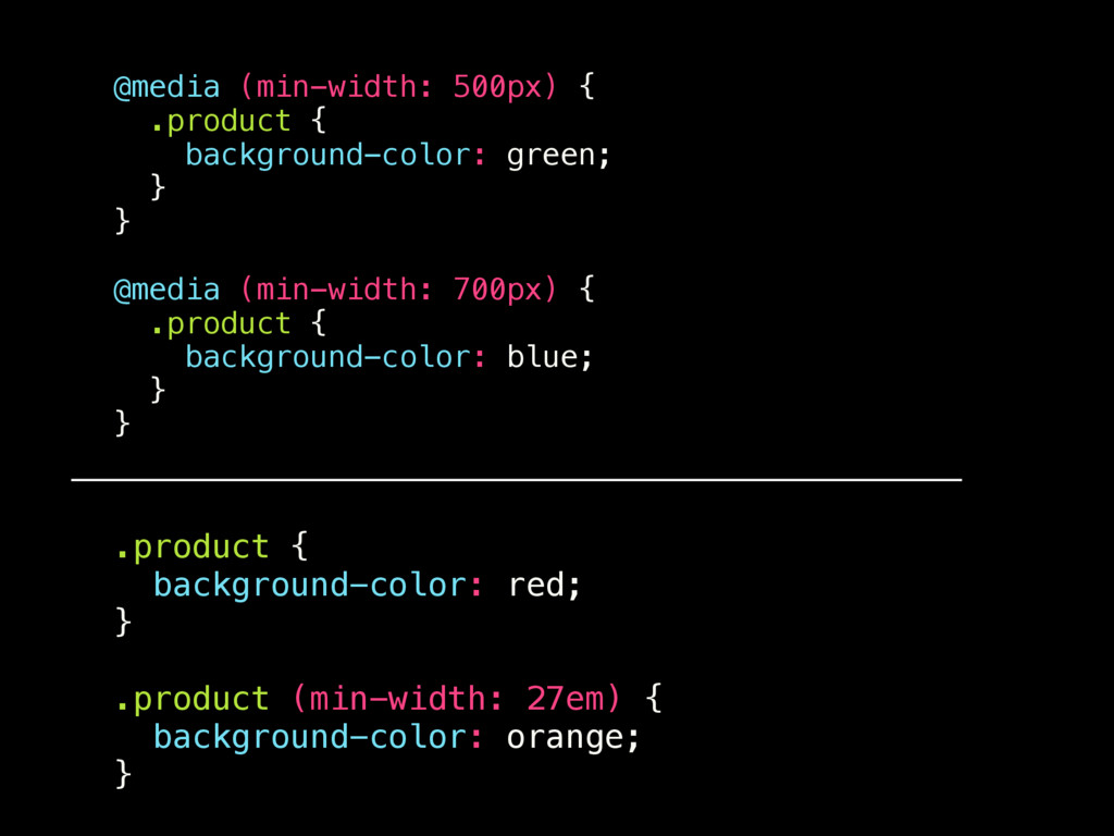
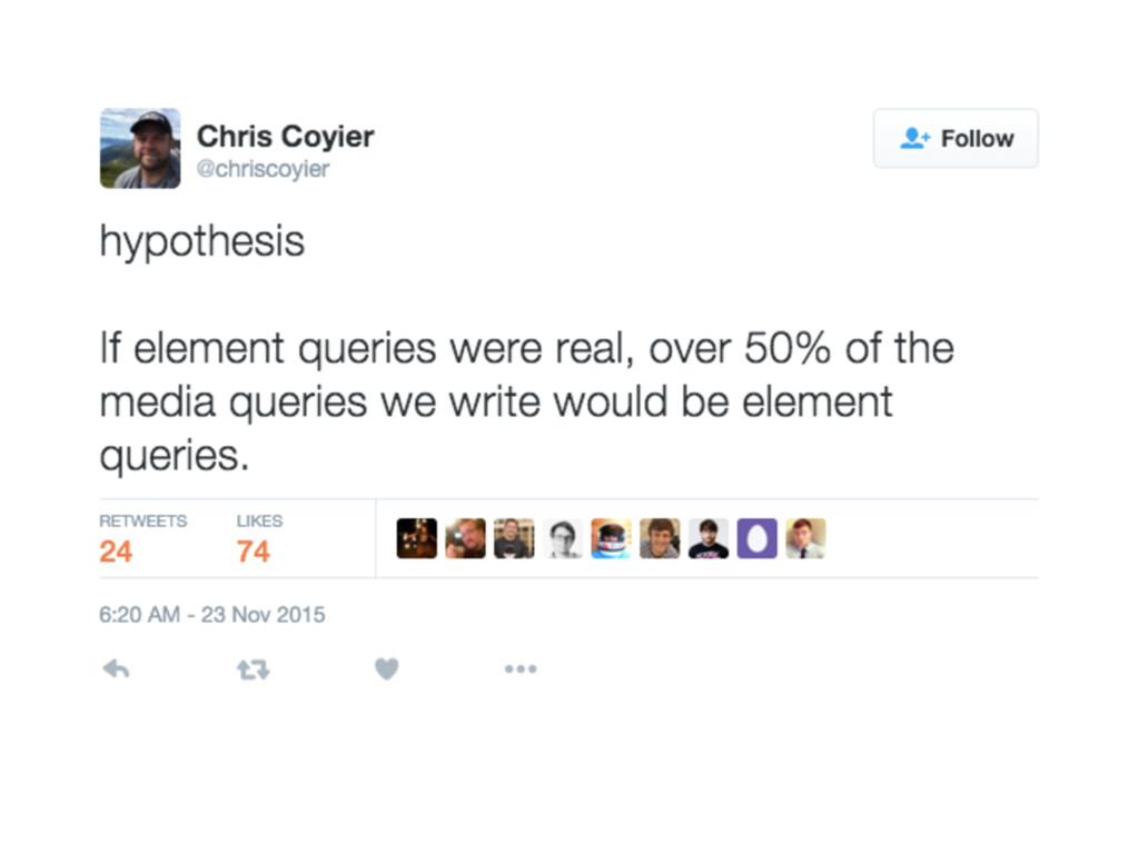
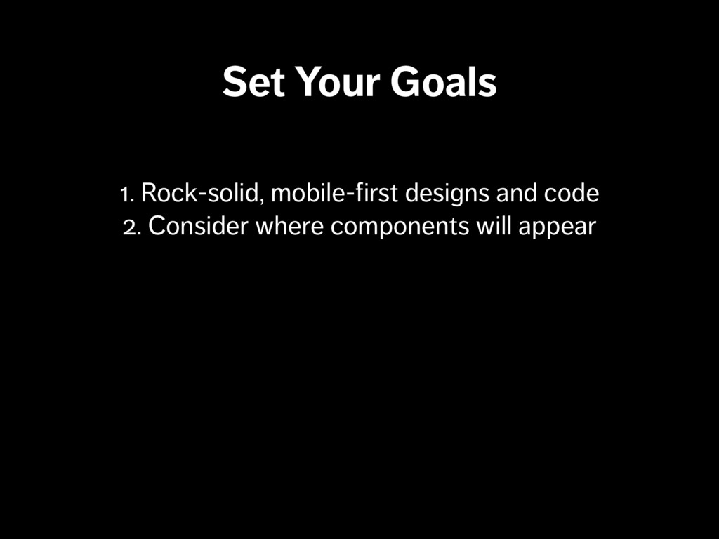
As developers and designers, we’re familiar with change being ever-present. As we address complex problems with solutions such as component-based design and development (aka Atomic Design), we’re faced with wondering: do our browsers’ viewport heights and widths really provide everything we need to inform our atoms, molecules, and organisms?

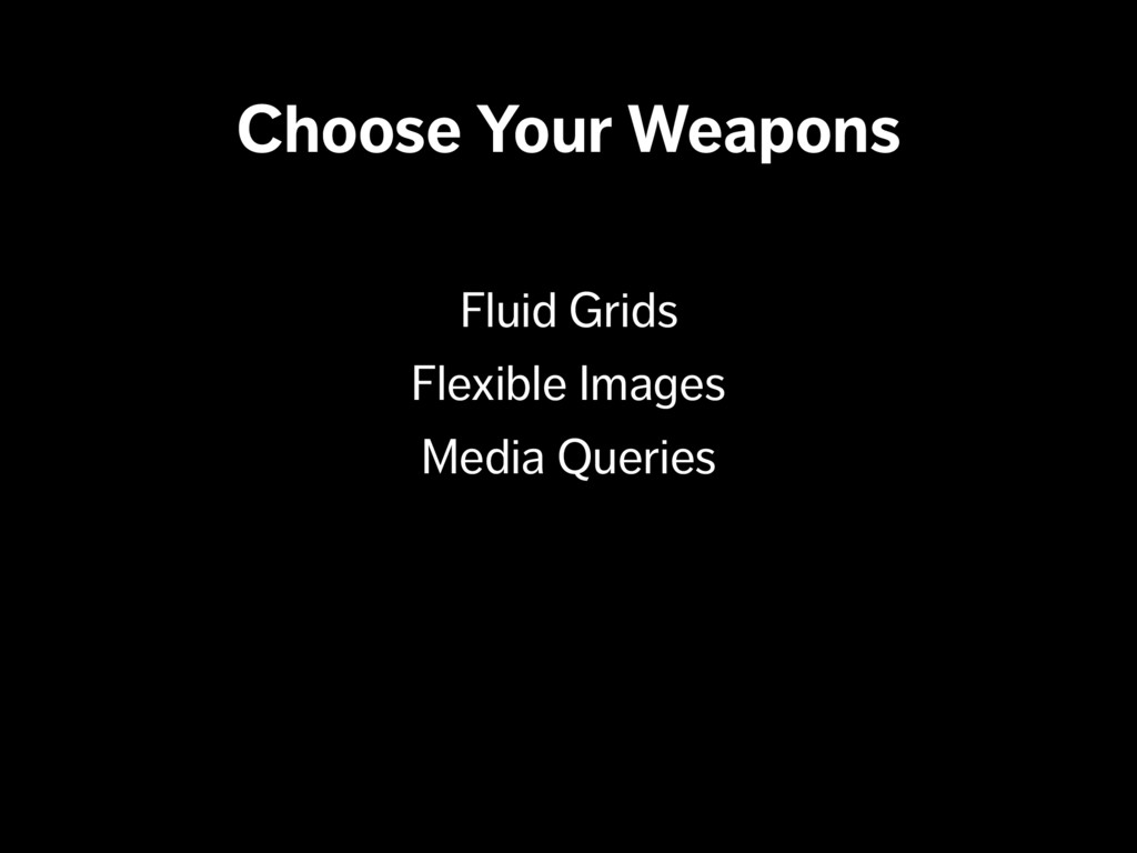
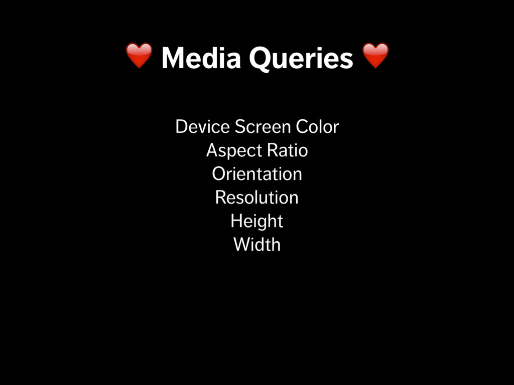
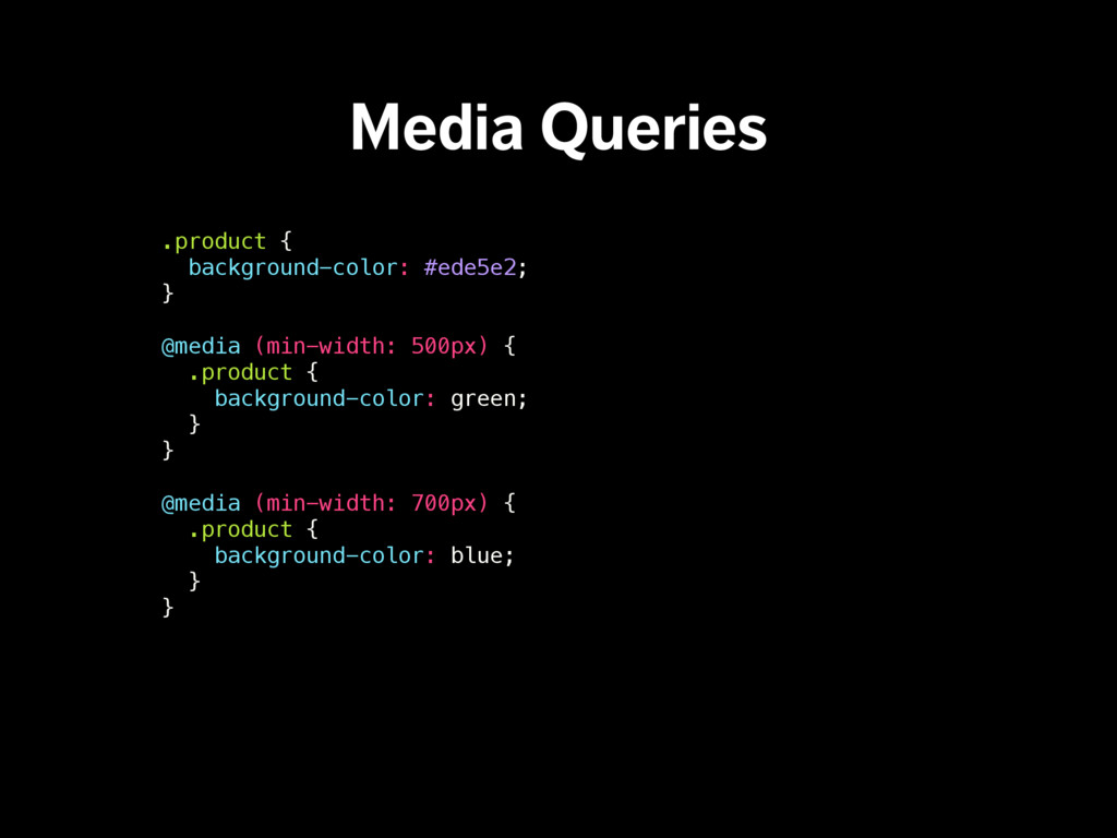
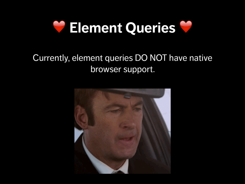
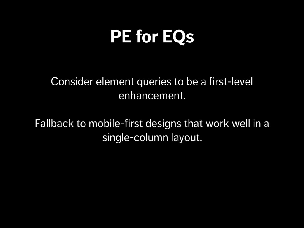
Enter: element queries – or, as we’ve recently reshaped them: container queries.

We’ll take a dive into what container queries are, how to use them, and when they might win out over our old friend the media query.

Patrick Fulton

February 23, 2016
Tweet

More Decks by Patrick Fulton

Other Decks in Technology

Transcript

  1. “The web’s greatest strength, I believe, is often seen as

    a limitation, as a defect. It is the nature of the web to be flexible, and it should be our role as designers and developers to embrace this flexibility, and produce pages which, by being flexible, are accessible to all.” JOHN ALLSOPP “A Dao of Web Design” ALA #58 - April 7, 2000
  2. “The web’s greatest strength, I believe, is often seen as

    a limitation, as a defect. It is the nature of the web to be flexible, and it should be our role as designers and developers to embrace this flexibility, and produce pages which, by being flexible, are accessible to all.” JOHN ALLSOPP “A Dao of Web Design” ALA #58 - April 7, 2000
  3. Media Queries .product { background-color: #ede5e2; } @media (min-width: 500px)

    { .product { background-color: green; } } @media (min-width: 700px) { .product { background-color: blue; } }
  4. IAN STORM TAYLOR “Media Queries are a Hack” http://bit.ly/1CRGquH “Writing

    modular code is about making small objects, and making them self-contained. Media queries don’t let you do that. In most cases, you don’t actually care about the width of the entire document (or screen), you care about the width of your element.”
  5. IAN STORM TAYLOR “Media Queries are a Hack” http://bit.ly/1CRGquH “Writing

    modular code is about making small objects, and making them self-contained. Media queries don’t let you do that. In most cases, you don’t actually care about the width of the entire document (or screen), you care about the width of your element.”
  6. .product { background-color: red; } .product (min-width: 27em) { background-color:

    orange; } @media (min-width: 500px) { .product { background-color: green; } } @media (min-width: 700px) { .product { background-color: blue; } }
  7. .product { background-color: red; } .product (min-width: 27em) { background-color:

    orange; } @media (min-width: 500px) { .product { background-color: green; } } @media (min-width: 700px) { .product { background-color: blue; } }
  8. Polyfills! Rely on data attributes (sometimes) <div class="product" data-eq-pts="small: 300,

    medium: 500"> And attribute selectors (also, sometimes) .container[data-eq-state$="small"], .container[data-eq-state$="medium"] { font-size: 1em; }
  9. Polyfills! elementQuery Tyson Matanich http://is.gd/mRliE5 “Media Queries Are Not the

    Answer: Element Query Polyfill”
 http://is.gd/cotama
  10. elementQuery scans the document.styleSheets collection for CSS rules <nav class="menu"

    min-width="500px"> .menu[min-width~="500px"] { background-color: #eee; } Then, it appends attributes to the appropriate selector(s)
  11. BoomQueries Uses JS to target selectors, then applies classes at

    defined breakpoints boomQueries.add('.component', [ [480, "component--md"], [600, "component--lg"] ]); .component.component--md { background: red; } .component.component--lg { background: orange; } Regular, ol’ CSS
  12. eq.js Data attribute & values in HTML (data-eq-state gets appended

    on resize) <div data-eq-pts="small: 300, medium: 500” data-eq-state="small"> Uses attribute selectors to apply styles .container[data-eq-state$="small"], .container[data-eq-state$="medium"] { font-size: 1em; }
  13. Set Your Goals MEDIA QUERY Use when a module is

    always the full-width of viewport ELEMENT QUERY Use when a module appears in multiple contexts
  14. “Most every component we build has a basic and an

    enhanced experience, though many have one or more middle levels of enhancement as well. The level of enhancement that each component receives is simply based on the features that are supported by a browser” SCOTT JEHL “Grade the Components”
 http://is.gd/RvqtA0
  15. Grade Components, Not Browsers Each component gets a basic experience

    and an enhanced experience. Levels of enhancement are based on features that the browser supports
  16. PE for EQs Consider element queries to be a first-level

    enhancement. Fallback to mobile-first designs that work well in a single-column layout.
  17. Recap •We ❤ media queries (but they’re kind of a

    hack) •Viewport size reporting via media queries is sometimes too broad. •We can get a component’s specific context by taking advantage of element container queries. •We can use element container queries today with the help of polyfills & progressive enhancement.
  18. More Resources EQCSS http://elementqueries.com/ Elementary http://is.gd/nmsve8 The State of Element/Container

    Queries
 http://is.gd/xxzlzu React Container Query
 http://is.gd/9skv6d