Upgrade to Pro
— share decks privately, control downloads, hide ads and more …
Speaker Deck
Features
Speaker Deck
PRO
Sign in
Sign up for free
Search
Search
Design Responsivo: Uma abordagem abrangente
Search
Sponsored
·
Ship Features Fearlessly
Turn features on and off without deploys. Used by thousands of Ruby developers.
→
Plataformatec
July 20, 2012
Design
230
2
Share
Embed
Copy iframe code
Copy JS code
Copy link
Start on current slide
Design Responsivo: Uma abordagem abrangente
Workshop realizado no Ndesign.
Plataformatec
July 20, 2012
More Decks by Plataformatec
See All by Plataformatec
O case da Plataformatec com o Elixir - Como uma empresa brasileira criou uma linguagem que é usada no mundo inteiro @ Elixir Brasil 2019
plataformatec
5
1.2k
O case da Plataformatec com o Elixir - Como uma empresa brasileira criou uma linguagem que é usada no mundo inteiro @ QCon SP 2018
plataformatec
1
260
Elixir @ iMasters Intercon 2016
plataformatec
1
280
GenStage and Flow by @josevalim at ElixirConf
plataformatec
17
2.9k
Elixir: Programação Funcional e Pragmática @ 2º Tech Day Curitiba
plataformatec
2
330
Elixir: Programação Funcional e Pragmática @ Encontro Locaweb 2016
plataformatec
4
320
What's ahead for Elixir: v1.2 and GenRouter
plataformatec
15
2.2k
Arquiteturas Comuns de Apps Rails @ RubyConf BR 2015
plataformatec
6
410
Pirâmide de testes, escrevendo testes com qualidade @ RubyConf 2015
plataformatec
10
2.5k
Other Decks in Design
See All in Design
The Art of Caring
klemens
0
360
組織で働く大人が「知らないままにやってみる」を取り戻す方法とその意味〜企業で働く実務家による実践知の言語化を事例とした考察〜
chiemitaki
1
190
開発・制作におけるUI・UXデザインの重要性について~UI・UXデザインってなんだろう~
yamasaku
0
110
工房としてのAI ── デザイナー、作家、ビルダー
hiranotomoki
0
280
AIスライド生成を進化させるMDファイル
kenichiota0711
1
1.4k
「ツール」から「パートナー」へ。AI伴走時代のUXデザインとは?~操作を減らし、成果を最大にするための設計~
ncdc
1
680
設計と制作 意図を形に表す / Design and Making: Intent Made Form
usagimaru
3
2k
図面資産×AI 眠れる資産を起こす挑戦
aonomasahiro
0
160
kintone開発におけるライターの役割の変化〜AI活用を添えて〜 / Changes in the Role of Writers in Kintone Development
keroyama
0
120
CULTURE DECK/Marketing Director
mhand01
0
1.4k
【優秀賞+特別賞】くまモン食いしん坊弁当「くまモンの魔法の柑橘弁当」最終審査資料
shoko_seven11
0
200
つくり方を変えていく | change-how-we-build
mottox2
2
1.3k
Featured
See All Featured
How to Create Impact in a Changing Tech Landscape [PerfNow 2023]
tammyeverts
55
3.4k
How to Align SEO within the Product Triangle To Get Buy-In & Support - #RIMC
aleyda
2
1.6k
The innovator’s Mindset - Leading Through an Era of Exponential Change - McGill University 2025
jdejongh
PRO
1
210
Connecting the Dots Between Site Speed, User Experience & Your Business [WebExpo 2025]
tammyeverts
11
950
How GitHub (no longer) Works
holman
316
150k
What’s in a name? Adding method to the madness
productmarketing
PRO
24
4.1k
[RailsConf 2023 Opening Keynote] The Magic of Rails
eileencodes
31
10k
Stop Working from a Prison Cell
hatefulcrawdad
274
21k
Cheating the UX When There Is Nothing More to Optimize - PixelPioneers
stephaniewalter
287
14k
Leadership Guide Workshop - DevTernity 2021
reverentgeek
1
310
<Decoding/> the Language of Devs - We Love SEO 2024
nikkihalliwell
1
260
The Myth of the Modular Monolith - Day 2 Keynote - Rails World 2024
eileencodes
28
3.5k
Transcript
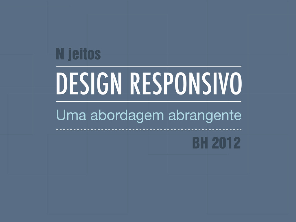
DESIGN RESPONSIVO Uma abordagem abrangente N jeitos BH 2012
None
BRUNA KOCHI @brutiko
[email protected]
ROGER ROSSI @_utgardloki
[email protected]
A OFICINA HISTÓRICO PRODUÇÃO BOAS PRÁTICAS
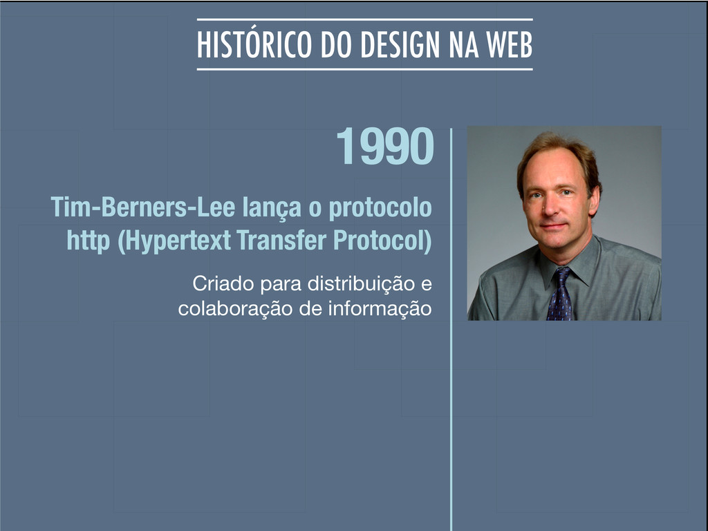
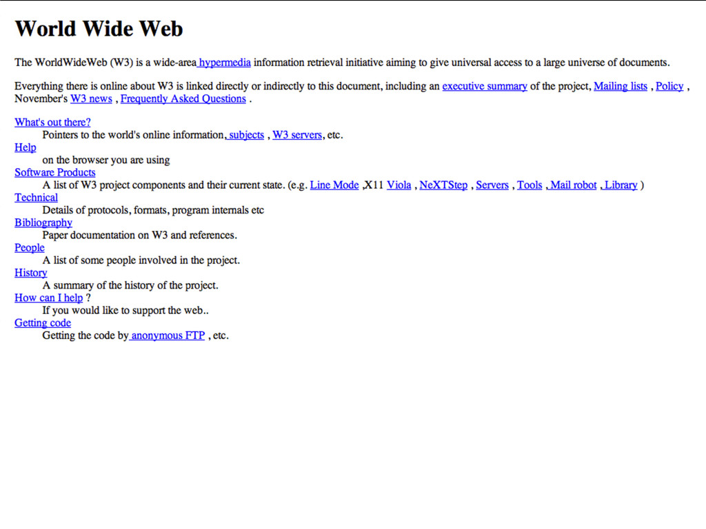
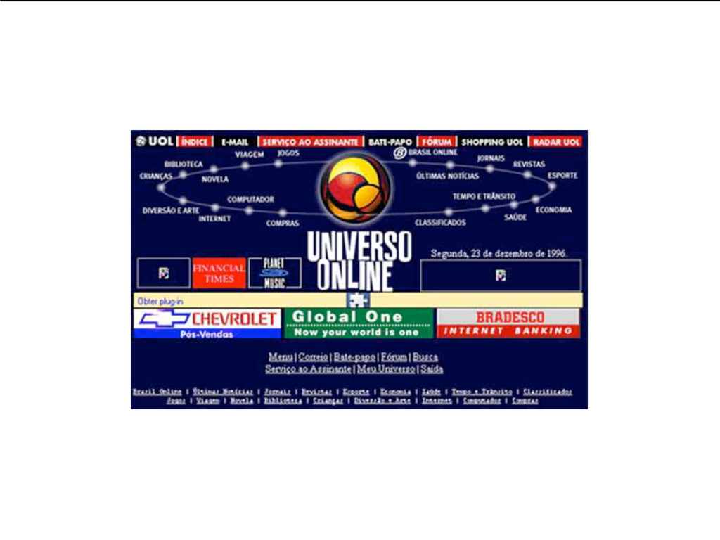
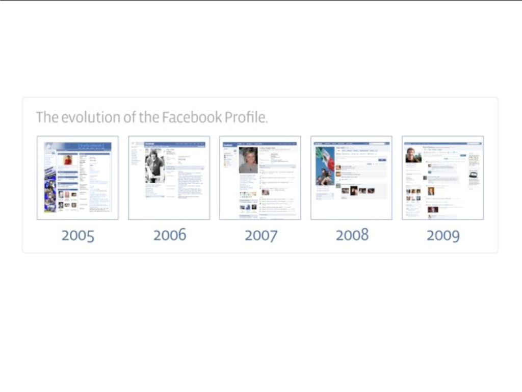
1990 Criado para distribuição e colaboração de informação Tim-Berners-Lee lança
o protocolo http (Hypertext Transfer Protocol) HISTÓRICO DO DESIGN NA WEB
HISTÓRICO DO DESIGN NA WEB
None
None
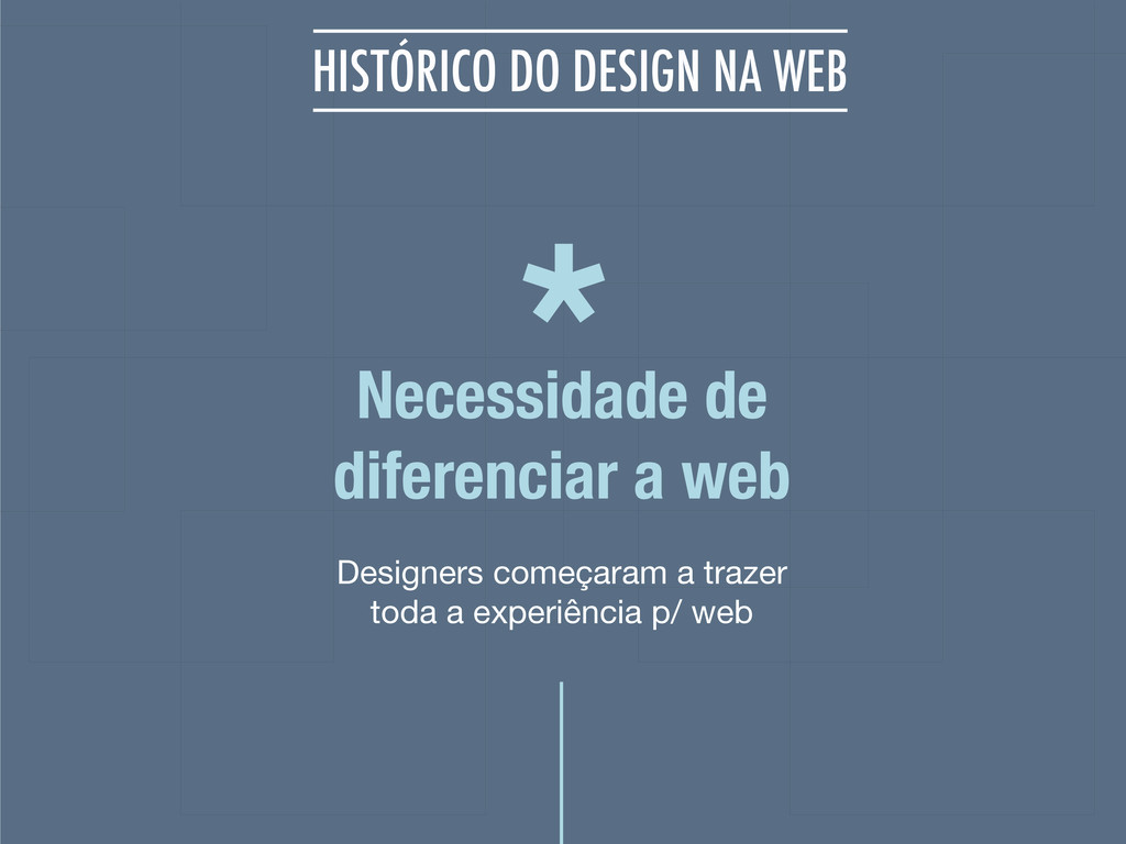
Designers começaram a trazer toda a experiência p/ web Necessidade
de diferenciar a web HISTÓRICO DO DESIGN NA WEB *
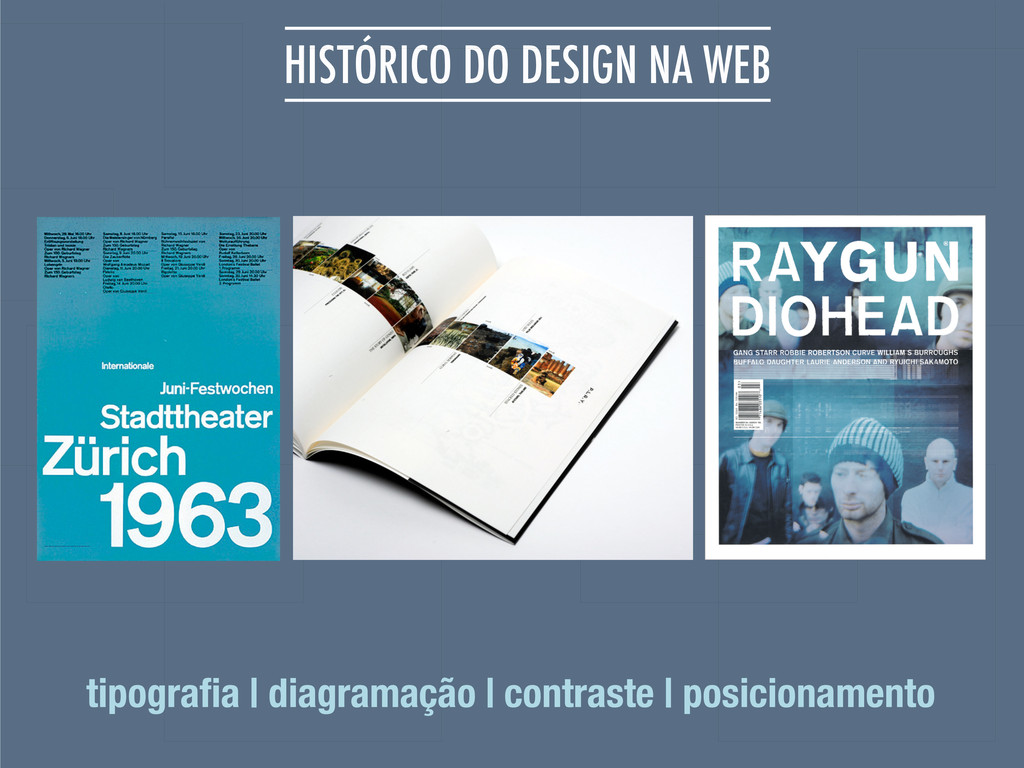
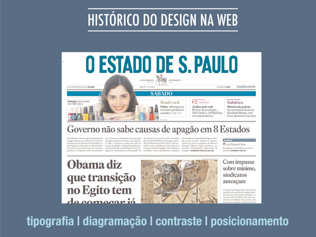
HISTÓRICO DO DESIGN NA WEB tipografia | diagramação | contraste
| posicionamento
HISTÓRICO DO DESIGN NA WEB tipografia | diagramação | contraste
| posicionamento
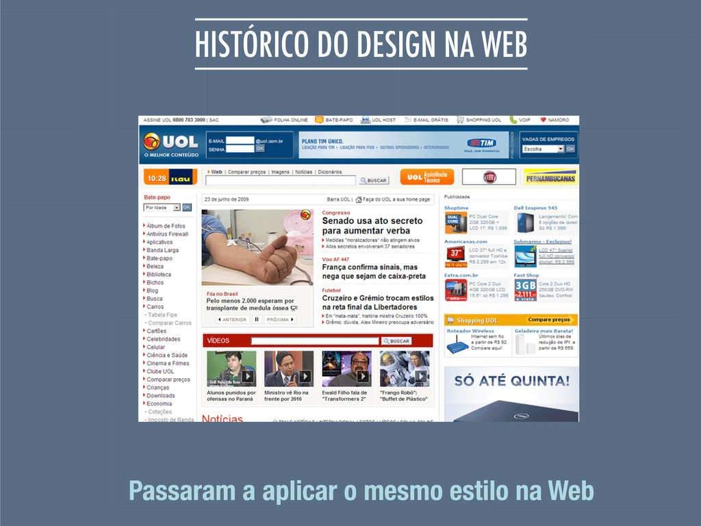
HISTÓRICO DO DESIGN NA WEB Passaram a aplicar o mesmo
estilo na Web
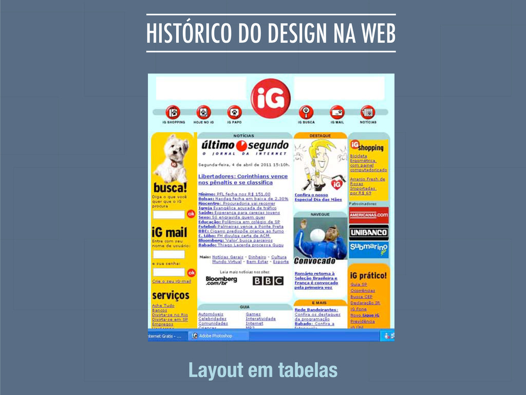
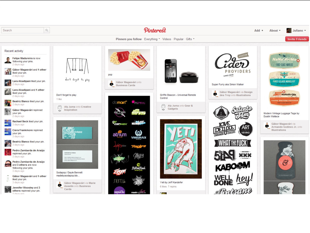
HISTÓRICO DO DESIGN NA WEB Layout em tabelas
1998 Layouts de forma semântica, uso de tabelas apenas para
dados tabulares Movimento Tableless Html propósito original HISTÓRICO DO DESIGN NA WEB
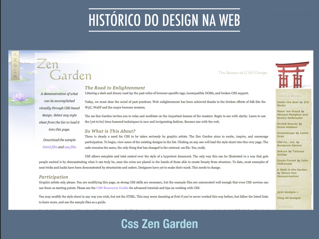
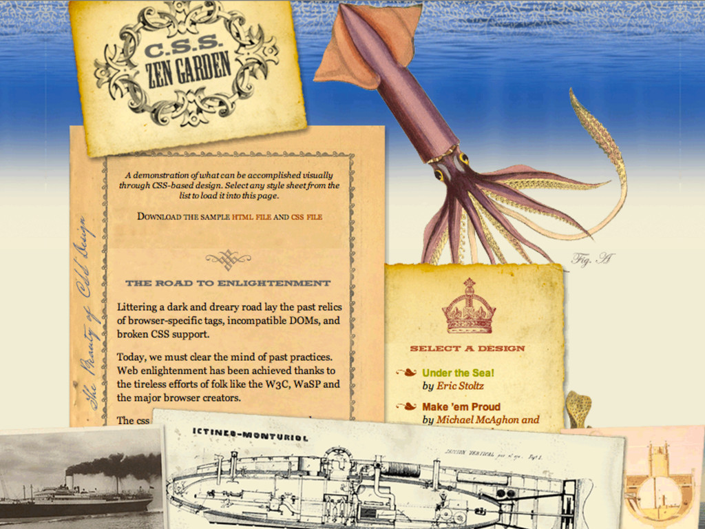
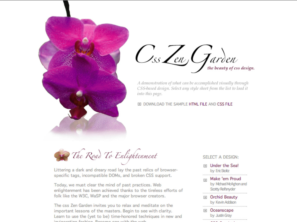
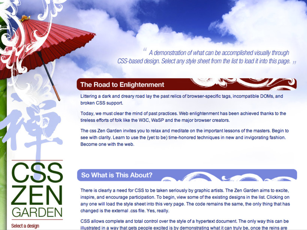
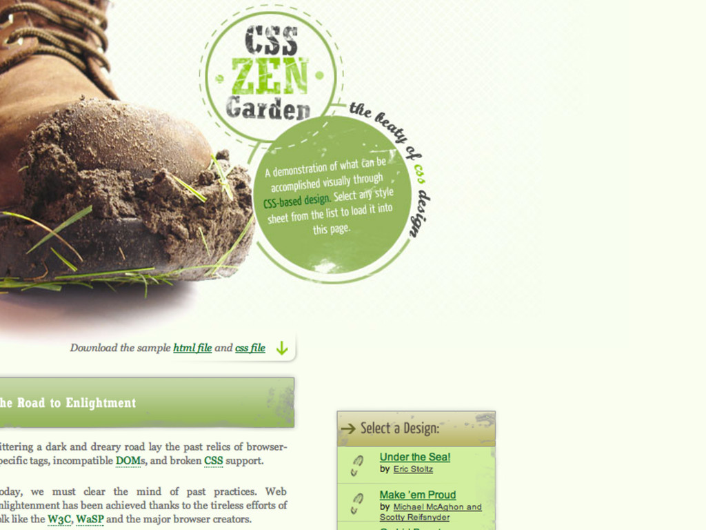
HISTÓRICO DO DESIGN NA WEB Css Zen Garden
None
None
None
None
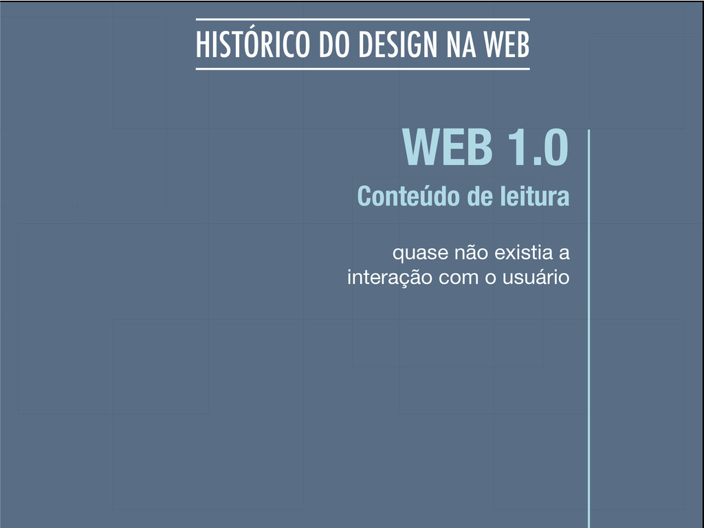
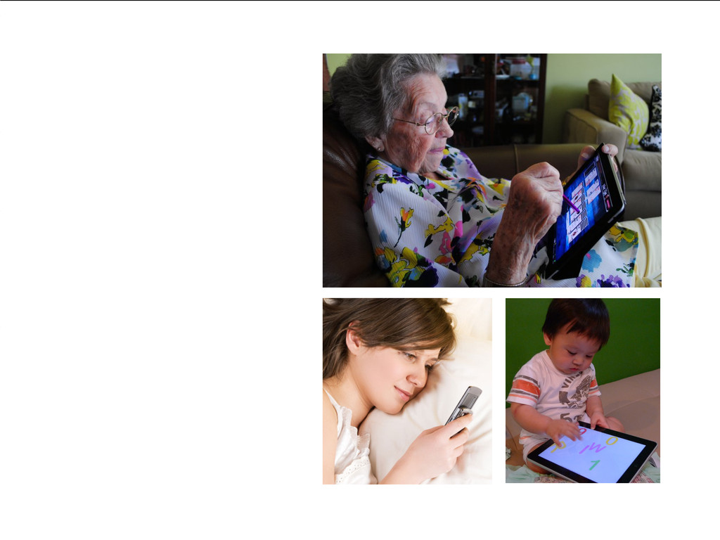
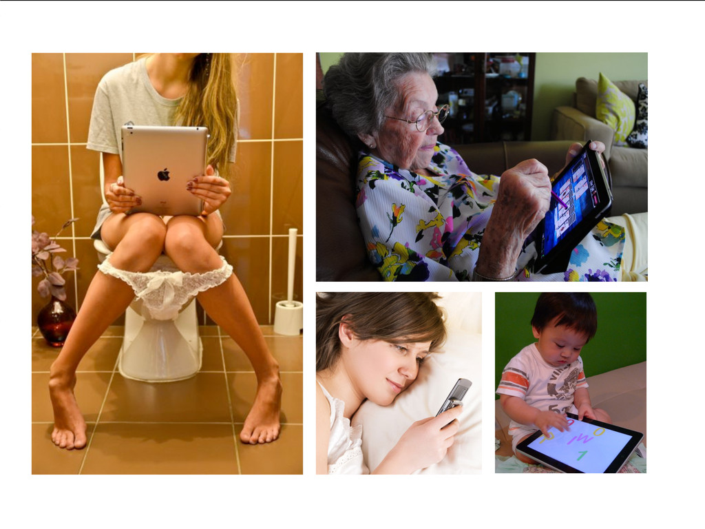
WEB 1.0 quase não existia a interação com o usuário
Conteúdo de leitura HISTÓRICO DO DESIGN NA WEB
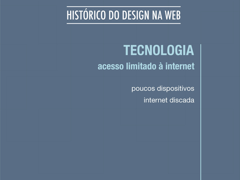
TECNOLOGIA poucos dispositivos acesso limitado à internet HISTÓRICO DO DESIGN
NA WEB internet discada
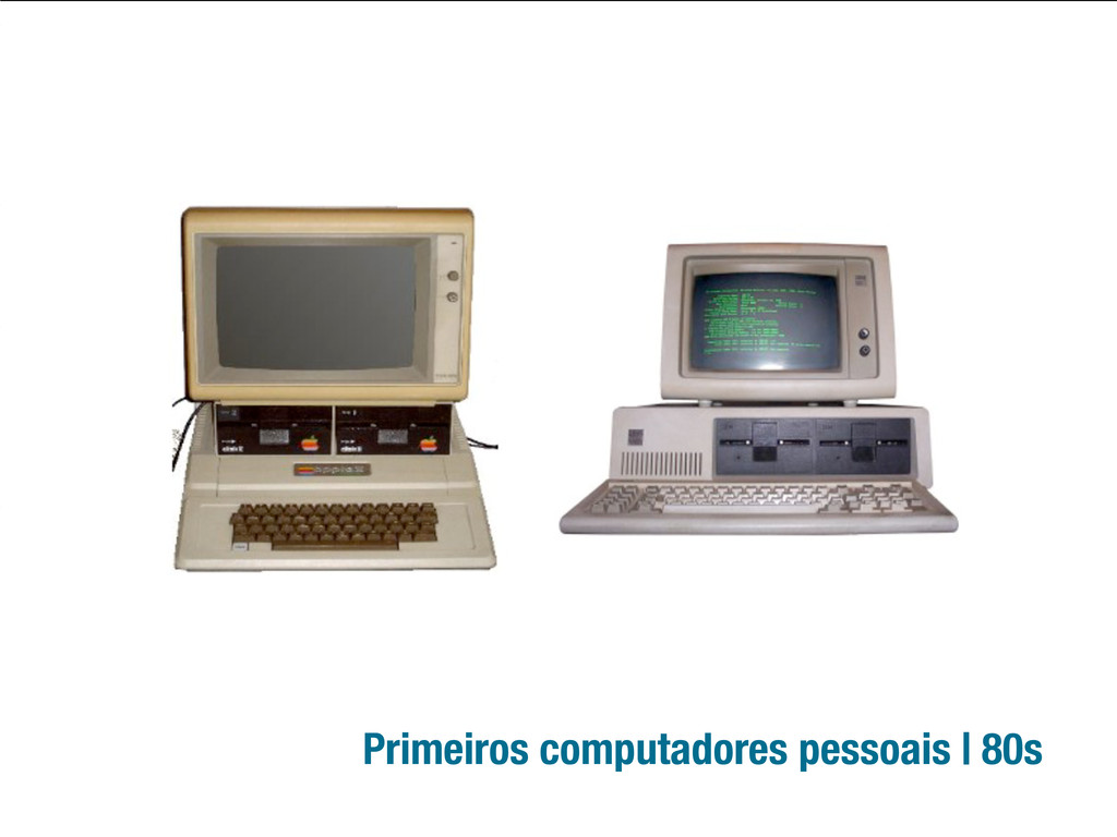
Primeiros computadores pessoais | 80s
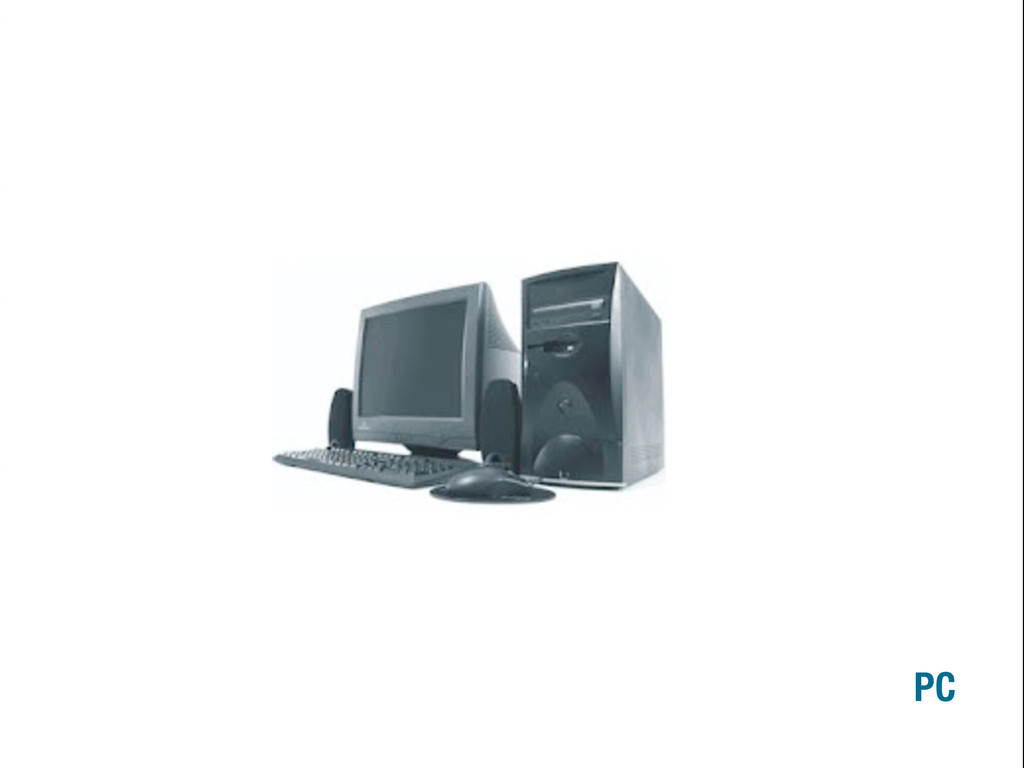
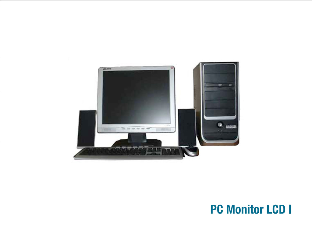
PC
PC Monitor LCD |
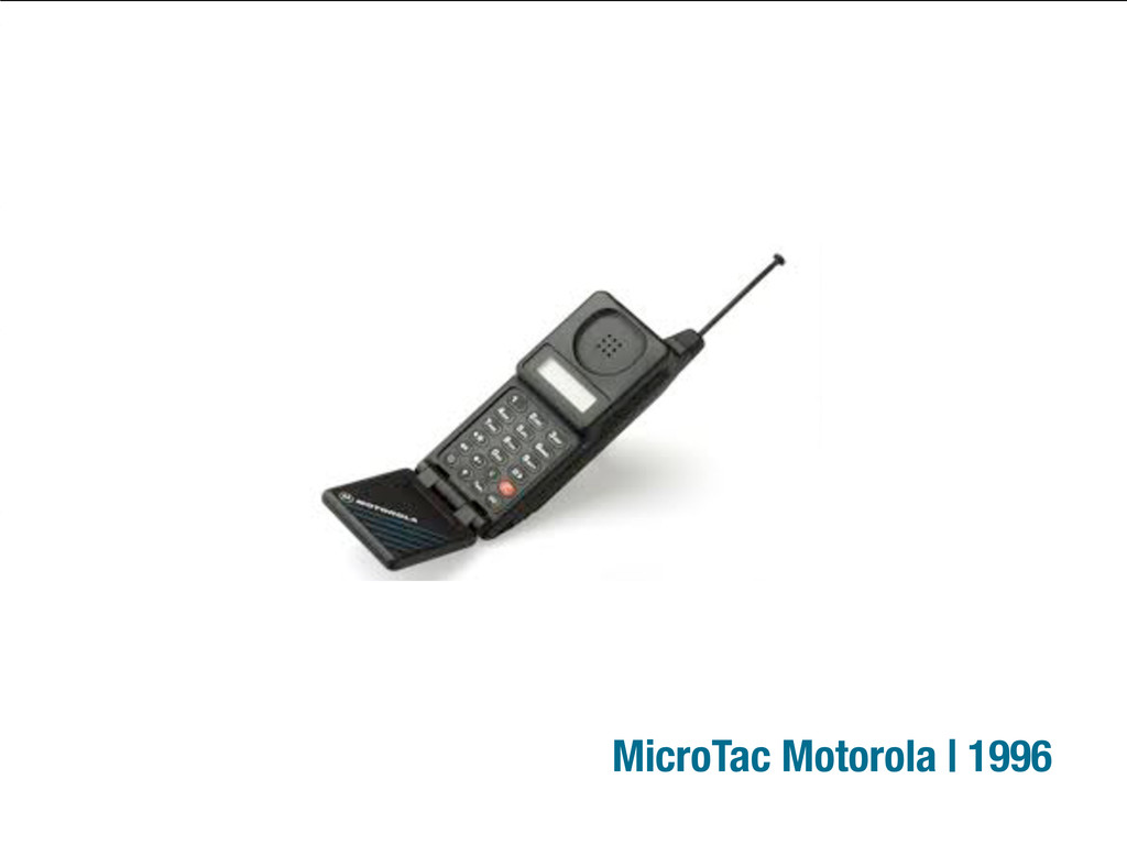
MicroTac Motorola | 1996
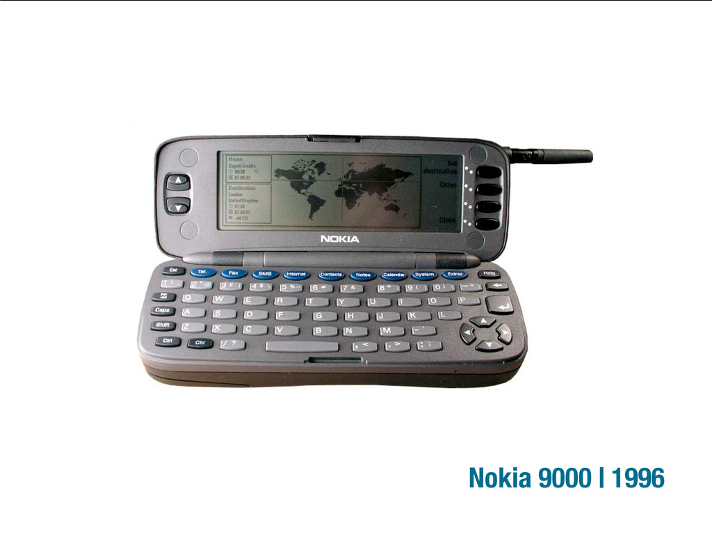
Nokia 9000 | 1996
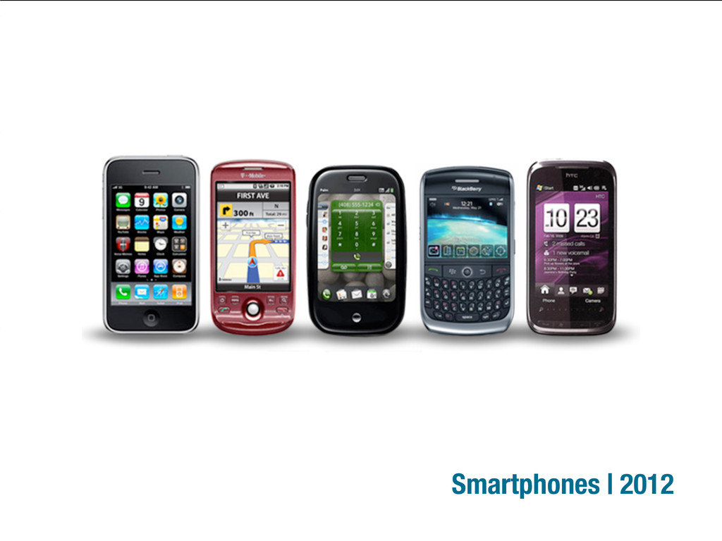
Smartphones | 2012
Tablets | 2012
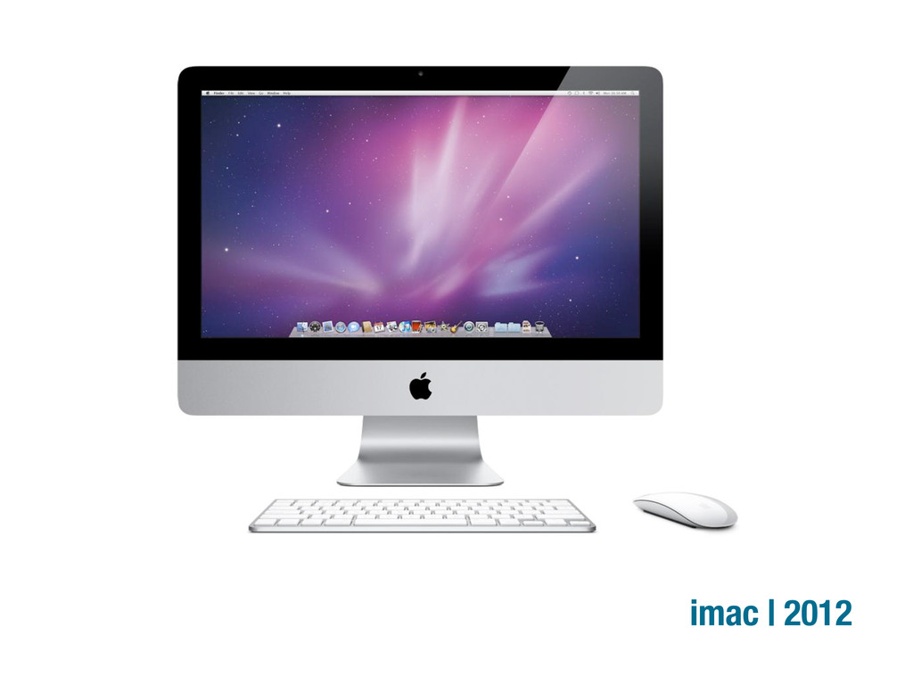
imac | 2012
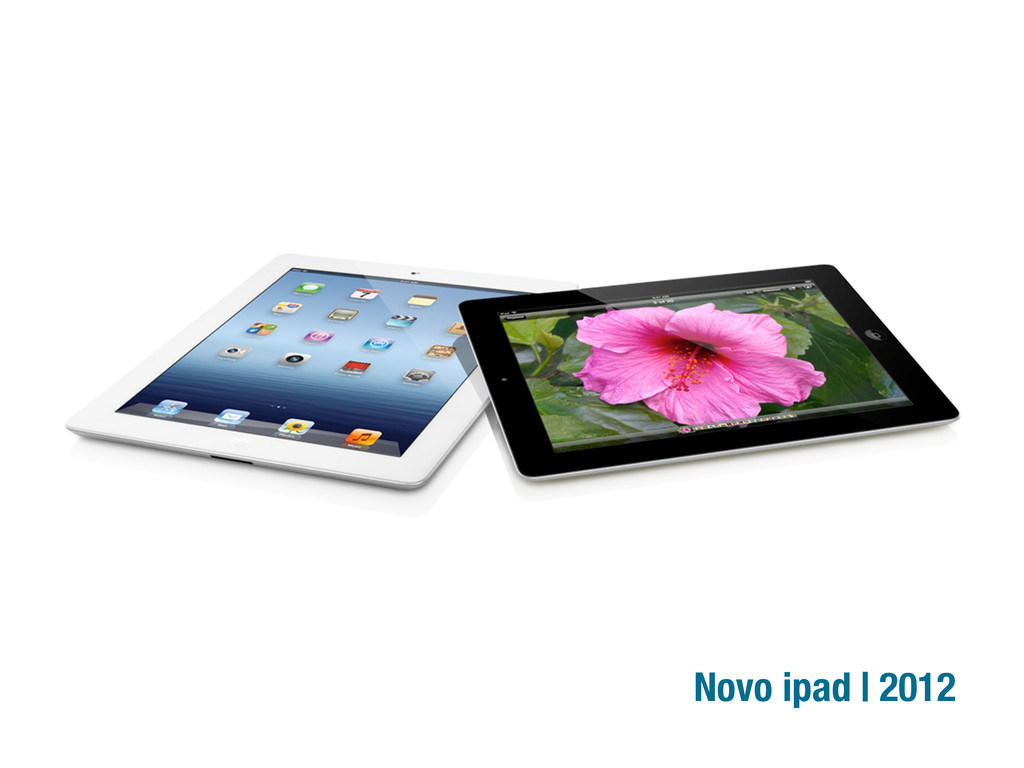
Novo ipad | 2012
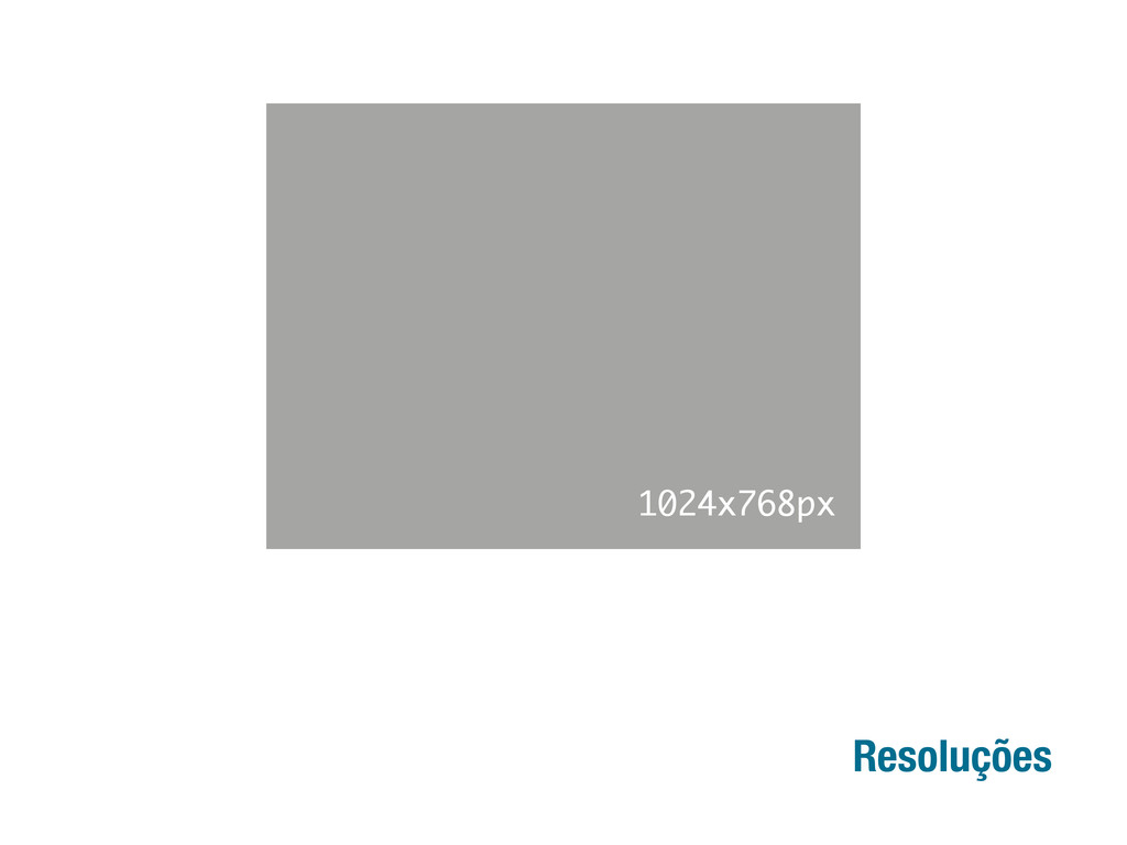
Resoluções 1024x768px
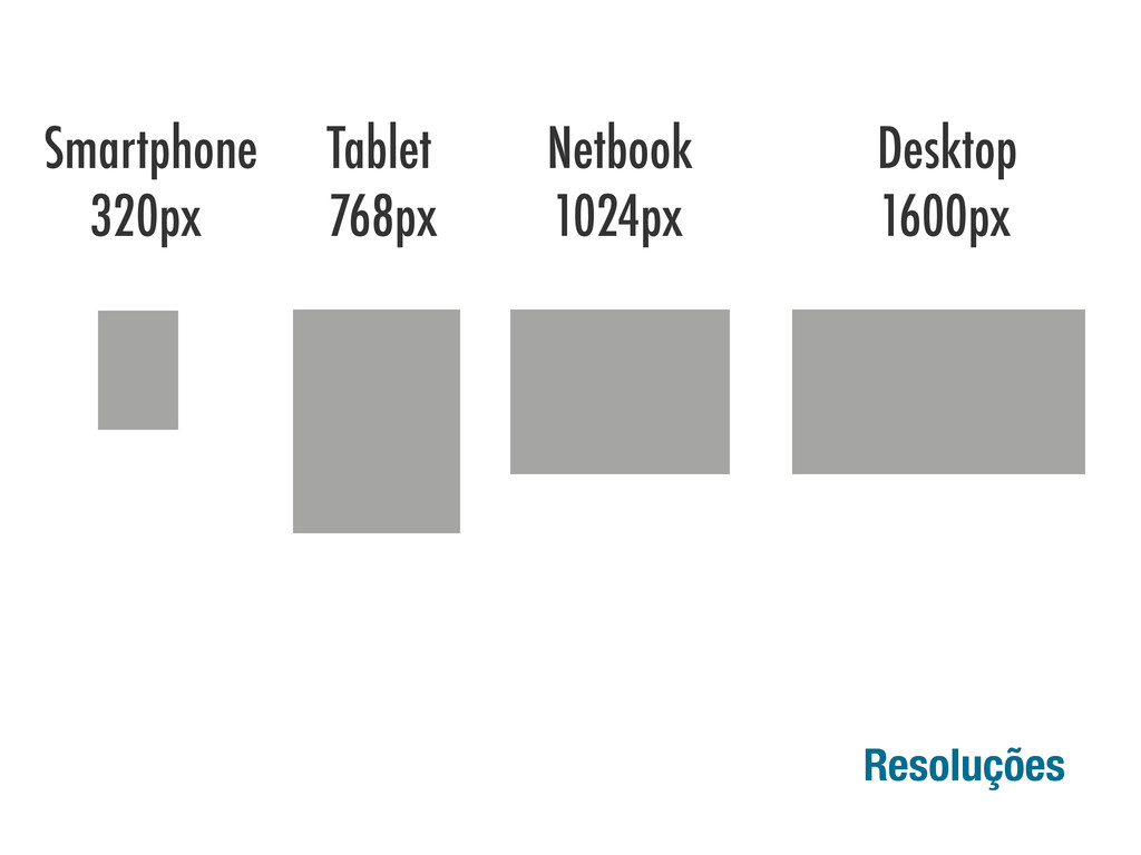
Resoluções 1024x768px Smartphone Tablet Netbook Desktop 320px 768px 1024px 1600px
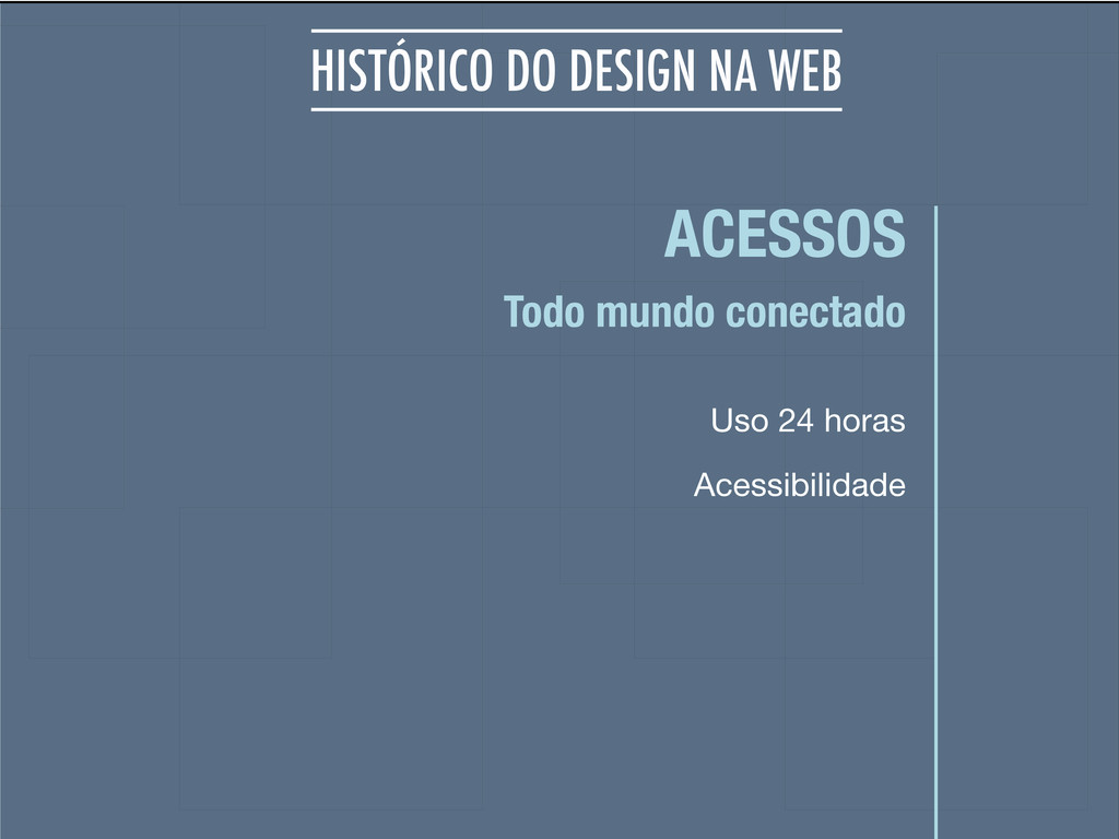
ACESSOS Uso 24 horas Todo mundo conectado HISTÓRICO DO DESIGN
NA WEB Acessibilidade
None
None
None
None
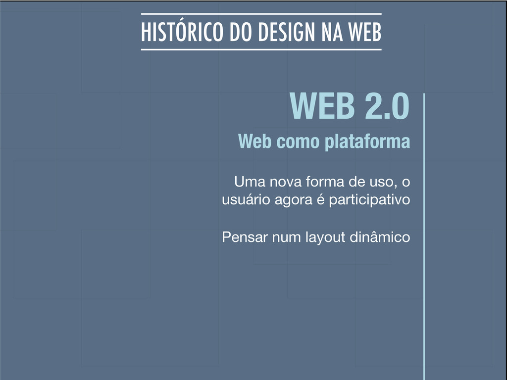
WEB 2.0 Uma nova forma de uso, o usuário agora
é participativo Web como plataforma HISTÓRICO DO DESIGN NA WEB Pensar num layout dinâmico
None
None
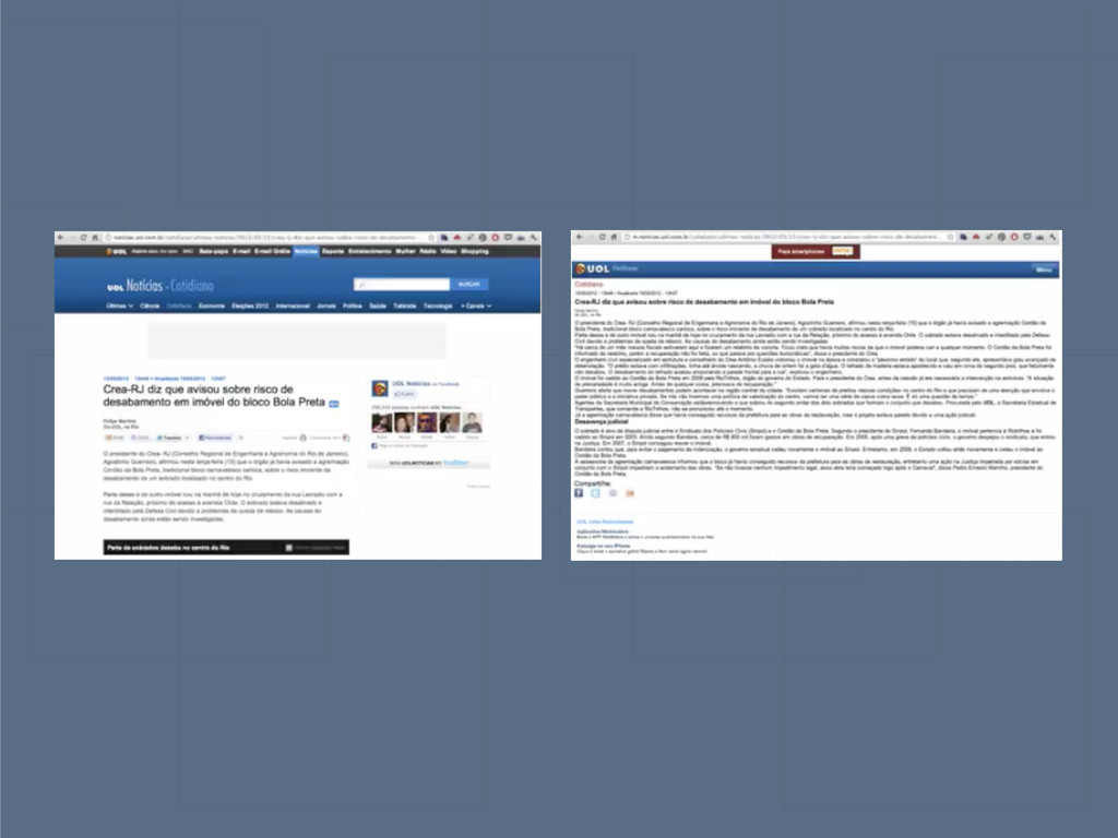
DESIGN RESPONSIVO Exibir todo conteúdo em diferentes dispositivos, adequado e
acessível
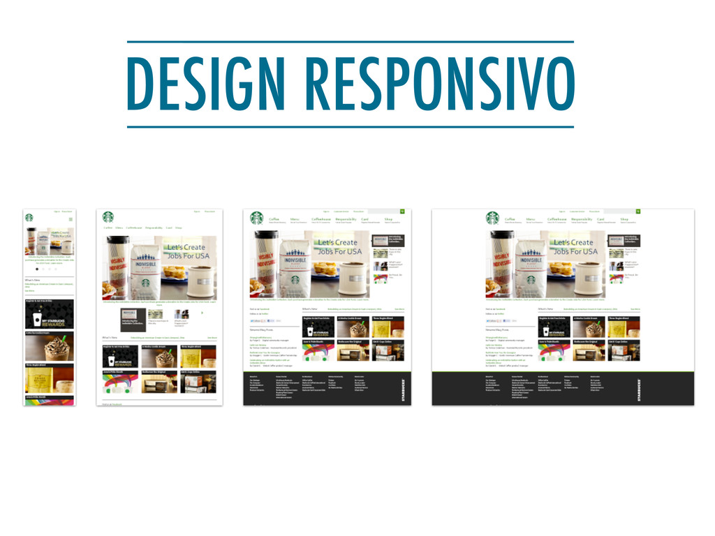
DESIGN RESPONSIVO
None
None
None
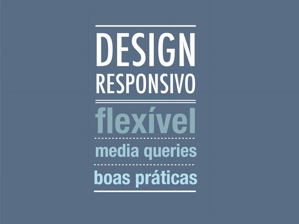
RESPONSIVO flexível media queries boas práticas DESIGN
None
None
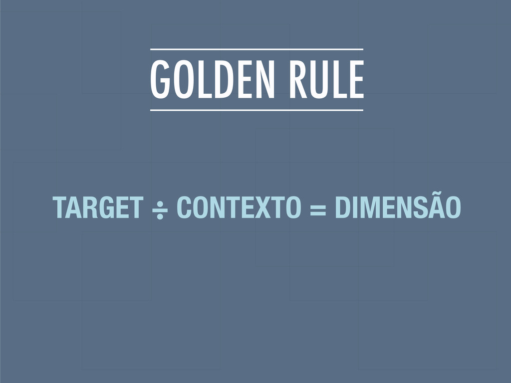
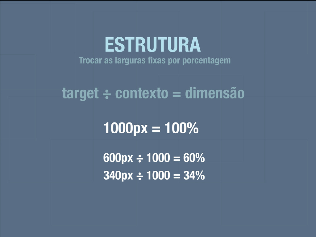
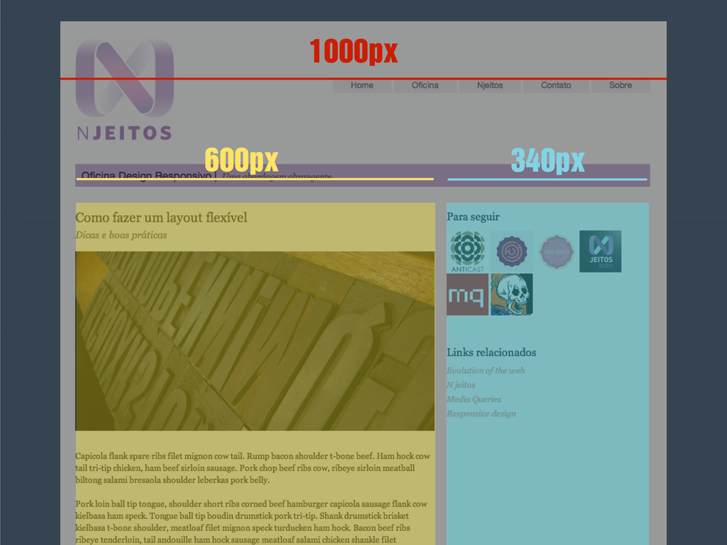
GOLDEN RULE TARGET ÷ CONTEXTO = DIMENSÃO
ESTRUTURA target ÷ contexto = dimensão Trocar as larguras fixas
por porcentagem 1000px = 100% 600px ÷ 1000 = 60% 340px ÷ 1000 = 34%
600px 340px 1000px
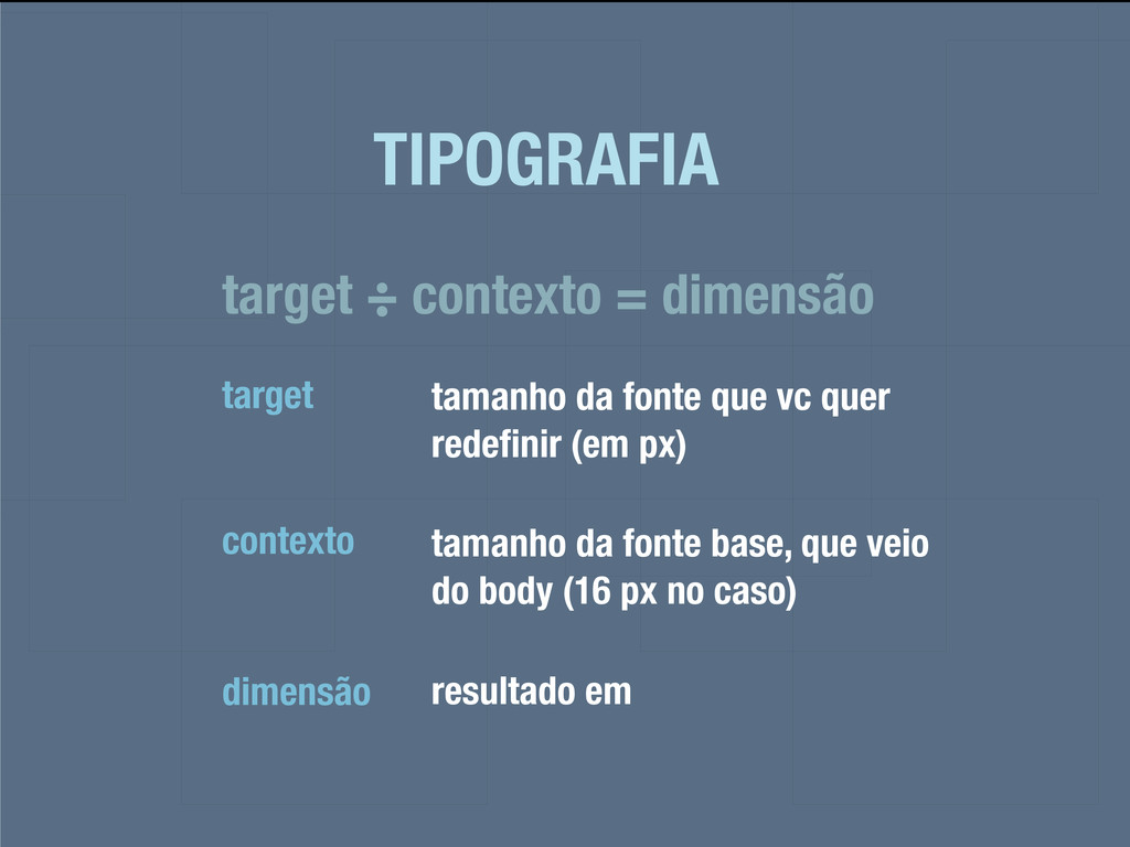
TIPOGRAFIA target ÷ contexto = dimensão target tamanho da fonte
que vc quer redefinir (em px) contexto tamanho da fonte base, que veio do body (16 px no caso) dimensão resultado em
22px / 24px 18px / 20px 14px / 20px
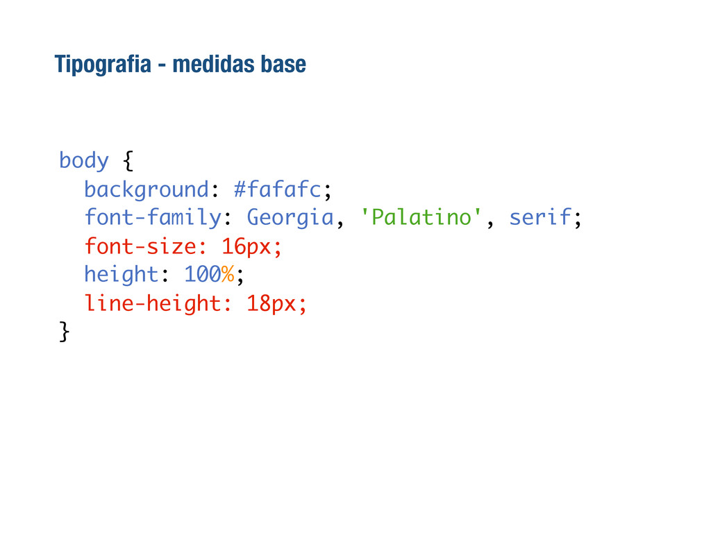
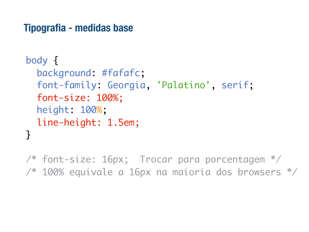
Tipografia - medidas base body { background: #fafafc; font-family: Georgia,
'Palatino', serif; font-size: 16px; height: 100%; line-height: 18px; }
body { background: #fafafc; font-family: Georgia, 'Palatino', serif; font-size: 100%;
height: 100%; line-height: 1.5em; } /* font-size: 16px; Trocar para porcentagem */ /* 100% equivale a 16px na maioria dos browsers */ Tipografia - medidas base
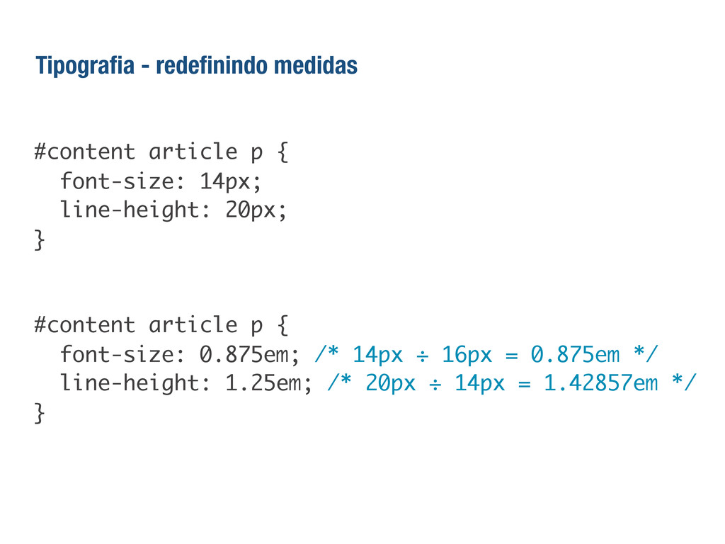
#content article p { font-size: 14px; line-height: 20px; } #content
article p { font-size: 0.875em; /* 14px ÷ 16px = 0.875em */ line-height: 1.25em; /* 20px ÷ 14px = 1.42857em */ } Tipografia - redefinindo medidas
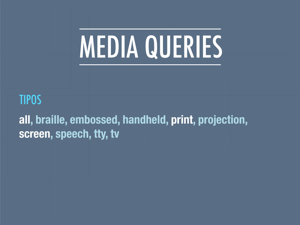
MEDIA QUERIES all, braille, embossed, handheld, print, projection, screen, speech,
tty, tv TIPOS
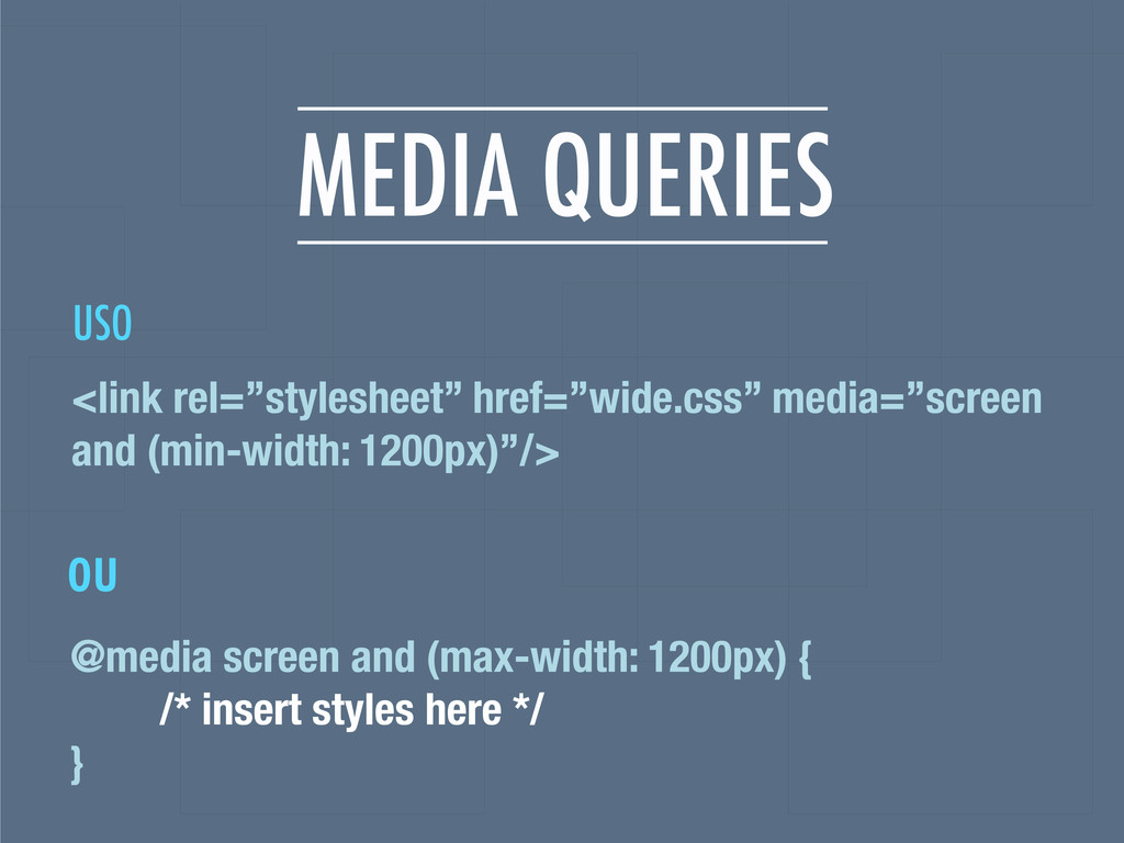
MEDIA QUERIES @media screen and (max-width: 1200px) { /* insert
styles here */ } <link rel=”stylesheet” href=”wide.css” media=”screen and (min-width: 1200px)”/> ou USO
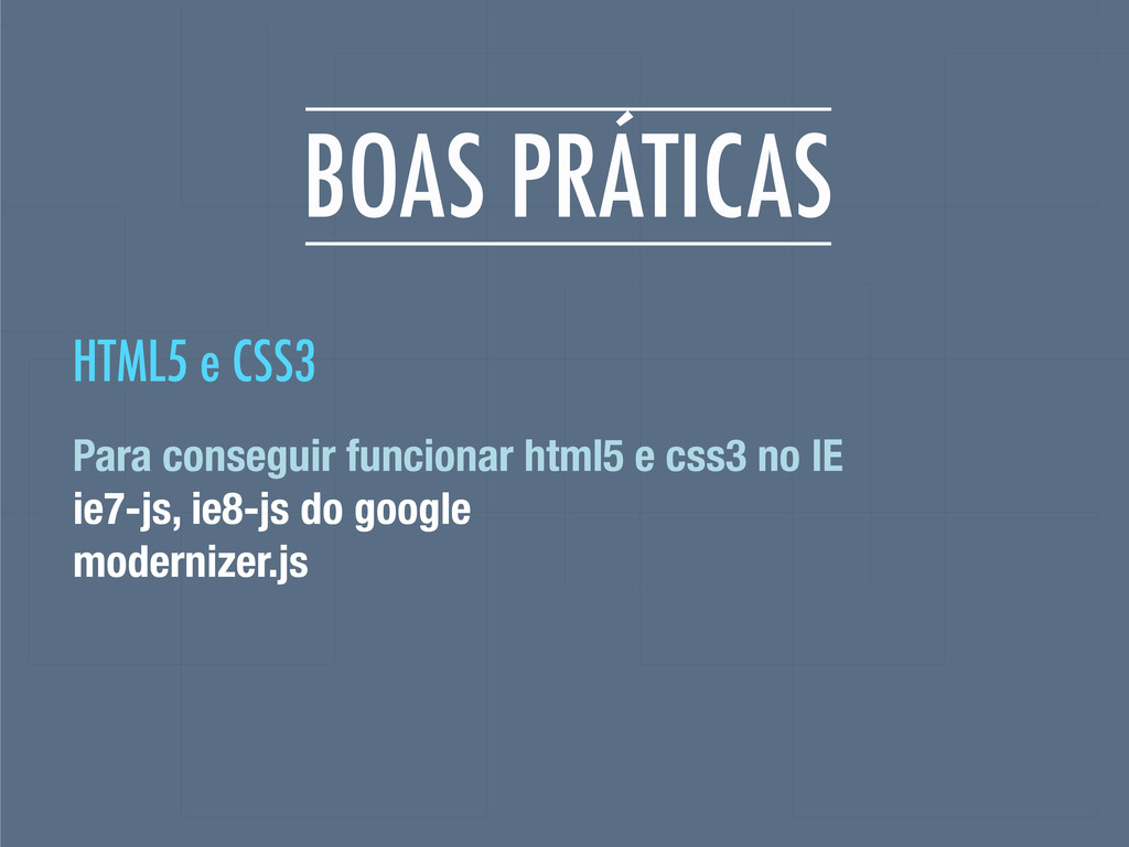
BOAS PRÁTICAS Para conseguir funcionar html5 e css3 no IE
ie7-js, ie8-js do google modernizer.js HTML5 e CSS3
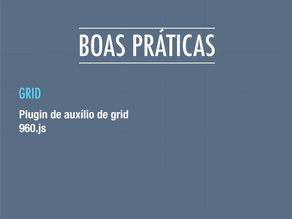
BOAS PRÁTICAS Plugin de auxílio de grid 960.js GRID
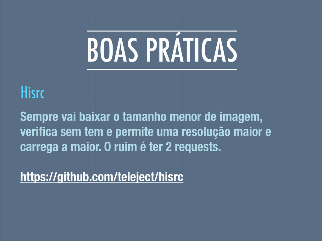
BOAS PRÁTICAS Sempre vai baixar o tamanho menor de imagem,
verifica sem tem e permite uma resolução maior e carrega a maior. O ruim é ter 2 requests. https://github.com/teleject/hisrc Hisrc
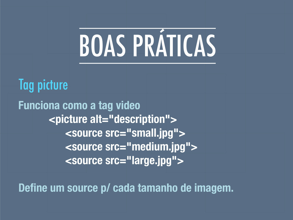
BOAS PRÁTICAS Funciona como a tag video <picture alt="description"> <source
src="small.jpg"> <source src="medium.jpg"> <source src="large.jpg"> Define um source p/ cada tamanho de imagem. Tag picture
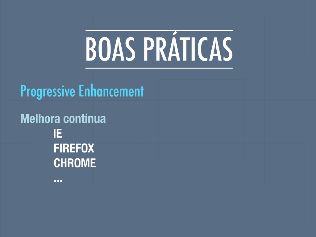
BOAS PRÁTICAS Melhora contínua IE FIREFOX CHROME ... Progressive Enhancement
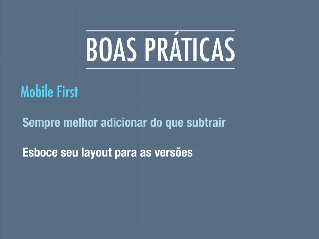
BOAS PRÁTICAS Sempre melhor adicionar do que subtrair Esboce seu
layout para as versões Mobile First
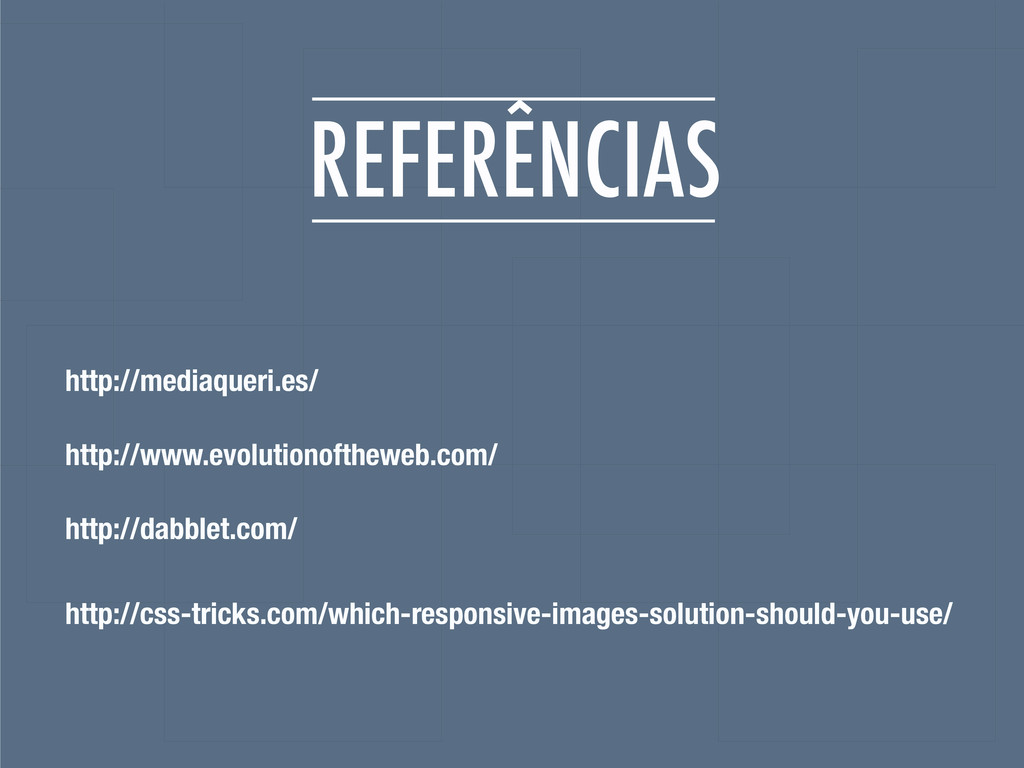
REFERÊNCIAS http://mediaqueri.es/ http://www.evolutionoftheweb.com/ http://dabblet.com/ http://css-tricks.com/which-responsive-images-solution-should-you-use/
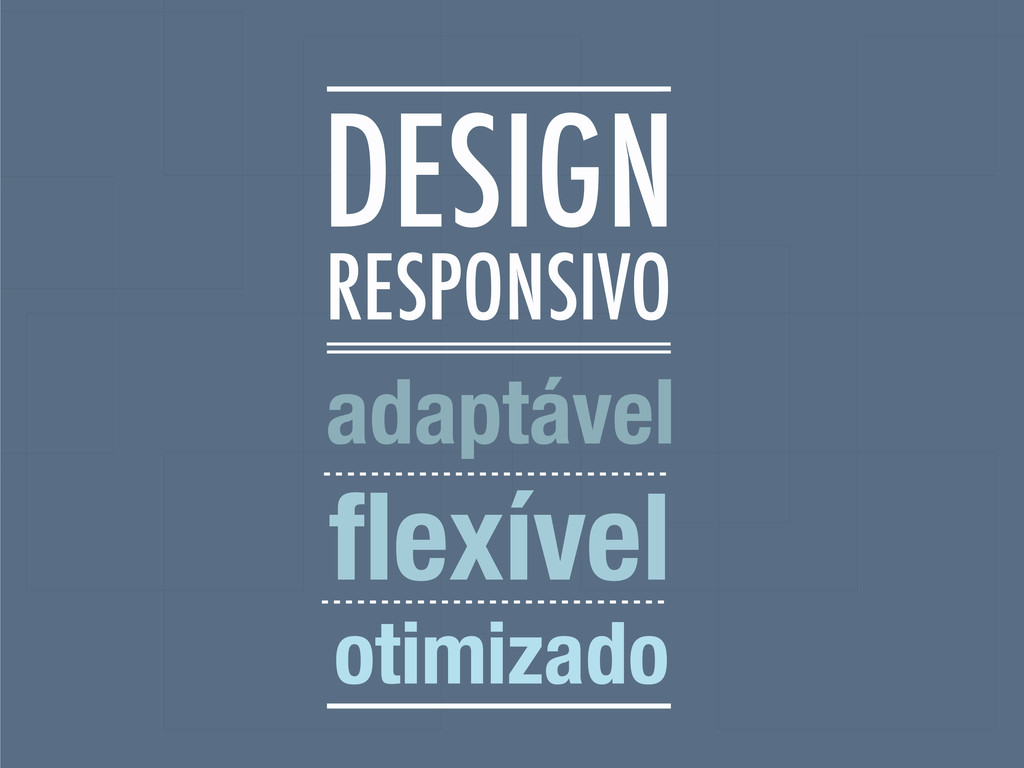
RESPONSIVO adaptável flexível otimizado DESIGN
 plataformatec
 klemens
 chiemitaki
 yamasaku
 hiranotomoki
 kenichiota0711
 ncdc
ncdc
 usagimaru
 aonomasahiro
 keroyama
 mhand01
 shoko_seven11
 mottox2
 tammyeverts
 aleyda
 jdejongh
 holman
 productmarketing
 eileencodes
 hatefulcrawdad
 stephaniewalter
 reverentgeek
 nikkihalliwell
![BRUNA KOCHI @brutiko [email protected]](https://files.speakerdeck.com/presentations/500eb701c267cb000204d1ac/slide_2.jpg)
![ROGER ROSSI @_utgardloki [email protected]](https://files.speakerdeck.com/presentations/500eb701c267cb000204d1ac/slide_3.jpg)