is it doing financially? • Revenues, expenses, “profits” (net income) • Private contributions • Earned income • Assets and liabilities • Financial ratios • Are organizations financially stable? • Do they have “money in the bank” for a rainy day?
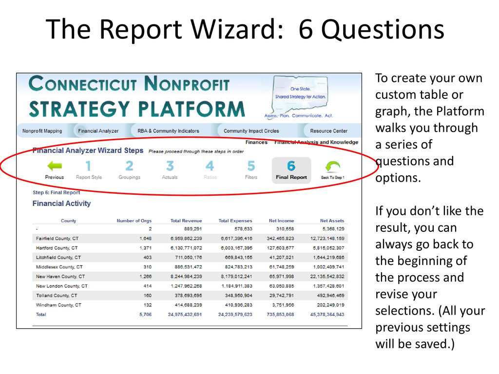
table or graph, the Platform walks you through a series of questions and options. If you don’t like the result, you can always go back to the beginning of the process and revise your selections. (All your previous settings will be saved.)
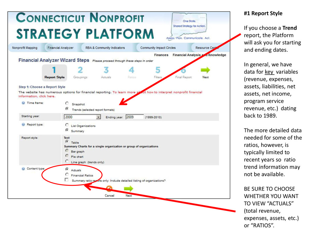
a wide variety of different analyses. The first choice is whether you want to look at trends from year to year or compare organizations at a fixed point in time (typically the most recent year). Table format is ideal for copying and pasting into Excel, Word or Powerpoint but you can also create graphs that can be added to documents as well. When you are done on this page, click either of the two green arrows to continue.
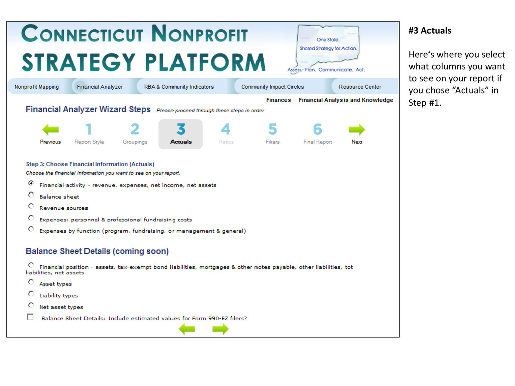
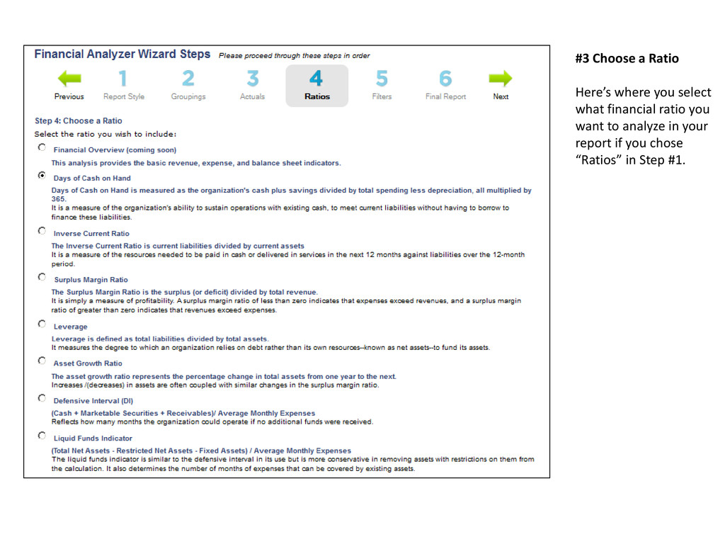
Platform will ask you for starting and ending dates. In general, we have data for key variables (revenue, expenses, assets, liabilities, net assets, net income, program service revenue, etc.) dating back to 1989. The more detailed data needed for some of the ratios, however, is typically limited to recent years so ratio trend information may not be available. BE SURE TO CHOOSE WHETHER YOU WANT TO VIEW “ACTUALS” (total revenue, expenses, assets, etc.) or “RATIOS”.
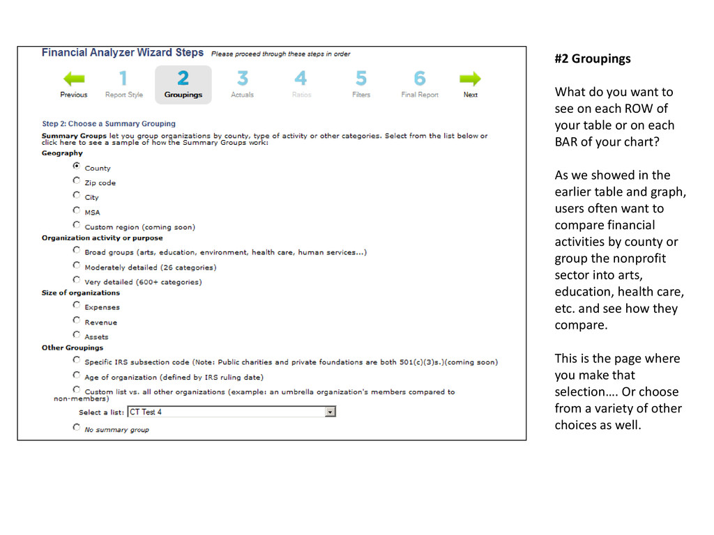
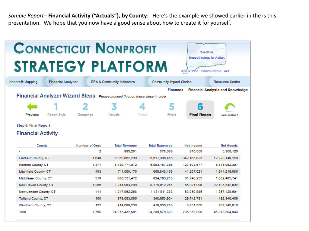
ROW of your table or on each BAR of your chart? As we showed in the earlier table and graph, users often want to compare financial activities by county or group the nonprofit sector into arts, education, health care, etc. and see how they compare. This is the page where you make that selection…. Or choose from a variety of other choices as well.
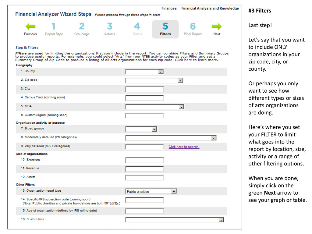
include ONLY organizations in your zip code, city, or county. Or perhaps you only want to see how different types or sizes of arts organizations are doing. Here’s where you set your FILTER to limit what goes into the report by location, size, activity or a range of other filtering options. When you are done, simply click on the green Next arrow to see your graph or table.
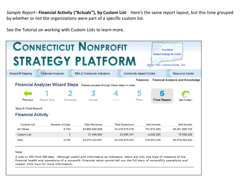
same report layout, but this time grouped by whether or not the organizations were part of a specific custom list. See the Tutorial on working with Custom Lists to learn more.
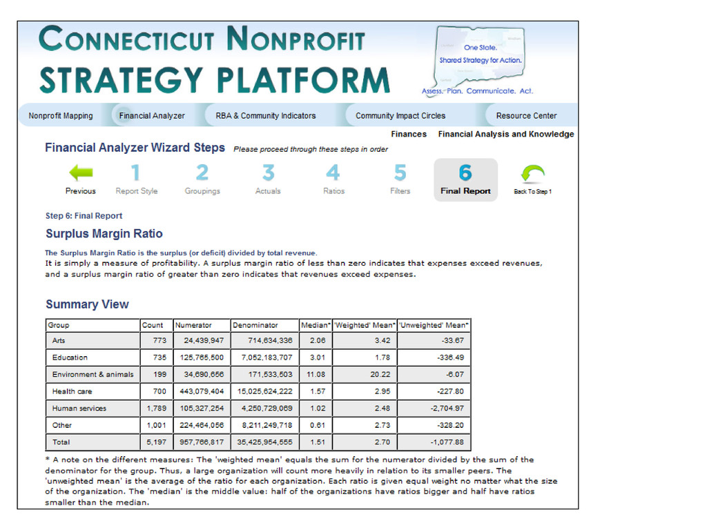
think about ratios. Sample Report– Surplus Margin Ratio, by Major NTEE Activity Code: Here’s an example of a Ratio report. Please continue this Tutorial to learn more about interpreting the report.
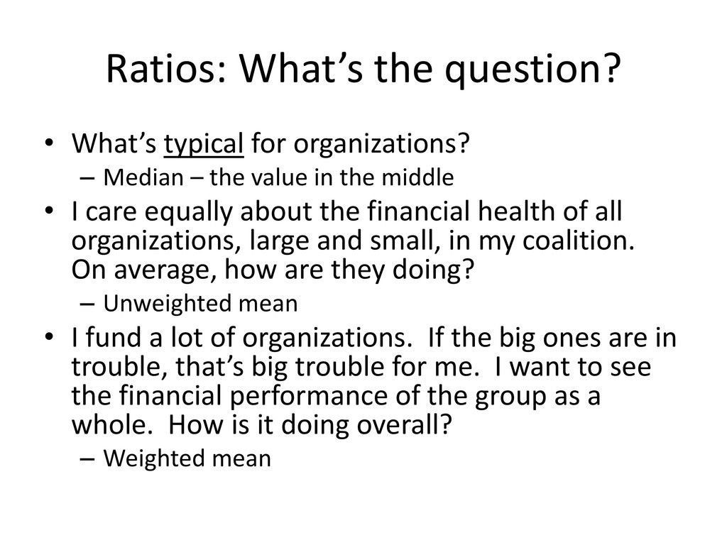
Median – the value in the middle • I care equally about the financial health of all organizations, large and small, in my coalition. On average, how are they doing? – Unweighted mean • I fund a lot of organizations. If the big ones are in trouble, that’s big trouble for me. I want to see the financial performance of the group as a whole. How is it doing overall? – Weighted mean
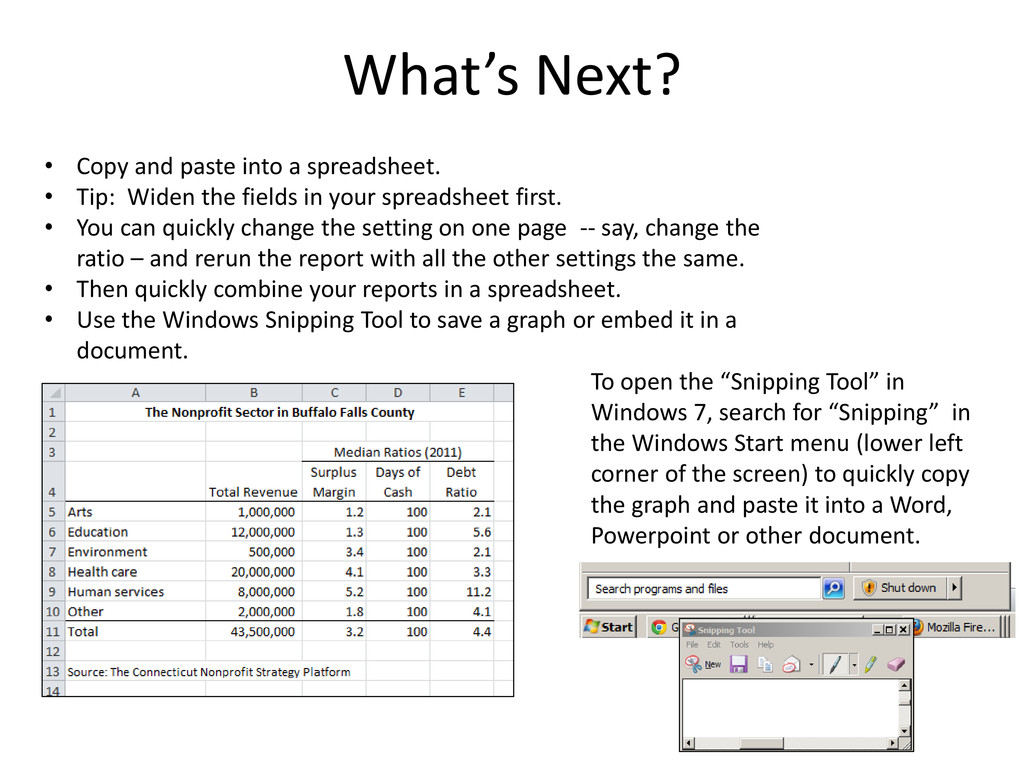
the fields in your spreadsheet first. • You can quickly change the setting on one page -- say, change the ratio – and rerun the report with all the other settings the same. • Then quickly combine your reports in a spreadsheet. • Use the Windows Snipping Tool to save a graph or embed it in a document. What’s Next? To open the “Snipping Tool” in Windows 7, search for “Snipping” in the Windows Start menu (lower left corner of the screen) to quickly copy the graph and paste it into a Word, Powerpoint or other document.