Upgrade to Pro — share decks privately, control downloads, hide ads and more …

Implementing Design System components for Android applications

Implementing Design System components for Android applications

Miłosz Lewandowski

June 04, 2019
Tweet

More Decks by Miłosz Lewandowski

Other Decks in Programming

Transcript

  1. Assumptions & requirements • Huge Design System ◦ Almost 100

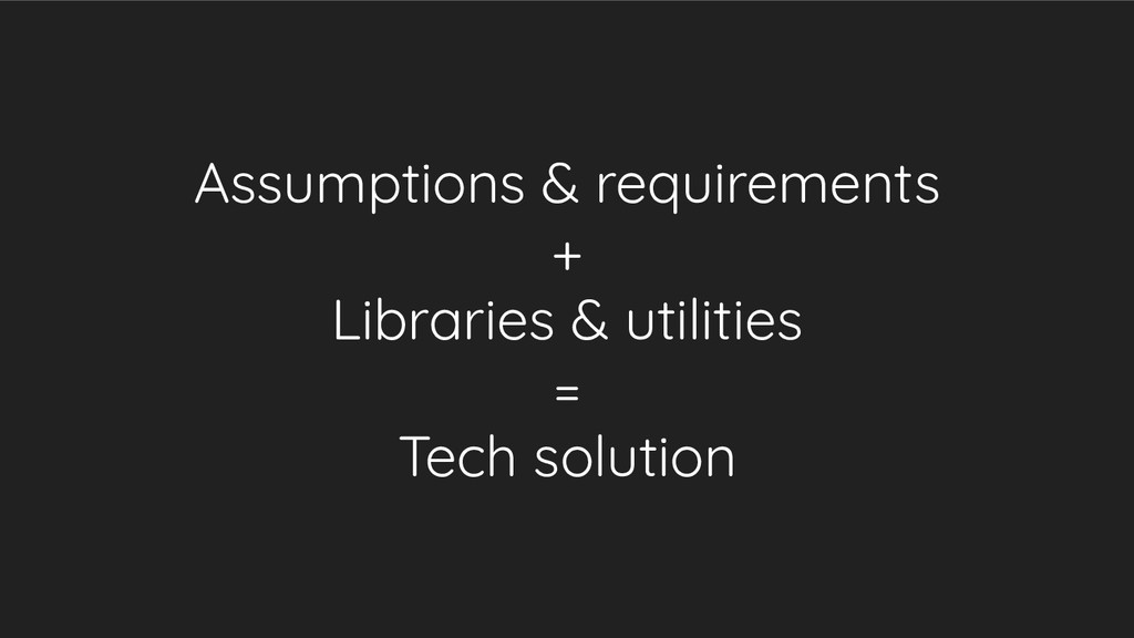
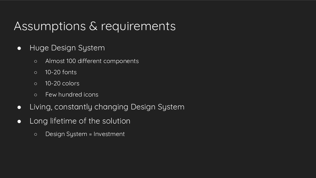
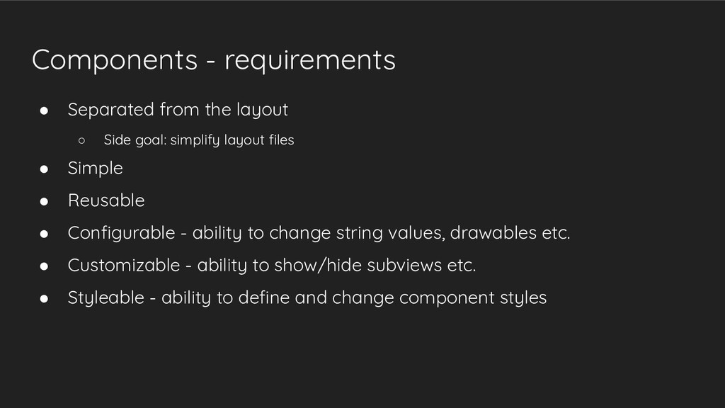
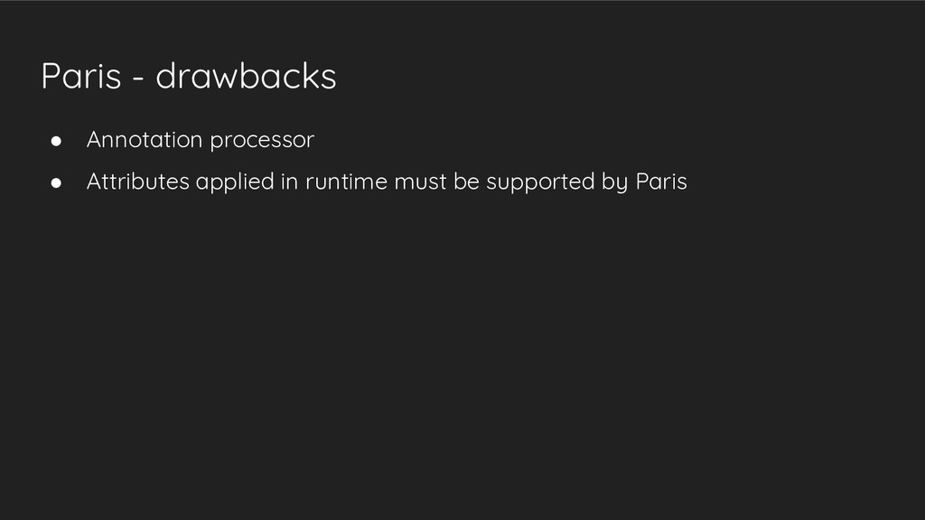
    different components ◦ 10-20 fonts ◦ 10-20 colors ◦ Few hundred icons • Living, constantly changing Design System • Long lifetime of the solution ◦ Design System = Investment
  2. Assumptions & requirements • Quite a big team (7 Android

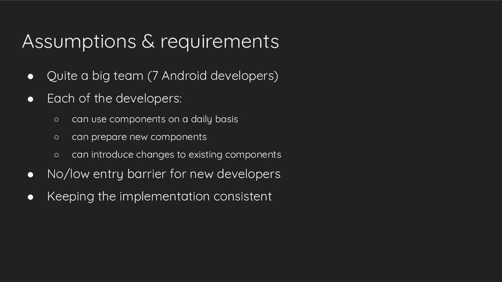
    developers) • Each of the developers: ◦ can use components on a daily basis ◦ can prepare new components ◦ can introduce changes to existing components • No/low entry barrier for new developers • Keeping the implementation consistent
  3. Assumptions & requirements • Easy and quick: ◦ Preparing new

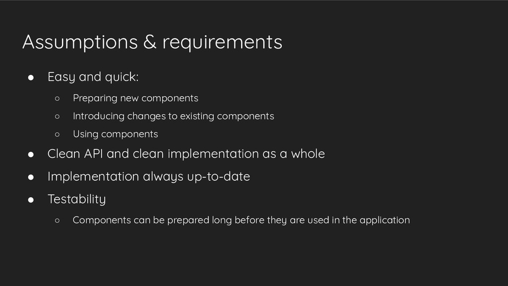
    components ◦ Introducing changes to existing components ◦ Using components • Clean API and clean implementation as a whole • Implementation always up-to-date • Testability ◦ Components can be prepared long before they are used in the application
  4. Where is the Design System’s place in the project? •

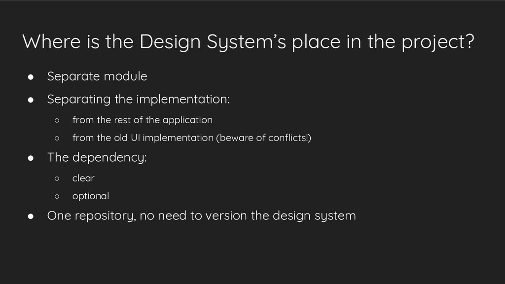
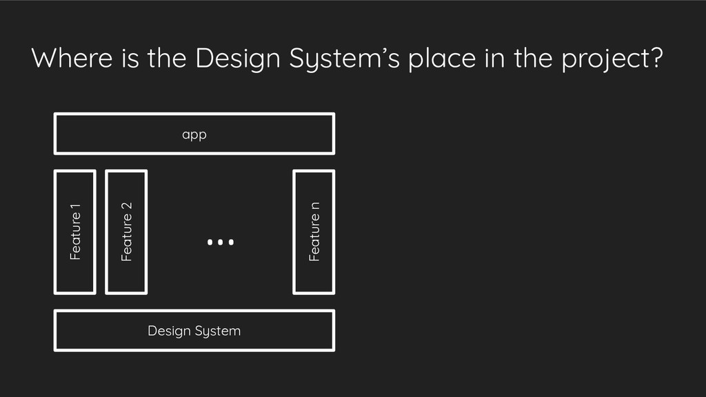
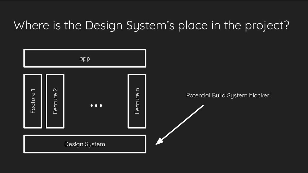
    Separate module • Separating the implementation: ◦ from the rest of the application ◦ from the old UI implementation (beware of conflicts!) • The dependency: ◦ clear ◦ optional • One repository, no need to version the design system
  5. Where is the Design System’s place in the project? Design

    System Feature 1 Feature 2 Feature n app ...
  6. Where is the Design System’s place in the project? Design

    System Feature 1 Feature 2 Feature n app ... Potential Build System blocker!
  7. Elements of the Design Systems in the module Colors Typography

    Icons, Materials (shadows) Components /res/values/colors.xml /res/values/typography.xml /res/drawable/ ???
  8. Example: PromoCard Image Title Content line 1 Content line 2

    • Image on the left, two text areas (title + content) on the right • Two styles: “default” and “important” (different fonts)
  9. Components - requirements • Separated from the layout ◦ Side

    goal: simplify layout files • Simple • Reusable • Configurable - ability to change string values, drawables etc. • Customizable - ability to show/hide subviews etc. • Styleable - ability to define and change component styles
  10. Components - intuition in Android ecosystem • <include layout=”...” />

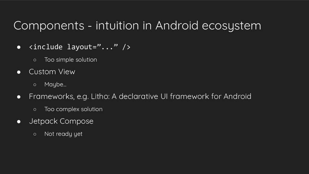
    ◦ Too simple solution • Custom View ◦ Maybe... • Frameworks, e.g. Litho: A declarative UI framework for Android ◦ Too complex solution • Jetpack Compose ◦ Not ready yet
  11. Custom View - the potential solution • Easy to use

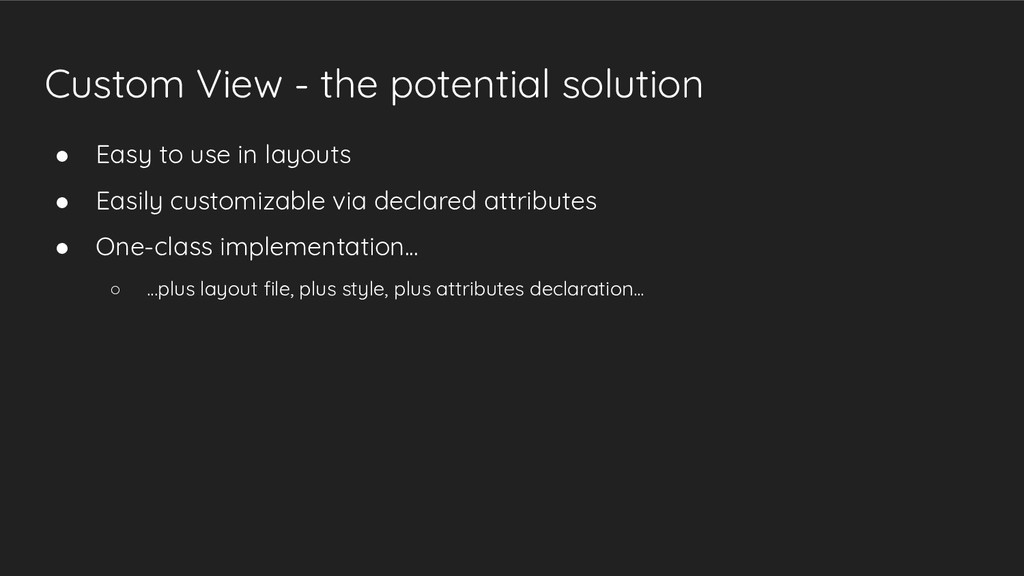
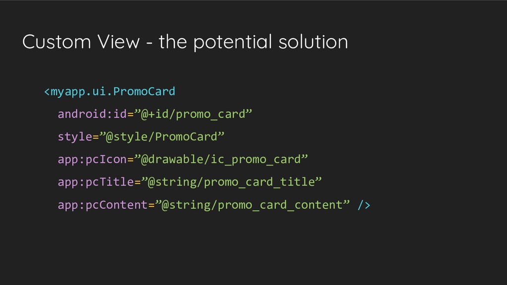
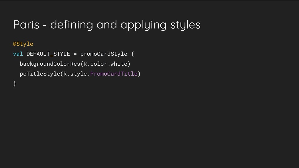
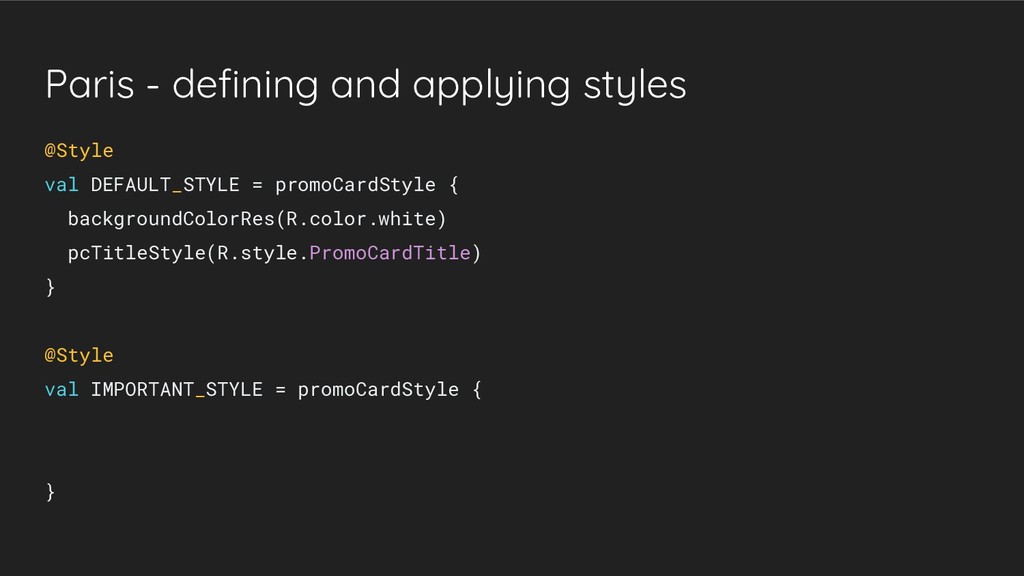
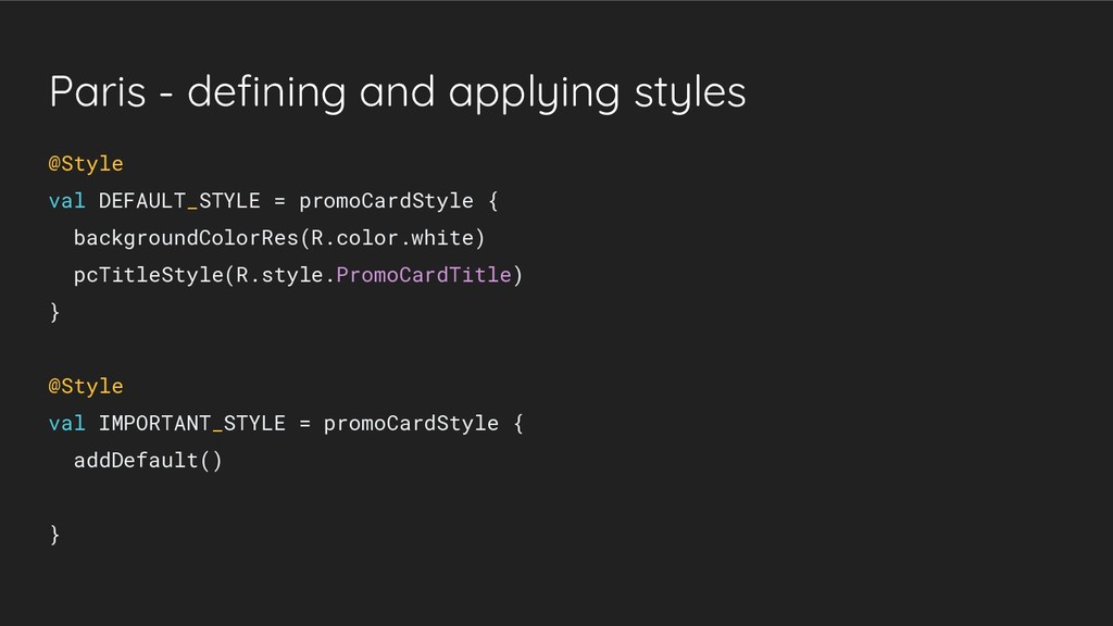
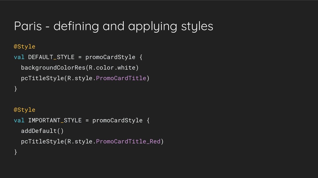
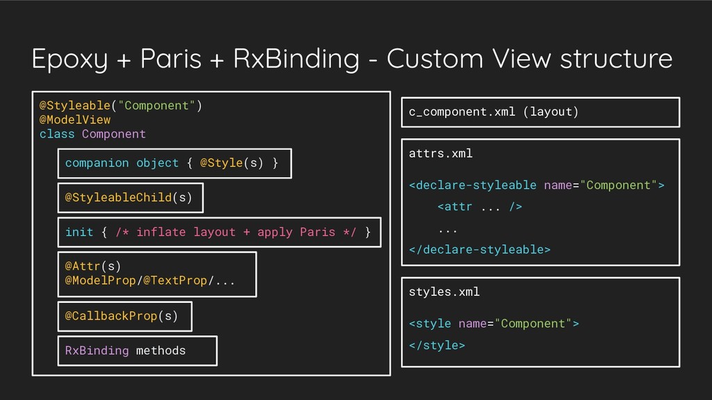
    in layouts • Easily customizable via declared attributes • One-class implementation... ◦ ...plus layout file, plus style, plus attributes declaration...
  12. Custom View - problems • Unstructured code • Boilerplate code,

    e.g. when parsing attributes • No possibility to style child views • No easy way to use in RecyclerView
  13. Custom View - boilerplate code <declare-styleable name="PromoCard"> <attr name="pcIcon" format="reference"

    /> <attr name="pcTitle" format="string" /> <attr name="pcContent" format="string" /> </declare-styleable>
  14. Custom View - boilerplate code init { context.theme.obtainStyledAttributes(attrs, R.styleable.PromoCard, 0,

    0).apply { try { icon = getDrawable(R.styleable.PromoCard_pcIcon) title = getString(R.styleable.PromoCard_pcTitle) content = getString(R.styleable.PromoCard_pcContent) } finally { recycle() } } // TODO do something with obtained attributes
  15. Custom View - boilerplate code + Android KTX init {

    context.theme.obtainStyledAttributes(attrs, R.styleable.PromoCard, 0, 0).use { icon = getDrawable(R.styleable.PromoCard_pcIcon) title = getString(R.styleable.PromoCard_pcTitle) content = getString(R.styleable.PromoCard_pcContent) } // TODO do something with obtained attributes
  16. Custom View - styling child views ConstraintLayout ImageView TextView TextView

    @style/PromoCard @style/PromoCard.Important @style/PromoCardTitle @style/PromoCardTitle.Red
  17. Custom View - RecyclerView • Additional code to prepare: ◦

    ViewHolder for each of the components, for each style variant ◦ Additional layout file for each of the ViewHolders ◦ Adapter • Maybe we can do better?
  18. Paris • “Define and apply styles to Android views programmatically”

    • Can be used to: ◦ Simplify working with Custom View attributes ◦ Style child views ◦ Define and apply component styles
  19. Paris - custom view attributes class PromoCard @JvmOverloads constructor(... init

    { LayoutInflater.from(context).inflate(R.layout.c_promo_card, this, true) } ...
  20. Paris - custom view attributes @Styleable("PromoCard") class PromoCard @JvmOverloads constructor(...

    init { LayoutInflater.from(context).inflate(R.layout.c_promo_card, this, true) } ...
  21. Paris - custom view attributes @Styleable("PromoCard") class PromoCard @JvmOverloads constructor(...

    init { LayoutInflater.from(context).inflate(R.layout.c_promo_card, this, true) Paris.style(this).apply(attrs) } ...
  22. Paris - custom view attributes fun setIcon(@DrawableRes drawableRes: Int) {

    iconView.setImageResource(drawableRes) } fun setTitle(title: CharSequence) { titleView.text = title }
  23. Paris - custom view attributes @Attr(R.styleable.PromoCard_pcIcon) fun setIcon(@DrawableRes drawableRes: Int)

    { iconView.setImageResource(drawableRes) } fun setTitle(title: CharSequence) { titleView.text = title }
  24. Paris - custom view attributes @Attr(R.styleable.PromoCard_pcIcon) fun setIcon(@DrawableRes drawableRes: Int)

    { iconView.setImageResource(drawableRes) } @Attr(R.styleable.PromoCard_pcTitle) fun setTitle(title: CharSequence) { titleView.text = title }
  25. Paris - custom view attributes @Attr(R.styleable.PromoCard_pcIcon) fun setIcon(@DrawableRes drawableRes: Int)

    { iconView.setImageResource(drawableRes) } @Attr(R.styleable.PromoCard_pcTitle) fun setTitle(title: CharSequence) { titleView.text = title } ...
  26. Paris - styling child views val titleView: TextView init {

    LayoutInflater.from(context).inflate(R.layout.c_promo_card, this, true) titleView = findViewById(R.id.title) Paris.style(this).apply(attrs) } ...
  27. Paris - styling child views @StyleableChild(R.styleable.PromoCard_pcTitleStyle) val titleView: TextView init

    { LayoutInflater.from(context).inflate(R.layout.c_promo_card, this, true) titleView = findViewById(R.id.title) Paris.style(this).apply(attrs) } ...
  28. Paris - styling child views <style name="PromoCard"> <item name="pcTitleStyle">@style/PromoCardTitle</item> </style>

    <style name="PromoCard.Important> <item name="pcTitleStyle">@style/PromoCardTitle.Red</item> </style>
  29. Paris - defining and applying styles companion object { @Style

    val DEFAULT_STYLE = R.style.PromoCard @Style val IMPORTANT_STYLE = R.style.PromoCard_Important }
  30. Paris - defining and applying styles val promoCard: PromoCard =

    … val isImportant: Boolean = … if (isImportant) { promoCard.style { addImportant() } }
  31. Paris - defining and applying styles @Style val DEFAULT_STYLE =

    promoCardStyle { backgroundColorRes(R.color.white) }
  32. Paris - defining and applying styles @Style val DEFAULT_STYLE =

    promoCardStyle { backgroundColorRes(R.color.white) pcTitleStyle(R.style.PromoCardTitle) }
  33. Paris - defining and applying styles @Style val DEFAULT_STYLE =

    promoCardStyle { backgroundColorRes(R.color.white) pcTitleStyle(R.style.PromoCardTitle) } @Style val IMPORTANT_STYLE = promoCardStyle { }
  34. Paris - defining and applying styles @Style val DEFAULT_STYLE =

    promoCardStyle { backgroundColorRes(R.color.white) pcTitleStyle(R.style.PromoCardTitle) } @Style val IMPORTANT_STYLE = promoCardStyle { addDefault() }
  35. Paris - defining and applying styles @Style val DEFAULT_STYLE =

    promoCardStyle { backgroundColorRes(R.color.white) pcTitleStyle(R.style.PromoCardTitle) } @Style val IMPORTANT_STYLE = promoCardStyle { addDefault() pcTitleStyle(R.style.PromoCardTitle_Red) }
  36. Epoxy • “Epoxy is an Android library for building complex

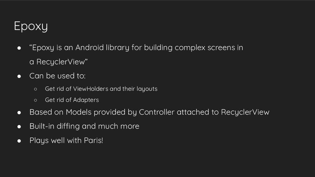
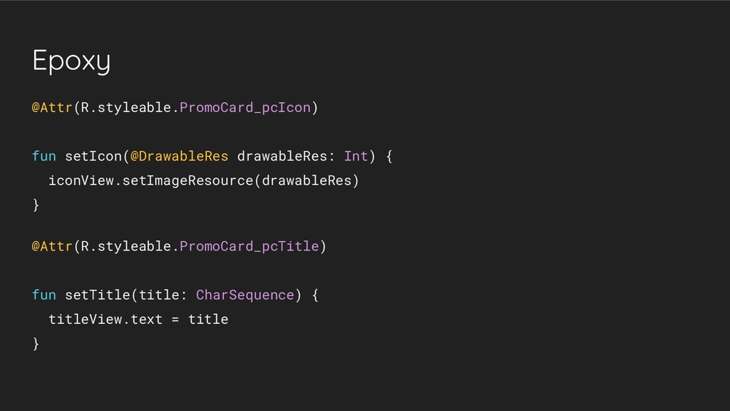
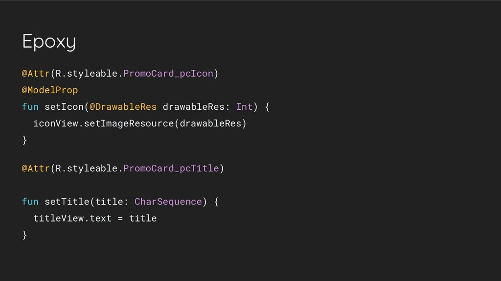
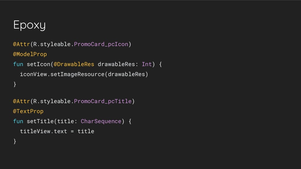
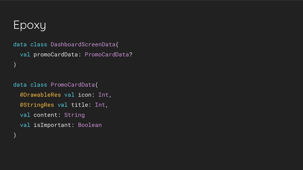
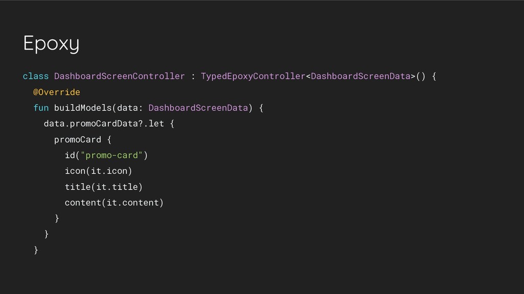
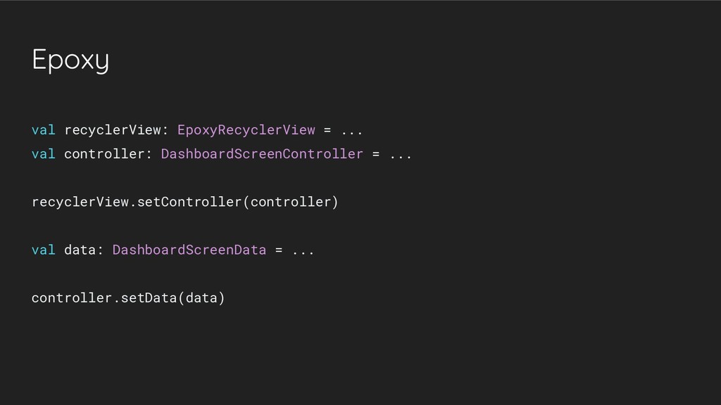
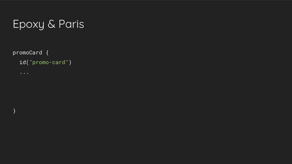
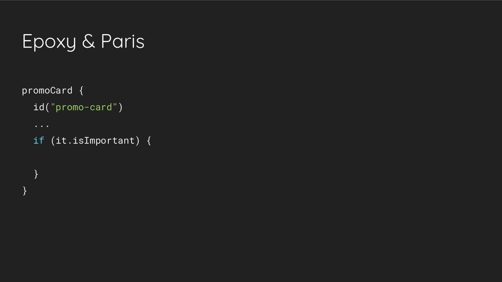
    screens in a RecyclerView” • Can be used to: ◦ Get rid of ViewHolders and their layouts ◦ Get rid of Adapters • Based on Models provided by Controller attached to RecyclerView • Built-in diffing and much more • Plays well with Paris!
  37. Epoxy @Attr(R.styleable.PromoCard_pcIcon) @ModelProp fun setIcon(@DrawableRes drawableRes: Int) { iconView.setImageResource(drawableRes) }

    @Attr(R.styleable.PromoCard_pcTitle) fun setTitle(title: CharSequence) { titleView.text = title }
  38. Epoxy @Attr(R.styleable.PromoCard_pcIcon) @ModelProp fun setIcon(@DrawableRes drawableRes: Int) { iconView.setImageResource(drawableRes) }

    @Attr(R.styleable.PromoCard_pcTitle) @TextProp fun setTitle(title: CharSequence) { titleView.text = title }
  39. Epoxy data class DashboardScreenData( val promoCardData: PromoCardData? ) data class

    PromoCardData( @DrawableRes val icon: Int, @StringRes val title: Int, val content: String val isImportant: Boolean )
  40. Epoxy class DashboardScreenController : TypedEpoxyController<DashboardScreenData>() { @Override fun buildModels(data: DashboardScreenData)

    { data.promoCardData?.let { promoCard { id("promo-card") icon(it.icon) title(it.title) content(it.content) } } }
  41. Epoxy val recyclerView: EpoxyRecyclerView = ... val controller: DashboardScreenController =

    ... recyclerView.setController(controller) val data: DashboardScreenData = ... controller.setData(data)
  42. RxBinding • “RxJava binding APIs for Android's UI widgets” •

    Can be used to: ◦ Extend component API with reactive methods
  43. Epoxy + Paris + RxBinding - Custom View structure @Styleable("Component")

    @ModelView class Component companion object { @Style(s) } @StyleableChild(s) init { /* inflate layout + apply Paris */ } @Attr(s) @ModelProp/@TextProp/... @CallbackProp(s) RxBinding methods attrs.xml <declare-styleable name="Component"> <attr ... /> ... </declare-styleable> c_component.xml (layout) styles.xml <style name="Component"> </style>
  44. Testing components • Demo app ◦ Separate application-type module ◦

    Presenting components in a master-detail view ◦ Dynamically changing components data (e.g. short text vs long text) ◦ Can be shared with designers to allow an early look at the components • Other ideas (didn’t check them yet): ◦ Espresso - testing the component in an empty, test Activity ◦ Lint check prohibiting to use other views than ViewGroups and components
  45. Final result • Module with reusable components • Well-defined components,

    with clean API and readable class structure • Easy to use: both in layouts and within RecyclerView • Can be tested in a demo app All requirements satisfied! :-)