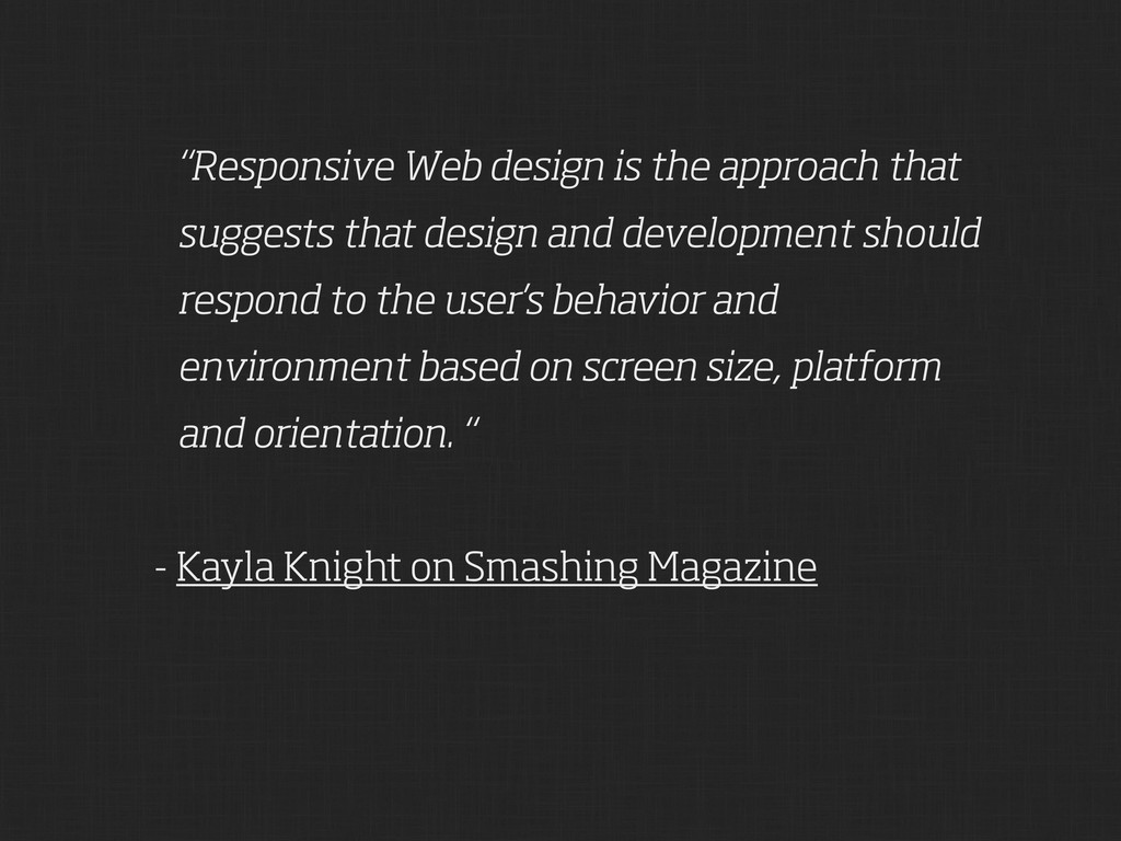
and development should respond to the user’s behavior and environment based on screen size, platform and orientation. “ - Kayla Knight on Smashing Magazine
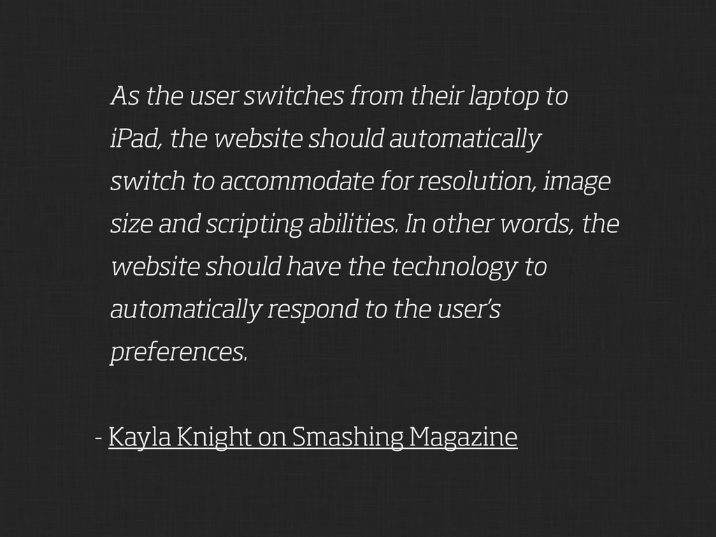
website should automatically switch to accommodate for resolution, image size and scripting abilities. In other words, the website should have the technology to automatically respond to the user’s preferences. - Kayla Knight on Smashing Magazine
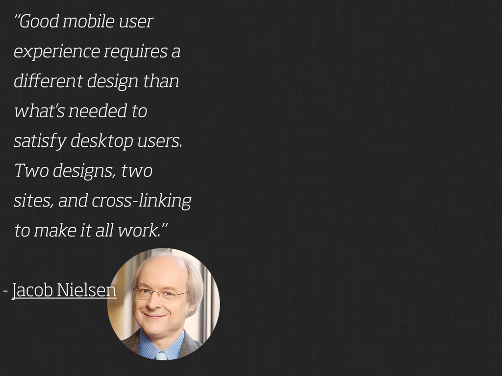
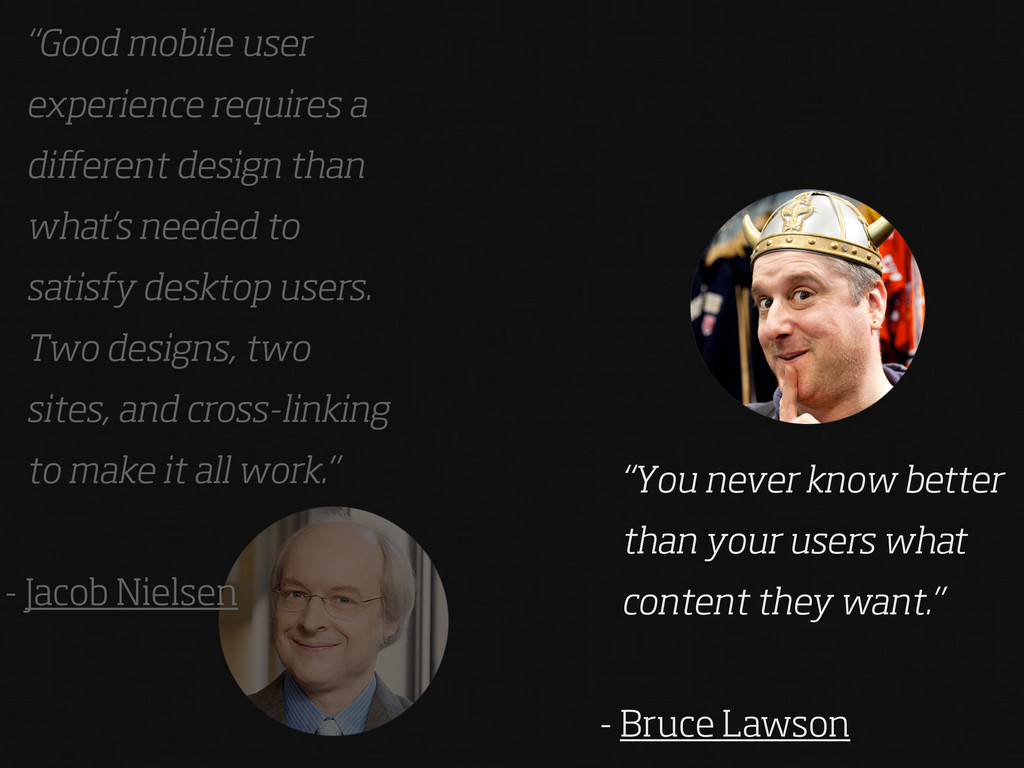
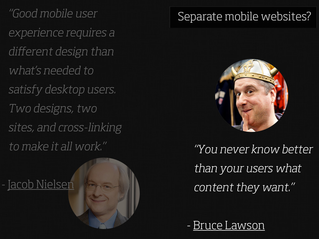
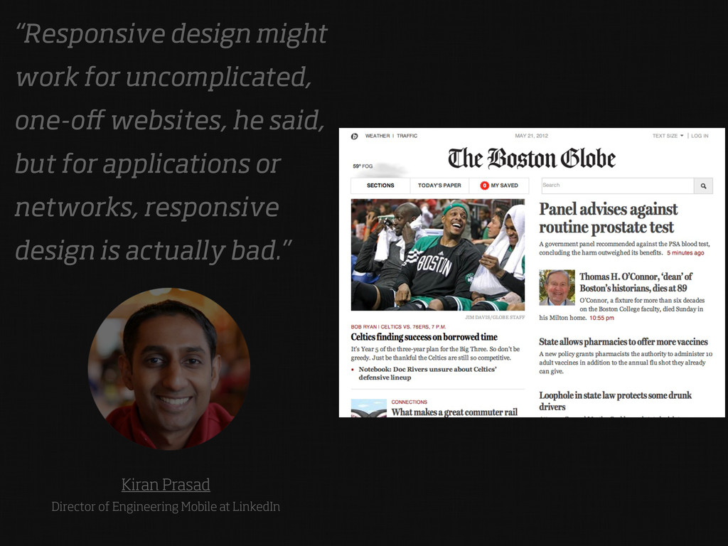
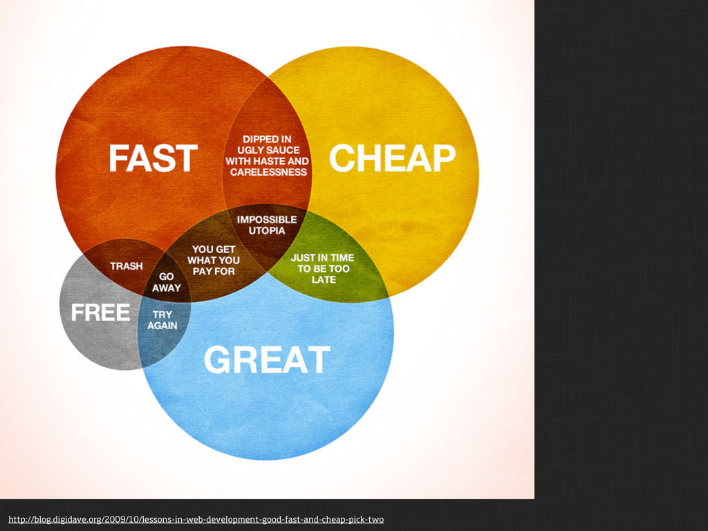
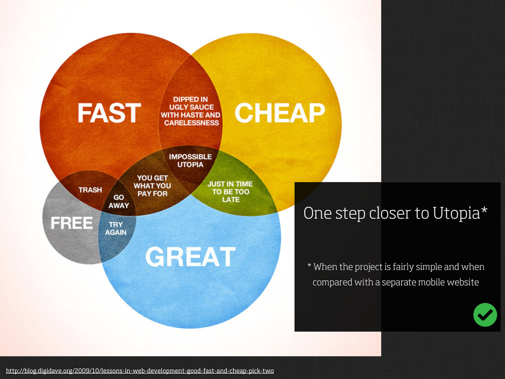
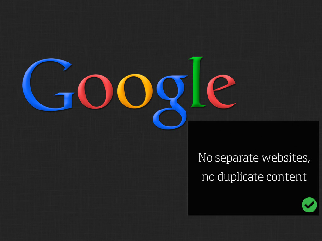
needed to satisfy desktop users. Two designs, two sites, and cross-linking to make it all work.” - Jacob Nielsen “You never know better than your users what content they want.” - Bruce Lawson
needed to satisfy desktop users. Two designs, two sites, and cross-linking to make it all work.” - Jacob Nielsen “You never know better than your users what content they want.” - Bruce Lawson Separate mobile websites?
fairly simple and when compared with a separate mobile website http://blog.digidave.org/2009/10/lessons-in-web-development-good-fast-and-cheap-pick-two
Point Content Choreography HTML5 adaptive images: end of round one Articles Tips and best practices to develop responsive websites Preserving vertical rhythm with CSS and jQuery Responsive CSS that scales Build a responsive site in a week: designing responsively (part 1) Build a responsive site in a week: typography and grids (part 2)
 porcupine
 sevendex
 lynteo
 baasie
 terencebasart
 teba_eleven
 kaikou
 hiromimaeo
 ncdc
ncdc
 webnaut
 r5ni4
r5ni4
 mhand01
 jnunemaker
 rasagy
 thoeni
 addyosmani
 nikkihalliwell
 codingconduct
 aleyda
 matthewcrist
 nwiizo
 lcolladotor
 427marketing
 retrage