Upgrade to Pro — share decks privately, control downloads, hide ads and more …

Resolution Aware Images

Resolution Aware Images

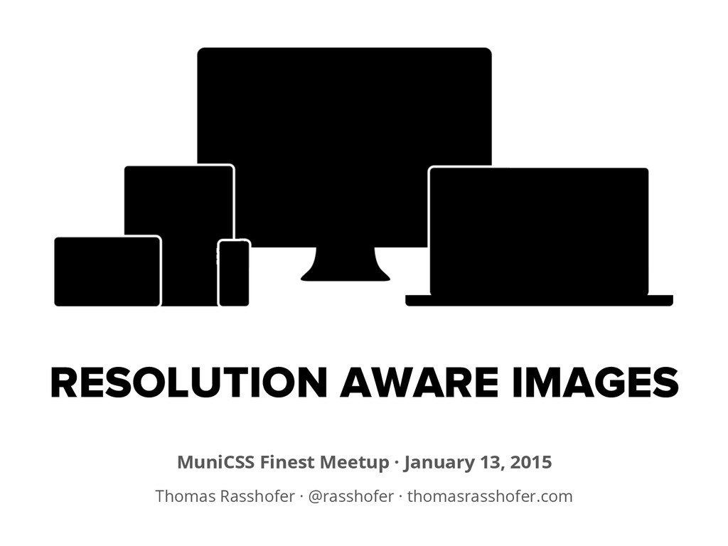
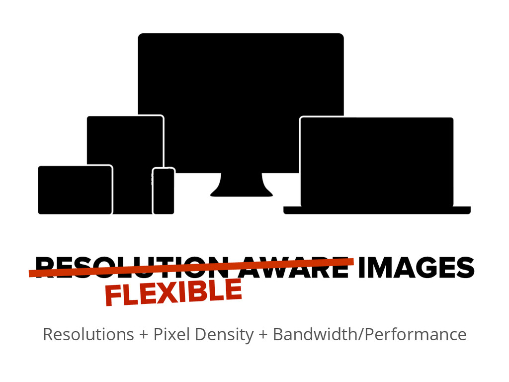
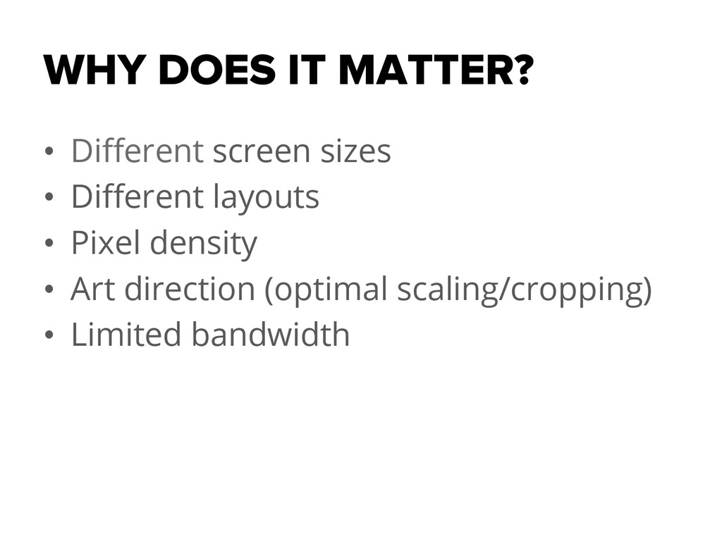
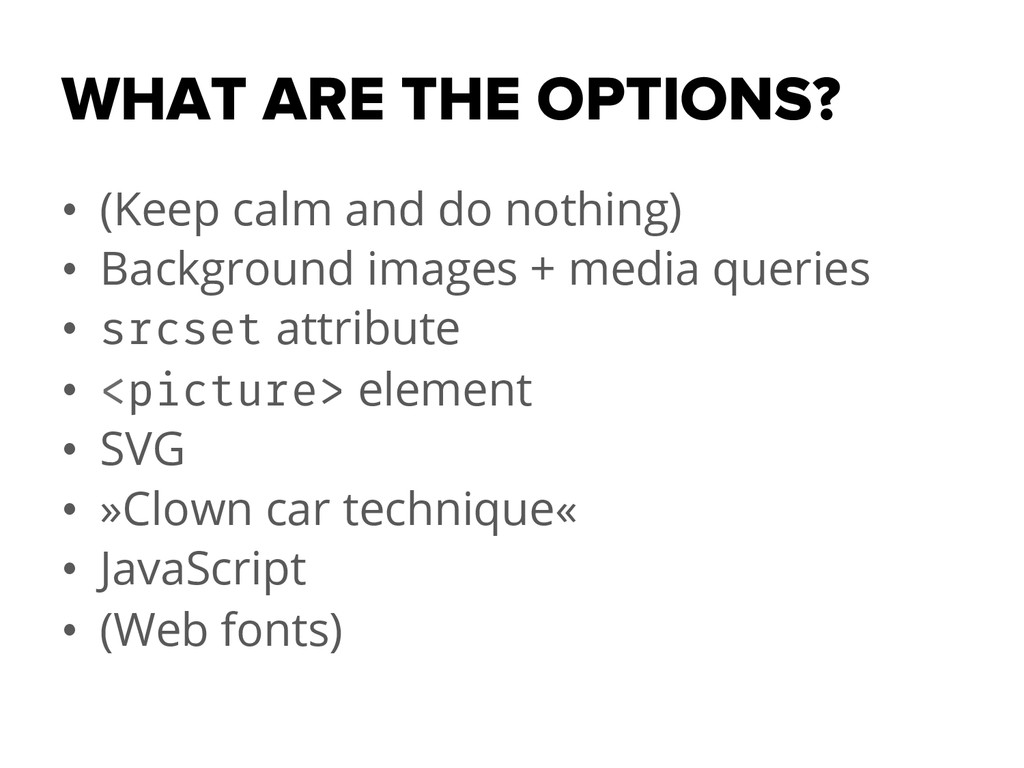
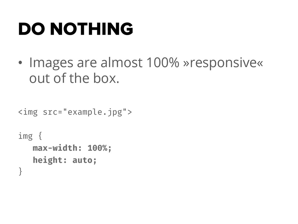
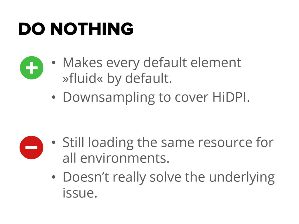
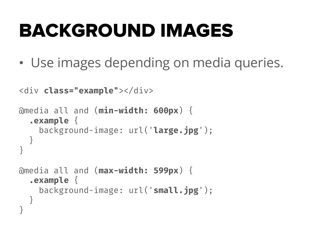
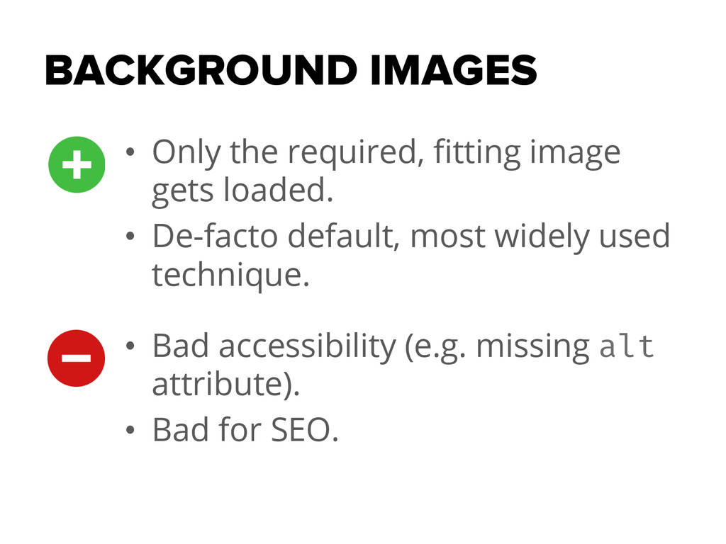
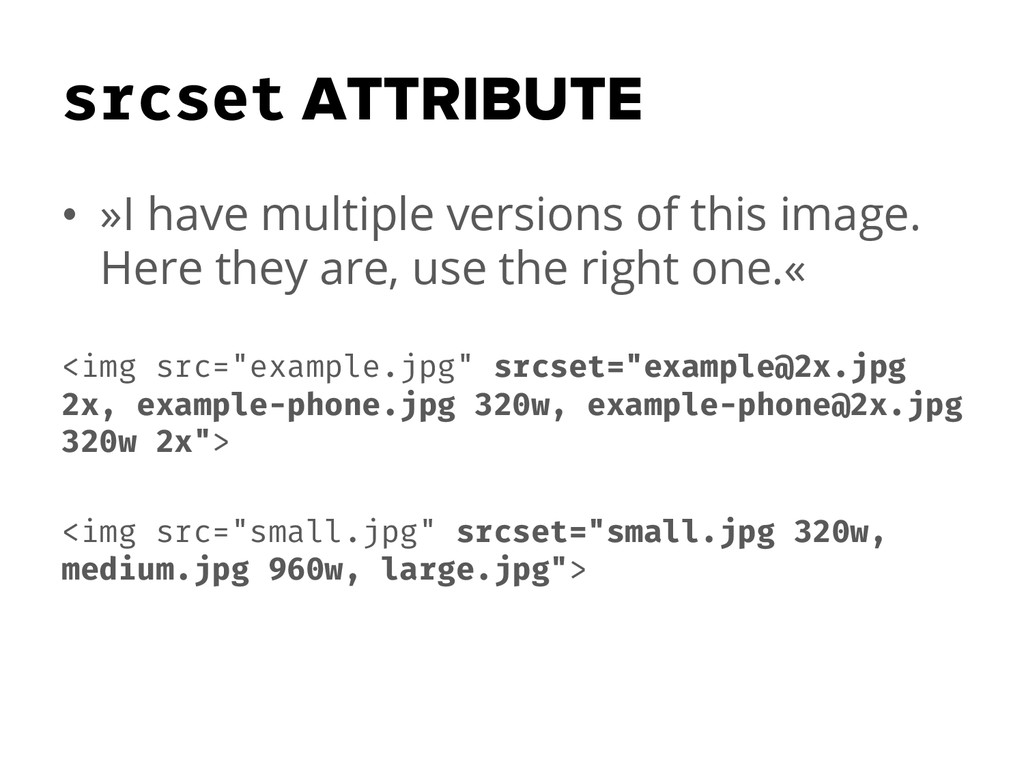
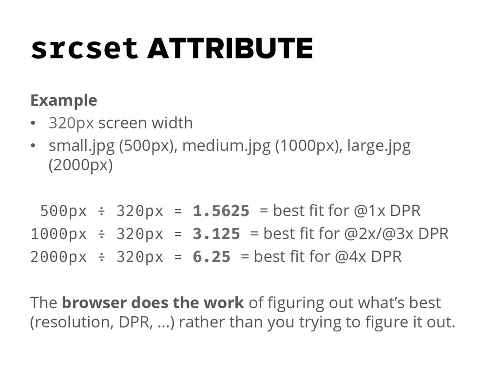
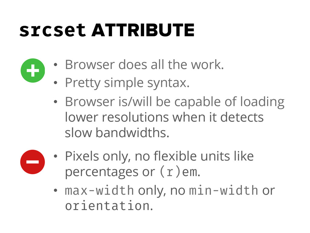
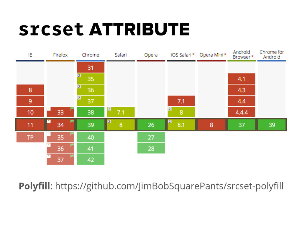
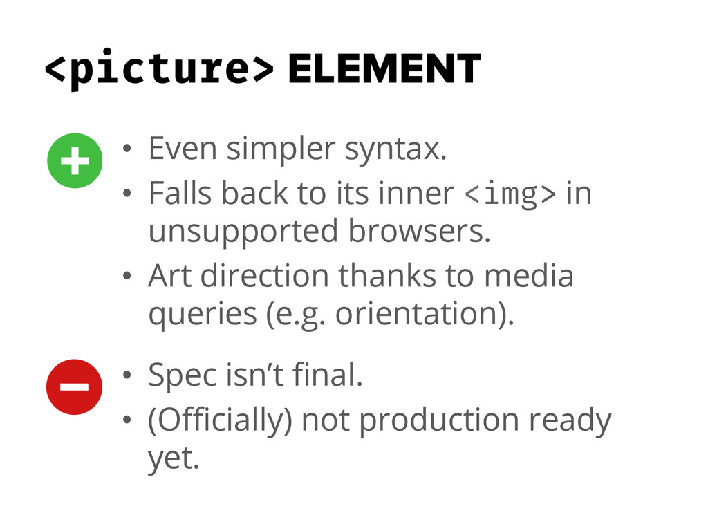
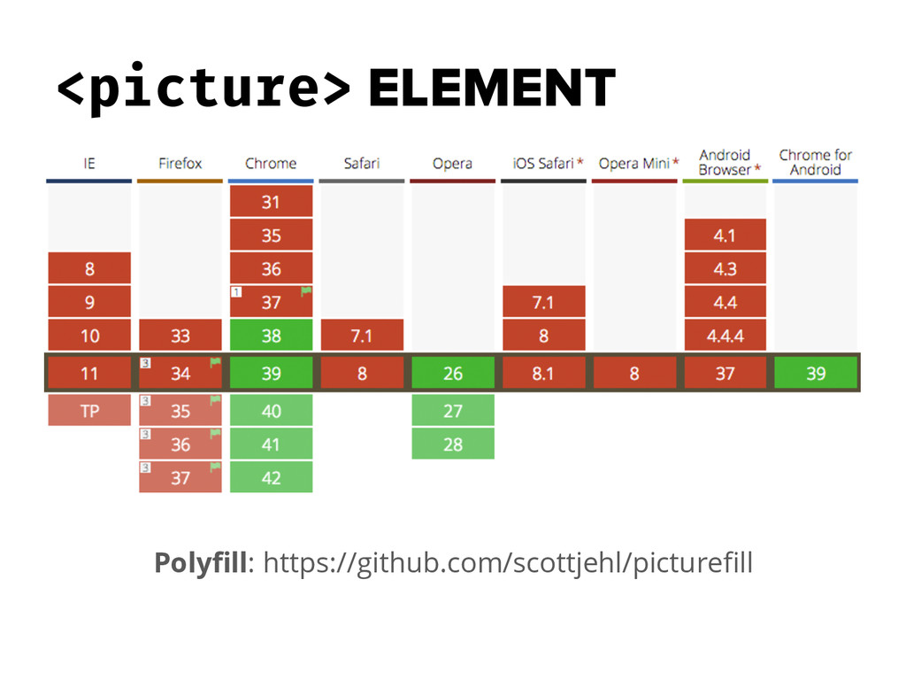
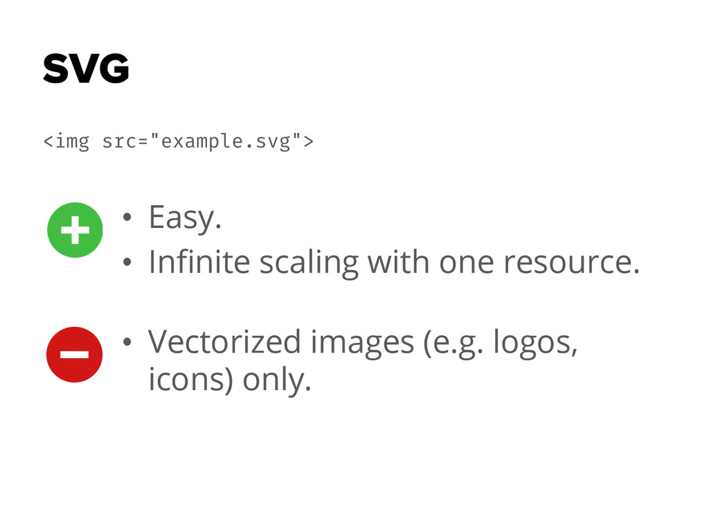
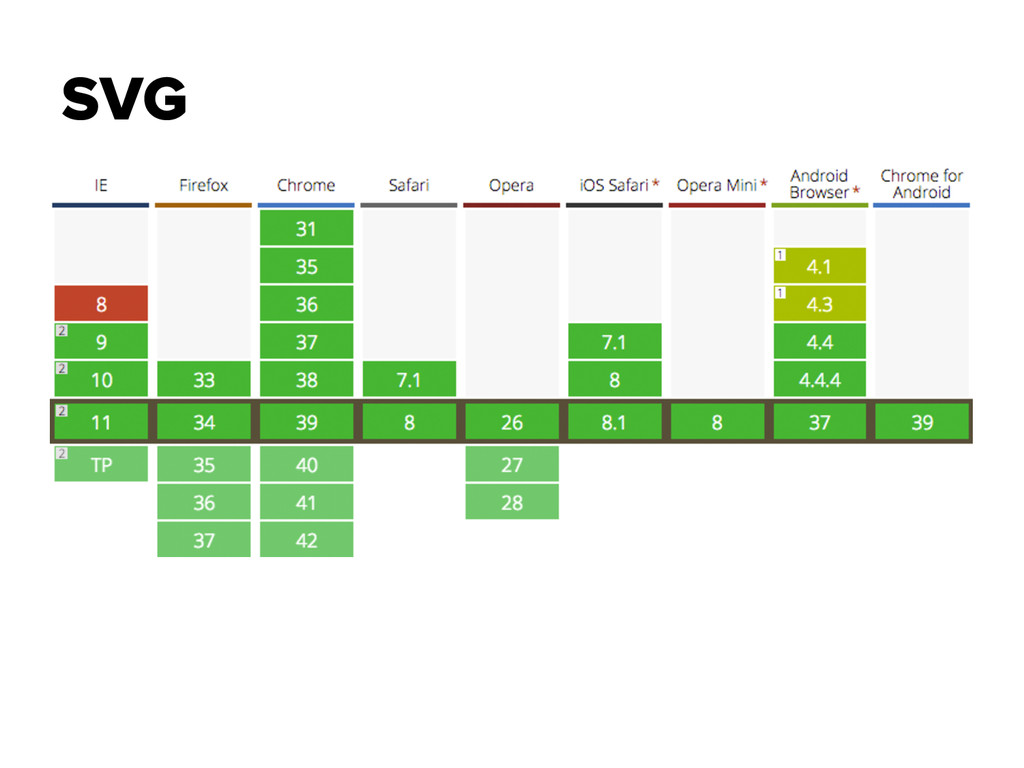
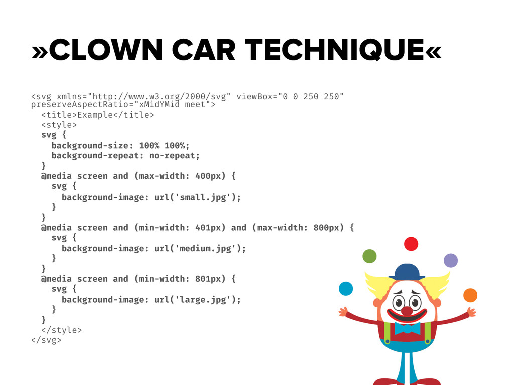
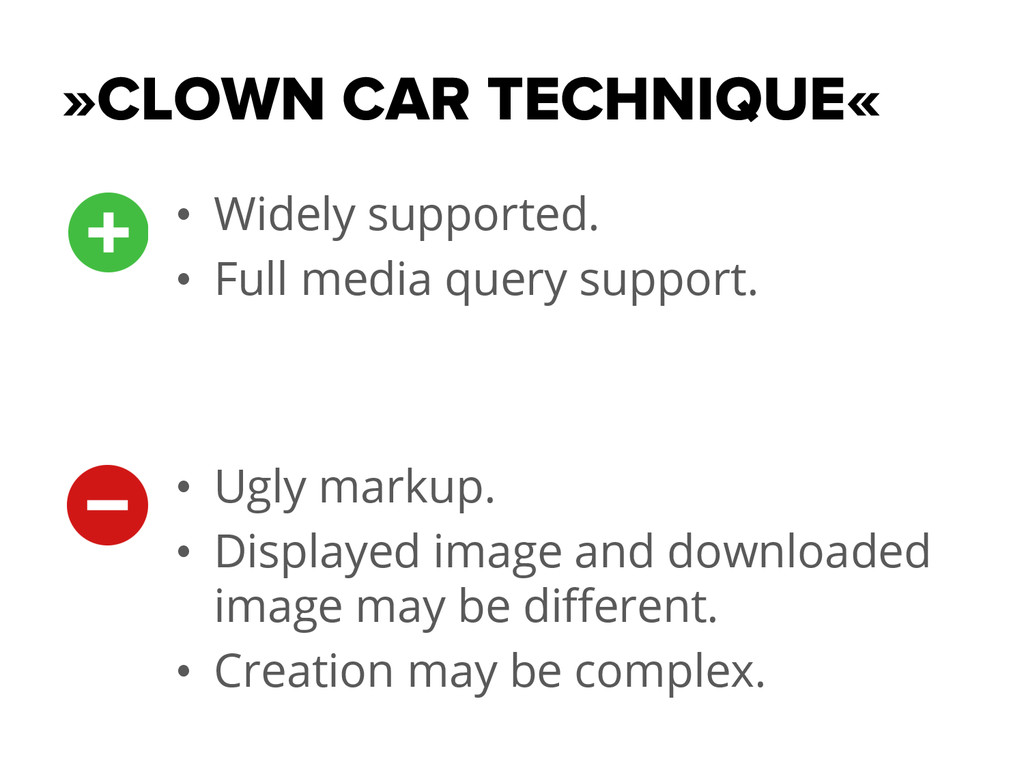
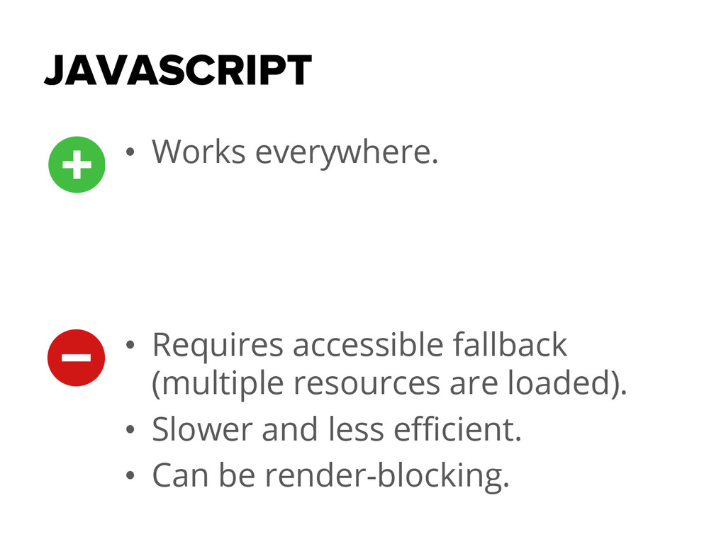
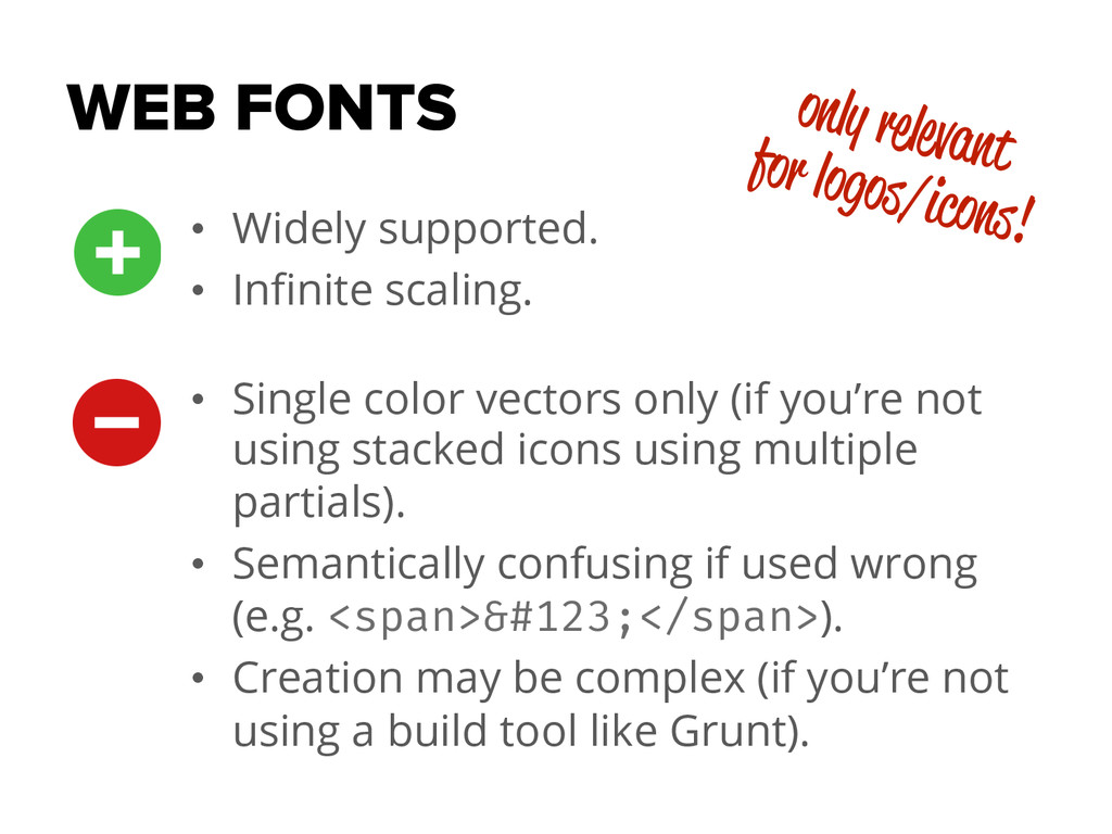
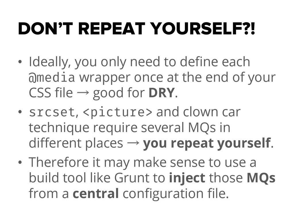
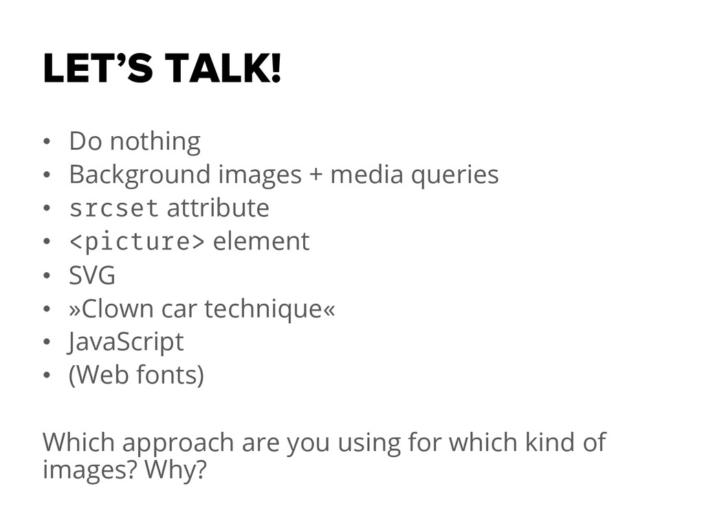
My talk for the »MuniCSS Finest Meetup« on January 13, 2015 about how to implement images flexibly regarding resolutions, pixel density and bandwidth/performance. The discussed approaches are doing nothing, background images combined with media queries, the srcset attribute, the »picture« element, SVG, the »clown car technique«, JavaScript and Web fonts.

Thomas Rasshofer

January 13, 2015
Tweet

More Decks by Thomas Rasshofer

Other Decks in Programming

Transcript

  1. RESOLUTION AWARE IMAGES MuniCSS Finest Meetup · January 13, 2015

    Thomas Rasshofer · @rasshofer · thomasrasshofer.com
  2. WHY DOES IT MATTER? •  Different screen sizes •  Different

    layouts •  Pixel density •  Art direction (optimal scaling/cropping) •  Limited bandwidth
  3. WHAT ARE THE OPTIONS? •  (Keep calm and do nothing)

    •  Background images + media queries •  srcset attribute •  <picture> element •  SVG •  »Clown car technique« •  JavaScript •  (Web fonts)
  4. DO NOTHING •  Images are almost 100% »responsive« out of

    the box. <img src="example.jpg"> img { max-width: 100%; height: auto; }
  5. DO NOTHING •  Makes every default element »fluid« by default.

    •  Downsampling to cover HiDPI. •  Still loading the same resource for all environments. •  Doesn’t really solve the underlying issue.
  6. BACKGROUND IMAGES •  Use images depending on media queries. <div

    class="example"></div> @media all and (min-width: 600px) { .example { background-image: url('large.jpg'); } } @media all and (max-width: 599px) { .example { background-image: url('small.jpg'); } }
  7. BACKGROUND IMAGES •  Only the required, fitting image gets loaded.

    •  De-facto default, most widely used technique. •  Bad accessibility (e.g. missing alt attribute). •  Bad for SEO.
  8. srcset ATTRIBUTE •  »I have multiple versions of this image.

    Here they are, use the right one.« <img src="example.jpg" srcset="[email protected] 2x, example-phone.jpg 320w, [email protected] 320w 2x"> <img src="small.jpg" srcset="small.jpg 320w, medium.jpg 960w, large.jpg">
  9. srcset ATTRIBUTE Example •  320px screen width •  small.jpg (500px),

    medium.jpg (1000px), large.jpg (2000px) 500px ÷ 320px = 1.5625 = best fit for @1x DPR 1000px ÷ 320px = 3.125 = best fit for @2x/@3x DPR 2000px ÷ 320px = 6.25 = best fit for @4x DPR The browser does the work of figuring out what’s best (resolution, DPR, …) rather than you trying to figure it out.
  10. srcset ATTRIBUTE •  Browser does all the work. •  Pretty

    simple syntax. •  Browser is/will be capable of loading lower resolutions when it detects slow bandwidths. •  Pixels only, no flexible units like percentages or (r)em. •  max-width only, no min-width or orientation.
  11. + sizes ATTRIBUTE •  Allows you to control the rendered

    size. <img sizes="(min-width: 1024px) 300px, (min-width: 640px) 50vw, 100vw">
  12. <picture> ELEMENT •  Includes DPR support for HiDPI screens. <picture>

    <source srcset="high.jpg 1x, [email protected] 2x" media="(min-width: 30em)"> <source srcset="med.jpg 1x, [email protected] 2x" media="(min-width: 15em)"> <source srcset="low.jpg 1x, [email protected] 2x"> <img src="fallback.jpg" alt=""> </picture>
  13. <picture> ELEMENT •  Allows you to specify different formats (e.g.

    WebP). <picture> <source srcset="large.webp" type="image/webp" media="(min-width: 30em)"> <source srcset="large.jpg" media="(min-width: 30em)"> <source srcset="medium.webp" type="image/webp" media="(min-width: 15em)"> <source srcset="medium.jpg" media="(min-width: 15em)"> <source srcset="small.webp" type="image/webp"> <source srcset="small.jpg"> <img src="fallback.jpg" alt=""> </picture> (WebP typically achieves an average of 30% more compression than JPEG and JPEG 2000, without loss of image quality.)
  14. <picture> ELEMENT •  Even simpler syntax. •  Falls back to

    its inner <img> in unsupported browsers. •  Art direction thanks to media queries (e.g. orientation). •  Spec isn’t final. •  (Officially) not production ready yet.
  15. SVG <img src="example.svg"> •  Easy. •  Infinite scaling with one

    resource. •  Vectorized images (e.g. logos, icons) only.
  16. SVG

  17. »CLOWN CAR TECHNIQUE« <svg xmlns="http://www.w3.org/2000/svg" viewBox="0 0 250 250" preserveAspectRatio="xMidYMid

    meet"> <title>Example</title> <style> svg { background-size: 100% 100%; background-repeat: no-repeat; } @media screen and (max-width: 400px) { svg { background-image: url('small.jpg'); } } @media screen and (min-width: 401px) and (max-width: 800px) { svg { background-image: url('medium.jpg'); } } @media screen and (min-width: 801px) { svg { background-image: url('large.jpg'); } } </style> </svg>
  18. »CLOWN CAR TECHNIQUE« •  Widely supported. •  Full media query

    support. •  Ugly markup. •  Displayed image and downloaded image may be different. •  Creation may be complex.
  19. JAVASCRIPT •  Works everywhere. •  Requires accessible fallback (multiple resources

    are loaded). •  Slower and less efficient. •  Can be render-blocking.
  20. WEB FONTS •  Widely supported. •  Infinite scaling. •  Single

    color vectors only (if you’re not using stacked icons using multiple partials). •  Semantically confusing if used wrong (e.g. <span>&#123;</span>). •  Creation may be complex (if you’re not using a build tool like Grunt). only relevant for logos/icons!
  21. DON’T REPEAT YOURSELF?! •  Ideally, you only need to define

    each @media wrapper once at the end of your CSS file → good for DRY. •  srcset, <picture> and clown car technique require several MQs in different places → you repeat yourself. •  Therefore it may make sense to use a build tool like Grunt to inject those MQs from a central configuration file.
  22. LET’S TALK! •  Do nothing •  Background images + media

    queries •  srcset attribute •  <picture> element •  SVG •  »Clown car technique« •  JavaScript •  (Web fonts) Which approach are you using for which kind of images? Why?