Upgrade to Pro — share decks privately, control downloads, hide ads and more …

Beyond Breakpoints - Improving Performance for Responsive Web

Ren Aysha
October 22, 2016

Beyond Breakpoints - Improving Performance for Responsive Web

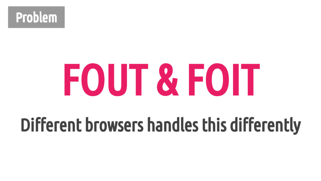
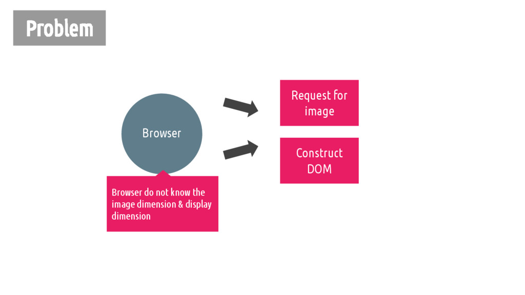
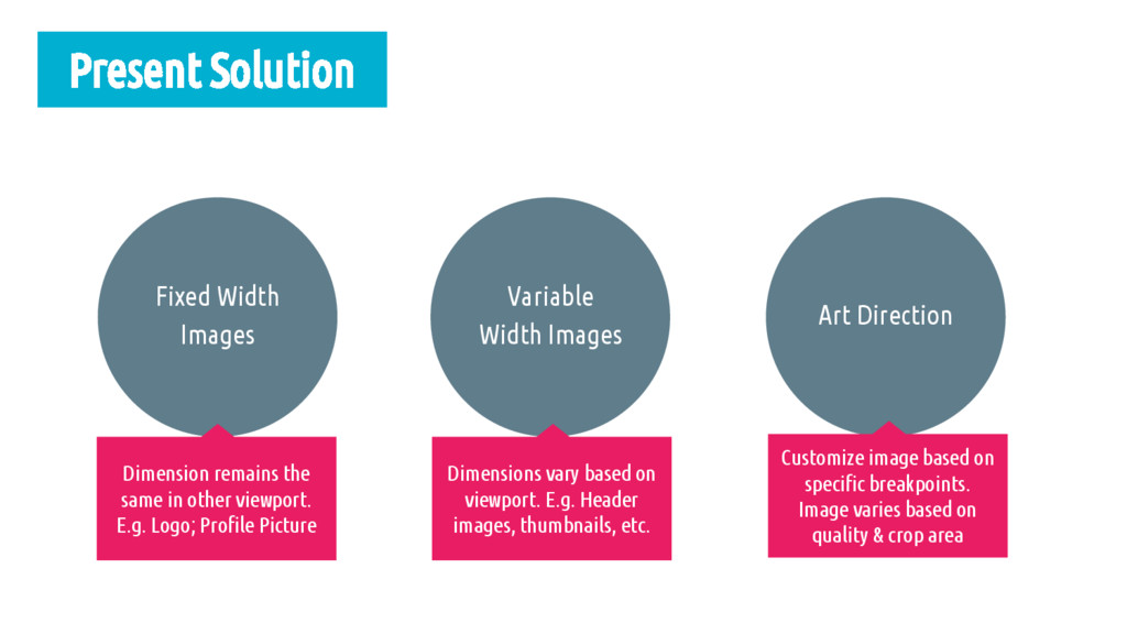
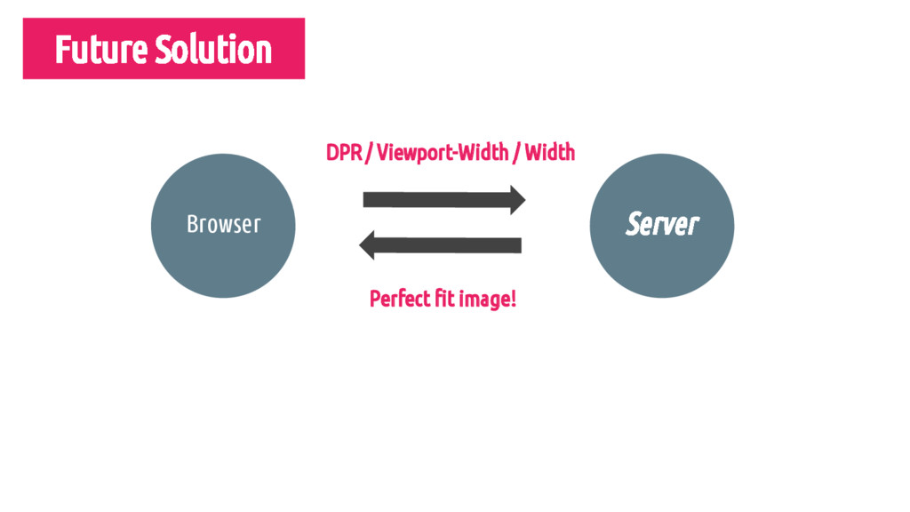
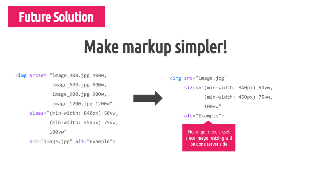
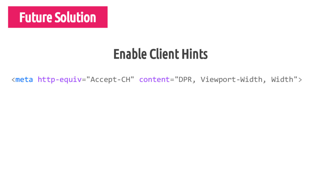
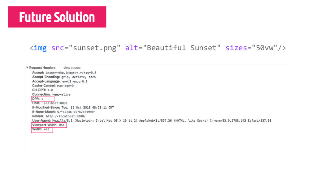
Performance is important but often overlooked when it comes to building responsive sites. We often spend time discussing layouts, breakpoints, and designs that fits well for both desktops and mobile but we do not invest more time in thinking about performance. We learned this the hard way when we revamped Viki's main web page to a responsive site a few months ago. In the process of improving Viki's performance, we discovered practical techniques and useful tools in helping us enhance our user experience and monitor our performance. In this talk, we are going to share the present and the future of performance optimizations for responsive sites.

Ren Aysha

October 22, 2016
Tweet

More Decks by Ren Aysha

Other Decks in Technology

Transcript

  1. body { font-family: 'Open Sans', sans-serif; } CSS Will only

    load when font is specifically declared under a rule
  2. Problem Image Credit: Bram Stein @ Smashing Magazine’s Real Life

    Responsive Web Design (Web Fonts Performance) Results in FOUT or FOIT
  3. Present Solution Define fallback & web fonts in CSS Basic

    Font Loading Strategy Leverage browser cache Load fonts dynamically & use it
  4. Define fallback & web fonts in CSS @font-face { font-family:

    'Open Sans'; src: url('open-sans.woff2') format("woff2"), url('open-sans.woff') format("woff"); } CSS
  5. Define fallback & web fonts in CSS Detect specific font

    loa body { font-family: sans-serif; } CSS .fonts-loaded { body { font-family: 'Open Sans', sans-serif; } }
  6. Present Solution Define fallback & web fonts in CSS Basic

    Font Loading Strategy Leverage browser cache Load fonts dynamically & use it
  7. Detect specific font load (Basic Font Load) Detect specific font

    loa font.load().then(function () { // Font successfully loads; use webfont class window.document.documentElement.className += " fonts-loaded"; }); JS // Font Face Observer is written by Bram Stein: // https://github.com/bramstein/fontfaceobserver var font = new FontFaceObserver("Open Sans", {weight: 400});
  8. Toggle class in order to use web fonts Detect specific

    font loa body { font-family: sans-serif; } .fonts-loaded { body { font-family: 'Open Sans', sans-serif; } } CSS <html class="fonts-loaded"> <body> <!-- Open sans fonts with class added w JS --> <p>Your content here</p> </body> </html> HTML
  9. Present Solution Define fallback & web fonts in CSS Basic

    Font Loading Strategy Leverage browser cache Load fonts dynamically & use it
  10. Leverage browser cache Detect specific font loa <!--#if expr="$HTTP_COOKIE=/fonts\-loaded\=true/" -->

    <html class="fonts-loaded"> <!--#else --> <html> <!--#endif --> HTML Set a cookie!
  11. Leverage Browser Cache Detect specific font loa // do not

    do anything if class is set if (w.document.documentElement.className.indexOf("fonts-loaded") > -1) { return; } var font = new FontFaceObserver("Open Sans", {weight: 400}); font.load().then(function () { window.document.documentElement.className += " fonts-loaded"; // Set cookie to optimize for repeat views document.cookie = "fonts_loaded=true; domain=" + viki.com + "; path=/"; }); JS
  12. Problem Image Credit: Bram Stein @ Smashing Magazine’s Real Life

    Responsive Web Design (Web Fonts Performance)
  13. Future Solution FOUT and FOIT can be reduced! Image Credit:

    https://www.bramstein.com/writing/preload-hints-for-web-fonts.html
  14. Future Solution Determines how a font-face is displayed when it

    is downloading & once it is downloaded Font-Display
  15. Future Solution @font-face { font-family: 'Open Sans'; font-display: 'auto'; src:

    local('Open Sans Light'), local('OpenSans-Light'), url('open-sans-v13-latin-300.woff2') format('woff2'); } CSS
  16. Future Solution @font-face { font-display: auto | block | swap

    | fallback | optional; } Determine by user agent Invisible text & swap once fonts is loaded (FOIT) Show fallback & swap once fonts is loaded (FOUT) Same as swap but will show fallback when font fails to load Font is used if it is already downloaded; else fallback is used Source: https://tabatkins.github.io/specs/css-font-display/#font-display-desc
  17. Future Solution Detect specific font loa @font-face { font-family: 'Open

    Sans'; font-display: 'fallback'; src: local('Open Sans'), local('OpenSans-Light'), url('open-sans.woff2') format('woff2'); } CSS <link rel="preload" href="open-sans.woff2" as="font" type="font/woff2"> HTML Can be combined to make font loading efficient
  18. Problem Document Object Model (DOM) CSS Object Model (CSSOM) Render

    Tree Layout Paint CSS is render blocking! Contains both content & style information Browser calculates the size & position of elements Browser picks up layout results and paint pixels to the screen
  19. Problem HTML Parser Script Download Parser Paused Script Execute HTML

    Parser Script Source: http://www.growingwiththeweb.com/2014/02/async-vs-defer-attributes.html
  20. Document Object Model (DOM) CSS Object Model (CSSOM) Render Tree

    Layout Paint CSS is render blocking! Contains both content & style information Browser calculates the size & position of elements Browser picks up layout results and paint pixels to the screen Time spent on each process should be minimize! HTML Parser Script Download Parser Paused Script Execute HTML Parser Script
  21. Present Solution HTML Parser Script Download Parser Paused Script Execute

    HTML Parser Async Defer HTML Parser Script Download Script Execute Source: http://www.growingwiththeweb.com/2014/02/async-vs-defer-attributes.html
  22. Present Solution Async —  Scripts with no dependencies Execution order

    implementation is buggy in IE < 10 Removing dependencies completely or inline them Only applies to small JS code Defer —  Scripts with dependencies; Execution order matters
  23. Size of inline scripts & CSS < 14KB “...server can

    send up to 10 TCP packets on a new connection (~14KB) in first roundtrip, and then it must wait for the client to acknowledge this data before it can grow its congestion window and proceed to deliver more data.” “Due to this TCP behavior, it is important to optimize your content to minimize the number of roundtrips required to deliver the necessary data to perform the first render of the page. Ideally, the ATF (above the fold) content should fit under 14KB — this allows the browser to paint the page after just one roundtrip…” Source: https://developers.google.com/speed/docs/insights/mobile#delivering-the-sub-one-second-rendering-experience
  24. Limitations of HTTP/1.x No compression of response headers No effective

    resource prioritization Multiple connections instead of one
  25. “HTTP/2 modifies how the data is formatted (framed) and transported

    between the client and server, both of whom manage the entire process, and hides all the complexity from our applications within the new framing layer.” - Ilya Grigorik Source: https://hpbn.co/http2/
  26. HTTP/1.x No compression of response headers No effective resource prioritization

    Multiple connections instead of one HTTP/2 Compress response headers Allow prioritization of request One connection for multiple concurrent exchange (multiplexing)
  27. Problem <img srcset="image_400.jpg 400w, image_600.jpg 600w, image_900.jpg 900w, image_1200.jpg 1200w"

    sizes="(min-width: 840px) 50vw, (min-width: 450px) 75vw, 100vw" src="image_600.jpg" alt="Some image for example’s sake"> Verbose syntax W-descriptors - describe width of image Decide display dimension
  28. Problem Browser Download Fonts! Construct DOM Request for image Browser

    do not know the image dimension & display dimension
  29. Variable Width Images Present Solution Art Direction Fixed Width Images

    Dimension remains the same in other viewport. E.g. Logo; Profile Picture Dimensions vary based on viewport. E.g. Header images, thumbnails, etc. Customize image based on specific breakpoints. Image varies based on quality & crop area
  30. Present Solution <img src="logo_500px.jpg" srcset="logo_700px.jpg 1.5x, logo_1000px.jpg 2x, logo_1500px.jpg 3x"

    width="500" alt="logo image"> Fallback - DPR of 1x X descriptors: Pixel density of screen Fixed Width Images
  31. Present Solution <img srcset="image_400.jpg 400w, image_600.jpg 600w, image_900.jpg 900w, image_1200.jpg

    1200w" sizes="(min-width: 840px) 50vw, (min-width: 450px) 75vw, 100vw" src="image_600.jpg" alt="Some image for example’s sake"> VW is viewport width 100vw = 100% of viewport width 75vw = 75% of the viewport width Browser will use srcset and sizes to serve image that match the condition Variable Width Images
  32. <img srcset="image_450.jpg 450w, image_600.jpg 600w, image_900.jpg 900w, image_1200.jpg 1200w" sizes="(min-width:

    840px) 50vw, (min-width: 600px) 75vw, 100vw" src="image_600.jpg" alt="Some image for example’s sake"> Browser Viewport: 900px 900 * 0.50 = 450 Retina display with DPR of 2 will load (450 * 2) px of image
  33. Image Credit: Yoav Weiss @ Smashing Magazine’s Real Life Responsive

    Web Design (Responsive Images) Example - Art Direction
  34. Present Solution <picture> <source media="(min-width: 840px)" srcset="image-large.jpg"> <source media="(min-width: 600px)"

    srcset="image-medium.jpg"> <img src="image-small.jpg" alt="Art directions"> </picture> Must have img tag for fallback & must appear after all sources You can have as many sources as you want & it will be obeyed
  35. <img srcset="image_400.jpg 400w, image_600.jpg 600w, image_900.jpg 900w, image_1200.jpg 1200w" sizes="(min-width:

    840px) 50vw, (min-width: 450px) 75vw, 100vw" src="image.jpg" alt="Example"> <img src="image.jpg" sizes="(min-width: 840px) 50vw, (min-width: 450px) 75vw, 100vw" alt="Example"> Make markup simpler! Future Solution No longer need srcset since image resizing will be done server side