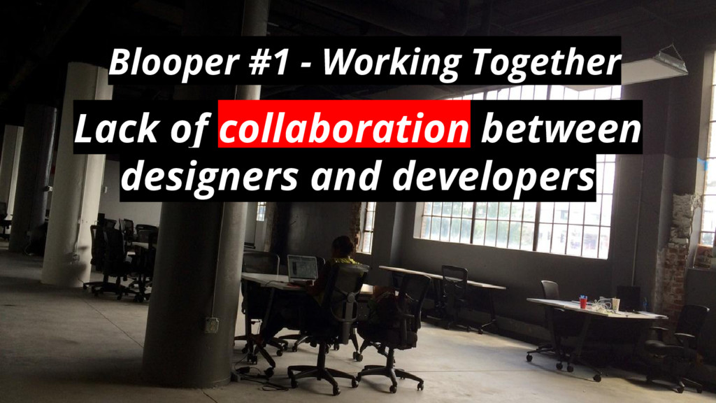
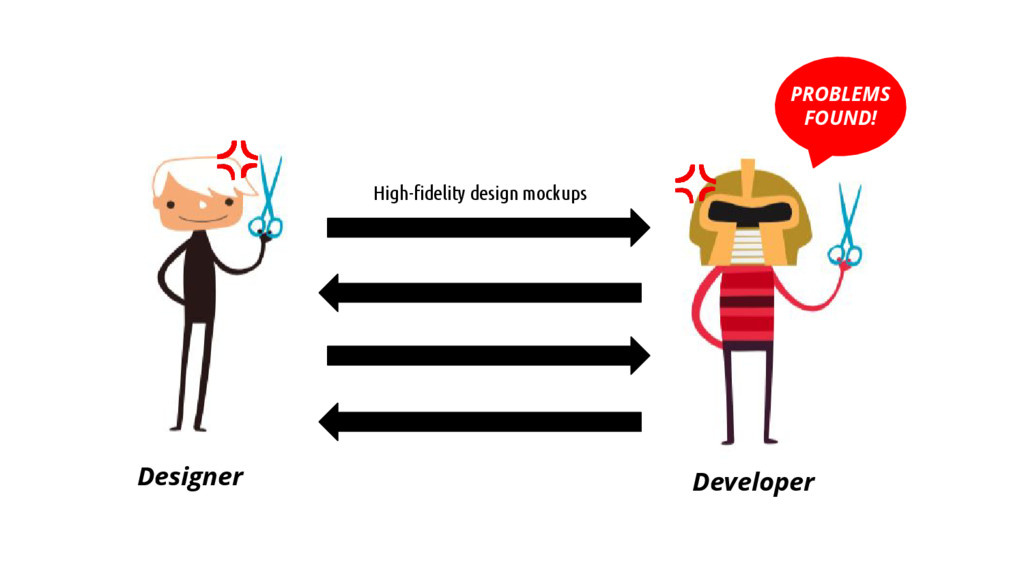
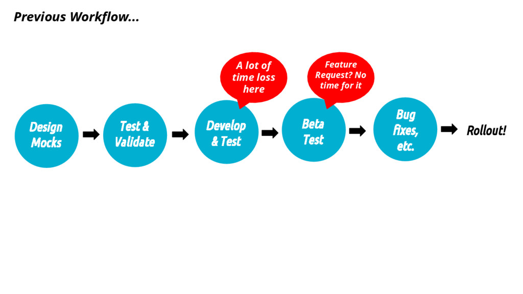
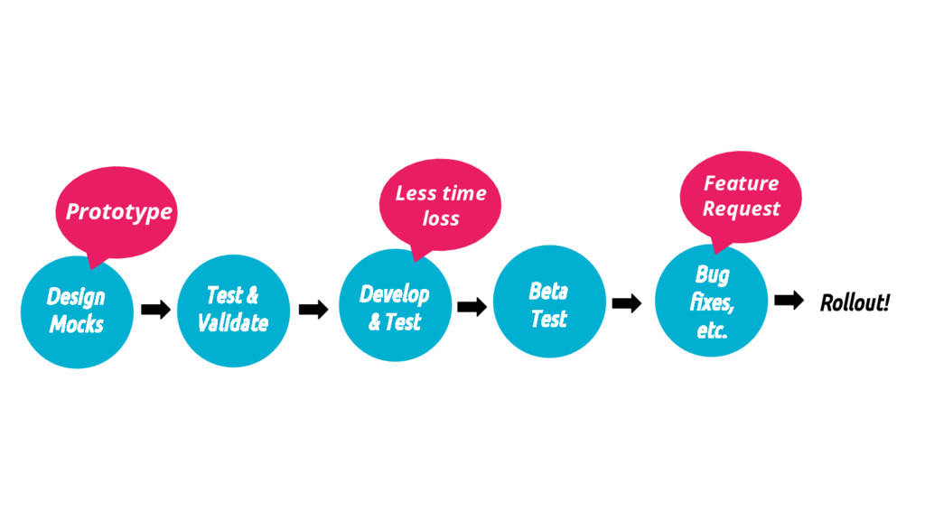
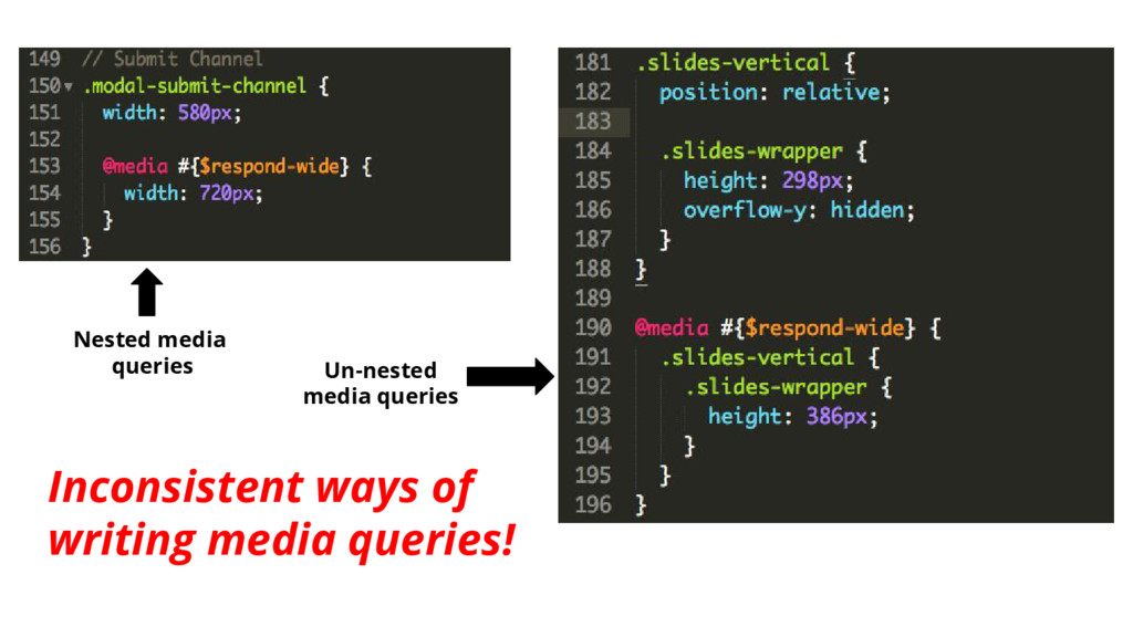
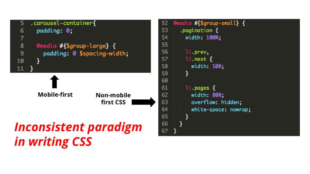
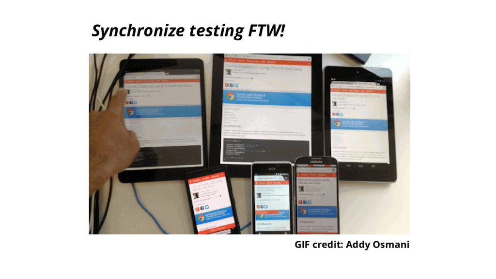
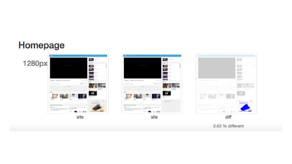
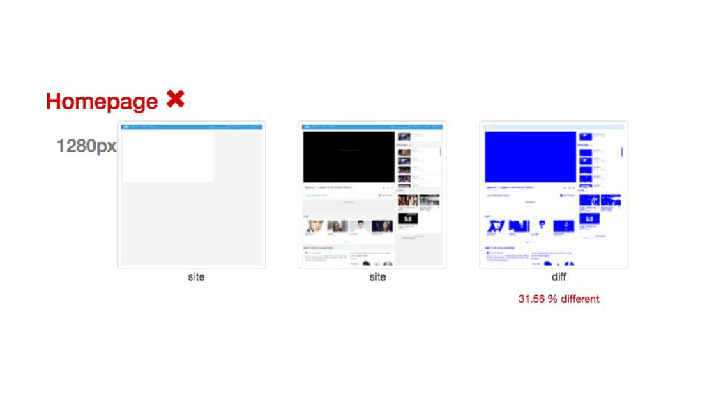
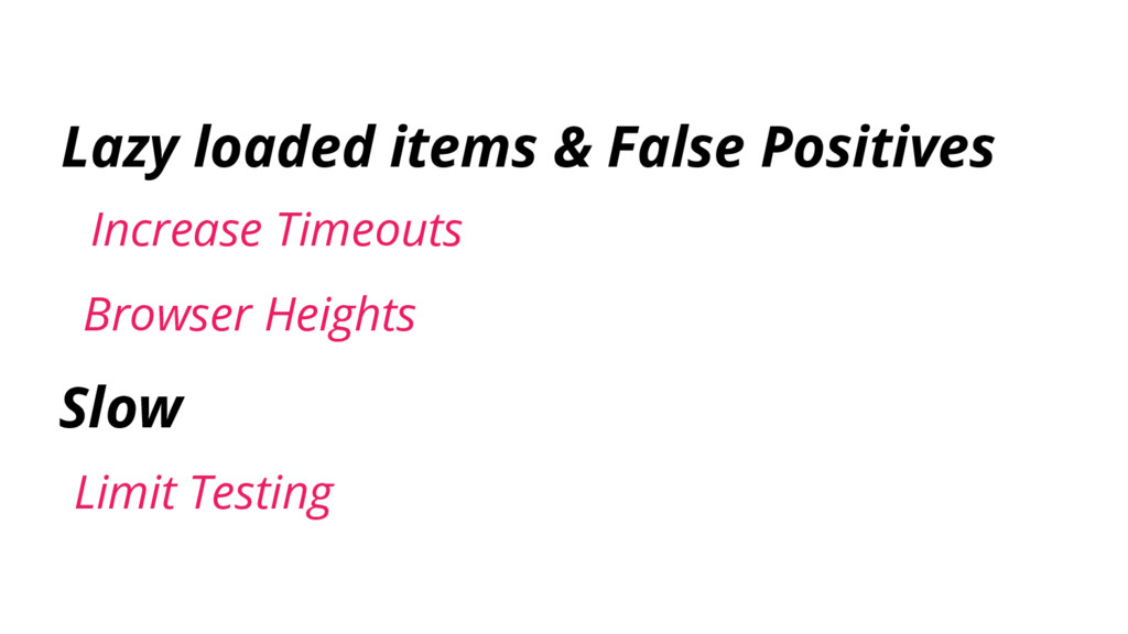
How hard can responsive web be? It sounds simple: design for a number of screen sizes and just throw in several media queries and your website is now "responsive"! Unfortunately, this is not the case and responsive web hasn't made our job easier. Adopting responsive web design will force you to change your design, development, and testing workflow. Problems may also arise in different stages of the workflow. In this talk, we will talk about responsive web blunders at Viki, how we overcome it, and some tips on how you can avoid it.
 renaysha
 har1101
 tomoyanonymous
 wemra
wemra
 kishida
 findyinc
 funnyycat
 tonkotsuboy_com
 jinwatanabe
 yukukotani
 16bitidol
 tooppoo
 rkaga
rkaga
 tammyeverts
 maggiecrowley
 caitiem20
 cassininazir
 mayatellez
 kneath
 csswizardry
 reverentgeek
 pedronauck
 nonsquared
 jacobian
 vanstee