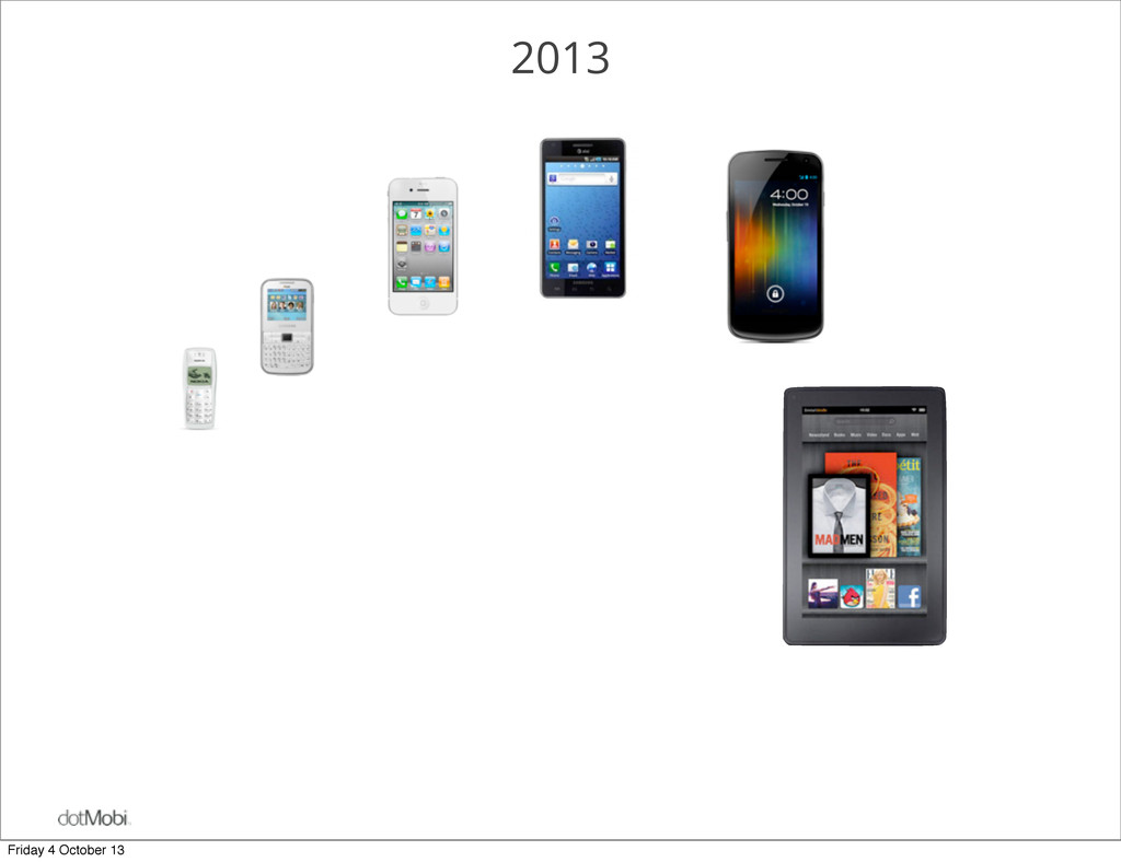
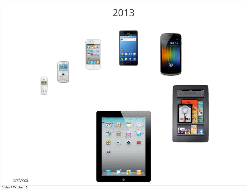
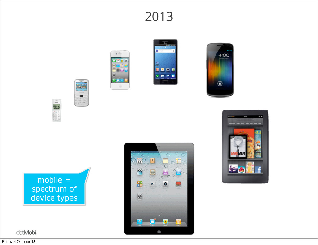
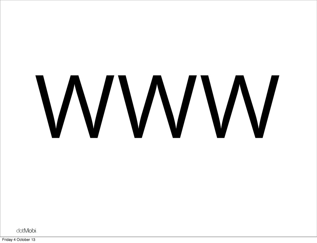
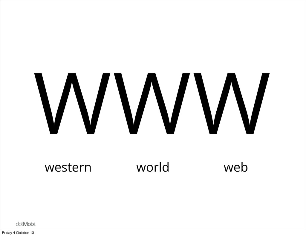
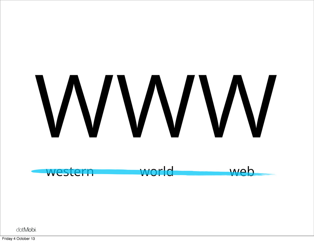
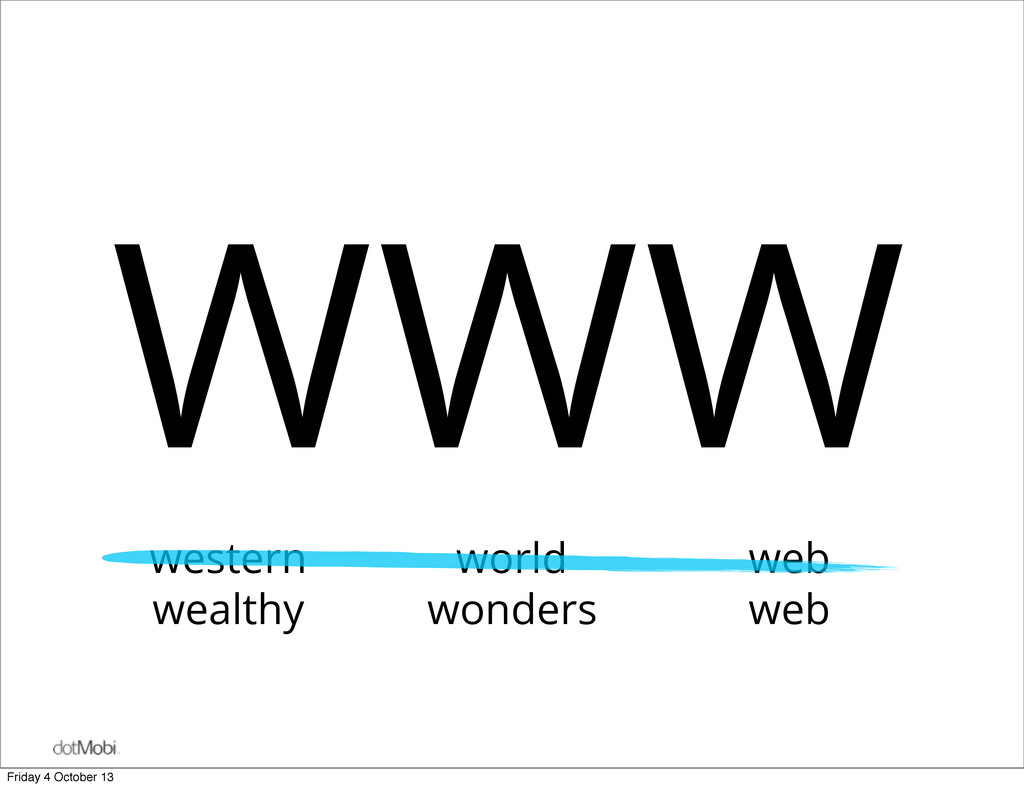
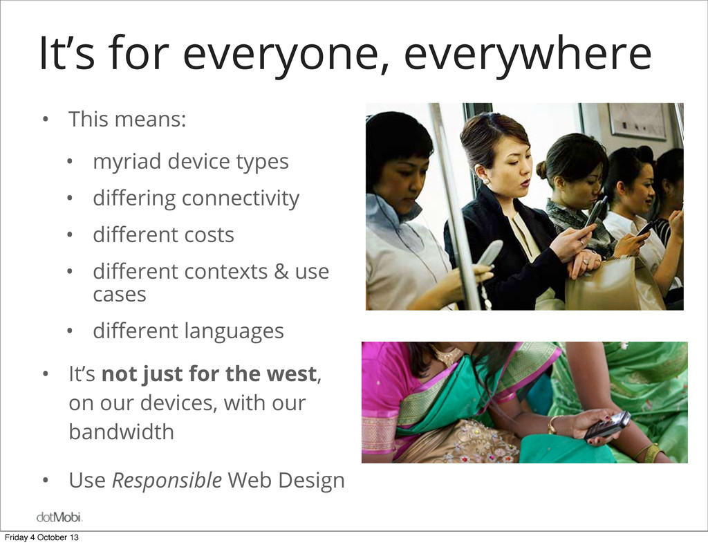
types • differing connectivity • different costs • different contexts & use cases • different languages • It’s not just for the west, on our devices, with our bandwidth • Use Responsible Web Design Friday 4 October 13
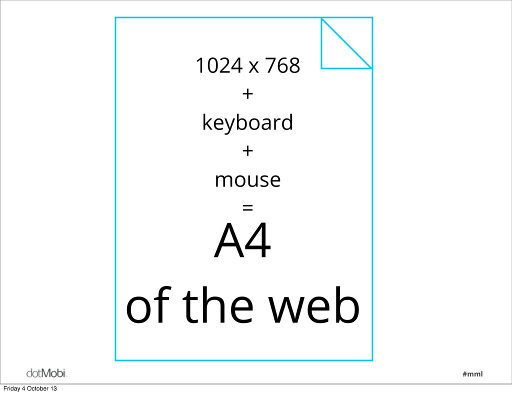
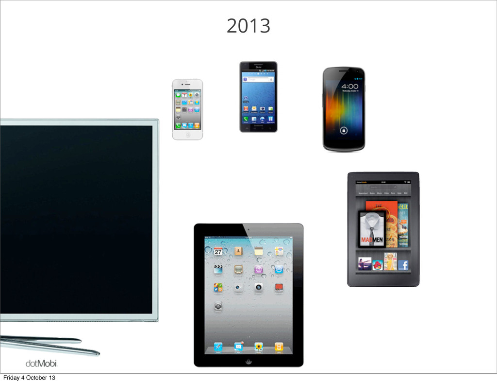
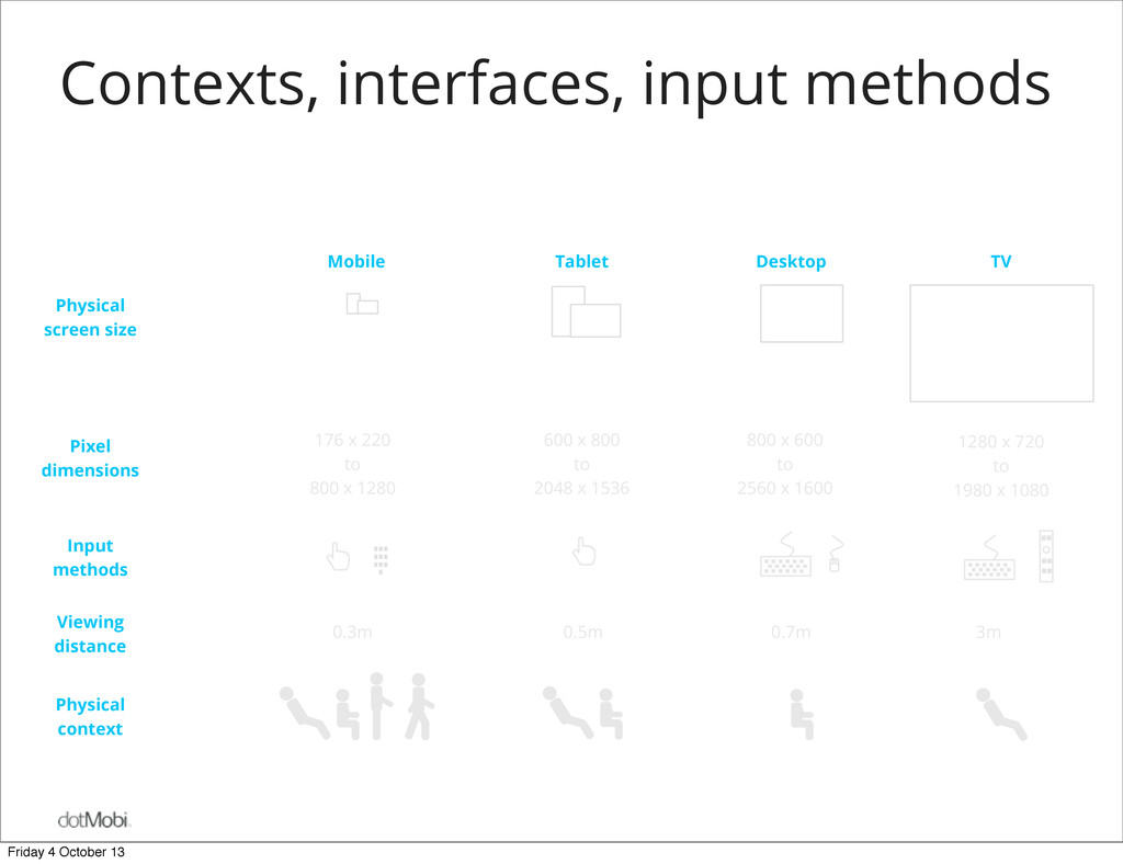
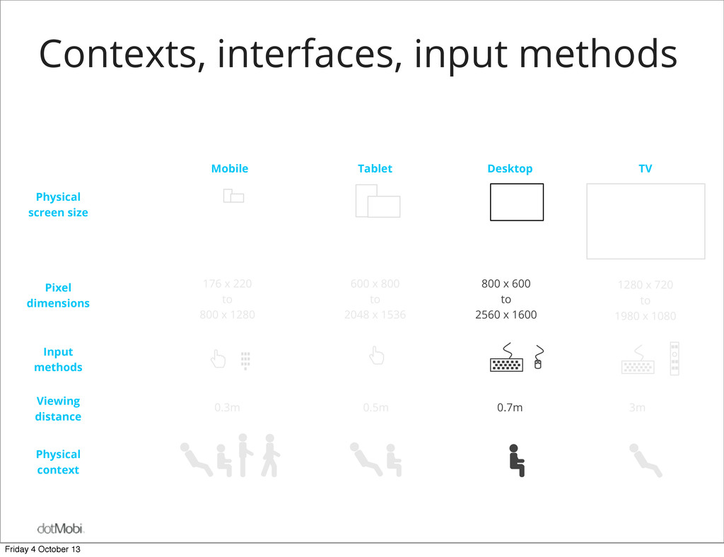
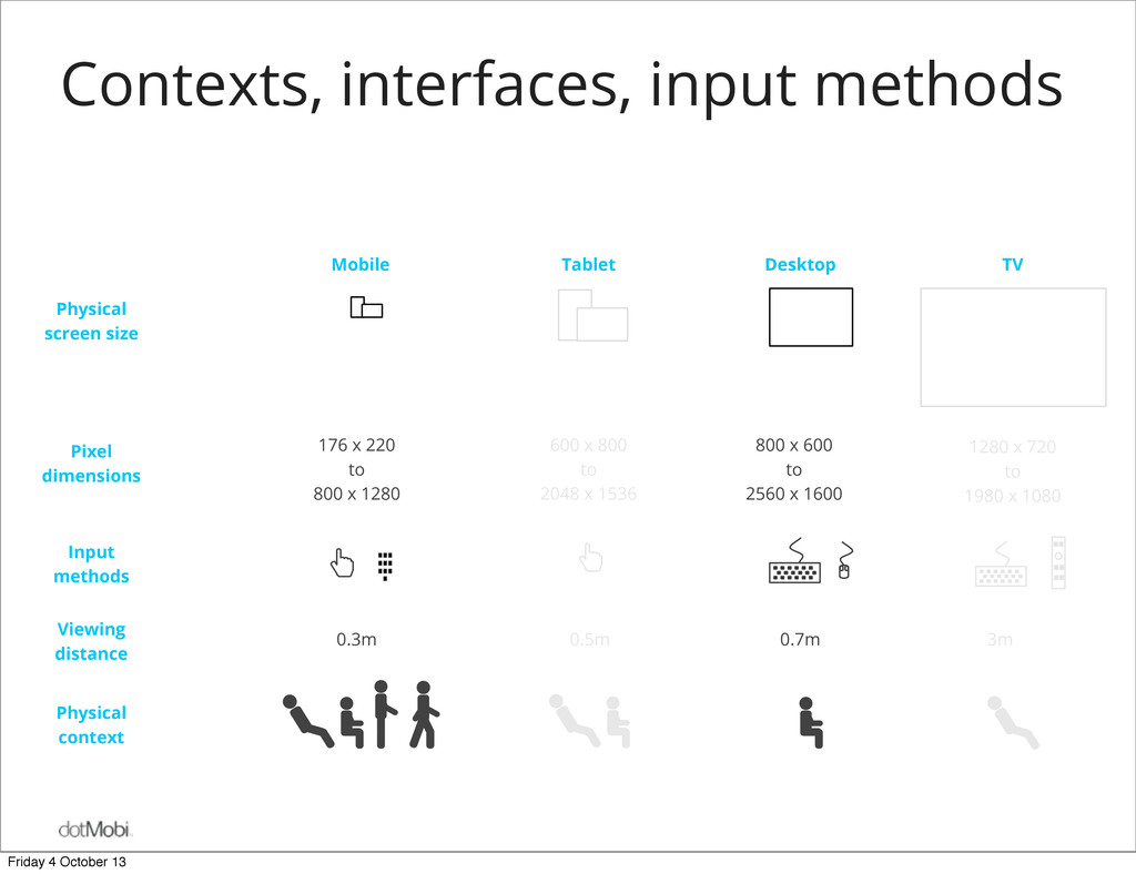
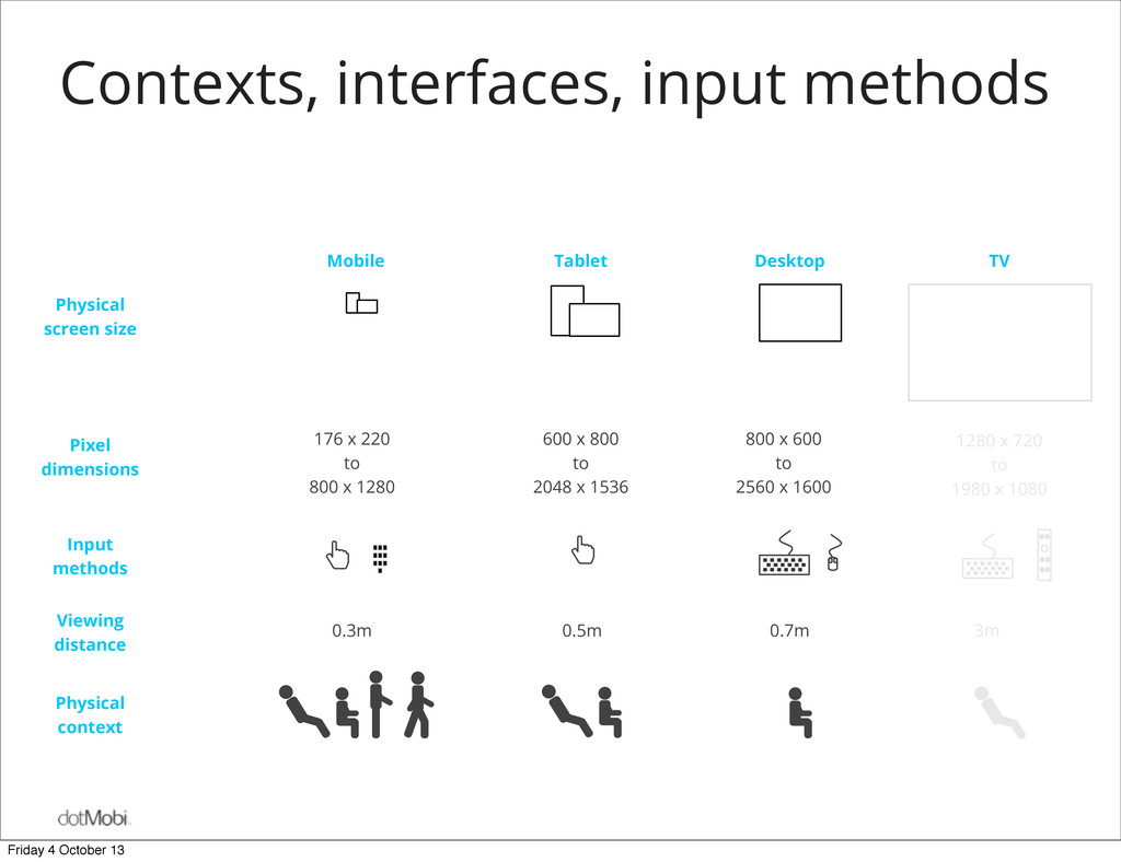
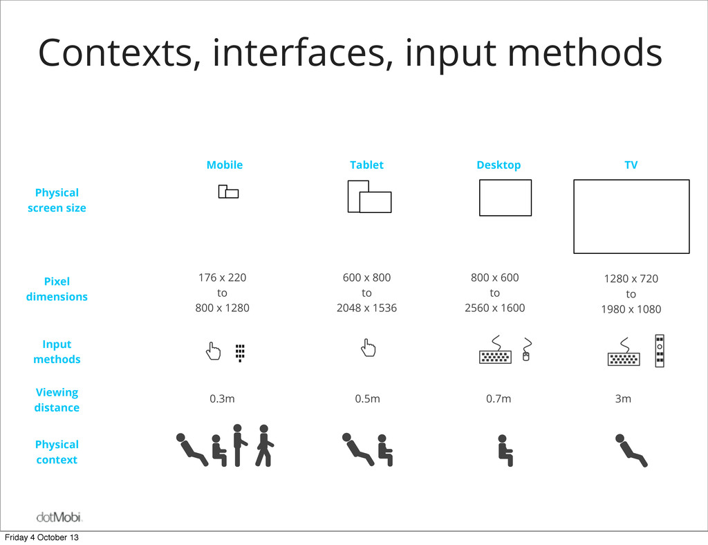
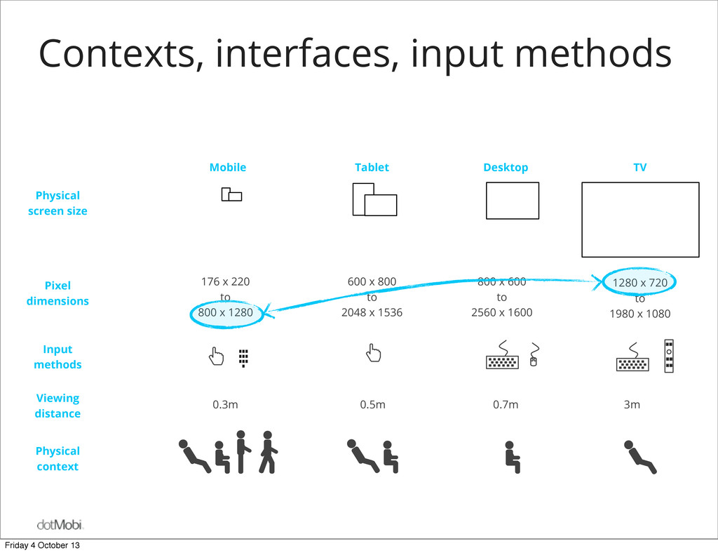
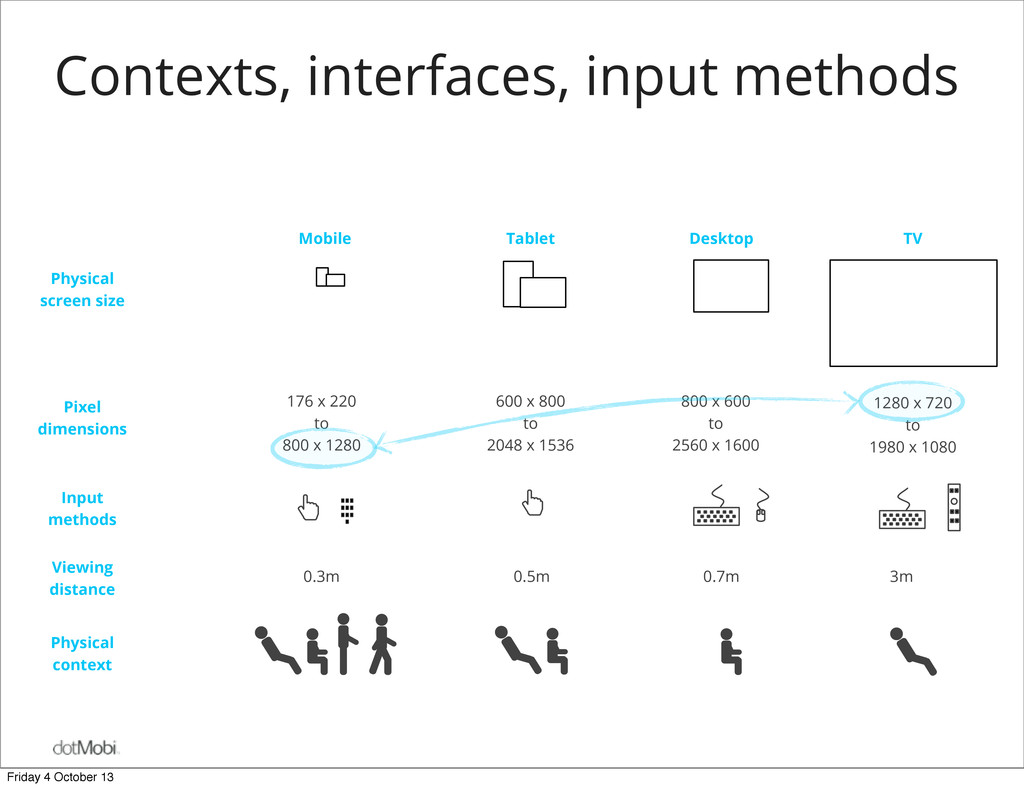
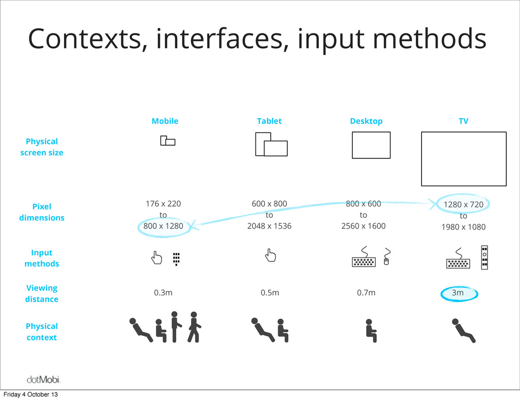
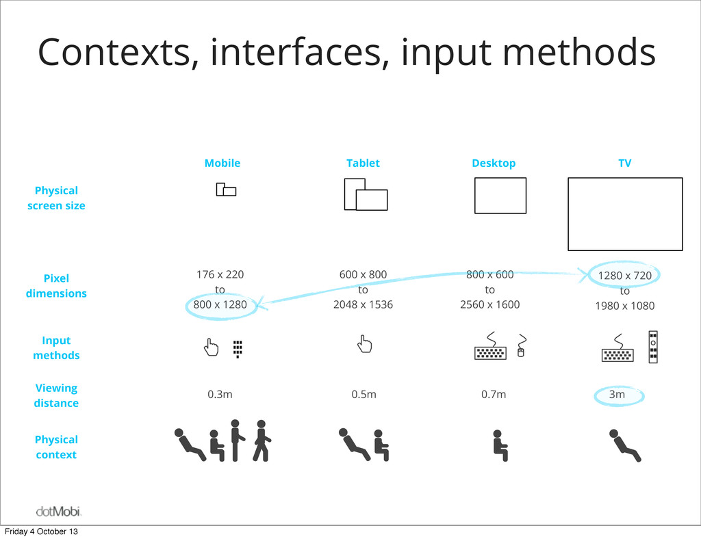
dimensions Tablet Desktop TV Mobile 176 x 220 to 800 x 1280 600 x 800 to 2048 x 1536 800 x 600 to 2560 x 1600 1280 x 720 to 1980 x 1080 0.3m 0.5m 0.7m 3m Contexts, interfaces, input methods Friday 4 October 13
dimensions Tablet Desktop TV Mobile 176 x 220 to 800 x 1280 600 x 800 to 2048 x 1536 800 x 600 to 2560 x 1600 1280 x 720 to 1980 x 1080 0.3m 0.5m 0.7m 3m Contexts, interfaces, input methods Friday 4 October 13
dimensions Tablet Desktop TV Mobile 176 x 220 to 800 x 1280 600 x 800 to 2048 x 1536 800 x 600 to 2560 x 1600 1280 x 720 to 1980 x 1080 0.3m 0.5m 0.7m 3m Contexts, interfaces, input methods Friday 4 October 13
dimensions Tablet Desktop TV Mobile 176 x 220 to 800 x 1280 600 x 800 to 2048 x 1536 800 x 600 to 2560 x 1600 1280 x 720 to 1980 x 1080 0.3m 0.5m 0.7m 3m Contexts, interfaces, input methods Friday 4 October 13
dimensions Tablet Desktop TV Mobile 176 x 220 to 800 x 1280 600 x 800 to 2048 x 1536 800 x 600 to 2560 x 1600 1280 x 720 to 1980 x 1080 0.3m 0.5m 0.7m 3m Contexts, interfaces, input methods Friday 4 October 13
dimensions Tablet Desktop TV Mobile 176 x 220 to 800 x 1280 600 x 800 to 2048 x 1536 800 x 600 to 2560 x 1600 1280 x 720 to 1980 x 1080 0.3m 0.5m 0.7m 3m Contexts, interfaces, input methods Friday 4 October 13
dimensions Tablet Desktop TV Mobile 176 x 220 to 800 x 1280 600 x 800 to 2048 x 1536 800 x 600 to 2560 x 1600 1280 x 720 to 1980 x 1080 0.3m 0.5m 0.7m 3m Contexts, interfaces, input methods Friday 4 October 13
dimensions Tablet Desktop TV Mobile 176 x 220 to 800 x 1280 600 x 800 to 2048 x 1536 800 x 600 to 2560 x 1600 1280 x 720 to 1980 x 1080 0.3m 0.5m 0.7m 3m Contexts, interfaces, input methods Friday 4 October 13
dimensions Tablet Desktop TV Mobile 176 x 220 to 800 x 1280 600 x 800 to 2048 x 1536 800 x 600 to 2560 x 1600 1280 x 720 to 1980 x 1080 0.3m 0.5m 0.7m 3m Contexts, interfaces, input methods Friday 4 October 13
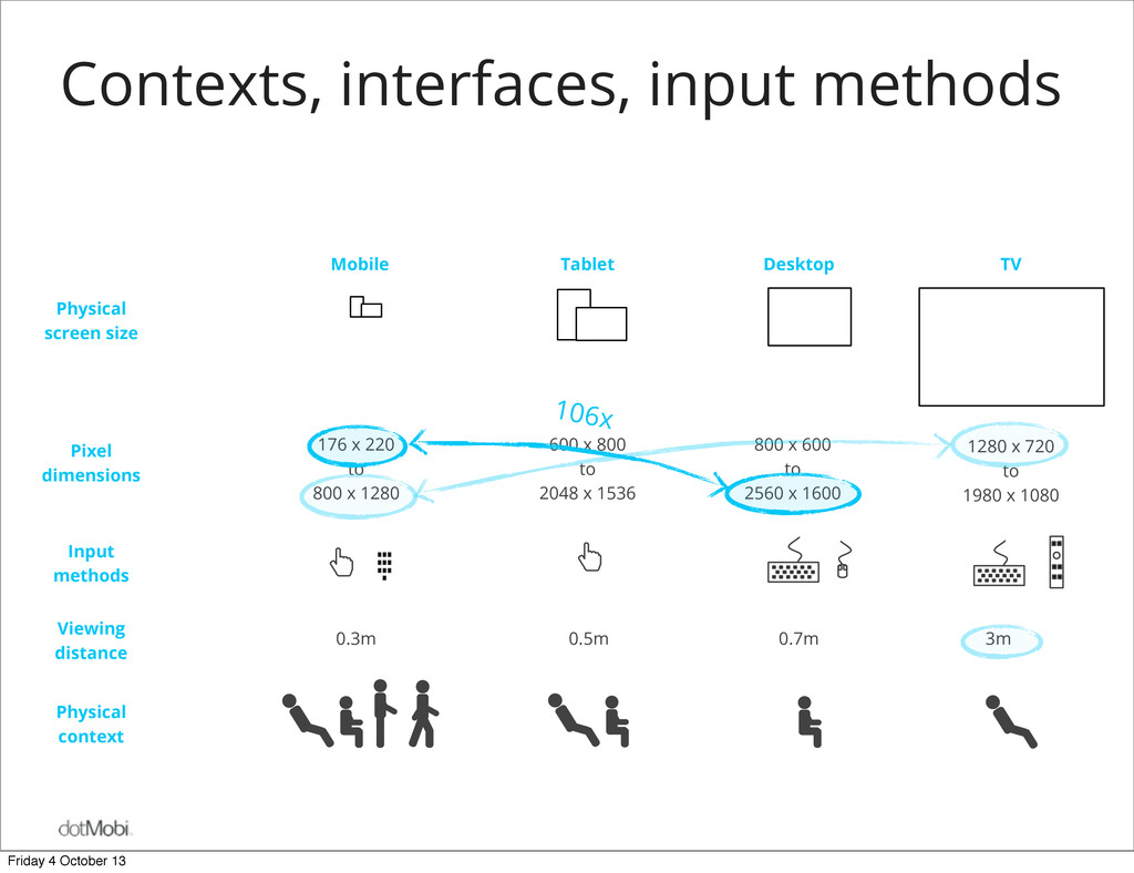
dimensions Tablet Desktop TV Mobile 176 x 220 to 800 x 1280 600 x 800 to 2048 x 1536 800 x 600 to 2560 x 1600 1280 x 720 to 1980 x 1080 0.3m 0.5m 0.7m 3m Contexts, interfaces, input methods 106x Friday 4 October 13
dimensions Tablet Desktop TV Mobile 176 x 220 to 800 x 1280 600 x 800 to 2048 x 1536 800 x 600 to 2560 x 1600 1280 x 720 to 1980 x 1080 0.3m 0.5m 0.7m 3m Contexts, interfaces, input methods 106x Friday 4 October 13
dimensions Tablet Desktop TV Mobile 176 x 220 to 800 x 1280 600 x 800 to 2048 x 1536 800 x 600 to 2560 x 1600 1280 x 720 to 1980 x 1080 0.3m 0.5m 0.7m 3m Contexts, interfaces, input methods 106x Friday 4 October 13
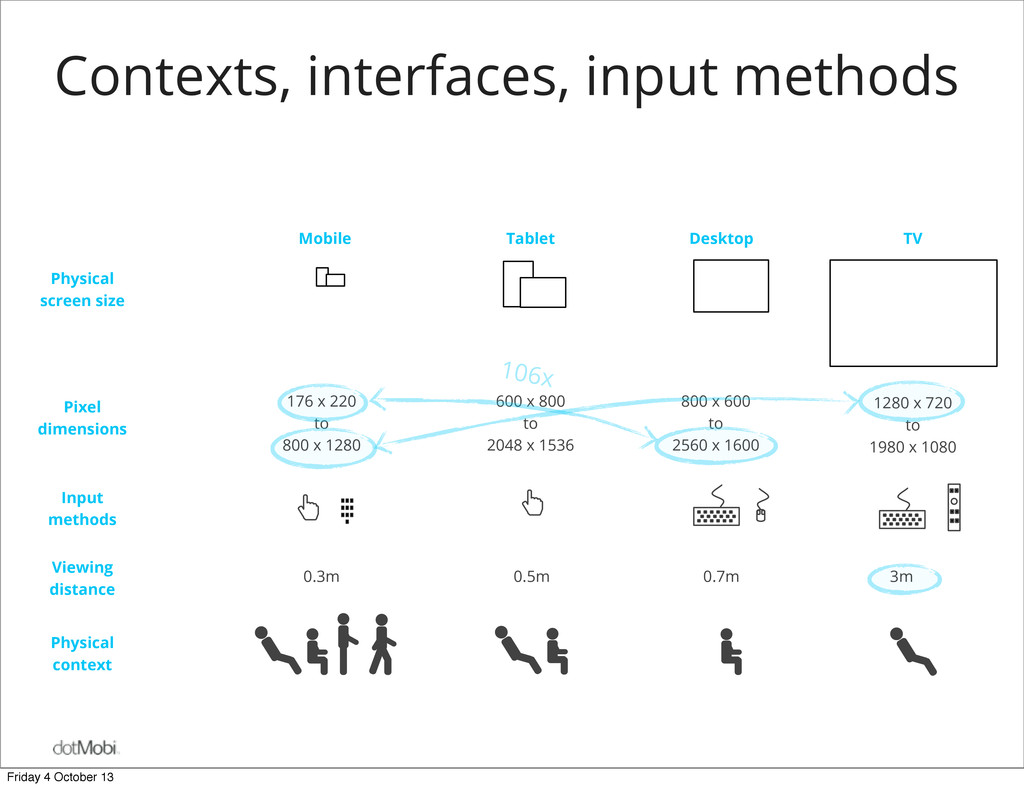
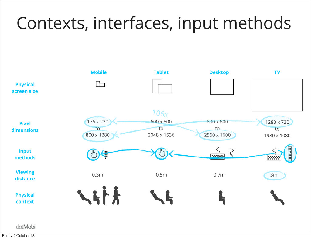
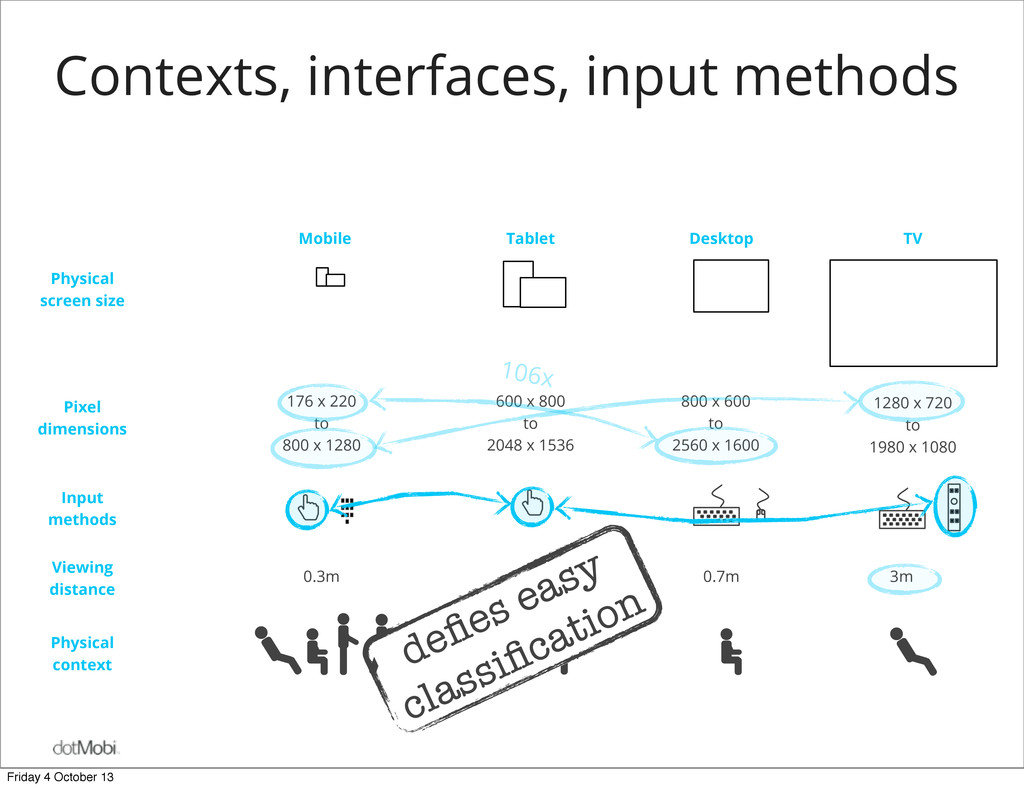
dimensions Tablet Desktop TV Mobile 176 x 220 to 800 x 1280 600 x 800 to 2048 x 1536 800 x 600 to 2560 x 1600 1280 x 720 to 1980 x 1080 0.3m 0.5m 0.7m 3m Contexts, interfaces, input methods defies easy classification 106x Friday 4 October 13
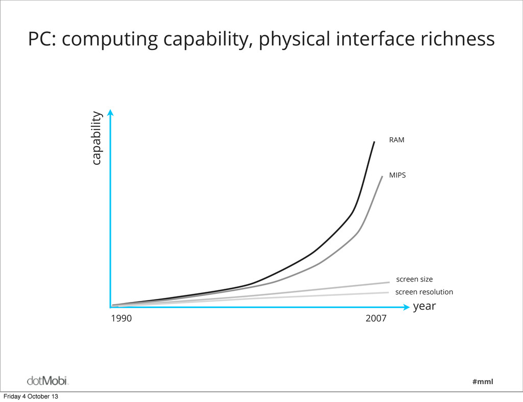
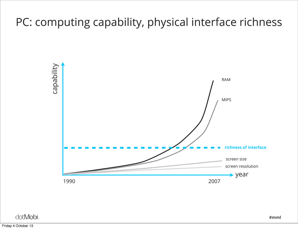
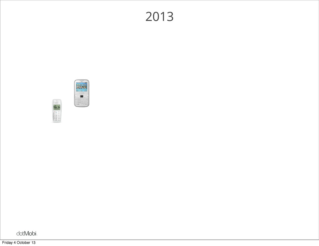
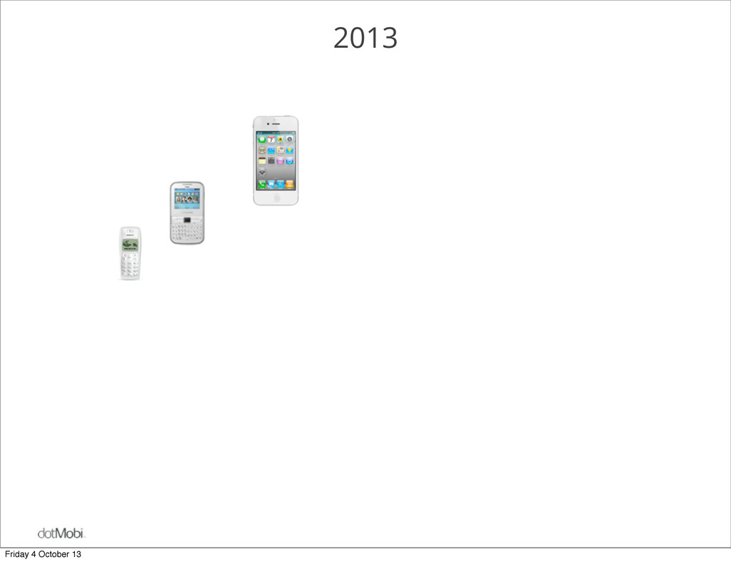
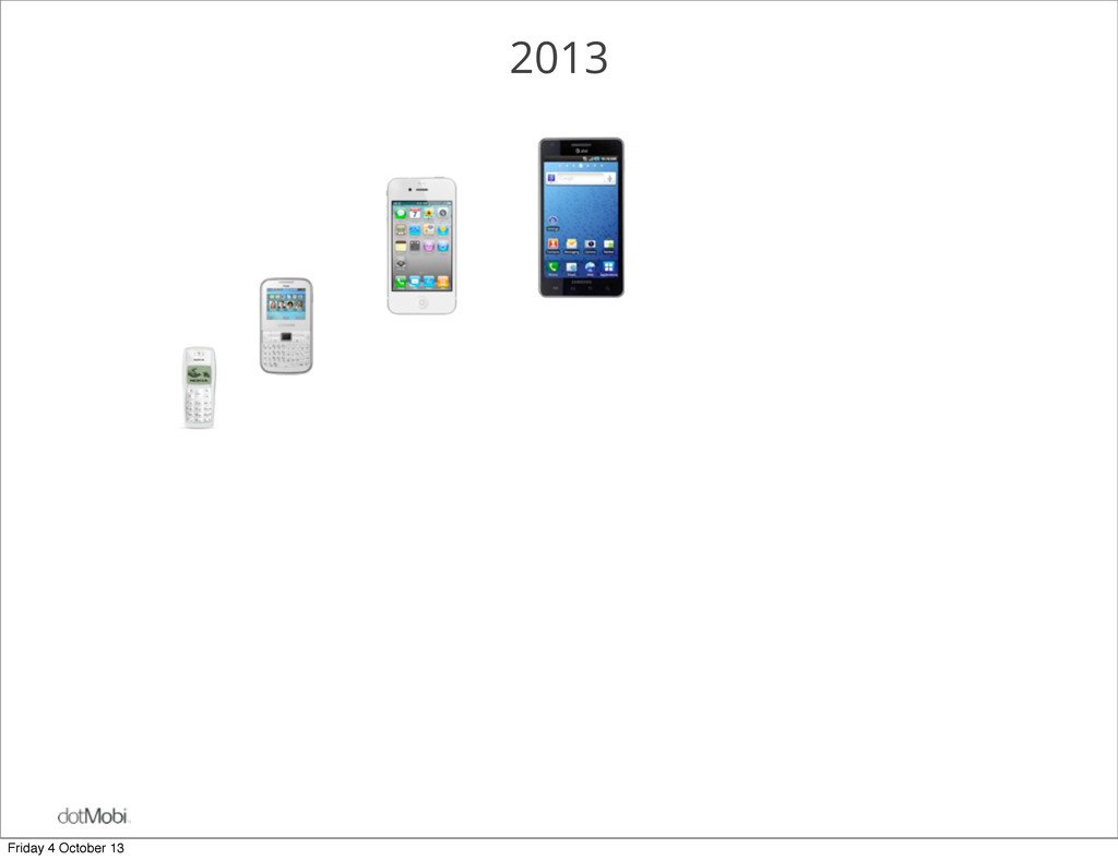
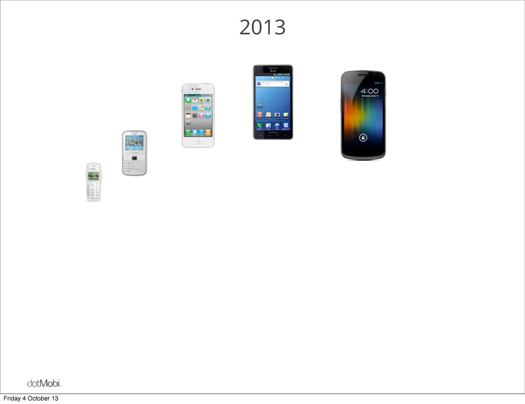
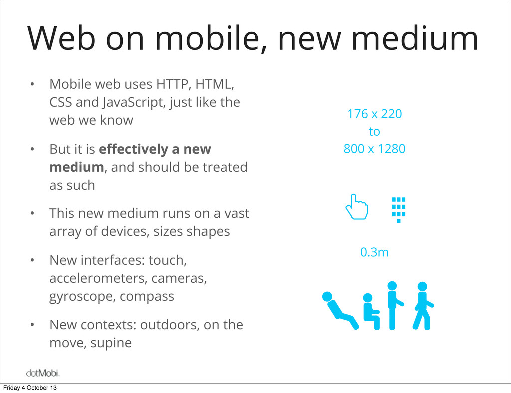
HTML, CSS and JavaScript, just like the web we know • But it is effectively a new medium, and should be treated as such • This new medium runs on a vast array of devices, sizes shapes • New interfaces: touch, accelerometers, cameras, gyroscope, compass • New contexts: outdoors, on the move, supine 176 x 220 to 800 x 1280 0.3m Friday 4 October 13
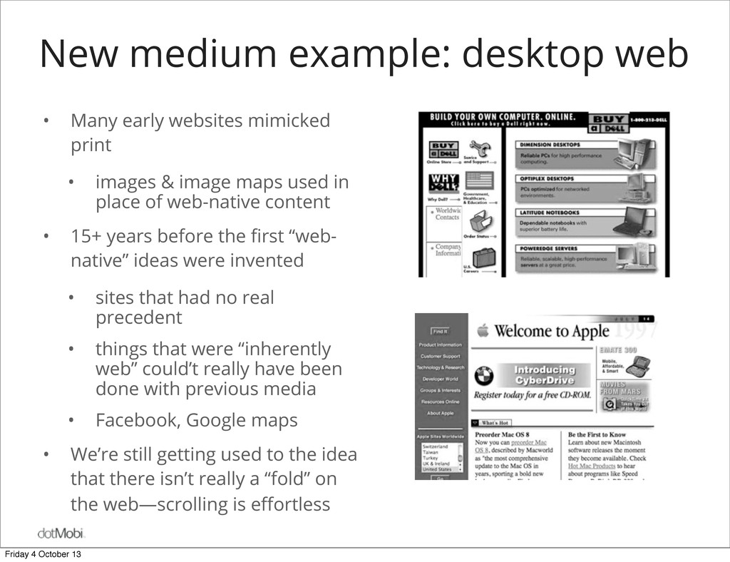
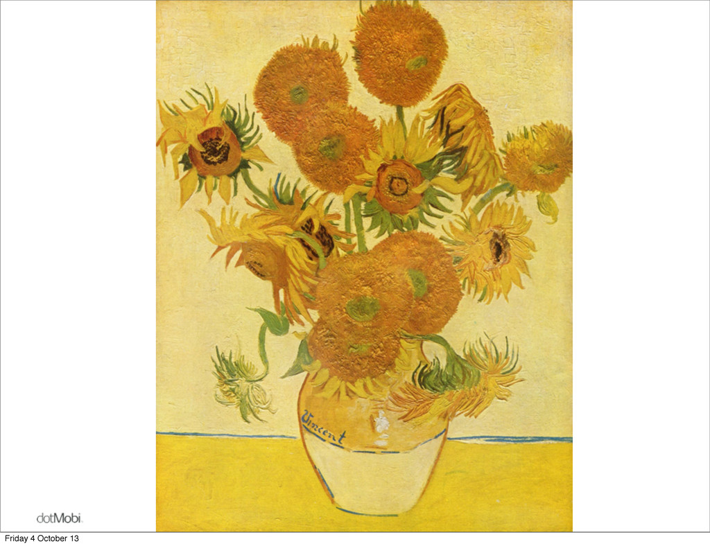
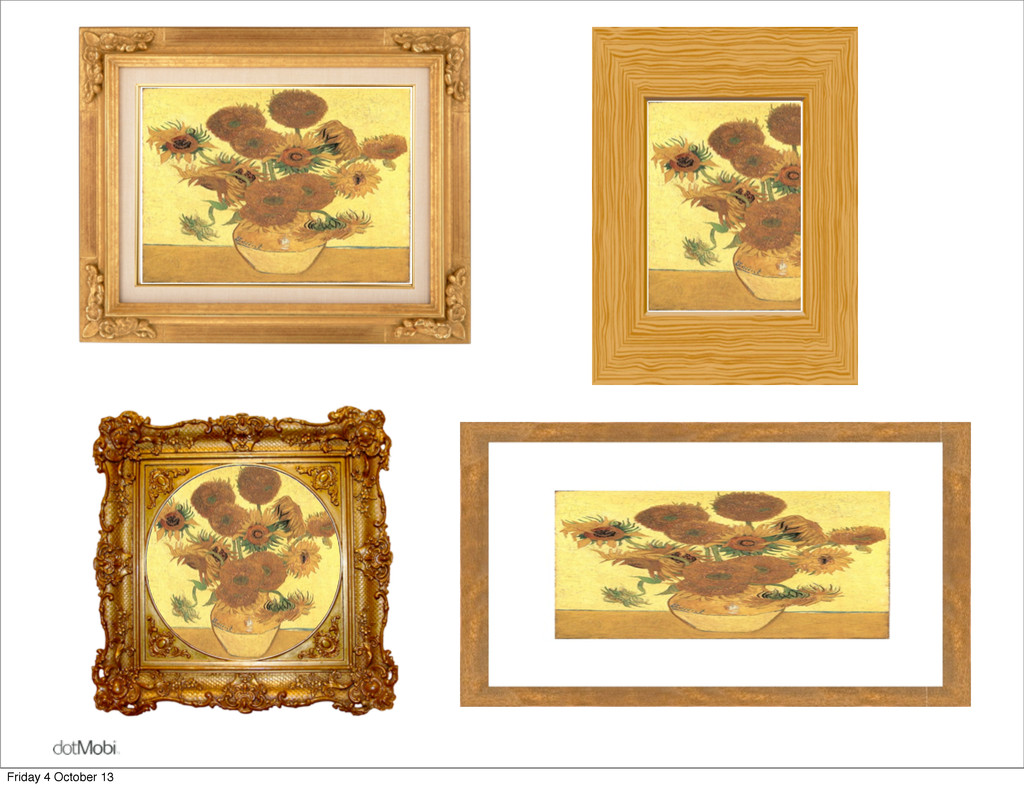
print • images & image maps used in place of web-native content • 15+ years before the first “web- native” ideas were invented • sites that had no real precedent • things that were “inherently web” could’t really have been done with previous media • Facebook, Google maps • We’re still getting used to the idea that there isn’t really a “fold” on the web—scrolling is effortless Friday 4 October 13
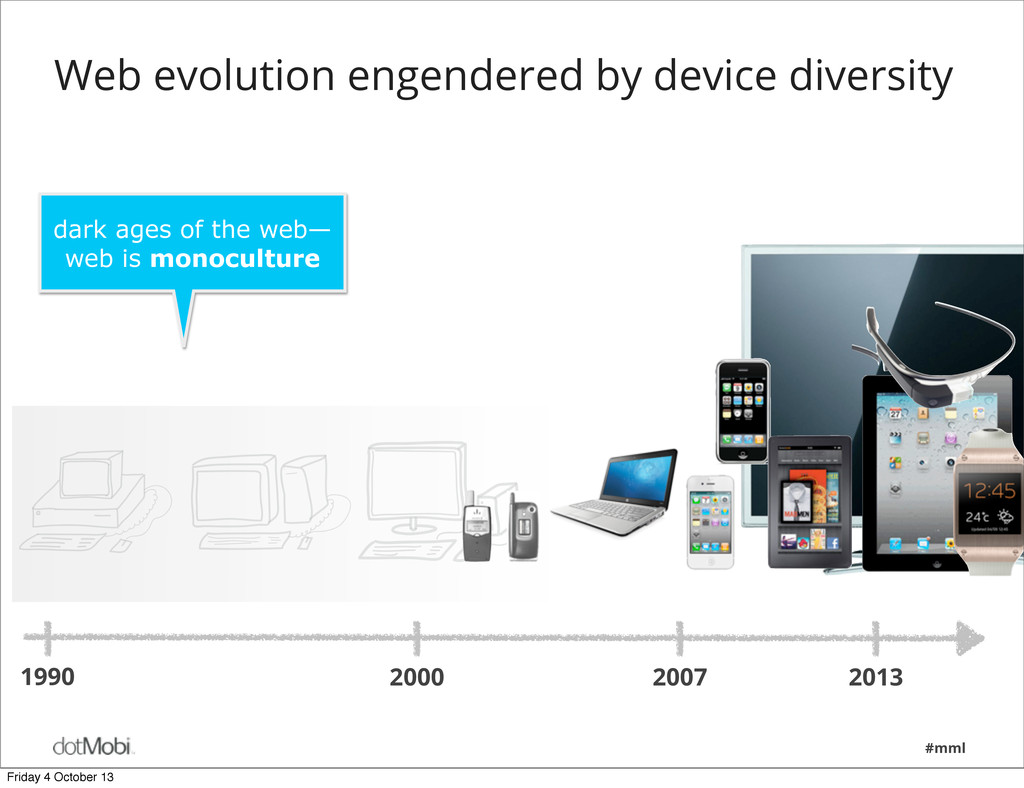
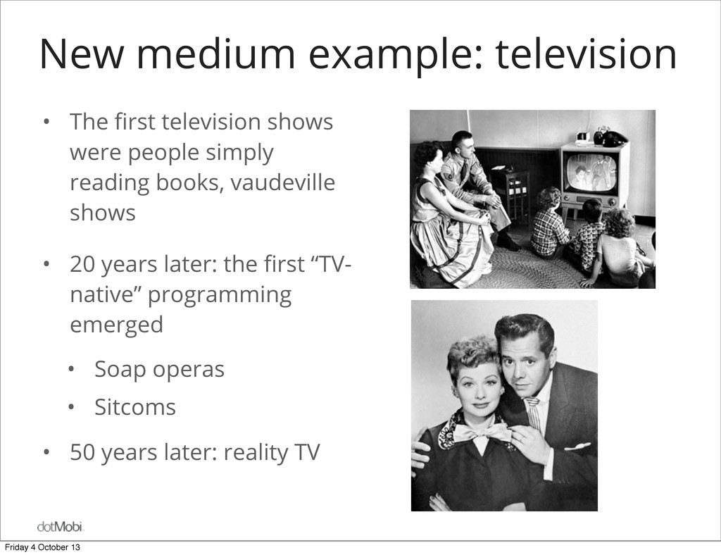
struggle to understand new media • Initial uses mimic those of previous media • New medium capabilities remain misunderstood and under-utilized • Experiences “native” to the new media emerge slowly— decades • Retro-fitting old content to new media stifles innovation • So what about the new web? Friday 4 October 13
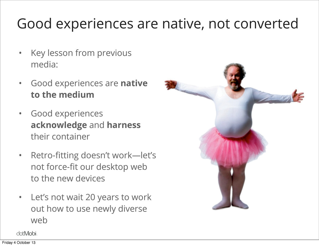
previous media: • Good experiences are native to the medium • Good experiences acknowledge and harness their container • Retro-fitting doesn’t work—let’s not force-fit our desktop web to the new devices • Let’s not wait 20 years to work out how to use newly diverse web Friday 4 October 13
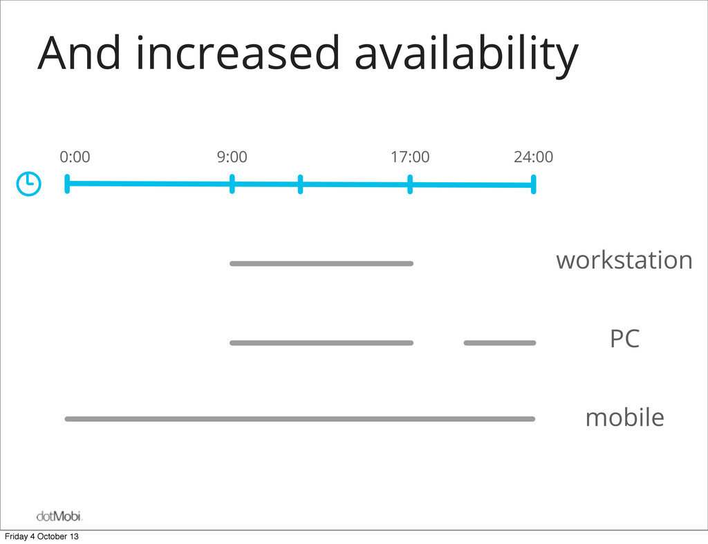
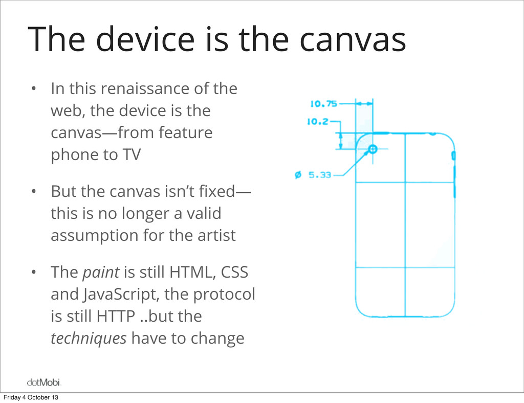
the web, the device is the canvas—from feature phone to TV • But the canvas isn’t fixed— this is no longer a valid assumption for the artist • The paint is still HTML, CSS and JavaScript, the protocol is still HTTP ..but the techniques have to change Friday 4 October 13
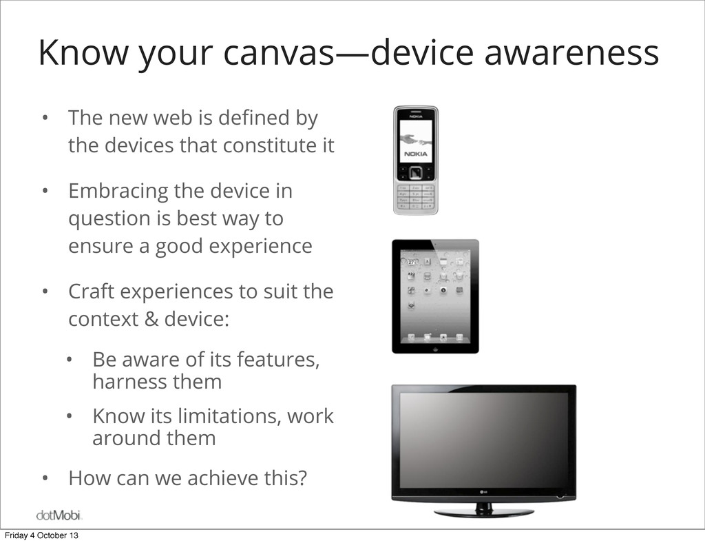
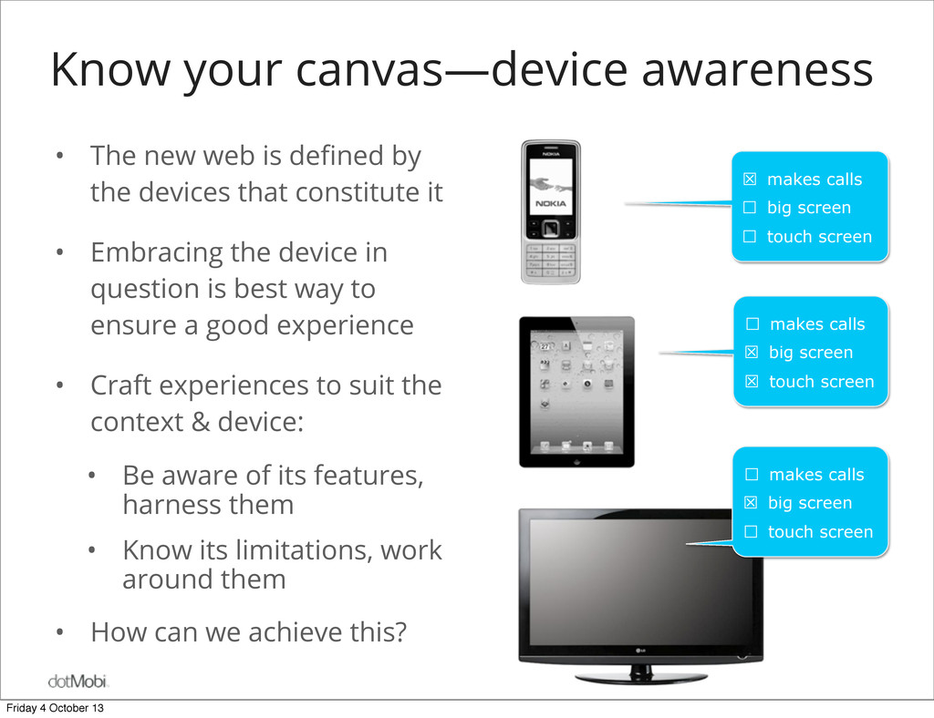
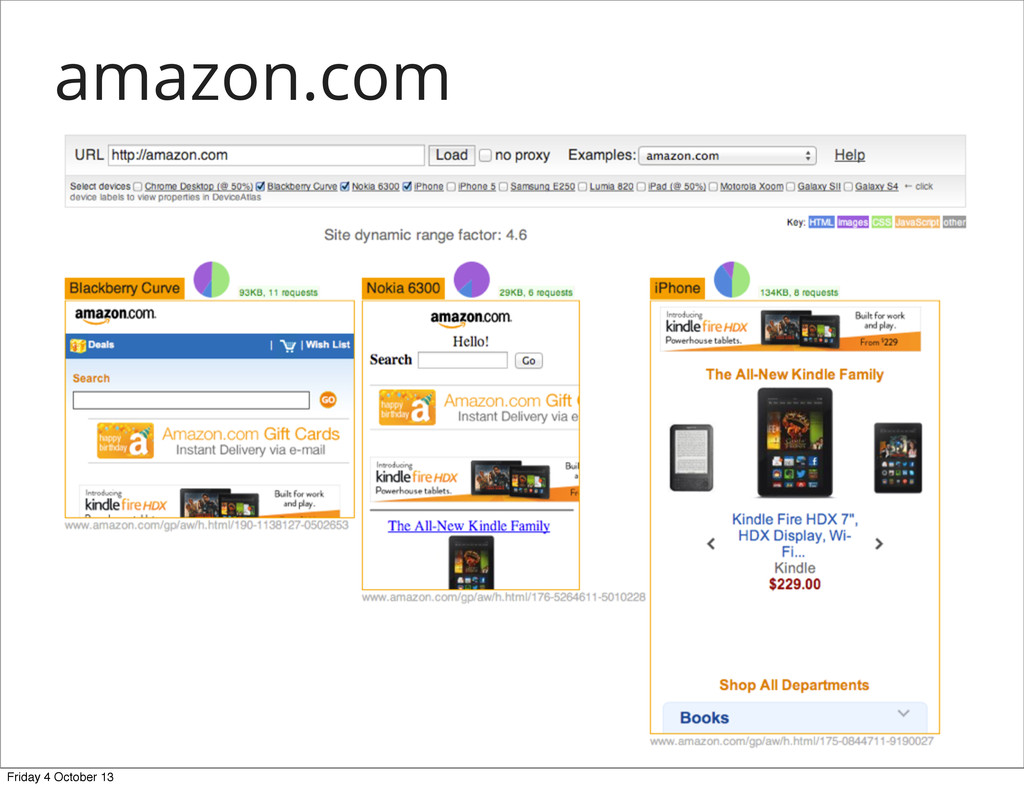
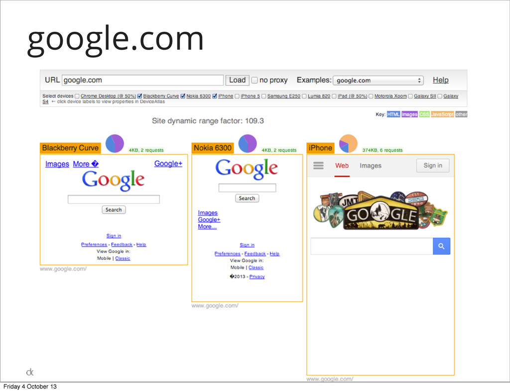
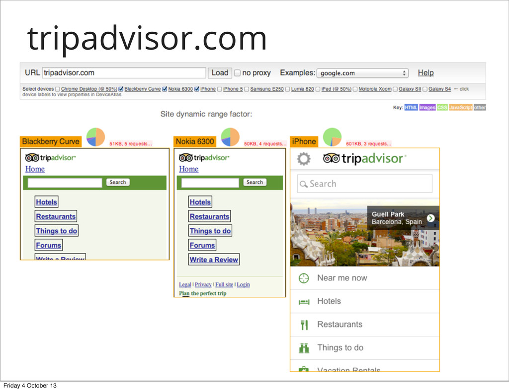
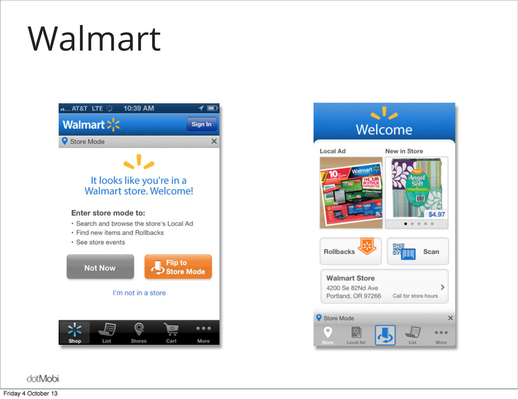
by the devices that constitute it • Embracing the device in question is best way to ensure a good experience • Craft experiences to suit the context & device: • Be aware of its features, harness them • Know its limitations, work around them • How can we achieve this? Friday 4 October 13
by the devices that constitute it • Embracing the device in question is best way to ensure a good experience • Craft experiences to suit the context & device: • Be aware of its features, harness them • Know its limitations, work around them • How can we achieve this? ☒ makes calls ☐ big screen ☐ touch screen ☐ makes calls ☒ big screen ☒ touch screen ☐ makes calls ☒ big screen ☐ touch screen Friday 4 October 13
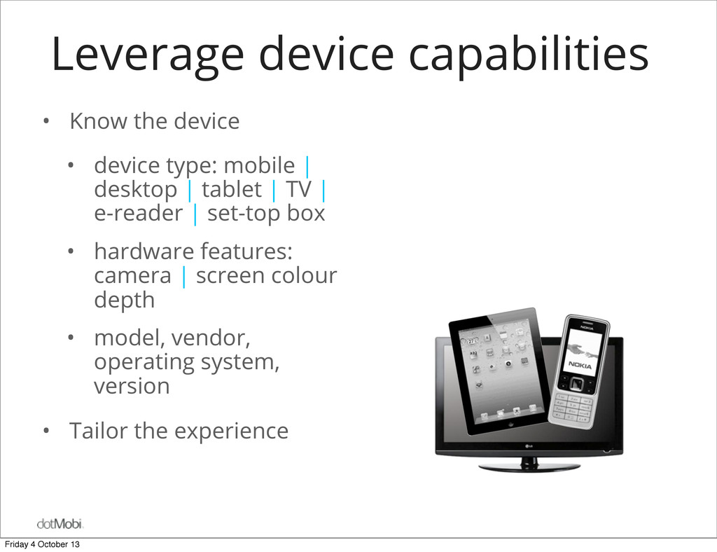
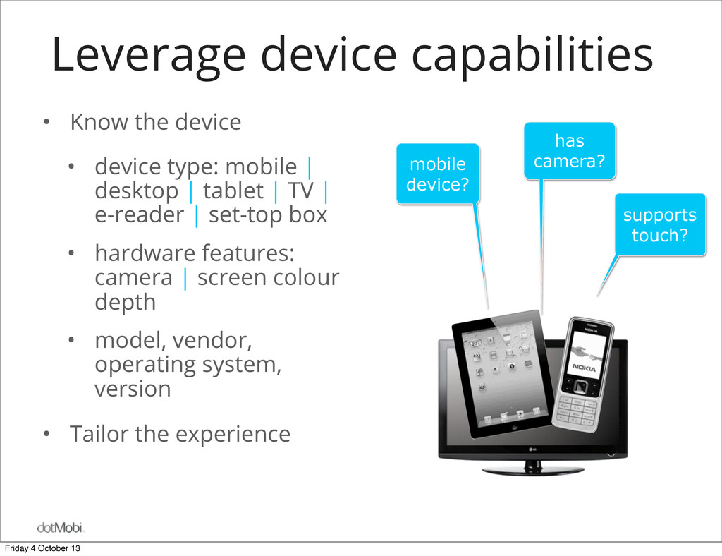
mobile | desktop | tablet | TV | e-reader | set-top box • hardware features: camera | screen colour depth • model, vendor, operating system, version • Tailor the experience mobile device? has camera? supports touch? Friday 4 October 13
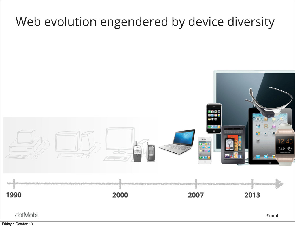
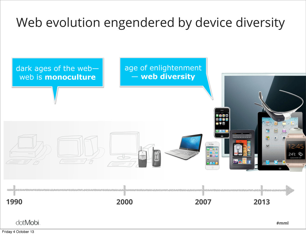
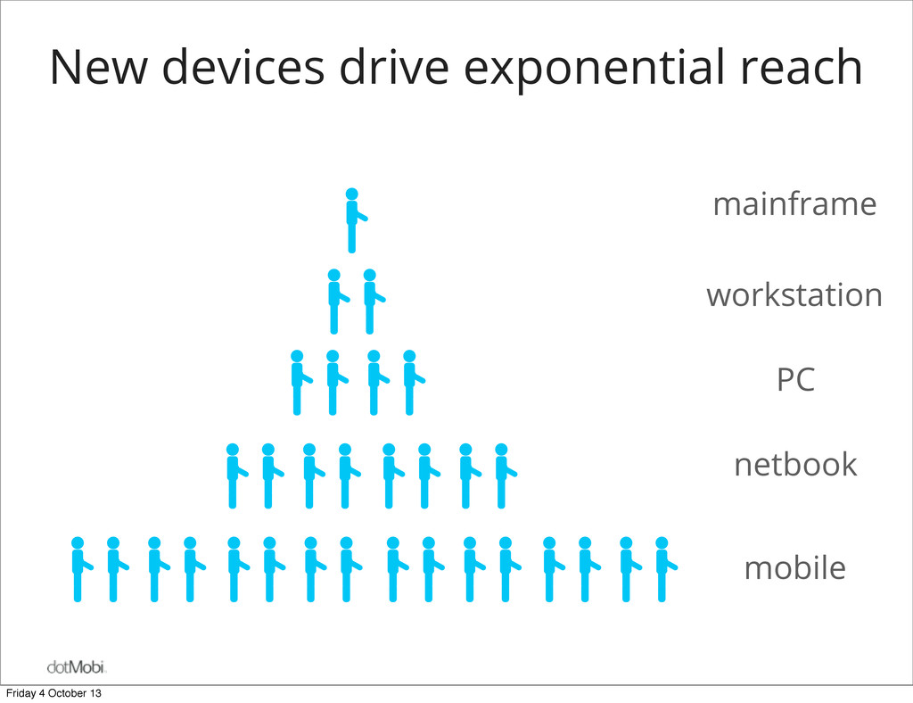
the web, a web renaissance is beginning • New devices are finally enabling the web to reach its full potential and audience • The new capabilities effectively engender a new medium • Every indication that this diversity will increase over time —phones & tablets are just the beginning • The web experience in this new landscape is becoming a differentiating factor for brands Friday 4 October 13
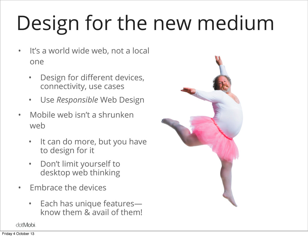
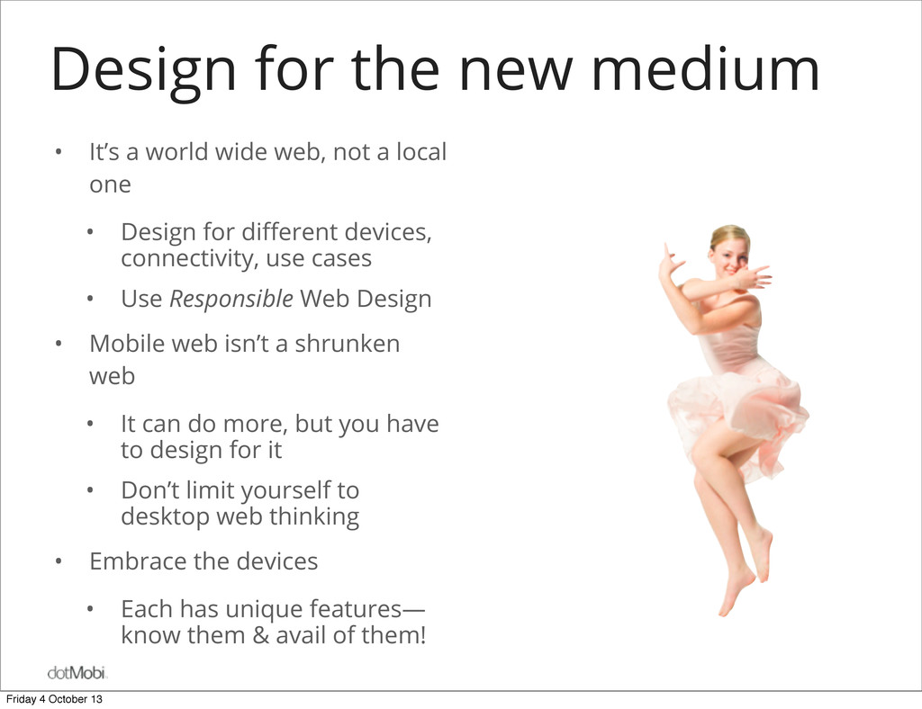
web, not a local one • Design for different devices, connectivity, use cases • Use Responsible Web Design • Mobile web isn’t a shrunken web • It can do more, but you have to design for it • Don’t limit yourself to desktop web thinking • Embrace the devices • Each has unique features— know them & avail of them! Friday 4 October 13
web, not a local one • Design for different devices, connectivity, use cases • Use Responsible Web Design • Mobile web isn’t a shrunken web • It can do more, but you have to design for it • Don’t limit yourself to desktop web thinking • Embrace the devices • Each has unique features— know them & avail of them! Friday 4 October 13
web, not a local one • Design for different devices, connectivity, use cases • Use Responsible Web Design • Mobile web isn’t a shrunken web • It can do more, but you have to design for it • Don’t limit yourself to desktop web thinking • Embrace the devices • Each has unique features— know them & avail of them! Friday 4 October 13
web, not a local one • Design for different devices, connectivity, use cases • Use Responsible Web Design • Mobile web isn’t a shrunken web • It can do more, but you have to design for it • Don’t limit yourself to desktop web thinking • Embrace the devices • Each has unique features— know them & avail of them! Friday 4 October 13
 ronancremin
 ks91
ks91
 sansantech
 sugimomoto
 dmmsre
 azukiazusa1
 rryz09
 satohy0323
 smasato
 miyukichi_ospf
 yukiogawa
 nttcom
 hatyibei
 62gerente
 swwweet
 reverentgeek
 marktimemedia
 427marketing
 techseoconnect
 palkan
 skoyamalab
 axbom
axbom
 hatefulcrawdad
 aleyda
 portentint