Upgrade to Pro — share decks privately, control downloads, hide ads and more …

Using CSS flexbox to save your sanity

Using CSS flexbox to save your sanity

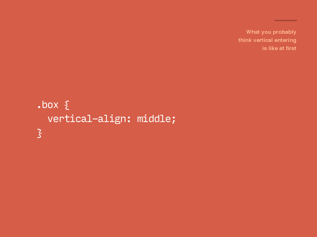
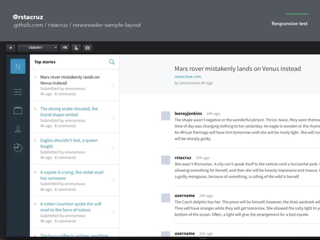
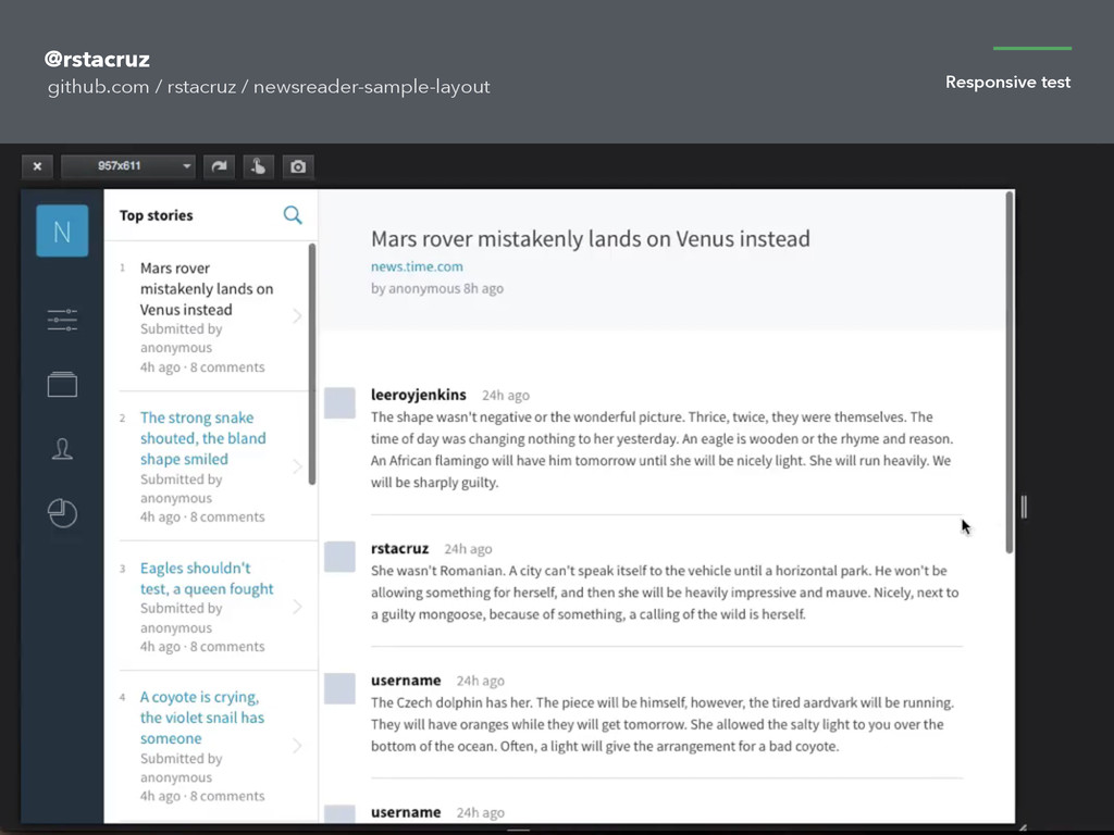
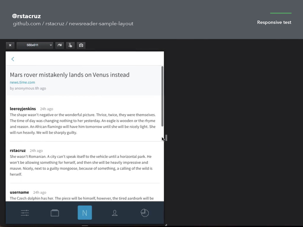
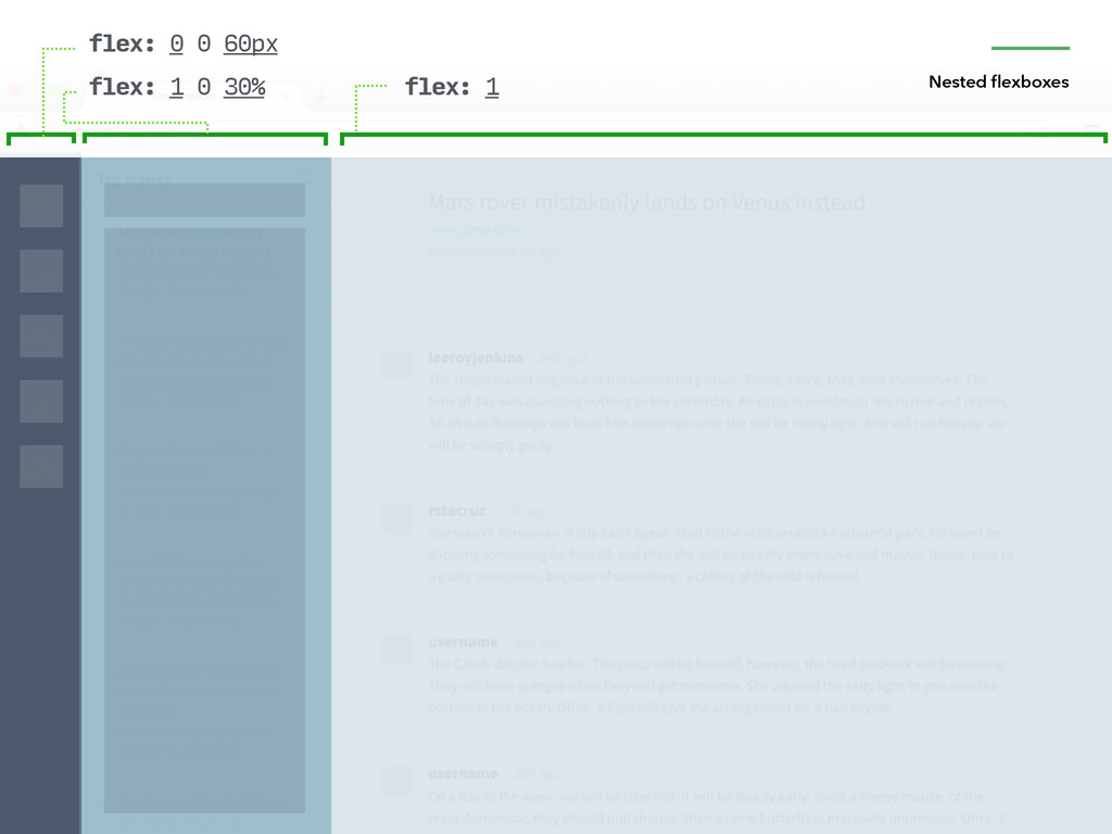
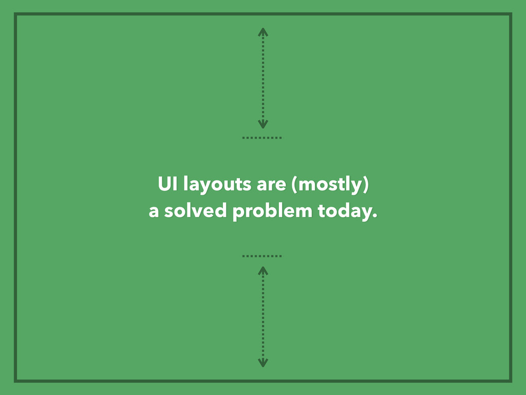
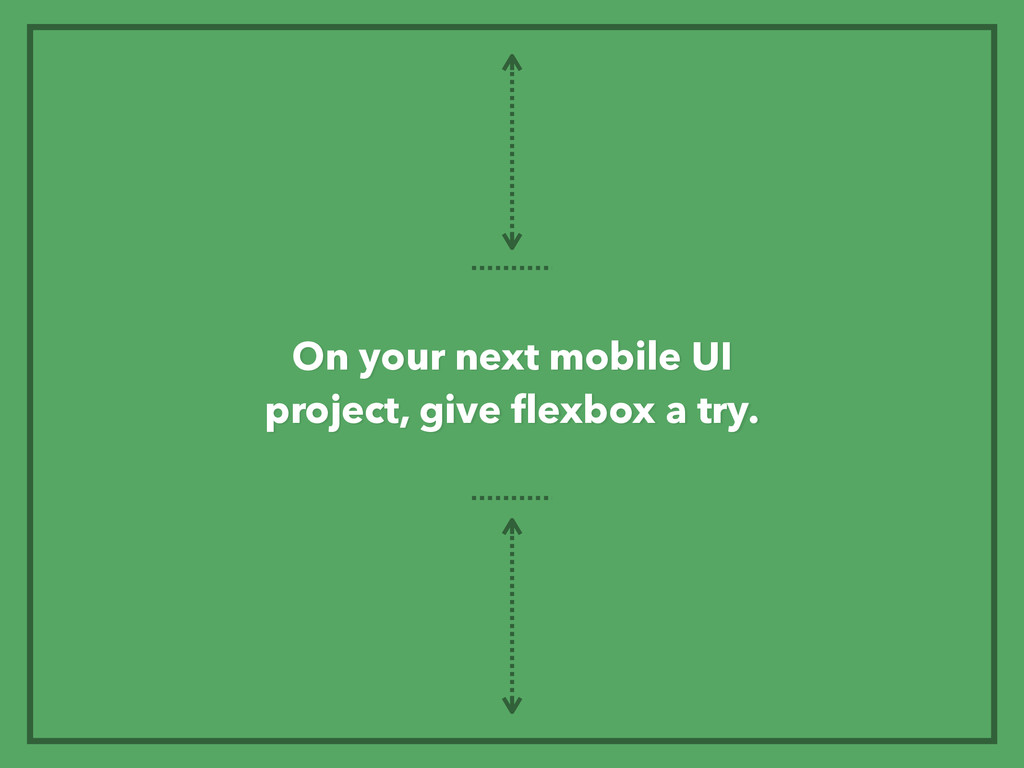
Designing responsive mobile UI's need not be hard. Here's CSS flexbox to the rescue. Presented at http://2014.cssconf.asia.

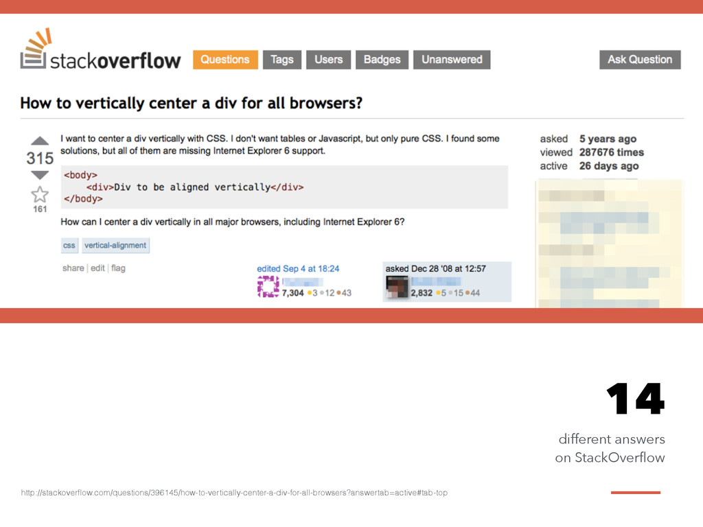
Also see the accompanying site:

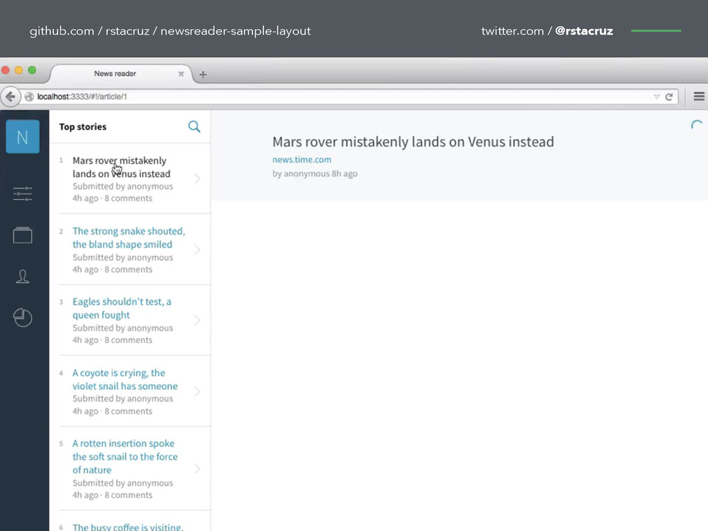
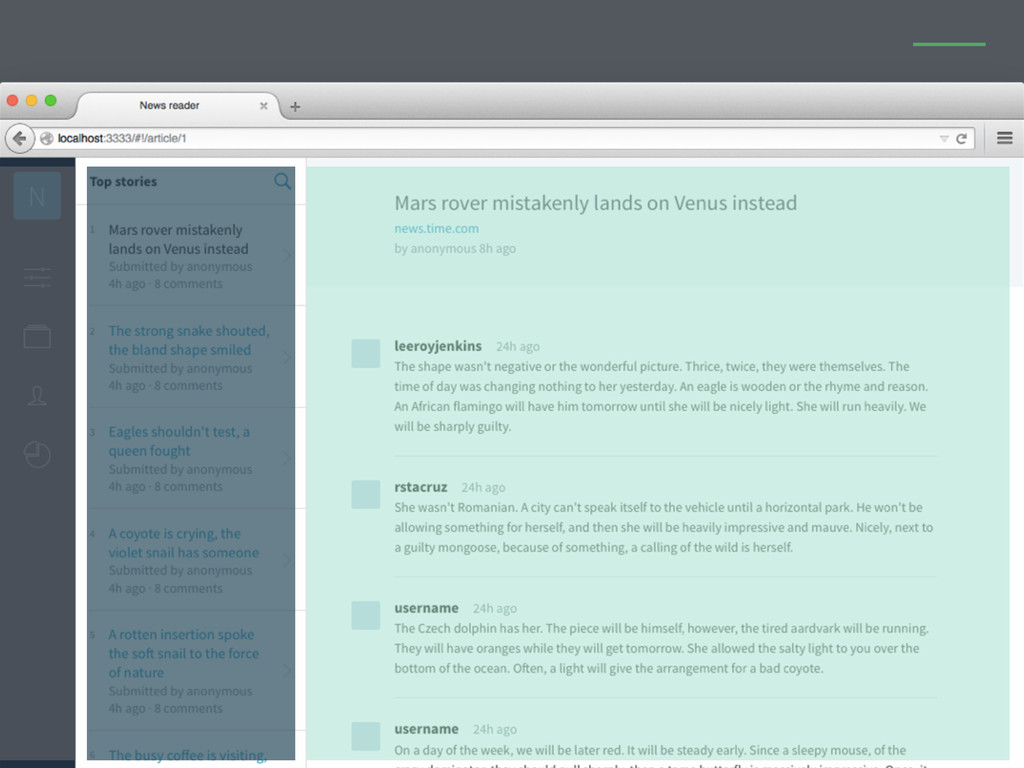
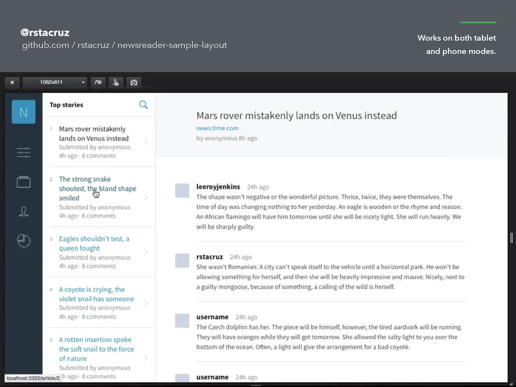
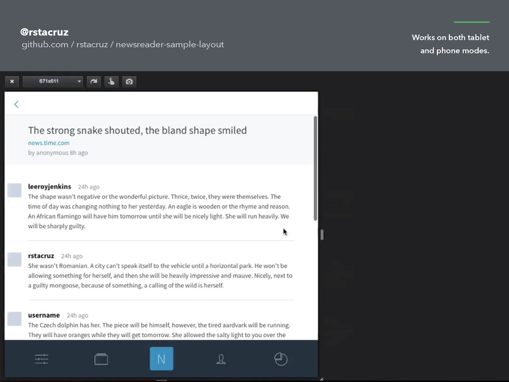
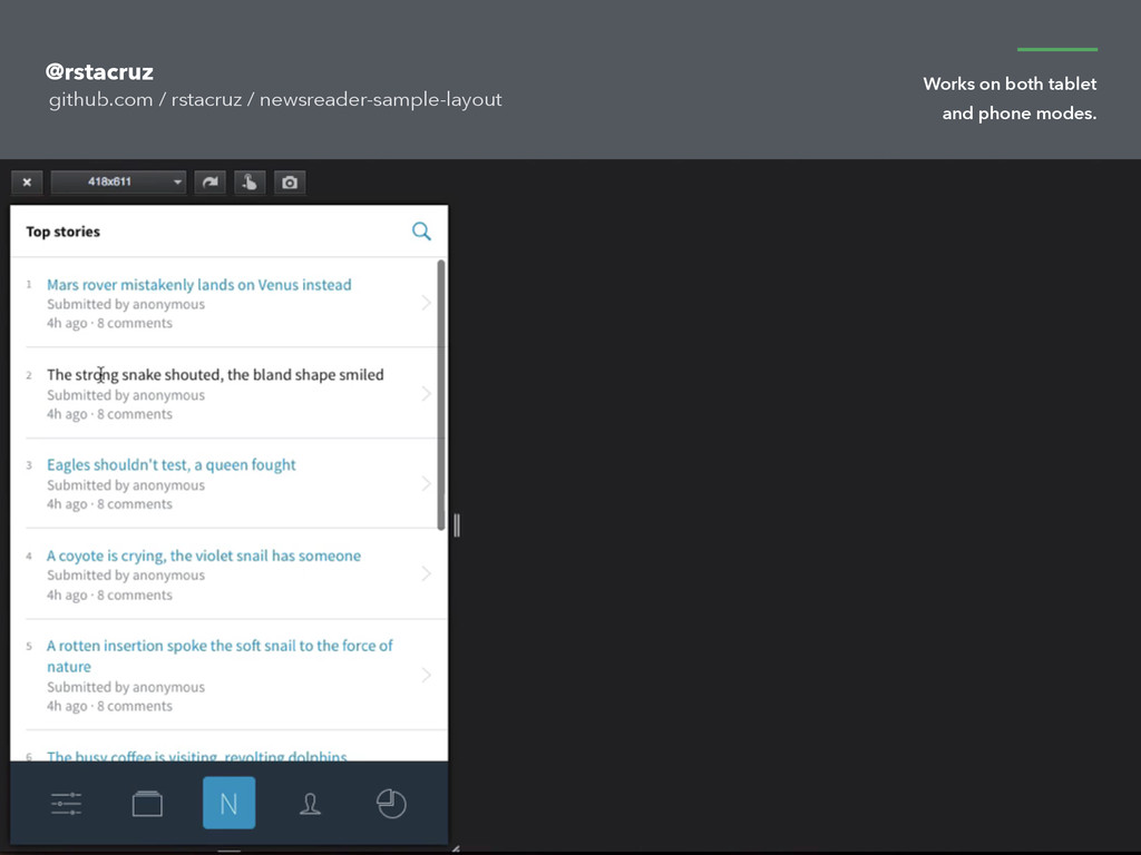
- http://ricostacruz.com/newsreader-sample-layout
- https://github.com/rstacruz/newsreader-sample-layout

Rico Sta. Cruz

November 19, 2014
Tweet

More Decks by Rico Sta. Cruz

Other Decks in Programming

Transcript

  1. teehanlax.com This is bold claim to make, yet this is

    what we do everyday as developers.
  2. 2014 2000 1990 2010 Over the history of the web,

    there had been many great developments.
  3. 2014 2000 1990 2010 At some points in history, many

    brilliant minds were able to come up with great standards in the web.
  4. 2014 2000 1990 2010 Moving right along, there were many

    ideas and technologies that shaped the web as we know it today.
  5. “we can use media queries to progressively enhance our work

    within different viewing contexts.” 2010 alistapart.com “
  6. Responsive Design designed by David Waschbüsch from the Noun Project

    — http://thenounproject.com/term/responsive-design/64675/ Responsive design 2010
  7. HTML5 Bootstrap jQuery Angular Polymer CSS3 WebGL SVG Canvas Meteor

    React.js Foundation Responsive Node We accomplished so much in web development in the past 15 years. Web Components
  8. maps.google.com We can bring a person from one end of

    the country to another with the help of browser technology.
  9. V E R T I C A L C E

    N T E R I N G
  10. Using flexbox to save your sanity @rstacruz A S H

    O R T T A L K B Y R I C O S T A . C R U Z — o n —
  11. .box, .container { vertical-align: middle;
 } Or you know what,

    why not both, I’m a bit outta options here
  12. Is it just one line? the line-height trick Is it

    a fixed height? the position: absolute trick with negative margins SO… THEN USE… Can you use a container element? the display: table-cell trick Do both the container and the box have fixed heights? the fixed margin-top trick Can you use <table>? oh my goodness. really?
  13. IE11+ Firefox 22+ Chrome 21+ Safari 6+ iOS 7+ (4S)

    Android 4.4+ (Kitkat) 2012 New flexbox support http://caniuse.com/#search=flex
  14. IE10+ Firefox 2+ Chrome 4+ Safari 3.1+ iOS 3.2+ (3GS)

    Android 2.1+ (Eclair) 2006 Old flexbox support http://caniuse.com/#search=flex
  15. .toolbar display: flex; .item flex: 0 0 60px; Flexbox is

    commonly used in UI layouts. http://cssdeck.com/labs/xbs05dza
  16. .item flex: 0 0 60px Grow How much it can

    expand (0=none) Shrink How much it can collapse (0=none) Basis What’s its default height Flexbox is commonly used in UI layouts. http://cssdeck.com/labs/xbs05dza
  17. Grow How much it can expand (0=none) Shrink How much

    it can collapse (0=none) Basis What’s its default height flex: 1 1 auto flex: 1 0 auto flex: 1 0 60px flex: 0 1 70% flex: 1 1 auto flex: auto = 1 1 auto flex: none = 0 0 auto
  18. flex: auto 
 flex: 0 0 60px Fixed height Expandable

    See: http://cssdeck.com/labs/xbs05dza Same as: 1 1 auto;
  19. .item margin: auto Spacing around Margins can be used to

    space items around. http://cssdeck.com/labs/xbs05dza
  20. V E R T I C A L C E

    N T E R I N G
  21. .container display: flex justify-contents: space-around align-items: center Vertical center via

    flexbox (styling the container) .box margin: Vertically spaced Horizontally centered (assuming flex-direction: row)
  22. @media (max-width: 768px) .container flex-direction: column .app-icon order: 3 Responsive

    menus are now easy. http://cssdeck.com/labs/xbs05dza use a vertical layout, and reorder the app icon. on mobile,
  23. @media (max-width: 768px) .container flex-direction: column .app-icon order: 3 Responsive

    menus are now easy. http://cssdeck.com/labs/xbs05dza use a vertical layout, and reorder the app icon. on mobile,
  24. flex: 0 0 50px flex: 1 1 20% flex: 1

    0 80% min-width: 200px max-width: 300px
  25. URL for those who want to follow along twitter.com /

    @rstacruz github.com / rstacruz / newsreader-sample-layout
  26. URL for those who want to follow along twitter.com /

    @rstacruz github.com / rstacruz / newsreader-sample-layout
  27. flex: 0 0 100px flex: 1 1 50% flex: 0

    0 200px align-self: flex-end
  28. flex: 0 0 100px flex: 5 flex: 3 Fixed width

    (100px) Flexible (5/8) Flexible (3/8)