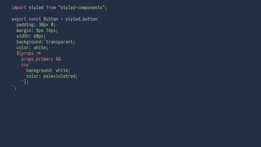
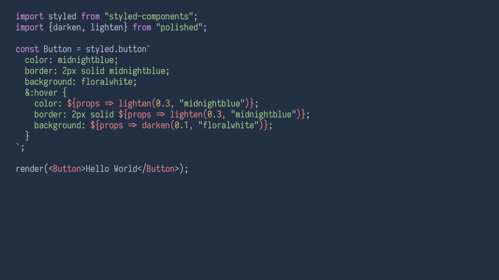
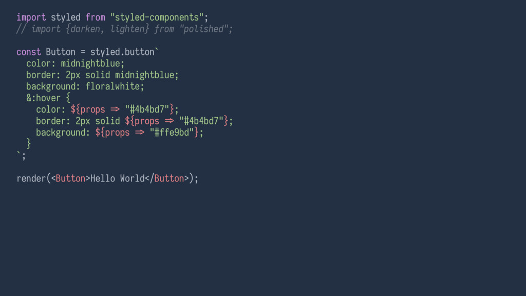
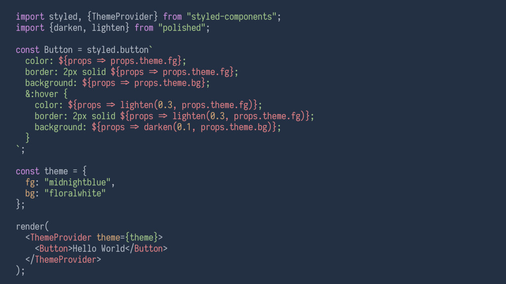
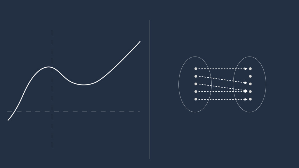
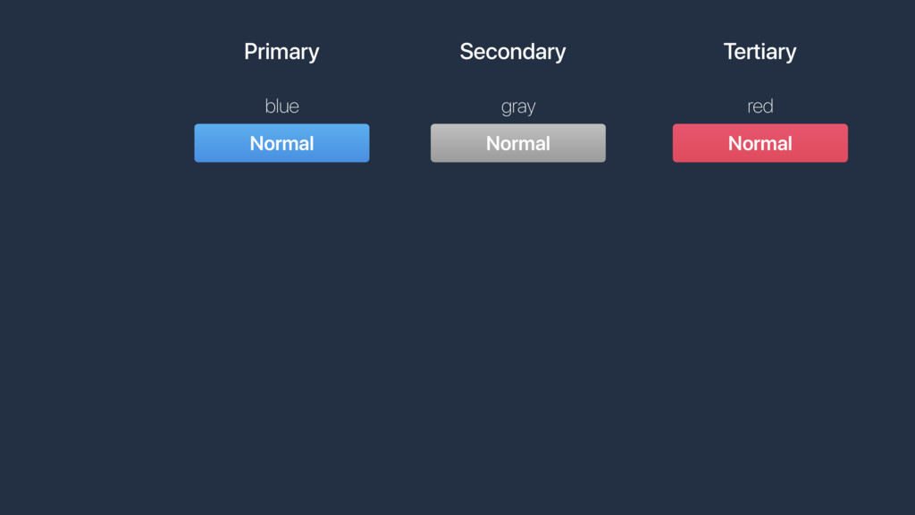
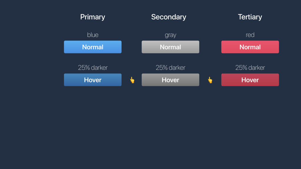
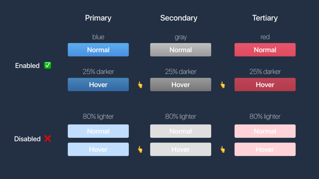
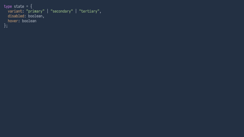
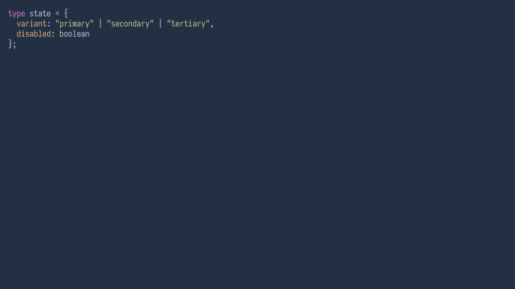
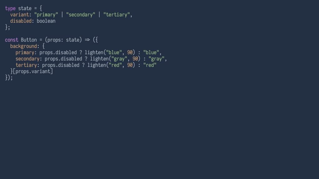
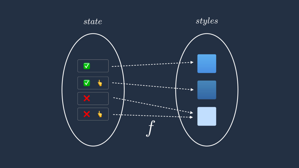
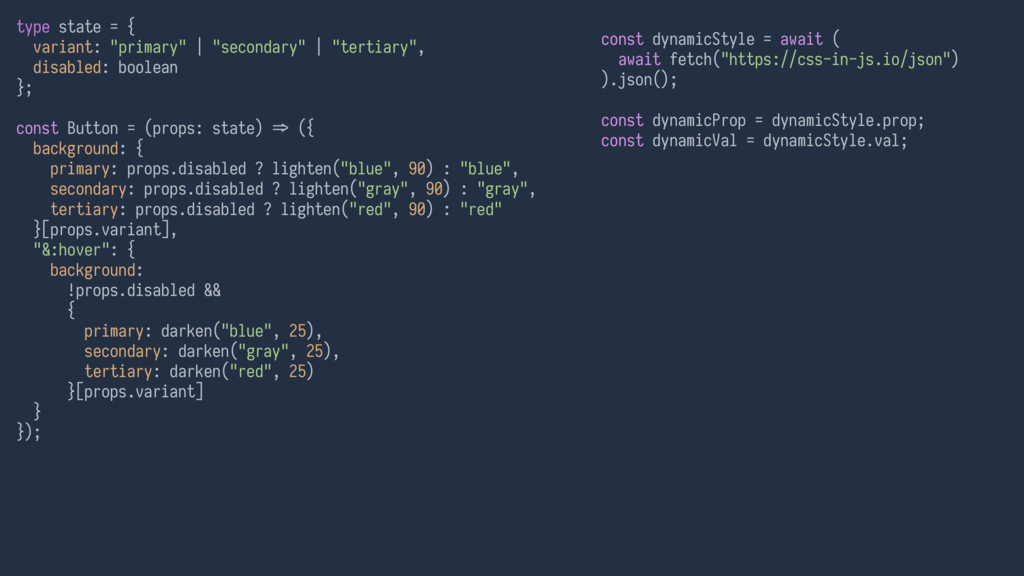
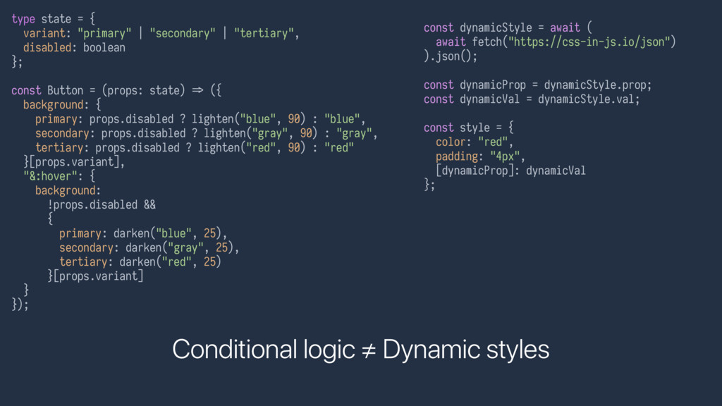
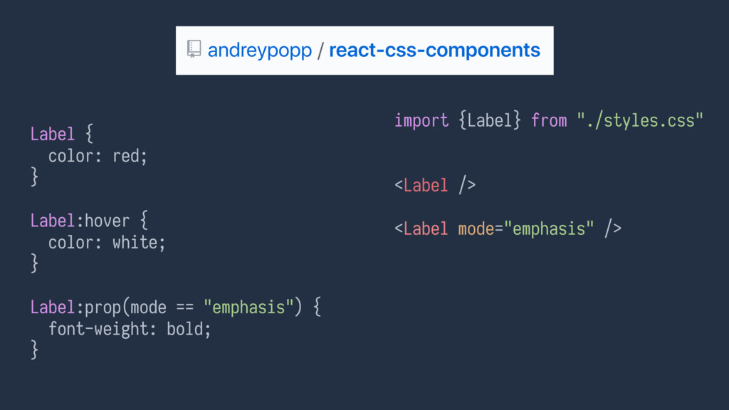
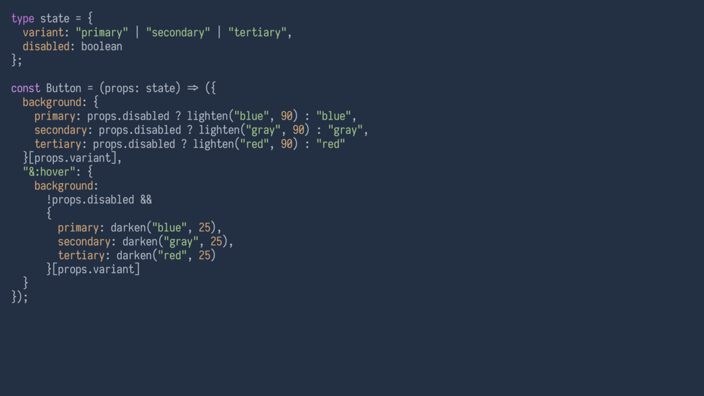
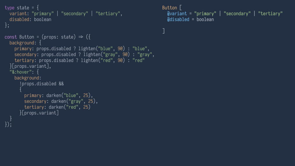
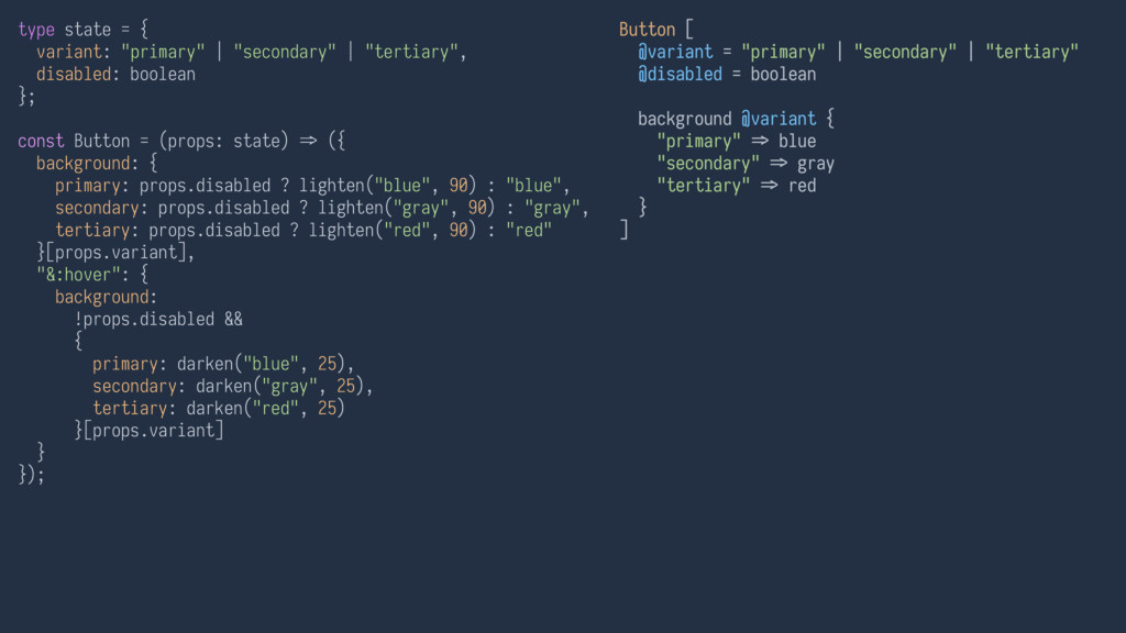
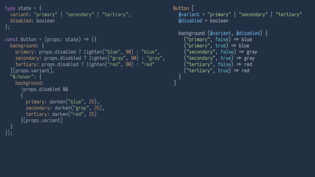
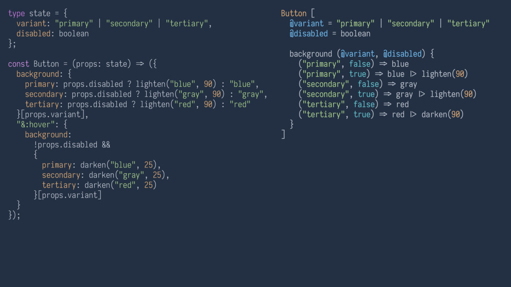
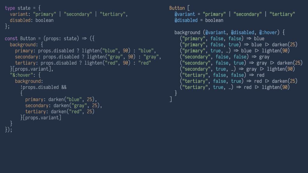
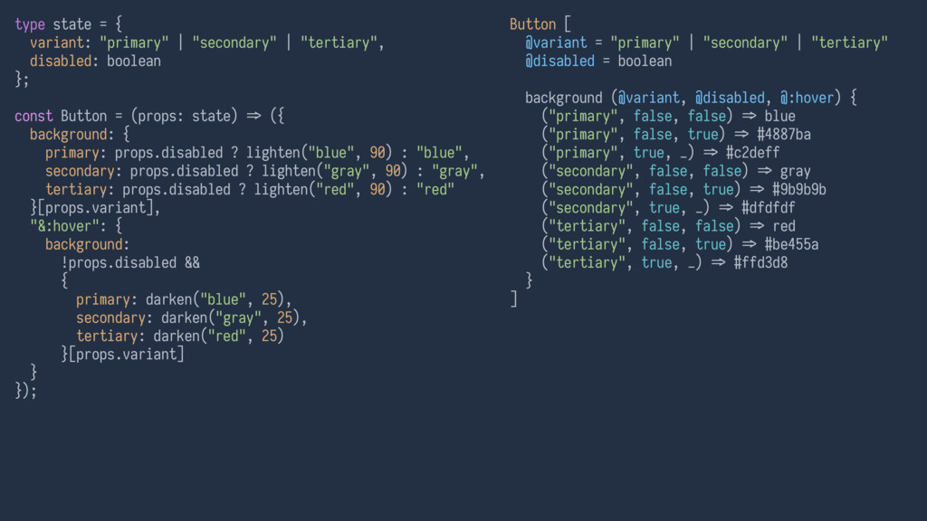
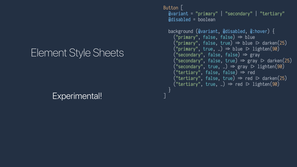
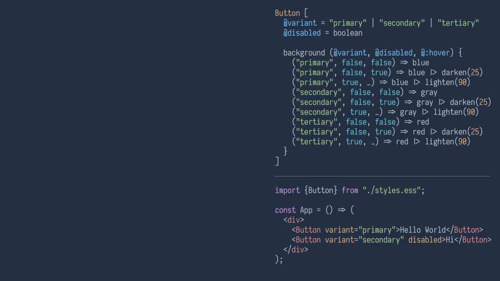
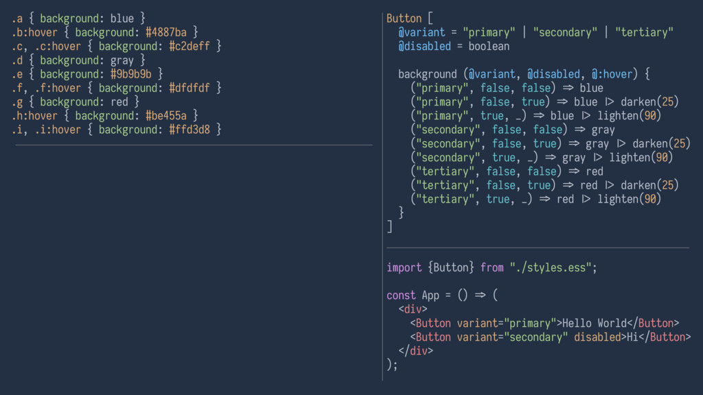
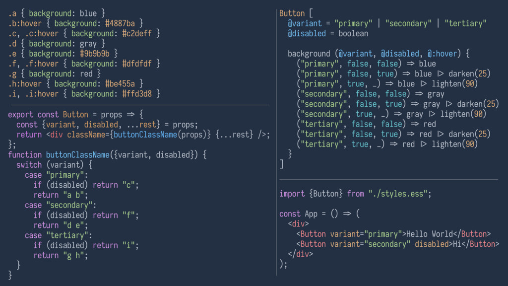
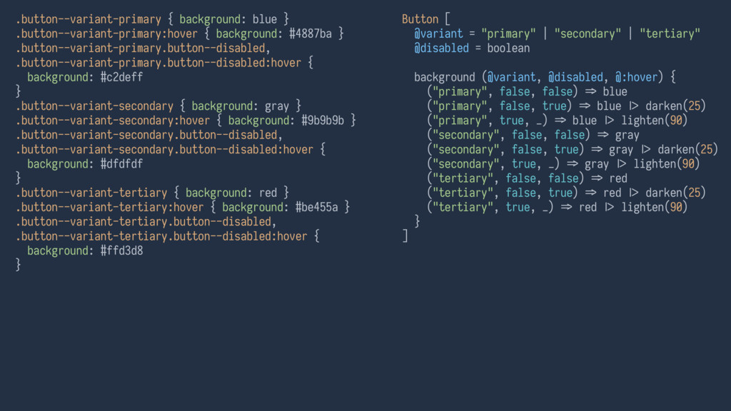
= boolean background (@variant, @disabled, @:hover) { ("primary", false, false) B> blue ("primary", false, true) B> blue DE darken(25) ("primary", true, _) B> blue DE lighten(90) ("secondary", false, false) B> gray ("secondary", false, true) B> gray DE darken(25) ("secondary", true, _) B> gray DE lighten(90) ("tertiary", false, false) B> red ("tertiary", false, true) B> red DE darken(25) ("tertiary", true, _) B> red DE lighten(90) } ] type state = { variant: "primary" | "secondary" | "tertiary", disabled: boolean }; const Button = (props: state) B> ({ background: { primary: props.disabled ? lighten("blue", 90) : "blue", secondary: props.disabled ? lighten("gray", 90) : "gray", tertiary: props.disabled ? lighten("red", 90) : "red" }[props.variant], "&:hover": { background: !props.disabled && { primary: darken("blue", 25), secondary: darken("gray", 25), tertiary: darken("red", 25) }[props.variant] } });
 nrslib
 matsuo_atsushi
 ya_ma23
 77web
77web
 toham
toham
 ragingwind
 kibitan
 franz1981
 kentaroutakeda
 ojun9
ojun9
 morim
morim
 seike460
 kristinabergwall1
 yeseniaperezcruz
 mfonobong
 reverentgeek
 akosma
 codingconduct
 marktimemedia
 ammeep
 aleyda
 portentint
 retrage
 mza
mza
![Button [ ] type state = { variant: "primary" |](https://files.speakerdeck.com/presentations/2ce88e6cd96940669a7346ecabb17310/slide_59.jpg)