Upgrade to Pro — share decks privately, control downloads, hide ads and more …

Job Posting Teardown: Instructure

Ruutly
February 13, 2017

Job Posting Teardown: Instructure

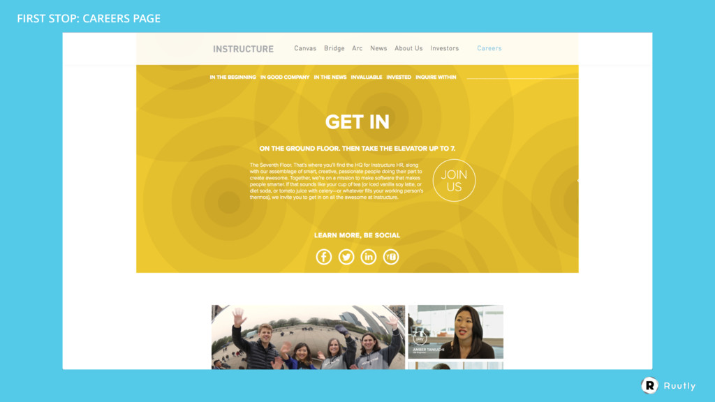
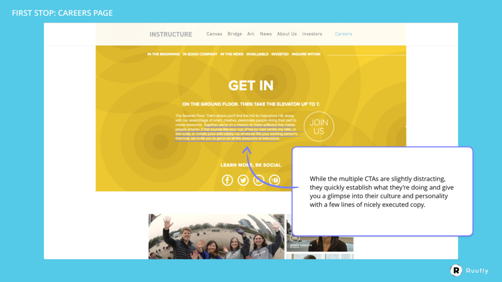
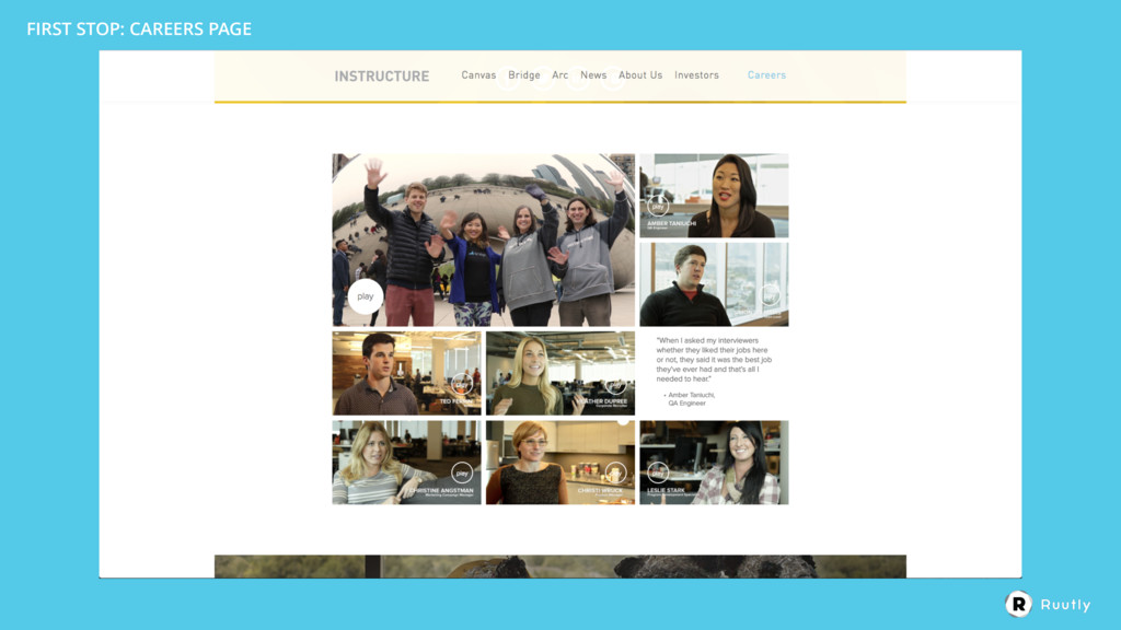
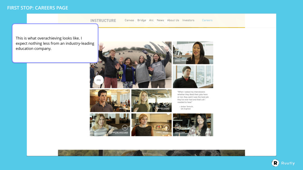
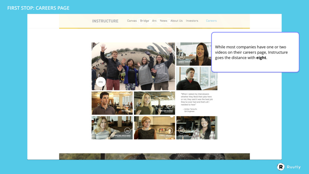
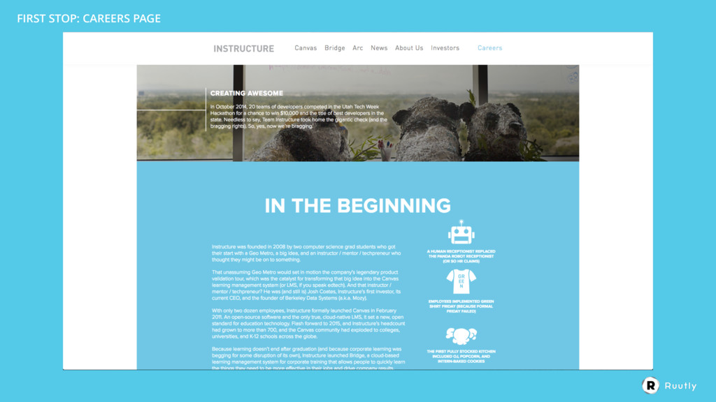
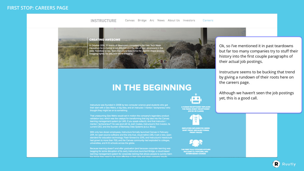
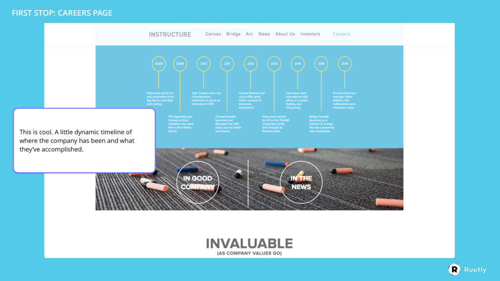
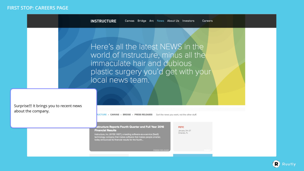
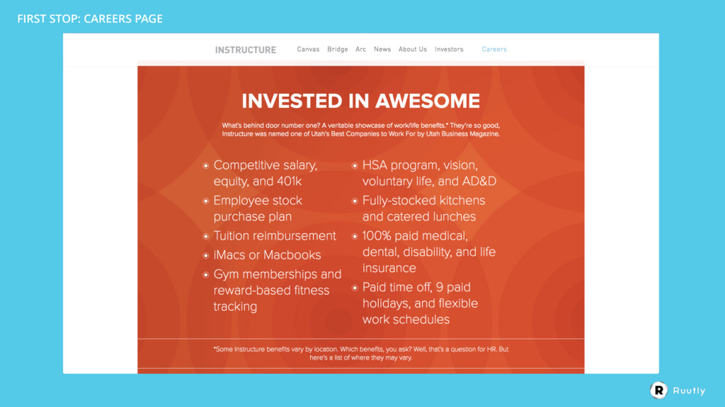
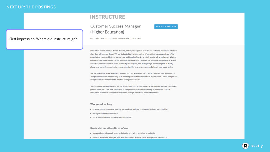
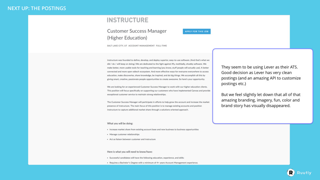
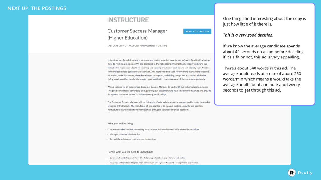
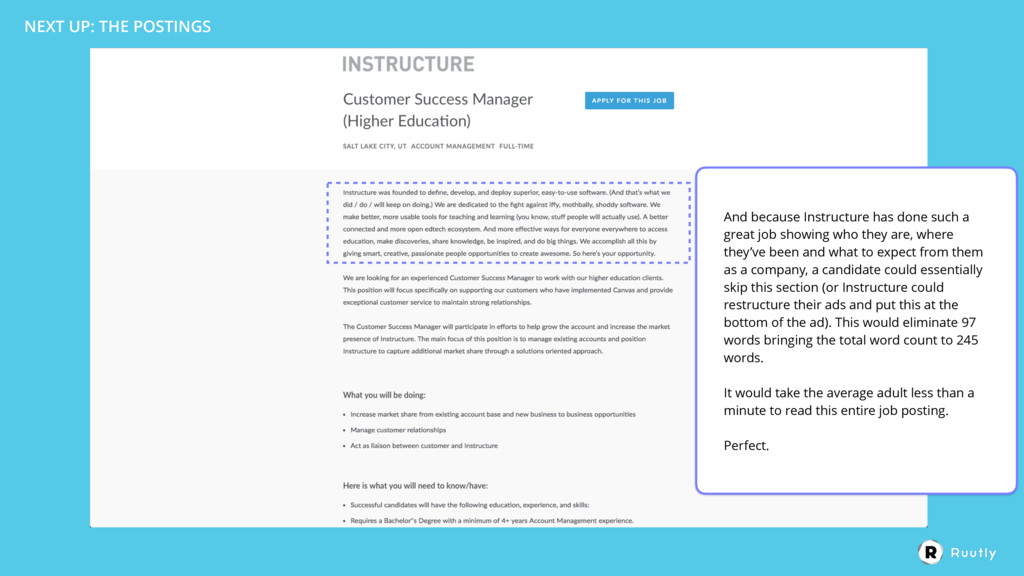
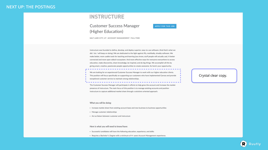
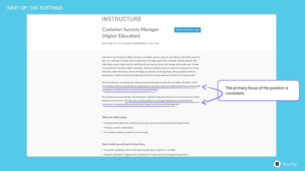
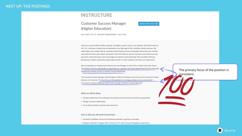
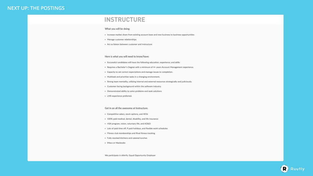
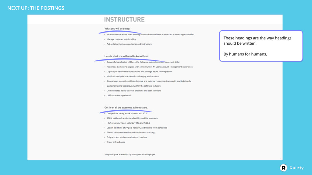
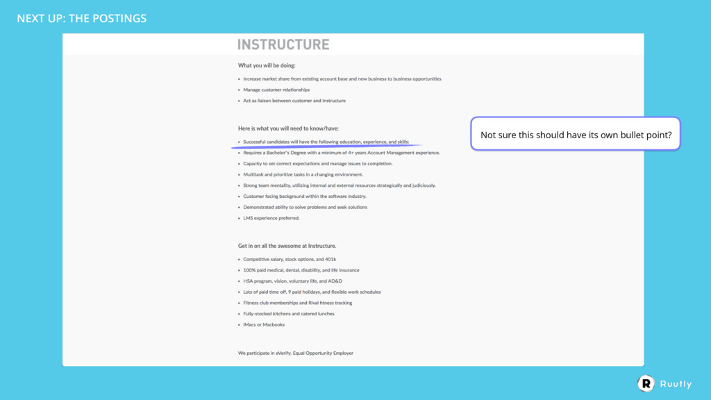
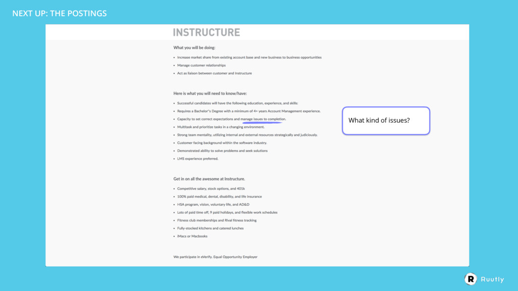
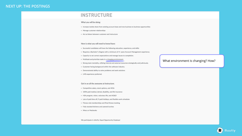
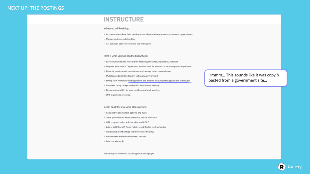
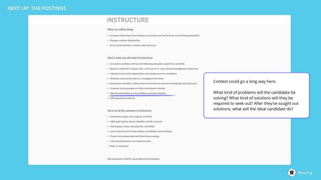
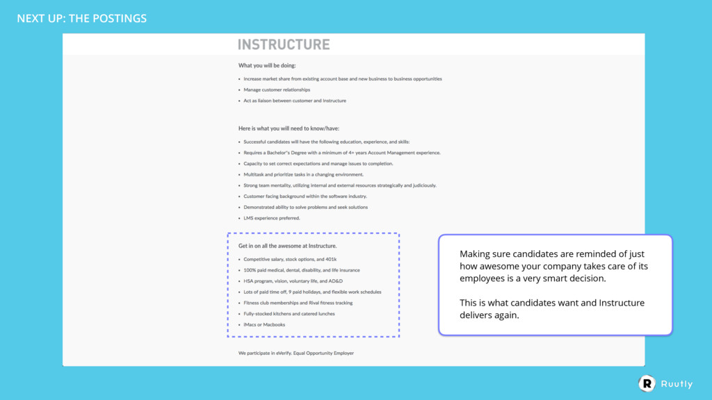
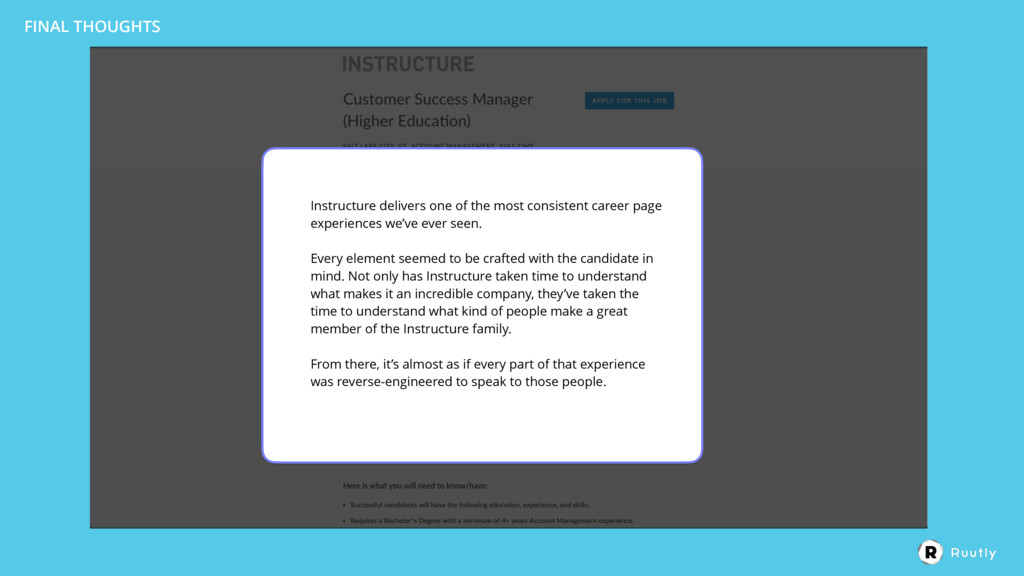
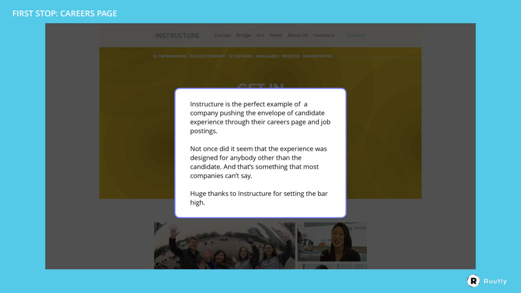
This week we take a look at Instructure's job postings. Spoiler alert: they are doing things really, really well.

It's no coincidence that an ed-tech company is schooling the rest of the world on creating a world-class candidate experience.

Interested in elevating the candidate experience in your job postings? Head to www.ruutly.com for more.

Ruutly

February 13, 2017
Tweet

More Decks by Ruutly

Other Decks in Business

Transcript

  1. FIRST STOP: CAREERS PAGE First impressions? I like the fact

    that they place the emphasis on copy. Instead of defaulting to a hero image of smiling employees.
  2. FIRST STOP: CAREERS PAGE There’s no weird industry-speak, acronyms or

    unknown terms. It’s all super straightforward.
  3. FIRST STOP: CAREERS PAGE While the multiple CTAs are slightly

    distracting, they quickly establish what they’re doing and give you a glimpse into their culture and personality with a few lines of nicely executed copy.
  4. FIRST STOP: CAREERS PAGE This is what overachieving looks like.

    I expect nothing less from an industry-leading education company.
  5. FIRST STOP: CAREERS PAGE While most companies have one or

    two videos on their careers page, Instructure goes the distance with eight.
  6. FIRST STOP: CAREERS PAGE Fantastic video. Not only does it

    show the personality of one of the members of the team, it also gives a glimpse into the culture of the company, the people who work there and what you could expect if you joined the team.
  7. FIRST STOP: CAREERS PAGE Confession: I actually got lost watching

    a few of these. Every one of them had their own flavor and showed a different dimension of the company. 
 
 Really, really well done.
  8. FIRST STOP: CAREERS PAGE Ok, so I’ve mentioned it in

    past teardowns but far too many companies try to stuff their history into the first couple paragraphs of their actual job postings. 
 
 Instructure seems to be bucking that trend by giving a rundown of their roots here on the careers page. 
 Although we haven’t seen the job postings yet, this is a good call.
  9. FIRST STOP: CAREERS PAGE They seem to be really great

    at balancing the facts and the “boring stuff”…
  10. FIRST STOP: CAREERS PAGE This is cool. A little dynamic

    timeline of where the company has been and what they’ve accomplished.
  11. FIRST STOP: CAREERS PAGE Let’s take a look at these

    two sections. Up first, “In The News”.
  12. FIRST STOP: CAREERS PAGE And they’ve done it again! 


    Dear Instructure: please teach a class to other companies on how to find this balance that you’ve mastered!
  13. FIRST STOP: CAREERS PAGE HA! Team photos. And in what

    seems to be true Instructure fashion, they lead with personality.
  14. FIRST STOP: CAREERS PAGE While all of the funny copy

    and entertaining team photos, it may come off as goofy to some (a Mickey Mouse pun?)… I’m guessing it’s much more intentional than that. Instructure wants people with personality, people who can have fun and not take themselves too seriously. 
 
 And by including that personality in each step/section of the Career page, it acts like a birdcall, summoning the other fun, slightly weird, people who are drawn to people, companies and products that speak their language, to spread their wings and fly in Instructure’s direction. 
 
 Well played.
  15. FIRST STOP: CAREERS PAGE I’m getting kind of picky here

    but I would love to see some of the other team members. 
 
 They only show nine people here. Why not show some love to the cookie- baking interns? (and other people who make the Instructure world go ‘round)?
  16. FIRST STOP: CAREERS PAGE Another video! You other companies need

    to step your culture video game up. Instructure has achieved superstars status.
  17. FIRST STOP: CAREERS PAGE Let’s keep scrolling and see what

    else Instructure has in store for us.
  18. FIRST STOP: CAREERS PAGE What really stands out about these

    (and the rest of Instructure’s copy) is that they come off so incredibly genuine. It’s clearly been written by real human beings and wasn’t simply copy and pasted from HR docs that have been sitting around in a filing cabinet for the past decade. 
 
 They are deliberate and want candidates to know (and also want to show), exactly who they are.
  19. FIRST STOP: CAREERS PAGE While clear copy, puns and entertaining

    videos are good, it’s important not to lose sight as to why candidates are here. 
 
 They want to know, aside from freshly-baked cookies and fully stocked fridges, what your company offers. 
 
 Far too many companies don’t reveal this info until the interview or on-boarding. And by doing so, risk missing out on talent. 
 
 It’s so critical to show candidates what they want, when they want it and establish that level of transparency from the first interaction with your brand.
  20. FIRST STOP: CAREERS PAGE …and one more brings us to

    the reason we’re here, the job postings.
  21. NEXT UP: THE POSTINGS Ooooh…. this is pretty.
 
 Not

    sure if the gradient serves a functional purpose but it looks good.
  22. NEXT UP: THE POSTINGS Strictly personal preference but I like

    this much more than dropdown menus or worse, auto-complete text fields.
 
 But this also has its limitations and would become very hectic once you add more cities or departments.
  23. They seem to be using Lever as their ATS. Good

    decision as Lever has very clean postings (and an amazing API to customize postings etc.) But we feel slightly let down that all of that amazing branding, imagery, fun, color and brand story has visually disappeared. NEXT UP: THE POSTINGS
  24. Let’s take a look at the copy. Something tells me

    we won’t be let down. NEXT UP: THE POSTINGS
  25. One thing I find interesting about the copy is just

    how little of it there is. 
 
 This is a very good decision. 
 
 If we know the average candidate spends about 49 seconds on an ad before deciding if it’s a fit or not, this ad is very appealing. 
 
 There’s about 340 words in this ad. The average adult reads at a rate of about 250 words/min which means it would take the average adult about a minute and twenty seconds to get through this ad. NEXT UP: THE POSTINGS
  26. And because Instructure has done such a great job showing

    who they are, where they’ve been and what to expect from them as a company, a candidate could essentially skip this section (or Instructure could restructure their ads and put this at the bottom of the ad). This would eliminate 97 words bringing the total word count to 245 words. 
 
 It would take the average adult less than a minute to read this entire job posting. 
 
 Perfect. NEXT UP: THE POSTINGS
  27. NEXT UP: THE POSTINGS These headings are the way headings

    should be written. 
 
 By humans for humans.
  28. NEXT UP: THE POSTINGS This is the first time Instructure

    has left more to be desired with copy.
 
 All of these skills/requirements are pretty vague. There’s no real context.
  29. NEXT UP: THE POSTINGS Hmmm… This sounds like it was

    copy & pasted from a government site…
  30. NEXT UP: THE POSTINGS Context could go a long way

    here. 
 
 What kind of problems will the candidate be solving? What kind of solutions will they be required to seek out? After they’ve sought out solutions, what will the ideal candidate do?
  31. NEXT UP: THE POSTINGS Context could go a long way

    here. 
 
 What kind of problems will the candidate be solving? What kind of solutions will they be required to seek out? After they’ve sought out solutions, what will the ideal candidate do?
  32. NEXT UP: THE POSTINGS Making sure candidates are reminded of

    just how awesome your company takes care of its employees is a very smart decision. 
 
 This is what candidates want and Instructure delivers again.
  33. NEXT UP: THE POSTINGS We’re very familiar with Lever so

    we know that clicking “Apply” will actually bring us to an application but in case you don’t believe me, let’s click.
  34. Instructure delivers one of the most consistent career page experiences

    we’ve ever seen. 
 
 Every element seemed to be crafted with the candidate in mind. Not only has Instructure taken time to understand what makes it an incredible company, they’ve taken the time to understand what kind of people make a great member of the Instructure family. 
 
 From there, it’s almost as if every part of that experience was reverse-engineered to speak to those people. FINAL THOUGHTS
  35. FINAL THOUGHTS The actual job postings were not bad at

    all. 
 
 With the exception of some ambiguous skills/requirements creeping into the ad, the copy was clear and consistent with the expectations established through the careers page.
  36. FINAL THOUGHTS The design of the job postings is very

    clear but they seemed to be missing some of that energy and life that was given on the careers page. 
 
 We rarely use these teardowns to talk about our own product but…
  37. WHAT IF…? What if Instructure included a fully interactive candidate

    experience in their ads? What if a candidate could continue the experience that was started on the careers page? 
 
 What if that experience could include video, images and interaction?
  38. WHAT IF…? It’s pretty self-serving for us to pose those

    questions but we believe that job ads can be so much more for the companies that clearly care about candidate experience… and in many cases, companies simply aren’t aware of the possibilities.
  39. FIRST STOP: CAREERS PAGE Instructure is the perfect example of

    a company pushing the envelope of candidate experience through their careers page and job postings. 
 
 Not once did it seem that the experience was designed for anybody other than the candidate. And that’s something that most companies can’t say. 
 
 Huge thanks to Instructure for setting the bar high.