Upgrade to Pro — share decks privately, control downloads, hide ads and more …

SWEcune_IDB_Presentation

 SWEcune_IDB_Presentation

Andrew Chun

April 21, 2016
Tweet

Other Decks in Education

Transcript

  1. About SWEcune • SWEcune is a Pokemon database • Tools

    used: Bootstrap, Flask, Carina, SQLAlchemy, Docker, etc • Stats: • # Commits: 302 • # Issues: 50 • # Unit Test: 10
  2. Big Dankers • Andrew • Issues Made: 0 • Issues

    Resolved: 8 • Issues Unresolved: 0 • Unit Tests: 2 • Dank Master • Issues Made: 20 • Issues Resolved: 11 • Issues Unresolved: 0 • Unit Tests: 2 • Vohl • Issues Made: 9 • Issues Resolved: 9 • Issues Unresolved: 0 • Unit Tests: 2 • Robert • Issues Made: 15 • Issues Resolved: 15 • Issues Unresolved: 0 • Unit Tests: 2 • Shubham • Issues Made: 6 • Issues Resolved: 7 • Issues Unresolved: 0 • Unit Tests: 2
  3. API • Root API - www.swecune.com/api • Main Endpoints •

    Pokemon • Single - /pokemon/<pokemon_id> • All - /pokemon • Move • Single - /move/<move_id> • All - /move • Type • Single - /type/<type_id> • All - /type • Thin Endpoints • Pokemon • Single - /min_pokemon/<pokemon_id> • All - /min_pokemon • Move • Single - /min_move/<move_id> • All - /min_move • Type • All - /min_type
  4. SWEcune Critique • What did we do well? • To

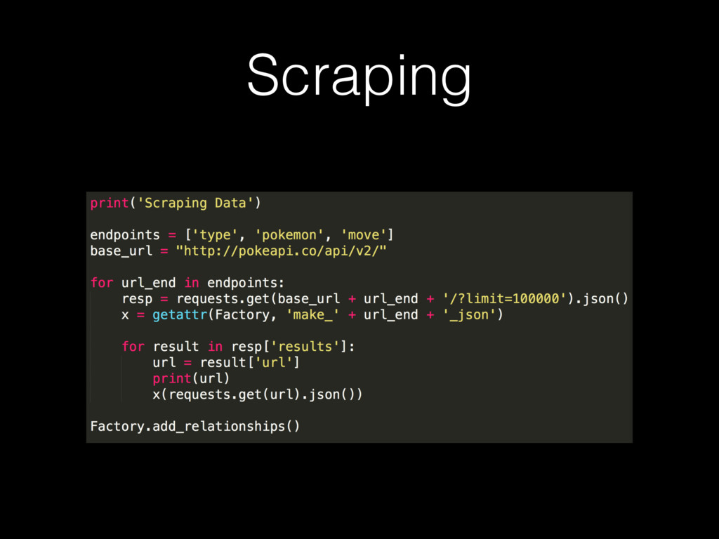
    start out with our project, we created a search that is fully functional and allows us to switch between an "or" result of multiple queries and a "and" result. The search matches for a pattern where one of the queries (queries being separated by space) appears somewhere in the objects name as long as that query is longer then 2. The query has to be a substring of the result. We also implemented sortable tables across the full set of our objects while maintaining a paginated set on screen. We designed our website to be flat and simple for the user experience with a search bar always present in the top right corner on the NavBar. • What did we learn? • We learned an assortment of different tools that we used through this project. We learned flask and Jinja to create a templated html file that could be rendered, react and bootstrap to make pretty front end designed tables for our models, MySql and Flask Alchemy to set up our database, and a bunch of tools outside our main code like, Slack, Apiary, yUML, and maintaining a git wiki. In addition to these tools we also ended up learning a set of tools used to deploy our web application called Carina and Docker. Carina was tool that creates a cluster of containers that we run our application in and host from after we push it up on Docker Hub. In addition to all these tools we used we also al learned a great deal of html and css and how to implement concepts like pagination, searching, and sorting based off of table attributes. And possibly the most important thing, at least pertaining to our project, that we learned was the poke api that we got all our data from.
  5. SWEcune Critique Cont. • What can we do better? •

    We didn't really focus on the design for the mobile version of the website, or take in that aspect at all really. Some things deal weird on the mobile version, with tables not fitting to screen, NavBar dropping to low to show the tabs to navigate to the models, and having two many pages to travers to shown at the bottom to the point it looks cluttered. Everything works on mobile, but it's just not aesthetically appealing. We could also improve our search such that it performs a fuzzy like search so it shows up with results that may relate to the query. Furthermore we could make the pattern matching better, such that if we select "and" we'll more often have something show up instead of it being tough to find an object that matches both the queries. With regards to sorting our tables we could of allowed the user to reset the order back to the original id order without refreshing the page. Furthermore, with each individual instance that we created for every model we could of used more information and data from the poke api to fully fill in and flesh out our website with as much as possible. • What puzzles us? • Docker puzzles us, we feel like we have a knowledge of how to use it, but for the most part don't actually know how it woks or how to write up the yml files. It may as well be black magic.
  6. GGMate Critique • What did they do well? • The

    website has a well presented splash screen that places clickable tabs in the top right corner in order to switch between their three different pillars. Furthermore, the search bar is presented up front on the splash screen to show the user the ideal method of navigating to a particular game, company, or developer they have in mind. Each of the pages for their pillars allows sorting in descending and ascending order. Their about page presents links to all their resources that they used, and the GitHub repo for the project, as well as their wiki on the development of the site in case you wouldn't to collaborate or contribute. These links are also presented in a separate color so the user knows that they are clickable. • What did we learn from their website? • In our about page we didn't use any form of indication for the text that were clickable links for the user to distinguish from regular black text. Our sorting has no distinction that you can click the attribute type in order to sort the tables, and doesn't provide the user feedback with regards to what order it is being sorted (like ascending and descending arrows).
  7. GGMate Critique Cont. • What can they do better? •

    So after playing around with their website for a little bit I pinpointed areas that could have been approved on. With regard to their pagination, they are only sorting based off of the objects in that page instead of all the objects in that pillar. This seems like a lesser sort because when the user wants a game that is near the end of the alphabet and try to sort to see it we don't obtain new data, we only get the same entries we had but sorted. Furthermore their sort is all string based, so if I sort developer tables based off of the number of games that they made (least to most), someone with 134 games comes before someone with 2. • What puzzles us about their website? • There are two navigations too the home screen in the top left and top right. This doesn't harm the design but is strange in the sense of why they chose to implement it as such. Furthermore, their search bar is only shown on the home page. We feel like this creates a hassle for the user to navigate back to the home page if they want to search a particular name.