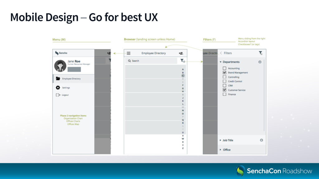
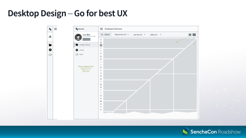
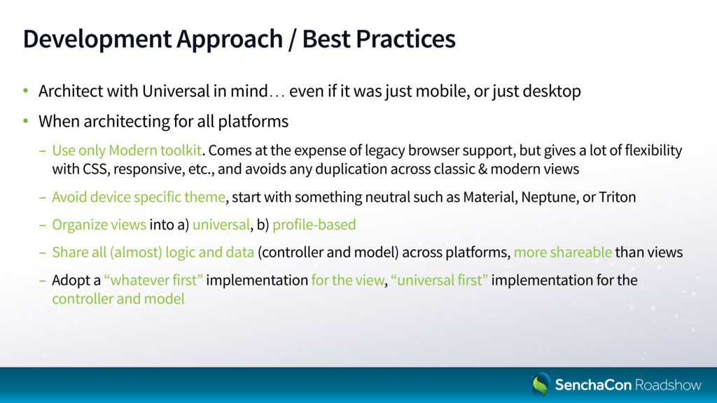
mind… even if it was just mobile, or just desktop • When architecting for all platforms - Use only Modern toolkit. Comes at the expense of legacy browser support, but gives a lot of flexibility with CSS, responsive, etc., and avoids any duplication across classic & modern views - Avoid device specific theme, start with something neutral such as Material, Neptune, or Triton - Organize views into a) universal, b) profile-based - Share all (almost) logic and data (controller and model) across platforms, more shareable than views - Adopt a “whatever first” implementation for the view, “universal first” implementation for the controller and model
 sencha
 yagikota
 kanyamaguc
 tsho
tsho
 lambda
 nazonohito51
 techniczna
 kurochan
 asumikam
 1210yuichi0
 kkato1
 karad
karad
 littlehands
 ryanjones
 addyosmani
 ipullrank
 ivargrimstad
 palkan
 jonoalderson
 honnibal
 eileencodes
 honzajavorek
 katarinadahlin
 tammyeverts
 garrettdimon