Upgrade to Pro — share decks privately, control downloads, hide ads and more …

Material Design for Android

Material Design for Android

Belajar menggunakan material design support library

Sidiq Permana

December 05, 2015
Tweet

More Decks by Sidiq Permana

Other Decks in Programming

Transcript

  1. Material Design for Android Ditulis berdasarkan sisi seorang pengembang (Developer)

    Sidiq Permana [email protected] Google Developer Expert for Android and Intel Android Software Innovator
  2. Definisi • Sebuah panduan komprehensif rancangan antara muka (User Interface)

    dan pengalaman pengguna (User Experience) dari Google yang konsisten di beragam platform dan device. • Merupakan sebuah identitas design UI dan UX untuk Android dan produk Google lainnya • Dikembangkan berdasarkan dua materi dasar : kertas dan tinta • Diperuntukan untuk Android 5.0 (Api Level 21 keatas) namun sudah support untuk backward compability ke pre Android 5.0 • Mengembangkan Material Design di Android Studio sangat disarankan • Dependency Gradle : com.android.support:design:23.0.1
  3. Bacaan dan Tontonan Lanjut • https://developer.android.com/design/material/index.html • http://www.google.com/design/spec/material- design/introduction.html#introduction-principles •

    https://www.youtube.com/watch?v=x5-ntYM_2UY • https://www.youtube.com/watch?v=p4gmvHyuZzw • https://www.youtube.com/watch?v=YaG_ljfzeUw
  4. Element tampilan pendukung Material Design • Tema aplikasi yang baru

    (Migrasi dari Holo Based ke Material) • Widget-widget baru untuk Complex Views seperti RecycledView, CardView, CoordinatorLayout, CollapsingToolbarLayout dsb • Beberapa api baru untuk efek bayangan (elevation) dan animasi seperti : • Activity Transition • View Animation
  5. Use Material Theme <resources> <!-- inherit from the material theme

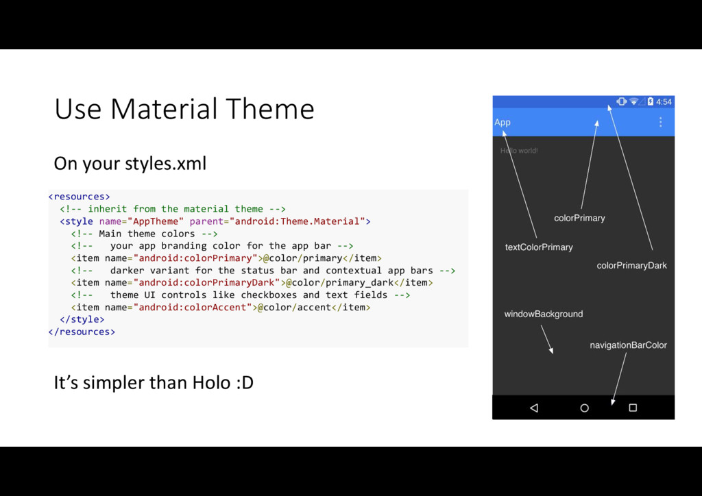
    --> <style name="AppTheme" parent="android:Theme.Material"> <!-- Main theme colors --> <!-- your app branding color for the app bar --> <item name="android:colorPrimary">@color/primary</item> <!-- darker variant for the status bar and contextual app bars --> <item name="android:colorPrimaryDark">@color/primary_dark</item> <!-- theme UI controls like checkboxes and text fields --> <item name="android:colorAccent">@color/accent</item> </style> </resources> It’s simpler than Holo :D On your styles.xml
  6. RecyclerView • Versi baru dari ListView yang diperuntukan untuk menampilkan

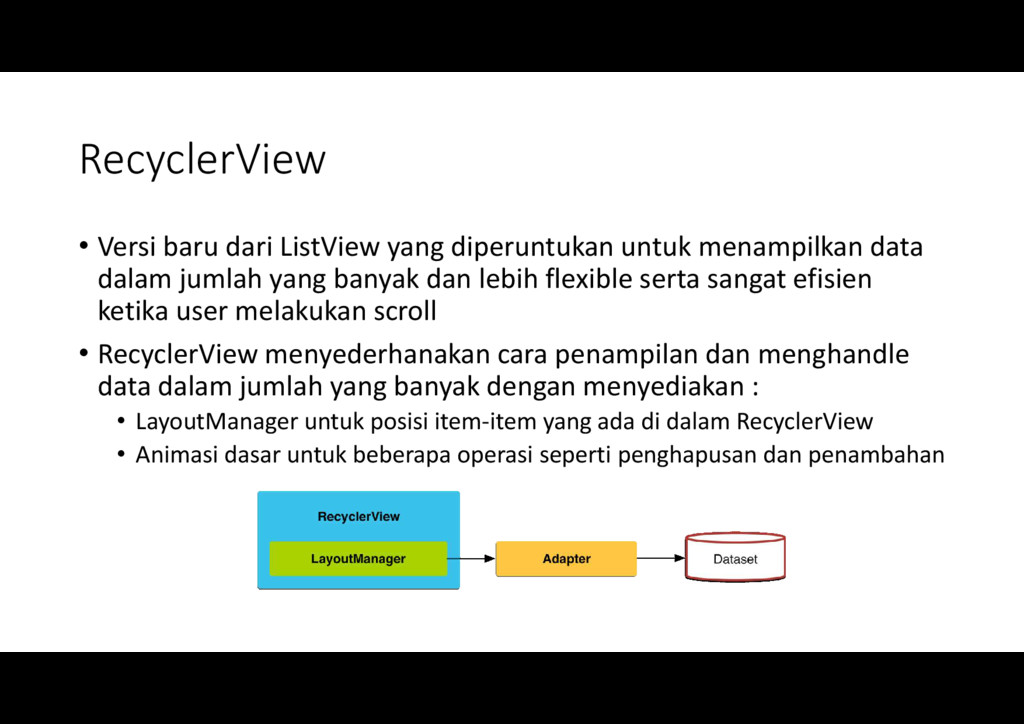
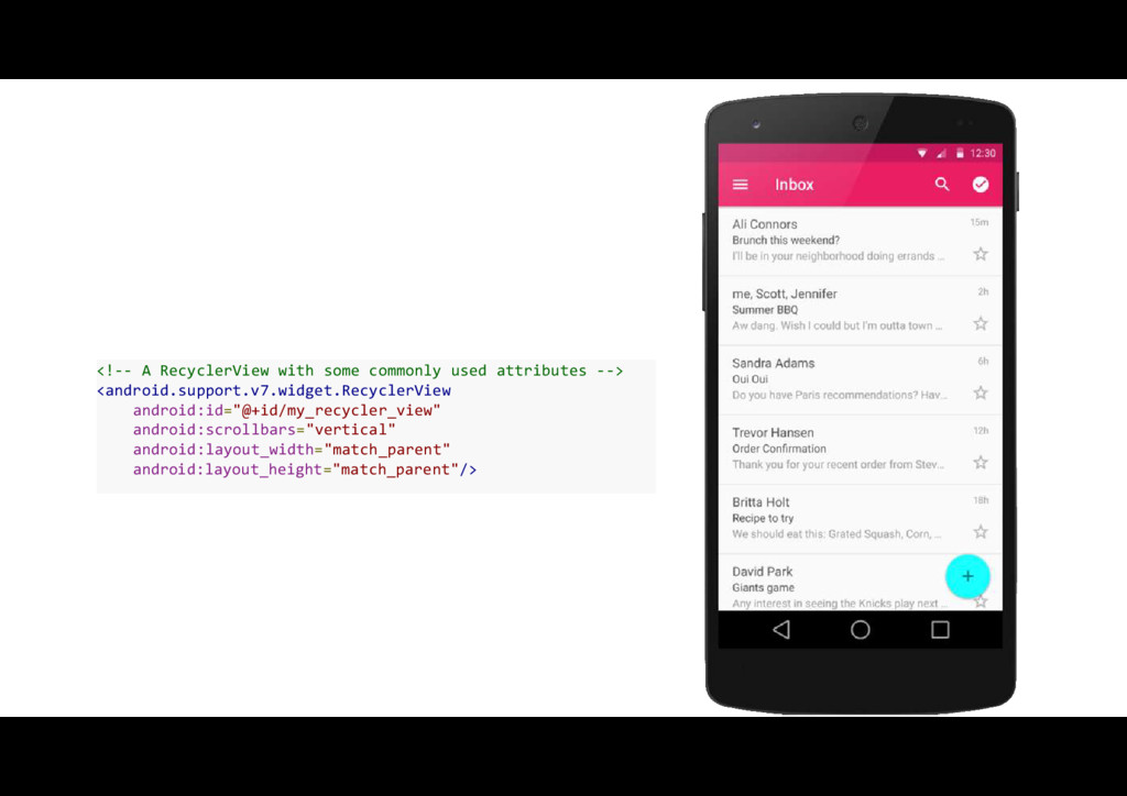
    data dalam jumlah yang banyak dan lebih flexible serta sangat efisien ketika user melakukan scroll • RecyclerView menyederhanakan cara penampilan dan menghandle data dalam jumlah yang banyak dengan menyediakan : • LayoutManager untuk posisi item-item yang ada di dalam RecyclerView • Animasi dasar untuk beberapa operasi seperti penghapusan dan penambahan
  7. <!-- A RecyclerView with some commonly used attributes --> <android.support.v7.widget.RecyclerView

    android:id="@+id/my_recycler_view" android:scrollbars="vertical" android:layout_width="match_parent" android:layout_height="match_parent"/>
  8. CardView • Merupakan extends view dari FrameLayout yang memudahkan kita

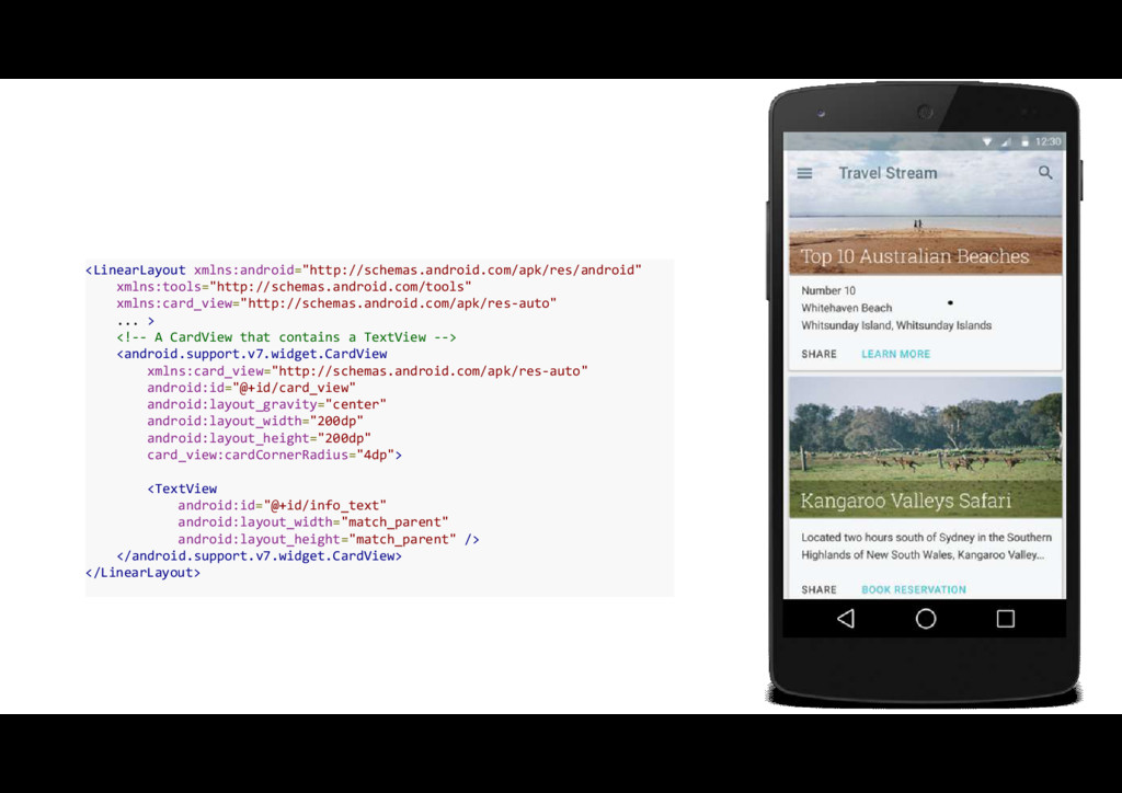
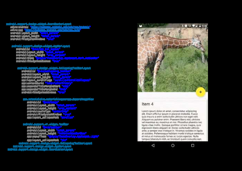
    membuat item dalam RecyclerView ke bentuk kartu (Card) dan akan konsisten di semua platform • Elemen CardView memiliki efek bayangan dan ujung2 yang tidak siku (Rounded)
  9. <LinearLayout xmlns:android="http://schemas.android.com/apk/res/android" xmlns:tools="http://schemas.android.com/tools" xmlns:card_view="http://schemas.android.com/apk/res-auto" ... > <!-- A CardView that

    contains a TextView --> <android.support.v7.widget.CardView xmlns:card_view="http://schemas.android.com/apk/res-auto" android:id="@+id/card_view" android:layout_gravity="center" android:layout_width="200dp" android:layout_height="200dp" card_view:cardCornerRadius="4dp"> <TextView android:id="@+id/info_text" android:layout_width="match_parent" android:layout_height="match_parent" /> </android.support.v7.widget.CardView> </LinearLayout>
  10. Dependency • Bacaan lanjutan : • https://developer.android.com/training/material/lists-cards.html • http://www.vogella.com/tutorials/AndroidRecyclerView/article.html •

    http://antonioleiva.com/recyclerview/ • http://code.tutsplus.com/tutorials/getting-started-with-recyclerview-and-cardview-on-android--cms-23465 • http://blog.grafixartist.com/pinterest-masonry-layout-staggered-grid/ dependencies { ... compile 'com.android.support:cardview-v7:23.0.+' compile 'com.android.support:recyclerview-v7:23.0.+' }
  11. Navigation View • Bentuk baru dari NavigationDrawer untuk navigasi menu

    yang pada komponen ini mengintegrasikan (inflate) resource menu dalam bentuk xml untuk menjadi item-item menu pada NavigationView
  12. <android.support.v4.widget.DrawerLayout xmlns:android="http://schemas.android.com/apk/res/android" xmlns:app="http://schemas.android.com/apk/res-auto" android:layout_width="match_parent" android:layout_height="match_parent" android:fitsSystemWindows="true"> <!-- your content layout

    --> <android.support.design.widget.NavigationView android:layout_width="wrap_content" android:layout_height="match_parent" android:layout_gravity="start" app:headerLayout="@layout/drawer_header" app:menu="@menu/drawer"/> </android.support.v4.widget.DrawerLayout> <group android:checkableBehavior="single"> <item android:id="@+id/navigation_item_1" android:checked="true" android:icon="@drawable/ic_android" android:title="@string/navigation_item_1"/> <item android:id="@+id/navigation_item_2" android:icon="@drawable/ic_android" android:title="@string/navigation_item_2"/> </group>
  13. Floating labels for editing text • Untuk membuat hint pada

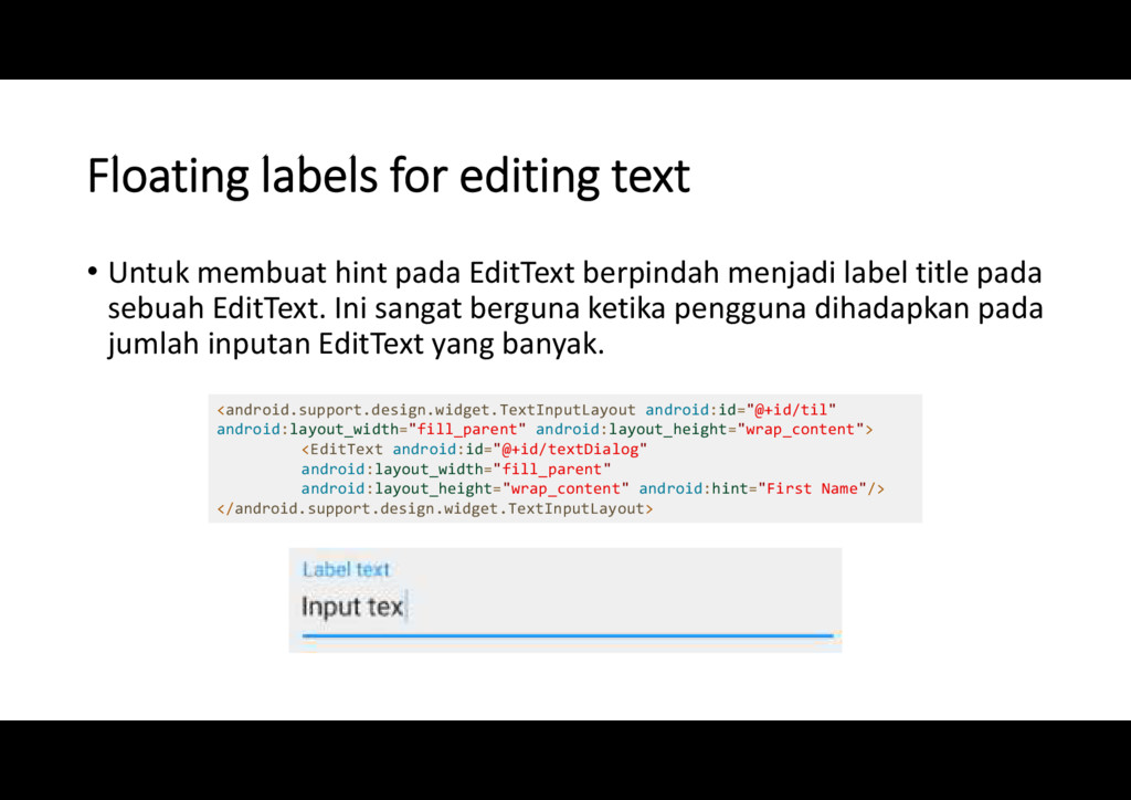
    EditText berpindah menjadi label title pada sebuah EditText. Ini sangat berguna ketika pengguna dihadapkan pada jumlah inputan EditText yang banyak. <android.support.design.widget.TextInputLayout android:id="@+id/til" android:layout_width="fill_parent" android:layout_height="wrap_content"> <EditText android:id="@+id/textDialog" android:layout_width="fill_parent" android:layout_height="wrap_content" android:hint="First Name"/> </android.support.design.widget.TextInputLayout>
  14. FloatingActionButton • Variasi baru untuk tombol Android yang diperuntukan untuk

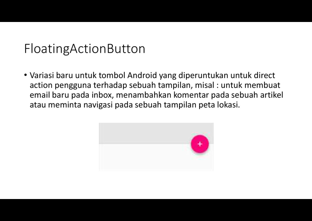
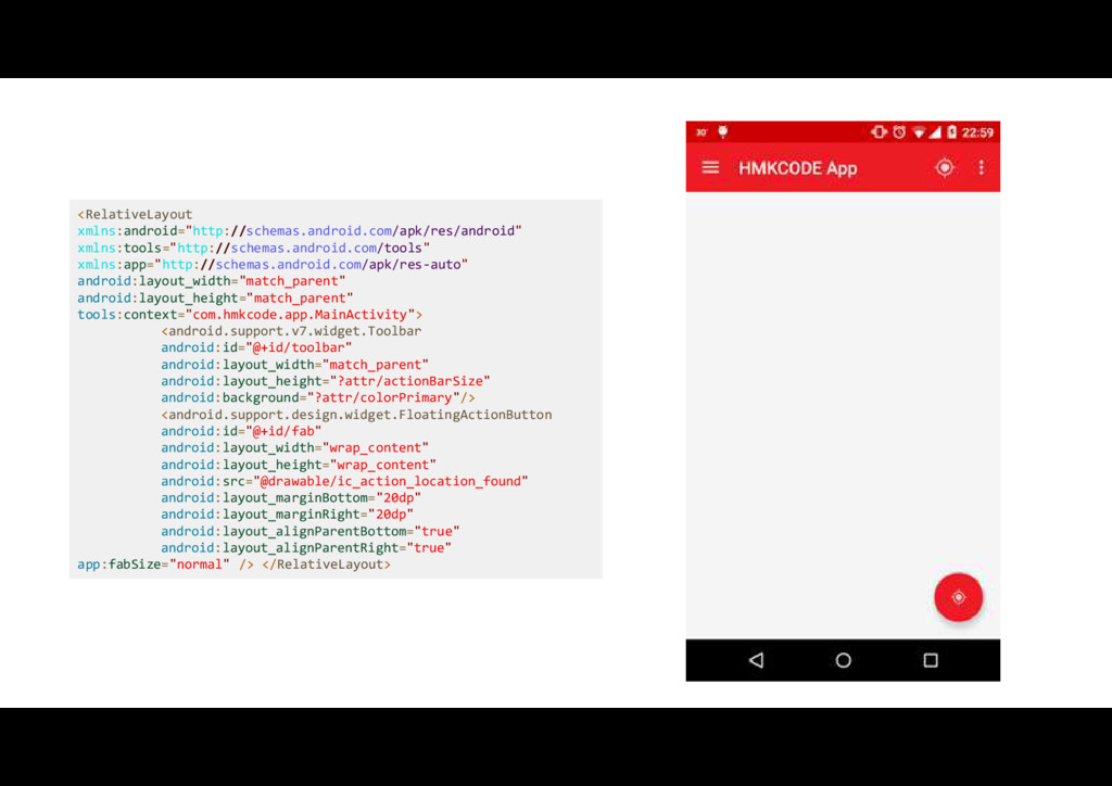
    direct action pengguna terhadap sebuah tampilan, misal : untuk membuat email baru pada inbox, menambahkan komentar pada sebuah artikel atau meminta navigasi pada sebuah tampilan peta lokasi.
  15. <RelativeLayout xmlns:android="http://schemas.android.com/apk/res/android" xmlns:tools="http://schemas.android.com/tools" xmlns:app="http://schemas.android.com/apk/res-auto" android:layout_width="match_parent" android:layout_height="match_parent" tools:context="com.hmkcode.app.MainActivity"> <android.support.v7.widget.Toolbar android:id="@+id/toolbar" android:layout_width="match_parent"

    android:layout_height="?attr/actionBarSize" android:background="?attr/colorPrimary"/> <android.support.design.widget.FloatingActionButton android:id="@+id/fab" android:layout_width="wrap_content" android:layout_height="wrap_content" android:src="@drawable/ic_action_location_found" android:layout_marginBottom="20dp" android:layout_marginRight="20dp" android:layout_alignParentBottom="true" android:layout_alignParentRight="true" app:fabSize="normal" /> </RelativeLayout>
  16. Snackbar • Bentuk yang lebih powerful ketimbang Toast yang memungkinkan

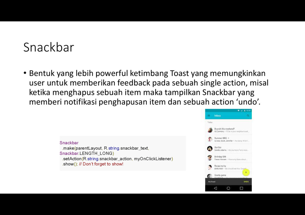
    user untuk memberikan feedback pada sebuah single action, misal ketika menghapus sebuah item maka tampilkan Snackbar yang memberi notifikasi penghapusan item dan sebuah action ‘undo’. Snackbar .make(parentLayout, R.string.snackbar_text, Snackbar.LENGTH_LONG) .setAction(R.string.snackbar_action, myOnClickListener) .show(); // Don’t forget to show!
  17. TabLayout • Bentuk baru untuk Tab di Android untuk menampilkan

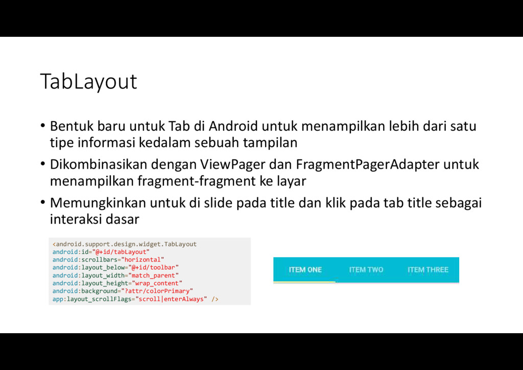
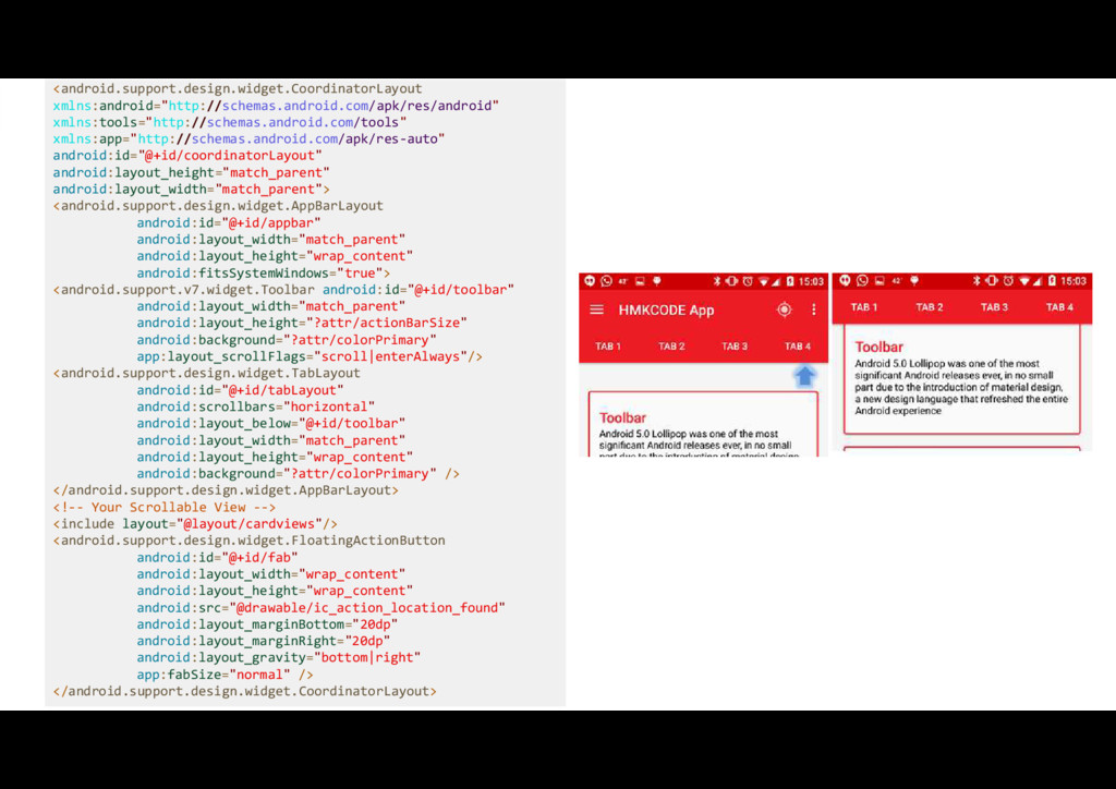
    lebih dari satu tipe informasi kedalam sebuah tampilan • Dikombinasikan dengan ViewPager dan FragmentPagerAdapter untuk menampilkan fragment-fragment ke layar • Memungkinkan untuk di slide pada title dan klik pada tab title sebagai interaksi dasar <android.support.design.widget.TabLayout android:id="@+id/tabLayout" android:scrollbars="horizontal" android:layout_below="@+id/toolbar" android:layout_width="match_parent" android:layout_height="wrap_content" android:background="?attr/colorPrimary" app:layout_scrollFlags="scroll|enterAlways" />
  18. Toolbar • Bentuk generalisasi dari ActionBar untuk tampilan aplikasi yang

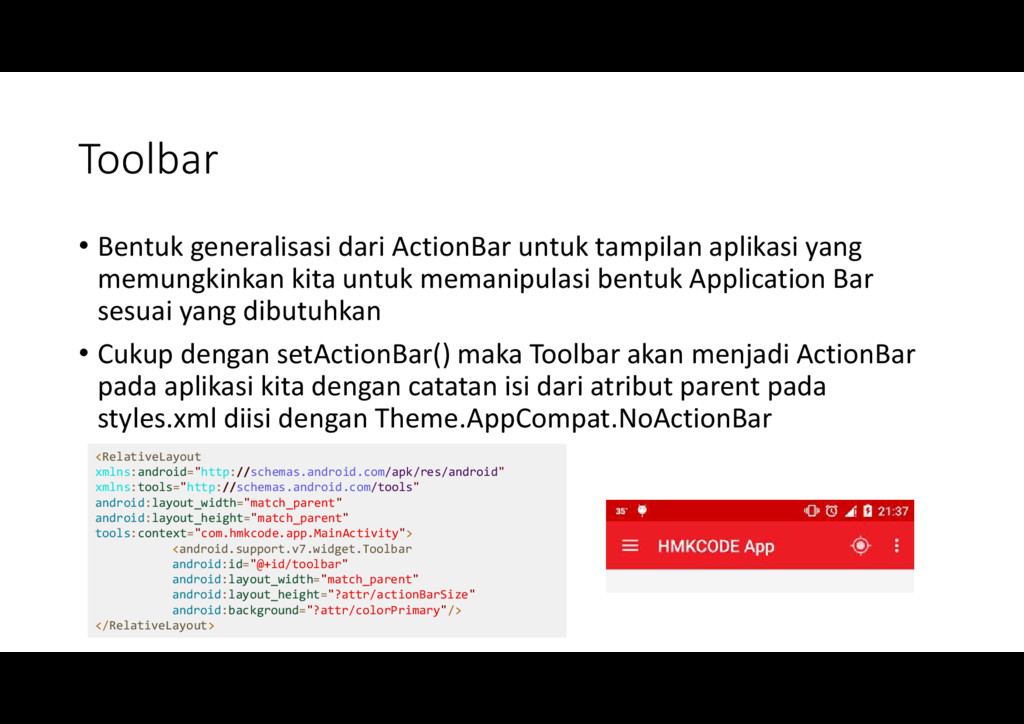
    memungkinkan kita untuk memanipulasi bentuk Application Bar sesuai yang dibutuhkan • Cukup dengan setActionBar() maka Toolbar akan menjadi ActionBar pada aplikasi kita dengan catatan isi dari atribut parent pada styles.xml diisi dengan Theme.AppCompat.NoActionBar <RelativeLayout xmlns:android="http://schemas.android.com/apk/res/android" xmlns:tools="http://schemas.android.com/tools" android:layout_width="match_parent" android:layout_height="match_parent" tools:context="com.hmkcode.app.MainActivity"> <android.support.v7.widget.Toolbar android:id="@+id/toolbar" android:layout_width="match_parent" android:layout_height="?attr/actionBarSize" android:background="?attr/colorPrimary"/> </RelativeLayout>
  19. CoordinatorLayout dan AppBarLayout • 2 komponen ini membuat tampilan Toolbar

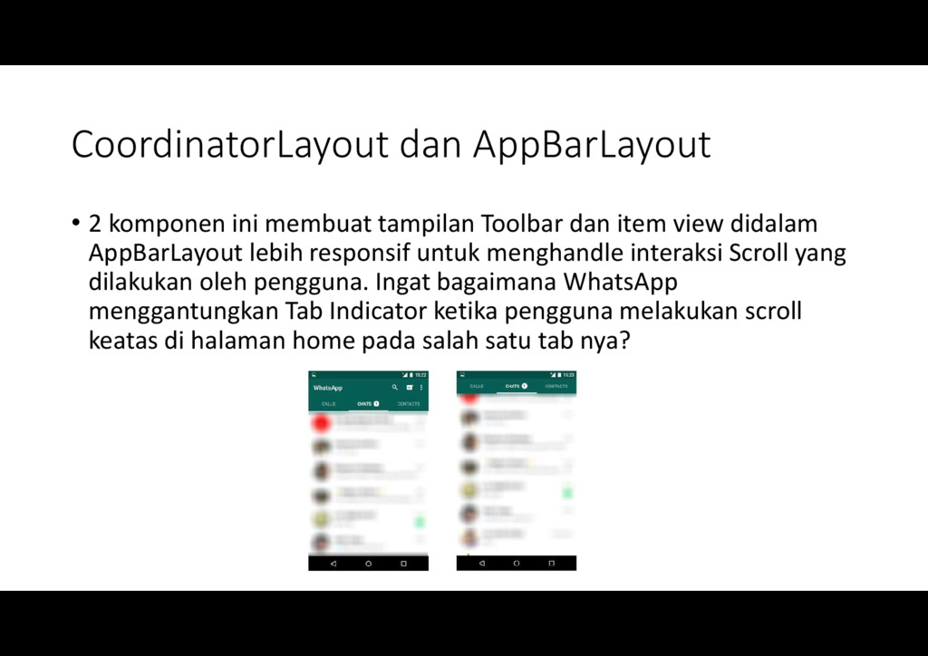
    dan item view didalam AppBarLayout lebih responsif untuk menghandle interaksi Scroll yang dilakukan oleh pengguna. Ingat bagaimana WhatsApp menggantungkan Tab Indicator ketika pengguna melakukan scroll keatas di halaman home pada salah satu tab nya?
  20. <android.support.design.widget.CoordinatorLayout xmlns:android="http://schemas.android.com/apk/res/android" xmlns:tools="http://schemas.android.com/tools" xmlns:app="http://schemas.android.com/apk/res-auto" android:id="@+id/coordinatorLayout" android:layout_height="match_parent" android:layout_width="match_parent"> <android.support.design.widget.AppBarLayout android:id="@+id/appbar" android:layout_width="match_parent"

    android:layout_height="wrap_content" android:fitsSystemWindows="true"> <android.support.v7.widget.Toolbar android:id="@+id/toolbar" android:layout_width="match_parent" android:layout_height="?attr/actionBarSize" android:background="?attr/colorPrimary" app:layout_scrollFlags="scroll|enterAlways"/> <android.support.design.widget.TabLayout android:id="@+id/tabLayout" android:scrollbars="horizontal" android:layout_below="@+id/toolbar" android:layout_width="match_parent" android:layout_height="wrap_content" android:background="?attr/colorPrimary" /> </android.support.design.widget.AppBarLayout> <!-- Your Scrollable View --> <include layout="@layout/cardviews"/> <android.support.design.widget.FloatingActionButton android:id="@+id/fab" android:layout_width="wrap_content" android:layout_height="wrap_content" android:src="@drawable/ic_action_location_found" android:layout_marginBottom="20dp" android:layout_marginRight="20dp" android:layout_gravity="bottom|right" app:fabSize="normal" /> </android.support.design.widget.CoordinatorLayout>
  21. Bacaan Lanjutan • https://developer.android.com/reference/android/support/design/widget/ CoordinatorLayout.html • https://guides.codepath.com/android/Handling-Scrolls-with- CoordinatorLayout • https://lab.getbase.com/introduction-to-coordinator-layout-on-android/

    • http://antonioleiva.com/coordinator-layout/ • https://crazyaboutandroid.wordpress.com/2015/05/31/android-design- librarycoordinatorlayout-and-the-app-bar/ • https://mzgreen.github.io/2015/06/23/How-to-hideshow-Toolbar-when- list-is-scrolling(part3)/
  22. CollapsingToolbarLayout • Ditambahkan langsung kedalam AppBarLayout agar item didalamnya dapat

    menerima efek animasi Collapse ketika dilakukan scroll oleh pengguna. • Pada item didalam CollapsingToolbarLayout ditambahkan dua tipe collapse effect : • pin (app:layout_collapseMode="pin") atau • parallax (app:layout_collapseMode=“parallax")
  23. <android.support.design.widget.CoordinatorLayout xmlns:android="http://schemas.android.com/apk/res/android" xmlns:app="http://schemas.android.com/apk/res-auto" android:layout_width="match_parent" android:layout_height="match_parent" android:fitsSystemWindows="true"> <android.support.design.widget.AppBarLayout android:id="@+id/app_bar_layout" android:layout_width="match_parent" android:layout_height="wrap_content"

    android:theme="@style/ThemeOverlay.AppCompat.Dark.ActionBar" android:fitsSystemWindows="true"> <android.support.design.widget.CollapsingToolbarLayout android:id="@+id/collapsing_toolbar" android:layout_width="match_parent" android:layout_height="match_parent" app:layout_scrollFlags="scroll|exitUntilCollapsed" app:contentScrim="?attr/colorPrimary" app:expandedTitleMarginStart="48dp" app:expandedTitleMarginEnd="64dp" android:fitsSystemWindows="true"> <com.antonioleiva.materializeyourapp.SquareImageView android:id="@+id/image" android:layout_width="match_parent" android:layout_height="wrap_content" android:scaleType="centerCrop" android:fitsSystemWindows="true" app:layout_collapseMode="parallax"/> <android.support.v7.widget.Toolbar android:id="@+id/toolbar" android:layout_width="match_parent" android:layout_height="?attr/actionBarSize" app:popupTheme="@style/ThemeOverlay.AppCompat.Light" app:layout_collapseMode="pin" /> </android.support.design.widget.CollapsingToolbarLayout> </android.support.design.widget.AppBarLayout> </android.support.design.widget.CoordinatorLayout>
  24. Imagine Instagram with Material Design Pelajari kodenya disini : https://frogermcs.github.io/

    Instagram-with-Material -Design-concept-is-getting-real/ Dan clone sourcenya disini https://github.com/frogermcs/InstaMaterial
  25. Beberapa Bacaan Renyah untuk Material Design di Android • http://android-developers.blogspot.com/2015/05/android-design-

    support-library.html • http://hmkcode.com/material-design-app-android-design-support- library-appcompat/ • https://medium.com/ribot-labs/exploring-the-new-android-design- support-library-b7cda56d2c32 • http://antonioleiva.com/materialize-app/ • http://blog.grafixartist.com/top-10-material-design-libraries-for- android/