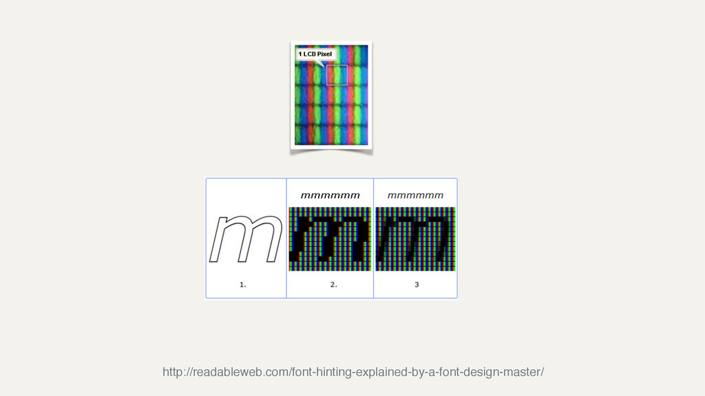
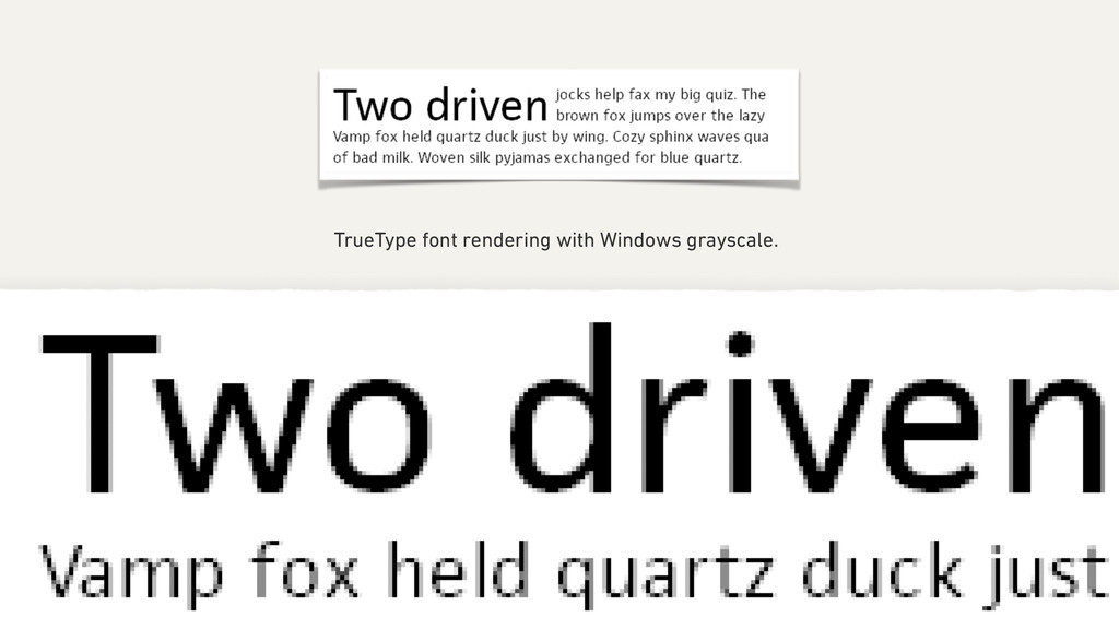
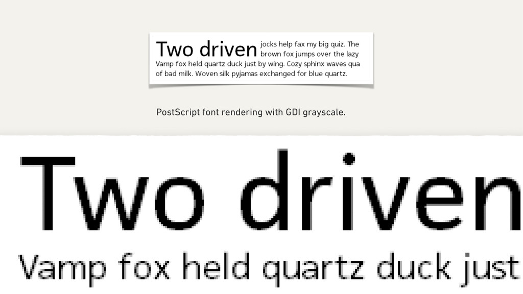
with hinting (lower rows). Note the increased edge contrast with the hinted text but more faithful character shape and more natural inter-character spacing in the unhinted text. http://en.wikipedia.org/wiki/Hinting
with the result that ‘Regular’ weights look lighter, ‘Bold’ weights look heavier, and subtle details of design can be lost at small point sizes. https://www.typotheque.com/articles/hinting
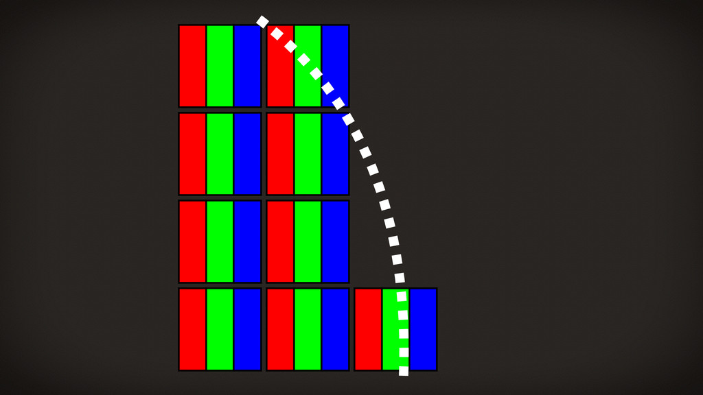
be hammered into pixel boundaries to prevent blur and improve readability, even at the cost of not being true to the typeface. http://www.joelonsoftware.com/items/2007/06/12.html
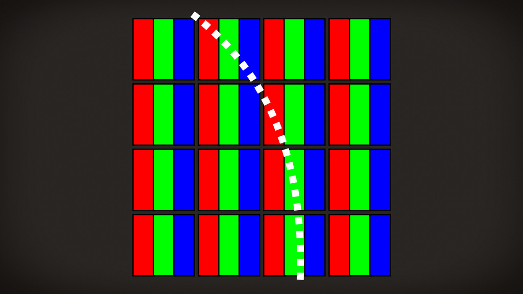
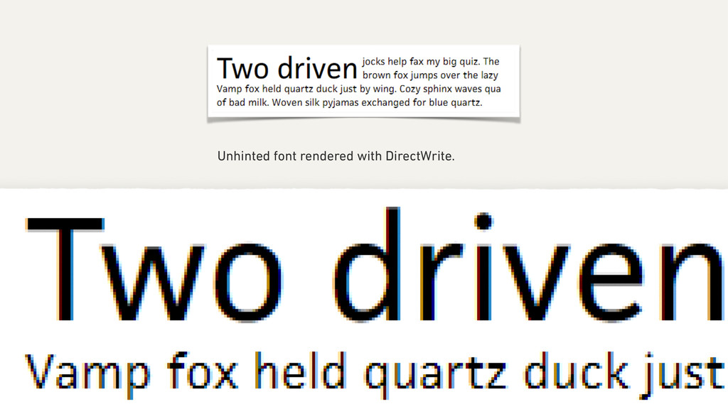
be to preserve the design of the typeface as much as possible, even at the cost of a little bit of blurriness. http://www.joelonsoftware.com/items/2007/06/12.html
![„Quartz [today: CoreText] rendering is reliable because it doesn’t try](https://files.speakerdeck.com/presentations/fa92229036d4013210631e10820fd188/slide_47.jpg)