Upgrade to Pro — share decks privately, control downloads, hide ads and more …

O'Reilly Webcast: UX Design for Mobile Payment Experiences

Skip Allums
October 14, 2014

O'Reilly Webcast: UX Design for Mobile Payment Experiences

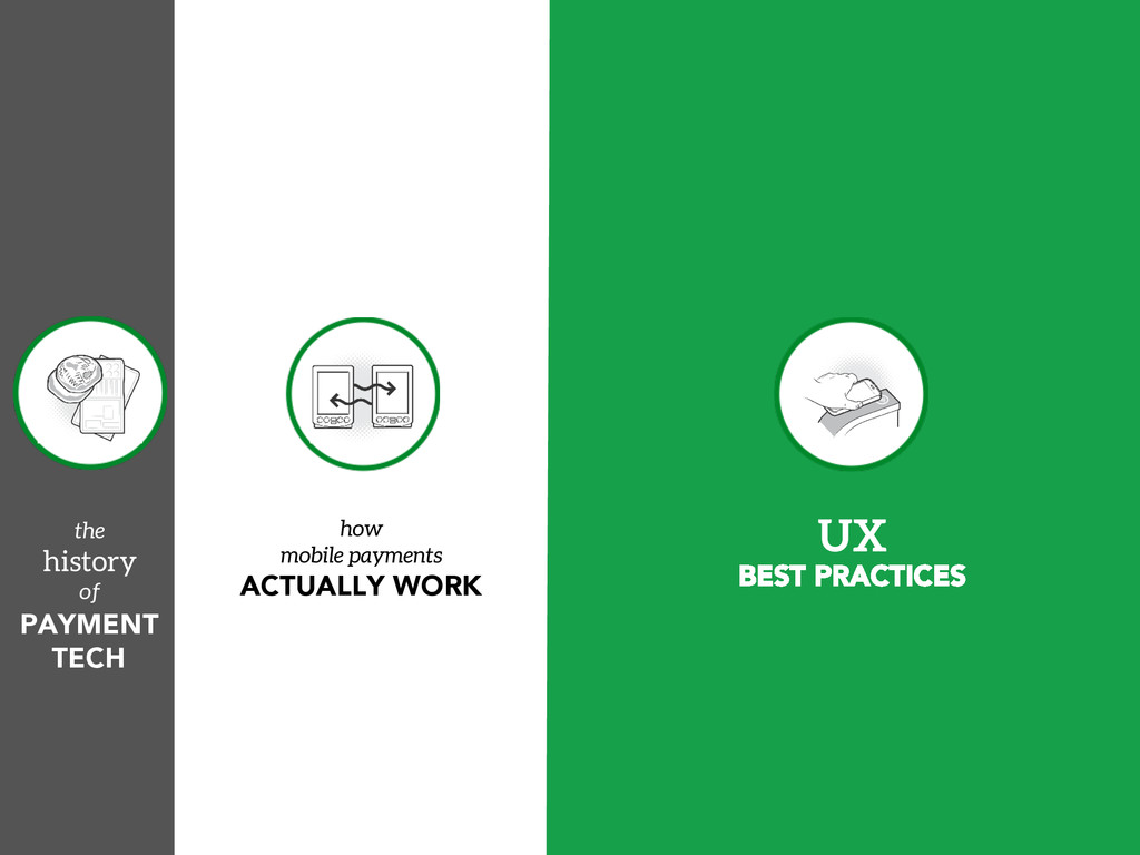
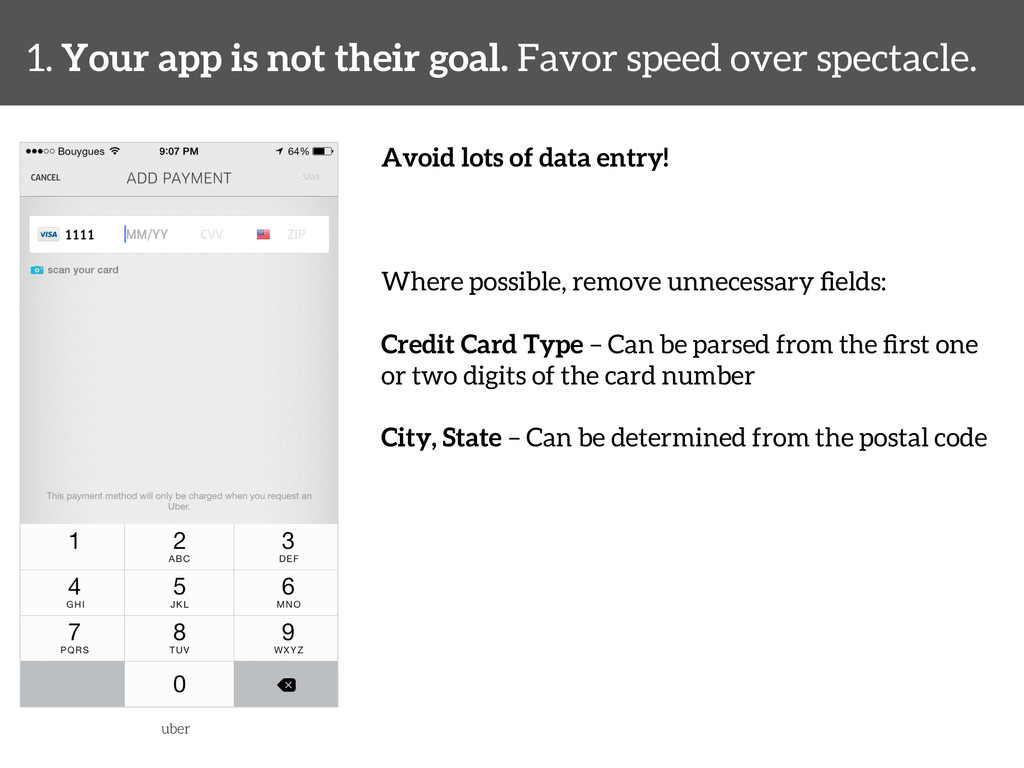
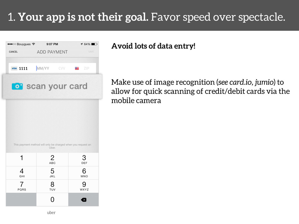
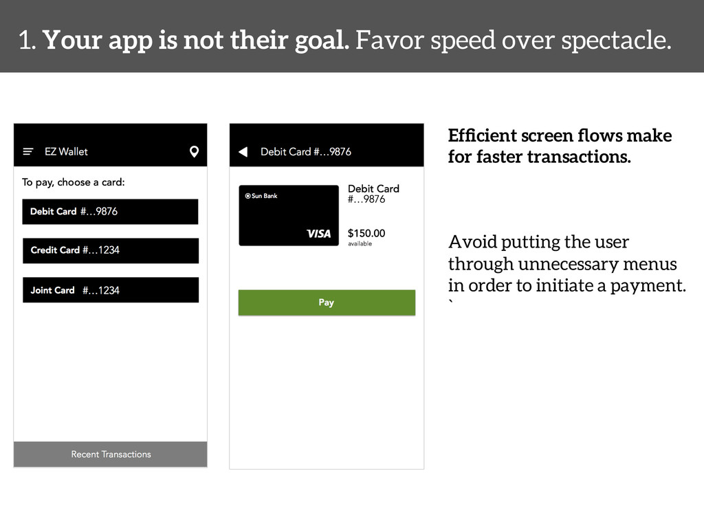
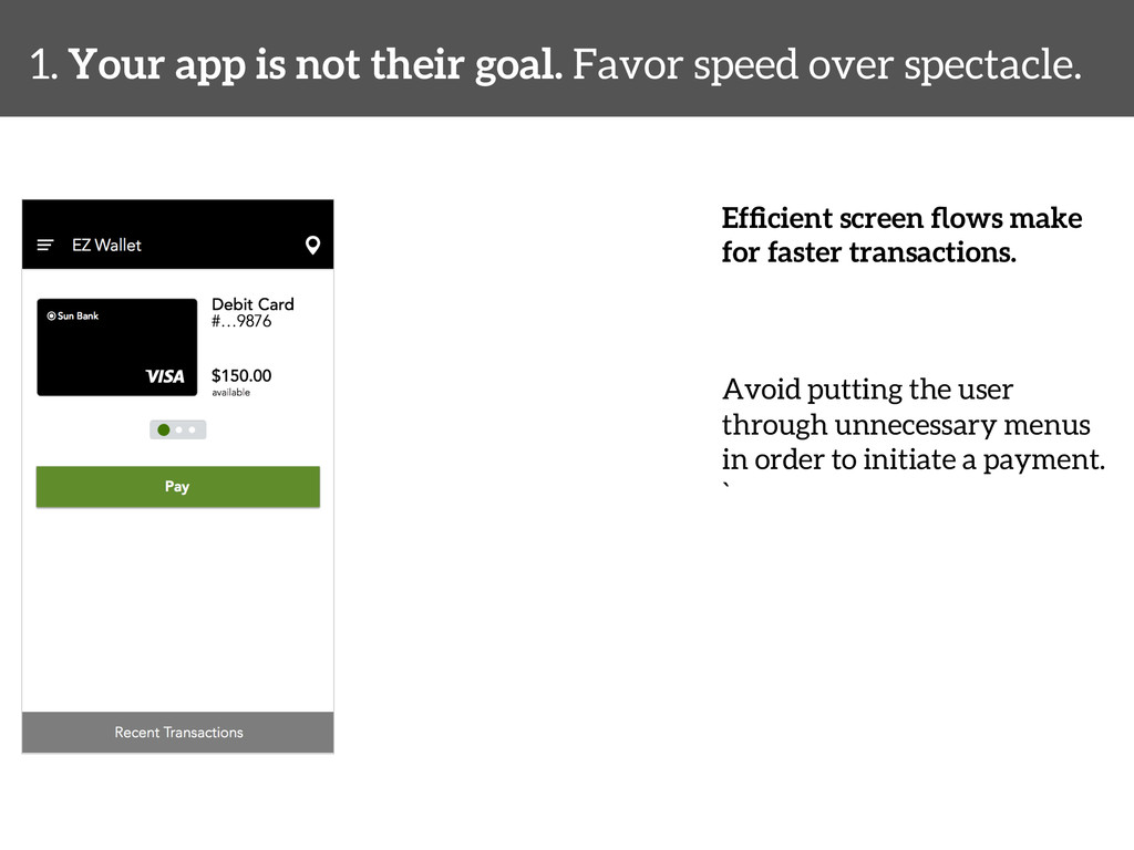
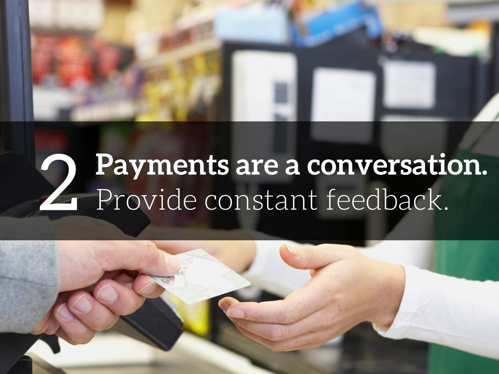
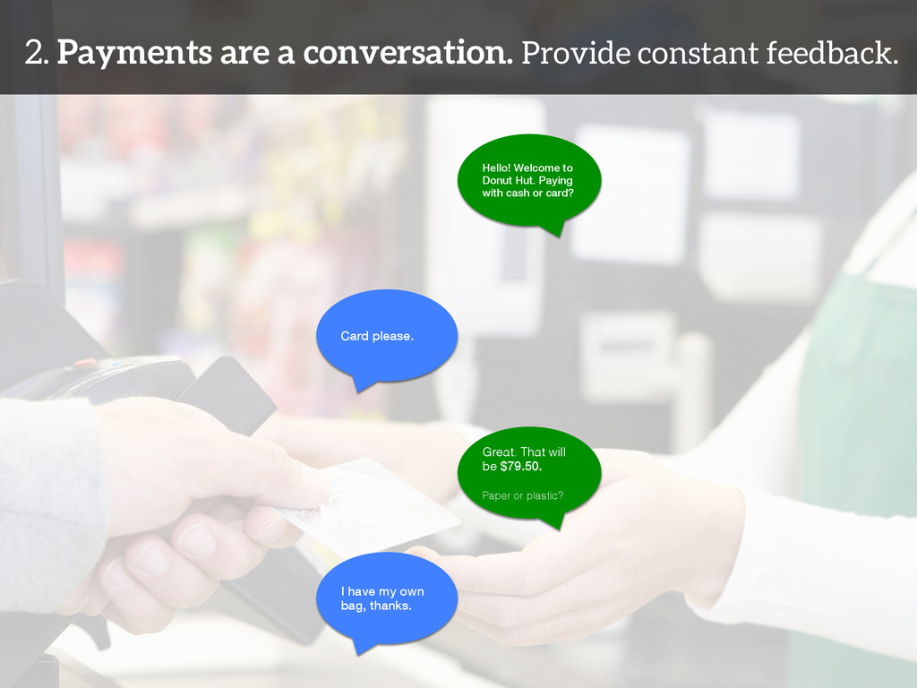
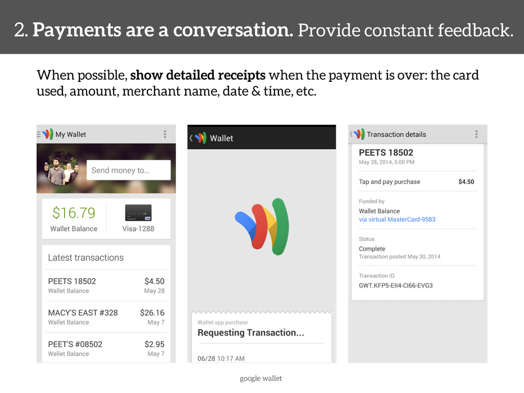
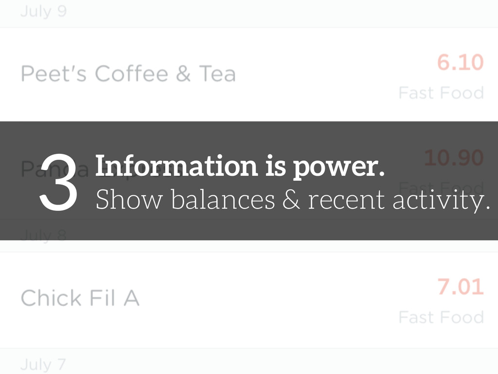
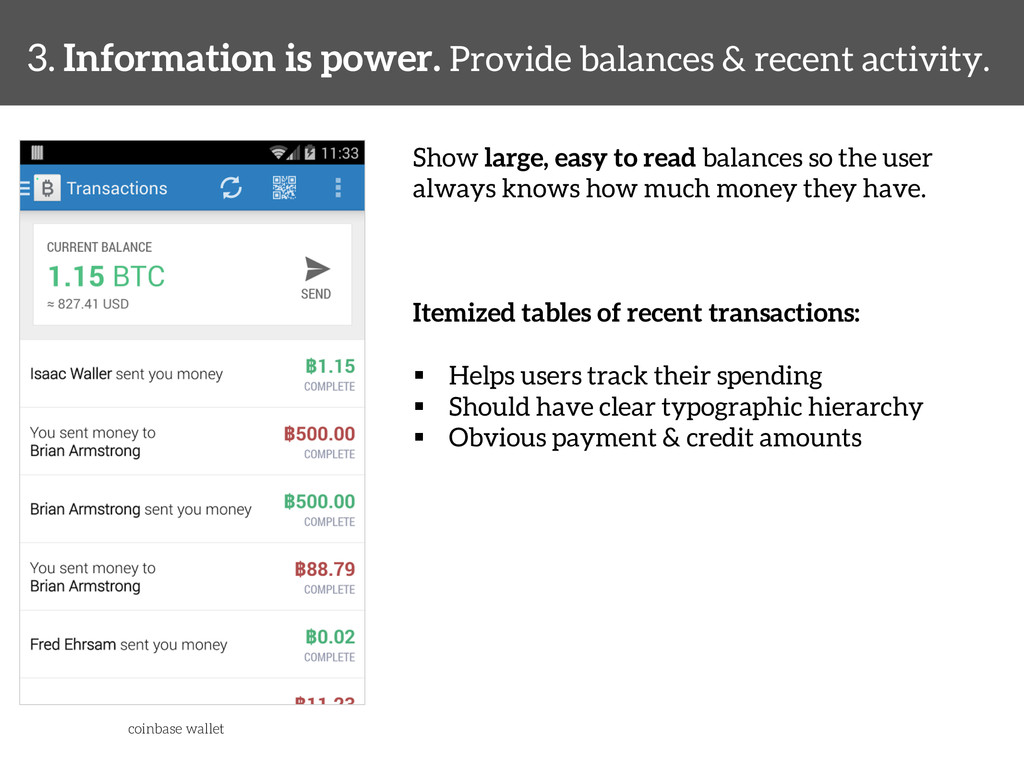
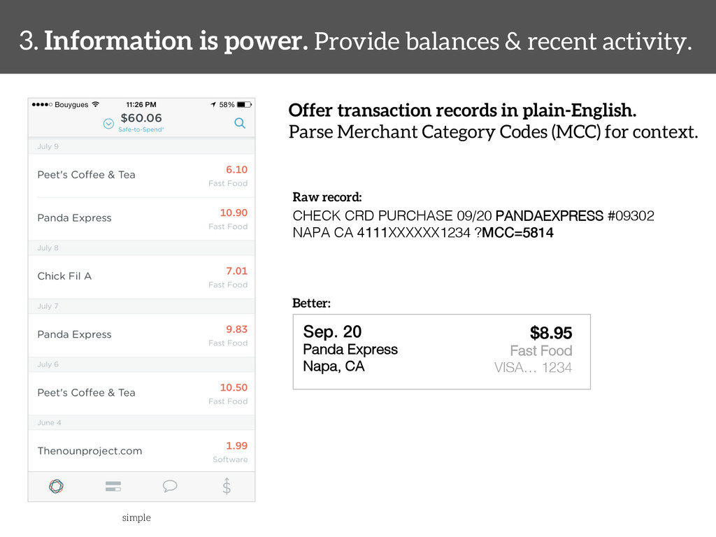
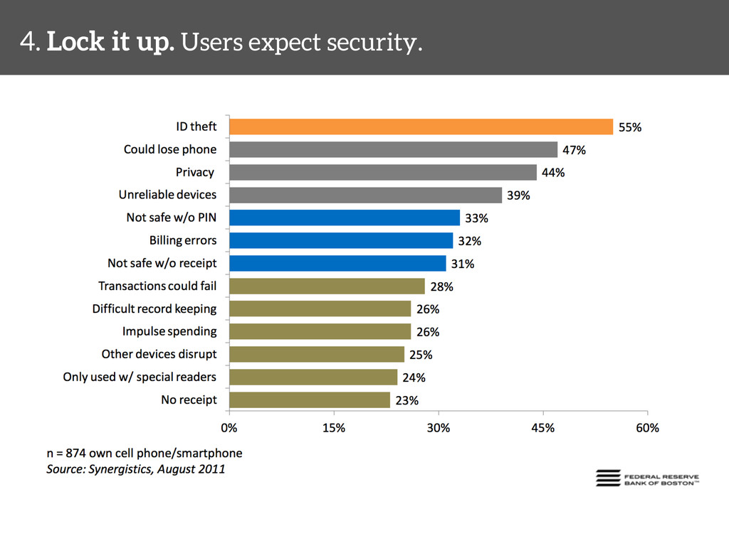
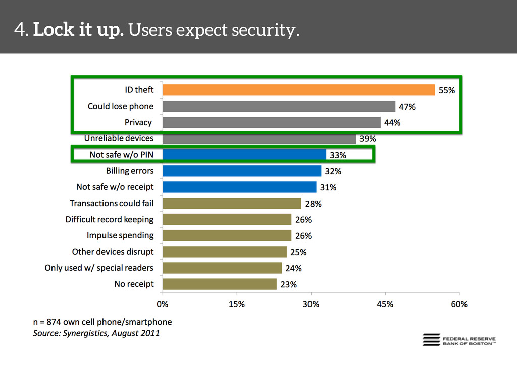
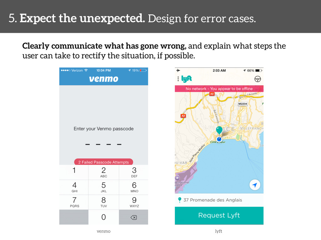
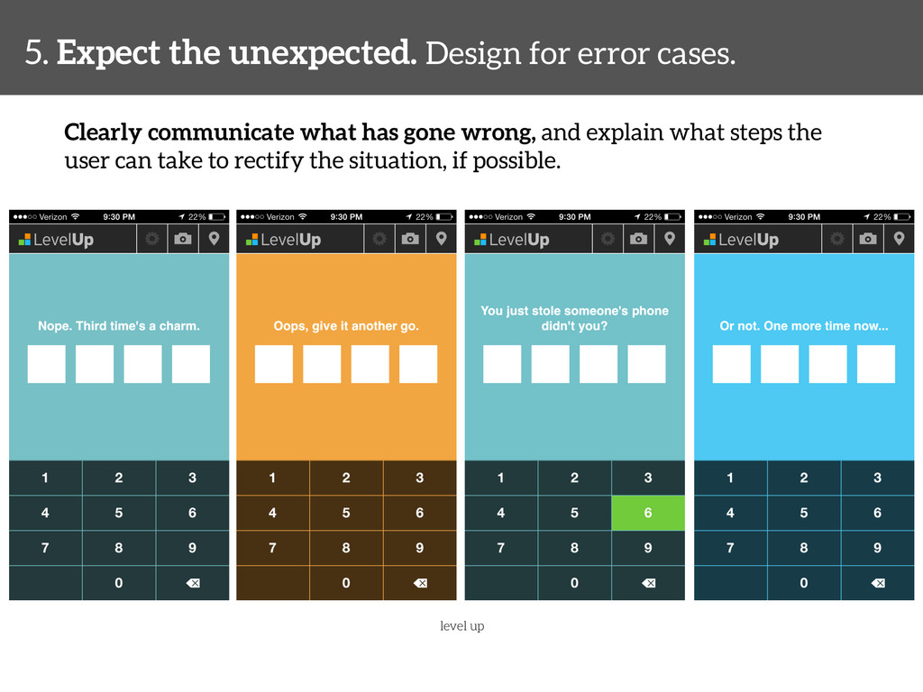
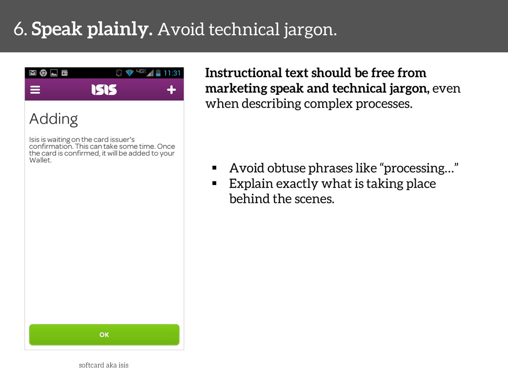
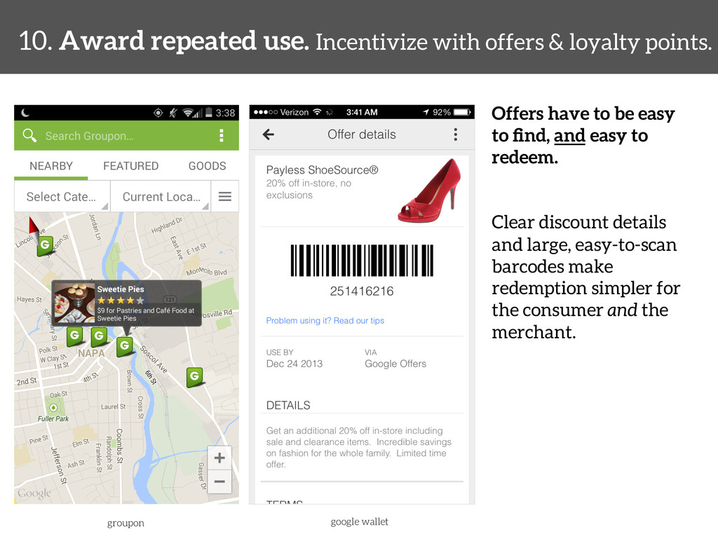
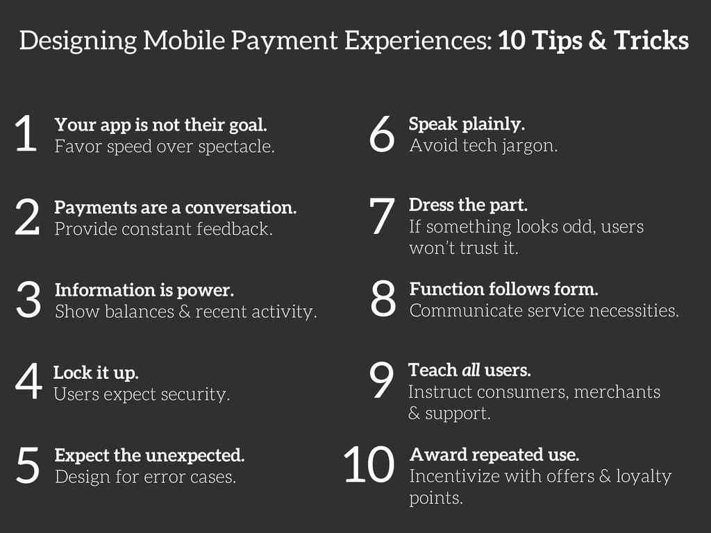
With mobile devices emerging as new tools for transactions and identification, designers face challenging interactions and user expectations from payment scenarios. Consumers expect mobile payment experiences to be frictionless and familiar, while faithfully protecting their financial data. Falling short on any of these aspects will cause users to drop out, or worse, compromise their financial privacy. In this webcast, we'll look at ten emerging UX design best practices for mobile payment interactions.

Skip Allums

October 14, 2014
Tweet

More Decks by Skip Allums

Other Decks in Design

Transcript

  1. UX Design for Mobile Payment Experiences Skip Allums UX Lead,

    Monitise Create @skippr #mobilepaymentux 10 Tips & Tricks
  2. Available now in print & digital formats: §  oreilly.com § 

    your favorite bookstore More at: mobilepaymentux.com
  3. 1 Your app is not their goal. Favor speed over

    spectacle. 2 Payments are a conversation. Provide constant feedback. 3 Information is power. Show balances & recent activity. 4 Lock it up. Users expect security. 5 Expect the unexpected. Design for error cases. 6 Speak plainly. Avoid tech jargon. 7 Dress the part. If something looks odd, users won’t trust it. 8 Function follows form. Communicate service necessities. 9 Teach all users. Instruct consumers, merchants & support. 10 Award repeated use. Incentivize with offers & loyalty points. Designing Mobile Payment Experiences: 10 Tips & Tricks
  4. PLAN TRAVEL BROWSE PURCHASE TRAVEL make a shopping list! find

    address of the store! arrive at the store! look for needed items! place them in the basket stand in check out line load items on counter pay for items arrive home
  5. 1. Your app is not their goal. Favor speed over

    spectacle. Avoid lots of data entry! Where possible, remove unnecessary fields: Credit Card Type – Can be parsed from the first one or two digits of the card number City, State – Can be determined from the postal code dunkin donuts
  6. 1. Your app is not their goal. Favor speed over

    spectacle. Avoid lots of data entry! Where possible, remove unnecessary fields: Credit Card Type – Can be parsed from the first one or two digits of the card number City, State – Can be determined from the postal code uber
  7. 1. Your app is not their goal. Favor speed over

    spectacle. Avoid lots of data entry! Make use of image recognition (see card.io, jumio) to allow for quick scanning of credit/debit cards via the mobile camera uber
  8. 1. Your app is not their goal. Favor speed over

    spectacle. Efficient screen flows make for faster transactions. Avoid putting the user through unnecessary menus in order to initiate a payment. `
  9. 1. Your app is not their goal. Favor speed over

    spectacle. Efficient screen flows make for faster transactions. Avoid putting the user through unnecessary menus in order to initiate a payment. `
  10. 2. Payments are a conversation. Provide constant feedback. Hello! Welcome

    to Donut Hut. Paying with cash or card?! Card please.! Great. That will be $79.50.! ! Paper or plastic?! I have my own ! bag, thanks.!
  11. 2. Payments are a conversation. Provide constant feedback. Give the

    user obvious feedback while paying. This can include animations, visual cues, messaging or audio/haptic feedback. softcard aka isis
  12. 2. Payments are a conversation. Provide constant feedback. When possible,

    show detailed receipts when the payment is over: the card used, amount, merchant name, date & time, etc. google wallet
  13. 3. Information is power. Provide balances & recent activity. Show

    large, easy to read balances so the user always knows how much money they have. Itemized tables of recent transactions: §  Helps users track their spending §  Should have clear typographic hierarchy §  Obvious payment & credit amounts coinbase wallet
  14. 3. Information is power. Provide balances & recent activity. Offer

    transaction records in plain-English. Parse Merchant Category Codes (MCC) for context. simple CHECK CRD PURCHASE 09/20 PANDAEXPRESS #09302 NAPA CA 4111XXXXXX1234 ?MCC=5814! Raw record: Sep. 20! Panda Express! Napa, CA! ! Better: $8.95 Fast Food! VISA… 1234
  15. 4. Lock it up. Users expect security. Hey consumers! What

    are your biggest concerns with mobile ! payments?!
  16. UI LAYER mPINs/Passcodes, Gesture Patterns, User data & preferences WEB

    SERVICES Encryption, PCI-DSS compliance, Username/passwords, Tokens COMMUNICATION Transport Protocols, Encryption OPERATING SYSTEM mPINs/Passcodes, Biometrics, Gesture Patterns, Trusted Applications
  17. 4. Lock it up. Users expect security. Mobile passcodes &

    PINs are faster than username/passwords, and can lock the app down after too many wrong attempts. softcard aka isis coinbase wallet paypal
  18. 4. Lock it up. Users expect security. Mobile passcodes &

    PINs are faster than username/passwords, and can lock the app down after too many wrong attempts. Passcode Best Practices: §  Large, easy to read, custom numeric keypads (avoid using stock OS keyboards) §  No more than 4 or 5 digits §  Mask the passcode as the user enters it §  Obvious path to revert back to primary sign in method, or reset their passcode §  Give the user a time-out option, which will prompt for a passcode after 1 to 5 minutes or more of inactivity §  Don’t allow the user to set an easy to guess passcode: 1234, 2580, 1111, etc.
  19. 4. Lock it up. Users expect security. Gesture patterns are

    another alternative for quick sign in, and can be more unique than passcodes. Gesture Pattern Best Practices: §  Use obvious touch/drag stop points §  No less than 4 stop points and no more than 9 or 10. §  Obvious path to revert back to primary sign in method, or reset their pattern capital one wallet
  20. 4. Lock it up. Users expect security. Biometrics are likely

    the most secure authentication method (very hard to fake). Usage is normally entirely dictated by the native OS. apple pay paypal + samsung
  21. 4. Lock it up. Users expect security. Avoid compromising cardholder

    data and personally identifiable information. Ensure these aren’t locally stored in your app: Cardholder Data: -  Full card numbers -  Cardholder name -  Expiration dates -  Security / CVV codes Personally Identifiable Information: -  Billing street address, city state & zip code -  Birth dates -  Social security numbers -  Phone numbers -  ID numbers (ex. driver’s licenses, passports) -  Pictures of the user, their voice or fingerprint
  22. 5. Expect the unexpected. Design for error cases. Designing for

    when things go wrong is just as important as when things go right. Again employ animations, visual cues, messaging or audio/haptic feedback.
  23. 5. Expect the unexpected. Design for error cases. Clearly communicate

    what has gone wrong, and explain what steps the user can take to rectify the situation, if possible. venmo lyft
  24. 5. Expect the unexpected. Design for error cases. Clearly communicate

    what has gone wrong, and explain what steps the user can take to rectify the situation, if possible. level up
  25. 6. Speak plainly. Avoid technical jargon. Instructional text should be

    free from marketing speak and technical jargon, even when describing complex processes. §  Avoid obtuse phrases like “processing…” §  Explain exactly what is taking place behind the scenes. softcard aka isis
  26. 6. Speak plainly. Avoid technical jargon. Instructional text should be

    free from marketing speak and technical jargon, even when describing complex processes. §  Avoid obtuse phrases like “processing…” §  Explain exactly what is taking place behind the scenes. square order
  27. 7. Dress the part. If something looks odd, users won’t

    trust it. Adhere to platform UI guidelines as much as possible. Mobile users have inherent expectations of their chosen operating system. Try to avoid incongruences such as: §  iOS UI elements on Android §  Web-derivative layouts secure wallet ing belgium
  28. 7. Dress the part. If something looks odd, users won’t

    trust it. Squish the bugs! UI defects and dead-end processes can kill any trust the user might have in a mobile app. This is especially true of financial experiences.
  29. 8. Function follows form. Account for service limitations. Explain any

    inherent service charges. Users don’t like to be caught off guard by hidden per-transaction fees. Pay $300.00 Payments over $100 will incur a $2 service fee for ! processing costs.!
  30. 8. Function follows form. Account for service limitations. Hardware issues

    should be brought to the attention of the user immediately. Include instructions so that the user can adjust any device settings. google wallet
  31. 9. Teach all users. Instruct consumers, merchants & support. Mobile

    payments are a new paradigm. Users need effective instruction upon first use. softcard aka isis paypal
  32. 9. Teach all users. Instruct consumers, merchants & support. FAQ

    / Help sections should be logically structured and relevant. If this content is viewed via the web wrapper, ensure a responsive layout is used. venmo
  33. 9. Teach all users. Instruct consumers, merchants & support. Ensure

    that all participants are made aware of the service, and how it works. POS systems should be clearly labeled, and staff should be briefed on what to do if something goes wrong.
  34. 10. Award repeated use. Incentivize with offers & loyalty points.

    Mobile payments have to be more than just “cool”. Relevant offers and substantial savings will encourage daily use. starbucks
  35. 10. Award repeated use. Incentivize with offers & loyalty points.

    Offers have to be easy to find, and easy to redeem. Clear discount details and large, easy-to-scan barcodes make redemption simpler for the consumer and the merchant. groupon google wallet
  36. 1 Your app is not their goal. Favor speed over

    spectacle. 2 Payments are a conversation. Provide constant feedback. 3 Information is power. Show balances & recent activity. 4 Lock it up. Users expect security. 5 Expect the unexpected. Design for error cases. 6 Speak plainly. Avoid tech jargon. 7 Dress the part. If something looks odd, users won’t trust it. 8 Function follows form. Communicate service necessities. 9 Teach all users. Instruct consumers, merchants & support. 10 Award repeated use. Incentivize with offers & loyalty points. Designing Mobile Payment Experiences: 10 Tips & Tricks
  37. Available now in print & digital formats: §  oreilly.com § 

    your favorite bookstore THANK YOU @skippr mobilepaymentux.com
  38. UX Design for Mobile Payment Experiences Skip Allums UX Lead,

    Monitise Create @skippr #mobilepaymentux 10 Tips & Tricks