Upgrade to Pro — share decks privately, control downloads, hide ads and more …

Designing the Fluid Web

The Standardistas
November 02, 2011

Designing the Fluid Web

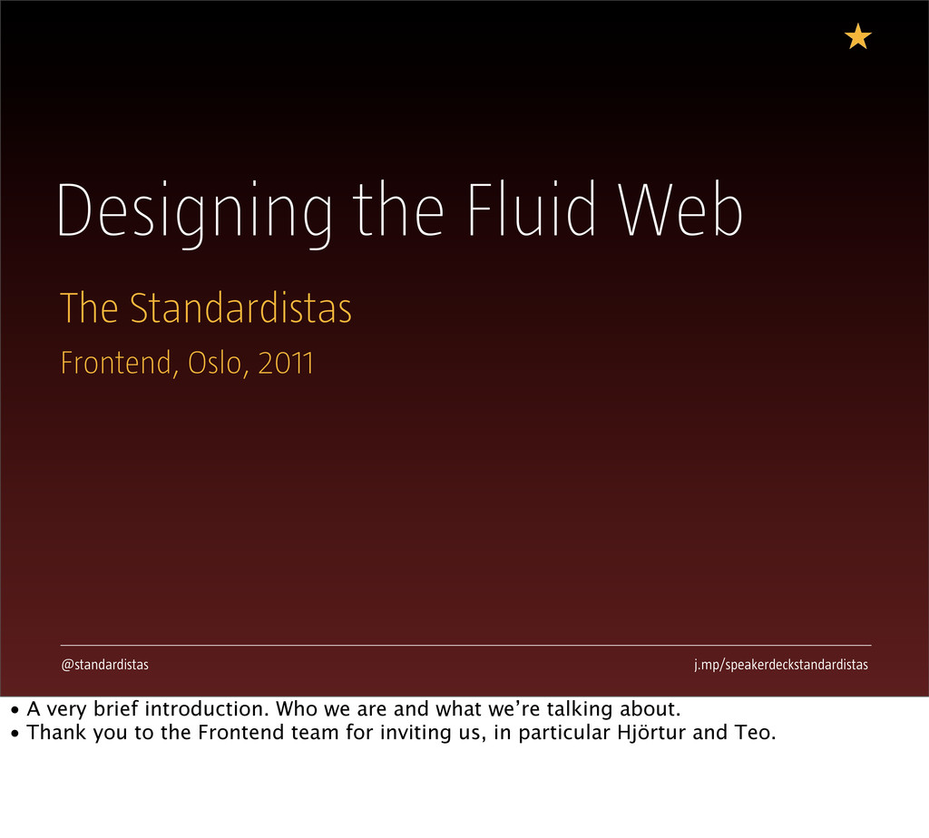
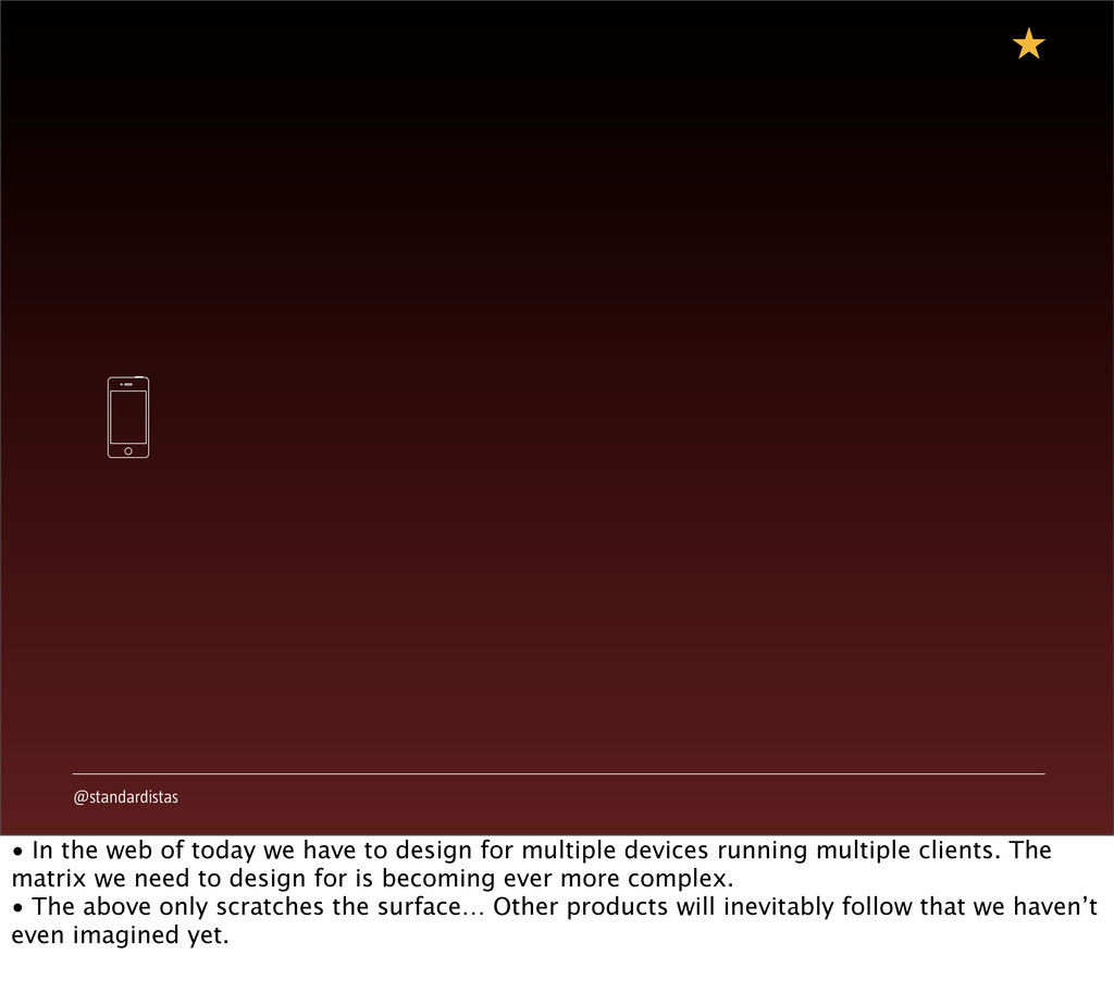
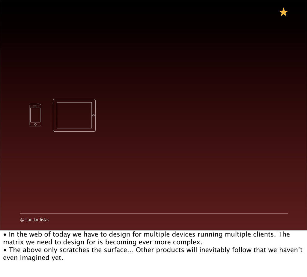
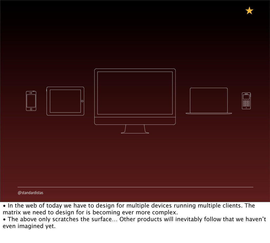
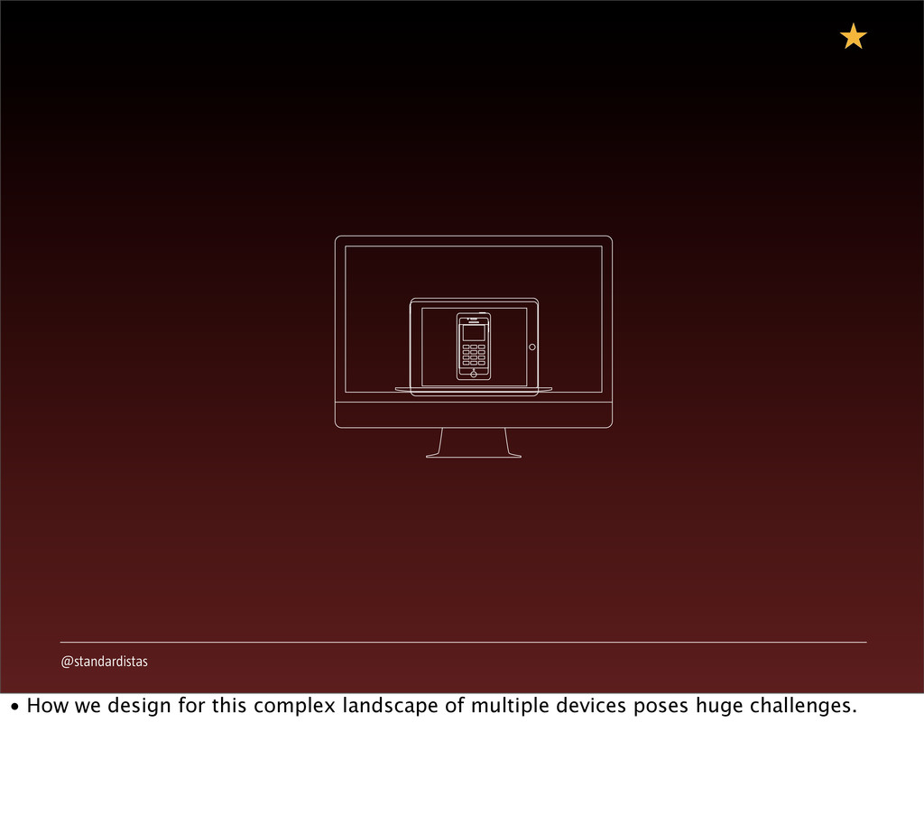
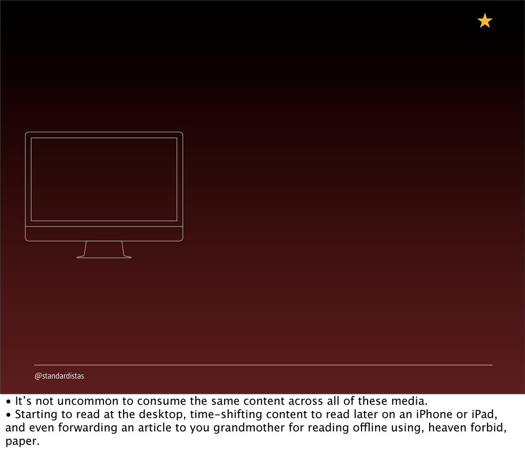
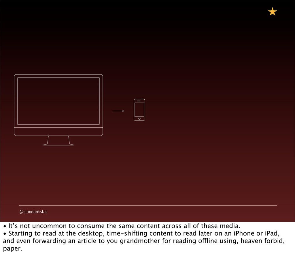
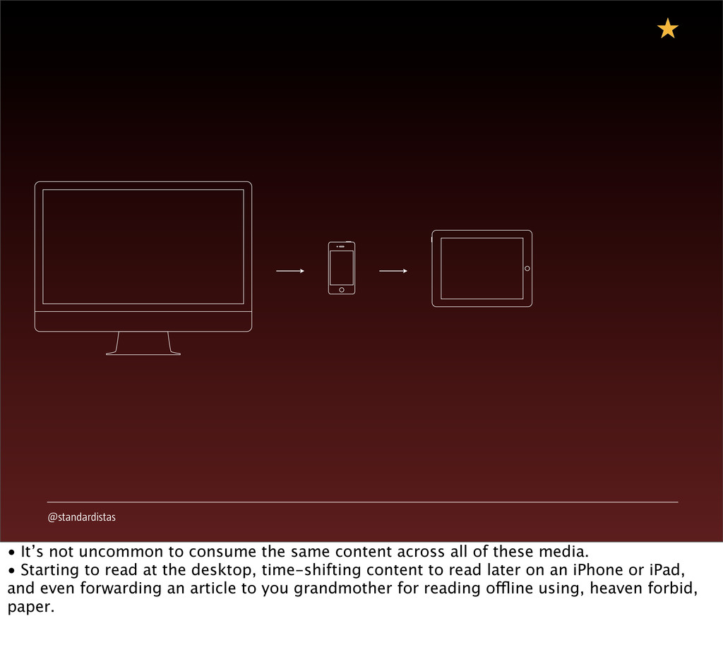
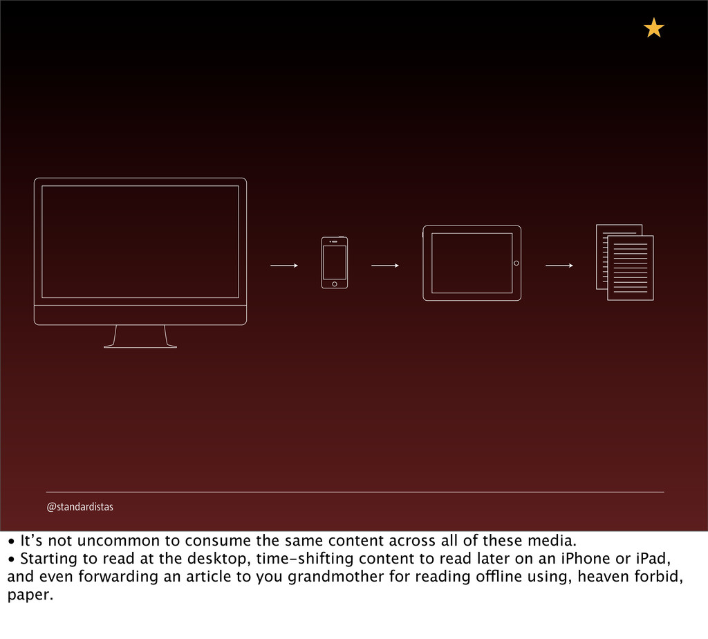
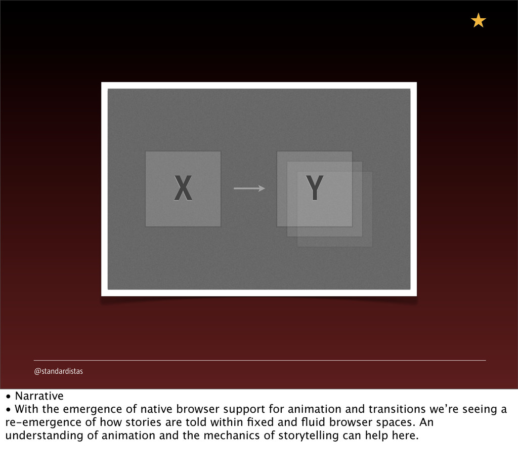
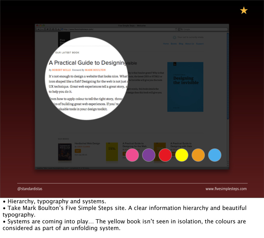
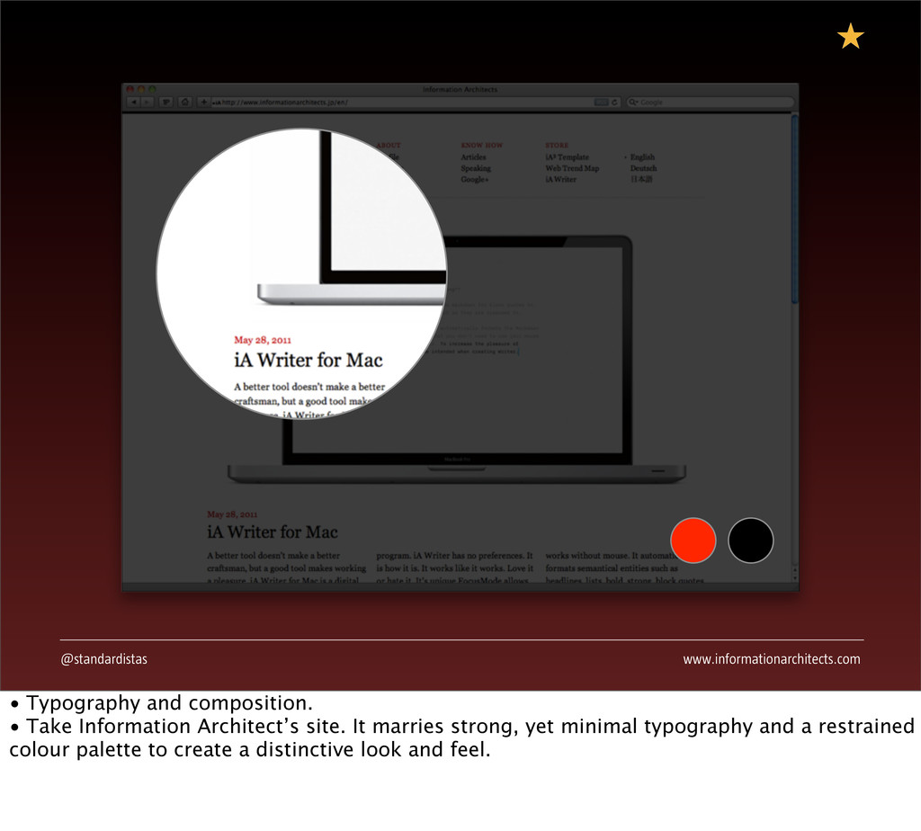
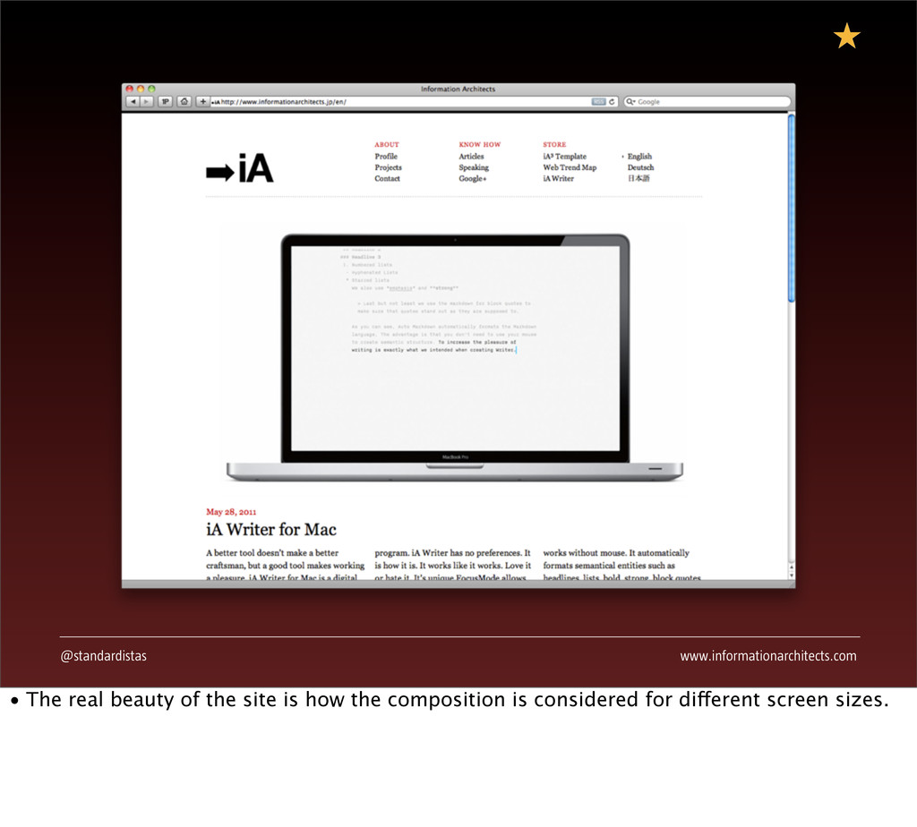
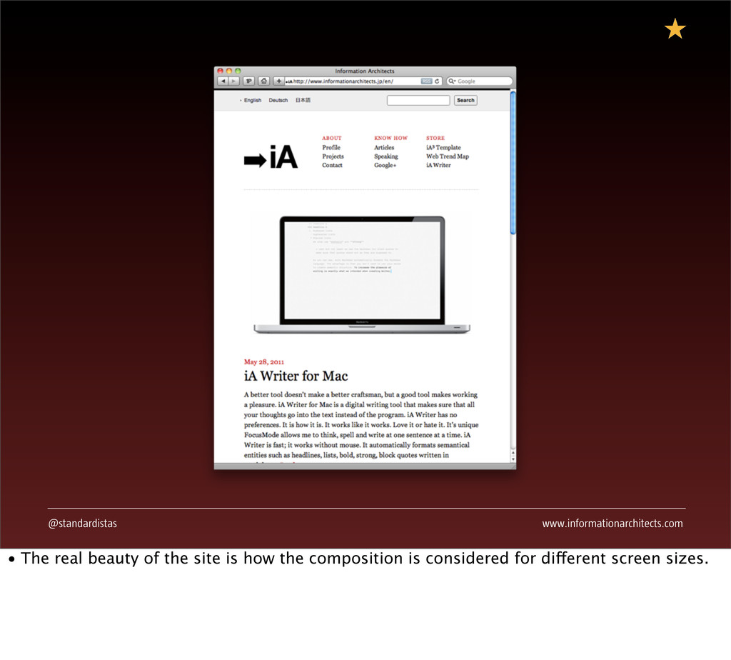
The web is evolving. Fast. As designers working in this volatile medium we face a challenge to deliver solutions for a 'fluid web', one in which our content is consumed across a growing range of devices, all with different characteristics. At first glance this challenge can appear overwhelming, however, by marrying fundamental web standards with timeless design principles, we can create beautifully designed user experiences that not only stand the test of time, but deliver regardless of context.

10th of October 2011, Frontend Conference, Oslo, Norway

The Standardistas

November 02, 2011
Tweet

More Decks by The Standardistas

Other Decks in Design

Transcript

  1. Designing the Fluid Web The Standardistas @standardistas Frontend, Oslo, 2011

    j.mp/speakerdeckstandardistas • A very brief introduction. Who we are and what we’re talking about. • Thank you to the Frontend team for inviting us, in particular Hjörtur and Teo.
  2. @standardistas Enjoying this? @standardistas #thefluidweb • Please feel free to

    engage with us via the back channel. Hashtag any questions or comments you have with #thefluidweb. • Follow us on Twitter and we’ll happily hook up for a chat over a beer later.
  3. @standardistas Really enjoying this? #standardistastotallyawesomekeynote • Long hashtags anyone? /*

    I’m sure we can conjure up some schwag for anyone using this hashtag. */
  4. @standardistas The Standardistas’ Approach Badges * * We also have

    books. • Anyone who’s attended a Standardistas’ presentation before knows we like to give out schwag. • We have: lovely, metal and enamel badges; wooden business cards; and a few copies of our last book to give away…
  5. @standardistas What we’ll be covering… • Surveying the Landscape •

    The Web Was Always Fluid • The Secret Formula™ • When it all comes together… • So, what will we be covering? • Before we get started on the main content we’d like to recommend a little light reading.
  6. @standardistas j.mp/requiredreading • In addition to our role as The

    Standardistas and as practicing designers, we’re academics, so you won’t be surprised to see a list of key texts that inform our thinking.
  7. @standardistas • Josef Müller-Brockmann’s ‘Grid Systems’ is worth its weight

    in gold… We’ll touch on Mr Müller-Brockmann’s work again shortly.
  8. @standardistas • Ethan Marcotte’s book is essential reading for anyone

    wishing to embark on a responsive design journey. • If you want to learn the hows of responsive web design, we strongly recommend you buy this book.
  9. @standardistas Surveying the Landscape • Let’s take a moment to

    survey the landscape we find ourselves in… • It’s a landscape that’s undergoing rapid and fundamental changes; changes that affect how we build what we build and design what we design.
  10. @standardistas Proliferating Devices • When we first began our careers

    there were far fewer devices to design for - there were desktops and Palm Vxs - and it was much easier to build for the web. That, however, has changed. • We now live in a landscape of proliferating devices, with the huge surge in the mobile web considerably changing the way we need to think about how we design.
  11. @standardistas • In the web of today we have to

    design for multiple devices running multiple clients. The matrix we need to design for is becoming ever more complex. • The above only scratches the surface… Other products will inevitably follow that we haven’t even imagined yet.
  12. @standardistas • In the web of today we have to

    design for multiple devices running multiple clients. The matrix we need to design for is becoming ever more complex. • The above only scratches the surface… Other products will inevitably follow that we haven’t even imagined yet.
  13. @standardistas • In the web of today we have to

    design for multiple devices running multiple clients. The matrix we need to design for is becoming ever more complex. • The above only scratches the surface… Other products will inevitably follow that we haven’t even imagined yet.
  14. @standardistas • In the web of today we have to

    design for multiple devices running multiple clients. The matrix we need to design for is becoming ever more complex. • The above only scratches the surface… Other products will inevitably follow that we haven’t even imagined yet.
  15. @standardistas • In the web of today we have to

    design for multiple devices running multiple clients. The matrix we need to design for is becoming ever more complex. • The above only scratches the surface… Other products will inevitably follow that we haven’t even imagined yet.
  16. @standardistas • In the web of today we have to

    design for multiple devices running multiple clients. The matrix we need to design for is becoming ever more complex. • The above only scratches the surface… Other products will inevitably follow that we haven’t even imagined yet.
  17. @standardistas • How we design for this complex landscape of

    multiple devices poses huge challenges.
  18. @standardistas Changing Contexts • The context in which the web

    is consumed is also changing. • We’ve witnessed this accelerate over the last two to three years as mobile web consumption has taken off.
  19. @standardistas • We used to consume the web primarily at

    our desks, in a static environment, but now we consume it when out and about. • This change, which only looks set to continue, brings challenges. • It’s not just about the vastly different experiences in a desktop and mobile context. It’s also about bandwidth – keeping markup tight and file sizes small can hugely improve experiences everywhere.
  20. @standardistas • We used to consume the web primarily at

    our desks, in a static environment, but now we consume it when out and about. • This change, which only looks set to continue, brings challenges. • It’s not just about the vastly different experiences in a desktop and mobile context. It’s also about bandwidth – keeping markup tight and file sizes small can hugely improve experiences everywhere.
  21. @standardistas • We used to consume the web primarily at

    our desks, in a static environment, but now we consume it when out and about. • This change, which only looks set to continue, brings challenges. • It’s not just about the vastly different experiences in a desktop and mobile context. It’s also about bandwidth – keeping markup tight and file sizes small can hugely improve experiences everywhere.
  22. @standardistas Content Shifting • How and where we consume the

    web is changing and as designers and developers we need to evolve to meet these challenges. • Time shifting content to read it later (using Instapaper or Readability, for example) and presenting content in environments that are less distracting where advertising has been muted (using Reader in Safari, for example). • We need to consider these challenges in our markup and design.
  23. @standardistas • It’s not uncommon to consume the same content

    across all of these media. • Starting to read at the desktop, time-shifting content to read later on an iPhone or iPad, and even forwarding an article to you grandmother for reading offline using, heaven forbid, paper.
  24. @standardistas • It’s not uncommon to consume the same content

    across all of these media. • Starting to read at the desktop, time-shifting content to read later on an iPhone or iPad, and even forwarding an article to you grandmother for reading offline using, heaven forbid, paper.
  25. @standardistas • It’s not uncommon to consume the same content

    across all of these media. • Starting to read at the desktop, time-shifting content to read later on an iPhone or iPad, and even forwarding an article to you grandmother for reading offline using, heaven forbid, paper.
  26. @standardistas • It’s not uncommon to consume the same content

    across all of these media. • Starting to read at the desktop, time-shifting content to read later on an iPhone or iPad, and even forwarding an article to you grandmother for reading offline using, heaven forbid, paper.
  27. @standardistas • It’s not uncommon to consume the same content

    across all of these media. • Starting to read at the desktop, time-shifting content to read later on an iPhone or iPad, and even forwarding an article to you grandmother for reading offline using, heaven forbid, paper.
  28. @standardistas How do we confront this challenge? • As we’ve

    seen, the challenge we face is not inconsiderable. How do we confront this dilemma? • We believe it’s through an understanding of timeless design principles and how they can fit with the fluid web of today.
  29. @standardistas • It’s human nature to see things in the

    here and now, but the web has in fact evolved over time. • Though it has evolved, at a fundamental level it has remained the same.
  30. @standardistas Tim Berners-Lee 1990 • Let’s rewind 21 years –

    to 13 November, 1990 – and take a look at the very first web page. We’ll see that, in essence, little has fundamentally changed over the last 21 years.
  31. @standardistas • It might not look like much, but this

    simple page fundamentally changed everything. It was the realisation of almost half a century’s thought. • In 1945, Vannevar Bush proposed Memex, a proto-hypertext ‘memory-index’; in 1965, Ted Nelson coined the word ‘hypertext’; however, it was only in 1990 that Tim Berners-Lee realised these extraordinary visions, in creating the www.
  32. @standardistas • It might not look like much, but this

    simple page fundamentally changed everything. It was the realisation of almost half a century’s thought. • In 1945, Vannevar Bush proposed Memex, a proto-hypertext ‘memory-index’; in 1965, Ted Nelson coined the word ‘hypertext’; however, it was only in 1990 that Tim Berners-Lee realised these extraordinary visions, in creating the www.
  33. @standardistas • Just 24 days later, the web page we

    saw on the previous slide had been expanded out to encompass many of the elements we know and love today. • This markup still works. Even better, it’s semantic, device independent and open. • Different operating systems, different platforms, different hardware and software, all able to access the same document. This is one of the fundamental design principles of the web, and it’s kind of a big deal.
  34. @standardistas • By it’s very nature the web in 1990

    was ‘responsive design’. • In 2011 we strive to create responsive designs, in 1990, everything we created was - de facto - responsive design.
  35. @standardistas • By it’s very nature the web in 1990

    was ‘responsive design’. • In 2011 we strive to create responsive designs, in 1990, everything we created was - de facto - responsive design.
  36. @standardistas • By it’s very nature the web in 1990

    was ‘responsive design’. • In 2011 we strive to create responsive designs, in 1990, everything we created was - de facto - responsive design.
  37. @standardistas j.mp/adaoofwebdesign “Make pages which are adaptable. Make pages which

    are accessible, regardless of the browser, platform or screen that your reader chooses or must use to access your pages… Perhaps now it remains an aspiration, with browsers so broken…” —John Allsopp, The Dao of Web Design • This is what John Allsopp was talking about in 2000, when he wrote his seminal article ‘The Dao of Web Design’ for A List Apart. It was also what the web was like in 1990. • We’re getting to a point where browsers aren’t that broken anymore and ‘The Dao of Web Design’ Allsop spoke of can be a reality.
  38. @standardistas 1990 2011 • Take two points in time and

    we see we’re returning to the founding principles of the web.
  39. @standardistas 1990 2011 • Take two points in time and

    we see we’re returning to the founding principles of the web.
  40. @standardistas 1990 2011 • Take two points in time and

    we see we’re returning to the founding principles of the web.
  41. @standardistas 1990 2011 • Both of these designs show content

    that adapts to the device. Old and new. In the middle we kind of lost our way in a world of fixed width web design.
  42. @standardistas 1990 2011 • Both of these designs show content

    that adapts to the device. Old and new. In the middle we kind of lost our way in a world of fixed width web design.
  43. @standardistas • If we return to the timeline and look

    at the start and finish, we see that we’ve come full circle.
  44. @standardistas • If we return to the timeline and look

    at the start and finish, we see that we’ve come full circle.
  45. @standardistas • Content is like water, it reflows to suit

    its container. • Design is like concentrated flavouring that we add to the content that ensures it is: delightful and memorable… • We’ll be focusing on this ‘added value’ aspect today. If you want to learn how to put these ideas to use in practice buy Ethan’s book.
  46. @standardistas The Secret Formula™ • The Secret Formula™ has been

    around for some time. It’s available by looking back to our history for inspiration.
  47. @standardistas It’s Not Sprinkles* * Though sprinkles, used judiciously, are

    a part of the equation. • Great design that lasts is not about sprinkling from the top down, it’s about building from the bottom up. • Sprinkles might be a part of the equation; they’re not the foundations of great designs, however.
  48. @standardistas HIGHLIGHTS TEXT-SHADOW BORDER-RADIUS 1% NOISE GRADIENTS TRANSITIONS • All

    too often the superficial elements that you see in CSS gallery sites are relied on as a crutch. • These are the icing on the cake, however, they’re not the cake itself. • Of course these elements can form a part of the design process, as we’ll see now, but by learning fundamentals we can do more.
  49. @standardistas http://j.mp/subtlerealistic CLICK  ME! CLICK  ME! • Is the button

    below better designed? Is it more satisfying to press, to click, to use? Of course! • The rounded corners, the noise, the gradient, the text-shadow… all add up to ‘that little extra something’ - caring about the details matters. • But there are other more fundamental principles we can draw on.
  50. @standardistas http://j.mp/subtlerealistic • Is the button below better designed? Is

    it more satisfying to press, to click, to use? Of course! • The rounded corners, the noise, the gradient, the text-shadow… all add up to ‘that little extra something’ - caring about the details matters. • But there are other more fundamental principles we can draw on.
  51. @standardistas It’s Fundamentals* * Building from the ground up. •

    We believe that great design for the web goes deeper, it’s about building from the ground up and adding the sprinkles as that little extra something.
  52. @standardistas COMPOSITION SYSTEMS PROPORTIONS HIERARCHY TYPOGRAPHY NARRATIVE • Proportions, hierarchy,

    typography, composition, systems and narrative. • All lie at the heart of great design and, when understood, can be applied to the fluid web experiences we are now beginning to build.
  53. @standardistas • Proportions • There’s a rich history here to

    draw from: The Golden Section; The Fibonacci Sequence; The Law of Thirds…
  54. @standardistas Frontend, Oslo 10-12 Oct, 2011 Designing the Fluid Web

    with The Standardistas Clarion Hotel Royal Christiania 11.00 am, October 10, 2011 • Hierarchy • We can use a number of factors to determine hierarchy. Size, weight, colour and position help to establish a visual hierarchy that can inform a design in a timeless manner. • When considered proportionally, we can apply hierarchy in the service of fluid designs.
  55. @standardistas Typogr a COUNTER SPUR ROOT TERMINAL • Typography •

    Thanks to the emergence of services like Typekit and Fontdeck (to name but two) we can now apply an understanding of typography to our design. Typography is about relationships and, again, we can apply this understanding of relationships to fluid web experiences.
  56. @standardistas • Composition and Grids Systems • We can learn

    from the history of the printed page. Yes, the web is different - and malleable - but the best grid systems deal with ratios, proportions and systems, these work in both fixed and fluid contexts.
  57. @standardistas 4 8 16 32 • Systems • With the

    proliferation of mobile devices, we need to consider device independence. Systems and organising principles can help with this. How different elements relate to each other needs to be considered up front.
  58. @standardistas X Y • Narrative • With the emergence of

    native browser support for animation and transitions we’re seeing a re-emergence of how stories are told within fixed and fluid browser spaces. An understanding of animation and the mechanics of storytelling can help here.
  59. @standardistas Find inspiration beyond the web… • We believe you

    can find inspiration beyond the web. A solid grounding in design - drawn from across a range of disciplines - can expand our vocabularies and design understanding.
  60. @standardistas • Sir Christopher Wren, born in 1632 is one

    of the most highly acclaimed English architects in history. His masterpiece, St. Paul's Cathedral, was completed in 1710. • We can draw inspiration from disciplines like architecture. Wren’s work was underpinned by harmonic ratios like the Golden Section and the Law of Thirds, principles we can apply in the service of web design today.
  61. @standardistas • In this drawing of St Paul's Cathedral’s famous

    dome everything is considered in terms of proportions and relationships. • This drawing by Christopher Wren shows the dome following the curve of a graph, underlining the importance of understanding mathematics as a part of design.
  62. @standardistas • The Fibonacci Sequence is evident in Wren’s Geometric

    Staircase in St. Paul’s Cathedral's South West Tower. These timeless principles still have relevance today.
  63. @standardistas • In this drawing by Wren, mathematics underpins everything

    and the relationships between elements is evident.
  64. @standardistas Hierarchy • Hierarchy - We can apply this at

    the markup layer, as we’ve said many times before, HTML is a design element.
  65. @standardistas • Born in 1928, Wim Crouwel is renowned for

    his information driven approach to design and his groundbreaking typeface New Alphabet, one of the earliest truly digital fonts, inspired by the cathode ray tube technology used by early data display screens.
  66. @standardistas • Three sizes of type, but their relationships and

    spacing show a clear information hierarchy.
  67. @standardistas • Again, minimal means, but maximum impact. A consideration

    of the relationship of type sizes and how they are arranged in relation to each other.
  68. @standardistas • The organisation of elements on a page needs

    to be considered, the relationship of elements to each other can lie at the heart of a systematic approach to design. • Highlighting the grid in such an explicit way underpins the importance of baseline rhythms.
  69. @standardistas Typography • Typography - Given the opportunities we now

    have to use rich web typography, an understanding of how type works and its ratios and proportions can underpin fluid web experiences.
  70. @standardistas • Born in 1902 Jan Tschichold is an undisputed

    master of typography. His work emphasised a clean and systematic approach to design. • If we rewind to 1928, the year Tschichold’s ‘Die Neue Typographie’ was published, we see a clear articulation of modernist design principles which placed a strong emphasis on clear hierarchy, composition and typography.
  71. @standardistas • Tschichold’s minimal, aesthetically rigorous style has proven hugely

    influential to designers for almost a century and we can still learn by looking at his principles.
  72. @standardistas • You can do a great deal with just

    two colours. Black, red and - of course - white, the paper the image is printed on, or the ground. • And isn’t that a great mustache.
  73. @standardistas • Reducing the typographic palette even further, this work

    is even more stripped back, but every bit as beautiful. • Notice how the golden section is used, drawing on composition ideas that extend much further back than the last century.
  74. @standardistas Composition • Composition - An understanding of composition and

    how elements relate to each other in design can be applied beyond the fixed world of paper to the fluid web we now design for.
  75. @standardistas • A master and pioneer of his craft, Müller-Brockmann

    was born in 1914. He studied architecture, design and history of art and, even after his death in 1996, his work still sets a benchmark for others in the communication design profession.
  76. @standardistas • Müller-Brockmann’s work emphasises the underlying grid systems and

    the discerning, but well chosen palettes of both colour and type which are minimal, yet still rich.
  77. @standardistas • All of these designs consider composition and how

    elements relate to each other, this understanding of relationships can be applied to the web.
  78. @standardistas • Though Müller-Brockmann’s work was for the fixed world

    of the page, it also emphasised an understanding of ratios and relationships and this can be applied to the world of the fluid web.
  79. @standardistas Systems • Systems - How elements relate to each

    other within often unpredictable situations lies at the heart of a fluid approach. Establishing systems that consider multiple outcomes can serve as the cornerstone of fluid and flexible designs.
  80. @standardistas • Born in 1947, Erik Spiekermann is a hugely

    talented German typophile and a gentleman to boot, we can learn a great deal from his practice. • Spiekermann’s approach to design is systemic. It considers elements as part of a wider system. Considering elements at every scale, from a business card to the signage in a building.
  81. @standardistas • Considering relationships - how elements relate to each

    other. • Look at the proportions: B/4. This is absolutely at the heart of responsive design and forms a cornerstone to Ethan Marcotte’s book.
  82. @standardistas • Consideration is given to elements across a spectrum

    of scales, all underpinned by systems and ratios.
  83. @standardistas • Again, everything is relative. The ratios and proportions

    are related - from the smallest delivery to the largest delivery.
  84. @standardistas Narrative • Narrative - At the heart of what

    we do is storytelling. We can learn about storytelling and pacing by looking outwards, to the world of film, for example.
  85. @standardistas • Born in 1928, Stanley Kubrick was a master

    storyteller. As our medium becomes more dynamic we can learn from his approach towards narrative and film. • We should consider narratives, stories and transitions and how they can be used in our increasingly dynamic web environment.
  86. @standardistas • Depth comes into play. We can learn from

    this by considering how elements within a browser context relate to each other in terms of depth.
  87. @standardistas • Storyboarding and working on paper we can establish

    narratives and pathways through information in the service of communication design.
  88. @standardistas • Transitions between states. A split second dissolve between

    millions of years. • The transitions between states can be considered and can be beautiful. Yes, this is film, but we do this on the web too, when a user transitions from one state to another or from one set of information to another.
  89. @standardistas • Transitions between states. A split second dissolve between

    millions of years. • The transitions between states can be considered and can be beautiful. Yes, this is film, but we do this on the web too, when a user transitions from one state to another or from one set of information to another.
  90. @standardistas When it all comes together… • By marrying fundamental

    web standards with timeless design principles, we can create beautifully designed user experiences that embrace the full range of emerging technologies at our disposal.
  91. @standardistas COMPOSITION SYSTEMS PROPORTIONS HIERARCHY TYPOGRAPHY NARRATIVE • Proportions, hierarchy,

    typography, composition, systems and narrative. • When these come together, coupled with a responsive approach to markup we can achieve greatness.
  92. @standardistas www.fivesimplesteps.com • Hierarchy, typography and systems. • Take Mark

    Boulton’s Five Simple Steps site. A clear information hierarchy and beautiful typography. • Systems are coming into play… The yellow book isn’t seen in isolation, the colours are considered as part of an unfolding system.
  93. @standardistas www.fivesimplesteps.com • Hierarchy, typography and systems. • Take Mark

    Boulton’s Five Simple Steps site. A clear information hierarchy and beautiful typography. • Systems are coming into play… The yellow book isn’t seen in isolation, the colours are considered as part of an unfolding system.
  94. @standardistas www.informationarchitects.com • Typography and composition. • Take Information Architect’s

    site. It marries strong, yet minimal typography and a restrained colour palette to create a distinctive look and feel.
  95. @standardistas www.informationarchitects.com • Typography and composition. • Take Information Architect’s

    site. It marries strong, yet minimal typography and a restrained colour palette to create a distinctive look and feel.
  96. @standardistas www.informationarchitects.com • The real beauty of the site is

    how the composition is considered for different screen sizes.
  97. @standardistas www.informationarchitects.com • The real beauty of the site is

    how the composition is considered for different screen sizes.
  98. @standardistas www.informationarchitects.com • The real beauty of the site is

    how the composition is considered for different screen sizes. • A flexible, grid-based approach applies the elements we’ve talked about in the service of fluid design.
  99. @standardistas cognition.happycog.com • Hierarchy, typography and composition. • Happy Cog’s

    Cognition site design is considered and composed for all devices.
  100. @standardistas cognition.happycog.com • Hierarchy, typography and composition. • Happy Cog’s

    Cognition site design is considered and composed for all devices.
  101. @standardistas cognition.happycog.com • The site is responsive, based on a

    fluid grid and considered for all devices. • As well as a flexible, grid-based layout, images are hidden at small sizes, showing that composition can be adapted to suit the device at hand.
  102. @standardistas 2011.buildconf.com • Hierarchy, typography, composition and narrative. • Kyle

    Meyer’s work for this year’s Build conference again combines a restrained colour palette, with restrained, elegant typography.
  103. @standardistas 2011.buildconf.com • Hierarchy, typography, composition and narrative. • Kyle

    Meyer’s work for this year’s Build conference again combines a restrained colour palette, with restrained, elegant typography.
  104. @standardistas 2011.buildconf.com Maybe swap this out for the videos? (Again,

    time based.) • Considering narrative, the videos introduce an element of time and storytelling into the otherwise static medium of the web. • Through this delightful touch, they capture the imagination with humour, wit and playfulness.
  105. @standardistas 2011.buildconf.com Maybe swap this out for the videos? (Again,

    time based.) • Considering narrative, the videos introduce an element of time and storytelling into the otherwise static medium of the web. • Through this delightful touch, they capture the imagination with humour, wit and playfulness.
  106. @standardistas www.apple.com/iphone • Composition and narrative. • Apple’s site echoes

    Kubrik’s bone to space ship transition, moving through information in a way that considers movement, pacing and depth. • Because we can now do handle animation and transitions natively in the browser, this is being explored once more.
  107. @standardistas www.apple.com/iphone • Composition and narrative. • Apple’s site echoes

    Kubrik’s bone to space ship transition, moving through information in a way that considers movement, pacing and depth. • Because we can now do handle animation and transitions natively in the browser, this is being explored once more.
  108. @standardistas www.aisleone.net • Typography, composition and systems. • AisleOne, a

    huge resource for inspiration, takes a resolutely Modernist approach with a systems based design.
  109. @standardistas www.aisleone.net • Typography, composition and systems. • AisleOne, a

    huge resource for inspiration, takes a resolutely Modernist approach with a systems based design.
  110. @standardistas www.aisleone.net • The dashboard, again shows a grid system

    in action, echoing the approach to layout epitomised by Josef Müller-Brockmann. • Though this isn’t an example of responsive design, its systems-driven approach could easily lend itself to a responsive execution.
  111. @standardistas www.aisleone.net • The dashboard, again shows a grid system

    in action, echoing the approach to layout epitomised by Josef Müller-Brockmann. • Though this isn’t an example of responsive design, its systems-driven approach could easily lend itself to a responsive execution.
  112. @standardistas www.colly.com • Typography, composition and systems. • Simon Collison’s

    personal site combines timeless design principles with a distinct aesthetic: Victorian engravings and Times New Roman… You can layer your own visual language on top of these principles, it doesn’t all have to be Modernist.
  113. @standardistas www.colly.com • Typography, composition and systems. • Simon Collison’s

    personal site combines timeless design principles with a distinct aesthetic: Victorian engravings and Times New Roman… You can layer your own visual language on top of these principles, it doesn’t all have to be Modernist.
  114. @standardistas j.mp/bakerstreetinquirer • Proportions, typography and narrative. • Ethan Marcotte’s

    example site for ALA also shows these principles in the service of a different visual language.
  115. @standardistas j.mp/bakerstreetinquirer • Proportions, typography and narrative. • Ethan Marcotte’s

    example site for ALA also shows these principles in the service of a different visual language.
  116. @standardistas j.mp/bakerstreetinquirer • The site is responsive, based on a

    fluid grid and considered for all devices. • Images are also flexible.
  117. @standardistas j.mp/bakerstreetinquirer • The site is responsive, based on a

    fluid grid and considered for all devices. • Images are also flexible.
  118. @standardistas j.mp/bakerstreetinquirer • The site is responsive, based on a

    fluid grid and considered for all devices. • Images are also flexible. • The web has gone full circle, but we’ve managed to add the flavouring design aspect, whilst retaining the fluidity of Tim Berners-Lee’s original vision.
  119. @standardistas So, what did we cover? • Surveying the Landscape

    • The Web Was Always Fluid • The Secret Formula™ • When it all comes together… • This is what we covered. /* Stress: The web had always been fluid. */