Upgrade to Pro — share decks privately, control downloads, hide ads and more …

Refresh LX - The Art of Typography

The Standardistas
September 21, 2012

Refresh LX - The Art of Typography

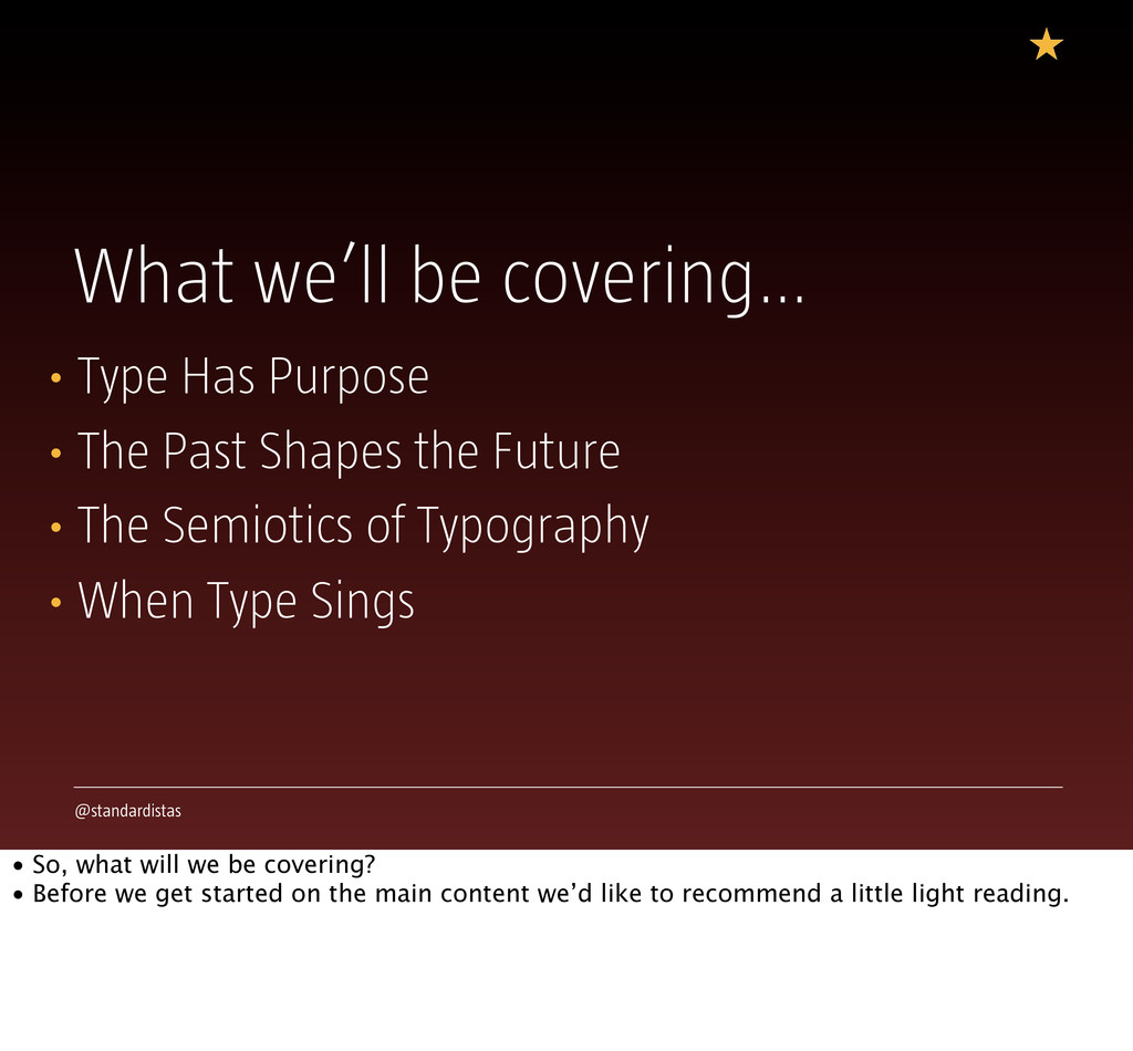
Our presentation explores the wonderful world of typography and everything it has to offer designers, as we embark on a rich web typography adventure. Services like Typekit, Fontdeck, and others, allow us to avail of exciting, new typographic approaches in the context of the web, promising inspirational design opportunities that can - and will - change the way we approach design for the wealth of platforms we design for. Whilst its tempting to think of the rich typographic landscape we now find ourselves occupying as a new and undiscovered land, it is - in fact - a land of opportunities that has been comprehensively mapped before. We journey through the past, cross-referencing to the present, discovering design patterns and approaches that - thanks to the possibilities rich web type offers - allow us, as designers, to once again rediscover timeless design qualities, creating works which sit outside of time.
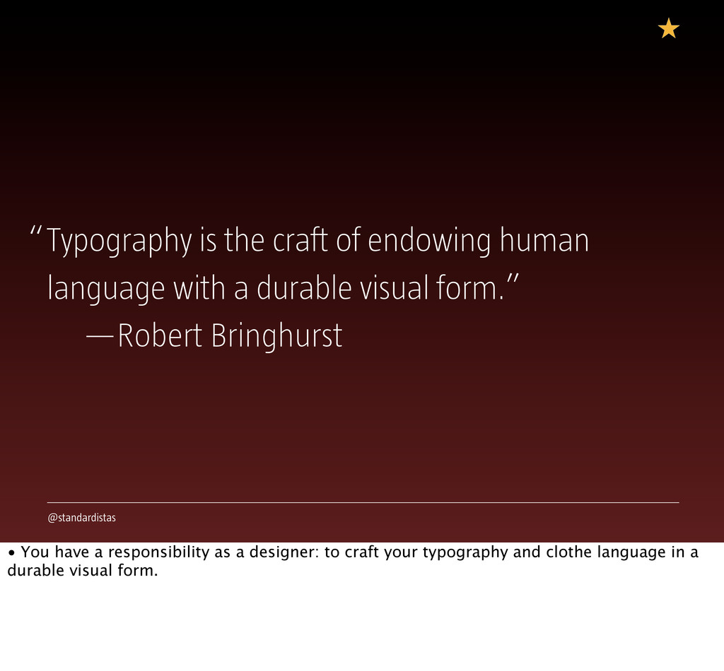
The Standardistas

September 21, 2012
Tweet

More Decks by The Standardistas

Other Decks in Design

Transcript

  1. The Art of Typography The Standardistas @standardistas Refresh LX, Lisbon,

    2012 j.mp/speakerdeckstandardistas • A very brief introduction. Who we are and what we’re talking about. • Thank you to the Bruno, the Refresh LX maestro, for being such a generous host.
  2. @standardistas Enjoying this? @standardistas #artoftypography • Follow us on Twitter

    and we’ll happily hook up for a chat over a beer later. • Our #hashtag for the day is #artoftypography, or in Portuguese on the next slide…
  3. @standardistas What we’ll be covering… • Type Has Purpose •

    The Past Shapes the Future • The Semiotics of Typography • When Type Sings • So, what will we be covering? • Before we get started on the main content we’d like to recommend a little light reading.
  4. @standardistas j.mp/requiredreading • In addition to our role as The

    Standardistas and as practicing designers, we’re academics, so you won’t be surprised to see a list of key texts that inform our thinking.
  5. @standardistas • Ellen Lupton’s ‘Thinking With Type’ is an excellent

    overview of the world of typography. Now in its second edition it’s well worth owning if you don’t already have a copy. http://j.mp/thinkwithtype
  6. @standardistas • Robert Bringhurst’s classic ‘The Elements of Typographic Style’

    is an exhaustive overview and a bible you can continue to regularly. Though its focus is primarily the printed page, it still harbours a great many secrets applicable to the web. • Richard Rutter, of Fontdeck, used it as the basis for the ‘The Elements of Typographic Style Applied to the Web’ (http://webtypography.net). http://j.mp/typographicstyle
  7. @standardistas • Jost Hochuli's excellent ‘Detail in Typography’, exhaustively catalogues

    the finer points of setting text, exploring the wealth of typographic details at our disposal. http://j.mp/detailintypography
  8. @standardistas Type Amplifies Meaning • Type conveys and amplifies meaning.

    • We can turn the dial to 1, or we can turn it to 11. • Where we turn the dial to, is determined by the content we’re shaping.
  9. @standardistas These go to eleven….” “ • We take a

    message and we shape it as designers. Sometimes we opt for loud, sometimes we opt for quiet. The choices we make are critical to the messages we shape.
  10. @standardistas This type is vocal, it kicks you in the

    balls… • A poster is intended to capture your attention, it’s vociferous. • Carving words into your chest isn’t quiet; this is type that’s going to eleven, it’s loud. • The letterforms capture your attention - forcefully - they grip you, they pull you in.
  11. @standardistas This type is vocal, it kicks you in the

    balls… • A book, on the other hand, requires typography of a different nature. • It needs type that recedes, that’s quiet, that disappears; this is type that’s going to one, it’s almost silent.
  12. @standardistas • Typography exists on a continuum. • You can

    go to eleven or dial down to one, the bottom line is to make your choice appropriate to your content. • Content and form should be inseparable.
  13. @standardistas The Crystal Goblet • Beatrice Warde’s ‘The Crystal Goblet’

    is rich with metaphors. The title itself is a reference to a clear vessel holding wine, where the vessel (the printed word) gives no obstruction to the presentation of its content (the text). • Warde states: “The man who first chose glass instead of metal to hold his wine was a ‘modernist’…. That is, the first he asked of this particular object was not, ‘How should it look?’ but, ‘What must it do?’ and to that extent all good typography is modernist.”
  14. @standardistas “Two goblets: one of solid gold, wrought in the

    most exquisite patterns and one of crystal-clear glass.” —Beatrice Warde, ‘The Crystal Goblet’ • Warde poses a choice between two wine glasses that serve different purposes.
  15. @standardistas “Believing we can deliver when message and form aren’t

    intimately bound betrays the promise of design as a communication practice.” —Robbie Manson, ‘Content Is the Fuel’ • Robbie Manson: “Content is the fuel. Design is the vehicle.”
  16. @standardistas What is your purpose? • Ask yourself: What purpose

    does your type serve? What is its intention?
  17. @standardistas • Is it intended to delight, like Robert Massin’s

    exuberant typography for Ionesco's play 'The Bald Soprano'?
  18. @standardistas • Is it intended to confound, like David Carson’s

    intentionally oblique typography for an article on Bryan Ferry he found to be “banal and predictable,” and so set in Zapf Dingbats to save readers the pain of reading it?
  19. @standardistas • Or is it intended to disappear, like Mitchell

    and Wightman’s restrained typography for their excellent book on ‘Book Typography’?
  20. @standardistas Purpose Shapes Form • Know the purpose and understand

    the intention – the typographic choices should flow down from that. • Bringhurst offers solid advice here…
  21. @standardistas 1.1.1 Typography exists to honour content. • Bringhurst: “[Typography]

    is a craft by which the meanings of a text (or its absense of meaning) can be clarified, honored and shared, or knowingly disguised.”
  22. @standardistas 1.1.3 There is a style beyond style. • Bringhurst:

    “Typography is to literature as musical performance is to composition: an essential act of interpretation.”
  23. @standardistas 1.2.1 Read the text before designing it. • This

    is critical. As designers working on the web, we can add meaning to the words we work with. The first stage of this process is through well-chosen markup which amplifies meaning.
  24. @standardistas Read and Understand • It sounds obvious, but if

    we are to design appropriately we must insist on content first, otherwise all we create as designers is window dressing, at the most banal and superficial level. • We owe our readers (and our writers) the very best we can do. That involves a combination of markup, carefully measured; coupled with form, appropriately tailored.
  25. @standardistas Analyse, Map, Design • Text – Foundation • Markup

    – Structure • CSS (Typographic Choices) – Amplification • A three stage process: • The text is the foundation on which we build; • The markup we choose to clothe the text in, further reveals, clarifying the underlying message; • The typographic choices we make, applied via CSS, amplify the text’s purpose even further.
  26. @standardistas Creative Non-Interference • Bringhurst calls this ‘Creative Non-Interference’: “Simple

    as it may sound, the task of creative non-interference… is a rewarding and difficult calling. In ideal conditions, it is all that typographers are really asked to do – and it is enough.” • The challenge - for the truly mature professional – is to take a step back and know when to let go. Your personality is not necessarily what the text needs. Don’t lose sight of that.
  27. @standardistas Do Your Work, Then Disappear • There was a

    time when a designer’s role was to shape meaning, amplifying a message to the best of their ability. They served content. • In an age of ‘designer celebrities’ – all eager to stamp their mark on the underlying content at hand, in an effort to further gild their designer’s lily – the challenge, for the true typographer – to ‘disappear’ – is one we might best rediscover.
  28. @standardistas The Past Shapes the Future • Typography is bound

    to time. We can learn from the past, indeed, the best designers do. • Many typographic problems have already been solved, elegantly. We can build on this knowledge.
  29. @standardistas • Time and technology shape typography. • All typefaces

    are a product of their time; understanding this will make you a better typographer. • A super-condensed history of typographic shifts, every one has impacted upon what we can do as typographers.
  30. @standardistas • Renaissance typography of the 15th and 16th centuries

    signalled the hand of the scribe, the cursive forms of the pen, characterising letterforms. • The echoes of the scribe, labouring to spread the word of god.
  31. @standardistas • Renaissance typography of the 15th and 16th centuries

    signalled the hand of the scribe, the cursive forms of the pen, characterising letterforms. • The echoes of the scribe, labouring to spread the word of god.
  32. @standardistas • Without advances in metallurgy the ultra-fine serifs of

    Didot and Bodoni would not have been possible. • This typography - and the forms of its letterforms - represented the pinnacle of technological achievement. A rationalist, vertical axis that reflected the Age of Enlightenment’s fascination with science and rationalism.
  33. @standardistas • Without advances in metallurgy the ultra-fine serifs of

    Didot and Bodoni would not have been possible. • This typography - and the forms of its letterforms - represented the pinnacle of technological achievement. A rationalist, vertical axis that reflected the Age of Enlightenment’s fascination with science and rationalism.
  34. @standardistas • The rationalist forms of Paul Renner’s Futura, of

    the early twentieth century, wear their machine credentials proudly on their utilitarian sleeves, suggesting a social sentiment, utopian in outlook and of the people. • Born of the factory, they eschewed needless ornament.
  35. @standardistas • The rationalist forms of Paul Renner’s Futura, of

    the early twentieth century, wear their machine credentials proudly on their utilitarian sleeves, suggesting a social sentiment, utopian in outlook and of the people. • Born of the factory, they eschewed needless ornament.
  36. @standardistas • OCR A – Optical Character Recognition A –

    could only have existed in the late 60s, a time characterised by the rise of the computer and machine readable typography. • Its letterforms capture the essence of the 60s, a time of moon landings and cold war tensions.
  37. @standardistas • OCR A – Optical Character Recognition A –

    could only have existed in the late 60s, a time characterised by the rise of the computer and machine readable typography. • Its letterforms capture the essence of the 60s, a time of moon landings and cold war tensions.
  38. @standardistas • By the 80s, say hello to Chicago, heralded

    in by Steve Jobs and Andy Hertzfeld, a cornerstone of the desktop publishing revolution with letterforms defined by the pixel grid of the Macintosh.
  39. @standardistas • By the 80s, say hello to Chicago, heralded

    in by Steve Jobs and Andy Hertzfeld, a cornerstone of the desktop publishing revolution with letterforms defined by the pixel grid of the Macintosh.
  40. @standardistas • Bello, by the obsessive and supremely talented team

    at Underware, encapsulates what is possible when OpenType is pushed to its absolute limits. It’s a product resolutely of the OpenType era. • Years in the making - in no small part due to a considerable array of typographic alternates enabled by OpenType - Bello offers a multitude of forms to the discerning designer, far, far more than any previous era might imagine. All enabled by the humble computer.
  41. @standardistas • Bello, by the obsessive and supremely talented team

    at Underware, encapsulates what is possible when OpenType is pushed to its absolute limits. It’s a product resolutely of the OpenType era. • Years in the making - in no small part due to a considerable array of typographic alternates enabled by OpenType - Bello offers a multitude of forms to the discerning designer, far, far more than any previous era might imagine. All enabled by the humble computer.
  42. @standardistas • Through these forms we see the march of

    time and the progress of history - through a very selective lens - the forms we clothe language in change, shaped by time.
  43. @standardistas Know Your History • Understanding your type’s heritage improves

    your ability as a designer. • If there’s one word of advice we can offer, it is to travel down the pathways of the past, discovering the typographic journey that has shaped the letterforms we use today.
  44. @standardistas The Semiotics of Typography • The type you choose

    acts as a signifier, communicating meaning and shaping your message.
  45. @standardistas • This scene encapsulates an era, of pin stripe

    suits, loud ties and competitive business cards.
  46. @standardistas • Technology shapes type. Two times, two types of

    type, enabled by what was possible at the time. In the first instance, the quill; in the second instance, the computer.
  47. @standardistas • Politics shapes our world view and it shapes

    typography too. In the 20s, to embrace modernity was to embrace the sans-serif, in the 60s the aesthetic of the Offset Duplicator, the typewriter and hand-painted protest signs, heralded a revolutionary spirit.
  48. @standardistas • Fashion also shapes typography. Two different ages, two

    different typographic fashions, both counter-culture. When choosing a typeface you also choose the context in which it was created, and everything that came since.
  49. @standardistas When Type Sings • By marrying timeless design principles

    with the semantics we have at our disposal, we can create beautifully designed typographic experiences that captivate.
  50. @standardistas • Dialled to almost zero, Frank Chimero’s site for

    ‘The Shape of Design’ tells its story in a timeless and elegant manner. • The type lets the words do the talking.
  51. @standardistas • Mule Design’s ‘Evening Edition’, dialled a little louder,

    is an interesting re-imagining of how news might be delivered, that echoes the semantics of newspaper design.
  52. @standardistas • A cornucopia of type, Swedish ad agency SWE

    turns the dial a little louder still, with a bombastic display of typographic expression. And all this with no colour at all.
  53. @standardistas • The site for XOXO – by our Portuguese

    friend, Paulo Pereira – is expressive, yet restrained. Colour and type, hand in hand in harmony.
  54. @standardistas • Tim Brown’s typographic samples, this one in particular,

    are a showcase of dialling to eleven, pushing type as far as it can go in an exuberant and experimental manner.
  55. @standardistas “Typography is the craft of endowing human language with

    a durable visual form.” —Robert Bringhurst • You have a responsibility as a designer: to craft your typography and clothe language in a durable visual form.