Upgrade to Pro
— share decks privately, control downloads, hide ads and more …
Speaker Deck
Features
Speaker Deck
PRO
Sign in
Sign up for free
Search
Search
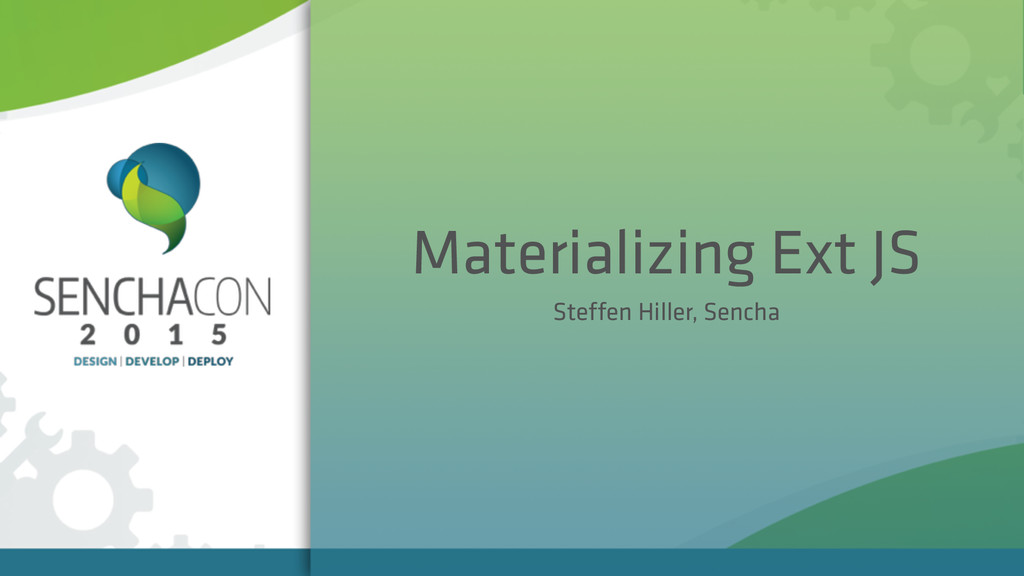
Materializing Ext JS
Search
Steffen Hiller
April 08, 2015
Programming
3.2k
5
Share
Embed
Copy iframe code
Copy JS code
Copy link
Start on current slide
Materializing Ext JS
Building a Material Design interface with Ext JS
Steffen Hiller
April 08, 2015
Other Decks in Programming
See All in Programming
act1-costs.pdf
sumedhbala
0
240
Apache Hive: そしてCloud Native Lakehouseへ
okumin
1
140
AIを活用したE2Eテスト実装効率化のあゆみ / ebisu-mobile-14-kotetu
kotetuco
0
170
これからAgentCoreを触る方へ トレンドはGatewayです
har1101
6
500
Go言語とトイモデルで学ぶTransformerの気持ち / fukuokago23-transformer
monochromegane
0
120
AI 輔助遺留系統現代化的經驗分享
jame2408
1
1.2k
OSINT for SRE: 学術論文とポストモーテムから探る システム障害の共通パターン / SRE NEXT 2026
tomoyk
1
3.9k
Generative UI & AI-Assistants for Your Angular Solutions
manfredsteyer
PRO
0
110
SREの積み重ねがAI駆動開発のガードレールになった ― 7つの実践/SRE Guardrails The 7
tomoyakitaura
8
4.5k
1B+ /day規模のログを管理する技術
broadleaf
0
140
任せる範囲はこう広がった / How the Scope of AI Delegation Has Expanded
nrslib
1
260
気圧・高度・GPSを記録&可視化するアプリ「Koudo」を作った話
hjmkth
1
360
Featured
See All Featured
Building Flexible Design Systems
yeseniaperezcruz
330
40k
The Invisible Side of Design
smashingmag
301
52k
Visualization
eitanlees
152
17k
CoffeeScript is Beautiful & I Never Want to Write Plain JavaScript Again
sstephenson
162
16k
コードの90%をAIが書く世界で何が待っているのか / What awaits us in a world where 90% of the code is written by AI
rkaga
62
45k
AI in Enterprises - Java and Open Source to the Rescue
ivargrimstad
0
1.4k
The Director’s Chair: Orchestrating AI for Truly Effective Learning
tmiket
1
220
Paper Plane
katiecoart
PRO
2
52k
Put a Button on it: Removing Barriers to Going Fast.
kastner
60
4.4k
Visualizing Your Data: Incorporating Mongo into Loggly Infrastructure
mongodb
49
10k
Why Your Marketing Sucks and What You Can Do About It - Sophie Logan
marketingsoph
0
290
The Psychology of Web Performance [Beyond Tellerrand 2023]
tammyeverts
49
3.5k
Transcript
None
Materializing Ext JS Steffen Hiller, Sencha
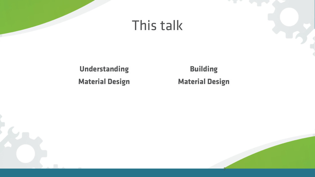
This talk 3 Understanding Material Design Building Material Design
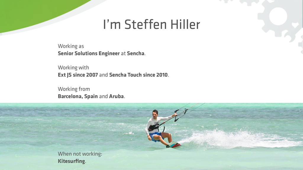
4 I’m Steffen Hiller Working as Senior Solutions Engineer at
Sencha. Working with Ext JS since 2007 and Sencha Touch since 2010. Working from Barcelona, Spain and Aruba. When not working: Kitesurfing.
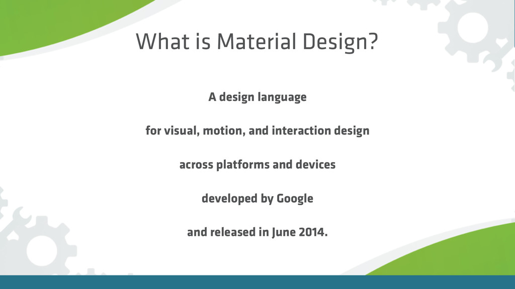
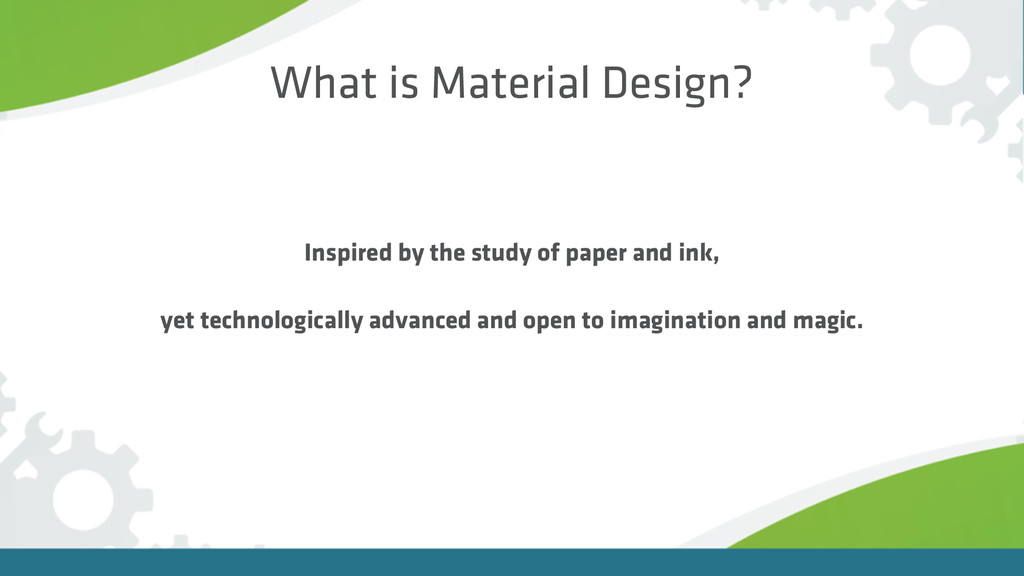
What is Material Design? A design language for visual, motion,
and interaction design across platforms and devices developed by Google and released in June 2014.
What is Material Design? Inspired by the study of paper
and ink, yet technologically advanced and open to imagination and magic.
https://www.youtube.com/watch?v=Q8TXgCzxEnw
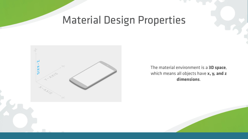
The material environment is a 3D space, which means all
objects have x, y, and z dimensions. Material Design Properties
All shadows in the material environment are cast by a
key light and an ambient light. = Material Design Properties
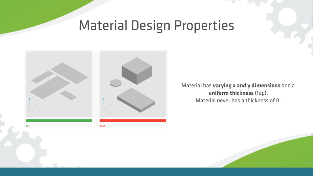
Material Design Properties Material has varying x and y dimensions
and a uniform thickness (1dp). Material never has a thickness of 0.
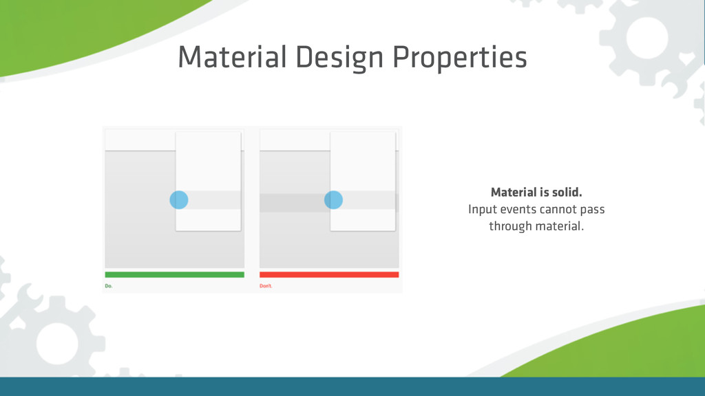
Material is solid. Input events cannot pass through material. Material
Design Properties
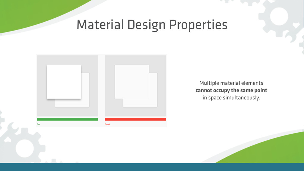
Multiple material elements cannot occupy the same point in space
simultaneously. Material Design Properties
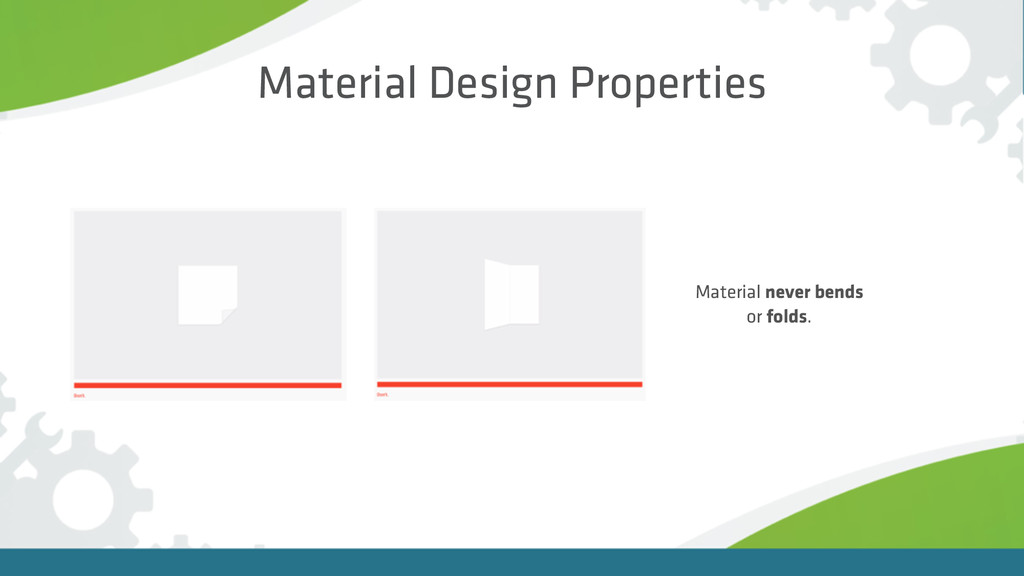
Material Design Properties Material never bends or folds.
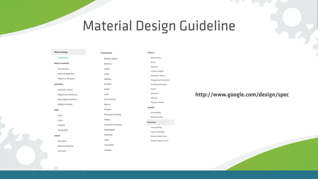
Material Design Guideline http://www.google.com/design/spec
Let’s build
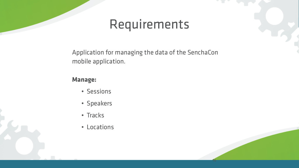
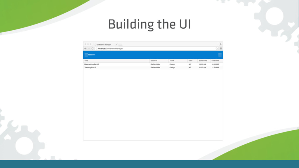
Requirements Application for managing the data of the SenchaCon mobile
application. Manage: • Sessions • Speakers • Tracks • Locations 16
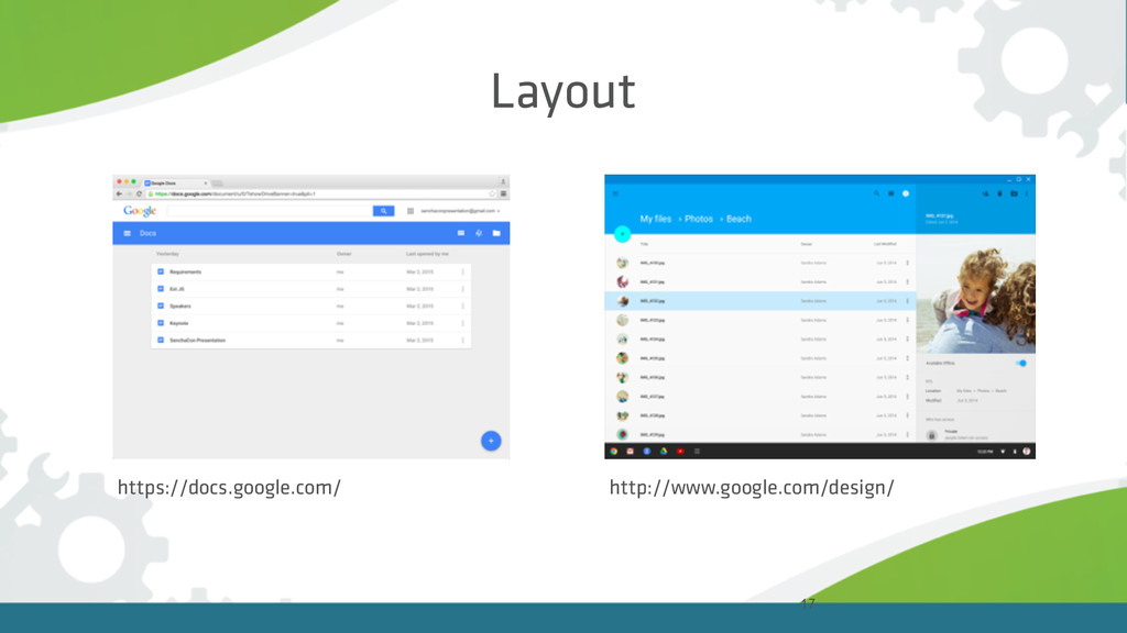
17 Layout https://docs.google.com/ http://www.google.com/design/
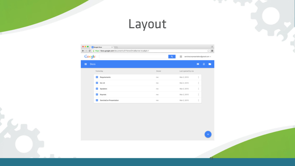
18 Layout
Building the UI
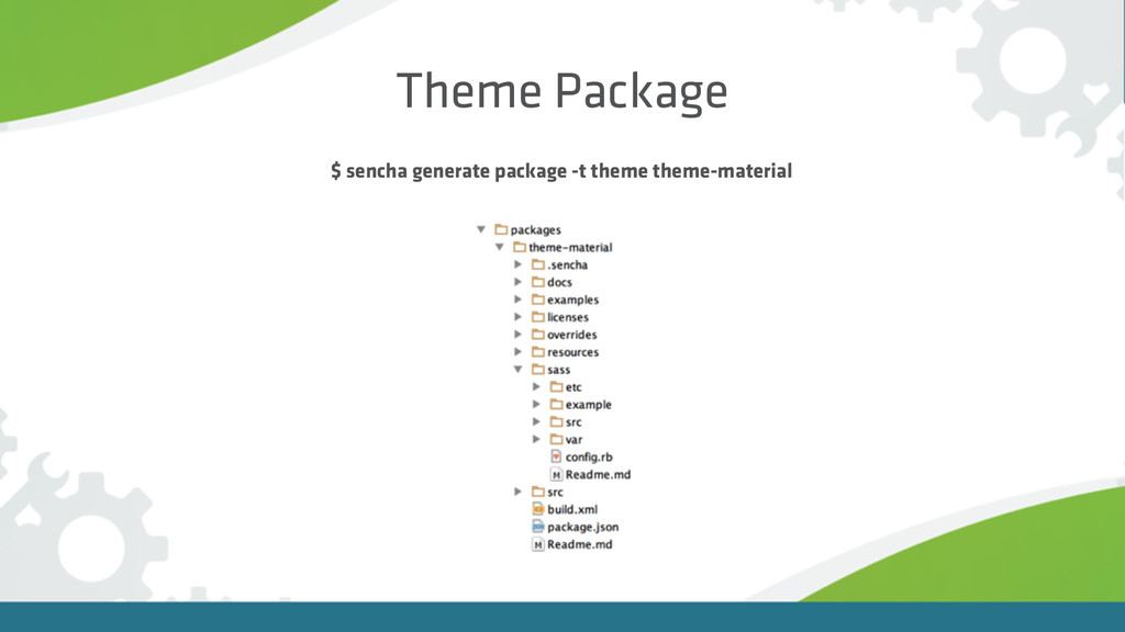
Theme Package $ sencha generate package -t theme theme-material
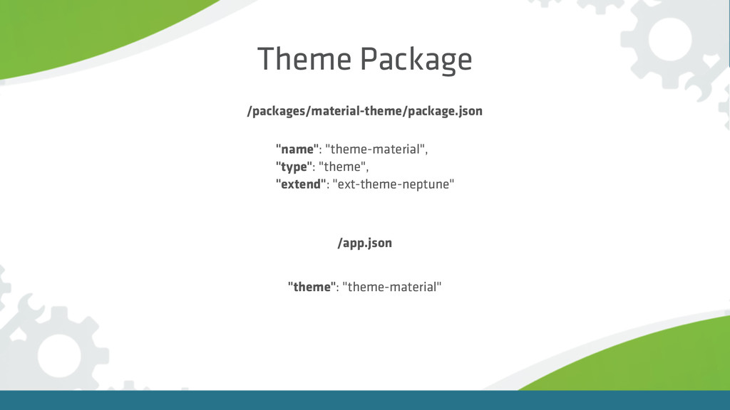
Theme Package /packages/material-theme/package.json /app.json "name": "theme-material", "type": "theme", "extend": "ext-theme-neptune"
"theme": "theme-material"
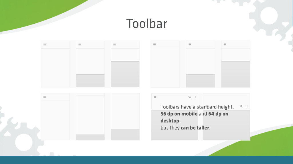
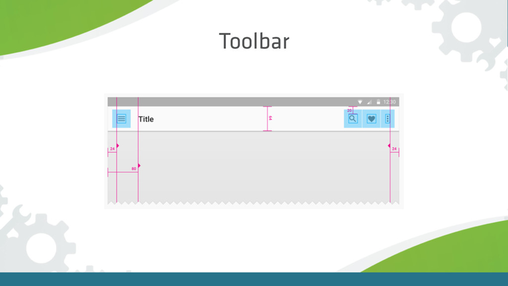
Toolbar
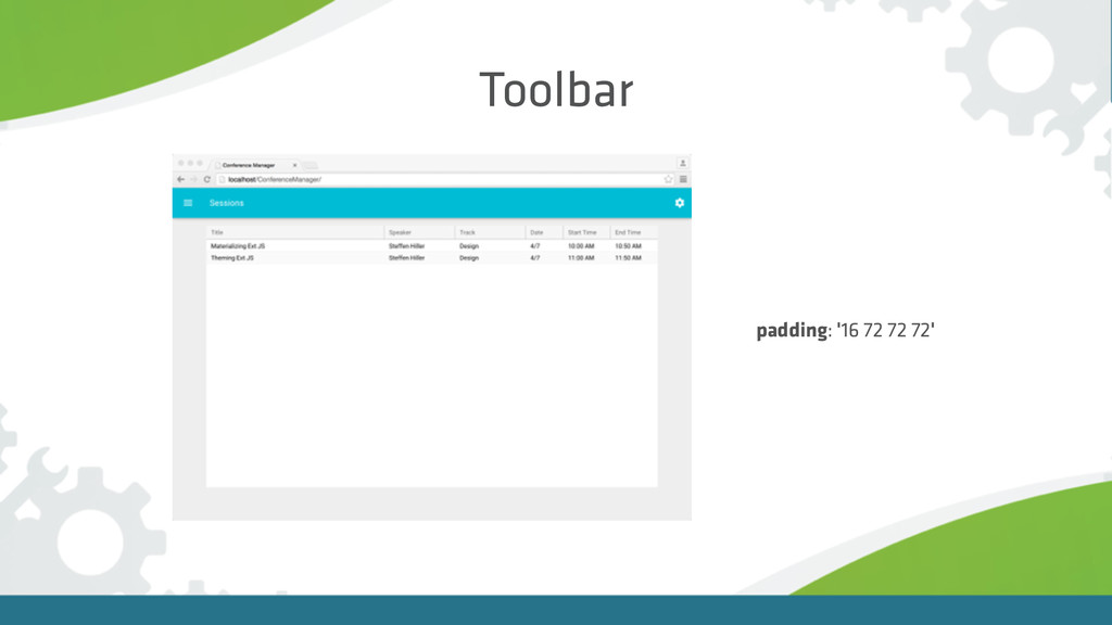
Toolbar Toolbars have a standard height, 56 dp on mobile
and 64 dp on desktop, but they can be taller.
Toolbar
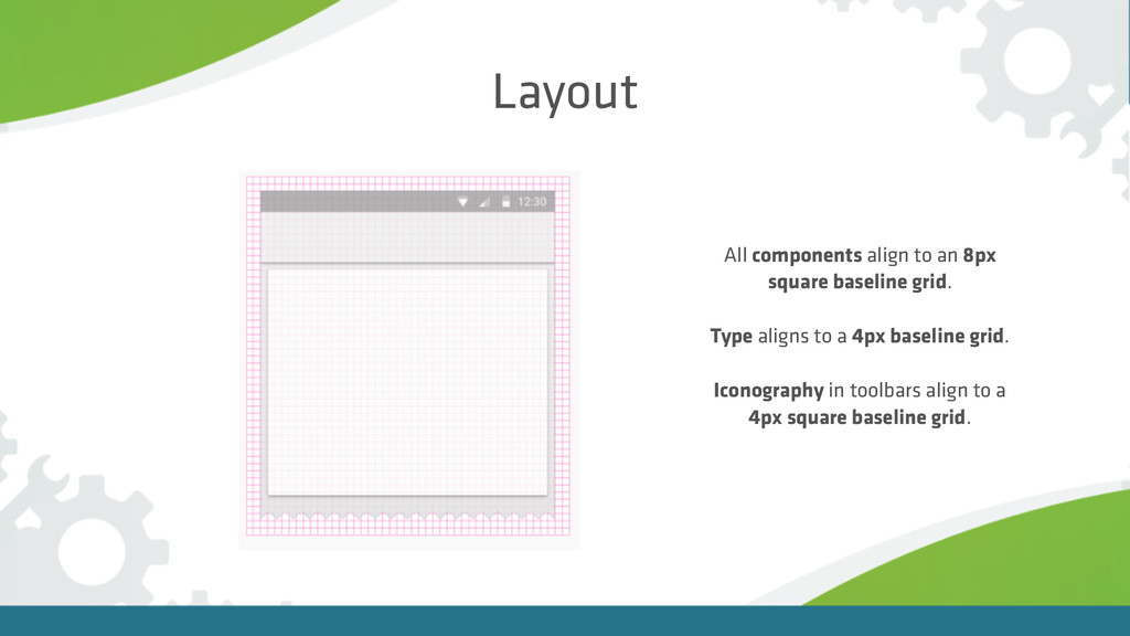
Layout All components align to an 8px square baseline grid.
Type aligns to a 4px baseline grid. Iconography in toolbars align to a 4px square baseline grid.
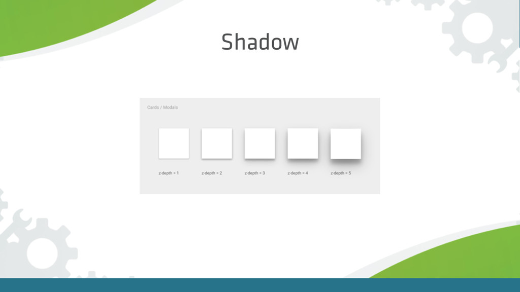
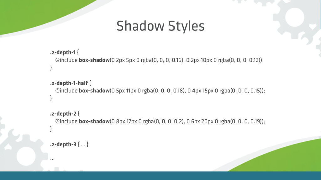
Shadow
Shadow Styles .z-depth-1 { @include box-shadow(0 2px 5px 0 rgba(0,
0, 0, 0.16), 0 2px 10px 0 rgba(0, 0, 0, 0.12)); } .z-depth-1-half { @include box-shadow(0 5px 11px 0 rgba(0, 0, 0, 0.18), 0 4px 15px 0 rgba(0, 0, 0, 0.15)); } .z-depth-2 { @include box-shadow(0 8px 17px 0 rgba(0, 0, 0, 0.2), 0 6px 20px 0 rgba(0, 0, 0, 0.19)); } .z-depth-3 { … } …
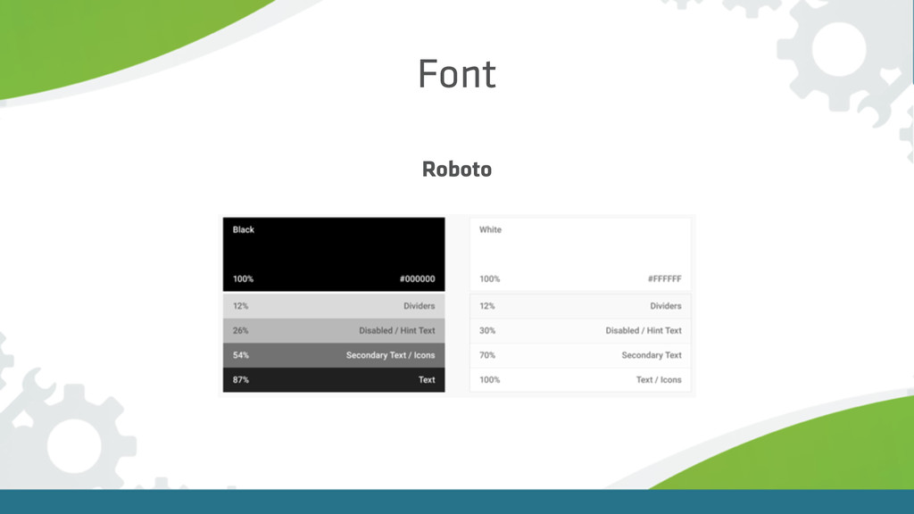
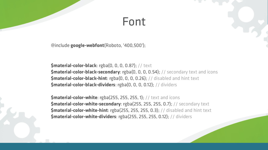
Font Roboto
Font @include google-webfont(Roboto, '400,500'); $material-color-black: rgba(0, 0, 0, 0.87); //
text $material-color-black-secondary: rgba(0, 0, 0, 0.54); // secondary text and icons $material-color-black-hint: rgba(0, 0, 0, 0.26); // disabled and hint text $material-color-black-dividers: rgba(0, 0, 0, 0.12); // dividers $material-color-white: rgba(255, 255, 255, 1); // text and icons $material-color-white-secondary: rgba(255, 255, 255, 0.7); // secondary text $material-color-white-hint: rgba(255, 255, 255, 0.3); // disabled and hint text $material-color-white-dividers: rgba(255, 255, 255, 0.12); // dividers
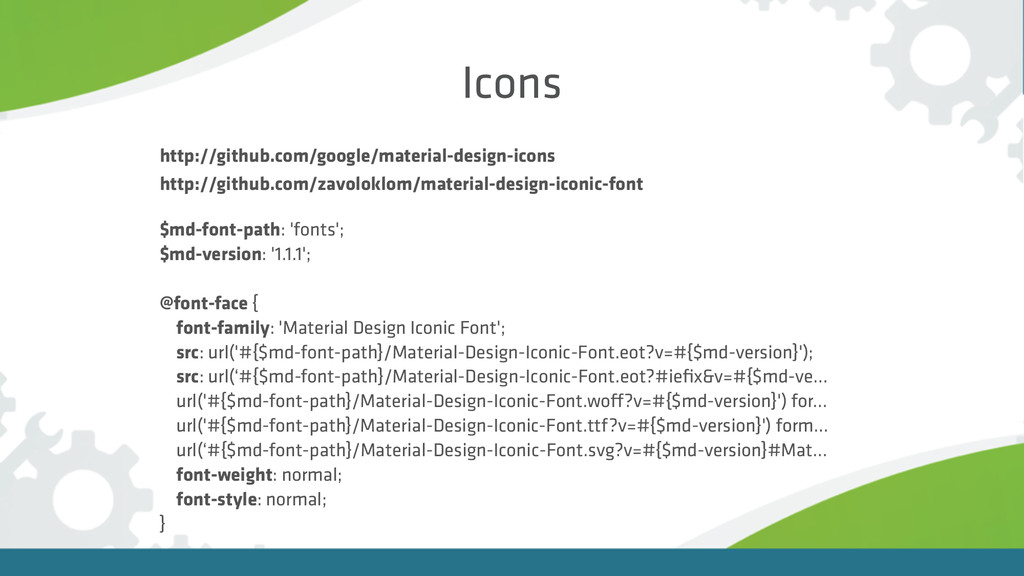
Icons http://github.com/google/material-design-icons http://github.com/zavoloklom/material-design-iconic-font $md-font-path: 'fonts'; $md-version: '1.1.1'; @font-face {
font-family: 'Material Design Iconic Font'; src: url('#{$md-font-path}/Material-Design-Iconic-Font.eot?v=#{$md-version}'); src: url(‘#{$md-font-path}/Material-Design-Iconic-Font.eot?#iefix&v=#{$md-ve… url('#{$md-font-path}/Material-Design-Iconic-Font.woff?v=#{$md-version}') for… url('#{$md-font-path}/Material-Design-Iconic-Font.ttf?v=#{$md-version}') form… url(‘#{$md-font-path}/Material-Design-Iconic-Font.svg?v=#{$md-version}#Mat… font-weight: normal; font-style: normal; }
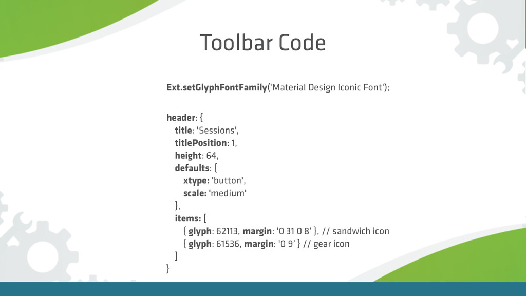
Toolbar Code header: { title: 'Sessions', titlePosition: 1, height: 64,
defaults: { xtype: 'button', scale: 'medium' }, items: [ { glyph: 62113, margin: '0 31 0 8’ }, // sandwich icon { glyph: 61536, margin: '0 9’ } // gear icon ] } Ext.setGlyphFontFamily('Material Design Iconic Font');
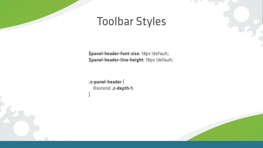
Toolbar Styles $panel-header-font-size: 18px !default; $panel-header-line-height: 18px !default; .x-panel-header {
@extend .z-depth-1; }
Toolbar padding: '16 72 72 72'
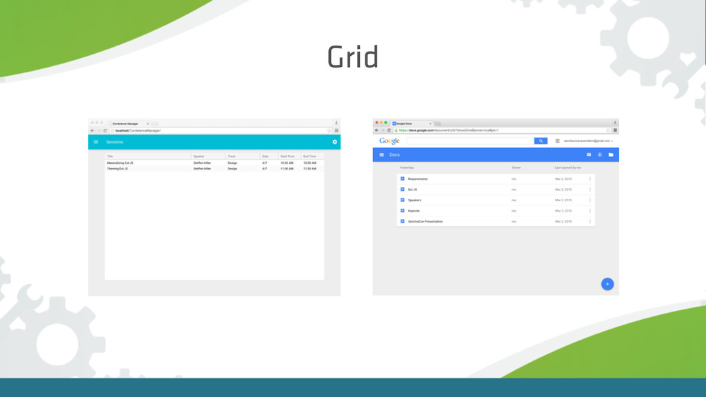
Grid
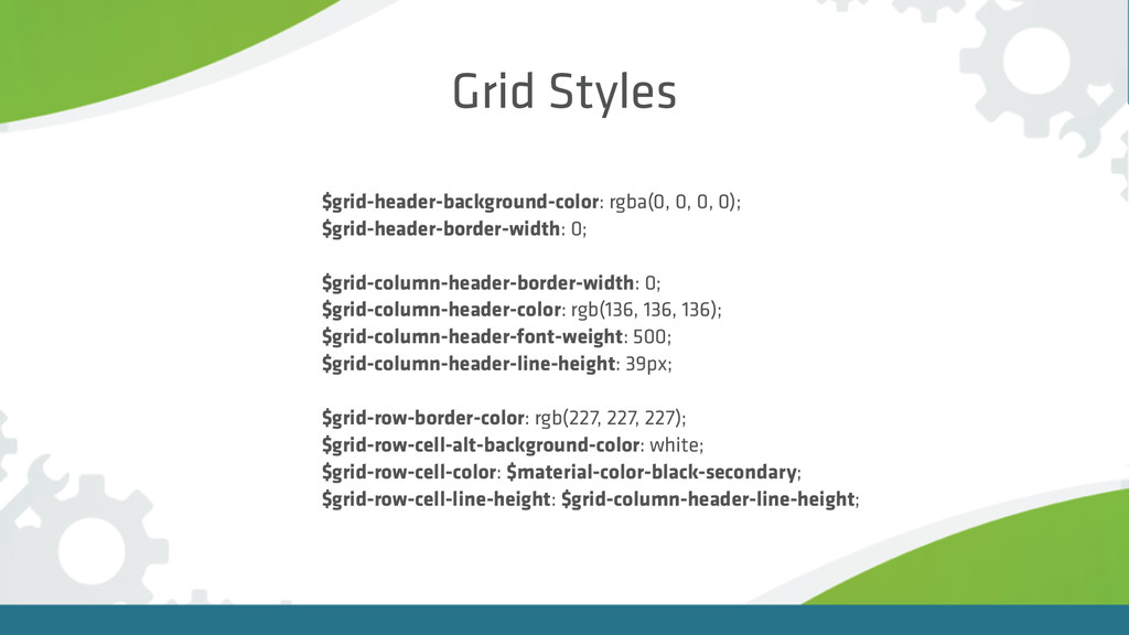
Grid Styles $grid-header-background-color: rgba(0, 0, 0, 0); $grid-header-border-width: 0;
$grid-column-header-border-width: 0; $grid-column-header-color: rgb(136, 136, 136); $grid-column-header-font-weight: 500; $grid-column-header-line-height: 39px; $grid-row-border-color: rgb(227, 227, 227); $grid-row-cell-alt-background-color: white; $grid-row-cell-color: $material-color-black-secondary; $grid-row-cell-line-height: $grid-column-header-line-height;
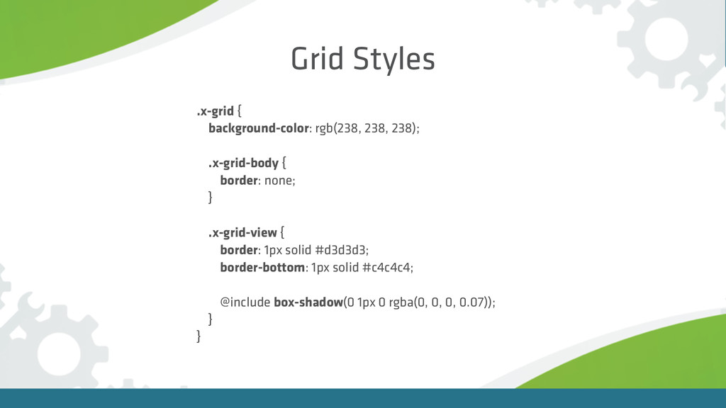
Grid Styles .x-grid { background-color: rgb(238, 238, 238); .x-grid-body
{ border: none; } .x-grid-view { border: 1px solid #d3d3d3; border-bottom: 1px solid #c4c4c4; @include box-shadow(0 1px 0 rgba(0, 0, 0, 0.07)); } }
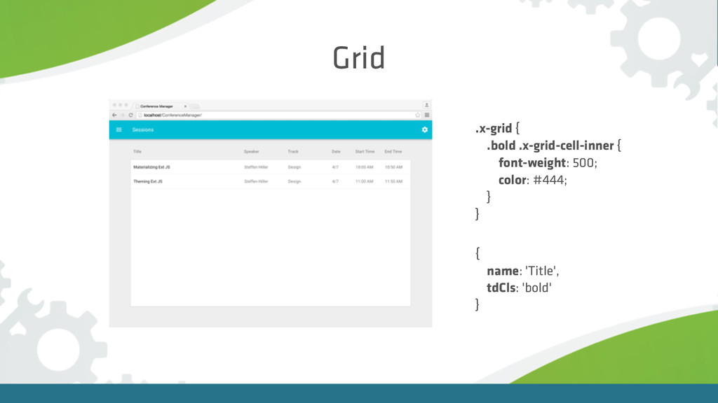
Grid .x-grid { .bold .x-grid-cell-inner { font-weight: 500; color: #444;
} } { name: 'Title', tdCls: 'bold' }
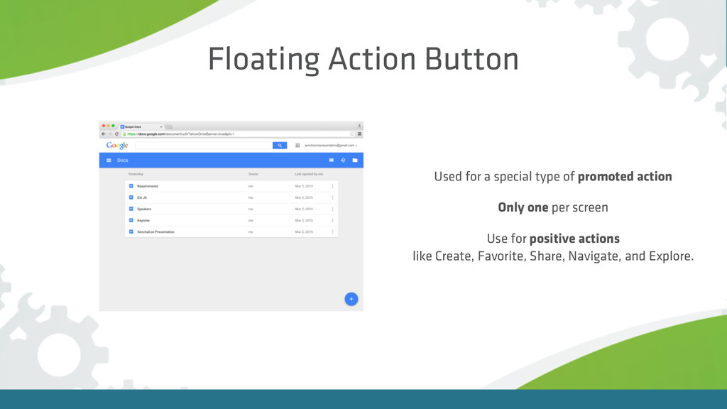
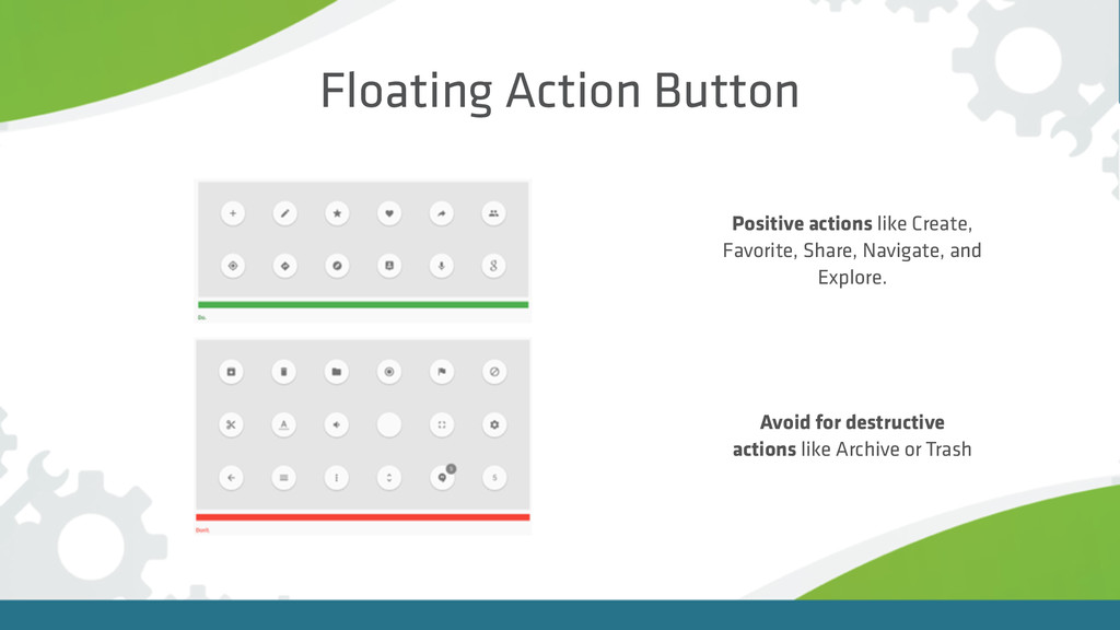
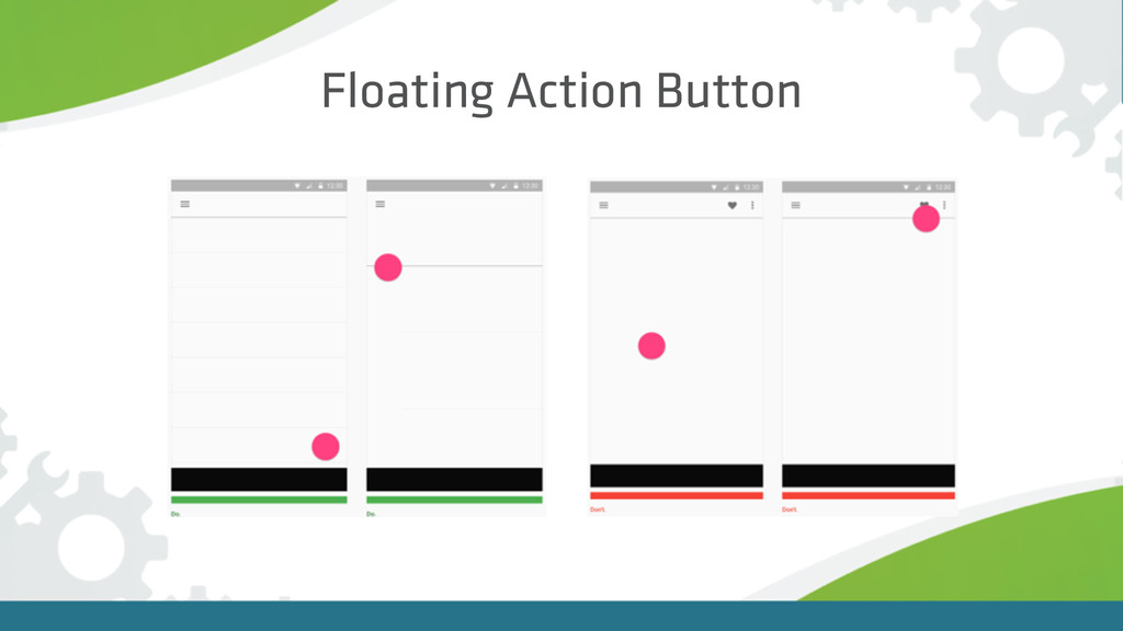
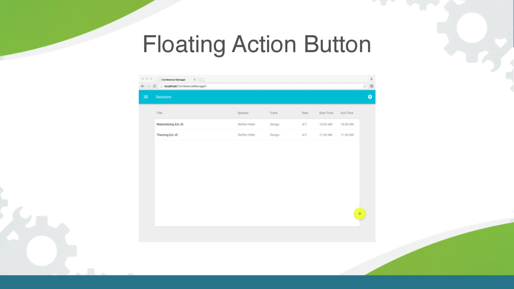
Floating Action Button Used for a special type of promoted
action Only one per screen Use for positive actions like Create, Favorite, Share, Navigate, and Explore.
Floating Action Button Positive actions like Create, Favorite, Share, Navigate,
and Explore. Avoid for destructive actions like Archive or Trash
Floating Action Button
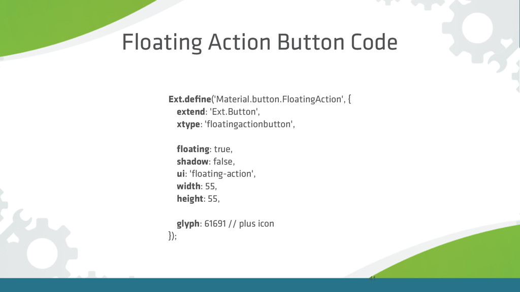
41 Floating Action Button Code Ext.define('Material.button.FloatingAction', { extend: 'Ext.Button', xtype:
'floatingactionbutton', floating: true, shadow: false, ui: 'floating-action', width: 55, height: 55, glyph: 61691 // plus icon });
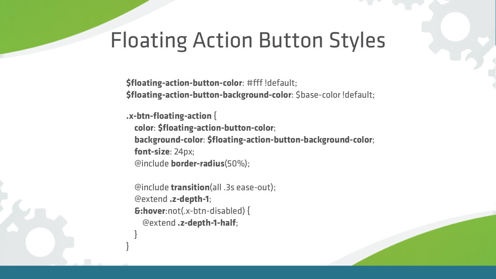
Floating Action Button Styles $floating-action-button-color: #fff !default; $floating-action-button-background-color: $base-color !default;
.x-btn-floating-action { color: $floating-action-button-color; background-color: $floating-action-button-background-color; font-size: 24px; @include border-radius(50%); @include transition(all .3s ease-out); @extend .z-depth-1; &:hover:not(.x-btn-disabled) { @extend .z-depth-1-half; } }
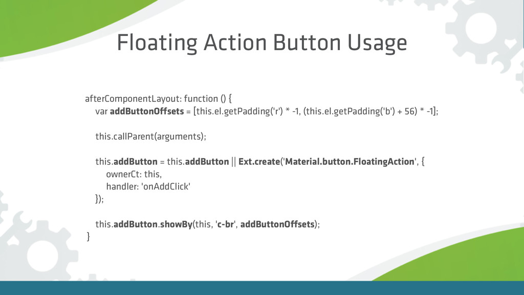
Floating Action Button Usage afterComponentLayout: function () { var addButtonOffsets
= [this.el.getPadding('r') * -1, (this.el.getPadding('b') + 56) * -1]; this.callParent(arguments); this.addButton = this.addButton || Ext.create('Material.button.FloatingAction', { ownerCt: this, handler: 'onAddClick' }); this.addButton.showBy(this, 'c-br', addButtonOffsets); }
Floating Action Button
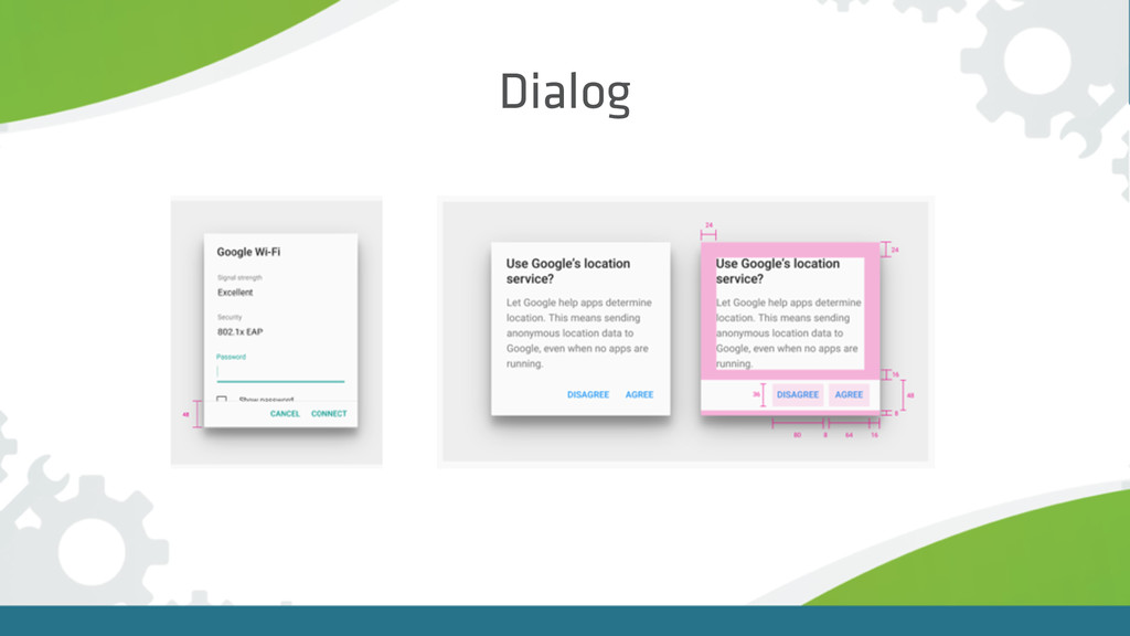
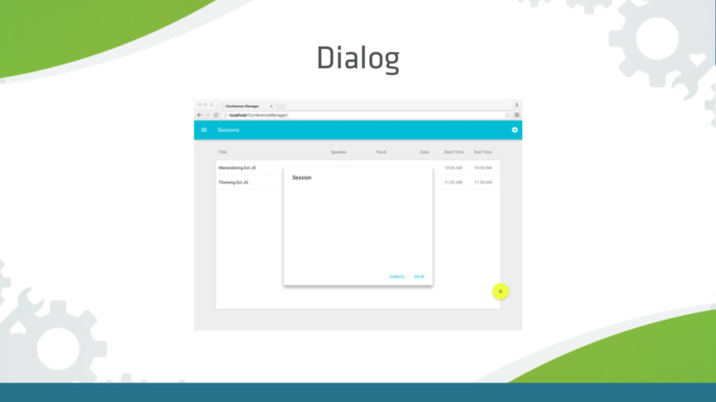
Dialog
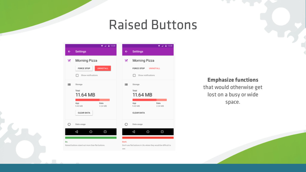
Raised Buttons Emphasize functions that would otherwise get lost on
a busy or wide space.
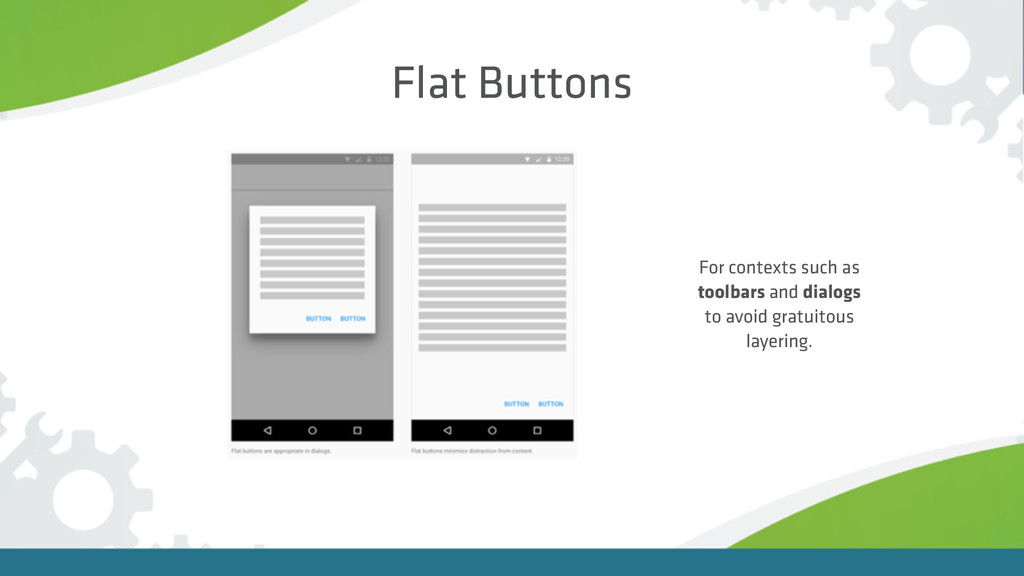
Flat Buttons For contexts such as toolbars and dialogs to
avoid gratuitous layering.
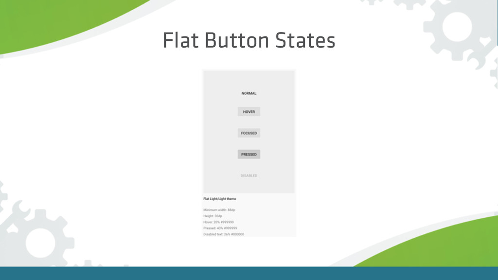
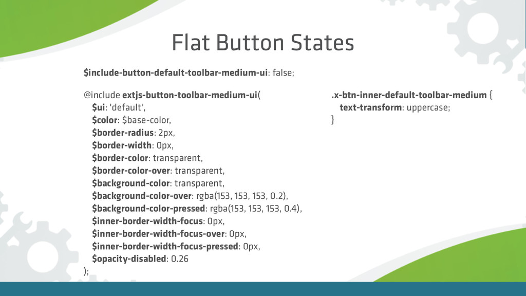
Flat Button States
Flat Button States $include-button-default-toolbar-medium-ui: false; @include extjs-button-toolbar-medium-ui( $ui: 'default', $color:
$base-color, $border-radius: 2px, $border-width: 0px, $border-color: transparent, $border-color-over: transparent, $background-color: transparent, $background-color-over: rgba(153, 153, 153, 0.2), $background-color-pressed: rgba(153, 153, 153, 0.4), $inner-border-width-focus: 0px, $inner-border-width-focus-over: 0px, $inner-border-width-focus-pressed: 0px, $opacity-disabled: 0.26 ); .x-btn-inner-default-toolbar-medium { text-transform: uppercase; }
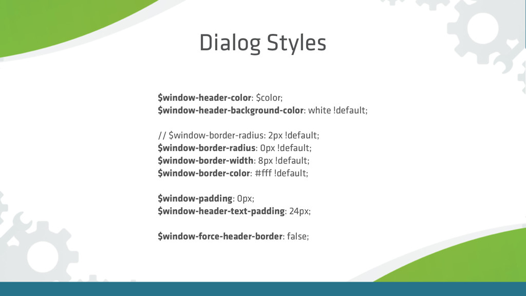
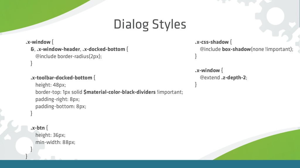
Dialog Styles $window-header-color: $color; $window-header-background-color: white !default; // $window-border-radius:
2px !default; $window-border-radius: 0px !default; $window-border-width: 8px !default; $window-border-color: #fff !default; $window-padding: 0px; $window-header-text-padding: 24px; $window-force-header-border: false;
Dialog Styles .x-window { &, .x-window-header, .x-docked-bottom { @include border-radius(2px);
} .x-toolbar-docked-bottom { height: 48px; border-top: 1px solid $material-color-black-dividers !important; padding-right: 8px; padding-bottom: 8px; } .x-btn { height: 36px; min-width: 88px; } } .x-window { @extend .z-depth-2; } .x-css-shadow { @include box-shadow(none !important); }
Dialog
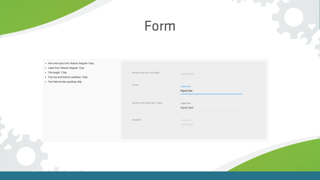
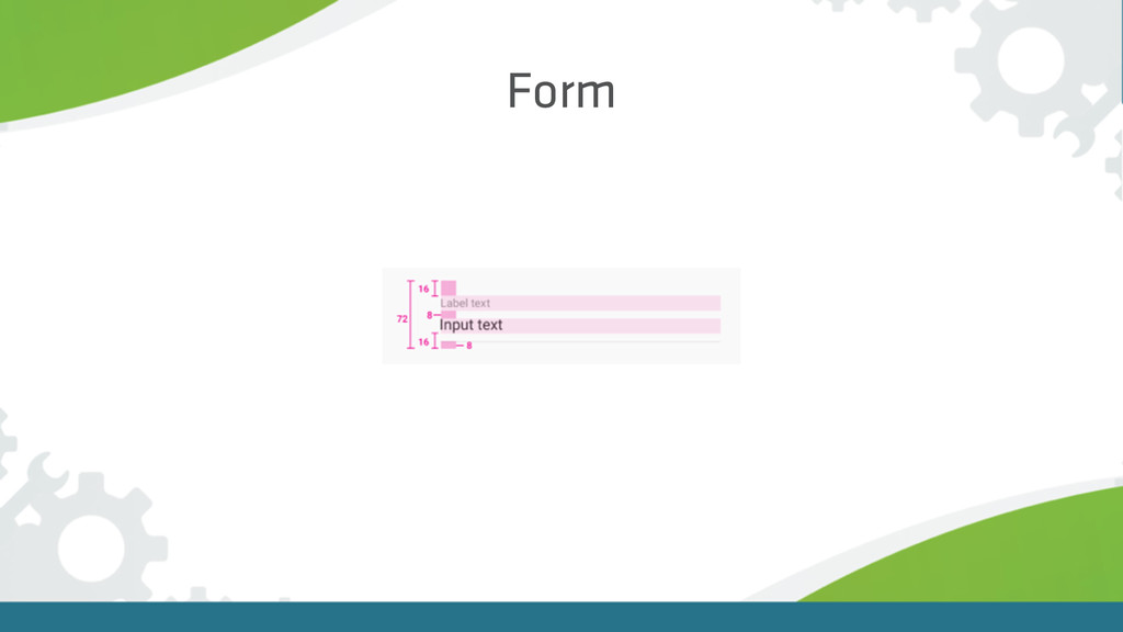
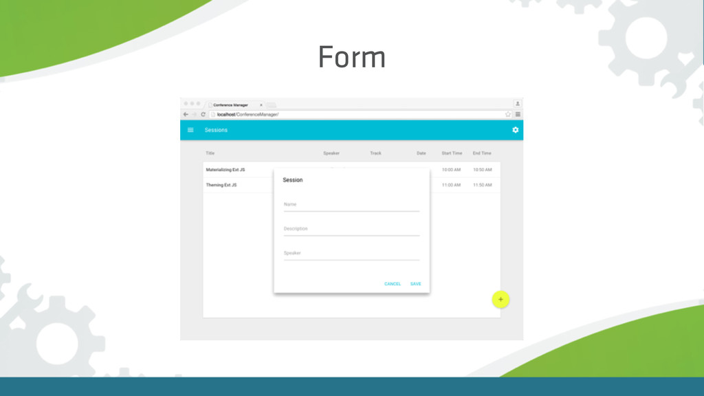
Form
Form
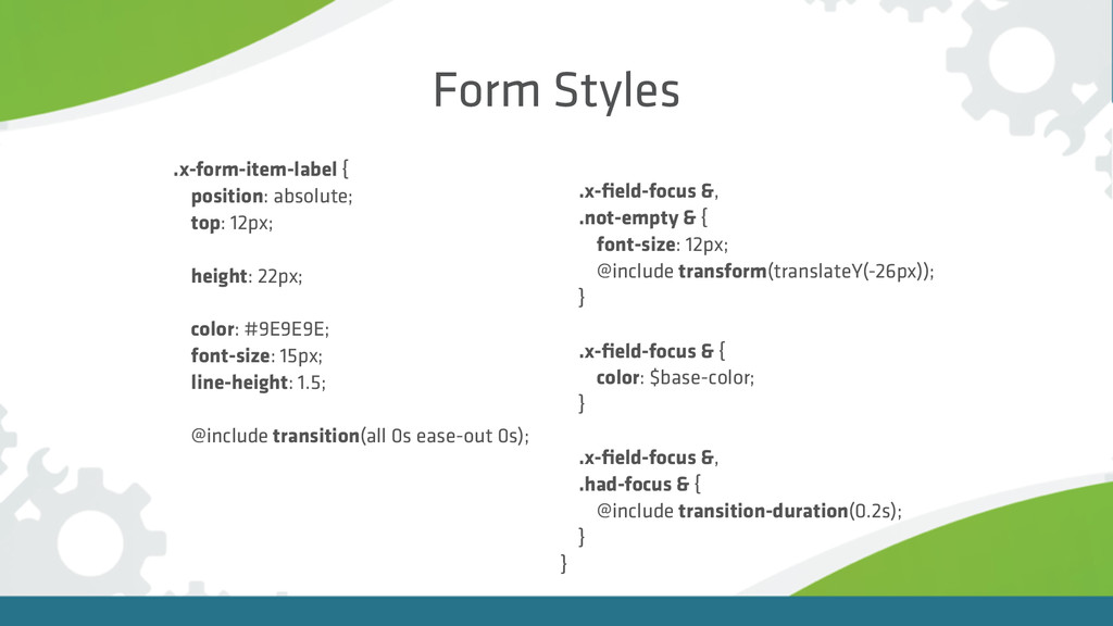
Form Styles .x-form-item-label { position: absolute; top: 12px; height:
22px; color: #9E9E9E; font-size: 15px; line-height: 1.5; @include transition(all 0s ease-out 0s); .x-field-focus &, .not-empty & { font-size: 12px; @include transform(translateY(-26px)); } .x-field-focus & { color: $base-color; } .x-field-focus &, .had-focus & { @include transition-duration(0.2s); } }
Form
Animation Form Field Animation Floating Button Animation Dialog Open Animation
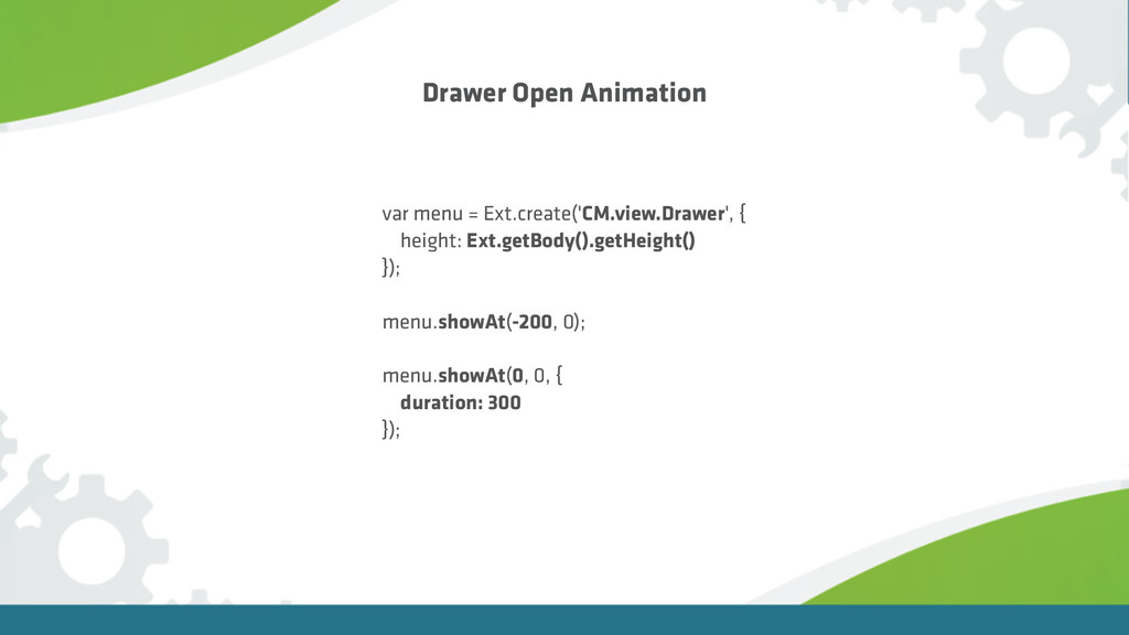
Drawer Open Animation
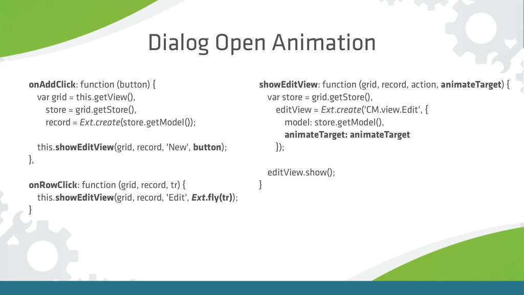
onAddClick: function (button) { var grid = this.getView(), store =
grid.getStore(), record = Ext.create(store.getModel()); this.showEditView(grid, record, 'New', button); }, onRowClick: function (grid, record, tr) { this.showEditView(grid, record, 'Edit', Ext.fly(tr)); } Dialog Open Animation showEditView: function (grid, record, action, animateTarget) { var store = grid.getStore(), editView = Ext.create('CM.view.Edit', { model: store.getModel(), animateTarget: animateTarget }); editView.show(); }
Drawer Open Animation var menu = Ext.create('CM.view.Drawer', { height: Ext.getBody().getHeight()
}); menu.showAt(-200, 0); menu.showAt(0, 0, { duration: 300 });
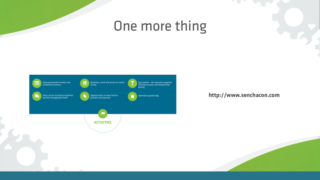
One more thing http://www.senchacon.com
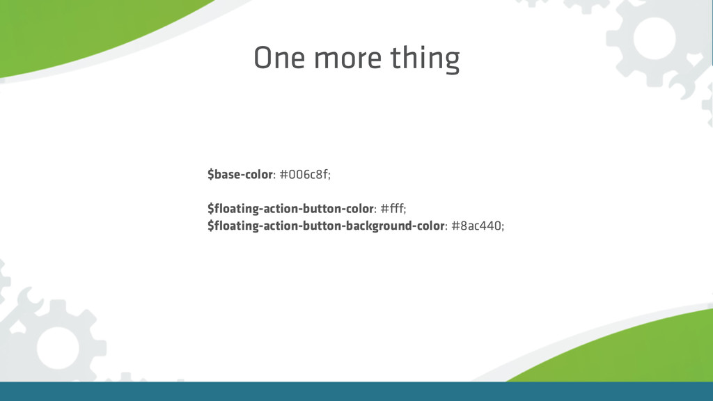
One more thing $base-color: #006c8f; $floating-action-button-color: #fff; $floating-action-button-background-color: #8ac440;
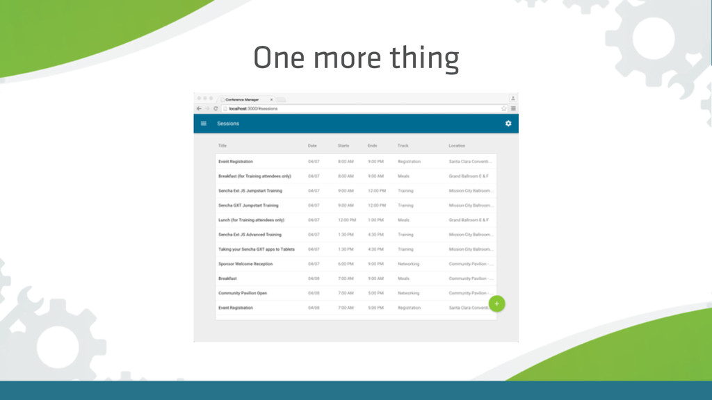
One more thing
Demo
Summary Very detailed style guide Helps you to design custom
components Great for your app Fun for you as developer It’s not difficult
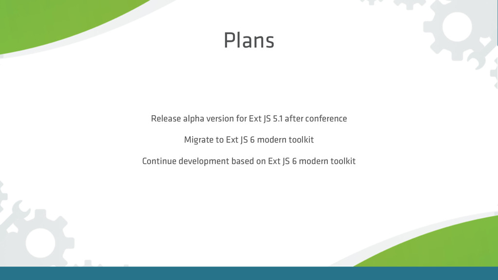
Plans Release alpha version for Ext JS 5.1 after conference
Migrate to Ext JS 6 modern toolkit Continue development based on Ext JS 6 modern toolkit
Questions? Follow me on Twitter @steffenhiller
 sumedhbala
 okumin
 kotetuco
 har1101
 monochromegane
 jame2408
 tomoyk
 manfredsteyer
 tomoyakitaura
 broadleaf
 nrslib
 hjmkth
 yeseniaperezcruz
 smashingmag
 eitanlees
 sstephenson
 rkaga
rkaga
 ivargrimstad
 tmiket
 katiecoart
 kastner
 mongodb
 marketingsoph
 tammyeverts