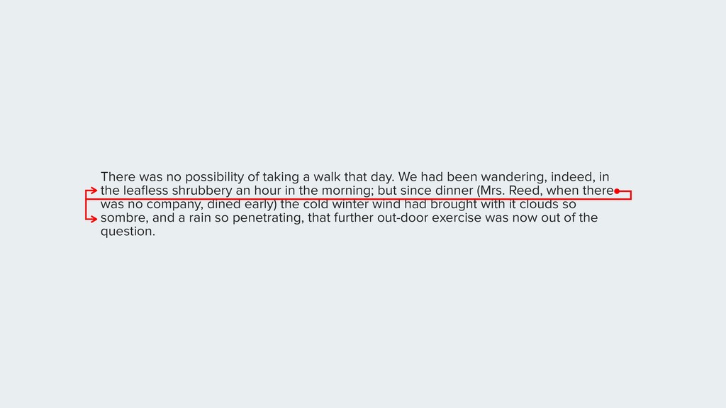
We had been wandering, indeed, in the leafless shrubbery an hour in the morning; but since dinner (Mrs. Reed, when there was no company, dined early) the cold winter wind had brought with it clouds so sombre, and a rain so penetrating, that further out-door exercise was now out of the question.
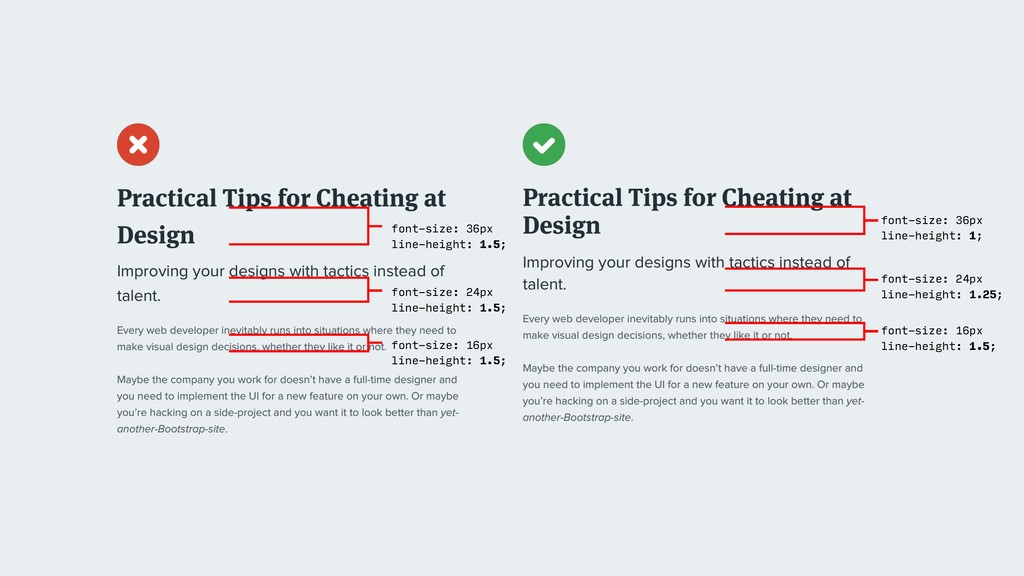
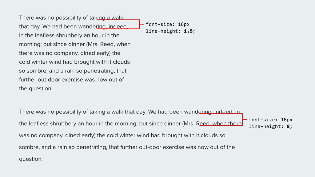
We had been wandering, indeed, in the leafless shrubbery an hour in the morning; but since dinner (Mrs. Reed, when there was no company, dined early) the cold winter wind had brought with it clouds so sombre, and a rain so penetrating, that further out-door exercise was now out of the question. There was no possibility of taking a walk that day. We had been wandering, indeed, in the leafless shrubbery an hour in the morning; but since dinner (Mrs. Reed, when there was no company, dined early) the cold winter wind had brought with it clouds so sombre, and a rain so penetrating, that further out-door exercise was now out of the question. font-size: 16px line-height: 1.5; font-size: 16px line-height: 2;