Upgrade to Pro
— share decks privately, control downloads, hide ads and more …
Speaker Deck
Features
Speaker Deck
PRO
Sign in
Sign up for free
Search
Search
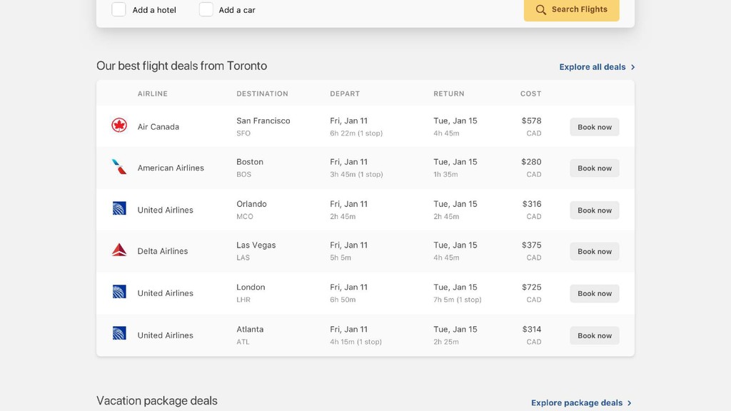
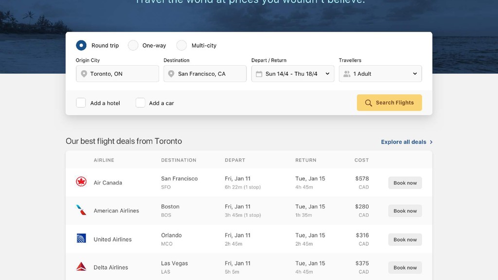
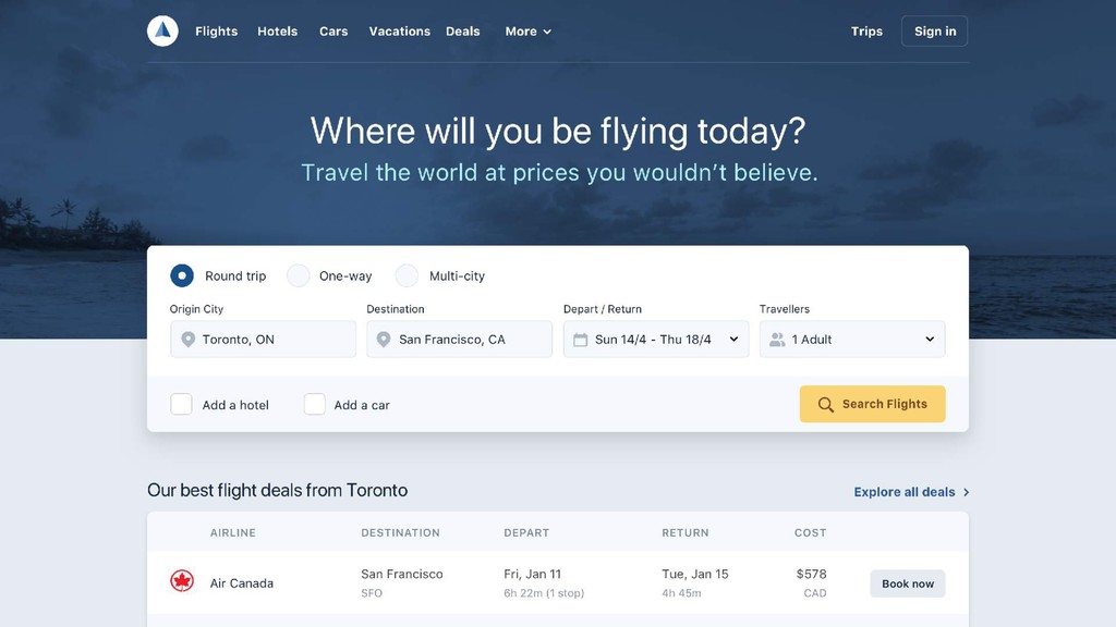
Practical Solutions to Common UI Design Problems
Search
steveschoger
June 13, 2019
Design
4.4k
9
Share
Embed
Copy iframe code
Copy JS code
Copy link
Start on current slide
Practical Solutions to Common UI Design Problems
steveschoger
June 13, 2019
More Decks by steveschoger
See All by steveschoger
How to Think Like a Visual Designer
steveschoger
8
4.9k
fluxible-15m.pdf
steveschoger
4
1.4k
The Little Details of UI Design
steveschoger
39
12k
Other Decks in Design
See All in Design
decksh object reference
ajstarks
2
1.7k
デザインツールを開く前に その画面は誰に何と言わせたい?受託UIデザイナーが顧客解像度を高める 「打ち合わせの場での確かめ方」
garyuten
1
110
デザインワークフローの最前線。 ログラスでのAI活用の現在地
ukaoli
1
1.5k
速く作れるかではなく、速く学べるか ― 学習ループを回すパイロットの途中報告
nagata03
0
540
1000人規模の組織でデザインハーネスを導入するための第一歩
pkshadeck
PRO
1
1.9k
「ツール」から「パートナー」へ。AI伴走時代のUXデザインとは?~操作を減らし、成果を最大にするための設計~
ncdc
1
690
セブンデックス プロジェクト事例 / innovation Scenes
sevendex
1
1.3k
デザインの文脈を理解する:エンジニアがデザインカンファレンスに参加して得た学びと気づき
hypebeans
0
240
Connpass-Xperia_Camera_App_by_HCD.pdf
sony
1
700
染み出し好きの、 染み出しコントロール論
mukai_takeru
0
180
工房としてのAI ── デザイナー、作家、ビルダー
hiranotomoki
0
330
20260215独立行政法人科学技術振興機構(JST) 社会技術研究開発センター(RISTEX)ケアが根づく社会システム _公開シンポジウム
a2k
1
230
Featured
See All Featured
Designing Powerful Visuals for Engaging Learning
tmiket
1
450
Unsuck your backbone
ammeep
672
58k
Dealing with People You Can't Stand - Big Design 2015
cassininazir
367
27k
Introduction to Domain-Driven Design and Collaborative software design
baasie
1
890
The Cost Of JavaScript in 2023
addyosmani
55
10k
Pawsitive SEO: Lessons from My Dog (and Many Mistakes) on Thriving as a Consultant in the Age of AI
davidcarrasco
0
190
Improving Core Web Vitals using Speculation Rules API
sergeychernyshev
21
1.5k
Jess Joyce - The Pitfalls of Following Frameworks
techseoconnect
PRO
1
190
Product Roadmaps are Hard
iamctodd
55
12k
What’s in a name? Adding method to the madness
productmarketing
PRO
24
4.1k
Design and Strategy: How to Deal with People Who Don’t "Get" Design
morganepeng
133
19k
Visualizing Your Data: Incorporating Mongo into Loggly Infrastructure
mongodb
49
10k
Transcript
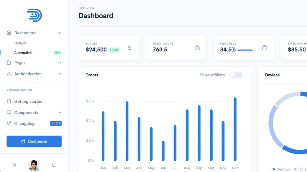
Practical Solutions to Common UI Design Problems
Steve Schoger (Pronounced Show-Grrrrr)
!
Practical Solutions to Common UI Design Problems
None
None
None
None
None
None
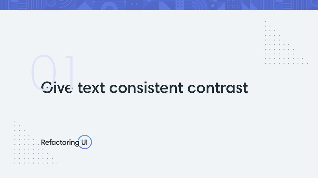
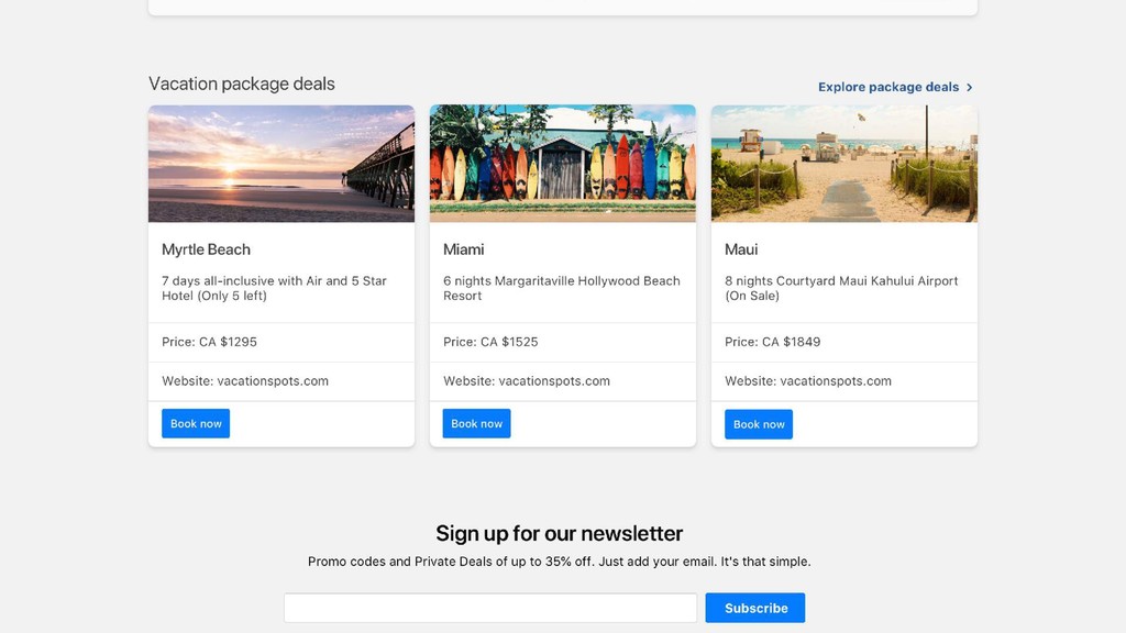
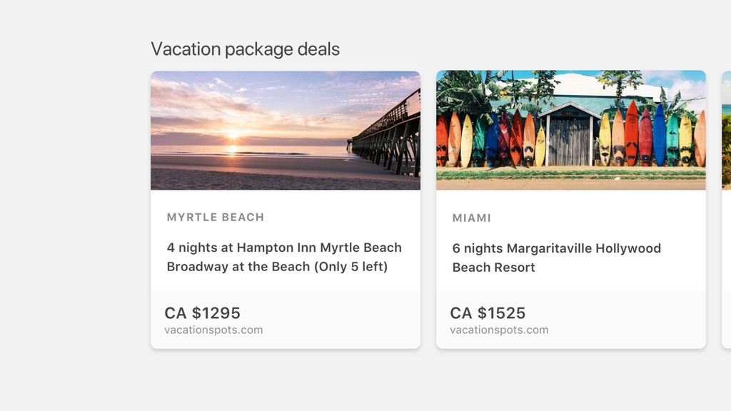
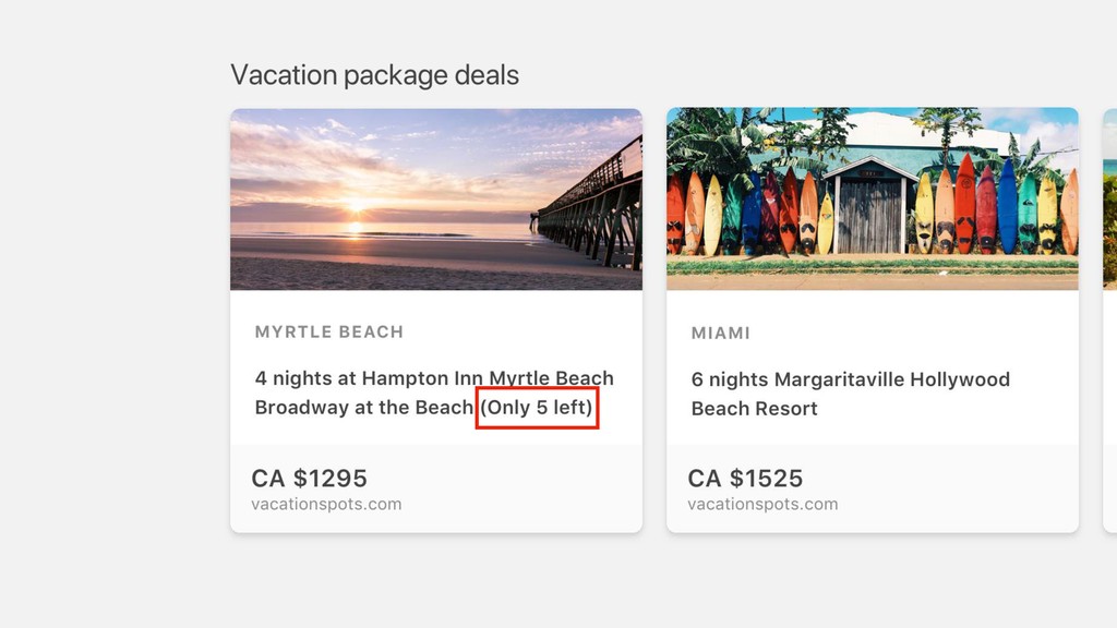
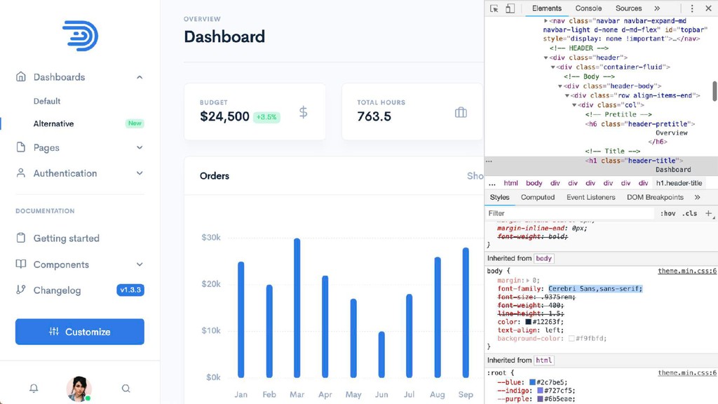
Give text consistent contrast 01
None
None
None
None
None
None
None
None
None
None
None
None
None
None
None
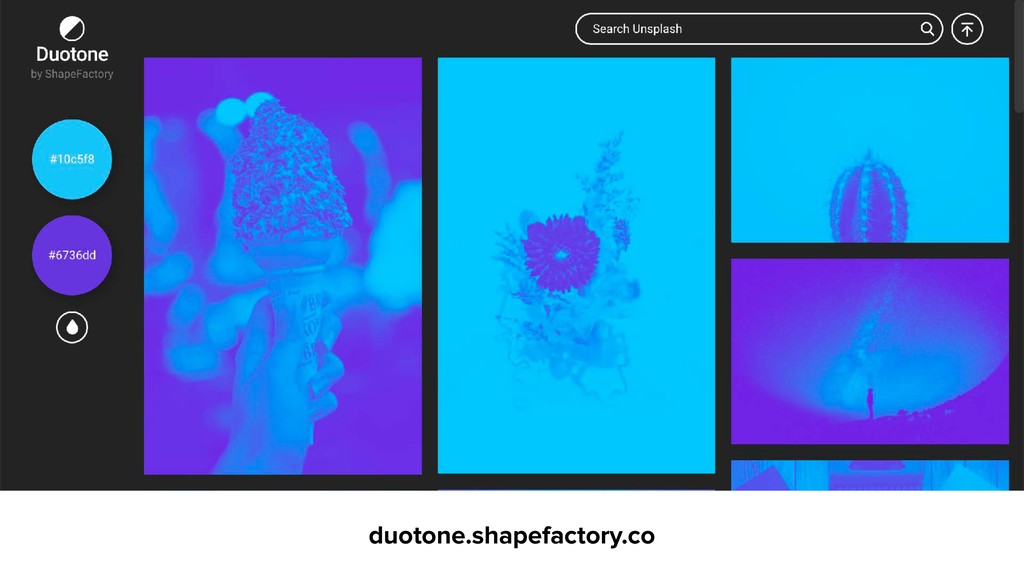
duotone.shapefactory.co
unsplash.com
None
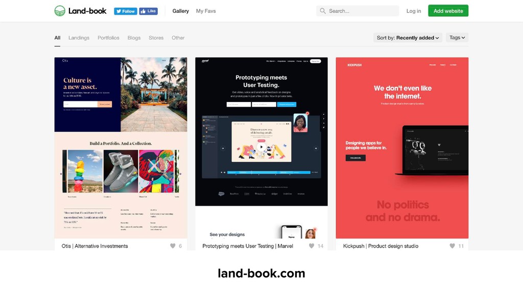
land-book.com
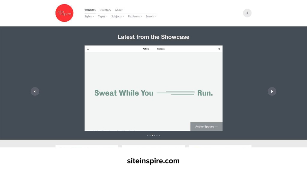
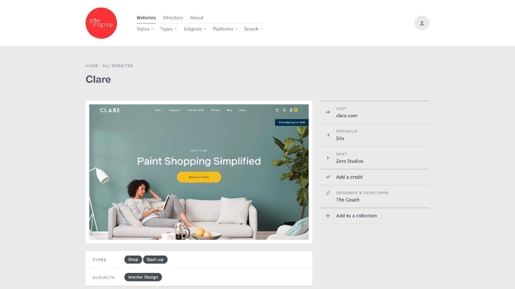
siteinspire.com
None
None
None
None
None
None
None
None
None
None
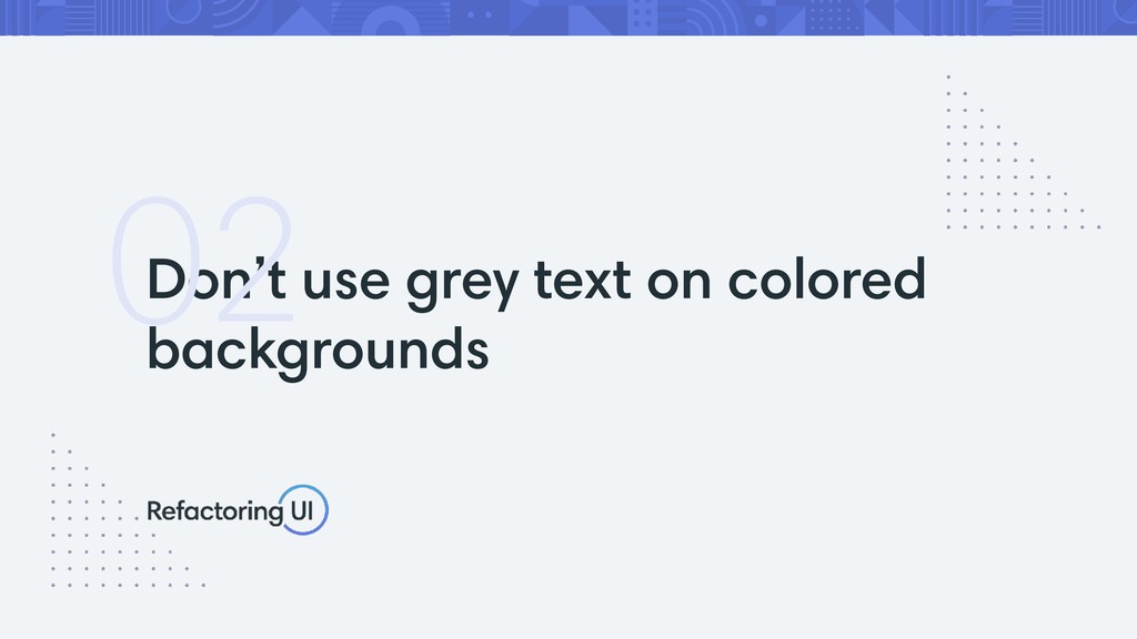
Don’t use grey text on colored backgrounds 02
None
None
None
None
None
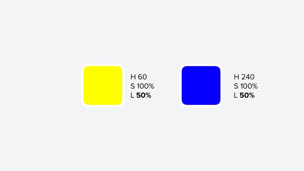
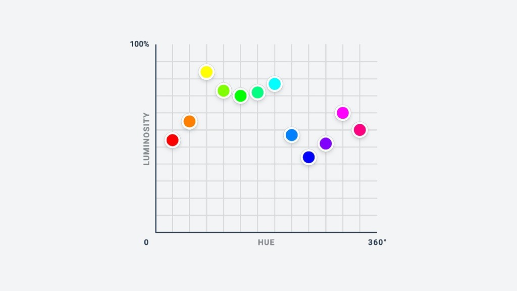
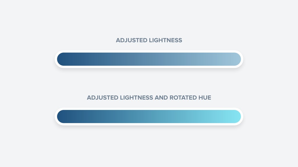
Use perceived brightness 03
None
H 60 S 100% L 50% H 240 S 100%
L 50%
None
ADJUSTED LIGHTNESS ADJUSTED LIGHTNESS AND ROTATED HUE
None
ADJUSTED LIGHTNESS ADJUSTED LIGHTNESS AND ROTATED HUE
None
None
None
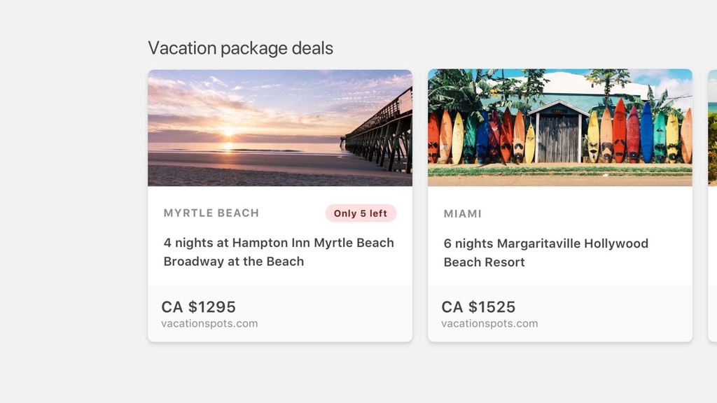
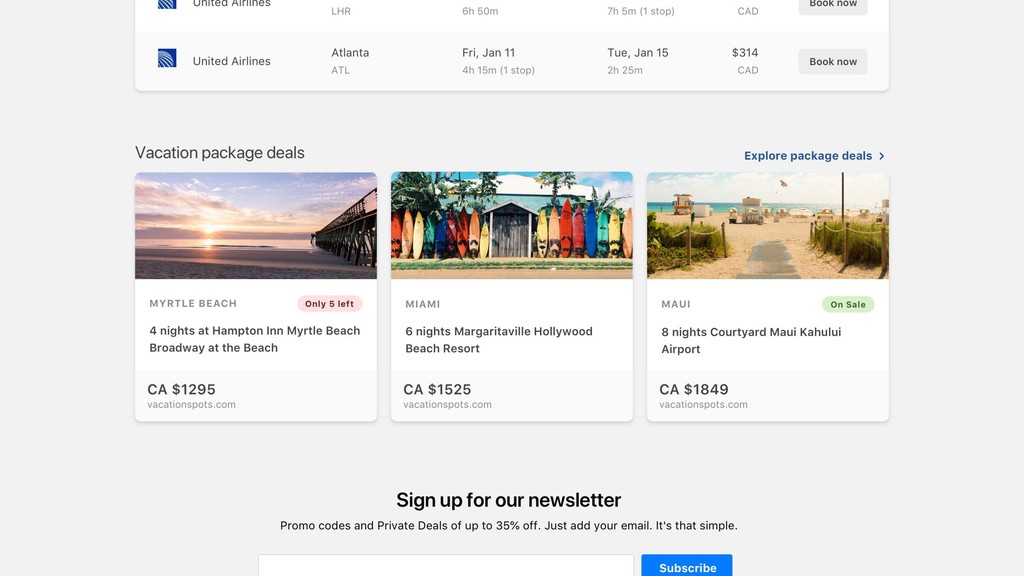
Start with too much whitespace 04
None
None
None
None
None
None
None
None
None
Balance weight and contrast 05
None
None
Supercharge the defaults 06
None
None
None
None
None
None
None
None
None
None
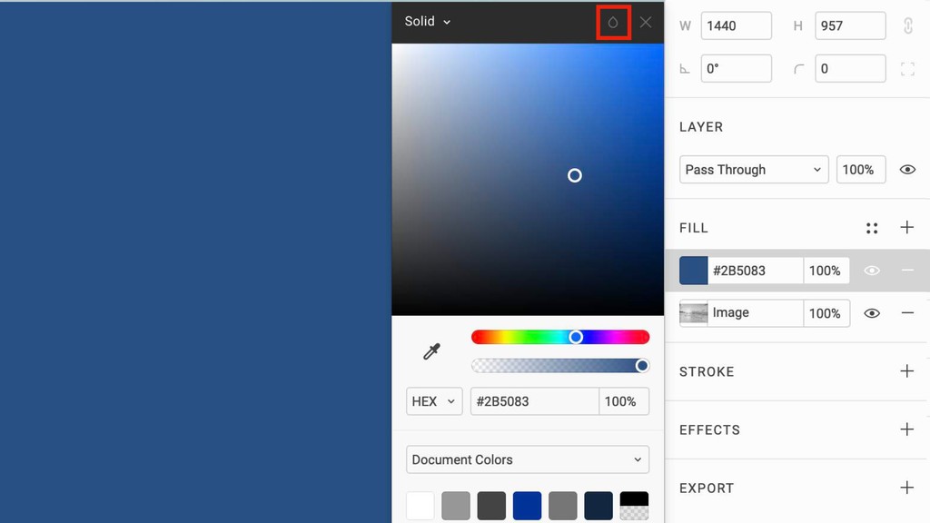
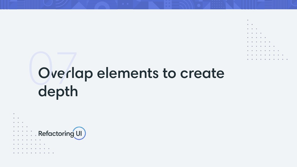
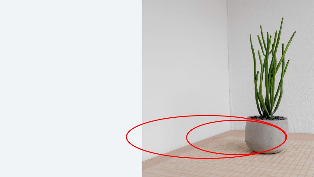
Overlap elements to create depth 07
None
Use shadows to convey elevation 08
None
None
None
None
None
None
None
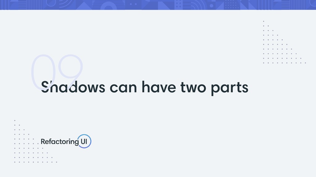
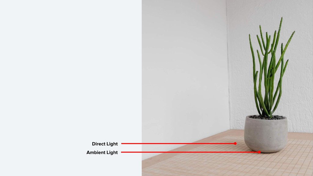
Shadows can have two parts 09
Ambient Light Direct Light
None
None
None
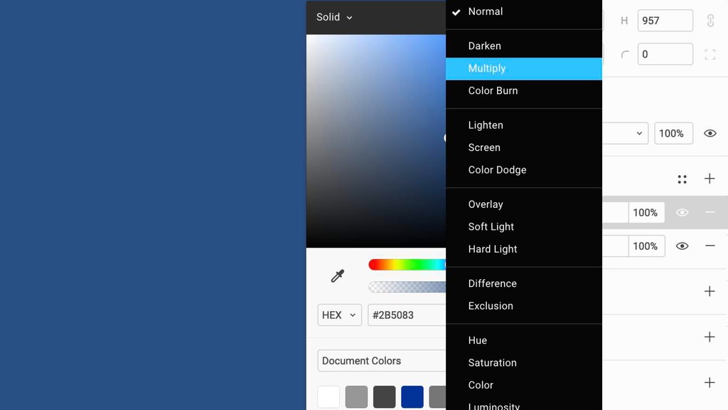
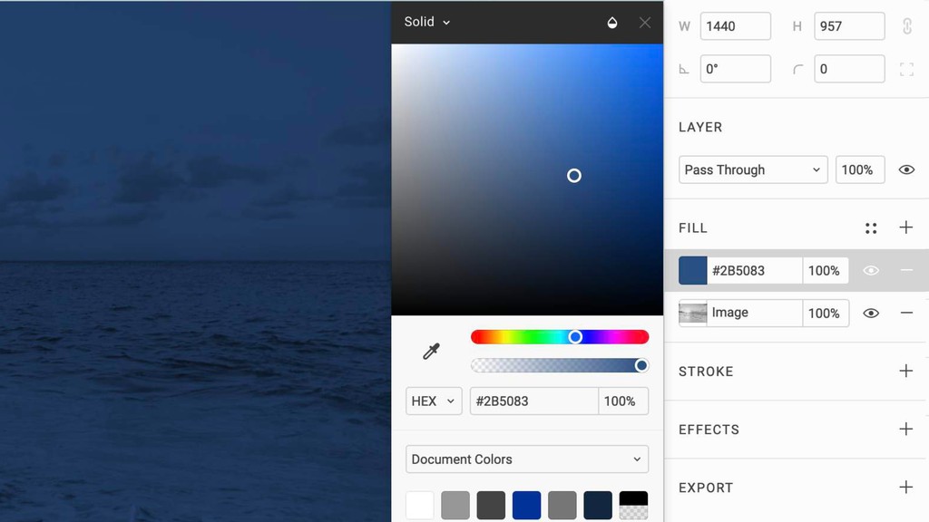
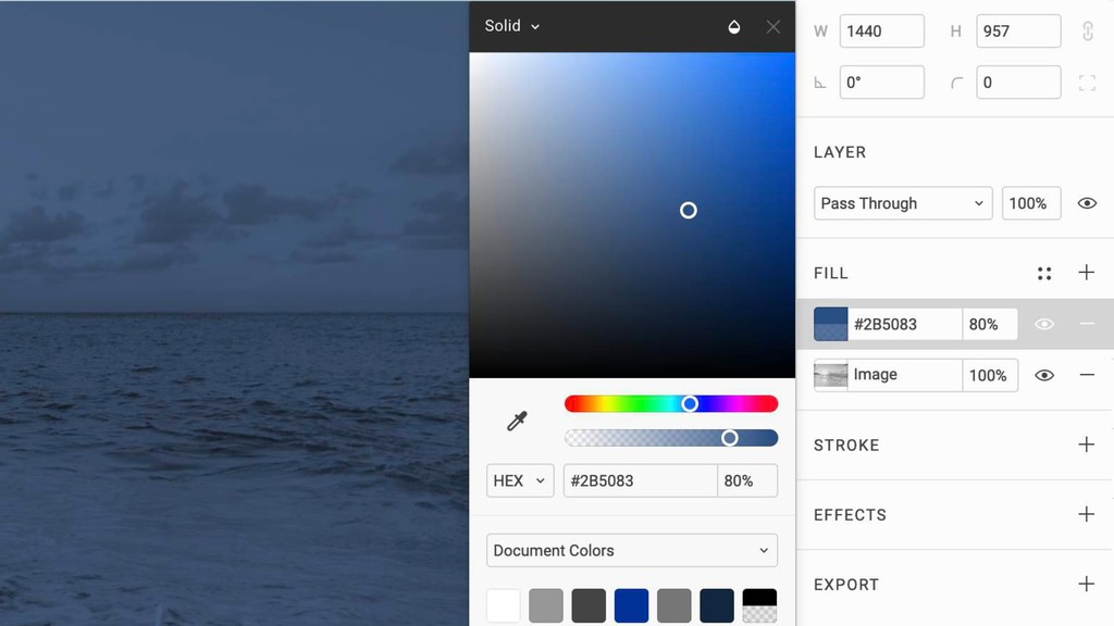
Create depth with color 10
None
None
None
None
None
None
Align with readability in mind 11
None
None
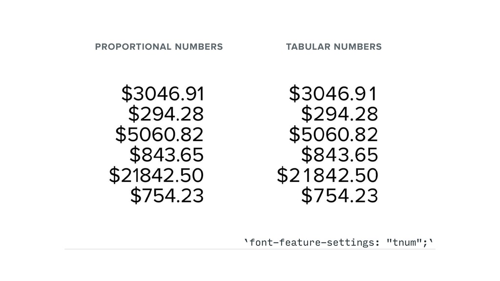
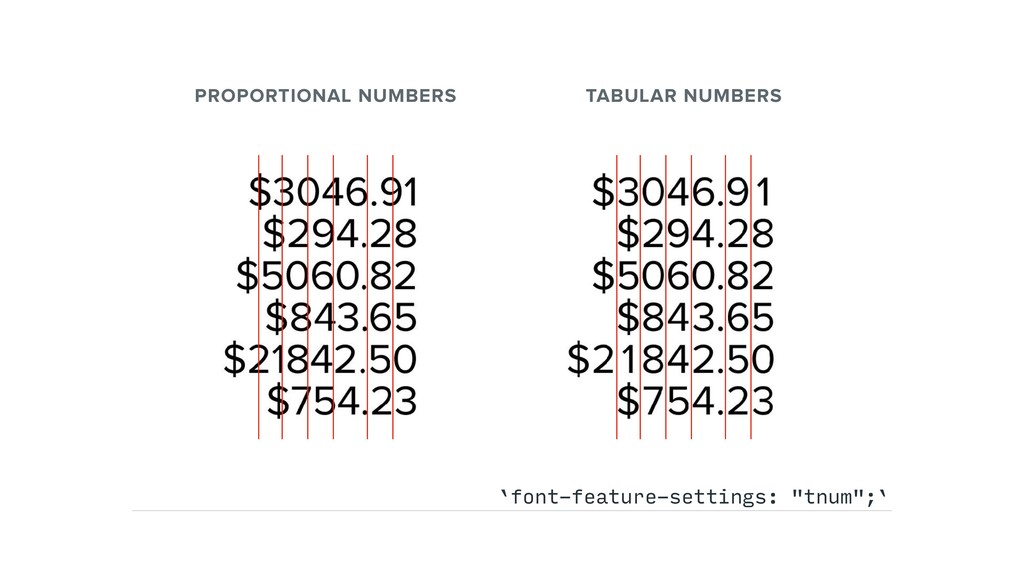
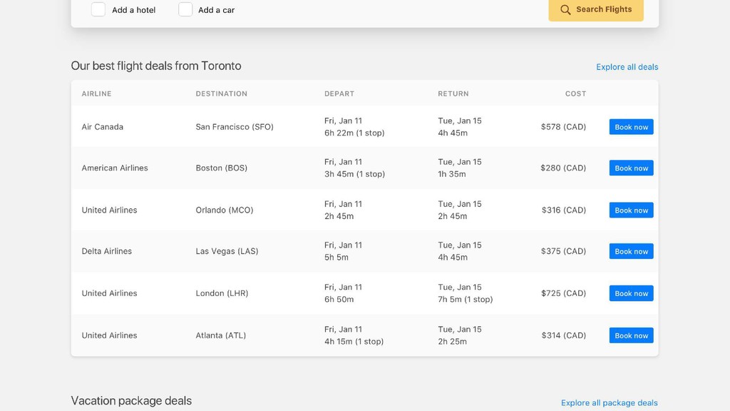
PROPORTIONAL NUMBERS TABULAR NUMBERS `font-feature-settings: "tnum";`
PROPORTIONAL NUMBERS TABULAR NUMBERS `font-feature-settings: "tnum";`
None
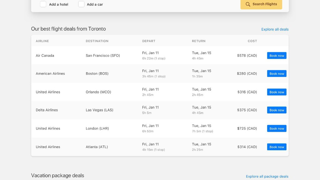
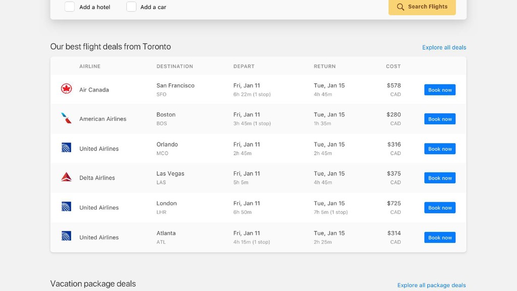
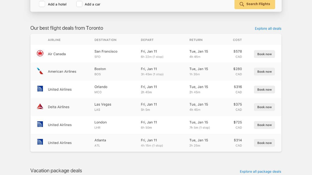
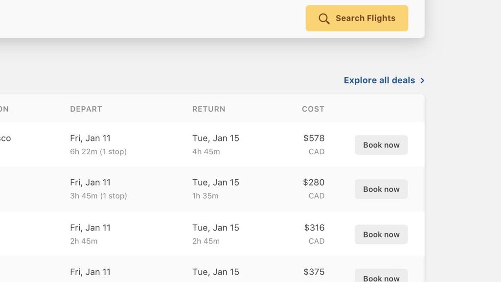
Use fewer borders 12
None
None
None
None
None
None
None
None
None
None
None
None
None
None
None
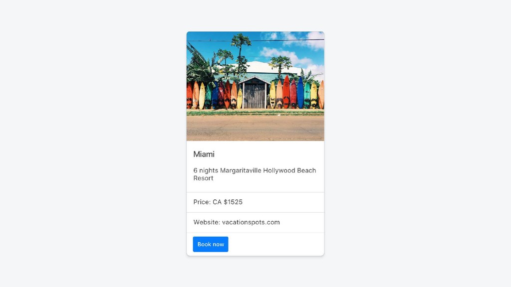
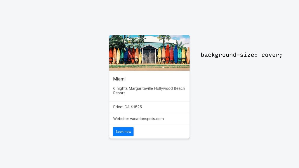
background-size: cover;
None
None
None
None
None
None
None
None
None
None
None
None
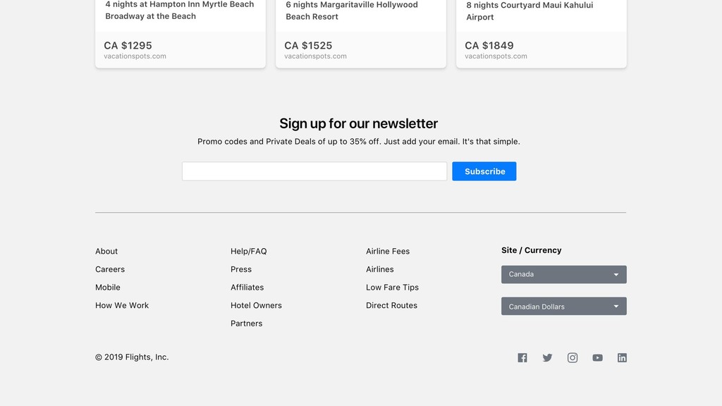
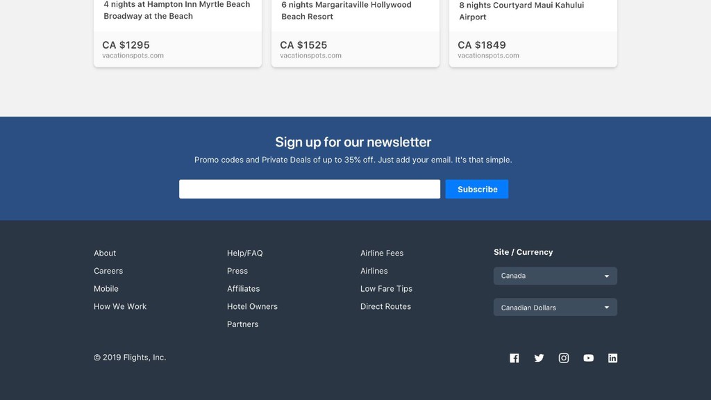
Alternate backgrounds 13
None
None
None
None
None
None
None
None
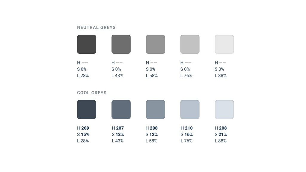
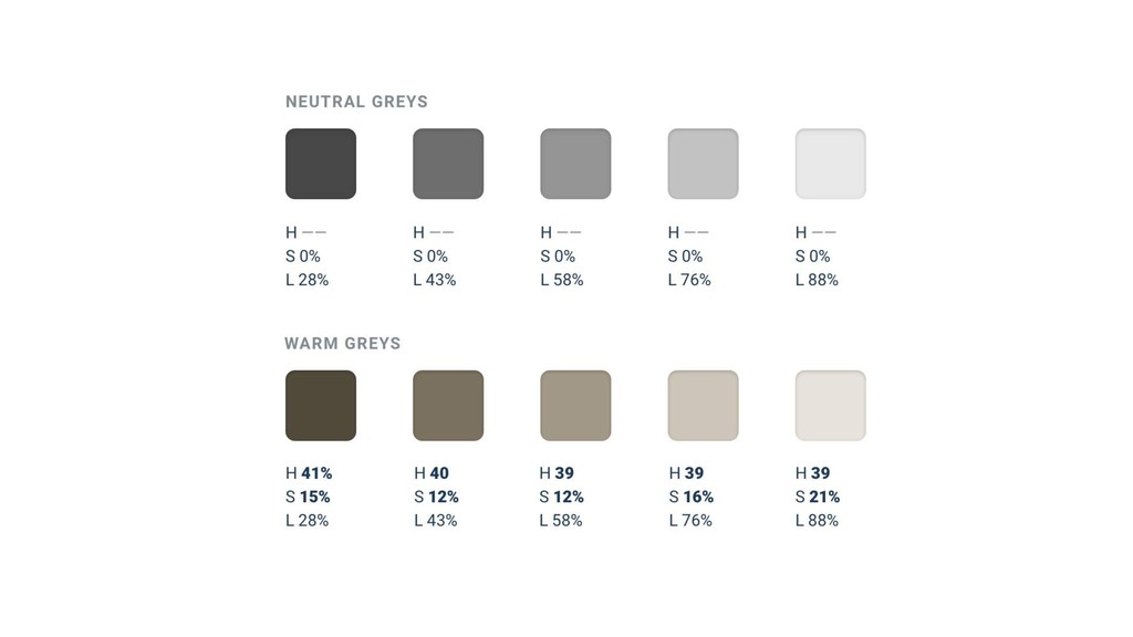
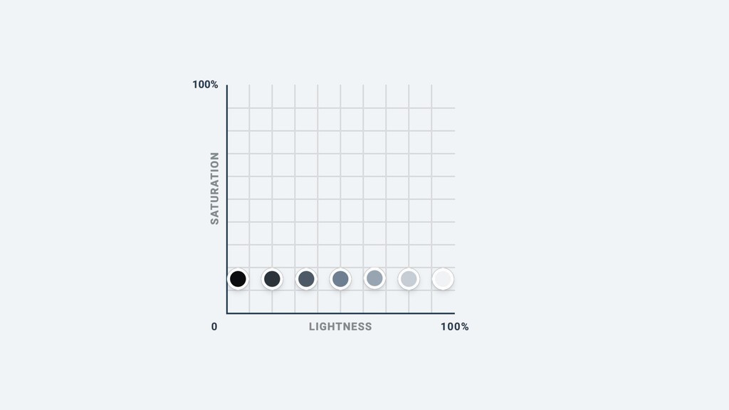
Greys don’t have to be “grey” 14
None
None
None
None
None
None
None
None
None
None
None
None
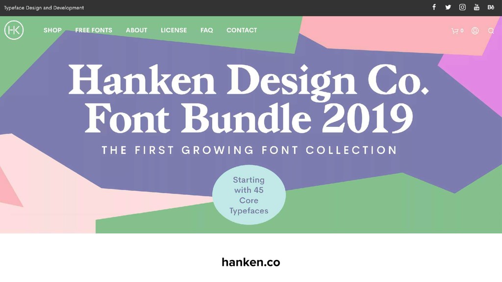
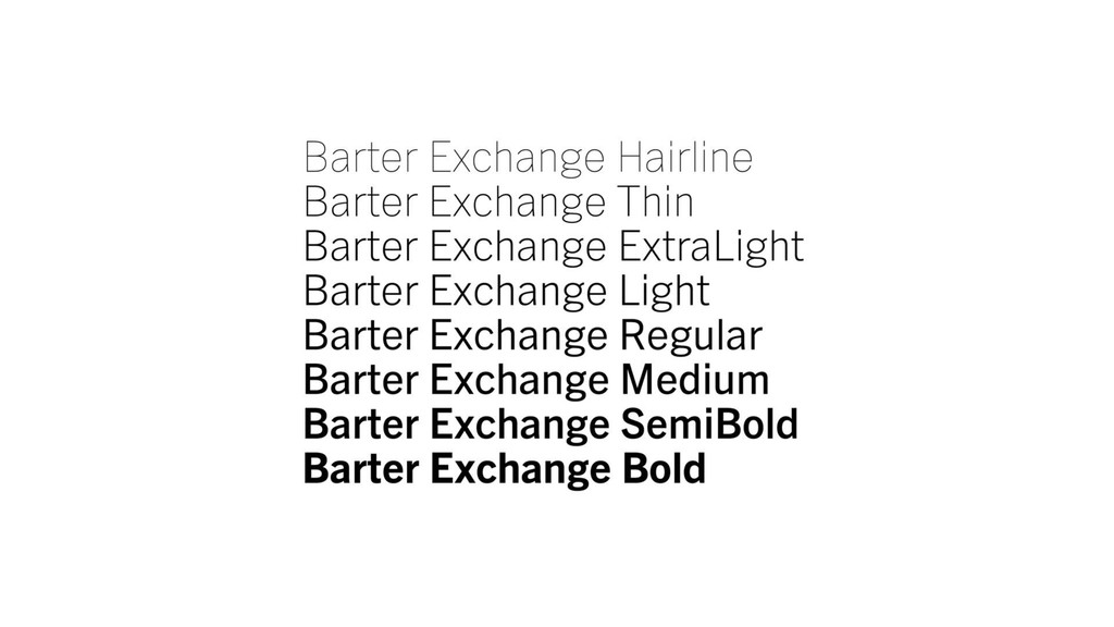
Use good fonts 15
None
typography.com
commercialtype.com
klim.co.nz
None
None
None
None
hanken.co
None
None
None
None
None
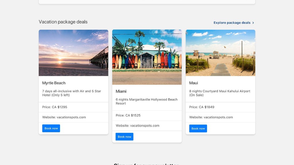
Make your ideas look awesome, without relying on a designer.
AVAILABLE NOW refactoringui.com/book 40% OFF
@steveschoger