Upgrade to Pro — share decks privately, control downloads, hide ads and more …

Composing a Design System

Composing a Design System

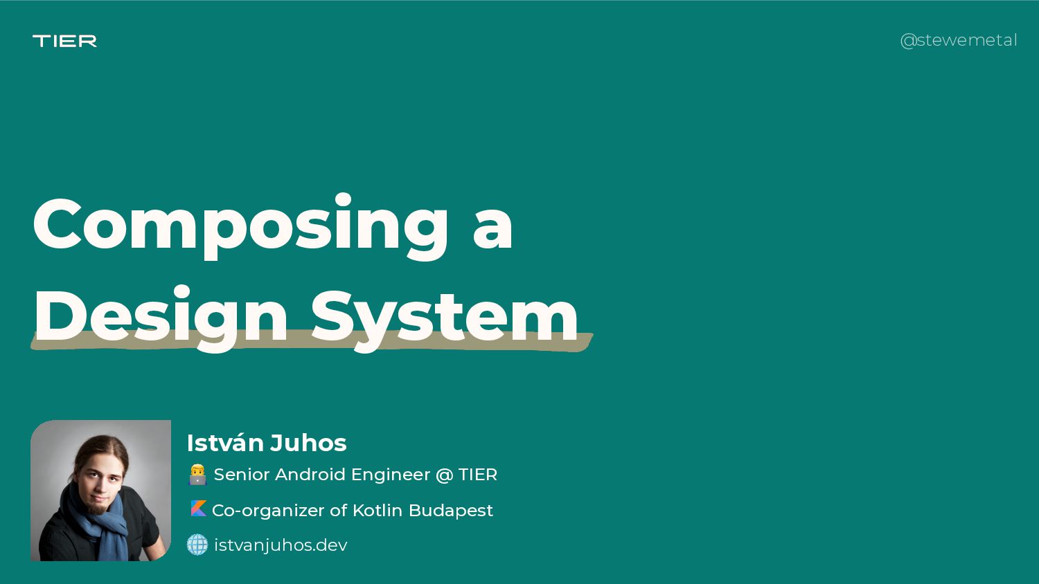
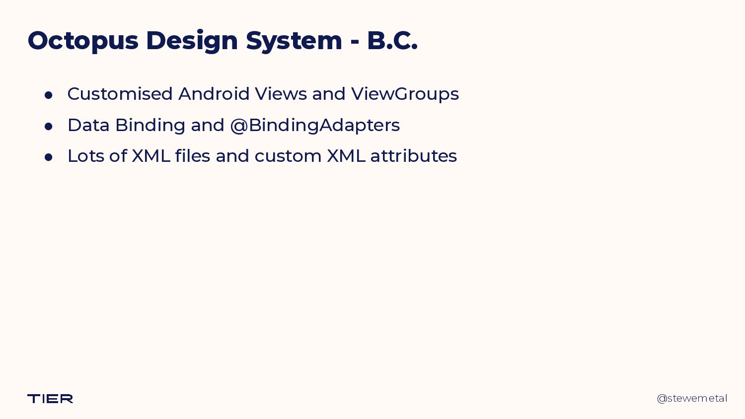
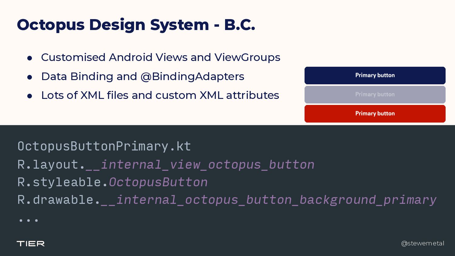
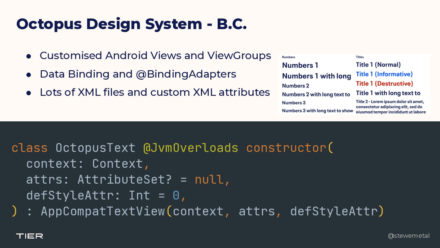
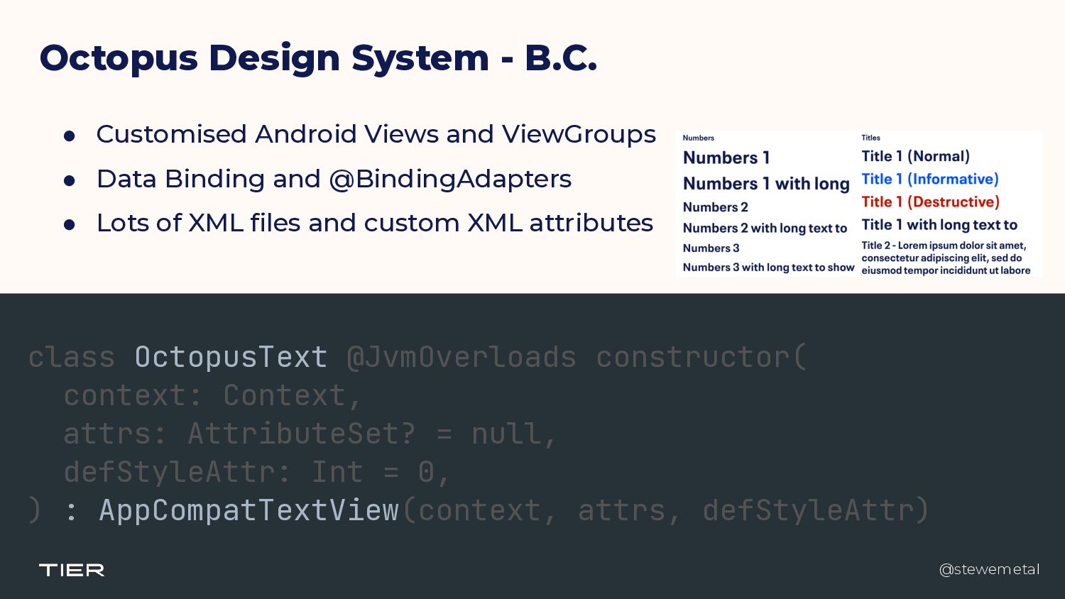
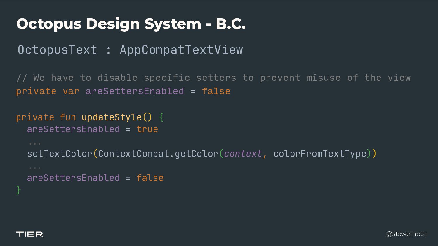
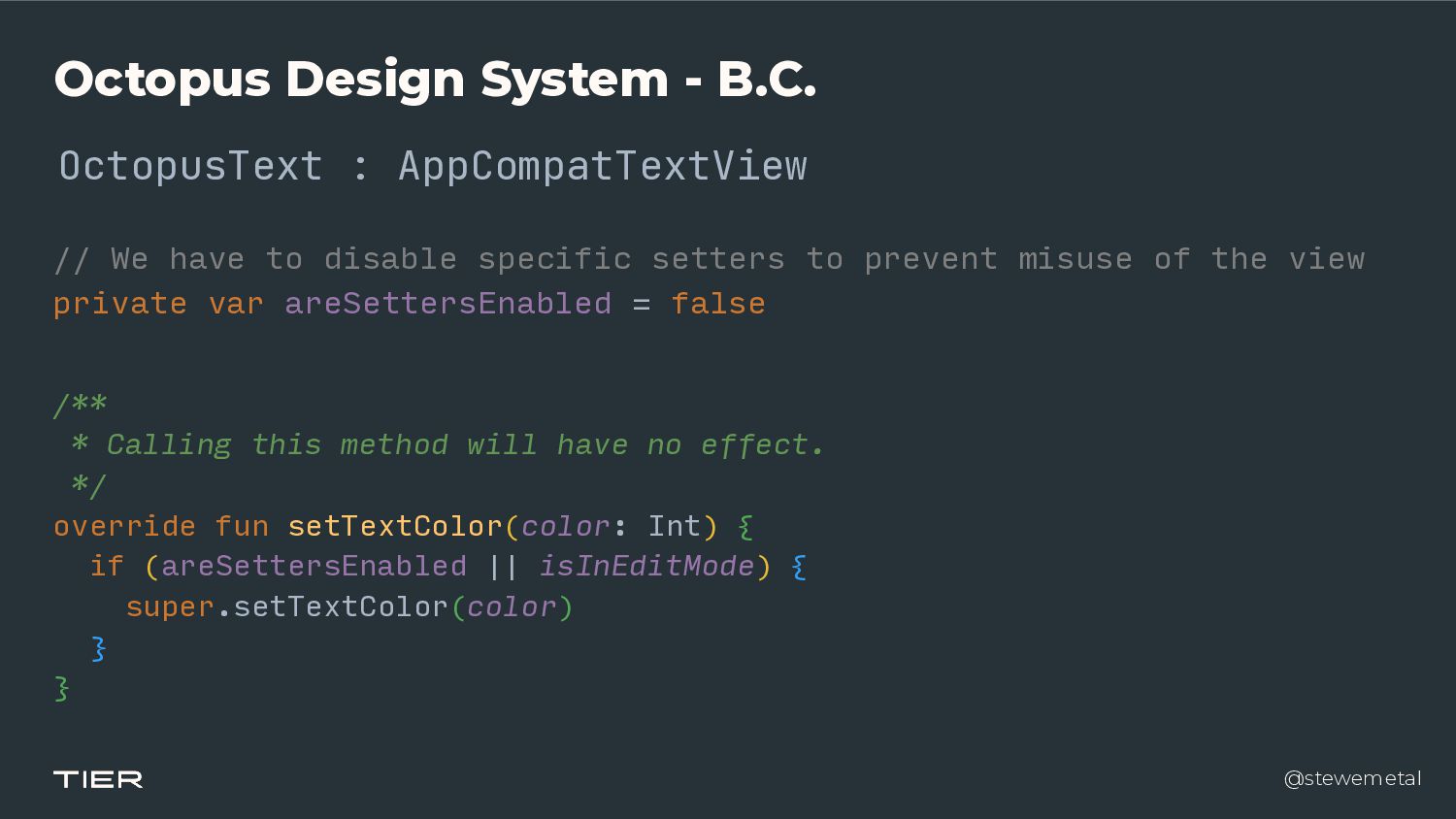
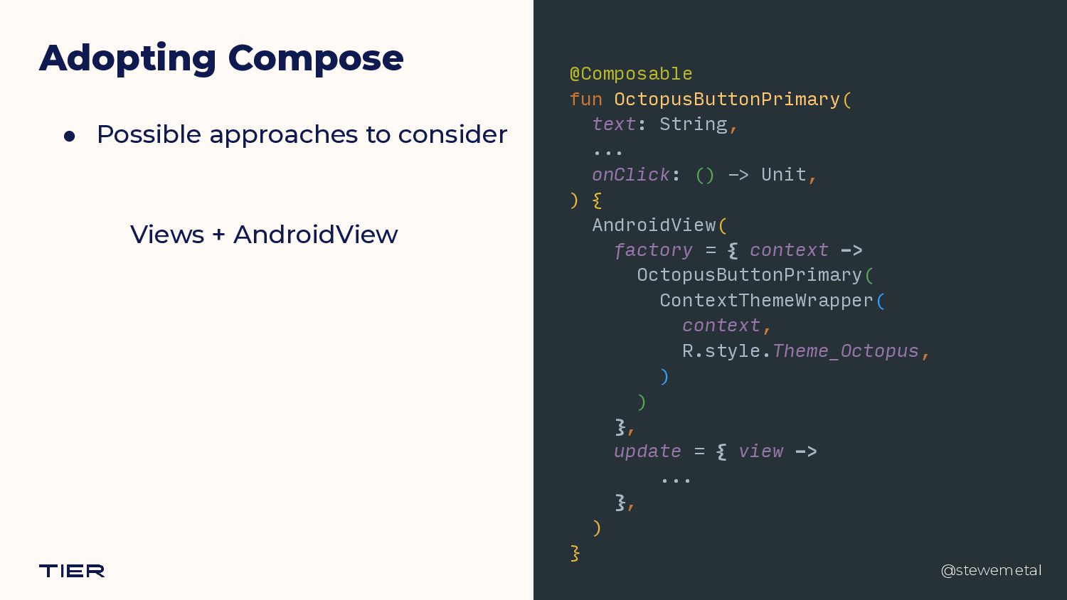
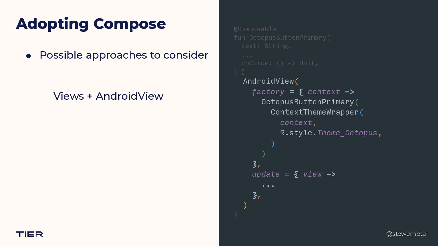
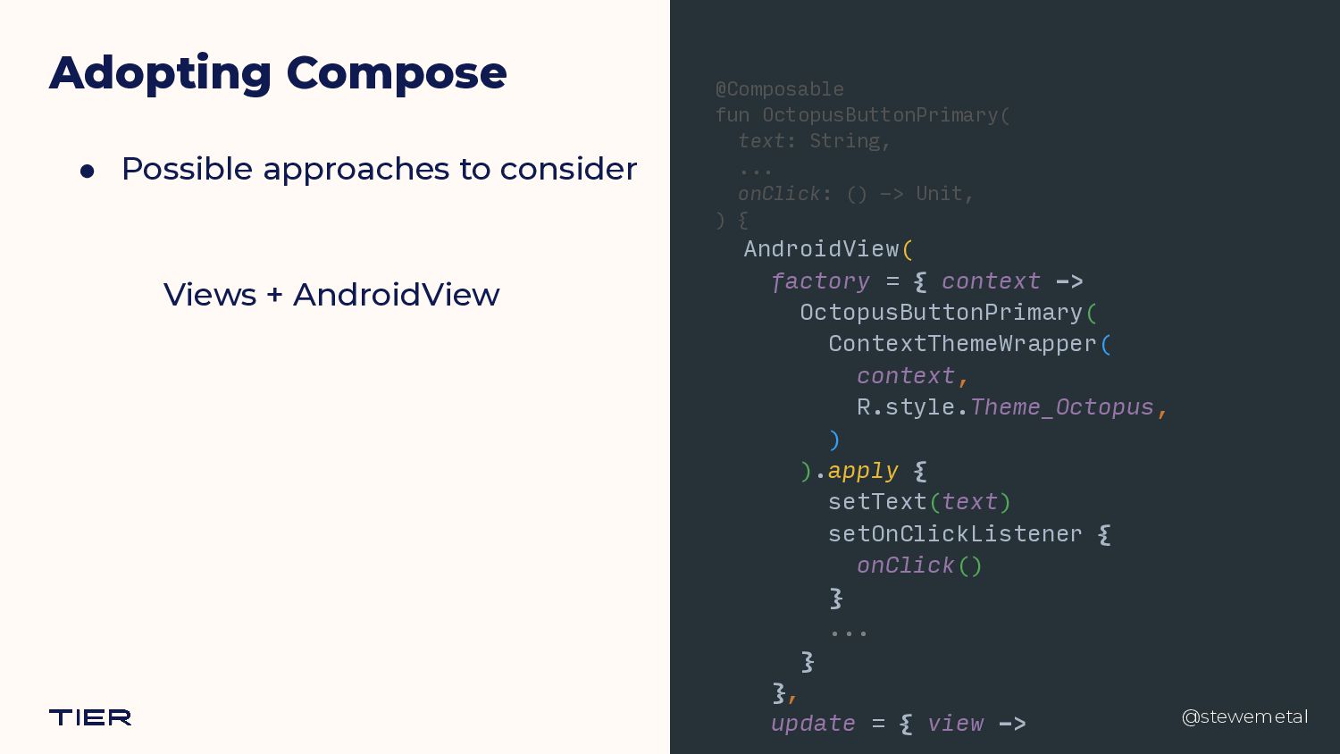
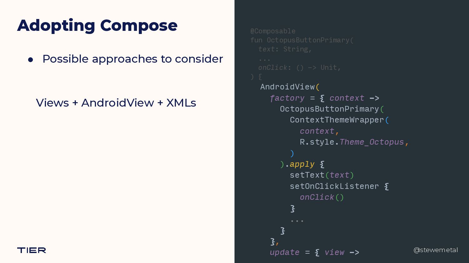
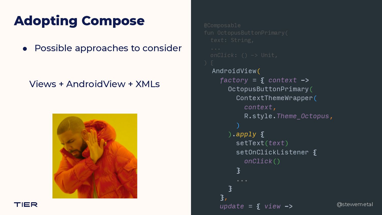
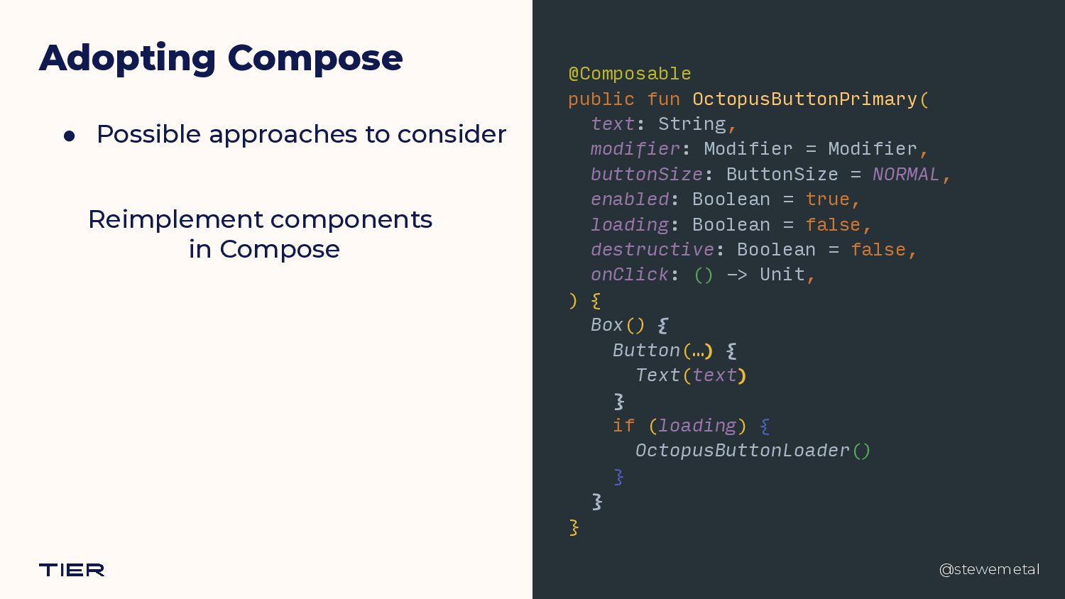
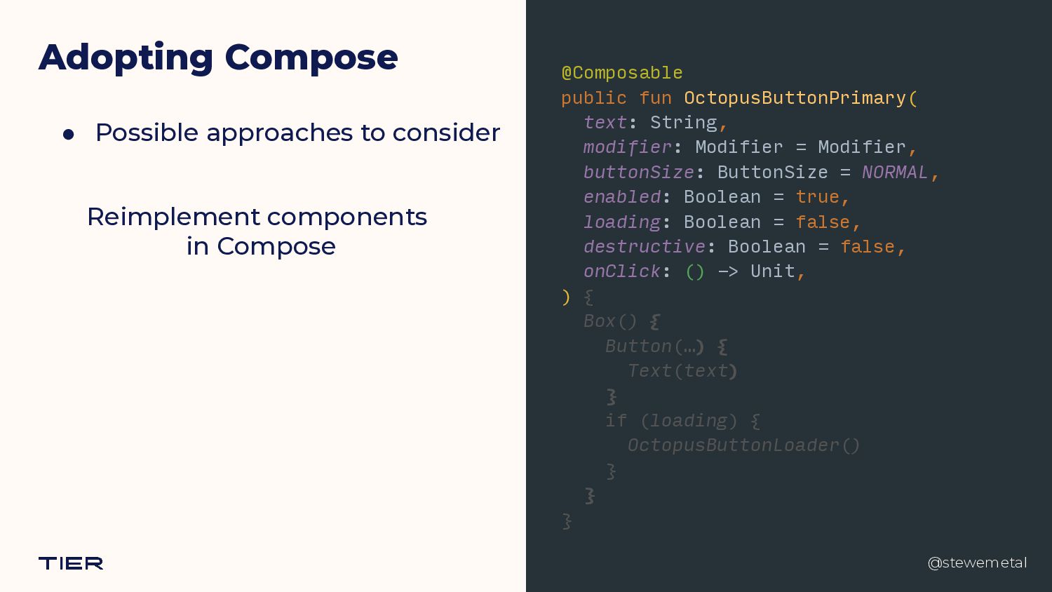
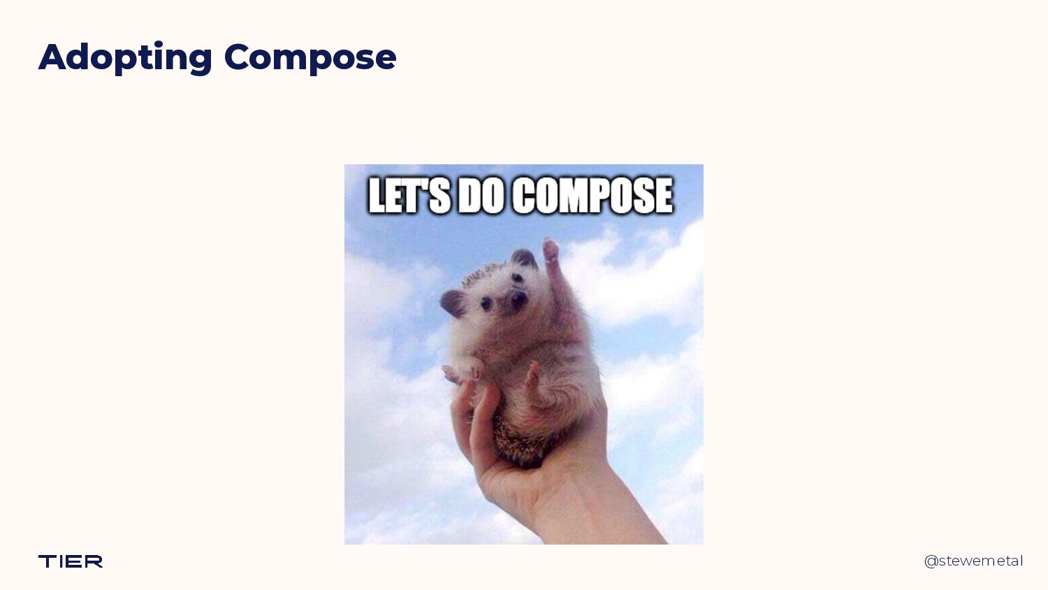
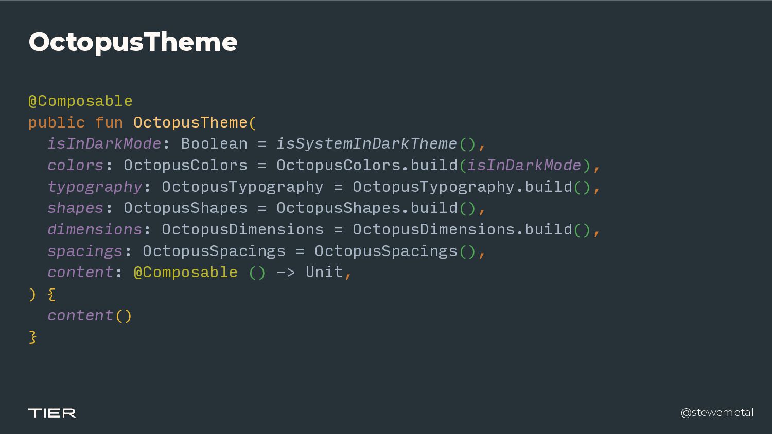
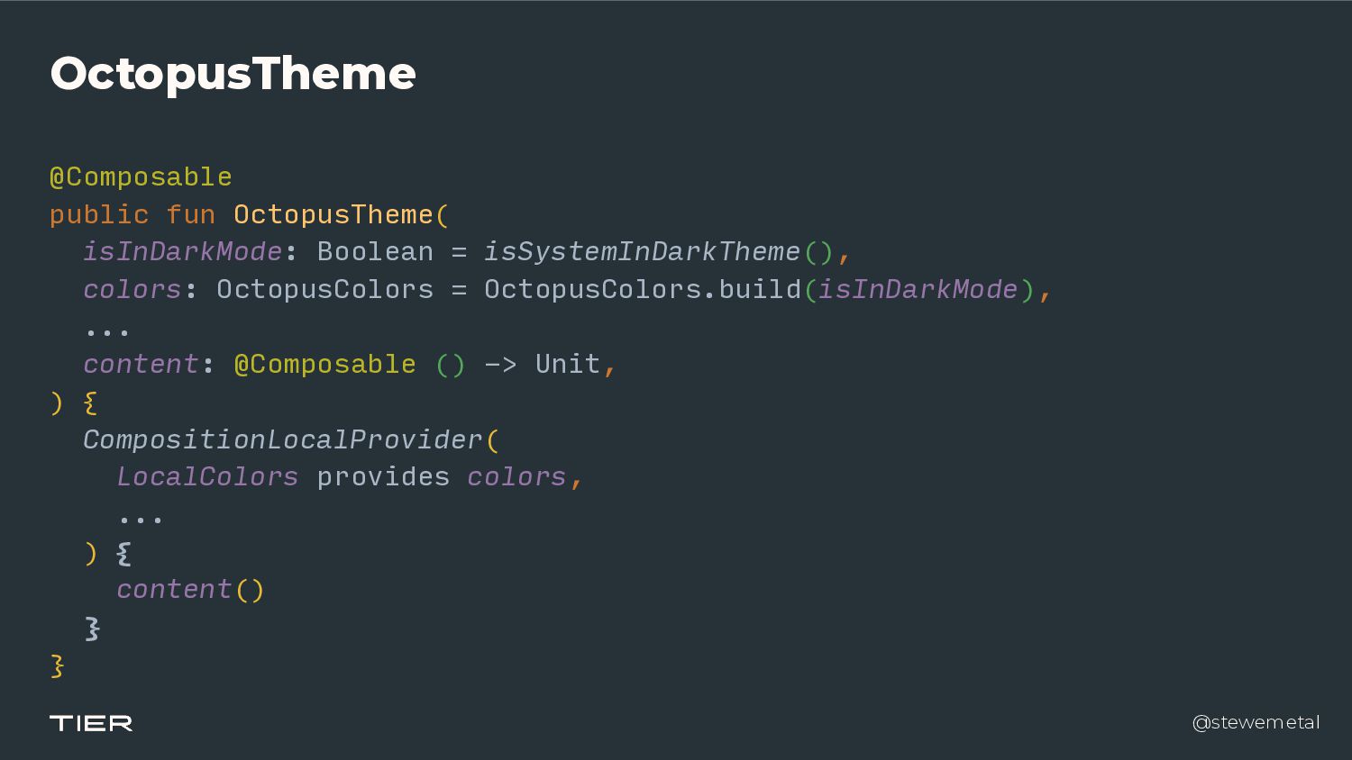
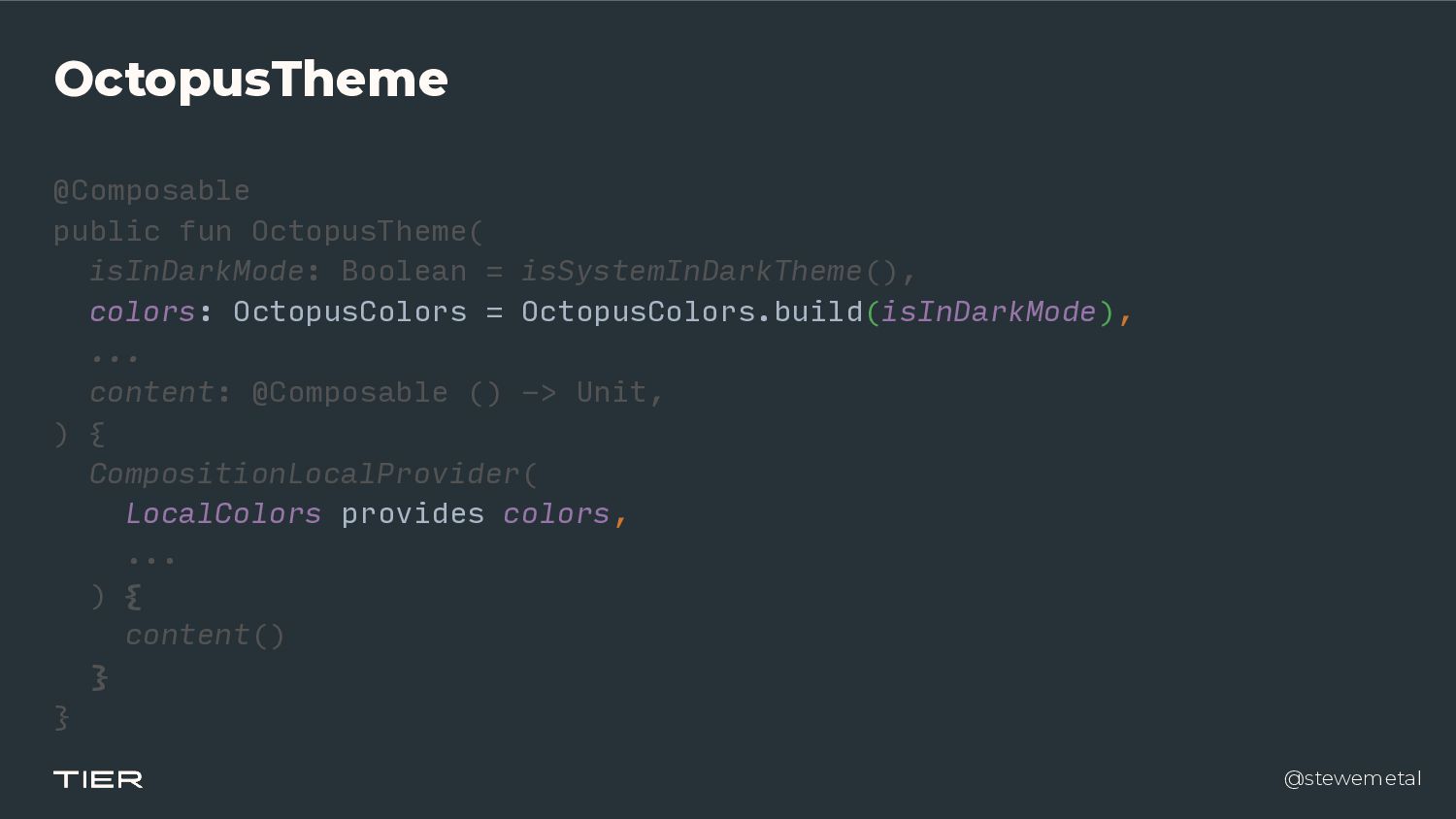
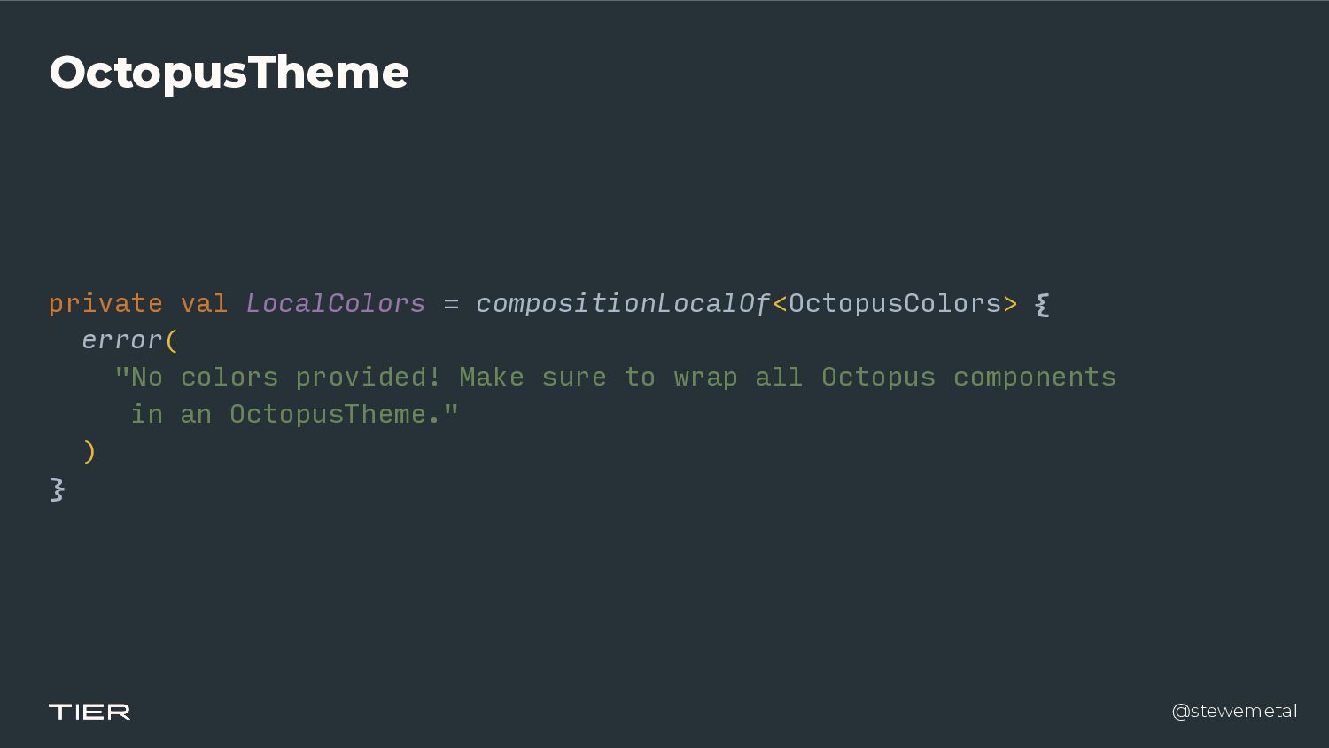
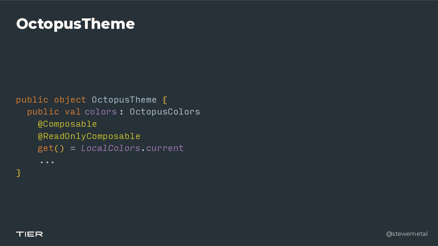
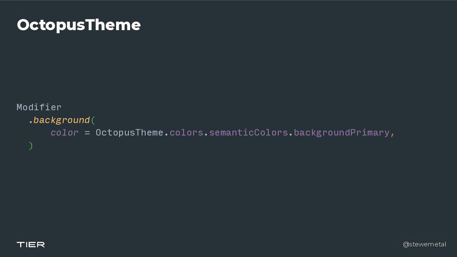
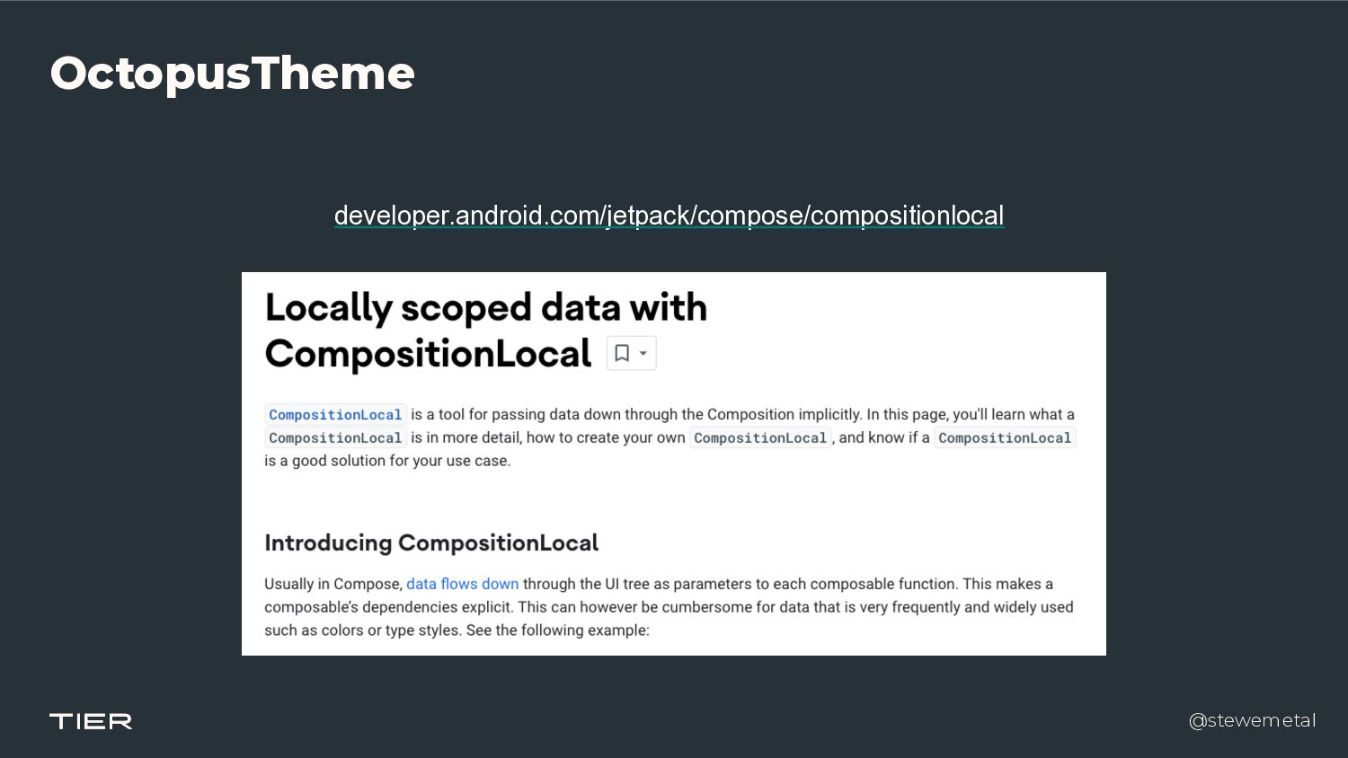
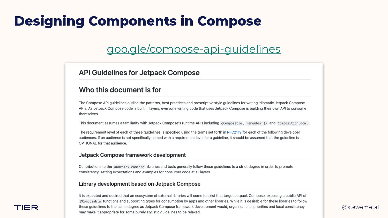
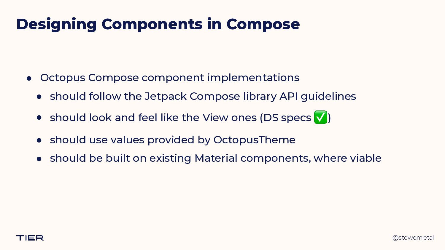
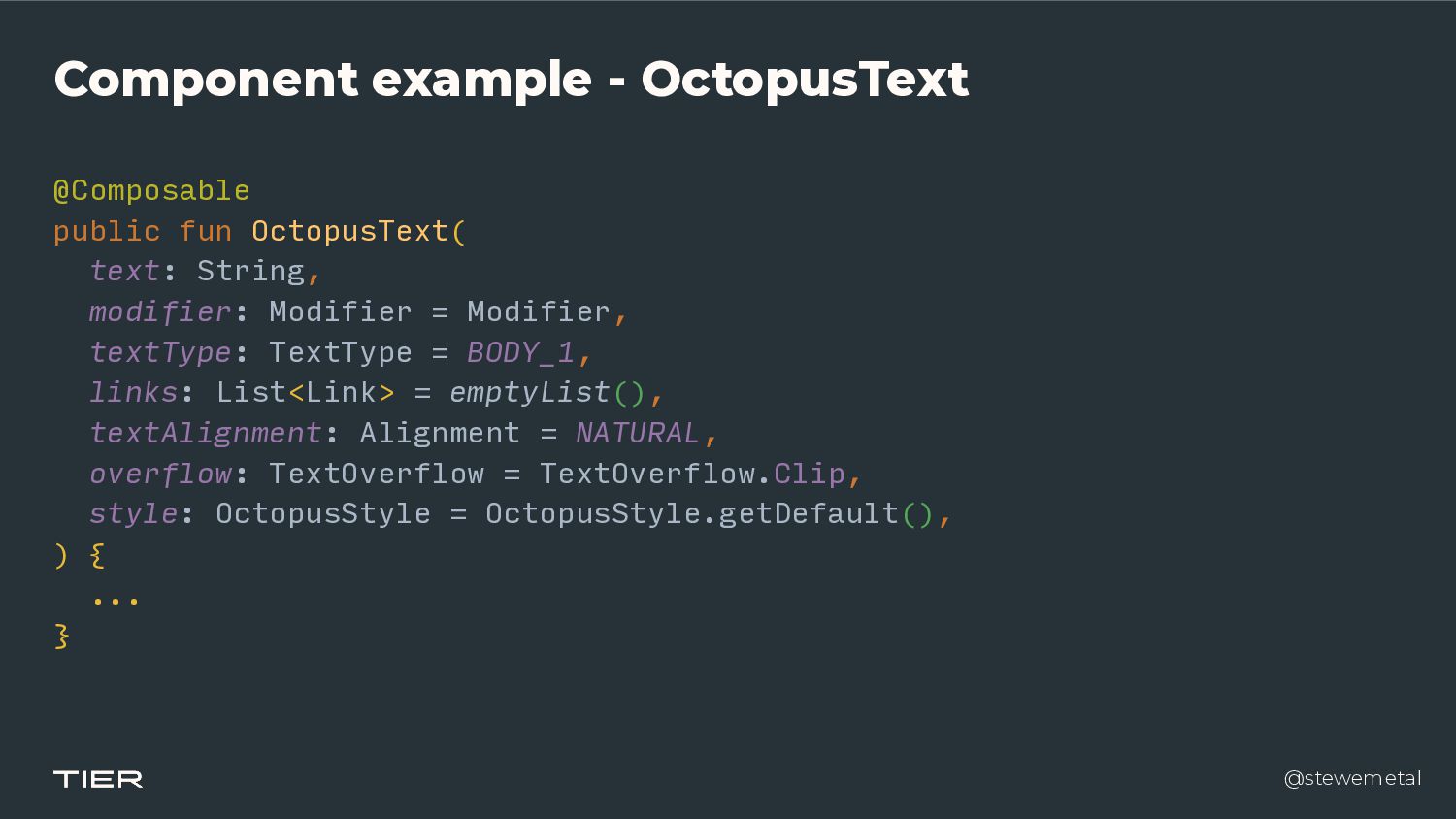
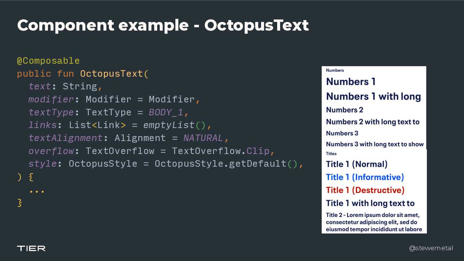
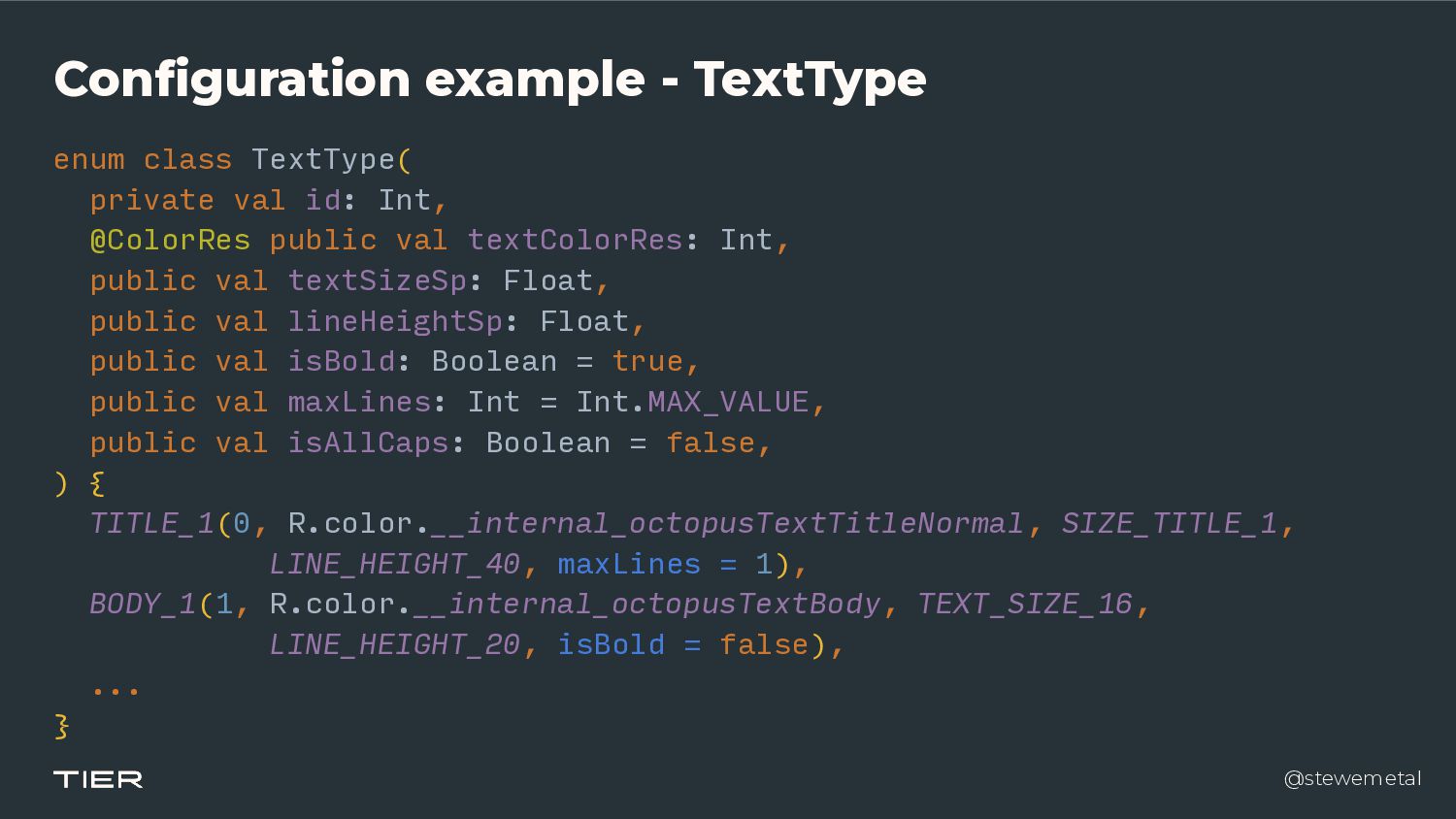
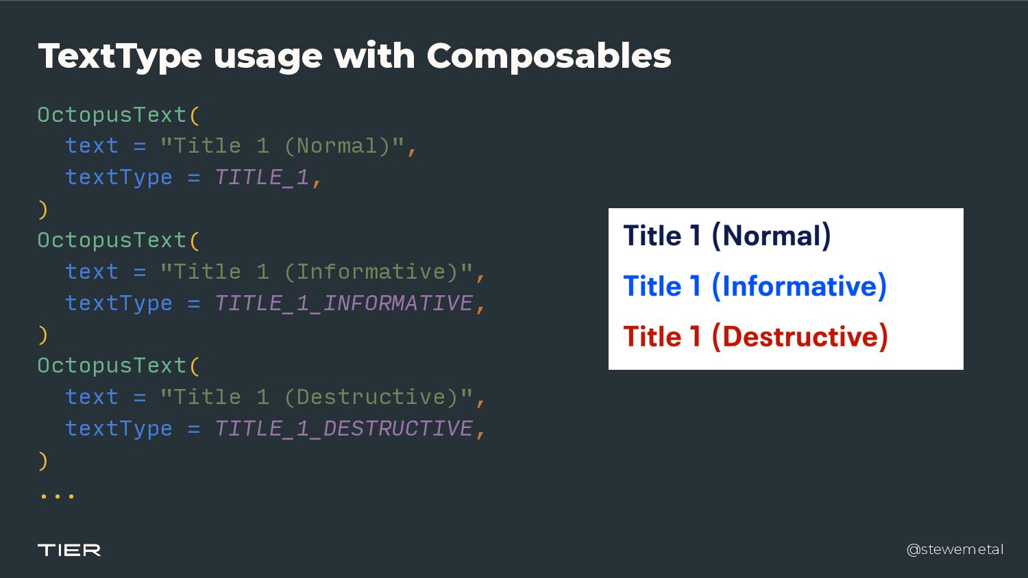
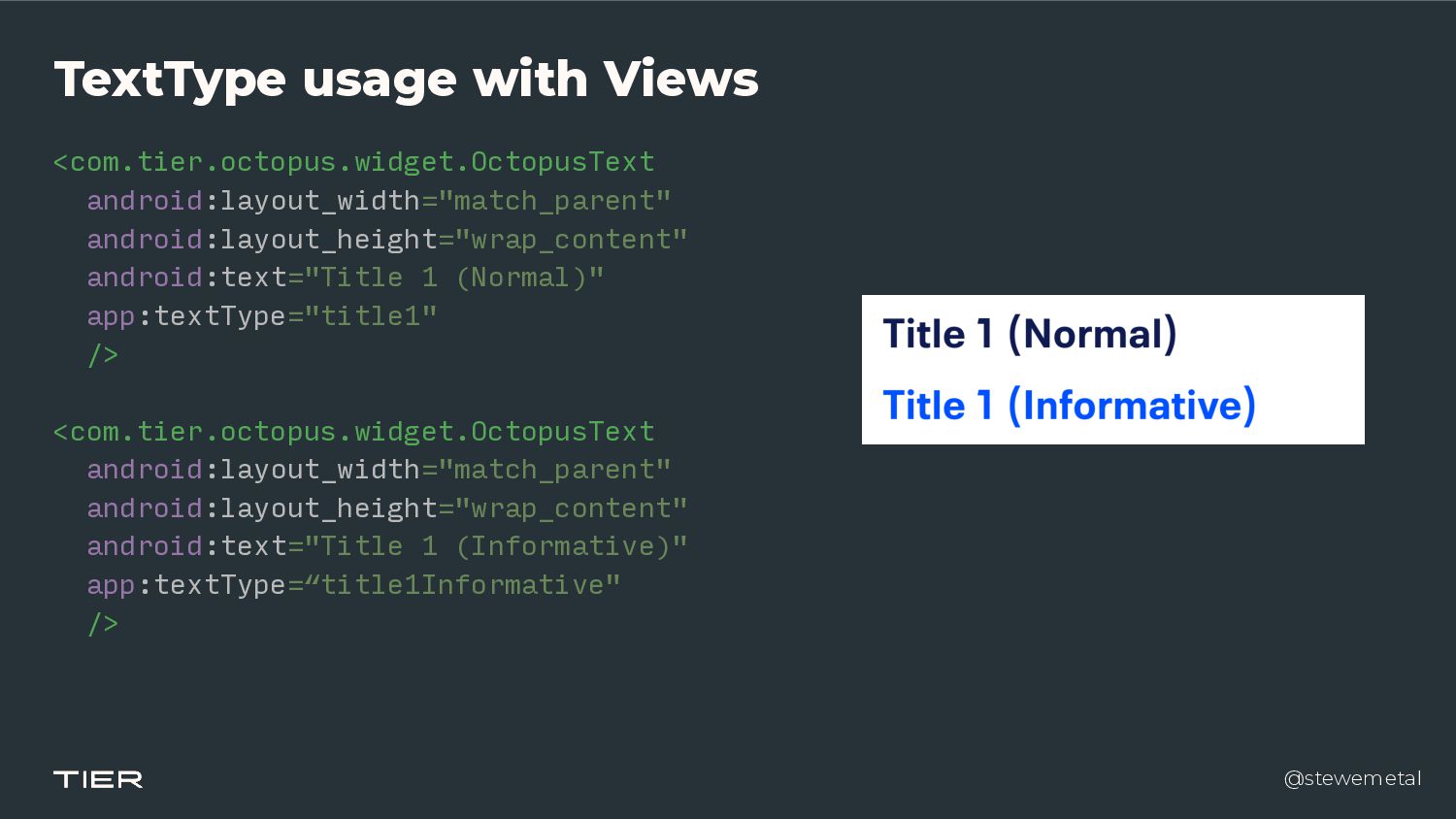
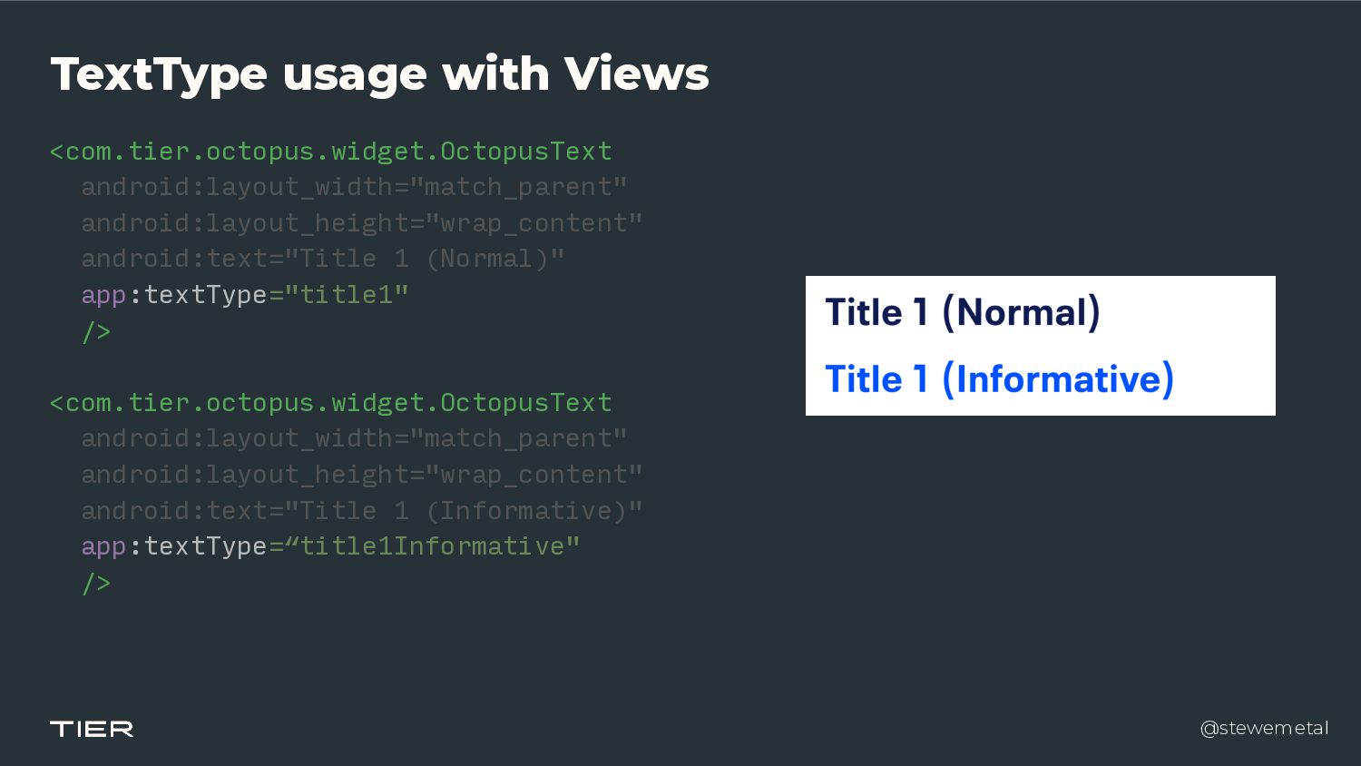
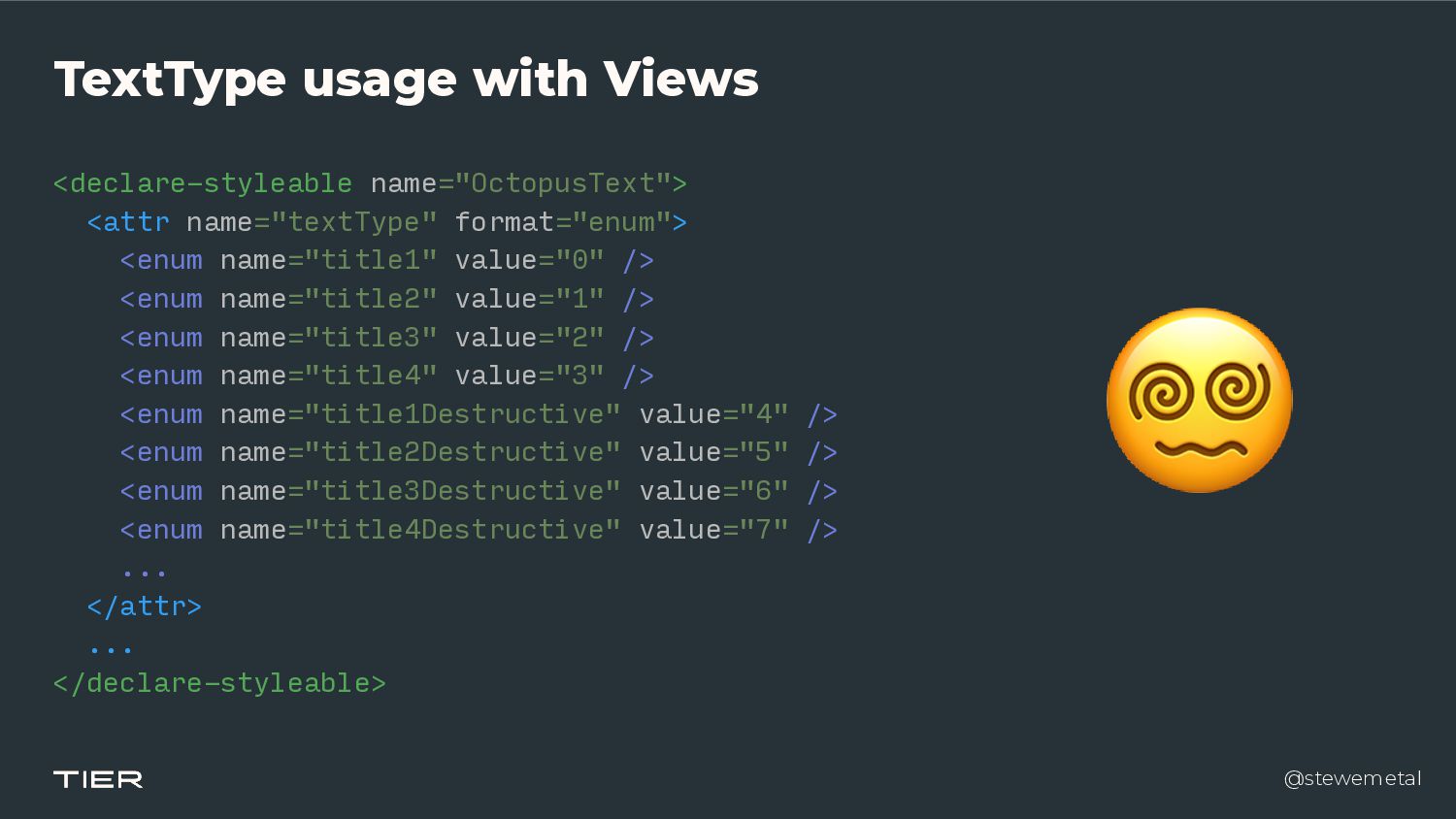
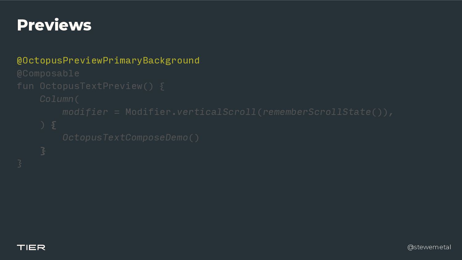
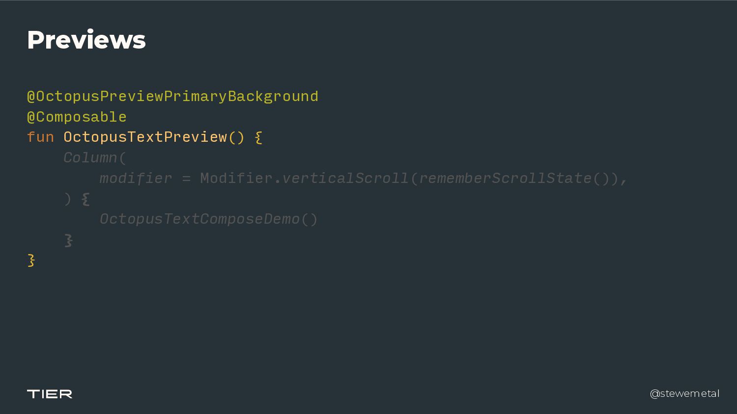
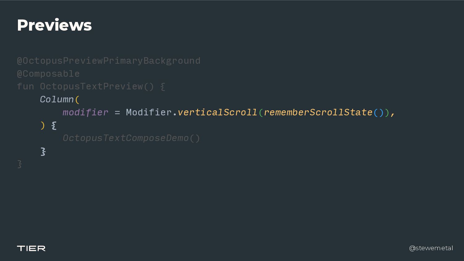
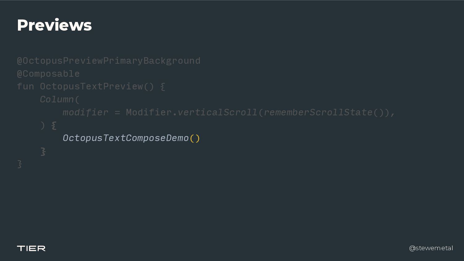
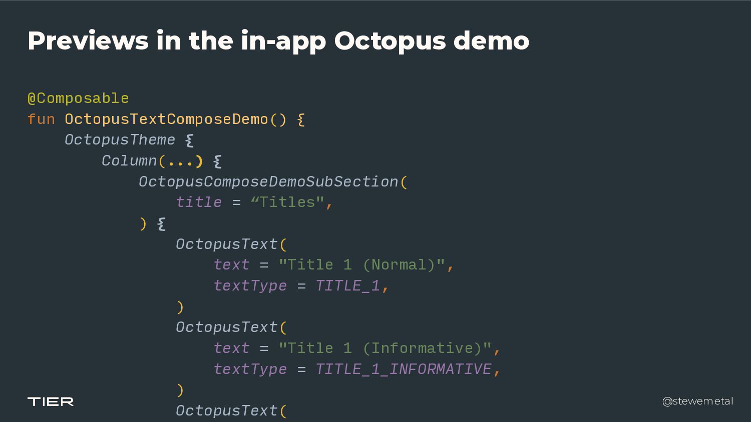
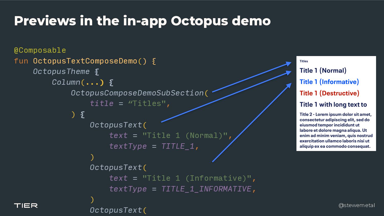
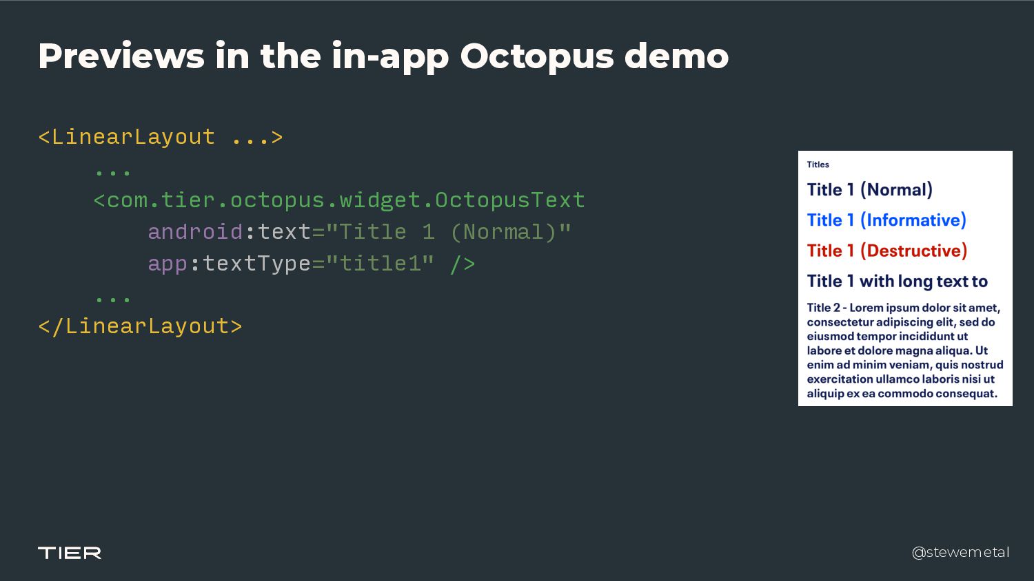
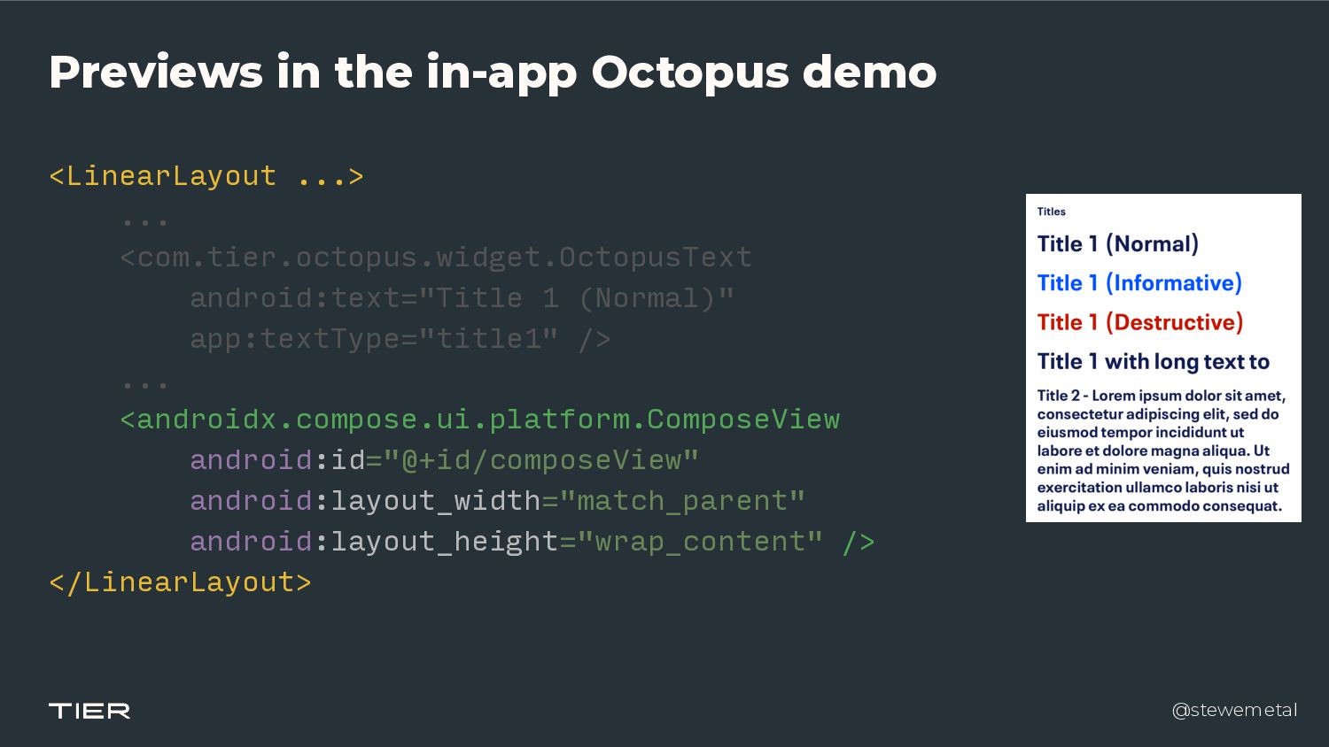
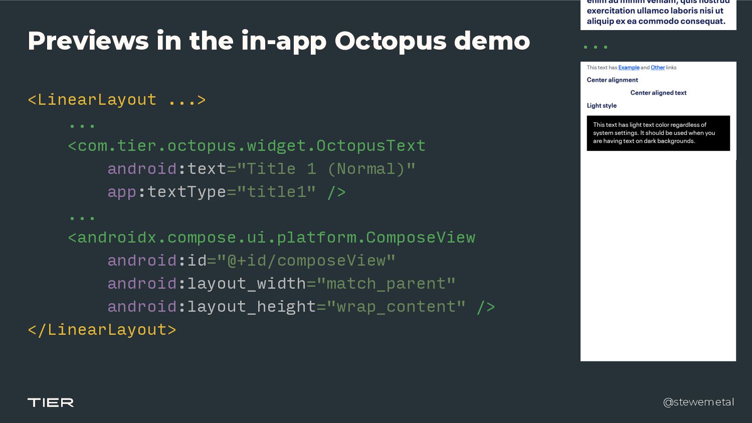
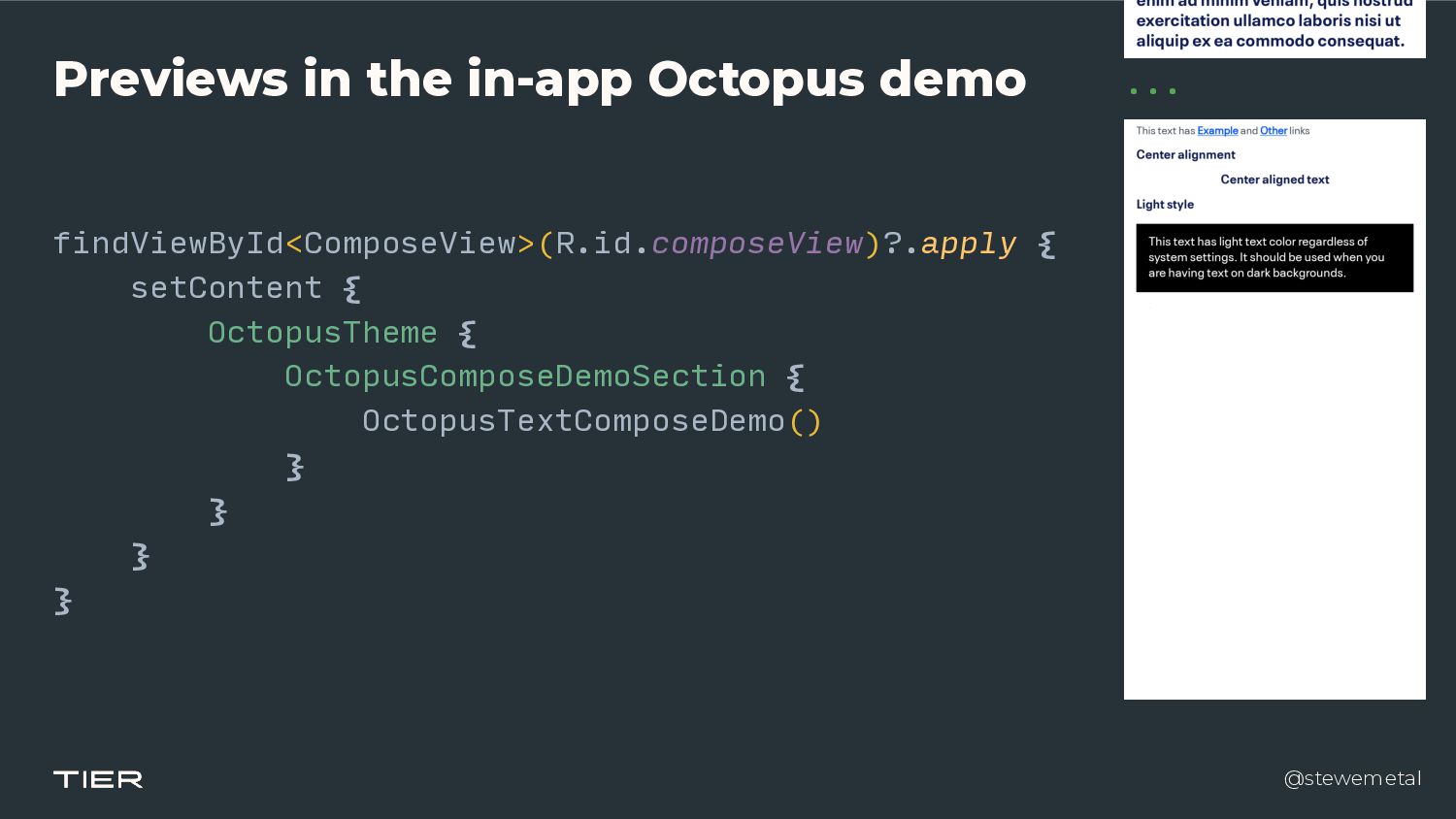
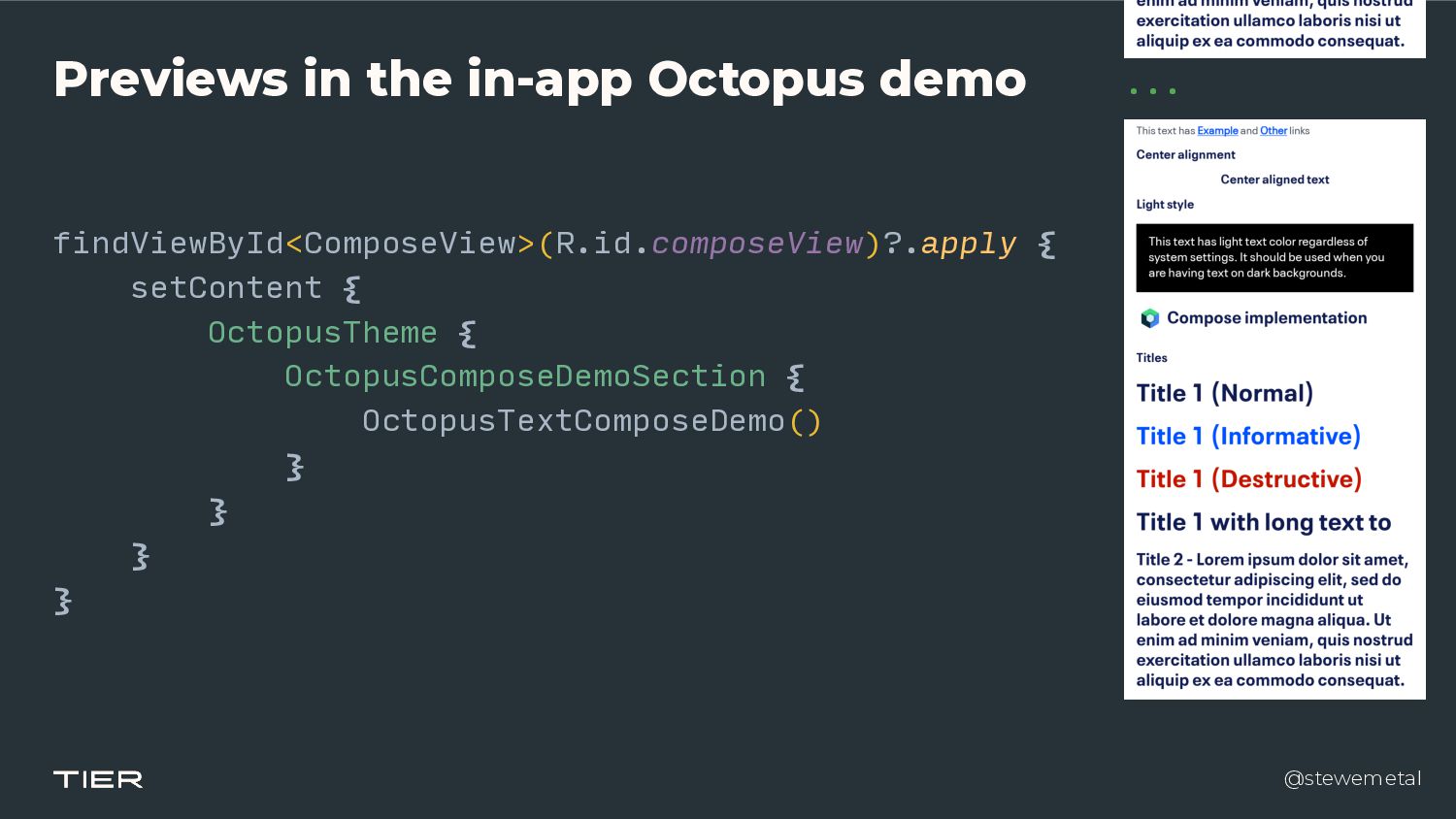
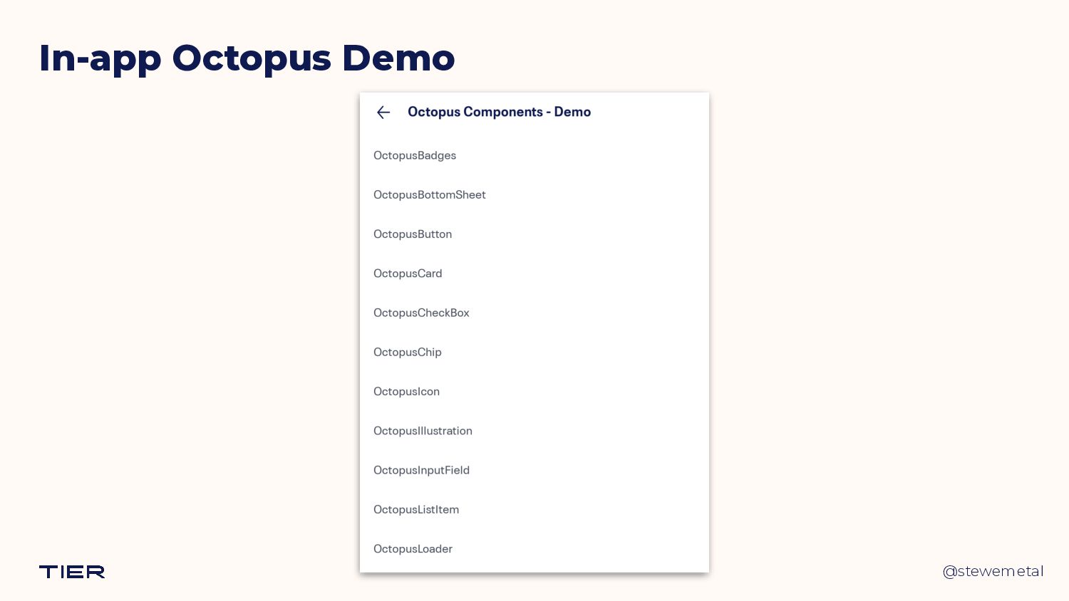
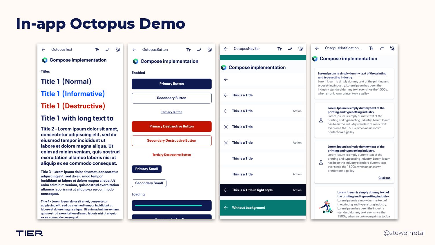
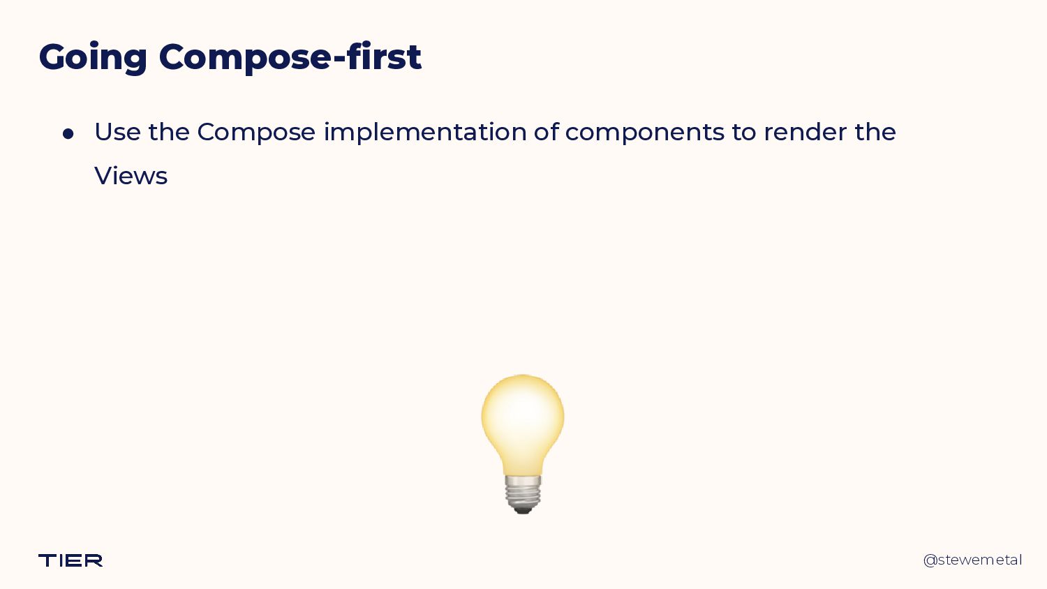
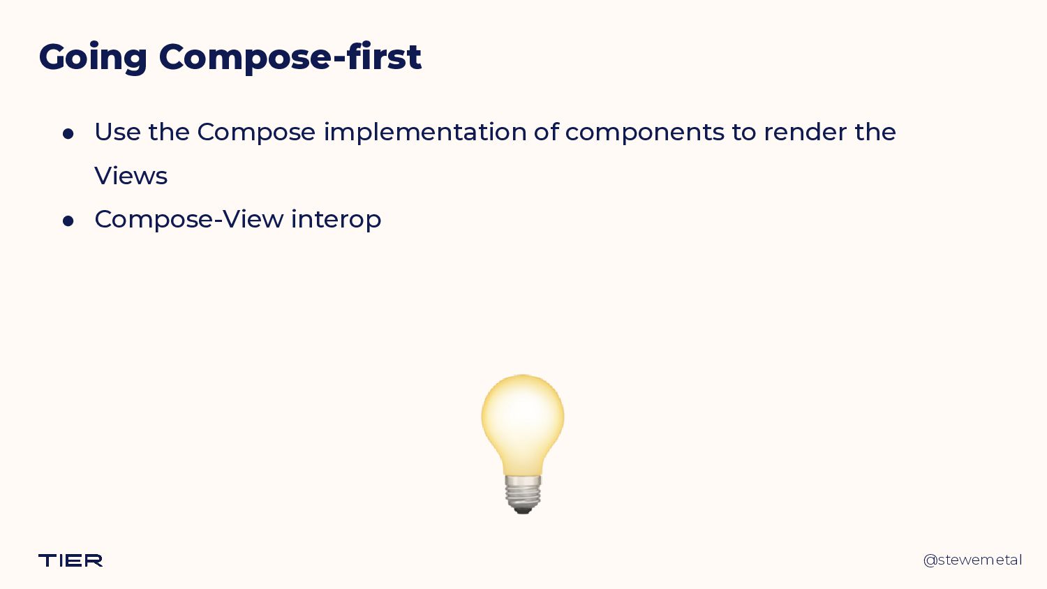
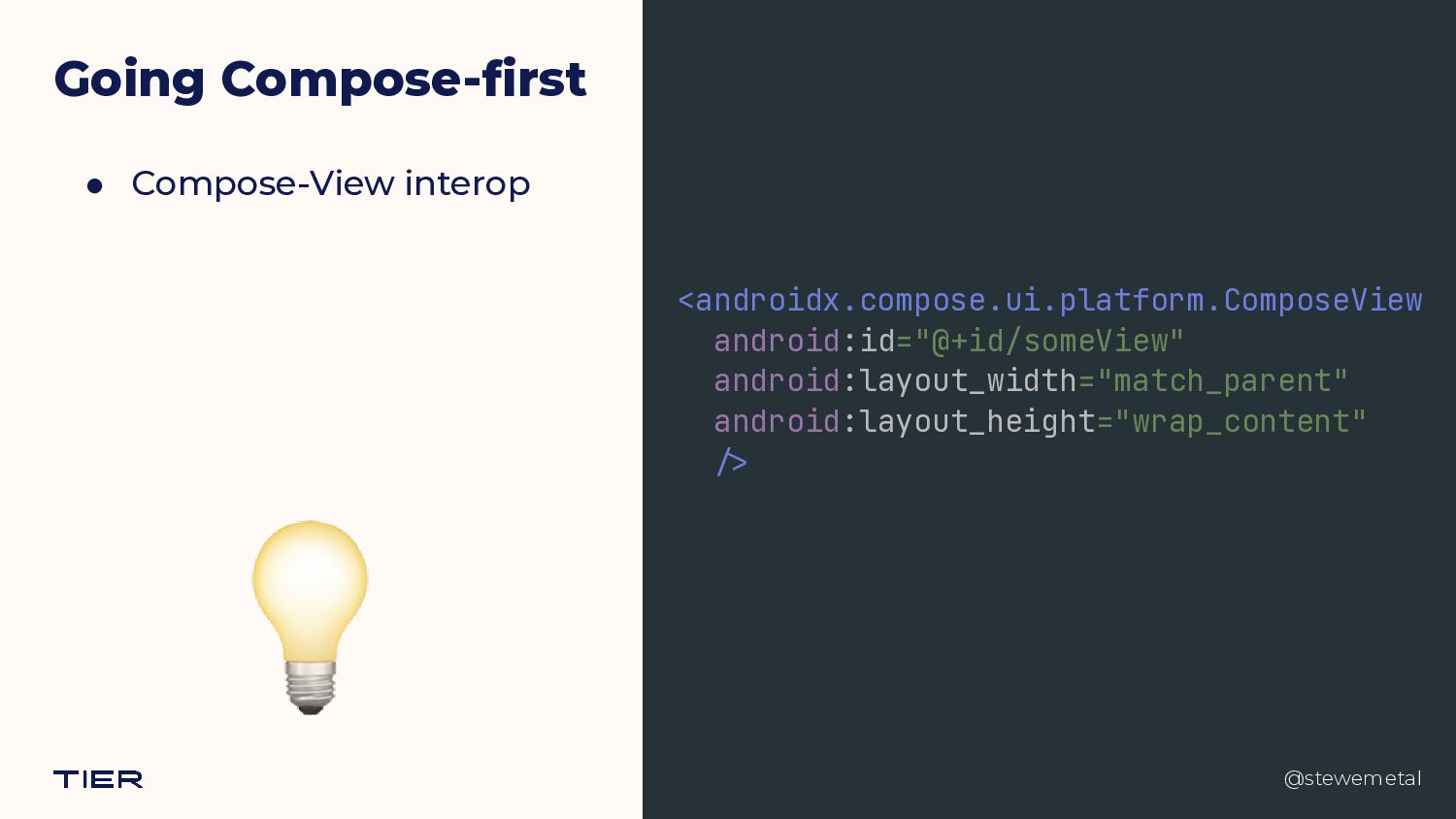
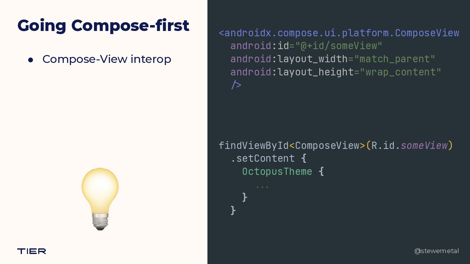
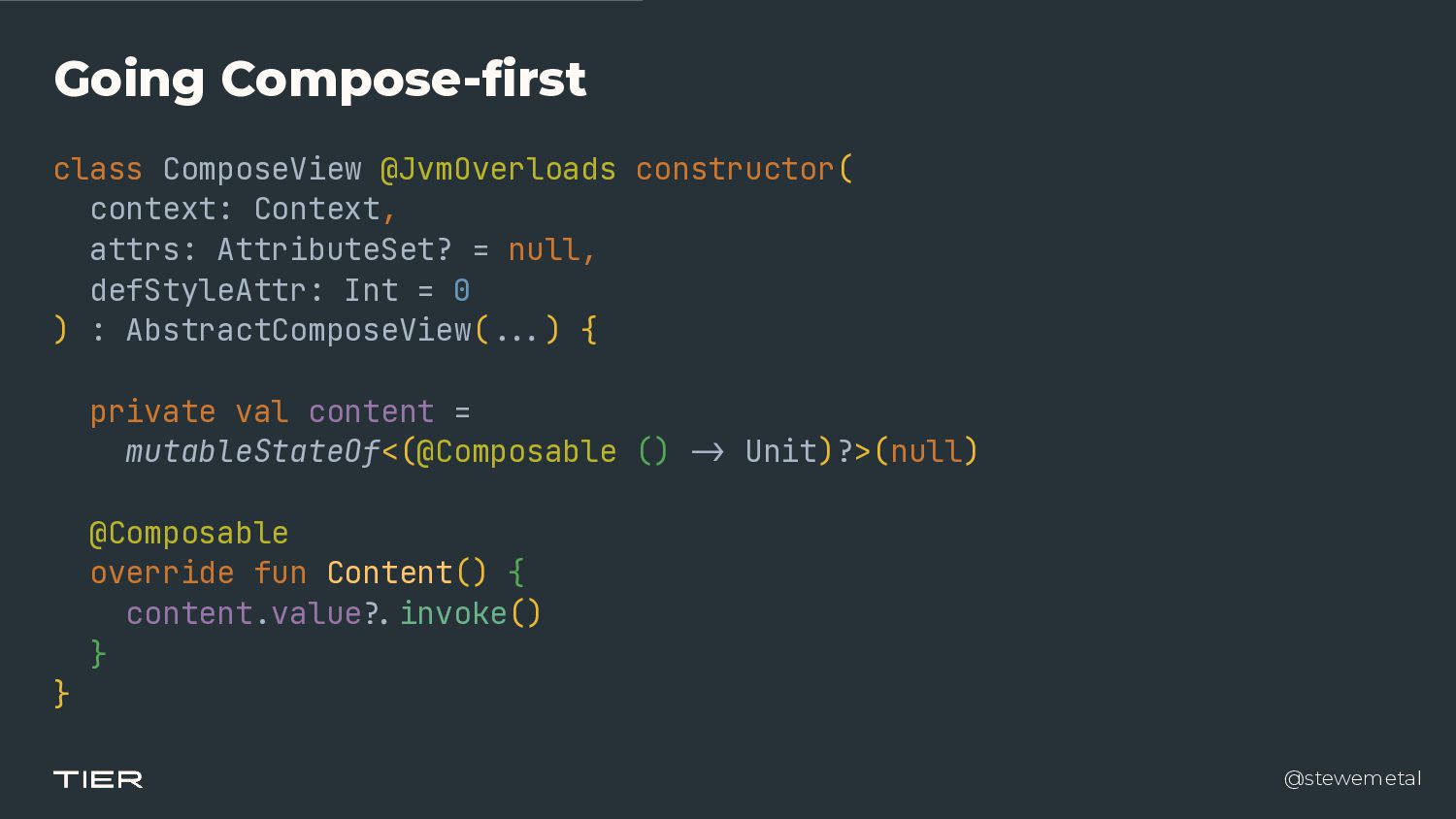
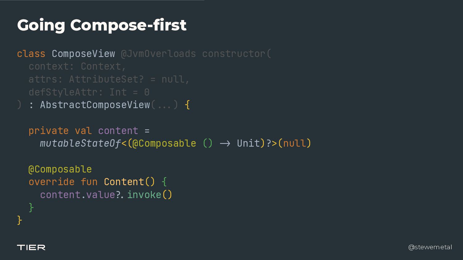
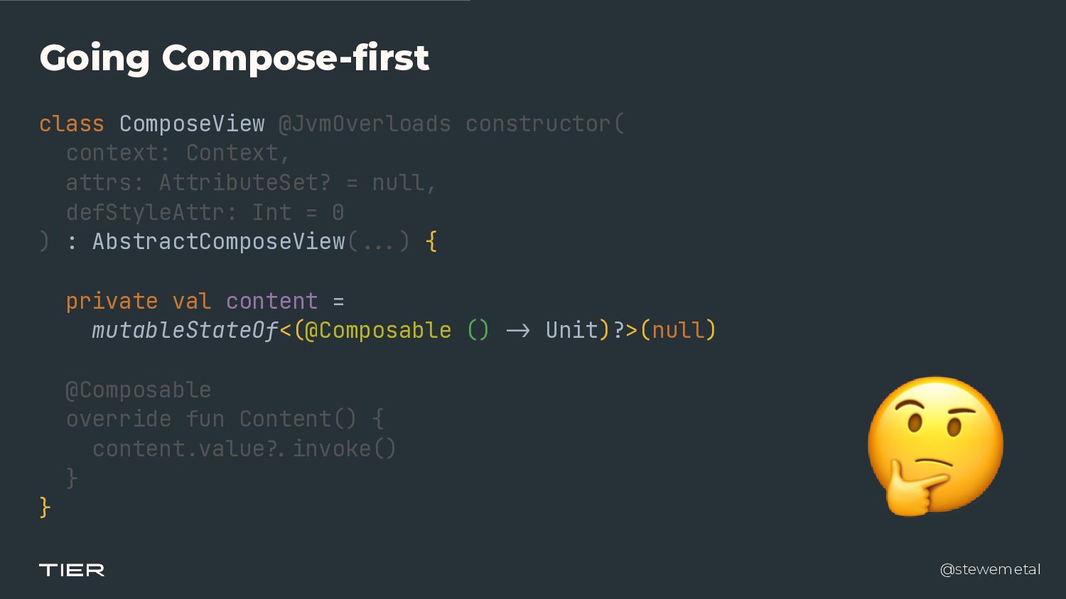
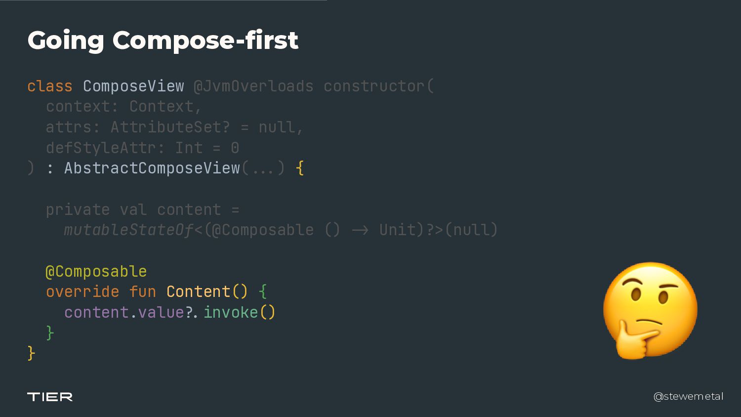
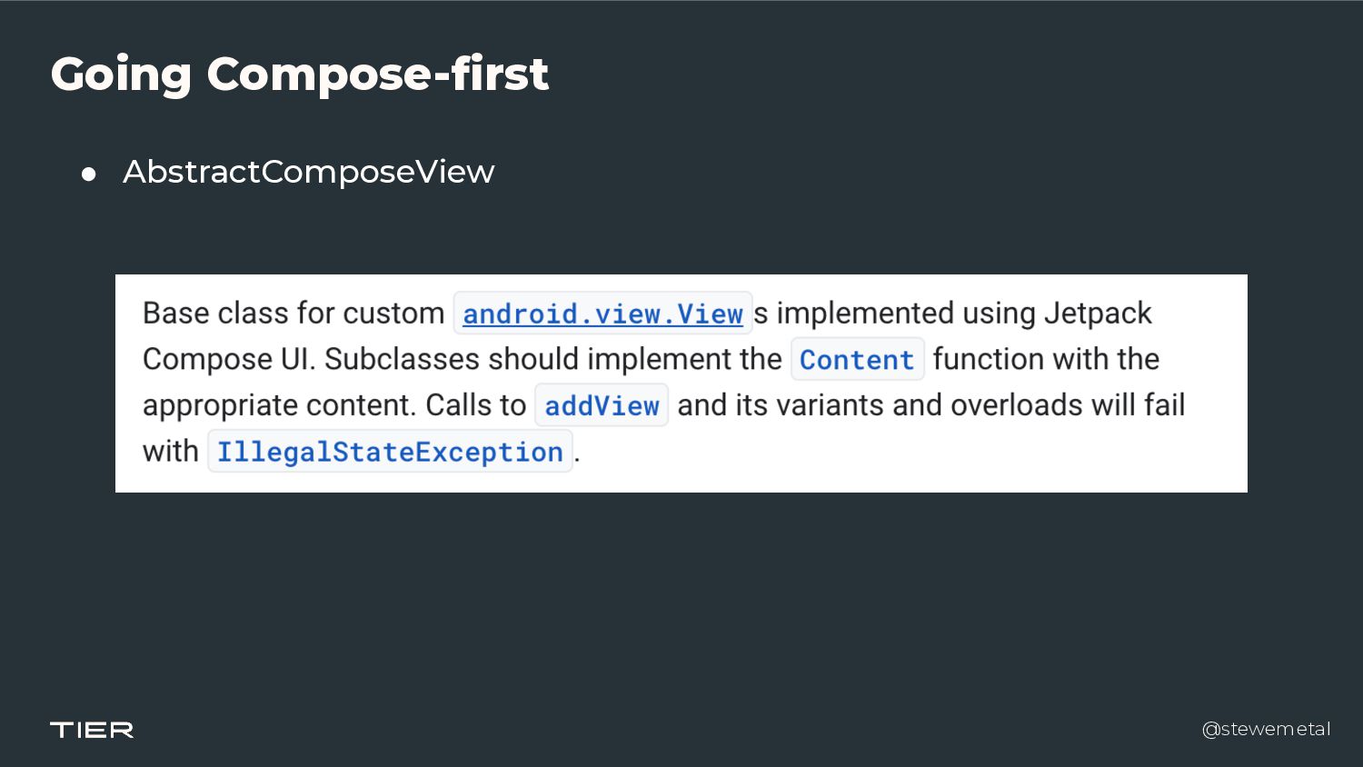
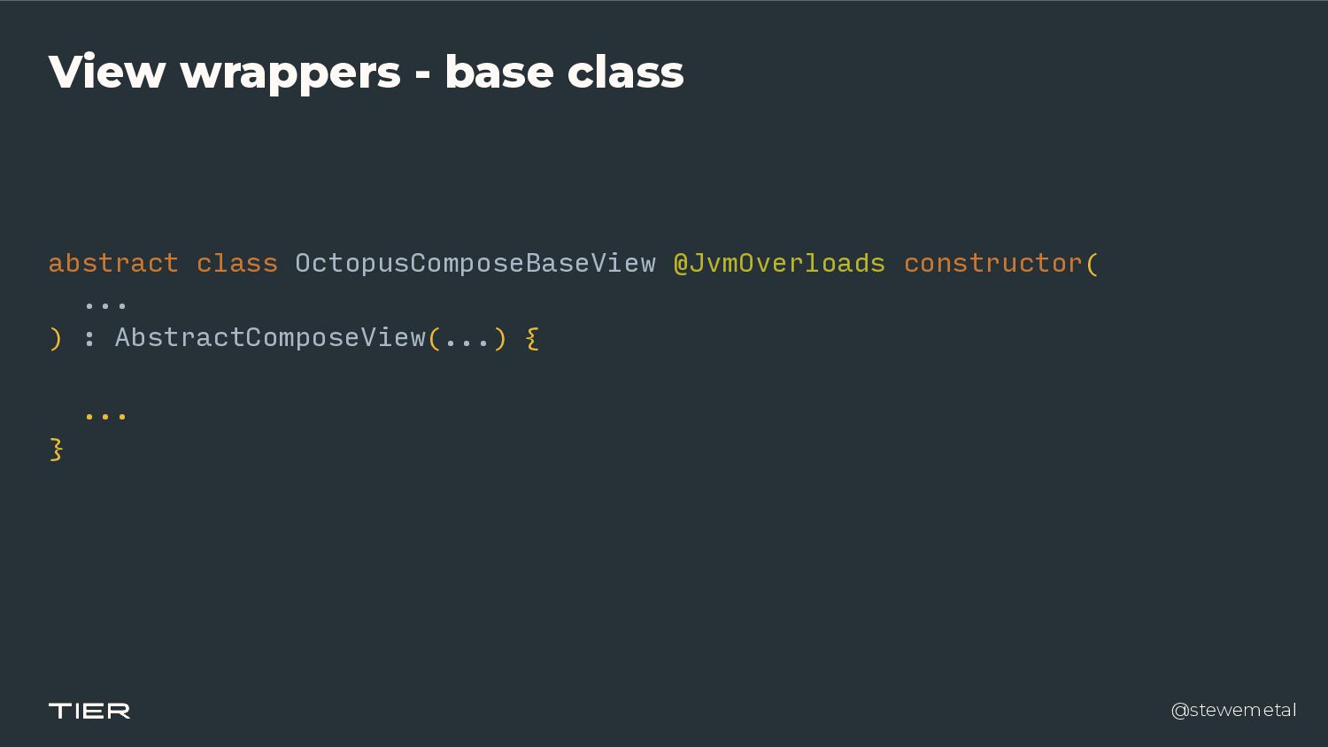
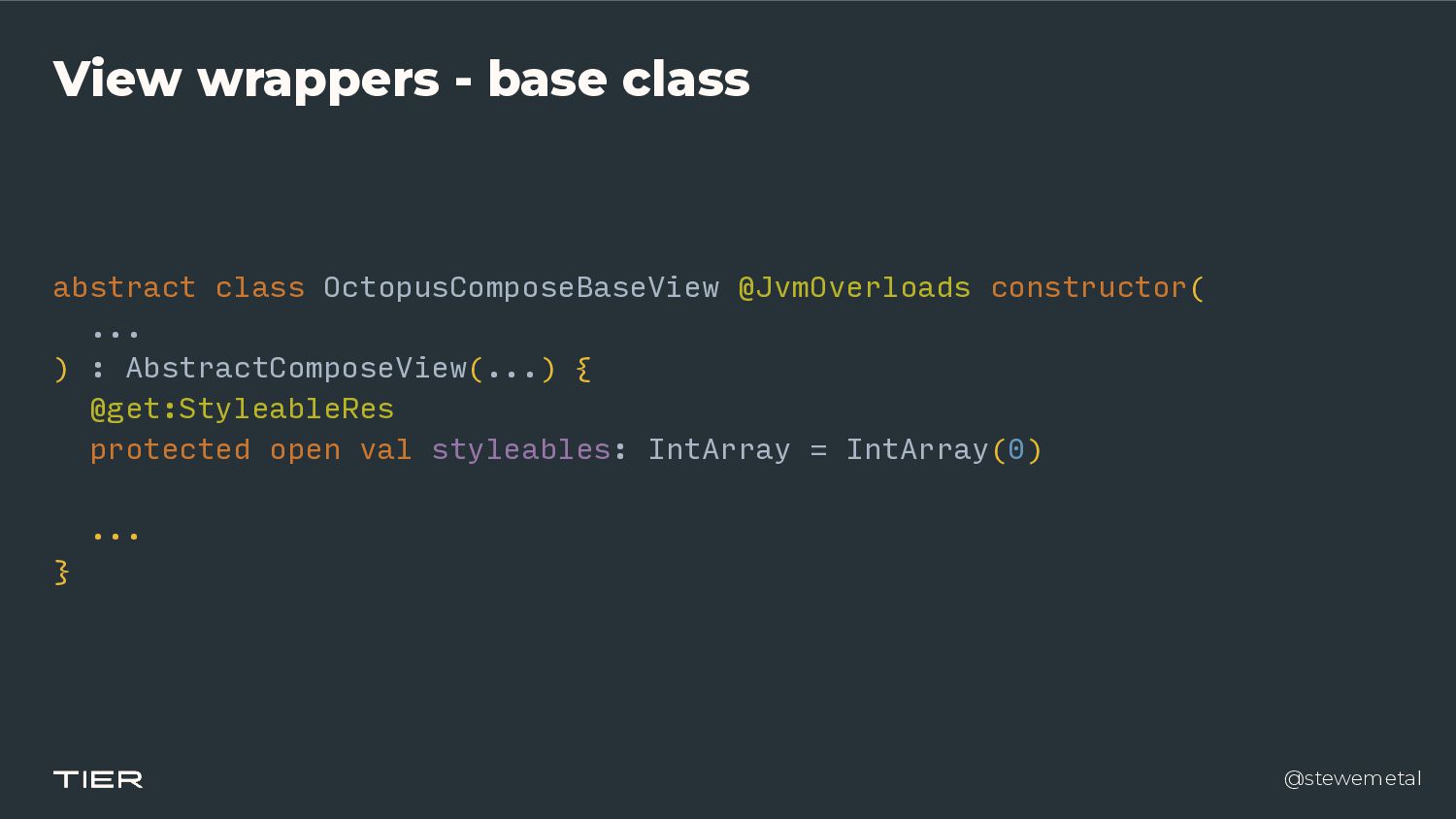
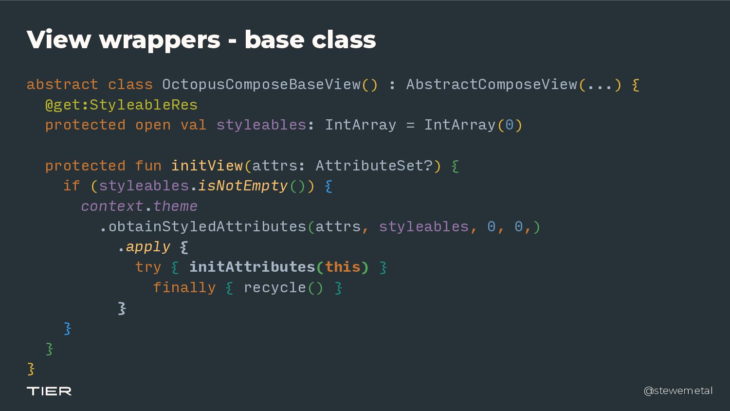
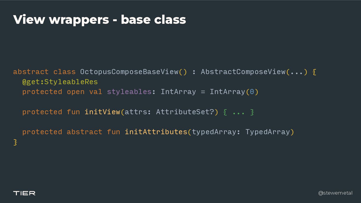
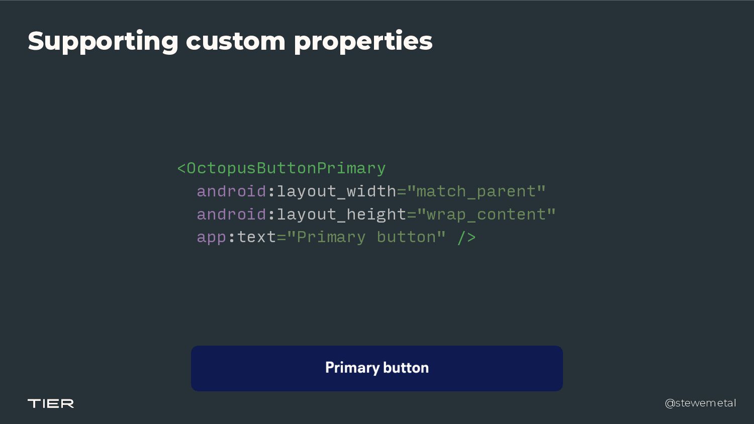
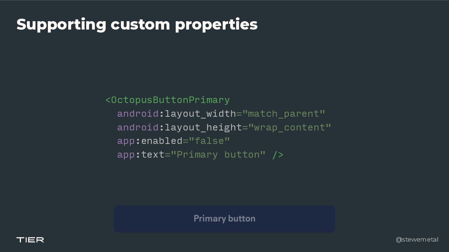
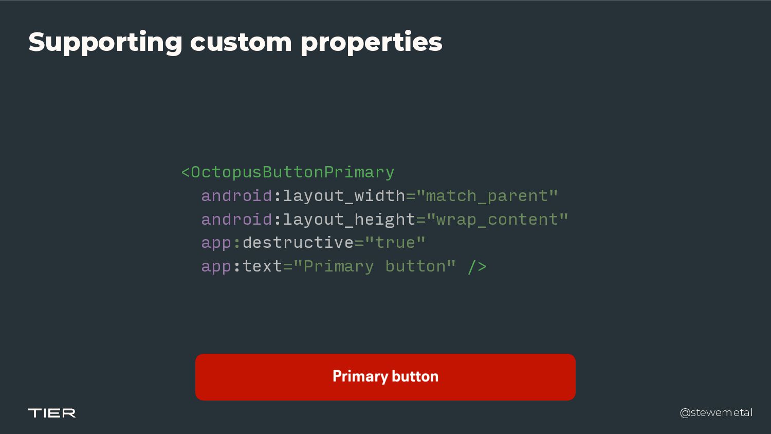
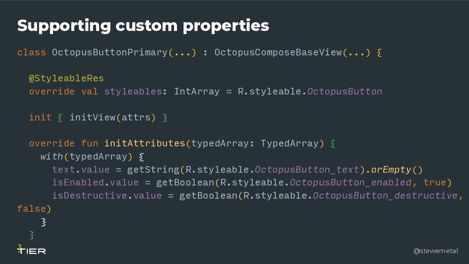
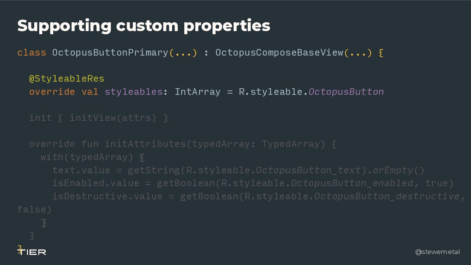
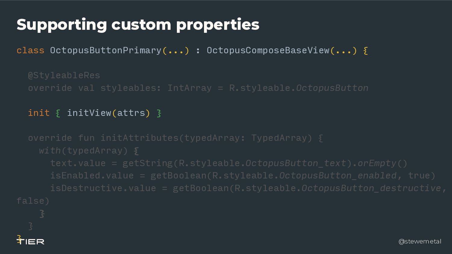
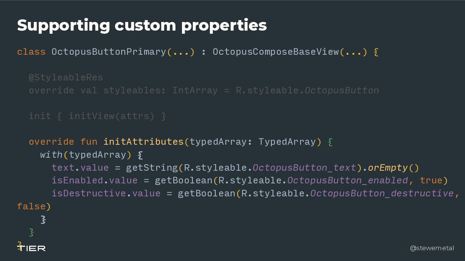
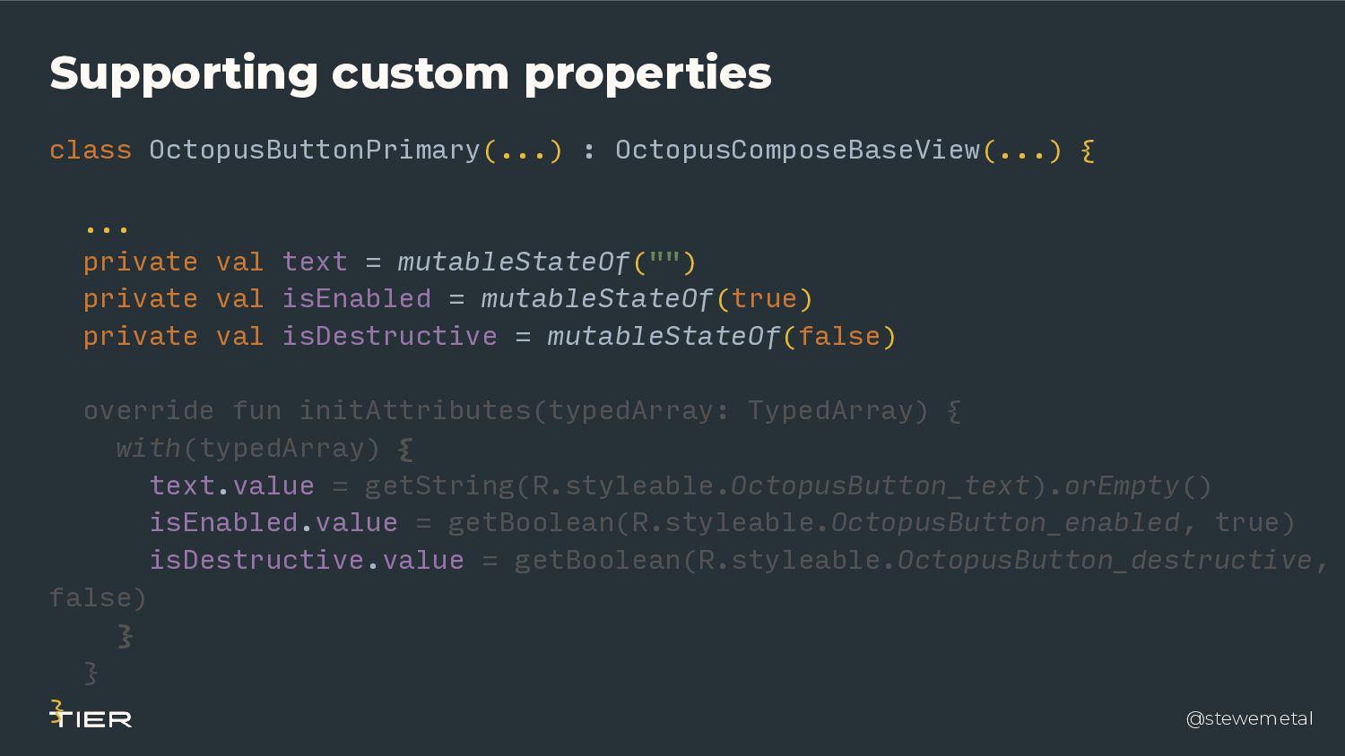
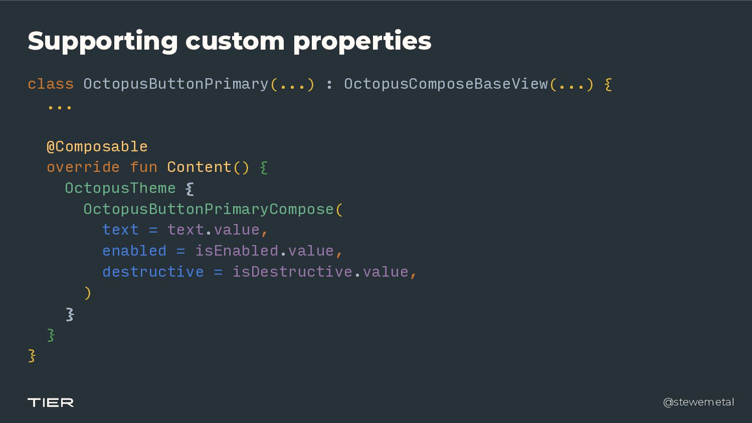
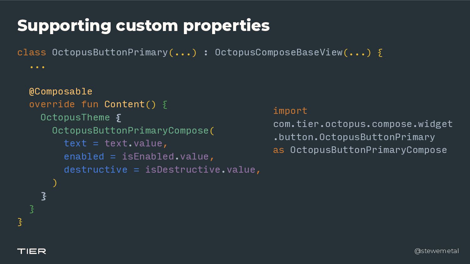
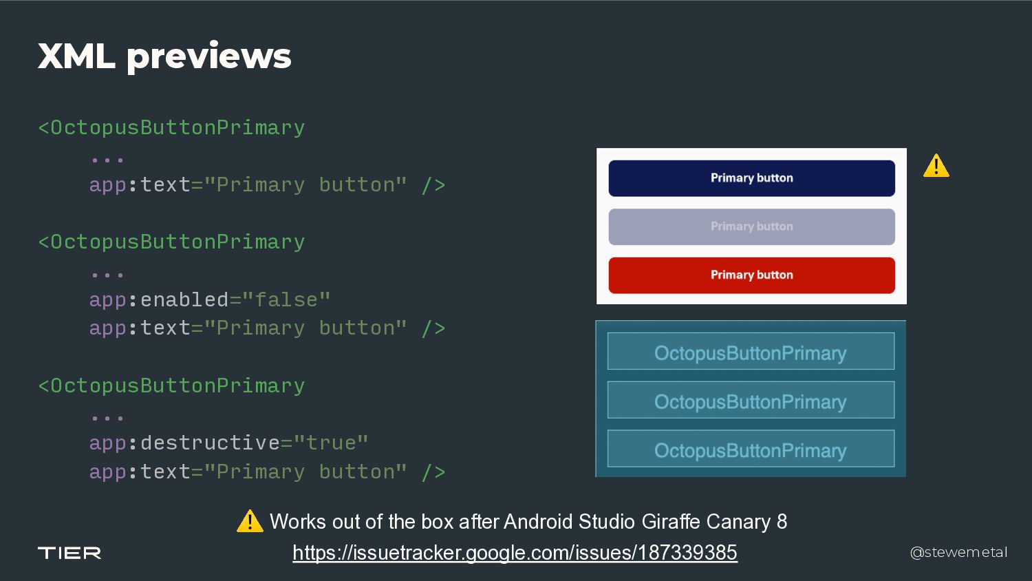
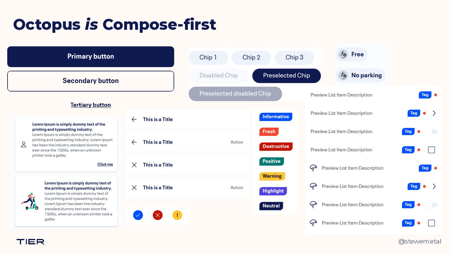
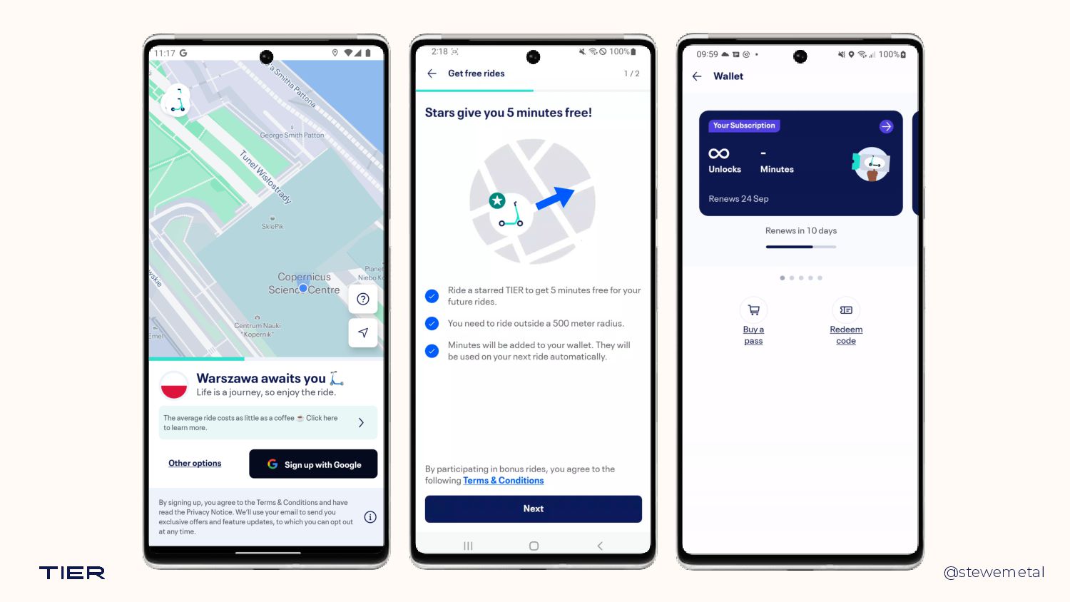
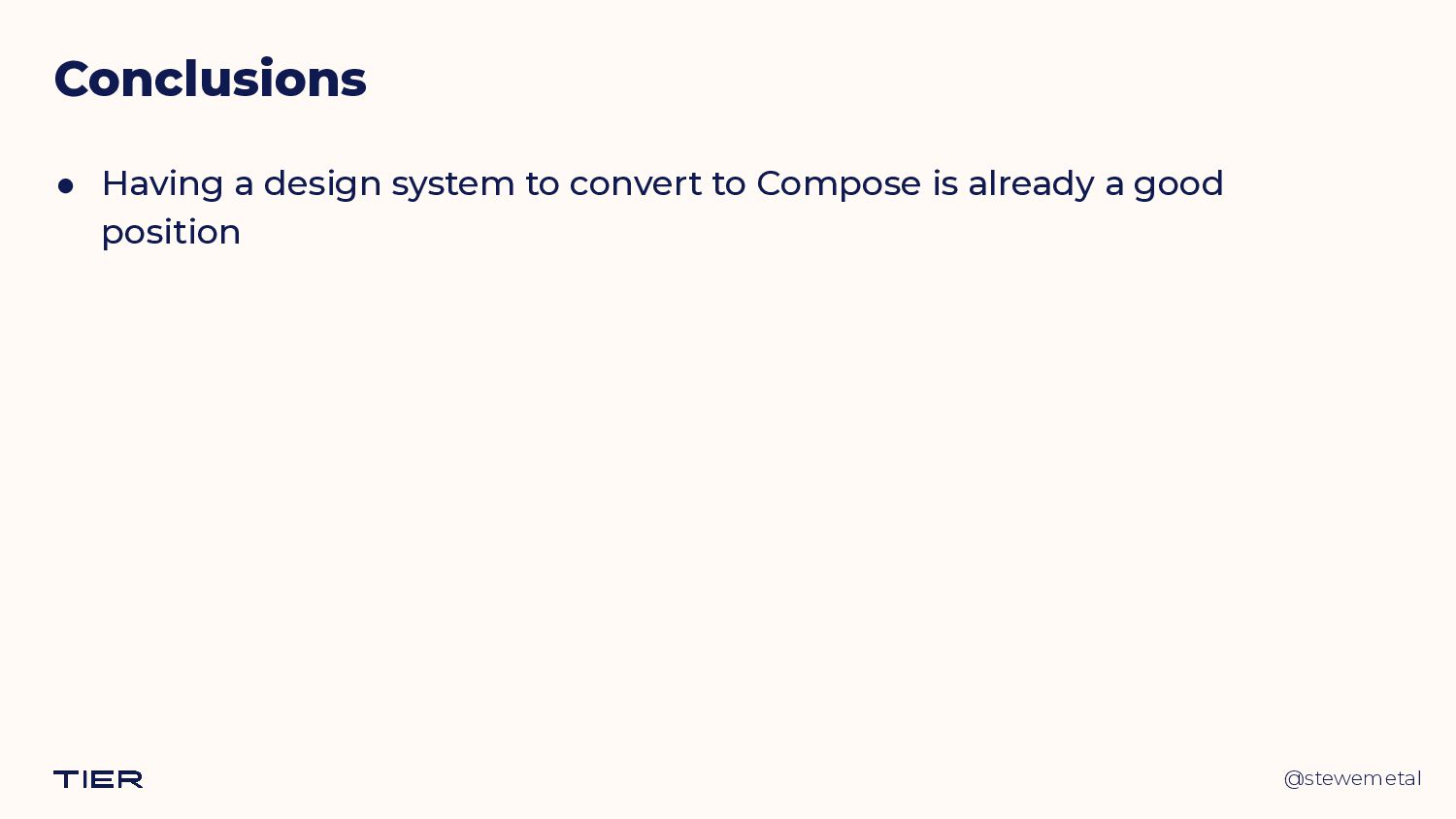
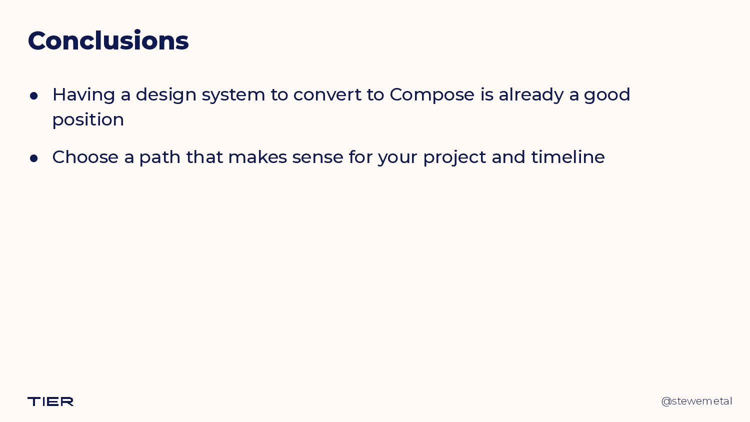
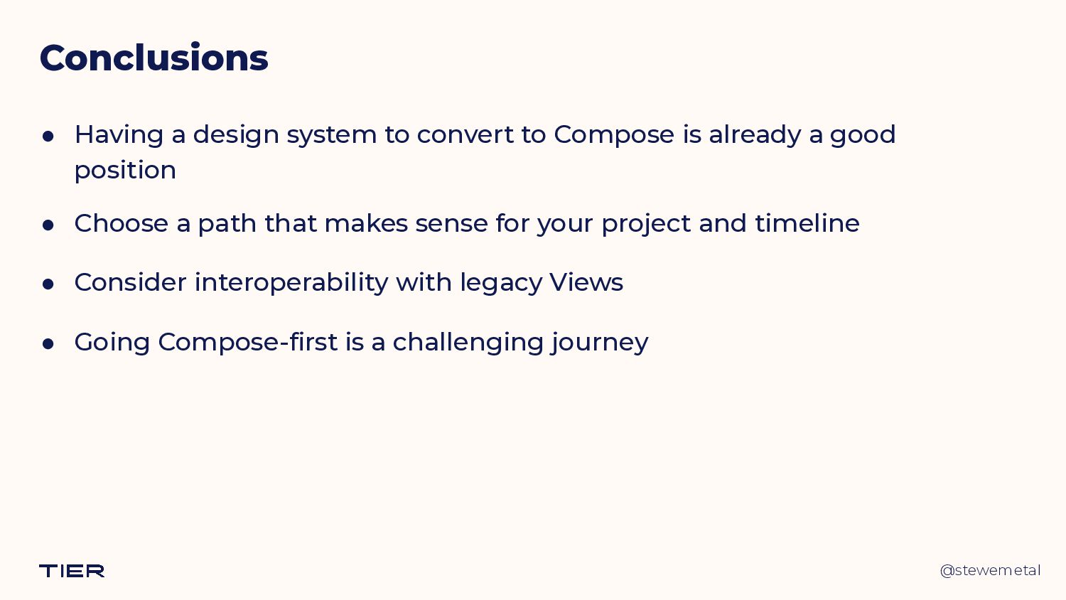
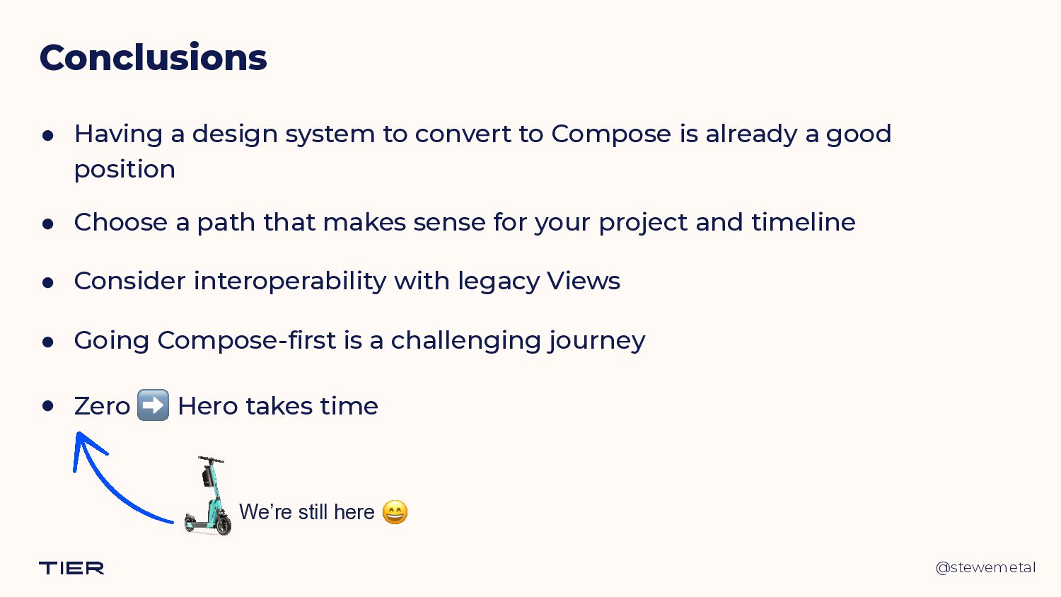
At TIER, we took the leap and adopted Jetpack Compose into our quite large code base. One of this journey's most significant milestones was having our design system, Octopus, implemented in pure Compose UI. In this talk, I present how we built Octopus with Compose, what we gained by reimplementing components instead of wrapping existing Views in AndroidView, and how we managed to support the still-View-based parts of our app with Compose.

Presented at the very first plDroid conference in Warsaw, Poland on 2023.05.30.

István Juhos

May 30, 2023
Tweet

More Decks by István Juhos

Other Decks in Programming

Transcript

  1. @stewemetal Composing a Design System 👨💻 Senior Android Engineer @

    TIER 
  Co-organizer of Kotlin Budapest 
 🌐 istvanjuhos.dev István Juhos
  2. @stewemetal Octopus Design System - B.C. • Customised Android Views

    and ViewGroups • Data Binding and @BindingAdapters • Lots of XML files and custom XML attributes
  3. @stewemetal Octopus Design System - B.C. • Customised Android Views

    and ViewGroups • Data Binding and @BindingAdapters • Lots of XML files and custom XML attributes OctopusButtonPrimary.kt R.layout.__internal_view_octopus_button R.styleable.OctopusButton R.drawable.__internal_octopus_button_background_primary ... @stewemetal
  4. @stewemetal Octopus Design System - B.C. • Customised Android Views

    and ViewGroups • Data Binding and @BindingAdapters • Lots of XML files and custom XML attributes class OctopusText @JvmOverloads constructor( context: Context, attrs: AttributeSet? = null, defStyleAttr: Int = 0, ) : AppCompatTextView(context, attrs, defStyleAttr) @stewemetal
  5. @stewemetal Octopus Design System - B.C. • Customised Android Views

    and ViewGroups • Data Binding and @BindingAdapters • Lots of XML files and custom XML attributes class OctopusText @JvmOverloads constructor( context: Context, attrs: AttributeSet? = null, defStyleAttr: Int = 0, ) : AppCompatTextView(context, attrs, defStyleAttr) @stewemetal
  6. @stewemetal Octopus Design System - B.C. private fun updateStyle() {

    areSettersEnabled = true ... setTextColor(ContextCompat.getColor(context, colorFromTextType)) ... areSettersEnabled = false } OctopusText : AppCompatTextView // We have to disable specific setters to prevent misuse of the view private var areSettersEnabled = false
  7. @stewemetal Octopus Design System - B.C. /** * Calling this

    method will have no effect. */ override fun setTextColor(color: Int) { if (areSettersEnabled || isInEditMode) { super.setTextColor(color) } } OctopusText : AppCompatTextView // We have to disable specific setters to prevent misuse of the view private var areSettersEnabled = false
  8. @stewemetal Adopting Compose • Possible approaches to consider Views +

    AndroidView @Composable fun OctopusButtonPrimary( text: String, ... onClick: () -> Unit, ) { AndroidView( factory = { context -> OctopusButtonPrimary( ContextThemeWrapper( context, R.style.Theme_Octopus, ) ) }, update = { view -> ... }, ) } @stewemetal
  9. @stewemetal Adopting Compose • Possible approaches to consider Views +

    AndroidView @Composable fun OctopusButtonPrimary( text: String, ... onClick: () -> Unit, ) { AndroidView( factory = { context -> OctopusButtonPrimary( ContextThemeWrapper( context, R.style.Theme_Octopus, ) ) }, update = { view -> ... }, ) } @stewemetal
  10. @stewemetal Adopting Compose • Possible approaches to consider Views +

    AndroidView @Composable fun OctopusButtonPrimary( text: String, ... onClick: () -> Unit, ) { AndroidView( factory = { context -> OctopusButtonPrimary( ContextThemeWrapper( context, R.style.Theme_Octopus, ) ).apply { setText(text) setOnClickListener { onClick() } ... } }, update = { view -> @stewemetal
  11. @stewemetal Adopting Compose • Possible approaches to consider Views +

    AndroidView + XMLs @Composable fun OctopusButtonPrimary( text: String, ... onClick: () -> Unit, ) { AndroidView( factory = { context -> OctopusButtonPrimary( ContextThemeWrapper( context, R.style.Theme_Octopus, ) ).apply { setText(text) setOnClickListener { onClick() } ... } }, update = { view -> @stewemetal
  12. @stewemetal Adopting Compose • Possible approaches to consider @Composable fun

    OctopusButtonPrimary( text: String, ... onClick: () -> Unit, ) { AndroidView( factory = { context -> OctopusButtonPrimary( ContextThemeWrapper( context, R.style.Theme_Octopus, ) ).apply { setText(text) setOnClickListener { onClick() } ... } }, update = { view -> @stewemetal Views + AndroidView + XMLs
  13. @stewemetal Adopting Compose • Possible approaches to consider @Composable public

    fun OctopusButtonPrimary( text: String, modifier: Modifier = Modifier, buttonSize: ButtonSize = NORMAL, enabled: Boolean = true, loading: Boolean = false, destructive: Boolean = false, onClick: () -> Unit, ) { Box() { Button(…) { Text(text) } if (loading) { OctopusButtonLoader() } } } Reimplement component s​ in ​ Compose @stewemetal
  14. @stewemetal Adopting Compose • Possible approaches to consider @Composable public

    fun OctopusButtonPrimary( text: String, modifier: Modifier = Modifier, buttonSize: ButtonSize = NORMAL, enabled: Boolean = true, loading: Boolean = false, destructive: Boolean = false, onClick: () -> Unit, ) { Box() { Button(…) { Text(text) } if (loading) { OctopusButtonLoader() } } } Reimplement component s​ in ​ Compose @stewemetal
  15. @stewemetal Adopting Compose • Possible approaches to consider Reimplement component

    s​ in ​ Compose @stewemetal @Composable public fun OctopusButtonPrimary( text: String, modifier: Modifier = Modifier, buttonSize: ButtonSize = NORMAL, enabled: Boolean = true, loading: Boolean = false, destructive: Boolean = false, onClick: () -> Unit, ) { Box() { Button(…) { Text(text) } if (loading) { OctopusButtonLoader() } } }
  16. @stewemetal Adopting Compose • Possible approaches to consider Reimplement component

    s​ in ​ Compose @stewemetal @Composable public fun OctopusButtonPrimary( text: String, modifier: Modifier = Modifier, buttonSize: ButtonSize = NORMAL, enabled: Boolean = true, loading: Boolean = false, destructive: Boolean = false, onClick: () -> Unit, ) { Box() { Button(…) { Text(text) } if (loading) { OctopusButtonLoader() } } }
  17. @stewemetal • The benefits of recreating components in Compose •

    Easier to maintain than custom Views • No attachments to the legacy Views and tech debt • Octopus is close to Material • A new experience for our teams Adopting Compose 🤩
  18. @stewemetal • Downsides of recreating components in Compose • Lack

    of experience in Compose APIs • A second implementation to maintain • Parity with the View-based components Adopting Compose 🧐
  19. @stewemetal Composing Octopus • Three possible approaches (not just for

    the theme!) • Customize Material • Extend Material • Go fully-custom
  20. @stewemetal Composing Octopus • Three possible approaches (not just for

    the theme!) • Customize Material • Extend Material • Go fully-custom
  21. @stewemetal Composing Octopus • Three possible approaches (not just for

    the theme!) • Customize Material • Extend Material • Go fully-custom - but use Material components where possible
  22. @stewemetal @Composable public fun OctopusTheme( isInDarkMode: Boolean = isSystemInDarkTheme(), colors:

    OctopusColors = OctopusColors.build(isInDarkMode), typography: OctopusTypography = OctopusTypography.build(), shapes: OctopusShapes = OctopusShapes.build(), dimensions: OctopusDimensions = OctopusDimensions.build(), spacings: OctopusSpacings = OctopusSpacings(), content: @Composable () -> Unit, ) { content() } OctopusTheme
  23. @stewemetal @Composable public fun OctopusTheme( isInDarkMode: Boolean = isSystemInDarkTheme(), colors:

    OctopusColors = OctopusColors.build(isInDarkMode), ... content: @Composable () -> Unit, ) { CompositionLocalProvider( LocalColors provides colors, ... ) { content() } } OctopusTheme
  24. @stewemetal @Composable public fun OctopusTheme( isInDarkMode: Boolean = isSystemInDarkTheme(), colors:

    OctopusColors = OctopusColors.build(isInDarkMode), ... content: @Composable () -> Unit, ) { CompositionLocalProvider( LocalColors provides colors, ... ) { content() } } OctopusTheme
  25. @stewemetal private val LocalColors = compositionLocalOf<OctopusColors> { error( 
 "No

    colors provided! Make sure to wrap all Octopus components 
 in an OctopusTheme." 
 ) } OctopusTheme
  26. @stewemetal public object { public val : OctopusColors @Composable @ReadOnlyComposable

    get() = LocalColors.current ... } OctopusTheme colors OctopusTheme
  27. @stewemetal • Octopus Compose component implementations • should follow the

    Jetpack Compose library API guidelines • should look and feel like the View ones (DS specs ✅ ) • should use values provided by OctopusTheme • should be built on existing Material components, where viable Designing Components in Compose
  28. @stewemetal Component example - OctopusText @Composable public fun OctopusText( text:

    String, modifier: Modifier = Modifier, textType: TextType = BODY_1, links: List<Link> = emptyList(), textAlignment: Alignment = NATURAL, overflow: TextOverflow = TextOverflow.Clip, style: OctopusStyle = OctopusStyle.getDefault(), ) { ... }
  29. @stewemetal Component example - OctopusText @Composable public fun OctopusText( text:

    String, modifier: Modifier = Modifier, textType: TextType = BODY_1, links: List<Link> = emptyList(), textAlignment: Alignment = NATURAL, overflow: TextOverflow = TextOverflow.Clip, style: OctopusStyle = OctopusStyle.getDefault(), ) { ... }
  30. @stewemetal Component example - OctopusText @Composable public fun OctopusText( text:

    String, modifier: Modifier = Modifier, textType: TextType = BODY_1, links: List<Link> = emptyList(), textAlignment: Alignment = NATURAL, overflow: TextOverflow = TextOverflow.Clip, style: OctopusStyle = OctopusStyle.getDefault(), ) { ... }
  31. @stewemetal Configuration example - TextType enum class TextType( private val

    id: Int, @ColorRes public val textColorRes: Int, public val textSizeSp: Float, public val lineHeightSp: Float, public val isBold: Boolean = true, public val maxLines: Int = Int.MAX_VALUE, public val isAllCaps: Boolean = false, ) { TITLE_1(0, R.color.__internal_octopusTextTitleNormal, SIZE_TITLE_1, 
 LINE_HEIGHT_40, maxLines = 1), BODY_1(1, R.color.__internal_octopusTextBody, TEXT_SIZE_16, 
 LINE_HEIGHT_20, isBold = false), ... }
  32. @stewemetal TextType usage with Composables OctopusText( text = "Title 1

    (Normal)", textType = TITLE_1, ) OctopusText( text = "Title 1 (Informative)", textType = TITLE_1_INFORMATIVE, ) OctopusText( text = "Title 1 (Destructive)", textType = TITLE_1_DESTRUCTIVE, ) ...
  33. @stewemetal <com.tier.octopus.widget.OctopusText android:layout_width="match_parent" android:layout_height="wrap_content" android:text="Title 1 (Normal)" app:textType="title1" /> <com.tier.octopus.widget.OctopusText

    android:layout_width="match_parent" android:layout_height="wrap_content" android:text="Title 1 (Informative)" app:textType=“title1Informative" /> TextType usage with Views
  34. @stewemetal <com.tier.octopus.widget.OctopusText android:layout_width="match_parent" android:layout_height="wrap_content" android:text="Title 1 (Normal)" app:textType="title1" /> <com.tier.octopus.widget.OctopusText

    android:layout_width="match_parent" android:layout_height="wrap_content" android:text="Title 1 (Informative)" app:textType=“title1Informative" /> TextType usage with Views
  35. @stewemetal <declare-styleable name="OctopusText"> <attr name="textType" format="enum"> <enum name="title1" value="0" />

    <enum name="title2" value="1" /> <enum name="title3" value="2" /> <enum name="title4" value="3" /> <enum name="title1Destructive" value="4" /> <enum name="title2Destructive" value="5" /> <enum name="title3Destructive" value="6" /> <enum name="title4Destructive" value="7" /> ... </attr> ... </declare-styleable> 😵💫 TextType usage with Views
  36. @stewemetal Previews @Preview( name = "1 - Light", showBackground =

    true, backgroundColor = 0xffffffff, // primaryBackgroundLight group = "Light/Dark", ) @Preview( name = "2 - Dark", showBackground = true, uiMode = UI_MODE_NIGHT_YES, backgroundColor = 0xff060a1e, // primaryBackgroundDark group = "Light/Dark", ) annotation class OctopusPreviewPrimaryBackground
  37. @stewemetal Previews @OctopusPreviewPrimaryBackground @Composable fun OctopusTextPreview() { Column( modifier =

    Modifier.verticalScroll(rememberScrollState()), ) { OctopusTextComposeDemo() } }
  38. @stewemetal Previews @OctopusPreviewPrimaryBackground @Composable fun OctopusTextPreview() { Column( modifier =

    Modifier.verticalScroll(rememberScrollState()), ) { OctopusTextComposeDemo() } }
  39. @stewemetal Previews @OctopusPreviewPrimaryBackground @Composable fun OctopusTextPreview() { Column( modifier =

    Modifier.verticalScroll(rememberScrollState()), ) { OctopusTextComposeDemo() } }
  40. @stewemetal Previews @OctopusPreviewPrimaryBackground @Composable fun OctopusTextPreview() { Column( modifier =

    Modifier.verticalScroll(rememberScrollState()), ) { OctopusTextComposeDemo() } }
  41. @stewemetal Previews @OctopusPreviewPrimaryBackground @Composable fun OctopusTextPreview() { Column( modifier =

    Modifier.verticalScroll(rememberScrollState()), ) { OctopusTextComposeDemo() } }
  42. @stewemetal Previews in the in-app Octopus demo @Composable fun OctopusTextComposeDemo()

    { OctopusTheme { Column(...) { OctopusComposeDemoSubSection( title = “Titles", ) { OctopusText( text = "Title 1 (Normal)", textType = TITLE_1, ) OctopusText( text = "Title 1 (Informative)", textType = TITLE_1_INFORMATIVE, ) OctopusText(
  43. @stewemetal Previews in the in-app Octopus demo @Composable fun OctopusTextComposeDemo()

    { OctopusTheme { Column(...) { OctopusComposeDemoSubSection( title = “Titles", ) { OctopusText( text = "Title 1 (Normal)", textType = TITLE_1, ) OctopusText( text = "Title 1 (Informative)", textType = TITLE_1_INFORMATIVE, ) OctopusText(
  44. @stewemetal Previews in the in-app Octopus demo <LinearLayout ...> ...

    <com.tier.octopus.widget.OctopusText android:text="Title 1 (Normal)" app:textType="title1" /> ... </LinearLayout>
  45. @stewemetal Previews in the in-app Octopus demo <LinearLayout ...> ...

    <com.tier.octopus.widget.OctopusText android:text="Title 1 (Normal)" app:textType="title1" /> ... </LinearLayout> <androidx.compose.ui.platform.ComposeView android:id="@+id/composeView" android:layout_width="match_parent" android:layout_height="wrap_content" />
  46. @stewemetal Previews in the in-app Octopus demo <LinearLayout ...> ...

    <com.tier.octopus.widget.OctopusText android:text="Title 1 (Normal)" app:textType="title1" /> ... <androidx.compose.ui.platform.ComposeView android:id="@+id/composeView" android:layout_width="match_parent" android:layout_height="wrap_content" /> </LinearLayout> ...
  47. @stewemetal Previews in the in-app Octopus demo findViewById<ComposeView>(R.id.composeView)?.apply { setContent

    { OctopusTheme { OctopusComposeDemoSection { OctopusTextComposeDemo() } } } } ...
  48. @stewemetal Previews in the in-app Octopus demo findViewById<ComposeView>(R.id.composeView)?.apply { setContent

    { OctopusTheme { OctopusComposeDemoSection { OctopusTextComposeDemo() } } } } ...
  49. @stewemetal Going Compose-first • Two separate Design System implementations 👎

    • Duplicated presentation and behavior • Keeping them in sync is tedious • New components = twice the work 🫠
  50. @stewemetal Going Compose-first • Compose-View interop @stewemetal <androidx.compose.ui.platform.ComposeView android:id="@+id/someView" android:layout_width="match_parent"

    android:layout_height="wrap_content" /> 💡 findViewById<ComposeView>(R.id.someView) .setContent { OctopusTheme { ... } }
  51. @stewemetal Going Compose-first @stewemetal class ComposeView @JvmOverloads constructor( context: Context,

    attrs: AttributeSet? = null, defStyleAttr: Int = 0 ) : AbstractComposeView( ... ) { private val content = mutableStateOf<(@Composable () -> Unit)?>(null) @Composable override fun Content() { content.value ?. invoke() } }
  52. @stewemetal Going Compose-first @stewemetal class ComposeView @JvmOverloads constructor( context: Context,

    attrs: AttributeSet? = null, defStyleAttr: Int = 0 ) : AbstractComposeView( ... ) { private val content = mutableStateOf<(@Composable () -> Unit)?>(null) @Composable override fun Content() { content.value ?. invoke() } }
  53. @stewemetal Going Compose-first @stewemetal class ComposeView @JvmOverloads constructor( context: Context,

    attrs: AttributeSet? = null, defStyleAttr: Int = 0 ) : AbstractComposeView( ... ) { private val content = mutableStateOf<(@Composable () -> Unit)?>(null) @Composable override fun Content() { content.value ?. invoke() } } 🤔
  54. @stewemetal Going Compose-first @stewemetal class ComposeView @JvmOverloads constructor( context: Context,

    attrs: AttributeSet? = null, defStyleAttr: Int = 0 ) : AbstractComposeView( ... ) { private val content = mutableStateOf<(@Composable () -> Unit)?>(null) @Composable override fun Content() { content.value ?. invoke() } } 🤔
  55. @stewemetal View wrappers - base class abstract class OctopusComposeBaseView @JvmOverloads

    constructor( ... ) : AbstractComposeView(...) { @get:StyleableRes protected open val styleables: IntArray = IntArray(0) ... }
  56. @stewemetal View wrappers - base class abstract class OctopusComposeBaseView() :

    AbstractComposeView(...) { @get:StyleableRes protected open val styleables: IntArray = IntArray(0) protected fun initView(attrs: AttributeSet?) { if (styleables.isNotEmpty()) { context.theme 
 .obtainStyledAttributes(attrs, styleables, 0, 0,) .apply { try { initAttributes(this) } finally { recycle() } } } } }
  57. @stewemetal View wrappers - base class abstract class OctopusComposeBaseView() :

    AbstractComposeView(...) { @get:StyleableRes protected open val styleables: IntArray = IntArray(0) protected fun initView(attrs: AttributeSet?) { ... } protected abstract fun initAttributes(typedArray: TypedArray) }
  58. @stewemetal Supporting custom properties class OctopusButtonPrimary(...) : OctopusComposeBaseView(...) { @StyleableRes

    override val styleables: IntArray = R.styleable.OctopusButton init { initView(attrs) } override fun initAttributes(typedArray: TypedArray) { with(typedArray) { text.value = getString(R.styleable.OctopusButton_text).orEmpty() isEnabled.value = getBoolean(R.styleable.OctopusButton_enabled, true) isDestructive.value = getBoolean(R.styleable.OctopusButton_destructive, false) } } }
  59. @stewemetal Supporting custom properties class OctopusButtonPrimary(...) : OctopusComposeBaseView(...) { @StyleableRes

    override val styleables: IntArray = R.styleable.OctopusButton init { initView(attrs) } override fun initAttributes(typedArray: TypedArray) { with(typedArray) { text.value = getString(R.styleable.OctopusButton_text).orEmpty() isEnabled.value = getBoolean(R.styleable.OctopusButton_enabled, true) isDestructive.value = getBoolean(R.styleable.OctopusButton_destructive, false) } } }
  60. @stewemetal Supporting custom properties class OctopusButtonPrimary(...) : OctopusComposeBaseView(...) { @StyleableRes

    override val styleables: IntArray = R.styleable.OctopusButton init { initView(attrs) } override fun initAttributes(typedArray: TypedArray) { with(typedArray) { text.value = getString(R.styleable.OctopusButton_text).orEmpty() isEnabled.value = getBoolean(R.styleable.OctopusButton_enabled, true) isDestructive.value = getBoolean(R.styleable.OctopusButton_destructive, false) } } }
  61. @stewemetal Supporting custom properties class OctopusButtonPrimary(...) : OctopusComposeBaseView(...) { @StyleableRes

    override val styleables: IntArray = R.styleable.OctopusButton init { initView(attrs) } override fun initAttributes(typedArray: TypedArray) { with(typedArray) { text.value = getString(R.styleable.OctopusButton_text).orEmpty() isEnabled.value = getBoolean(R.styleable.OctopusButton_enabled, true) isDestructive.value = getBoolean(R.styleable.OctopusButton_destructive, false) } } }
  62. @stewemetal Supporting custom properties class OctopusButtonPrimary(...) : OctopusComposeBaseView(...) { ...

    private val text = mutableStateOf("") private val isEnabled = mutableStateOf(true) private val isDestructive = mutableStateOf(false) override fun initAttributes(typedArray: TypedArray) { with(typedArray) { text.value = getString(R.styleable.OctopusButton_text).orEmpty() isEnabled.value = getBoolean(R.styleable.OctopusButton_enabled, true) isDestructive.value = getBoolean(R.styleable.OctopusButton_destructive, false) } } }
  63. @stewemetal Supporting custom properties class OctopusButtonPrimary(...) : OctopusComposeBaseView(...) { ...

    @Composable override fun Content() { OctopusTheme { OctopusButtonPrimaryCompose( text = text.value, enabled = isEnabled.value, destructive = isDestructive.value, ) } } }
  64. @stewemetal Supporting custom properties class OctopusButtonPrimary(...) : OctopusComposeBaseView(...) { ...

    @Composable override fun Content() { OctopusTheme { OctopusButtonPrimaryCompose( text = text.value, enabled = isEnabled.value, destructive = isDestructive.value, ) } } } import com.tier.octopus.compose.widget .button.OctopusButtonPrimary as OctopusButtonPrimaryCompose
  65. @stewemetal XML previews <OctopusButtonPrimary ... app:text="Primary button" /> <OctopusButtonPrimary ...

    app:enabled="false" app:text="Primary button" /> <OctopusButtonPrimary ... app:destructive="true" app:text="Primary button" /> ⚠
  66. @stewemetal XML previews <OctopusButtonPrimary ... app:text="Primary button" /> <OctopusButtonPrimary ...

    app:enabled="false" app:text="Primary button" /> <OctopusButtonPrimary ... app:destructive="true" app:text="Primary button" /> ⚠ Works out of the box after Android Studio Giraffe Canary 8 https://issuetracker.google.com/issues/187339385 ⚠
  67. @stewemetal Conclusions • Having a design system to convert to

    Compose is already a good position • Choose a path that makes sense for your project and timeline
  68. @stewemetal Conclusions • Having a design system to convert to

    Compose is already a good position • Choose a path that makes sense for your project and timeline • Consider interoperability with legacy Views
  69. @stewemetal Conclusions • Having a design system to convert to

    Compose is already a good position • Choose a path that makes sense for your project and timeline • Consider interoperability with legacy Views • Going Compose-first is a challenging journey
  70. @stewemetal Conclusions • Having a design system to convert to

    Compose is already a good position • Choose a path that makes sense for your project and timeline • Consider interoperability with legacy Views • Going Compose-first is a challenging journey • Zero ➡ Hero takes time We’re still here 😄
  71. @stewemetal Composing a Design System István Juhos 👨💻 Senior Android

    Engineer @ TIER 
  Co-organizer of Kotlin Budapest 
 Mastodon: androiddev.social/@stewemetal 
 Twitter: @stewemetal 
 Web: istvanjuhos.dev 
 Thank you! / Dziękuję!