Upgrade to Pro — share decks privately, control downloads, hide ads and more …

Untitled_presentation.pdf

 Untitled_presentation.pdf

suryamadireddy

November 28, 2018
Tweet

Other Decks in Education

Transcript

  1. Group Members • Noah Keller ◦ Bio: A junior Mathematics

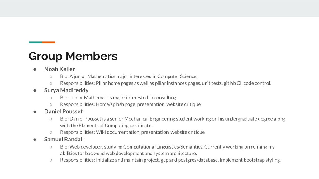
    major interested in Computer Science. ◦ Responsibilities: Pillar home pages as well as pillar instances pages, unit tests, gitlab CI, code control. • Surya Madireddy ◦ Bio: Junior Mathematics major interested in consulting. ◦ Responsibilities: Home/splash page, presentation, website critique • Daniel Pousset ◦ Bio: Daniel Pousset is a senior Mechanical Engineering student working on his undergraduate degree along with the Elements of Computing certificate. ◦ Responsibilities: Wiki documentation, presentation, website critique • Samuel Randall ◦ Bio: Web developer, studying Computational Linguistics/Semantics. Currently working on refining my abilities for back-end web development and system architecture. ◦ Responsibilities: Initialize and maintain project, gcp and postgres/database. Implement bootstrap styling.
  2. Features - Is this needed? • Website run on GCP

    and used namecheap to get the name • Aesthetically we wanted to create an old library vibe • Main page • Model Tables • Have a search bar in each tab to decrease confusion on what people are looking for
  3. Technology used • Slack and Gitlab • Front-End: ◦ HTML

    ◦ Bootstrap 4 ◦ CSS • Back-End: ◦ Flask ◦ SQL ◦ PostGres
  4. Issue Tracker Stats • # Resolved - 26 • #

    Unresolved - 0 • By Member: ◦ Noah - 14 ◦ Samuel - 11 ◦ Surya - 1 ◦ Daniel - 0
  5. Self-Critique What did we do well? • Easy to navigate

    • Meets all technical requirements • Search functionality works very well ◦ Responsive to partial searches • Template HTML document ◦ Consistent style • Consistent navigation bar What did we learn? • How to link a database structure on the back end with an HTML user interface on the front end. What can we do better? • More modern style • Splash page What puzzles us? • Table arrows
  6. Critique of Group #4 What did they do well? •

    We liked how clean their UI looked and how simple their datatables looked • The pictures in data tables increases the accessibility of the information • The blue background definitely creates a memorable look to the page What did we learn? • We combined our splash page and our about page but realized how it improves the aesthetics if we split them apart What can they do better? • Navbar not responsive on mobile devices What puzzles us? • Puzzled about why they have three search bars on their navigation bar