Upgrade to Pro — share decks privately, control downloads, hide ads and more …

WASI Logo Proposal

WASI Logo Proposal

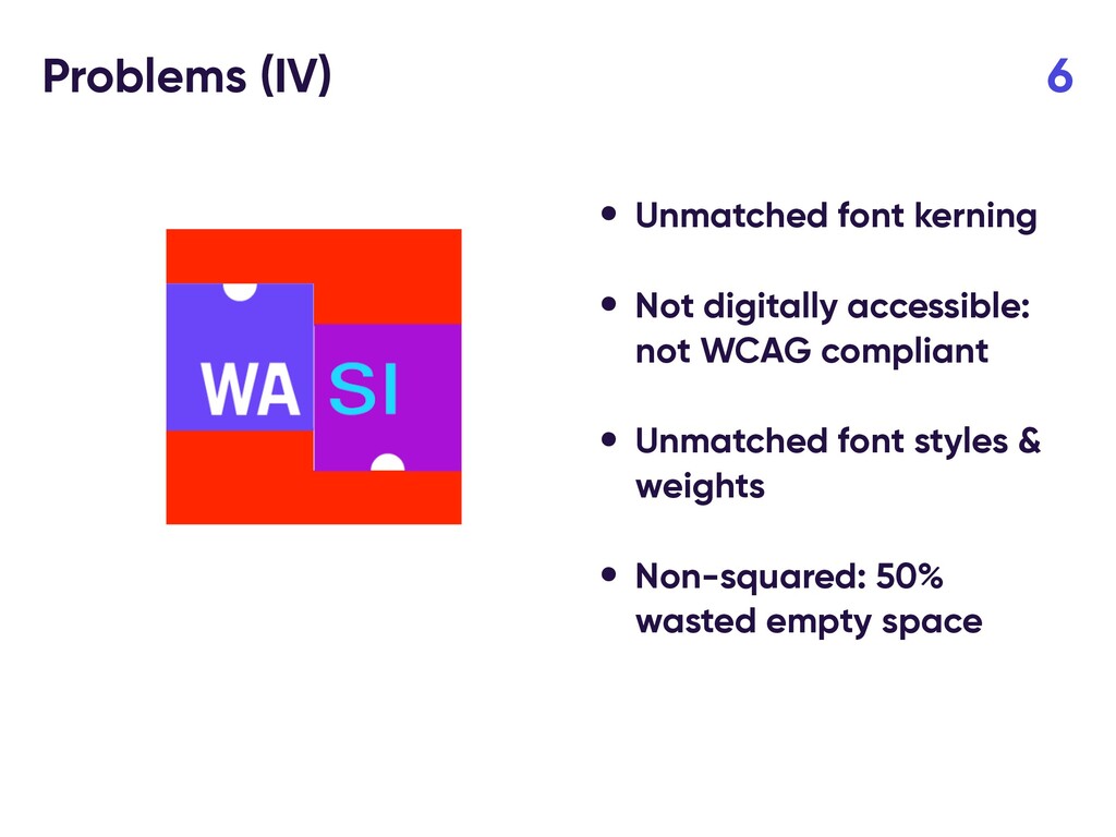
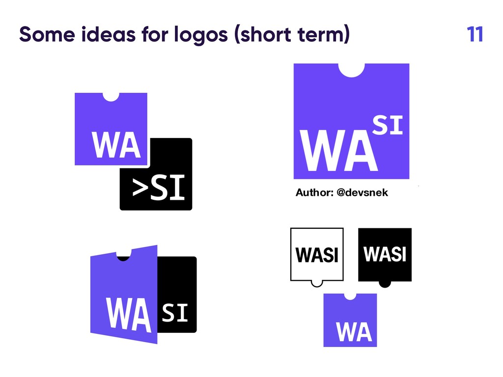
The presentation done in the WASI CG Meeting in Oct 22, 2020, trying to solve the issues with the current WASI draft logo

Syrus Akbary

October 22, 2020
Tweet

More Decks by Syrus Akbary

Other Decks in Technology

Transcript

  1. Problems (II) 4 • Unmatched font kerning • Not digitally

    accessible: not WCAG compliant Foreground color (SI) - #66D5FF Background color - #9C26CF
  2. Problems (III) 5 • Unmatched font kerning • Not digitally

    accessible: not WCAG compliant • Unmatched font styles & weights
  3. Problems (IV) 6 • Unmatched font kerning • Not digitally

    accessible: not WCAG compliant • Unmatched font styles & weights • Non-squared: 50% wasted empty space
  4. How a WASI Logo should be 7 • Accessible (WCAG

    compliant) • Vectorizable (.svg version) • Consistent style • Easy to recognize
  5. Proposal 9 • Replace current logo with one that is

    more accessible and solve the mentioned problems (short-term) • Organize a contest for a WASI logo, similar to the WASM, for the long-term
  6. Why this approach could make sense? 10 • We address

    the accessibility issues for low- vision people, setting a better-suited temporal icon • We setup the process to do a proper WASI logo contest
  7. Decision from the WASI Meeting (new slide) 12 • Fix

    accessibility issues, deviating the minimally possible from current logo. • Font kerning • Font style • Color Proposed icon