Upgrade to Pro — share decks privately, control downloads, hide ads and more …

Fire On the Bay SF: Intro to Responsive Web Design

tarajane
April 28, 2012

Fire On the Bay SF: Intro to Responsive Web Design

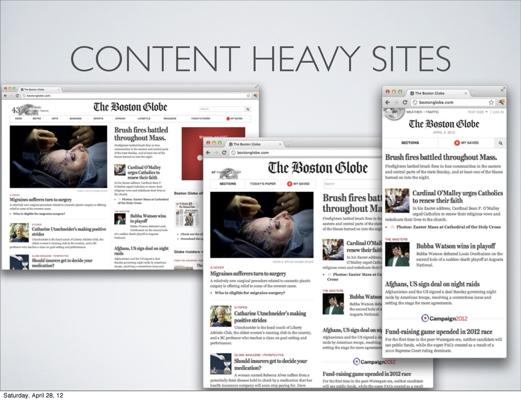
A presentation I gave to the Fire On the Bay SF group at Adobe on April 10th.

This is an introduction to responsive web design. The 5 W's. With example sites/resources to get started.

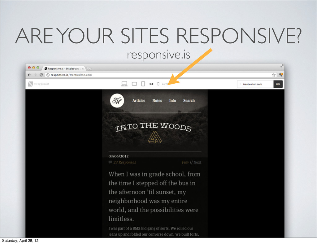
Video examples may/may not be working, so please visit any sample sites I list and resize your browser :)

tarajane

April 28, 2012
Tweet

More Decks by tarajane

Other Decks in Design

Transcript

  1. WHO AM I? • Software engineer at Adobe since 2006

    • Working in the XD group as an Experience Developer • Experience Developer? You say? • Design savvy developer. Implementer of pixel perfect user interfaces and interactions. Saturday, April 28, 12
  2. MY FOCUS Working with XD and the Web Platform group

    at Adobe to prototype experiences in the browser. http://blogs.adobe.com/webplatform/ Saturday, April 28, 12
  3. How do we create a great experience which spans across

    multiple devices, different screen widths, different resolutions, etc? Saturday, April 28, 12
  4. M.MYSITE.COM On a tablet? TABLET.MYSITE.COM New Retina iPad? New iPad:

    Retina, 2048-by-1536-pixel resolution at 264 pixels per inch (ppi) On mobile? Landscape orientation on a tablet? TABLETLANDSCAPE.MYSITE.COM RETINATABLET.MYSITE.COM Saturday, April 28, 12
  5. DESIGNING FOR NATIVE How does my app look on Windows

    Metro? How does it look on an iDevice? How does it look on an android phone? Am I dealing with multiple dev teams? How do I as a designer, push a change to native apps across all of these different platforms? Saturday, April 28, 12
  6. “Day by day, the number of devices, platforms, and browsers

    that need to work with your site grows. Responsive web design represents a fundamental shift in how we’ll build websites for the decade to come.” - Jeffrey Veen Saturday, April 28, 12
  7. 1. FLEXIBLE GRID SYSTEM 2. MEDIA QUERIES 3. FLUID MEDIA

    (IMAGES & TEXT) Saturday, April 28, 12
  8. 1. FLEXIBLE GRID SYSTEM 2. MEDIA QUERIES 3. FLUID MEDIA

    (IMAGES & TEXT) Saturday, April 28, 12
  9. 1. FLEXIBLE GRID SYSTEM The static 960 grid 12 and

    16 column layouts just doesn’t cut it anymore. Saturday, April 28, 12
  10. 1. FLEXIBLE GRID SYSTEM - % width columns, gutters and

    margins - drops columns in and out as space is available target width/context width * 100 = % width Saturday, April 28, 12
  11. 1. FLEXIBLE GRID SYSTEM - % width columns, gutters and

    margins - drops columns in and out as space is available target width/context width * 100 = % width 55px Saturday, April 28, 12
  12. 1. FLEXIBLE GRID SYSTEM - % width columns, gutters and

    margins - drops columns in and out as space is available target width/context width * 100 = % width 848px Saturday, April 28, 12
  13. 1. FLEXIBLE GRID SYSTEM target width/context width * 100 =

    % width 55px/848px * 100 = 6.485849056604% Saturday, April 28, 12
  14. 1. FLEXIBLE GRID SYSTEM 2. MEDIA QUERIES 3. FLUID MEDIA

    (IMAGES & TEXT) Saturday, April 28, 12
  15. 2. MEDIA QUERIES Media queries allow us to describe a

    set of rules for how our web elements appear at certain max and min screen widths. Use them to fix your design when it breaks. . Saturday, April 28, 12
  16. 2. MEDIA QUERIES @media screen and (max-width: 320px) { header

    img .logo { align: middle; } } @media screen and (max-width: 767px) { header img .logo { align: left; } } Saturday, April 28, 12
  17. 3. FLUID MEDIA Fonts - pixels vs ems - use

    pixels for absolute font sizes (when precision is needed) - use ems (scalable, ratio unit) otherwise - ems are proportional fonts, relative to the <body> and <html> defined font-size Saturday, April 28, 12
  18. 3. FLUID MEDIA The body tag has font-size=16px or 1em

    by default, so if you wanted your header to have a font size of 32px: 32/16 = 2em SO? As you zoom in/out in the browser (i.e. increase your font size), a font-size of 2em will scale to be twice the size of the body font size. Saturday, April 28, 12
  19. 1. FLEXIBLE GRID SYSTEM 2. MEDIA QUERIES 3. FLUID MEDIA

    (IMAGES & TEXT) Saturday, April 28, 12
  20. DESIGN CONTENT FIRST. What is the most important content your

    user will be looking for? - on a mobile sized screen - on a tablet sized screen - on a desktop sized screen ORDER MATTERS. Saturday, April 28, 12
  21. LEARN RWD DESIGN PATTERNS 1. Mostly Fluid 2. Column Drop

    3. Layout Shifter source: http://www.lukew.com/ff/entry.asp?1514 From a recent Luke Wrobleski post: Saturday, April 28, 12
  22. GET IN THE LOOP • Read the Responsive Web Design

    ‘A Book Apart’ book by Ethan Marcotte • Follow @RWD on twitter • Check out www.mediaqueri.es Saturday, April 28, 12