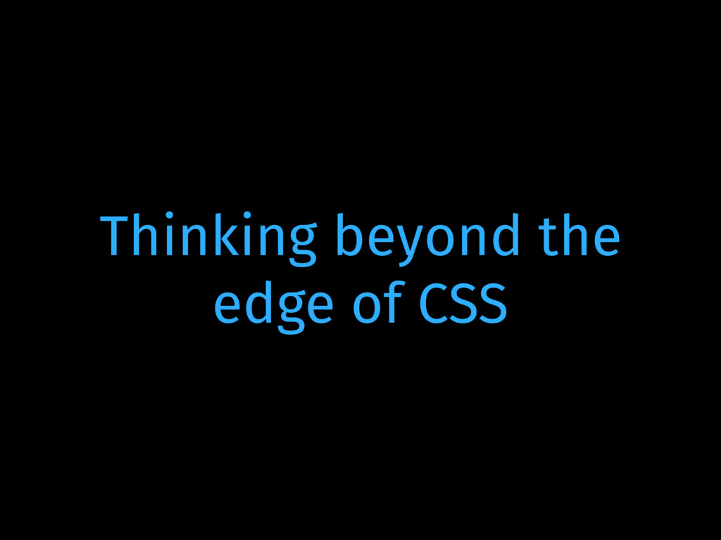
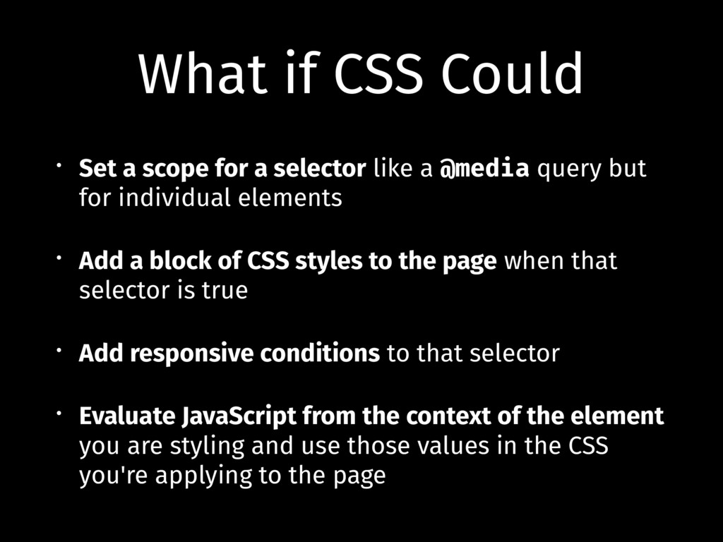
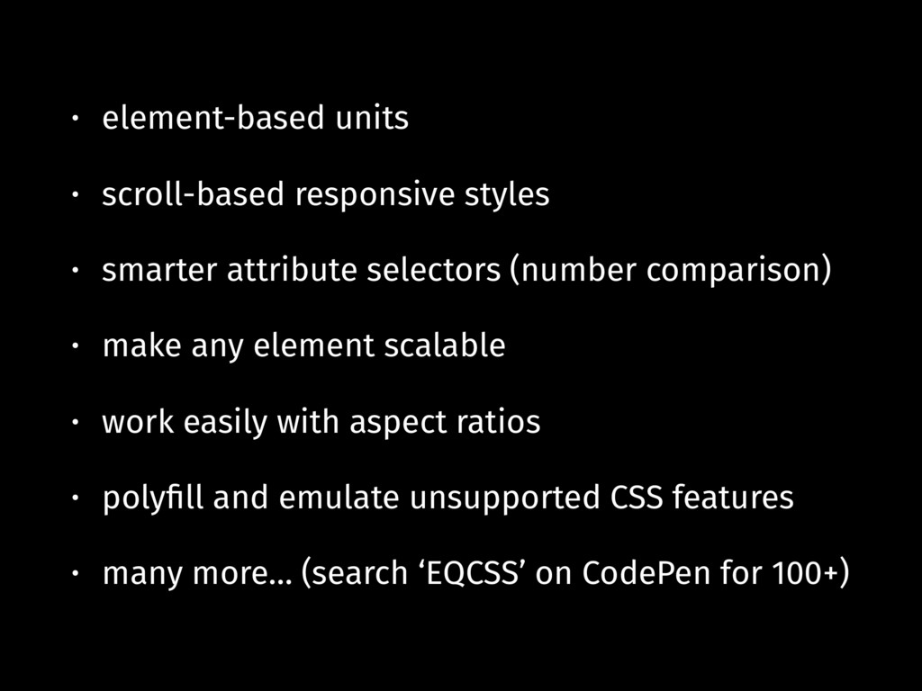
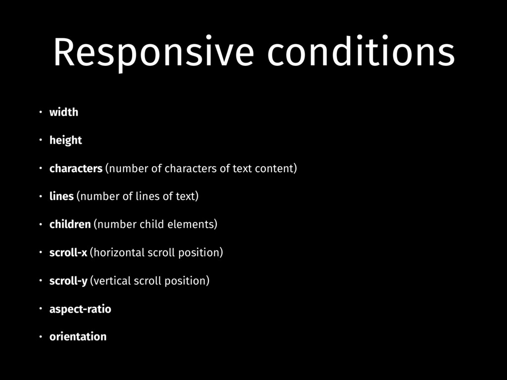
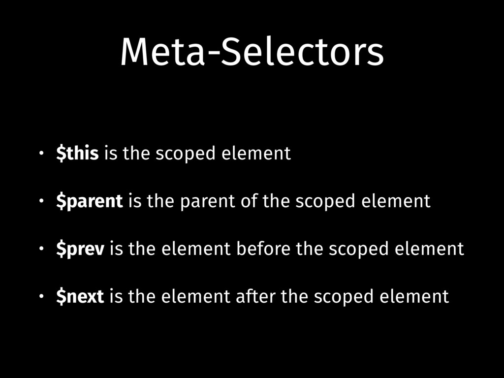
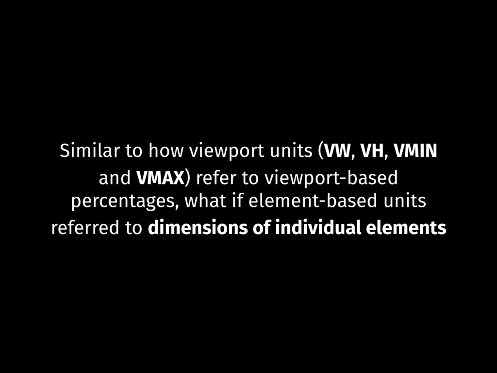
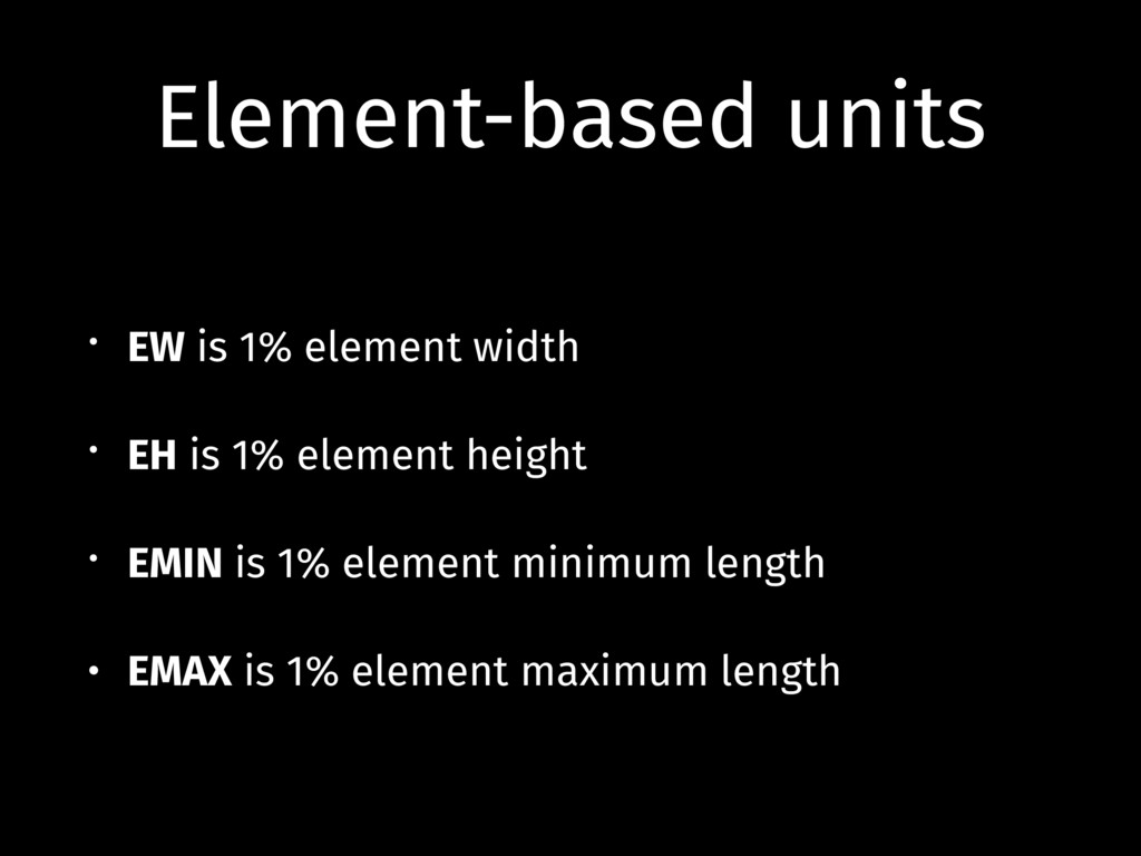
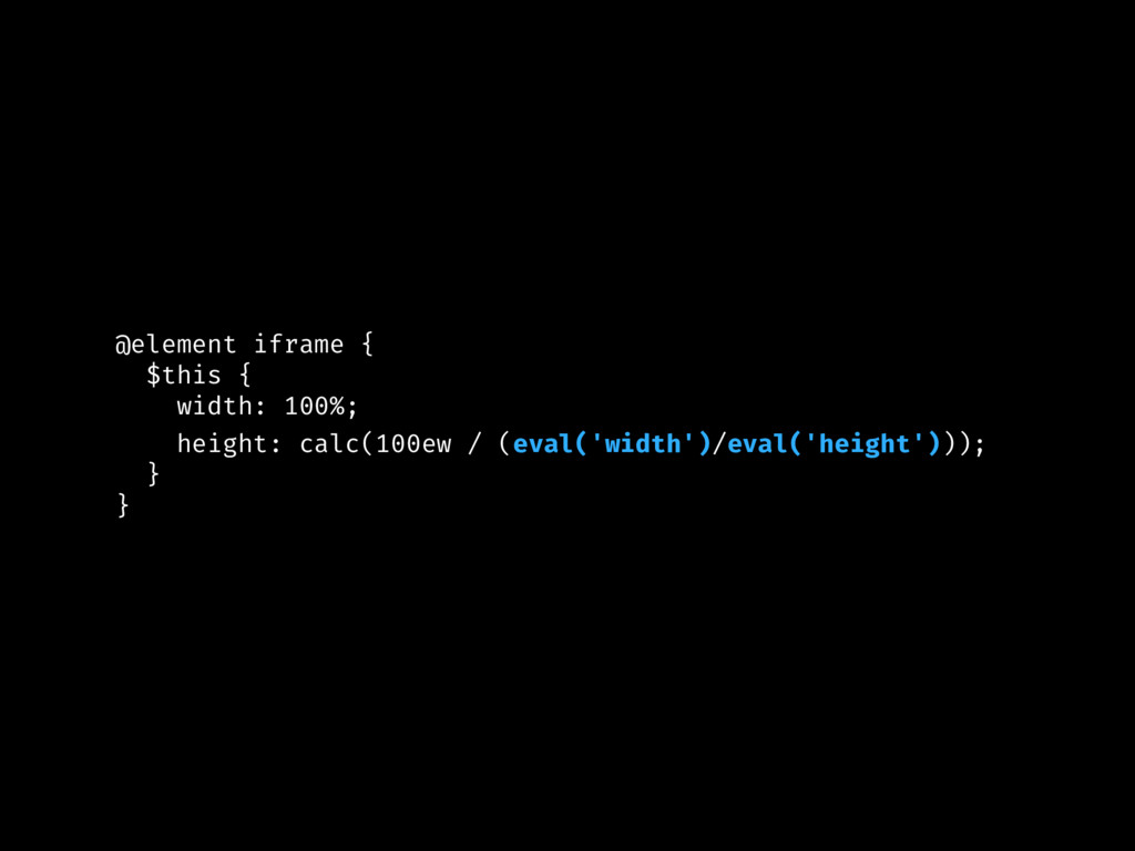
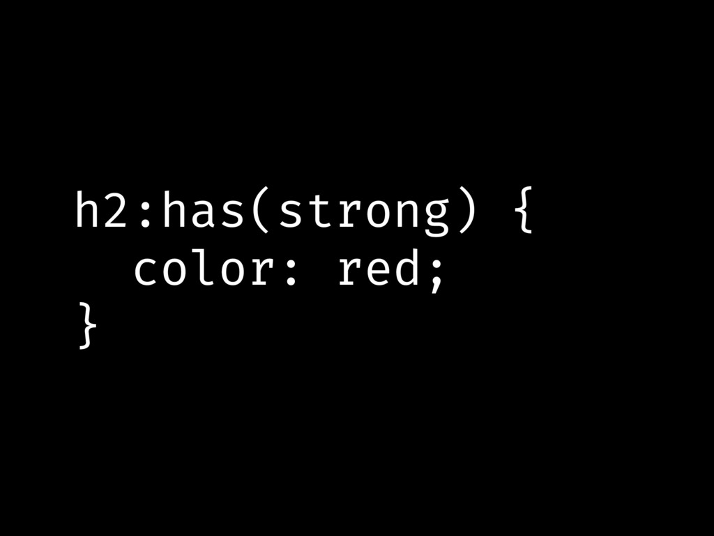
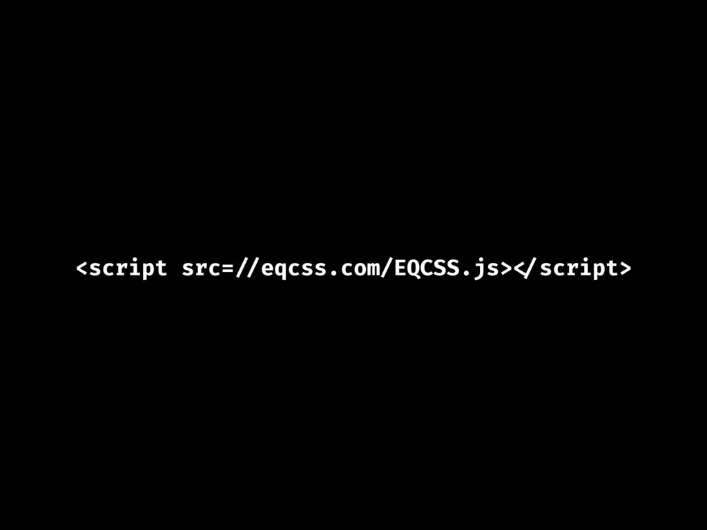
Have you ever felt limited by CSS and found yourself needing to apply styles to an element CSS can't quite select, or based on a breakpoint CSS isn't quite aware of? Follow along as Tommy shares a CSS extension that adds a few new abilities to how you can write CSS, and learn how you can begin using concepts like style scoping, element and container queries, and much more in your own projects right away!
 tomhodgins
 pkshadeck
 ryu1013
 lynteo
.jpg) rwang05
rwang05
 mhand01
 ukaoli
 hiromimaeo
 shosira
 signull
 kakukoki
 ammeep
 codingconduct
 marketingsoph
 3n
3n
 aleyda
 gr2m
gr2m
 dougneiner
 lara
lara
 holman
 aarron
 gurzu
gurzu
![What if you could use a selector like [type=number][value<0] to](https://files.speakerdeck.com/presentations/0d84501c3e884d5382214c98cb35c2ca/slide_76.jpg)
![[type=number][value < 0] { border: 1px solid red; }](https://files.speakerdeck.com/presentations/0d84501c3e884d5382214c98cb35c2ca/slide_77.jpg)
![We can use [value=0] and match the number 0 as](https://files.speakerdeck.com/presentations/0d84501c3e884d5382214c98cb35c2ca/slide_78.jpg)
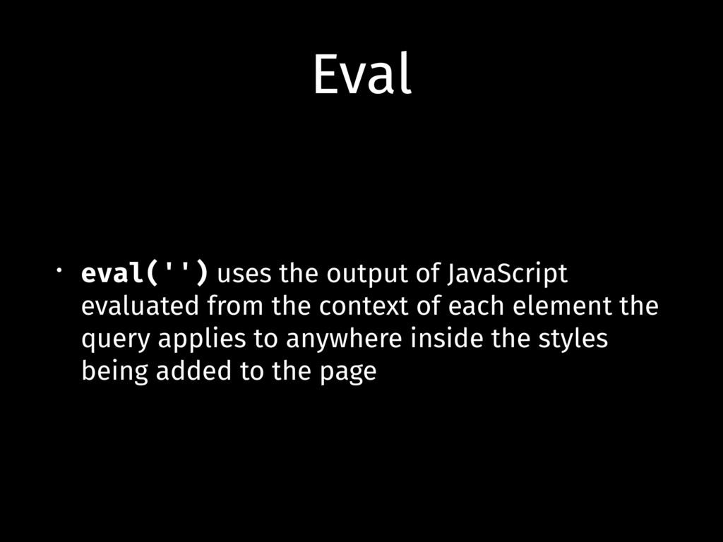
![@element [type=number] { eval('(value < 0) && "$this"') { border:](https://files.speakerdeck.com/presentations/0d84501c3e884d5382214c98cb35c2ca/slide_79.jpg)
![Here we add a red border to every [type=number] element](https://files.speakerdeck.com/presentations/0d84501c3e884d5382214c98cb35c2ca/slide_80.jpg)