Upgrade to Pro — share decks privately, control downloads, hide ads and more …

Responsive Web Design Workshop for Remix South, 2012

Ben Callahan
October 19, 2012

Responsive Web Design Workshop for Remix South, 2012

The slides from my three-hour workshop on responsive web design for Remix South 2012 in Atlanta, Georgia. #remix12 @remixsouth

Ben Callahan

October 19, 2012
Tweet

More Decks by Ben Callahan

Other Decks in Design

Transcript

  1. Ben Callahan President, Sparkbox Remix South October 19, 2012 Responsive

    Web Design @BENCALLAHAN http://bit.ly/LWLTEA RESPONSIVE WEB DESIGN 1 Sunday, October 21, 12
  2. 52% of laptop owners also own a smartphone In the

    US... http://bit.ly/zE1zgp @BENCALLAHAN RESPONSIVE WEB DESIGN 4 Sunday, October 21, 12
  3. 31% of smartphone owners also own a tablet In the

    US... http://bit.ly/zE1zgp @BENCALLAHAN RESPONSIVE WEB DESIGN 5 Sunday, October 21, 12
  4. 23% of laptop owners also own a tablet In the

    US... http://bit.ly/zE1zgp @BENCALLAHAN RESPONSIVE WEB DESIGN 6 Sunday, October 21, 12
  5. 13% own a laptop, smartphone, and tablet In the US...

    http://bit.ly/zE1zgp @BENCALLAHAN RESPONSIVE WEB DESIGN 7 Sunday, October 21, 12
  6. @BENCALLAHAN The Necessary Intro RESPONSIVE WEB DESIGN My name is

    Ben @bencallahan http://seesparkbox.com http://buildresponsively.com 10 Sunday, October 21, 12
  7. @BENCALLAHAN The Necessary Intro RESPONSIVE WEB DESIGN Download the repo

    (later) http://bit.ly/LWLTEA 13 Sunday, October 21, 12
  8. @BENCALLAHAN What We’ll Cover RESPONSIVE WEB DESIGN RWD 101 RWD

    Process Lessons Learned What’s Next in RWD 14 Sunday, October 21, 12
  9. The penetration of desktop/ laptop ownership is the same today

    as it was in 2007. In the US... http://bit.ly/zE1zgp @BENCALLAHAN RESPONSIVE WEB DESIGN 17 Sunday, October 21, 12
  10. @BENCALLAHAN RESPONSIVE WEB DESIGN 0 500 1000 1500 2000 2007

    2008 2009 2010 2011 2012 2013 2014 2015 Mobile Users Desktop Users RWD 101 18 Sunday, October 21, 12
  11. @BENCALLAHAN RESPONSIVE WEB DESIGN People are trying to browse your

    sites on these devices. Today. RWD 101 20 Sunday, October 21, 12
  12. @BENCALLAHAN RESPONSIVE WEB DESIGN Honor the proportions of the design

    by creating percentage-based grids instead of fixed-width, pixel-based grids. RWD 101: A Fluid Foundation 24 Sunday, October 21, 12
  13. @BENCALLAHAN RESPONSIVE WEB DESIGN <div class=”span-1”> <!-- one column -->

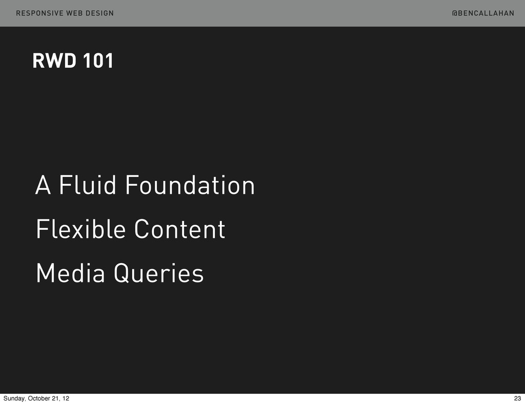
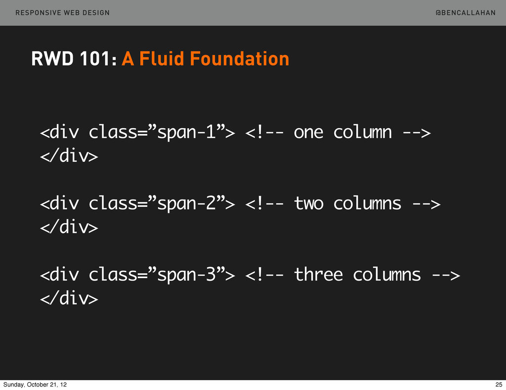
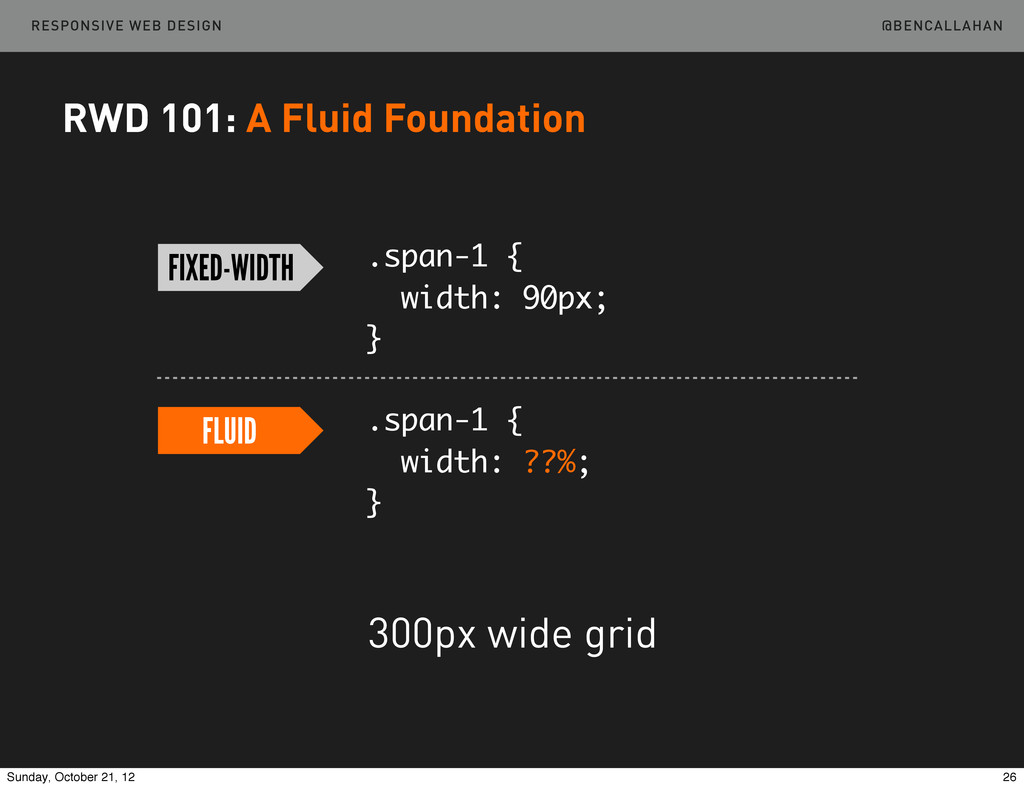
    </div> <div class=”span-2”> <!-- two columns --> </div> <div class=”span-3”> <!-- three columns --> </div> RWD 101: A Fluid Foundation 25 Sunday, October 21, 12
  14. @BENCALLAHAN RESPONSIVE WEB DESIGN .span-1 { width: 90px; } .span-1

    { width: ??%; } FIXED-WIDTH FLUID 300px wide grid RWD 101: A Fluid Foundation 26 Sunday, October 21, 12
  15. @BENCALLAHAN RESPONSIVE WEB DESIGN .span-1 { width: 90px; } .span-1

    { width: ??%; } FIXED-WIDTH FLUID target / context = % RWD 101: A Fluid Foundation 27 Sunday, October 21, 12
  16. @BENCALLAHAN RESPONSIVE WEB DESIGN .span-1 { width: 90px; } .span-1

    { width: 30%; } FIXED-WIDTH FLUID 90 / 300 = .3 target / context = % RWD 101: A Fluid Foundation 28 Sunday, October 21, 12
  17. @BENCALLAHAN RESPONSIVE WEB DESIGN Turn a 300px 3-column grid into

    a fluid grid. /01-RWD101/br-1.html RWD 101: A Fluid Foundation Example http://bit.ly/LWLTEA 29 Sunday, October 21, 12
  18. @BENCALLAHAN RESPONSIVE WEB DESIGN IE & Rounding RWD 101: A

    Fluid Foundation 30 Sunday, October 21, 12
  19. @BENCALLAHAN RESPONSIVE WEB DESIGN RWD 101: A Fluid Foundation ➡Semantic

    Grid Systems ‣ http://semantic.gs ‣ http://susy.oddbird.net 31 Sunday, October 21, 12
  20. @BENCALLAHAN RESPONSIVE WEB DESIGN RWD 101: A Fluid Foundation @column-­‐width:

     60; @gutter-­‐width:  20; @columns:  12; @total-­‐width:  100%; header  {  .column(12);  } article  {  .column(12);  } aside  {  .column(12);  } @media  (min-­‐width:  38em)  {      article  {  .column(8);  }      aside  {  .column(4);  } } 32 Sunday, October 21, 12
  21. @BENCALLAHAN RESPONSIVE WEB DESIGN RWD 101: Flexible Content Once we

    have a grid which is based on proportions, the content we put in that grid must also respond. 33 Sunday, October 21, 12
  22. @BENCALLAHAN RESPONSIVE WEB DESIGN RWD 101: Flexible Content img {

    max-width: 100%; } 34 Sunday, October 21, 12
  23. @BENCALLAHAN RESPONSIVE WEB DESIGN Make the image flexible. /01-RWD101/br-3.html http://bit.ly/LWLTEA

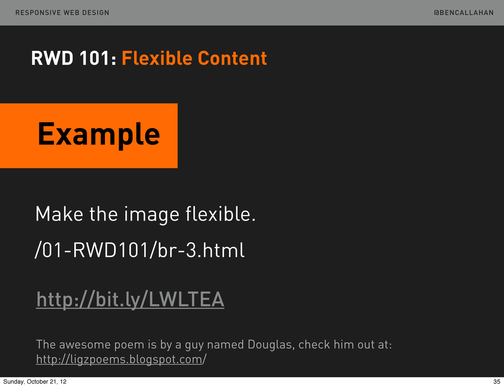
    RWD 101: Flexible Content The awesome poem is by a guy named Douglas, check him out at: http://ligzpoems.blogspot.com/ Example 35 Sunday, October 21, 12
  24. @BENCALLAHAN RESPONSIVE WEB DESIGN RWD 101: Flexible Content Video embed/object

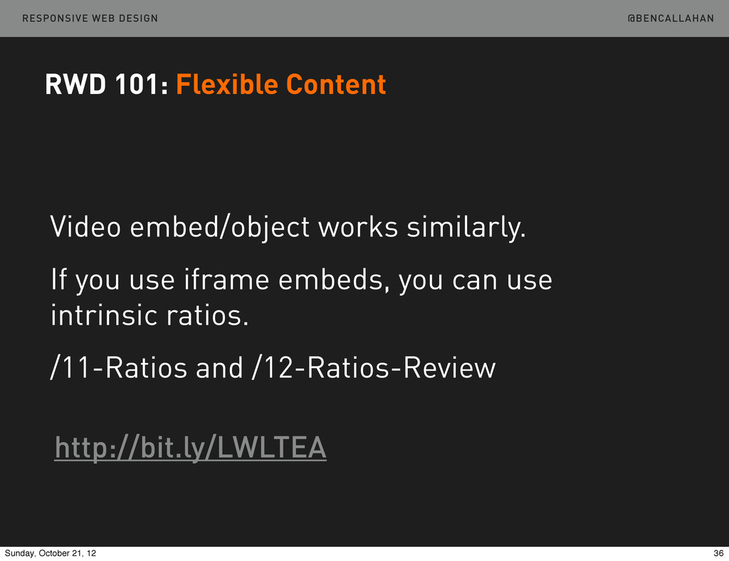
    works similarly. If you use iframe embeds, you can use intrinsic ratios. /11-Ratios and /12-Ratios-Review http://bit.ly/LWLTEA 36 Sunday, October 21, 12
  25. @BENCALLAHAN RESPONSIVE WEB DESIGN RWD 101: Media Queries When our

    content and our design are no longer working in harmony, we need to make a larger shift in layout. 37 Sunday, October 21, 12
  26. @BENCALLAHAN RESPONSIVE WEB DESIGN RWD 101: Media Queries <link  media=”(min-­‐width:

     30em)”  ... <link  media=”screen  and  (min-­‐width:  30em)”  ... @media  (min-­‐width:  30em)  {  ...  } @media  screen  and  (min-­‐width:  30em)  {  ...  } 38 Sunday, October 21, 12
  27. @BENCALLAHAN RESPONSIVE WEB DESIGN RWD 101: Media Types <link  media=”(min-­‐width:

     30em)”  ... <link  media=”screen  and  (min-­‐width:  30em)”  ... @media  (min-­‐width:  30em)  {  ...  } @media  print  {  ...  } 39 Sunday, October 21, 12
  28. @BENCALLAHAN RESPONSIVE WEB DESIGN RWD 101: Media Types all braille,

    embossed, speech handheld, projection, screen, tv print tty http://www.w3.org/TR/CSS21/media.html#media-types 40 Sunday, October 21, 12
  29. @BENCALLAHAN RESPONSIVE WEB DESIGN RWD 101: Media Features <link  media=”(min-­‐width:

     30em)”  ... <link  media=”screen  and  (max-­‐width:  30em)”  ... @media  (orientation:  portrait)  {  ...  } @media  screen  and  (color)  {  ...  } 41 Sunday, October 21, 12
  30. @BENCALLAHAN RESPONSIVE WEB DESIGN RWD 101: Media Features width, height,

    device-width, device-height orientation aspect-ratio, device-aspect-ratio color, color-index, monochrome resolution, scan, grid http://www.w3.org/TR/css3-mediaqueries 42 Sunday, October 21, 12
  31. @BENCALLAHAN RESPONSIVE WEB DESIGN RWD 101: Media Queries @media (min-width:

    600px) { /* styles for 600px and up here */ } @media (max-width: 38em) { /* styles for 38em and down here */ } 43 Sunday, October 21, 12
  32. @BENCALLAHAN RESPONSIVE WEB DESIGN RWD 101: Media Queries /* Large

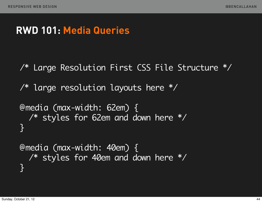
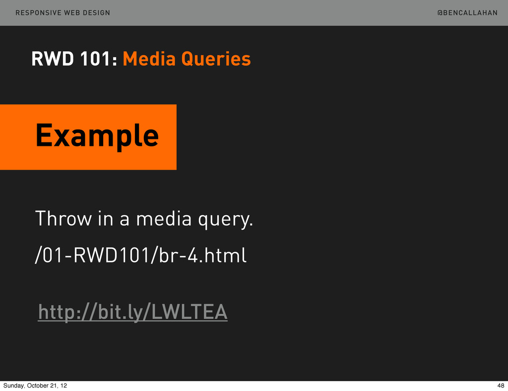
    Resolution First CSS File Structure */ /* large resolution layouts here */ @media (max-width: 62em) { /* styles for 62em and down here */ } @media (max-width: 40em) { /* styles for 40em and down here */ } 44 Sunday, October 21, 12
  33. @BENCALLAHAN RESPONSIVE WEB DESIGN RWD 101: Media Queries /* Small

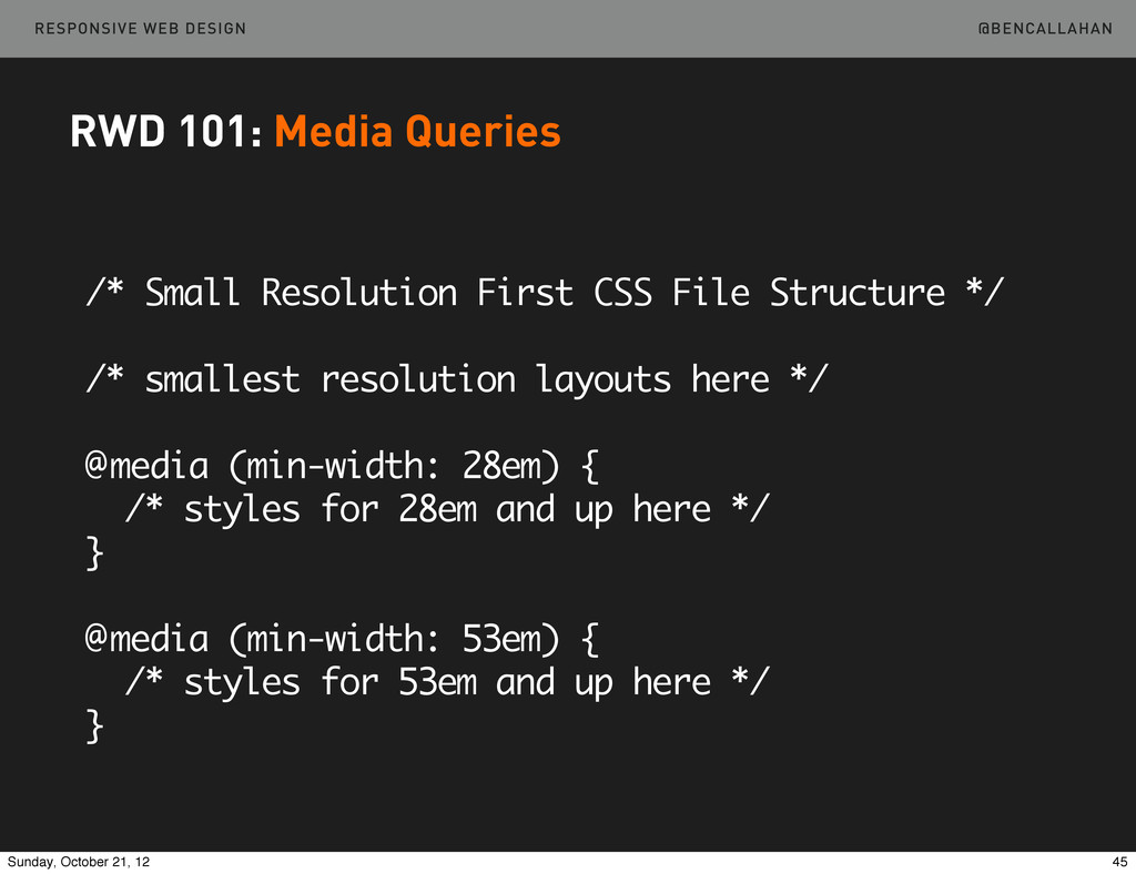
    Resolution First CSS File Structure */ /* smallest resolution layouts here */ @media (min-width: 28em) { /* styles for 28em and up here */ } @media (min-width: 53em) { /* styles for 53em and up here */ } 45 Sunday, October 21, 12
  34. @BENCALLAHAN RESPONSIVE WEB DESIGN RWD 101: Media Queries Large Rez

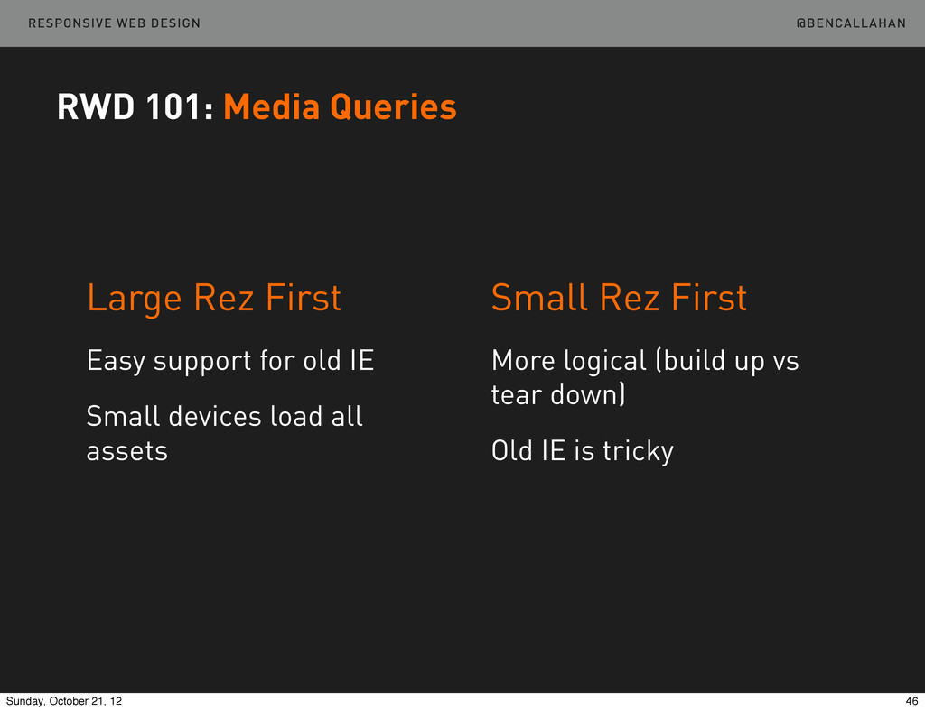
    First Easy support for old IE Small devices load all assets Small Rez First More logical (build up vs tear down) Old IE is tricky 46 Sunday, October 21, 12
  35. @BENCALLAHAN RESPONSIVE WEB DESIGN RWD 101: Media Queries The Media

    Query Bookmarklet by @robtarr http://sparkbox.github.com/mediaQueryBookmarklet 47 Sunday, October 21, 12
  36. @BENCALLAHAN RESPONSIVE WEB DESIGN Throw in a media query. /01-RWD101/br-4.html

    Example http://bit.ly/LWLTEA RWD 101: Media Queries 48 Sunday, October 21, 12
  37. @BENCALLAHAN RESPONSIVE WEB DESIGN ➡ Touch Target Area ➡ Hover

    States ➡ Contrast ➡ Readability Other Considerations RWD 101 50 Sunday, October 21, 12
  38. @BENCALLAHAN RESPONSIVE WEB DESIGN RWD 101: Other Considerations ➡ Touch

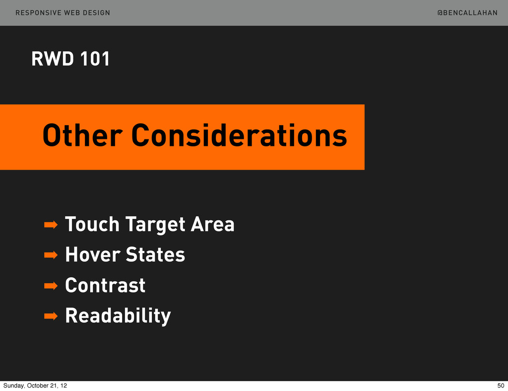
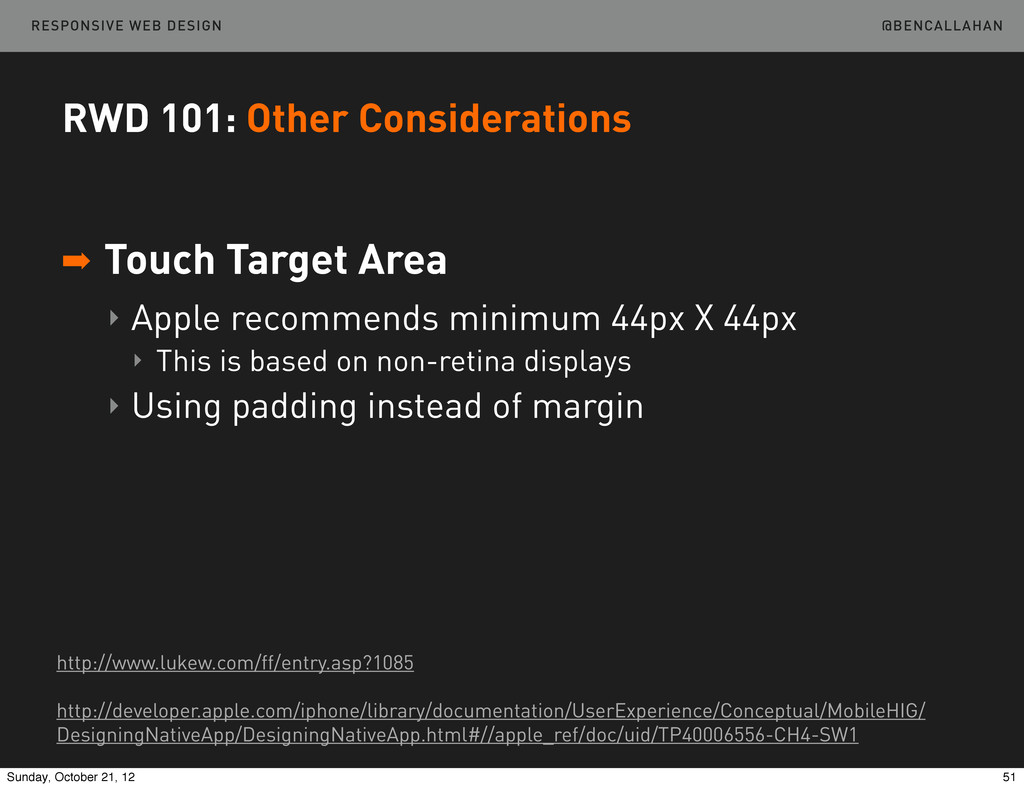
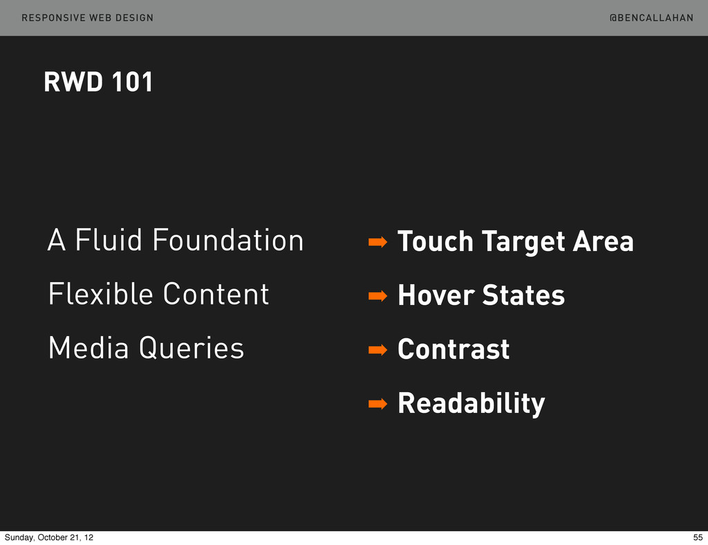
    Target Area ‣ Apple recommends minimum 44px X 44px ‣ This is based on non-retina displays ‣ Using padding instead of margin http://www.lukew.com/ff/entry.asp?1085 http://developer.apple.com/iphone/library/documentation/UserExperience/Conceptual/MobileHIG/ DesigningNativeApp/DesigningNativeApp.html#//apple_ref/doc/uid/TP40006556-CH4-SW1 51 Sunday, October 21, 12
  39. @BENCALLAHAN RESPONSIVE WEB DESIGN RWD 101: Other Considerations ➡ Hover

    States ‣ Don’t hide content behind :hover ‣ Consider using modernizr a { /* standard styles */ } .no-touch a:hover { /* :hover styles */ } 52 Sunday, October 21, 12
  40. @BENCALLAHAN RESPONSIVE WEB DESIGN RWD 101: Other Considerations ➡ Contrast

    ‣ Try your site outside in the sun ‣ Try your site in bed when it’s dark ‣ Take it with you 53 Sunday, October 21, 12
  41. @BENCALLAHAN RESPONSIVE WEB DESIGN RWD 101: Other Considerations ➡ Readability

    ‣ Small screen != small type ‣ Consider increasing font size 54 Sunday, October 21, 12
  42. @BENCALLAHAN RESPONSIVE WEB DESIGN RWD 101 ➡ Touch Target Area

    ➡ Hover States ➡ Contrast ➡ Readability A Fluid Foundation Flexible Content Media Queries 55 Sunday, October 21, 12
  43. @BENCALLAHAN RESPONSIVE WEB DESIGN A Process Myth Each client deliverable

    needs to look more like a final, beautiful end- product than the previous one. RWD Process 57 Sunday, October 21, 12
  44. @BENCALLAHAN RESPONSIVE WEB DESIGN Which Results In Pushing toward nearly-designed

    wireframes quickly and completely designed comps soon after. RWD Process 58 Sunday, October 21, 12
  45. @BENCALLAHAN RESPONSIVE WEB DESIGN A Better Mindset Deliverables that best

    serve the organization and prioritization of content and function across multiple resolutions. RWD Process 59 Sunday, October 21, 12
  46. @BENCALLAHAN RESPONSIVE WEB DESIGN Our Deliverables RWD Process Research Deliverables

    Content Deliverables Priority Deliverables Style Deliverables Functional Deliverables 61 Sunday, October 21, 12
  47. @BENCALLAHAN RESPONSIVE WEB DESIGN Let’s Focus On RWD Process Research

    Deliverables Content Deliverables Priority Deliverables Style Deliverables Functional Deliverables 62 Sunday, October 21, 12
  48. @BENCALLAHAN RESPONSIVE WEB DESIGN Content Priority Prototype Takes the place

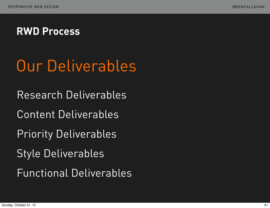
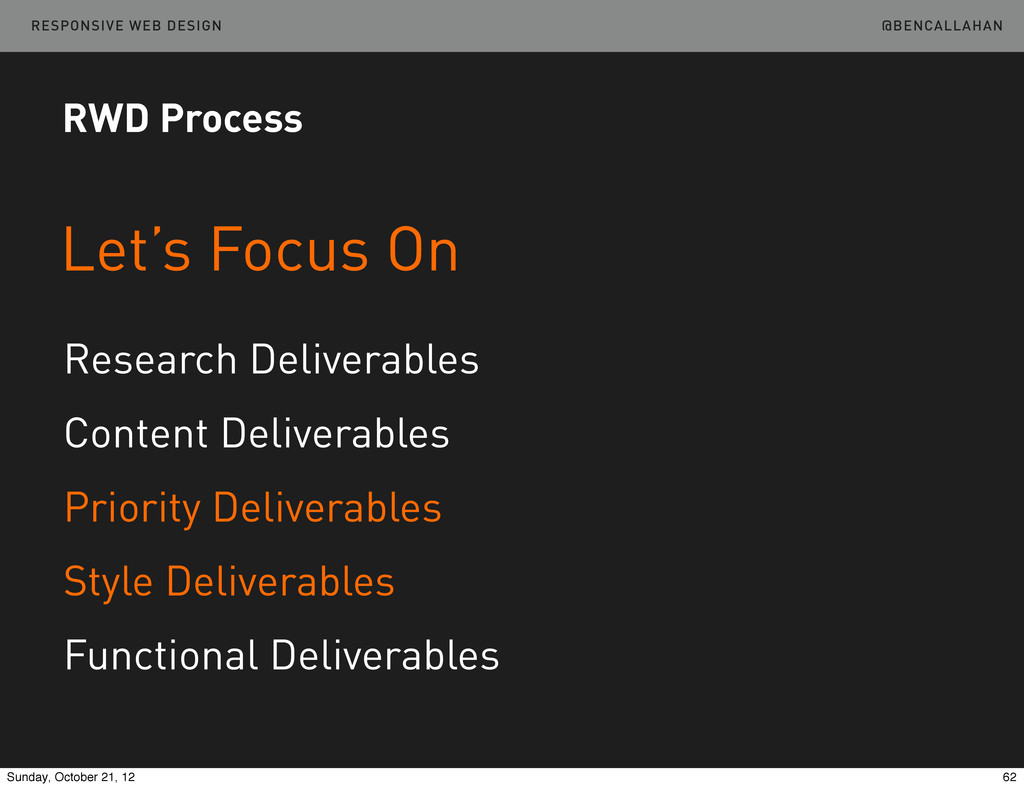
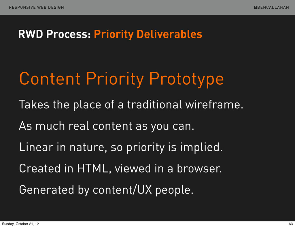
    of a traditional wireframe. As much real content as you can. Linear in nature, so priority is implied. Created in HTML, viewed in a browser. Generated by content/UX people. RWD Process: Priority Deliverables 63 Sunday, October 21, 12
  49. @BENCALLAHAN RESPONSIVE WEB DESIGN There is an example in the

    repository. /02-PlanDesign Take A Look http://bit.ly/LWLTEA RWD Process: Priority Deliverables 64 Sunday, October 21, 12
  50. @BENCALLAHAN RESPONSIVE WEB DESIGN Style Prototype Like Style Tiles, but

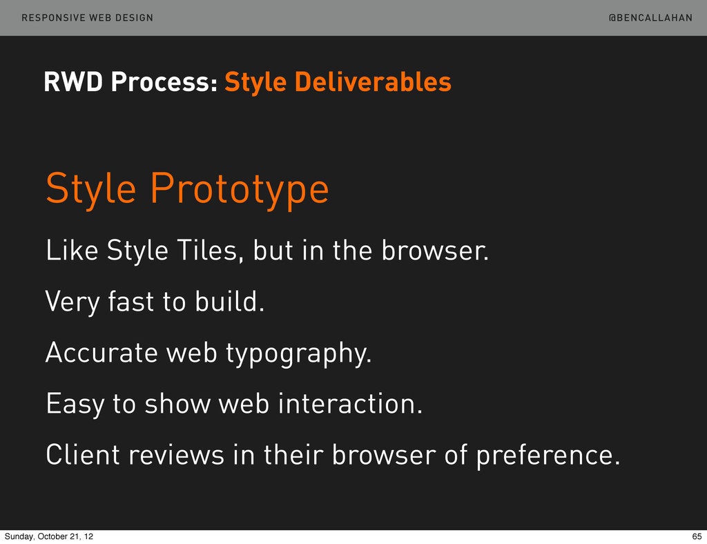
    in the browser. Very fast to build. Accurate web typography. Easy to show web interaction. Client reviews in their browser of preference. RWD Process: Style Deliverables 65 Sunday, October 21, 12
  51. @BENCALLAHAN RESPONSIVE WEB DESIGN There is an example on Github.

    Take A Look http://sparkbox.github.com/dr-style-prototype RWD Process: Style Deliverables http://bit.ly/Tb7HPr 66 Sunday, October 21, 12
  52. @BENCALLAHAN RESPONSIVE WEB DESIGN Can’t throw it over the wall

    RWD Process: Collaboration 67 Sunday, October 21, 12
  53. @BENCALLAHAN RESPONSIVE WEB DESIGN As much as 100% more, initially

    Likely to be 50% more, soon after Probably never less than 25% more Lessons Learned: Pricing 71 Sunday, October 21, 12
  54. @BENCALLAHAN RESPONSIVE WEB DESIGN You must test on real devices

    Do your development in a webkit browser Build libraries of your patterns Lessons Learned: Testing 79 Sunday, October 21, 12
  55. @BENCALLAHAN RESPONSIVE WEB DESIGN Familiarity breeds usability Don’t do crazy

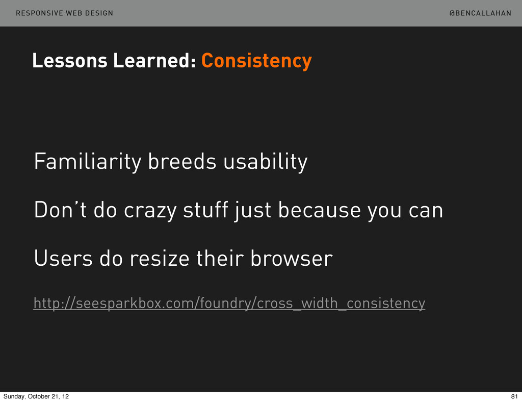
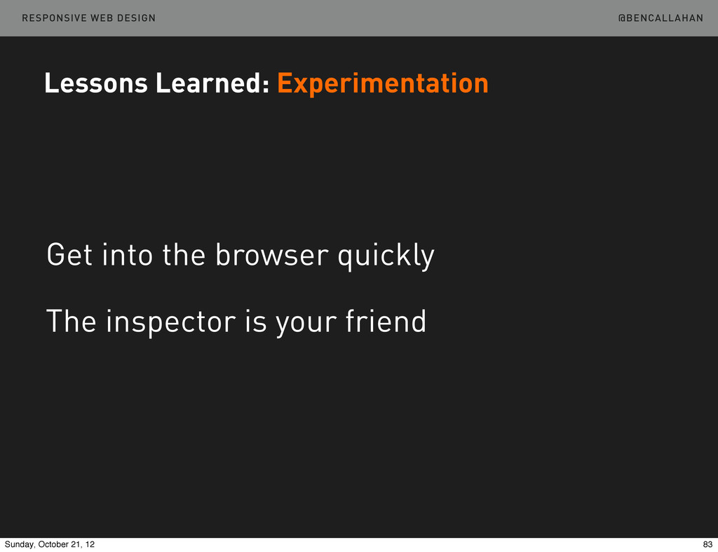
    stuff just because you can Users do resize their browser http://seesparkbox.com/foundry/cross_width_consistency Lessons Learned: Consistency 81 Sunday, October 21, 12
  56. @BENCALLAHAN RESPONSIVE WEB DESIGN Get into the browser quickly The

    inspector is your friend Lessons Learned: Experimentation 83 Sunday, October 21, 12
  57. @BENCALLAHAN RESPONSIVE WEB DESIGN RWD Patterns: Navigation Top Nav Bottom

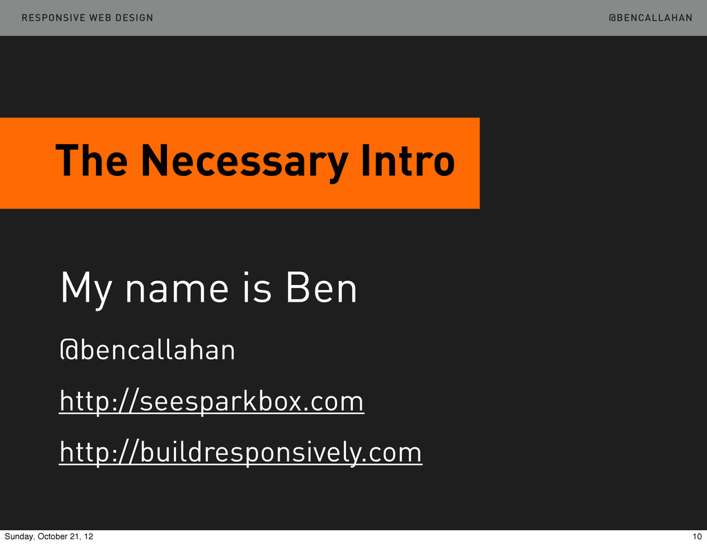
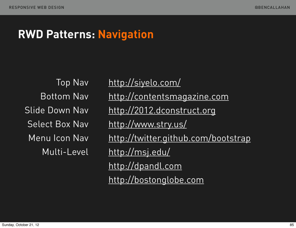
    Nav Slide Down Nav Select Box Nav Menu Icon Nav Multi-Level http://siyelo.com/ http://contentsmagazine.com http://2012.dconstruct.org http://www.stry.us/ http://twitter.github.com/bootstrap http://msj.edu/ http://dpandl.com http://bostonglobe.com 85 Sunday, October 21, 12
  58. @BENCALLAHAN RESPONSIVE WEB DESIGN RWD Patterns: Tables Show the first

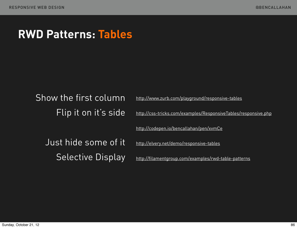
    column Flip it on it’s side Just hide some of it Selective Display http://www.zurb.com/playground/responsive-tables http://css-tricks.com/examples/ResponsiveTables/responsive.php http://codepen.io/bencallahan/pen/xvmCe http://elvery.net/demo/responsive-tables http://filamentgroup.com/examples/rwd-table-patterns 86 Sunday, October 21, 12
  59. @BENCALLAHAN RESPONSIVE WEB DESIGN RWD Patterns: Images Picturefill Sencha.io Resrc.it

    Adaptive Images https://github.com/scottjehl/picturefill http://docs.sencha.io http://resrc.it http://adaptive-images.com and tons more... 87 Sunday, October 21, 12
  60. @BENCALLAHAN RESPONSIVE WEB DESIGN “...performance is important, but access is

    more important. Mobile later is better than mobile never.” RWD Patterns: Images K istofer Layon http://tiny.cc/vr24gw 88 Sunday, October 21, 12
  61. @BENCALLAHAN RESPONSIVE WEB DESIGN What’s Next in RWD: The Dip

    Stages of Competence Unconscious Incompetence Conscious Incompetence Conscious Competence Unconscious Competence 93 Sunday, October 21, 12
  62. @BENCALLAHAN RESPONSIVE WEB DESIGN What’s Next in RWD The Responsive

    Dip http://bit.ly/MasqBk 94 Sunday, October 21, 12
  63. @BENCALLAHAN RESPONSIVE WEB DESIGN What’s Next in RWD The Responsive

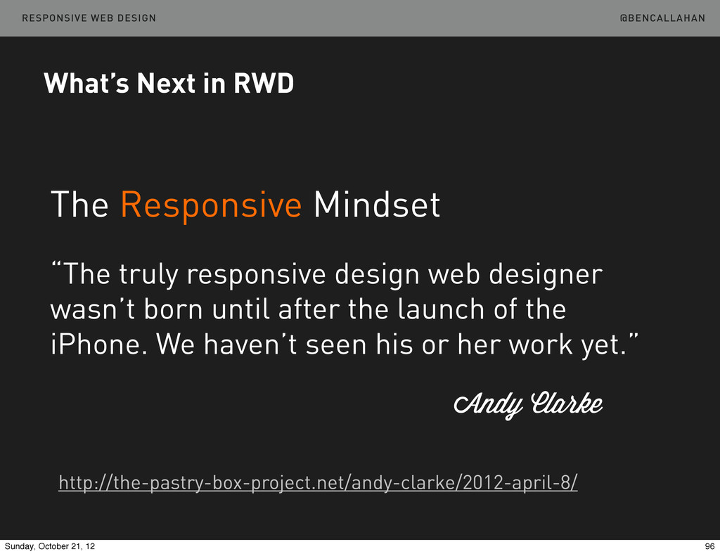
    Mindset “The truly responsive design web designer wasn’t born until after the launch of the iPhone. We haven’t seen his or her work yet.” Andy Clarke http://the-pastry-box-project.net/andy-clarke/2012-april-8/ 96 Sunday, October 21, 12
  64. @BENCALLAHAN RESPONSIVE WEB DESIGN What’s Next in RWD Move beyond

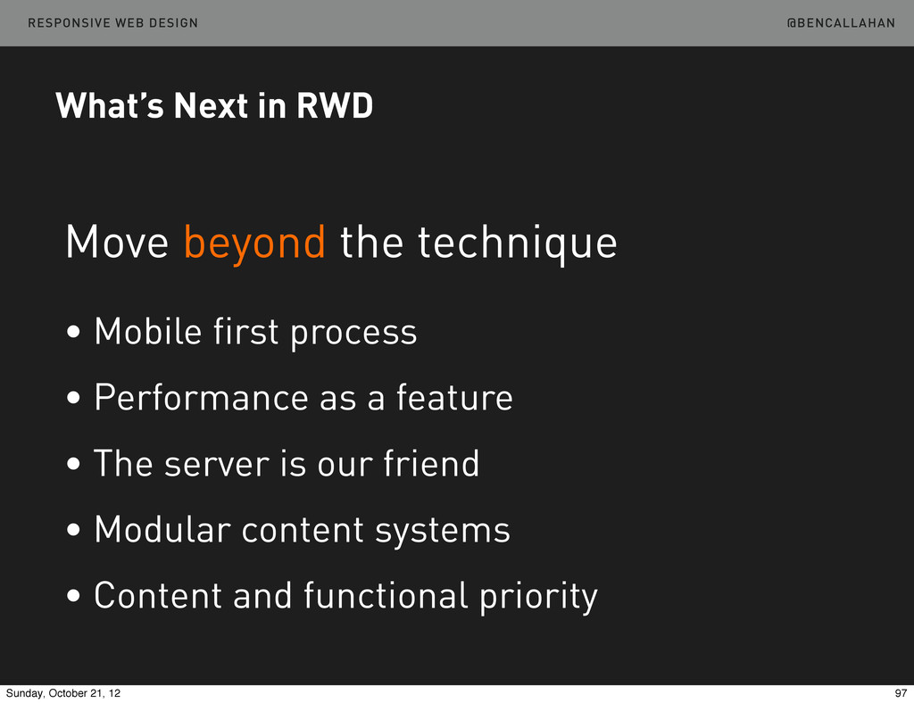
    the technique • Mobile first process • Performance as a feature • The server is our friend • Modular content systems • Content and functional priority 97 Sunday, October 21, 12
  65. @BENCALLAHAN RESPONSIVE WEB DESIGN What’s Next in RWD Move the

    industry forward • Apprenticeships • Board of Advisors • Experimentation 98 Sunday, October 21, 12
  66. Ben Callahan President, Sparkbox Remix South October 19, 2012 Thank

    You! @BENCALLAHAN http://bit.ly/LWLTEA RESPONSIVE WEB DESIGN 99 Sunday, October 21, 12