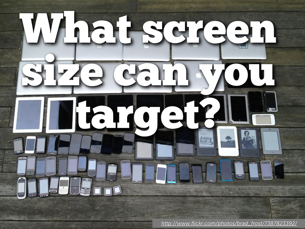
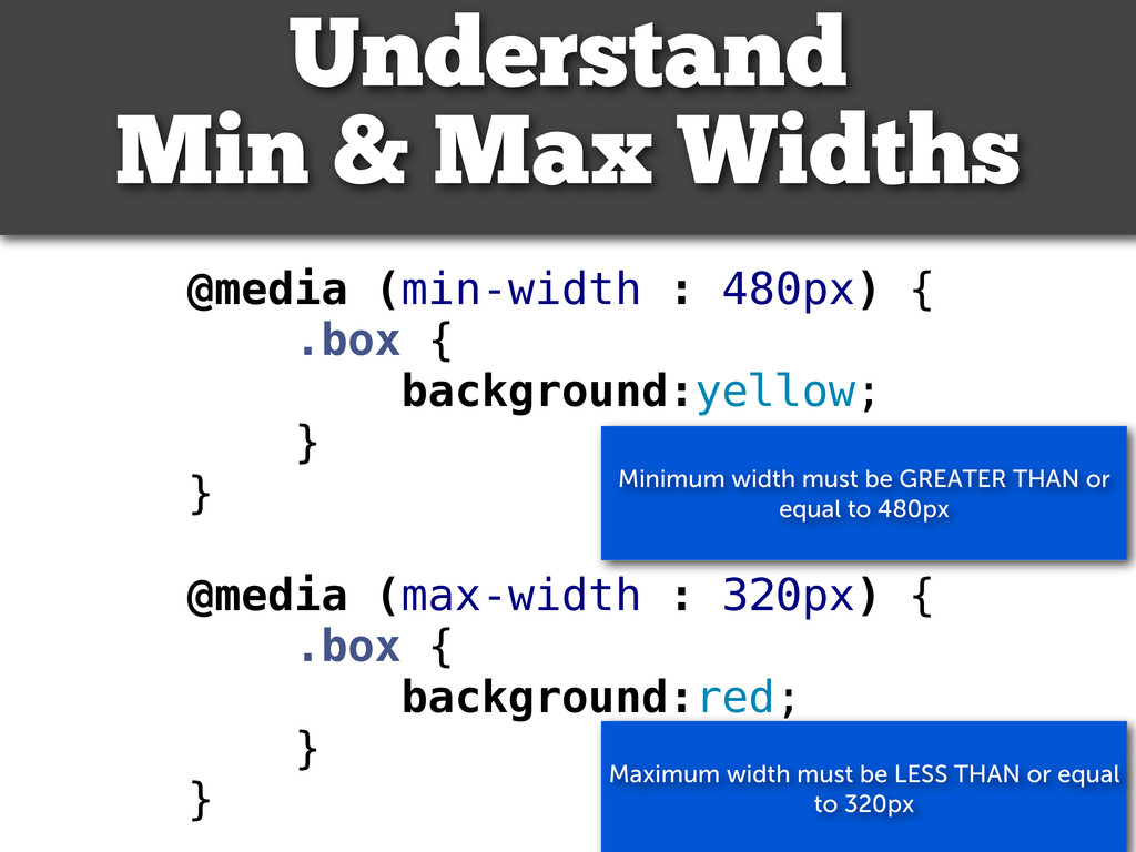
@media (max-width : 320px) { .box { background:red; } } Understand Min & Max Widths Maximum width must be LESS THAN or equal to 320px Minimum width must be GREATER THAN or equal to 480px
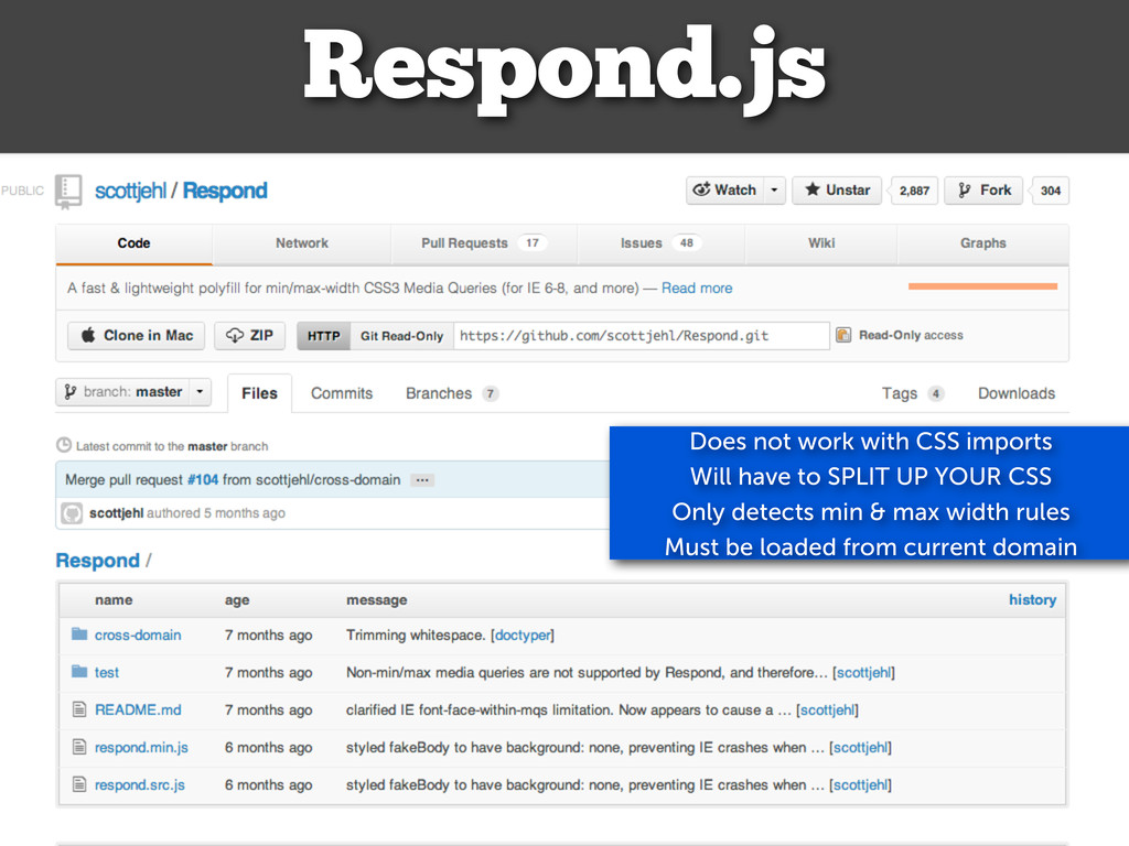
portrait Respond.js Does not work with CSS imports Will have to SPLIT UP YOUR CSS Only detects min & max width rules Must be loaded from current domain
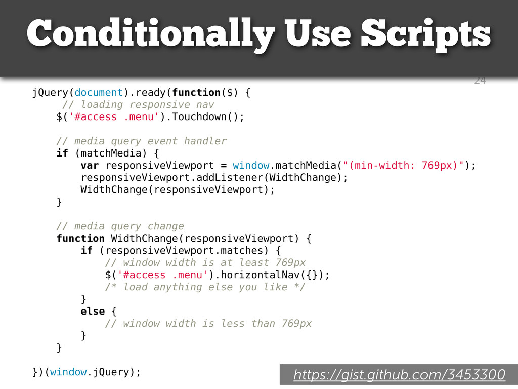
loading responsive nav $('#access .menu').Touchdown(); // media query event handler if (matchMedia) { var responsiveViewport = window.matchMedia("(min-width: 769px)"); responsiveViewport.addListener(WidthChange); WidthChange(responsiveViewport); } // media query change function WidthChange(responsiveViewport) { if (responsiveViewport.matches) { // window width is at least 769px $('#access .menu').horizontalNav({}); /* load anything else you like */ } else { // window width is less than 769px } } })(window.jQuery); Conditionally Use Scripts https://gist.github.com/3453300
 rachelbaker
 mogamit
 cockscomb
 nrslib
 tk3fftk
 tomoyanonymous
 kashioka
 oku053
 tonkotsuboy_com
 tooppoo
 yuzneri
 inoueasei
 shibuchaaaan
 jmmastey
 tammyeverts
 soudai
 palkan
 samtorres
 reverentgeek
 mongodb
 ryanjones
 rabernat
 pedronauck
 mayunak
 bluesmoon