Upgrade to Pro — share decks privately, control downloads, hide ads and more …

Designing for Clarity — Unbounce Conversion Road Trip 2015

Designing for Clarity — Unbounce Conversion Road Trip 2015

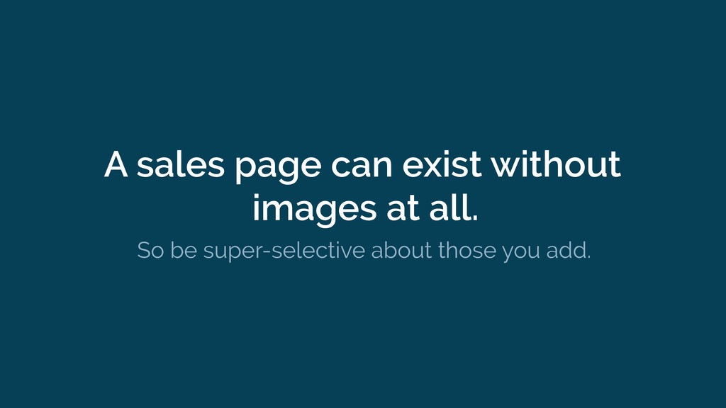
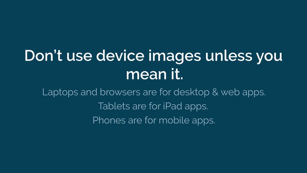
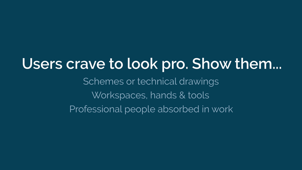
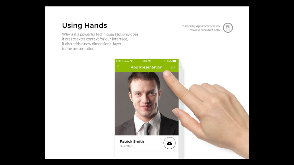
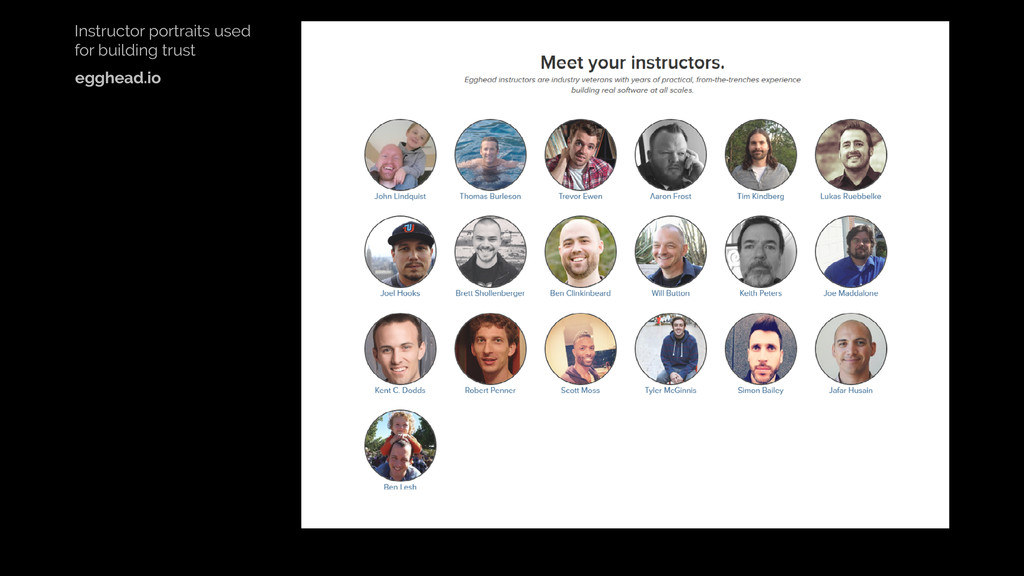
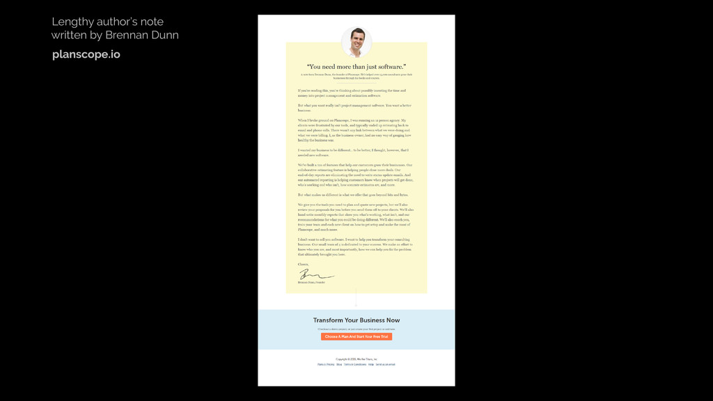
In her talk, Jane will go over hero-shots and product screenshots, why visual context is just as important as consistent messaging, how to maintain visual interest, how to pick the right visuals that will demonstrate your benefits and lastly, how to build and maintain trust.

Jane Portman

June 01, 2015
Tweet

More Decks by Jane Portman

Other Decks in Design

Transcript

  1. “Déformation Professionnelle” — a tendency to process the world through

    one’s professional eyes rather than from a more balanced perspective.
  2. “Consumer Hat” Scenario: 1. Tell me what it is. 2.

    Tell me what to do. 3. Don’t undermine my trust.
  3. “Very often you will hear that ugly converts better but

    it doesn’t have to be the case.” — Denis Suhopoljac
  4. A sales page can exist without images at all. So

    be super-selective about those you add.
  5. Don’t use device images unless you mean it. Laptops and

    browsers are for desktop & web apps. Tablets are for iPad apps. Phones are for mobile apps.
  6. Keep a simple arsenal of assets. A logo One background

    color One accent color for your CTAs An idea of the font (optional) One or two illustrations (optional)
  7. Control the logic. Control the environment. Make your CTA a

    visual culmination point of the flow.
  8. The benefits are not only about the end result. We

    want to be cool in the process.
  9. Users crave to look pro. Show them... Schemes or technical

    drawings Workspaces, hands & tools Professional people absorbed in work