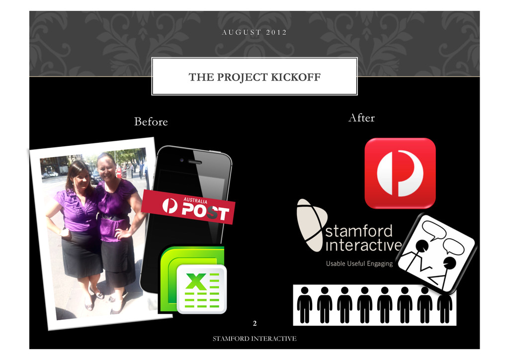
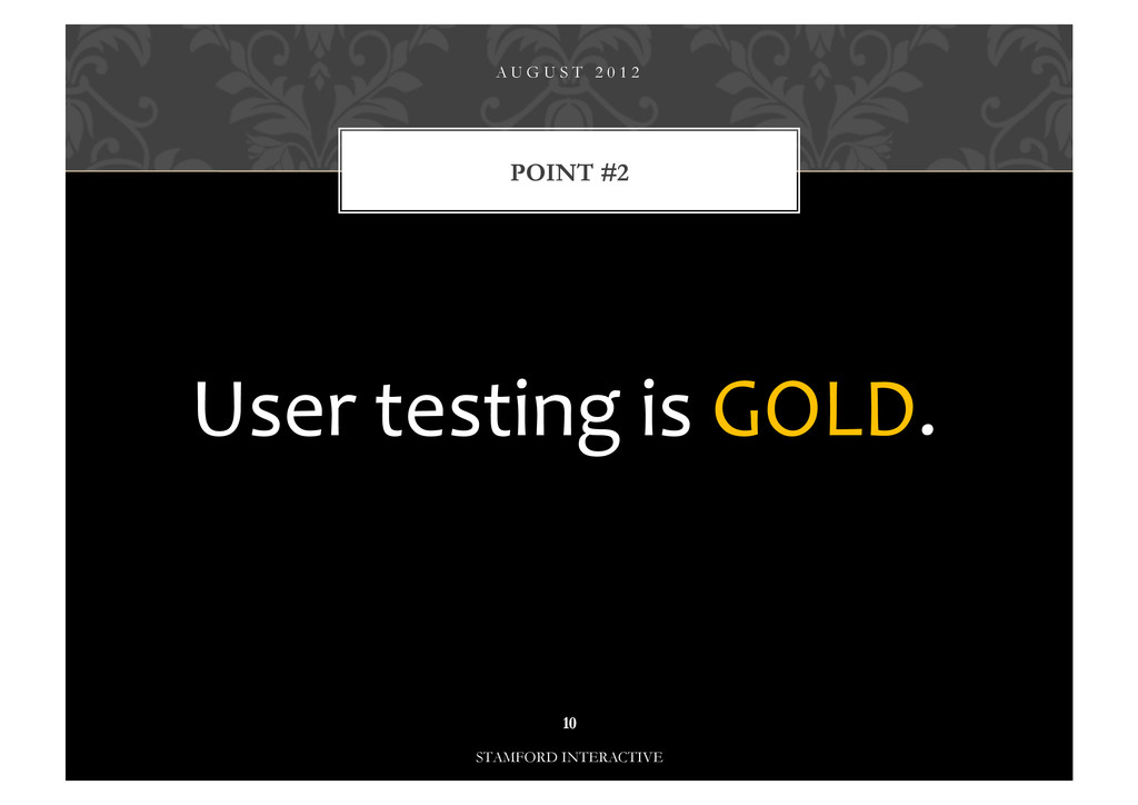
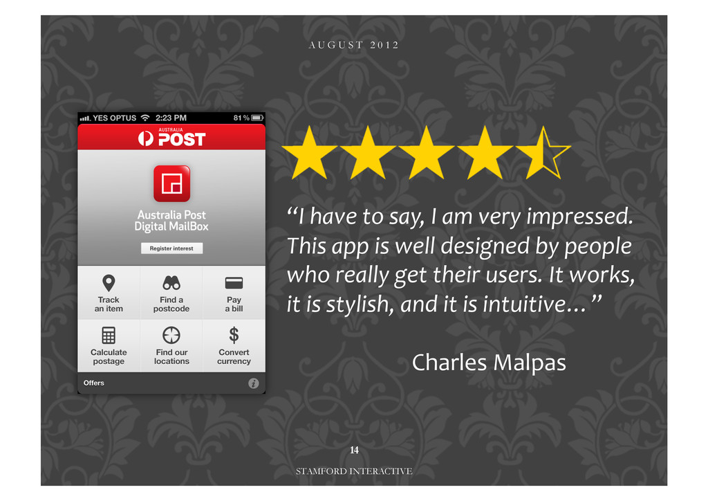
I’ll explain the process of designing a 4 and a 1/2 star app. I’ll share our successes and our lessons learnt from the project.
Kathryn Ross UX Australia, August 2012
View Slide
Before AfterA U G U S T 2 0 1 22STAMFORD INTERACTIVETHE PROJECT KICKOFF
A U G U S T 2 0 1 23STAMFORD INTERACTIVE12 days
A U G U S T 2 0 1 24STAMFORD INTERACTIVE12 days 1 day is practically gone
DESIGNAPPROACH?A U G U S T 2 0 1 25STAMFORD INTERACTIVEWWYD? 63 3
POINT #1A U G U S T 2 0 1 26STAMFORD INTERACTIVEThis is what ROCKED.
7STAMFORD INTERACTIVE1 2 3 4 5 6 7 8 9 10 11 12
A U G U S T 2 0 1 28STAMFORD INTERACTIVE
A U G U S T 2 0 1 29STAMFORD INTERACTIVE
POINT #2A U G U S T 2 0 1 210STAMFORD INTERACTIVEUser testing is GOLD.
A U G U S T 2 0 1 211STAMFORD INTERACTIVE
NAVIGATIONA U G U S T 2 0 1 212STAMFORD INTERACTIVE1. Tab 2. List 3. Springboard
OUTCOME…A U G U S T 2 0 1 2STAMFORD INTERACTIVEWireframe design Live applica
A U G U S T 2 0 1 214STAMFORD INTERACTIVE“I have to say, I am very impressed. This app is well designed by people who really get their users. It works, it is stylish, and it is intuitive…” Charles Malpas
A U G U S T 2 0 1 215Kathryn Ross [email protected]