Upgrade to Pro — share decks privately, control downloads, hide ads and more …

CSS Grid-The Future Is Now

CSS Grid-The Future Is Now

Talk about the CSS Grid specification, given to the Charlotte Front-End Developers Meetup, March 30, 2017

Avatar for vjwilson

vjwilson

March 30, 2017
Tweet

More Decks by vjwilson

Other Decks in Programming

Transcript

  1. What Is CSS Grid? “This CSS module defines a two-dimensional

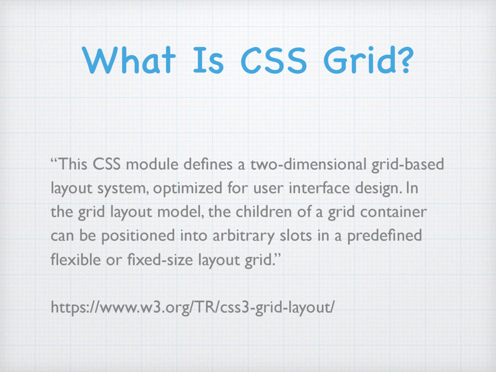
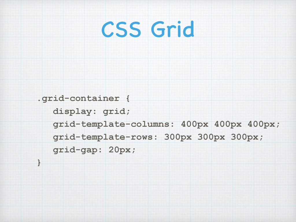
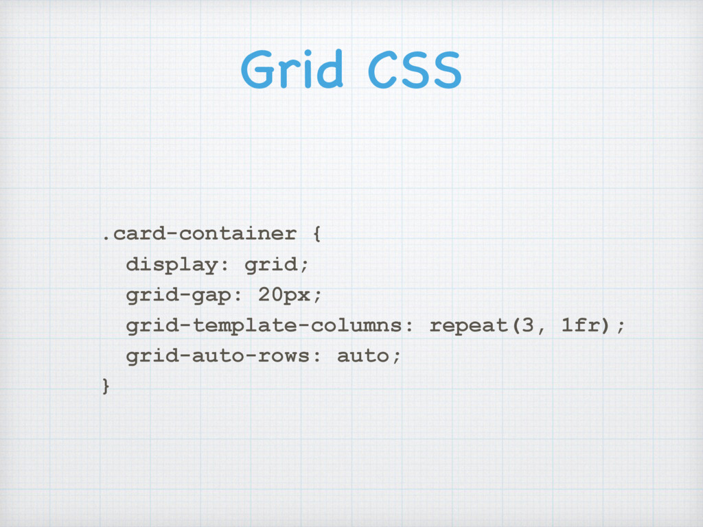
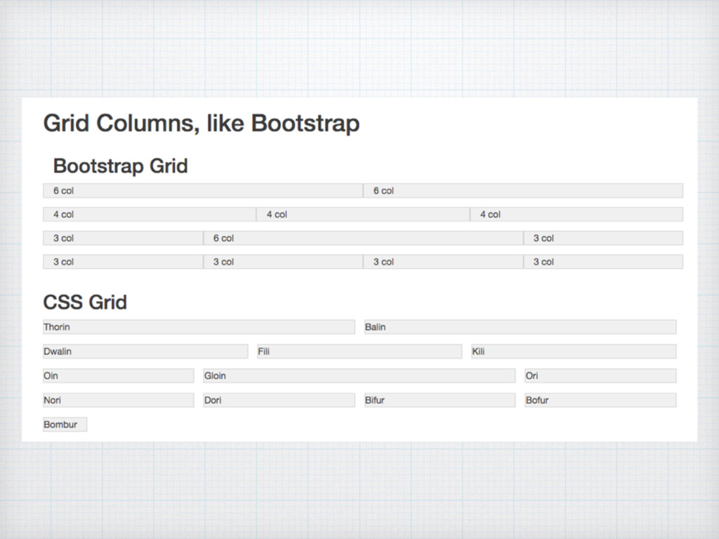
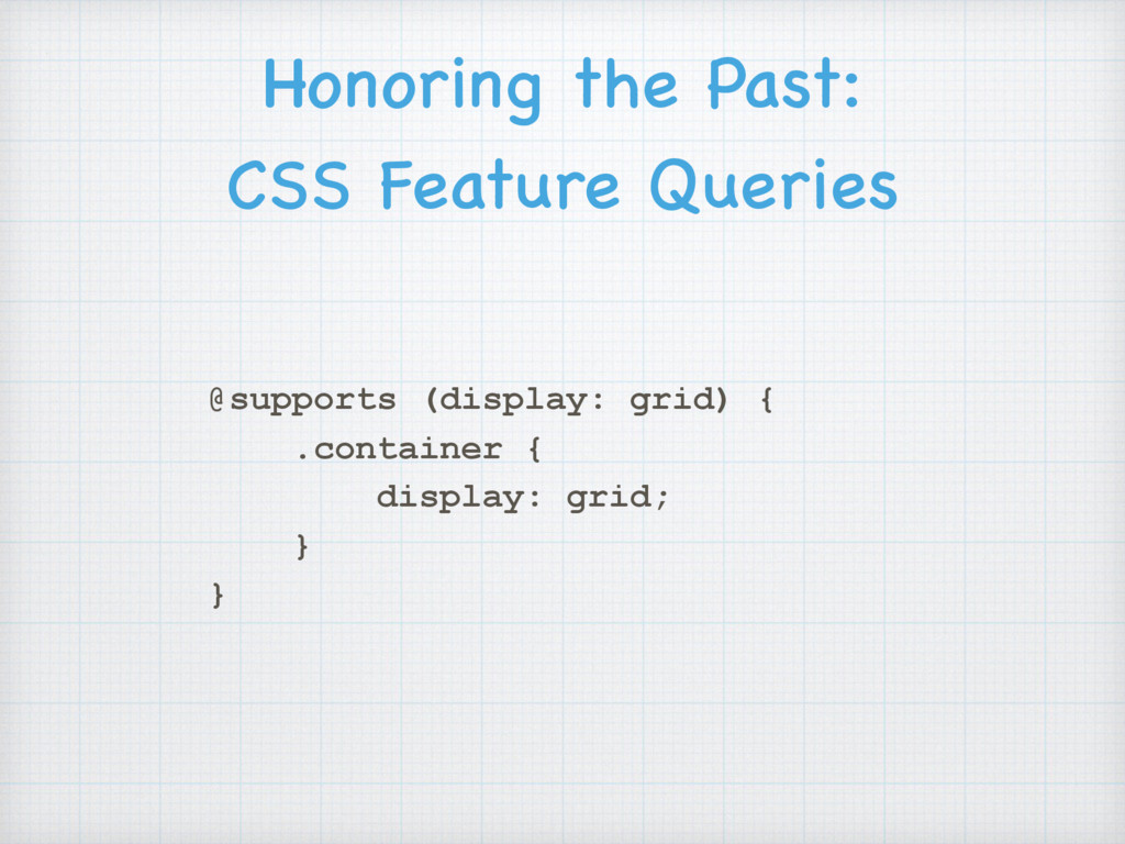
    grid-based layout system, optimized for user interface design. In the grid layout model, the children of a grid container can be positioned into arbitrary slots in a predefined flexible or fixed-size layout grid.” https://www.w3.org/TR/css3-grid-layout/
  2. Better than tables, but those classes… seriously? <div class="container-fluid body-wrap">

    <div id="main"> <div class="row main-content"> <div class="side-nav col-xs-12 col-md-2"></div> <div> <div> <div class="main-col col-xs-12 col-md-7"> ... </div> <div class="side-properties col-xs-12 col-md-3 pull- right"> ... </div> <div class="main-col col-xs-12 col-md-7"> ...
  3. Limitations of Flexbox
 for Layout Flexbox is designed for one

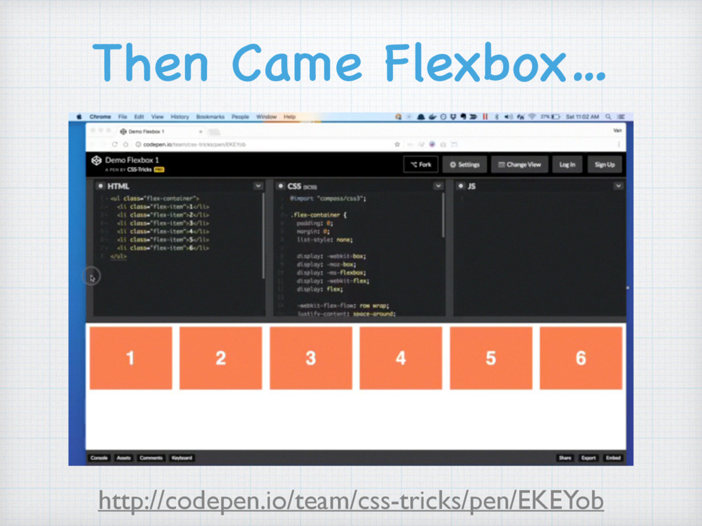
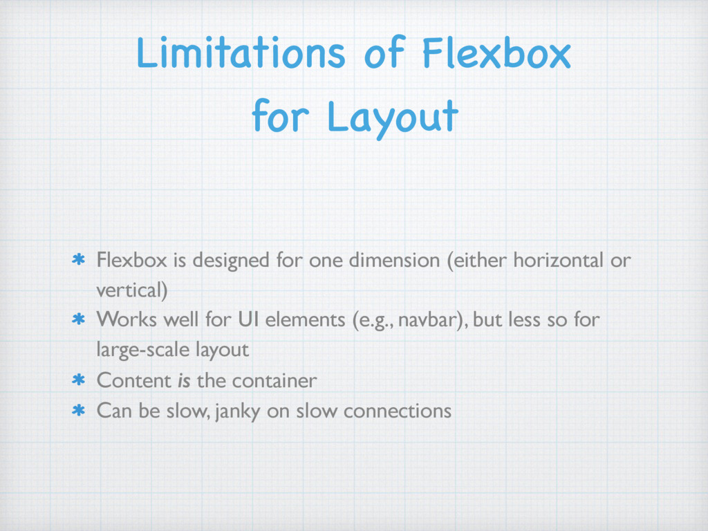
    dimension (either horizontal or vertical) Works well for UI elements (e.g., navbar), but less so for large-scale layout Content is the container Can be slow, janky on slow connections
  4. CSS Grid .grid-container { display: grid; grid-template-columns: 400px 400px 400px;

    grid-template-rows: 300px 300px 300px; grid-gap: 20px; }
  5. Grid Terminology:
 Grid Lines Grid Lines: defined by the number

    of tracks you specify (always one more line than tracks in that dimension) 1 2 3 4 1 2 3 4
  6. Grid Terminology:
 Grid Gaps Grid Gaps: if you specify a

    gap, you’re really just making the empty grid line fatter 1 2 3 4 1 2 3 4
  7. Grid Terminology:
 fr fr: remaining free space, a new CSS

    unit of measurement for grid tracks can be used with multipliers (e.g., 1fr 3fr 2fr) 1fr 1fr 1fr 1fr 3fr 2fr
  8. Grid Terminology:
 Grid Cell Grid Cell: like a table cell,

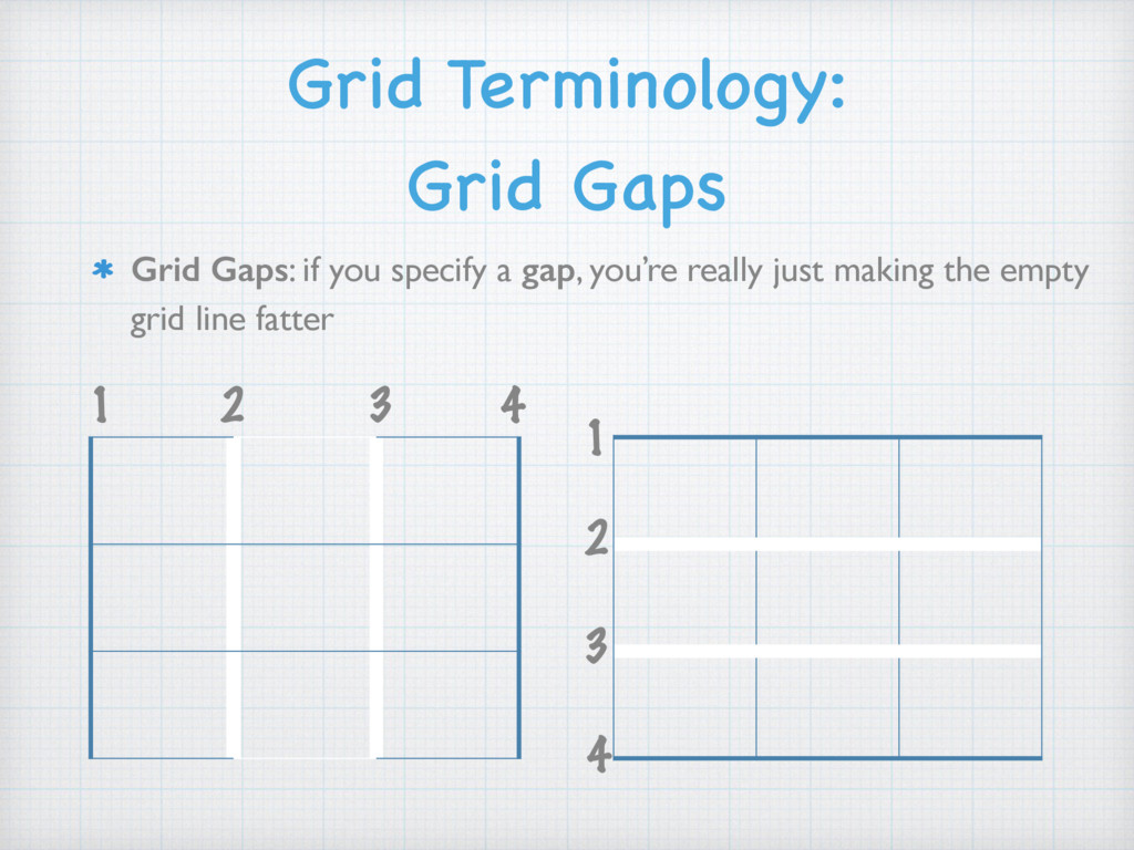
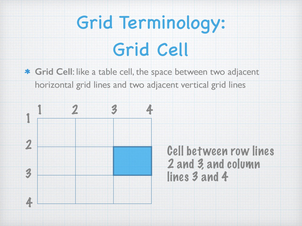
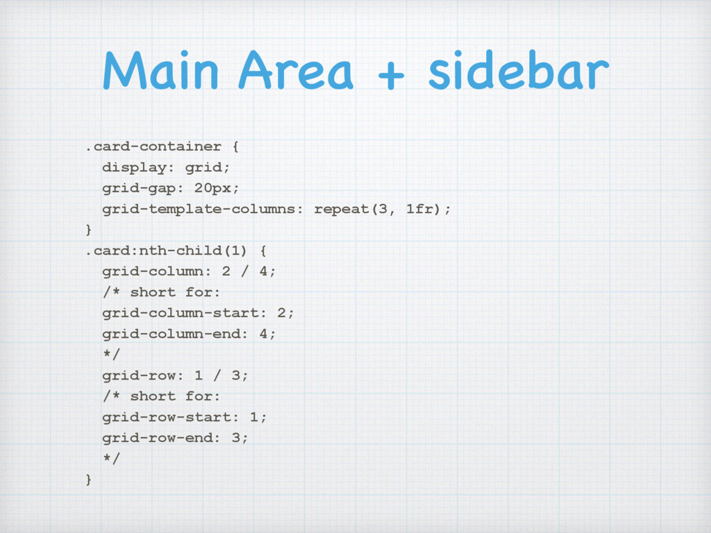
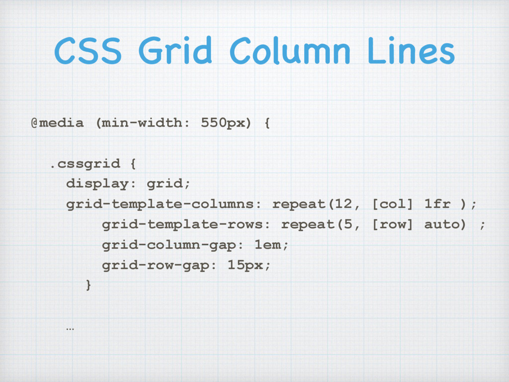
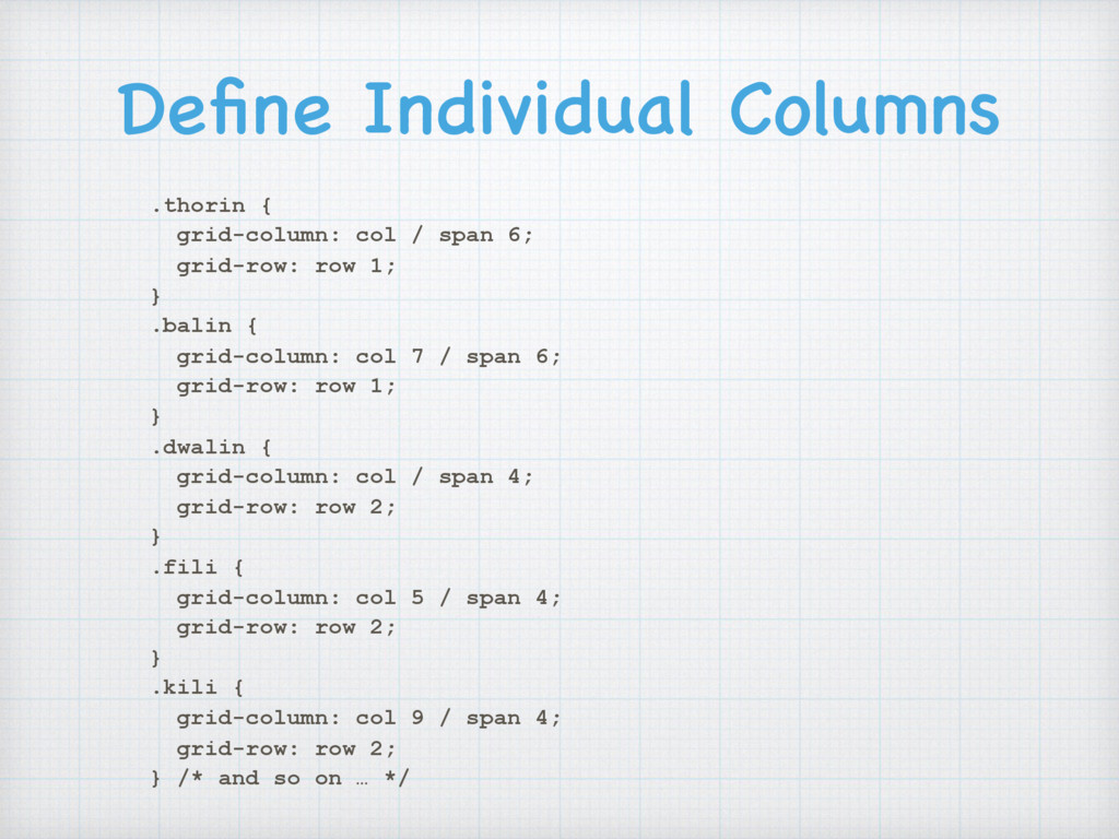
    the space between two adjacent horizontal grid lines and two adjacent vertical grid lines 1 2 3 4 1 2 3 4 Cell between row lines 2 and 3, and column lines 3 and 4
  9. Grid Terminology:
 Grid Area Grid Area: an area bounded by

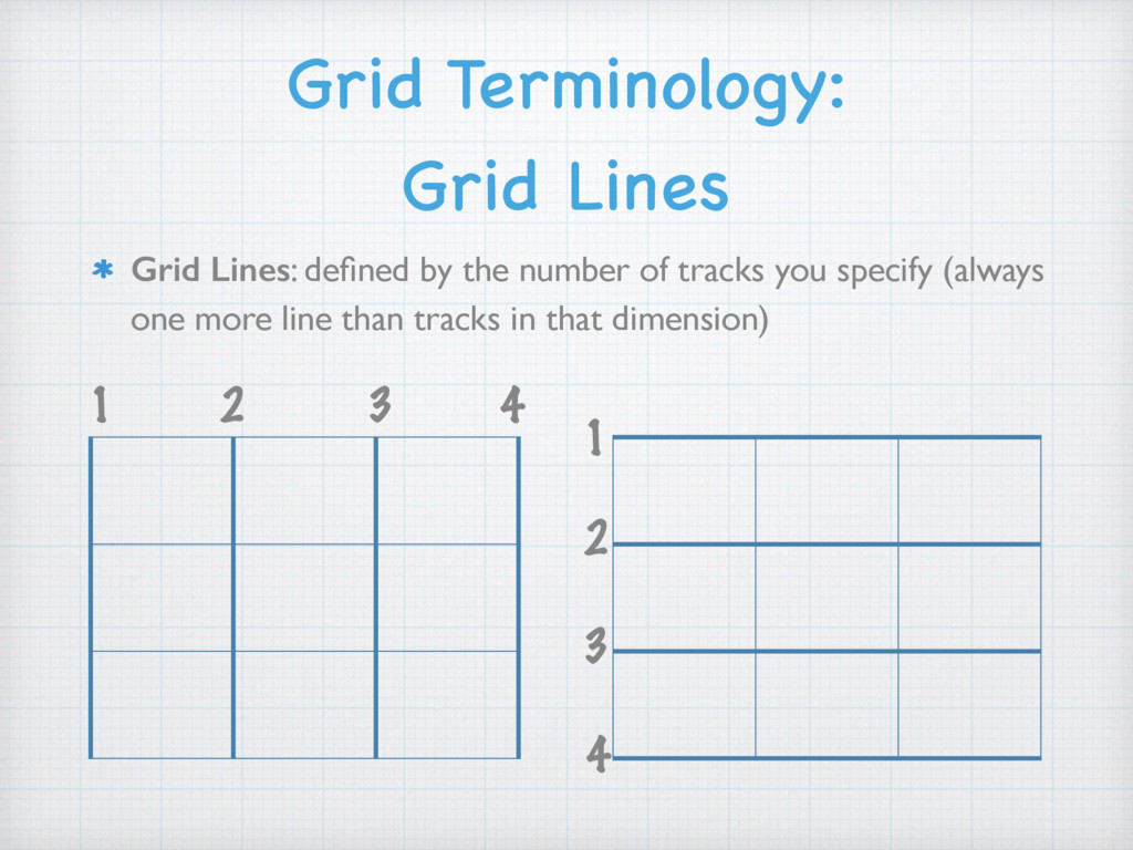
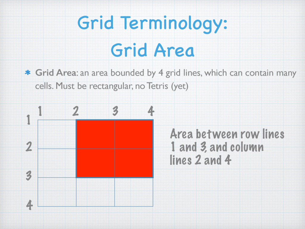
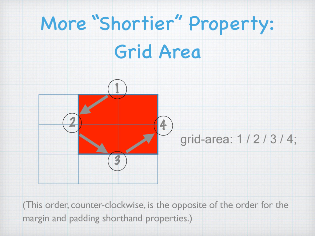
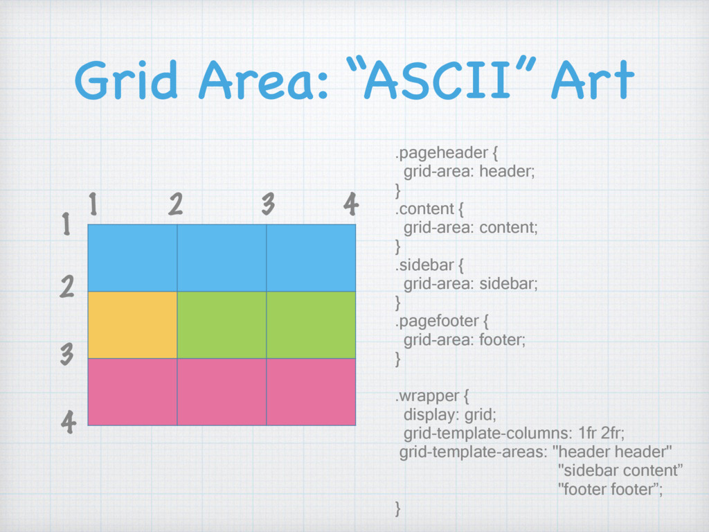
    4 grid lines, which can contain many cells. Must be rectangular, no Tetris (yet) 1 2 3 4 1 2 3 4 Area between row lines 1 and 3, and column lines 2 and 4
  10. Defining a Grid Area 1 2 3 4 1 2

    3 4 grid-row-start: 1; grid-row-end: 3; grid-column-start: 2; grid-column-end: 4;
  11. Shorthand Properties: Grid Row & Grid-Column 1 2 3 4

    1 2 3 4 grid-row: 1 / 3; grid-column: 2 / 4;
  12. More “Shortier” Property: Grid Area (This order, counter-clockwise, is the

    opposite of the order for the margin and padding shorthand properties.) 1 grid-area: 1 / 2 / 3 / 4; 2 4 3
  13. Grid Area: “ASCII” Art 1 2 3 4 1 2

    3 4 .pageheader { grid-area: header; } .content { grid-area: content; } .sidebar { grid-area: sidebar; } .pagefooter { grid-area: footer; } .wrapper { display: grid; grid-template-columns: 1fr 2fr; grid-template-areas: "header header" "sidebar content” "footer footer”; }
  14. The Markup <div class="card-container"> <article class="card"> <header class="card__header"> <h2 class="card__title">Item

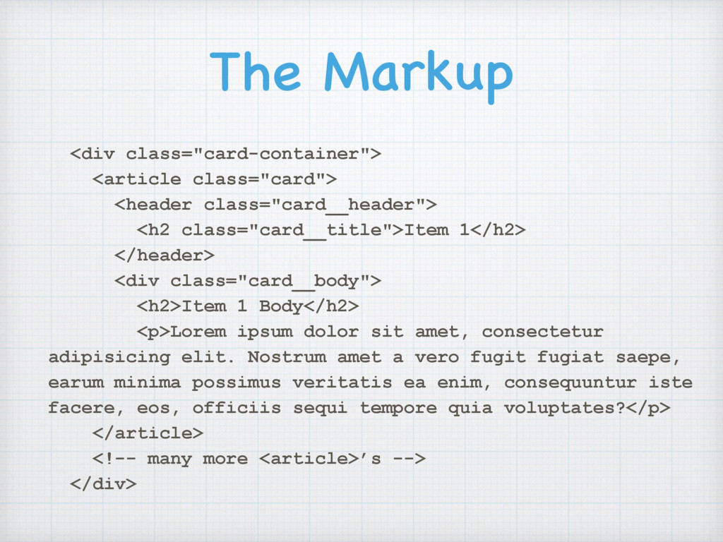
    1</h2> </header> <div class="card__body"> <h2>Item 1 Body</h2> <p>Lorem ipsum dolor sit amet, consectetur adipisicing elit. Nostrum amet a vero fugit fugiat saepe, earum minima possimus veritatis ea enim, consequuntur iste facere, eos, officiis sequi tempore quia voluptates?</p> </article> <!-- many more <article>’s --> </div>
  15. Flexbox CSS .card-container { display: flex; flex-wrap: wrap; justify-content: space-between;

    } .card { border: 1px solid #ccc; flex-basis: 32%; /* can be shortened to */ flex-grow: 0; /* flex: 0 1 32% */ flex-shrink: 1; /* - - - - - - - - - - */ margin-bottom: 1rem; }
  16. Main Area + sidebar .card-container { display: grid; grid-gap: 20px;

    grid-template-columns: repeat(3, 1fr); } .card:nth-child(1) { grid-column: 2 / 4; /* short for: grid-column-start: 2; grid-column-end: 4; */ grid-row: 1 / 3; /* short for: grid-row-start: 1; grid-row-end: 3; */ }
  17. Same, but named grid lines .card-container { display: grid; grid-column-gap:

    20px; grid-row-gap: 10px; } .card { border: 1px solid #ccc; } @media screen and (min-width: 600px) { .card-container { grid-template-columns: [side-start] 1fr [main-start] 1fr 1fr [main-end]; grid-template-rows: [main-start] 300px 300px [main-end]; } .card:nth-child(1) { grid-area: main; } }
  18. Named Areas, and ACSII Art .card-container { display: grid; grid-column-gap:

    20px; grid-row-gap: 10px; grid-template-columns: repeat(3, 1fr); grid-template-rows: 300px 300px; grid-template-areas: "side1 main main" "side2 main main"; } .card:nth-child(1) { grid-area: main; background-color: hotpink; } .card:nth-child(2) { grid-area: side1; background-color: lightskyblue; } .card:nth-child(3) { grid-area: side2; background-color: palegreen; }
  19. Bootstrap Markup <h2>Bootstrap Grid</h2> <div class="row"> <div class="col-md-6">6 col</div> <div

    class="col-md-6">6 col</div> </div> <div class="row"> <div class="col-md-4">4 col</div> <div class="col-md-4">4 col</div> <div class="col-md-4">4 col</div> </div> <!-- and so on … -->
  20. Grid Markup <h2>CSS Grid</h2> <div class="cssgrid"> <div class="thorin">Thorin</div> <div class="balin">Balin</div>

    <div class="dwalin">Dwalin</div> <div class="fili">Fili</div> <div class="kili">Kili</div> <div class="oin">Oin</div> <div class="gloin">Gloin</div> <div class="ori">Ori</div> <div class="nori">Nori</div> <div class="dori">Dori</div> <div class="bifur">Bifur</div> <div class="bofur">Bofur</div> <div class="bombur">Bombur</div> </div>
  21. CSS Grid Column Lines @media (min-width: 550px) { .cssgrid {

    display: grid; grid-template-columns: repeat(12, [col] 1fr ); grid-template-rows: repeat(5, [row] auto) ; grid-column-gap: 1em; grid-row-gap: 15px; } …
  22. Define Individual Columns .thorin { grid-column: col / span 6;

    grid-row: row 1; } .balin { grid-column: col 7 / span 6; grid-row: row 1; } .dwalin { grid-column: col / span 4; grid-row: row 2; } .fili { grid-column: col 5 / span 4; grid-row: row 2; } .kili { grid-column: col 9 / span 4; grid-row: row 2; } /* and so on … */
  23. Make Some Columns 
 Span Multiple Rows .thorin2 { grid-column:

    col / span 6; grid-row: row 1 / span 2; } .balin2 { grid-column: col 7 / span 6; grid-row: row 1; } .dwalin2 { grid-column: col 7 / span 4; grid-row: row 2 / span 2; } .fili2 { grid-column: col 11 / span 2; grid-row: row 2; }
  24. The Markup <body class="hg"> <header>…</header> <div class="HolyGrail-body"> <main class=“HolyGrail-content”> …

    </main> <nav class="HolyGrail-nav">…</nav> <aside class="HolyGrail-ads">…</aside> </div> <footer>…</footer> </body>
  25. Simplified Grid Markup <body class="hg"> <header class="hg__header">This is the header.</

    header> <main class="hg__main column"> </main> <nav class="hg__left column"> </nav> <aside class="hg__right column"> </aside> <footer class="hg__footer">This is the footer.</ footer> </body>
  26. Holy Grail Grid Rules .hg__header { grid-area: header; } .hg__footer

    { grid-area: footer; } .hg__main { grid-area: main; } .hg__left { grid-area: navigation; } .hg__right { grid-area: ads; } .hg { display: grid; grid-template-areas: "header header header" "navigation main ads" "footer footer footer"; grid-template-columns: 12em 1fr 12em; grid-template-rows: auto 1fr auto; min-height: 100vh; }
  27. “Come on, Microsoft, 
 you can do it!” https:/ /wpdev.uservoice.com/forums/257854-

    microsoft-edge-developer/suggestions/6514853- update-css-grid