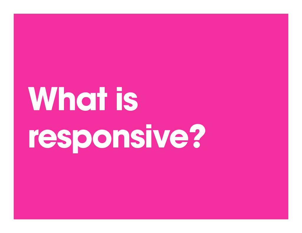
Why designing responsively isn't enough. We must think about adaptive design based on a user's context. This is from my class taught at General Assembly in New York October 11, 2012.
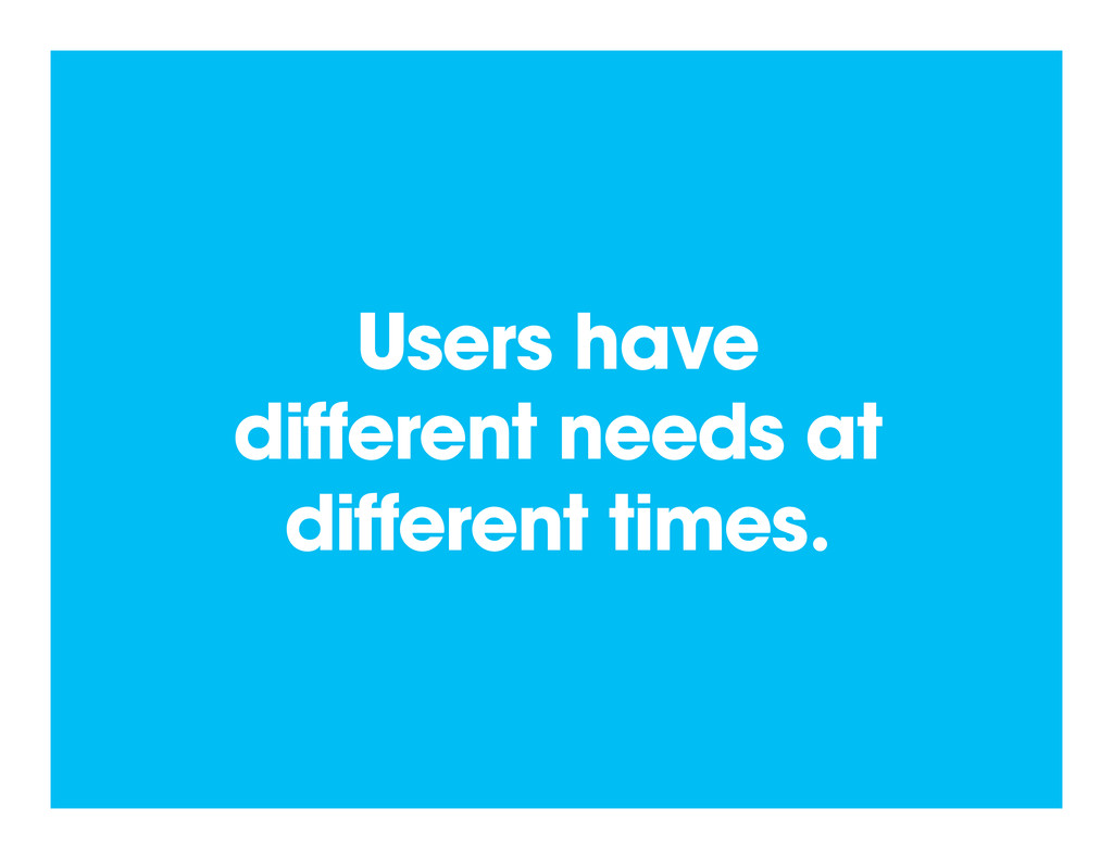
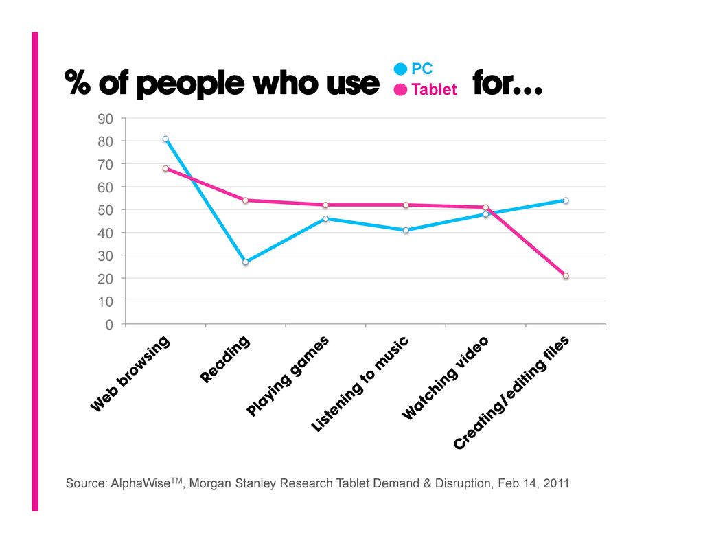
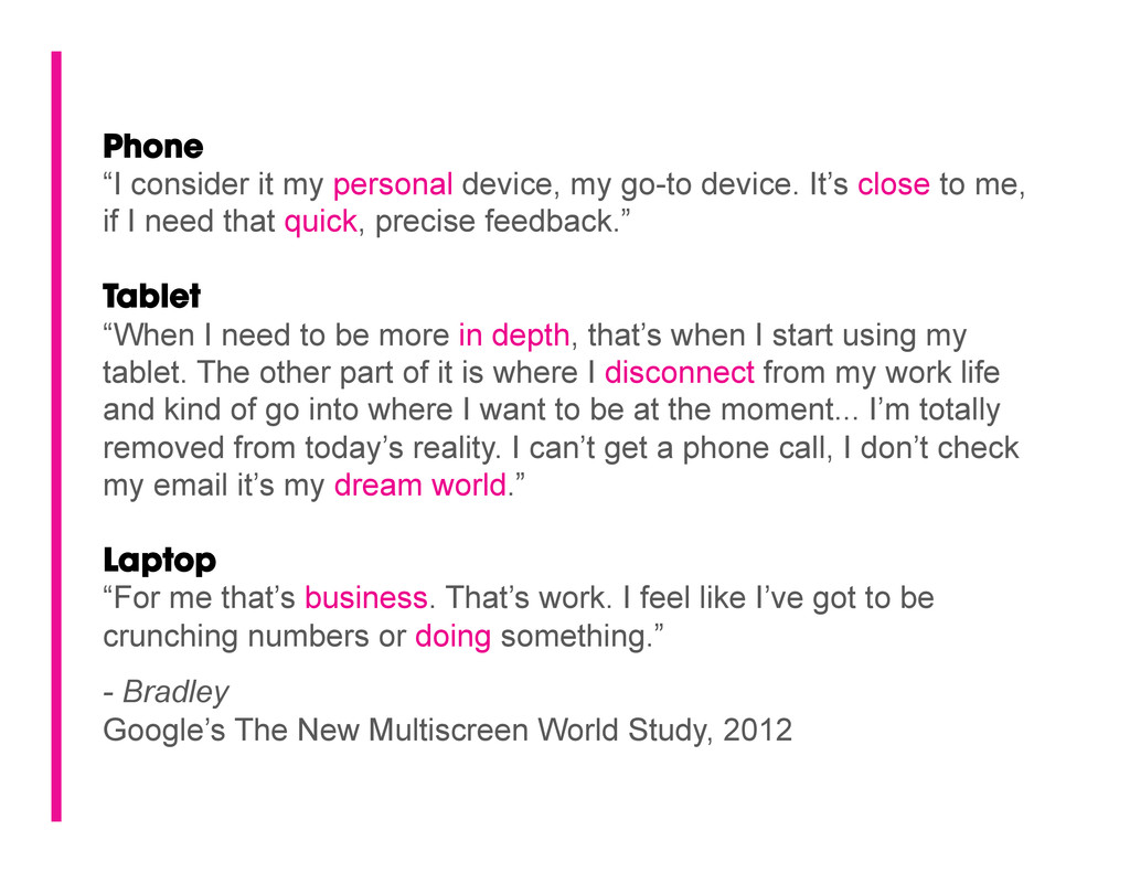
It’s close to me, if I need that quick, precise feedback.” Tablet “When I need to be more in depth, that’s when I start using my tablet. The other part of it is where I disconnect from my work life and kind of go into where I want to be at the moment... I’m totally removed from today’s reality. I can’t get a phone call, I don’t check my email it’s my dream world.” Laptop “For me that’s business. That’s work. I feel like I’ve got to be crunching numbers or doing something.” - Bradley Google’s The New Multiscreen World Study, 2012
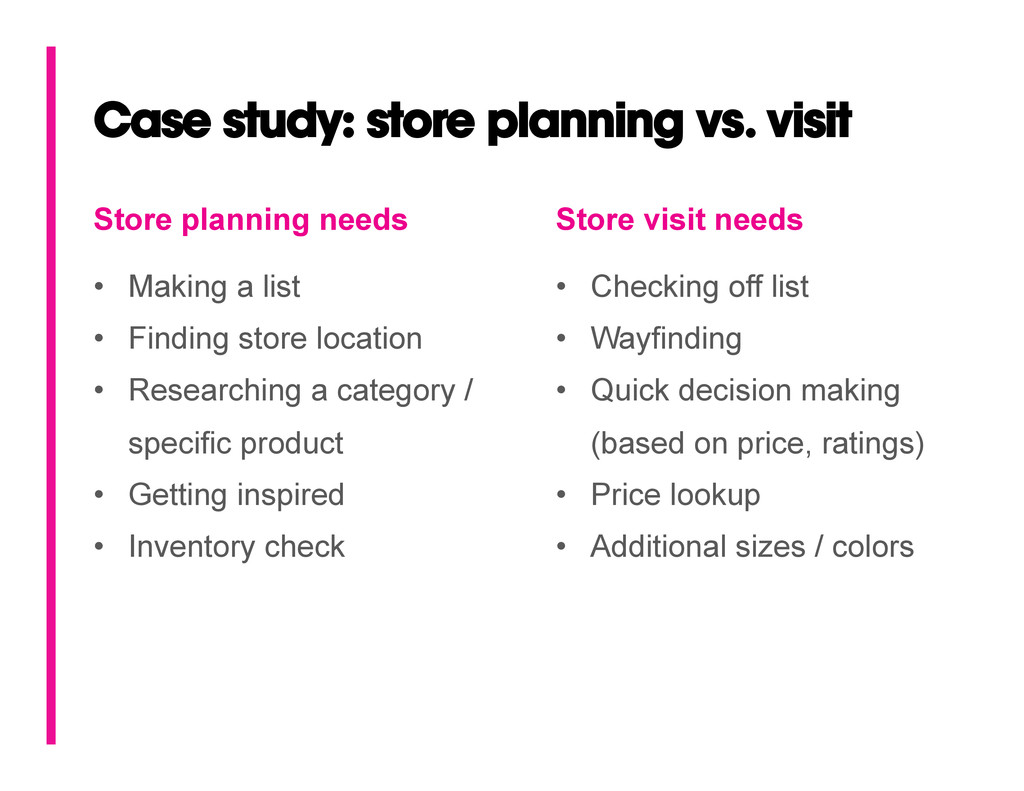
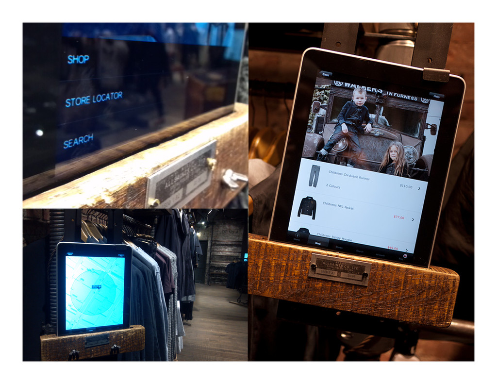
Making a list • Finding store location • Researching a category / specific product • Getting inspired • Inventory check Store visit needs • Checking off list • Wayfinding • Quick decision making (based on price, ratings) • Price lookup • Additional sizes / colors
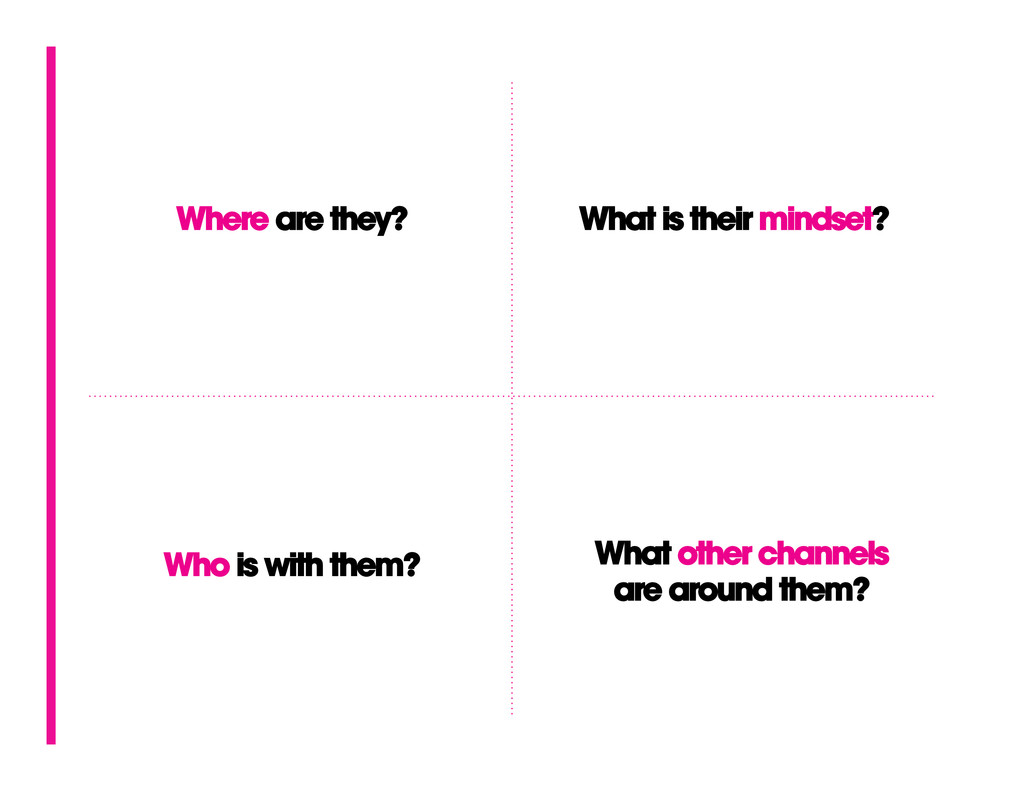
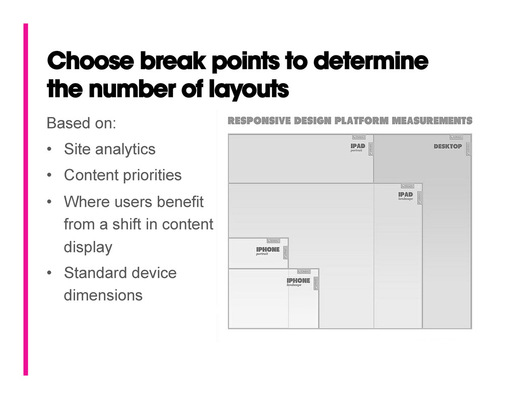
goal of the product? • Are the user’s goals always the same from device to device? What are their primary contexts? • Is it time to start taking advantage of larger monitors as well as smaller devices? • Other insightful questions… First, define WHY you’re doing this.
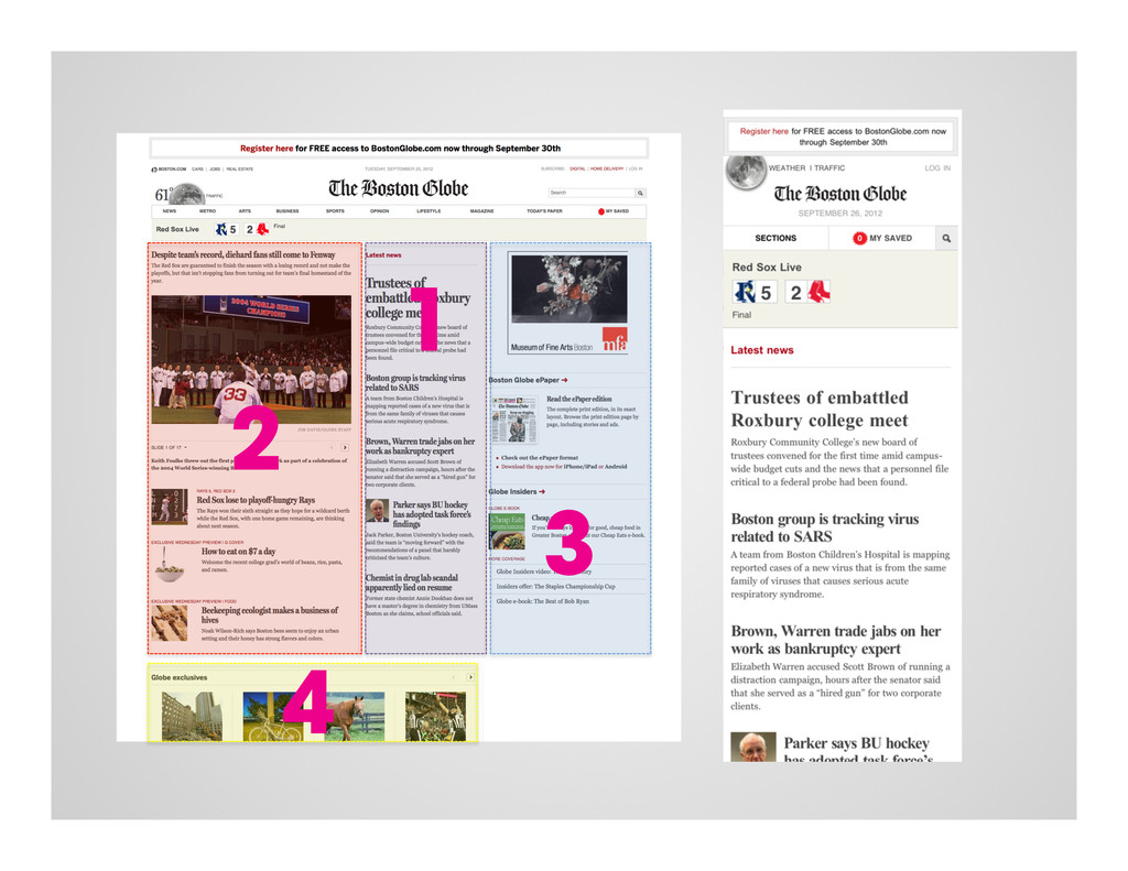
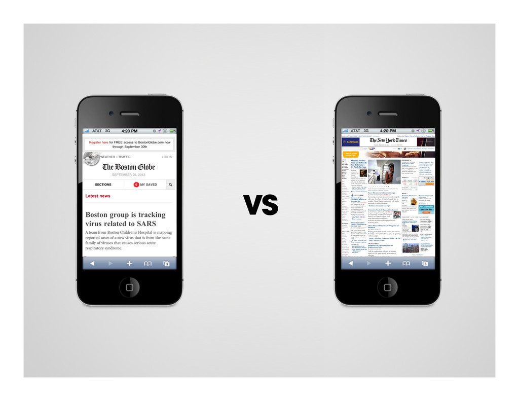
an application. • The narrow viewport dictates that you lay things out based on importance. • It requires you to simplify UI and interaction patterns. • It encourages you to think more seriously about what the actual content will be. Mobile forces you to focus.
by creating a bunch of static deliverables. • Each wireframe, visual design and development solution should be implemented in a simple prototype. From here, decisions can be solidified. • How does that menu change? • What happens to these content areas? • Can we introduce a new way of getting from breakpoint A to breakpoint B? Use prototypes to evolve towards your final product. Prototype early and often:
start creating a style guide without having to wait for UX to produce a deliverable. • It lets you create universal components, not unique pages. • It will allow you to be more consistent from the start which hopefully prevents you from having to go back to revise and consolidate.
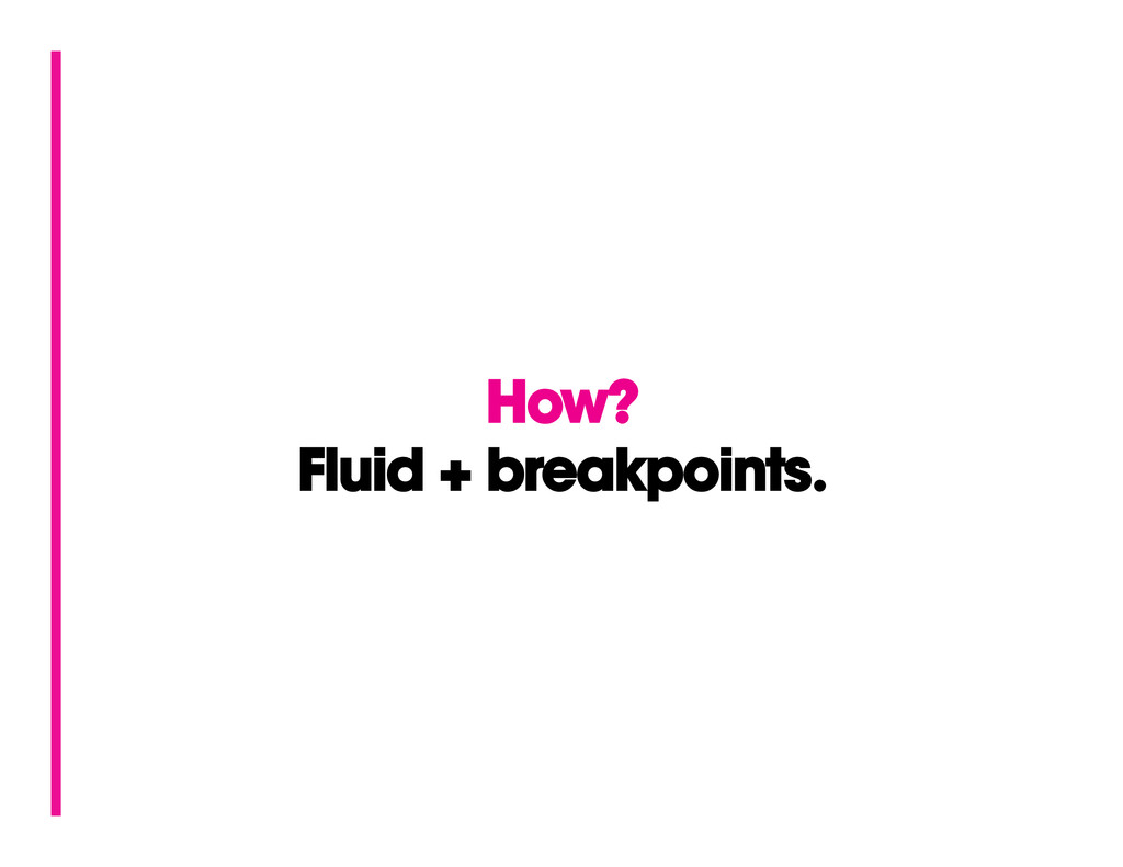
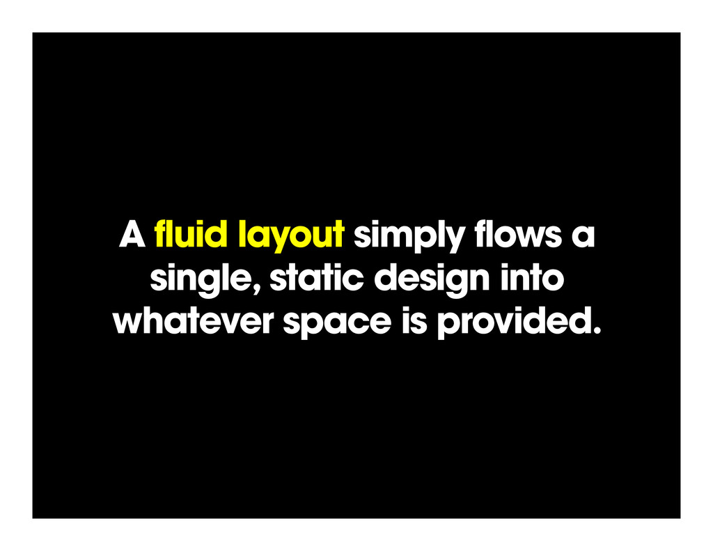
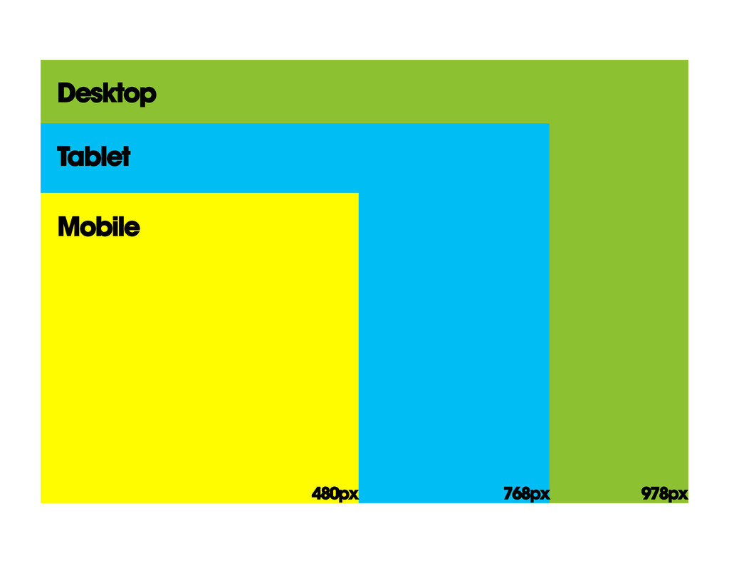
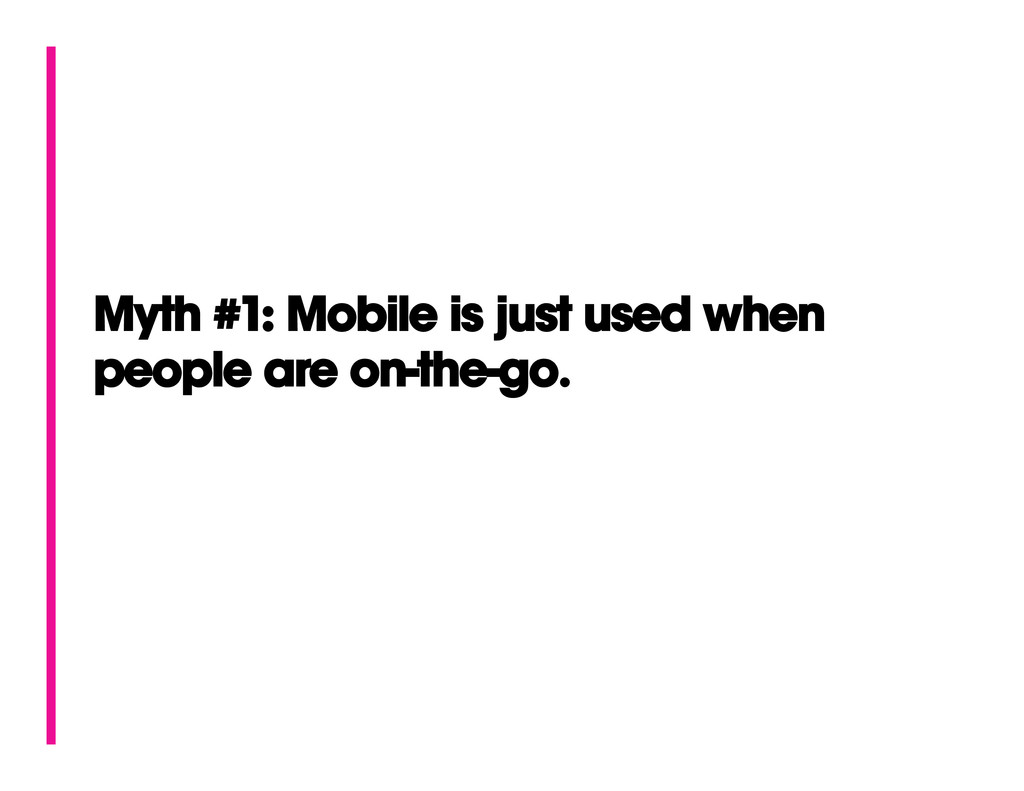
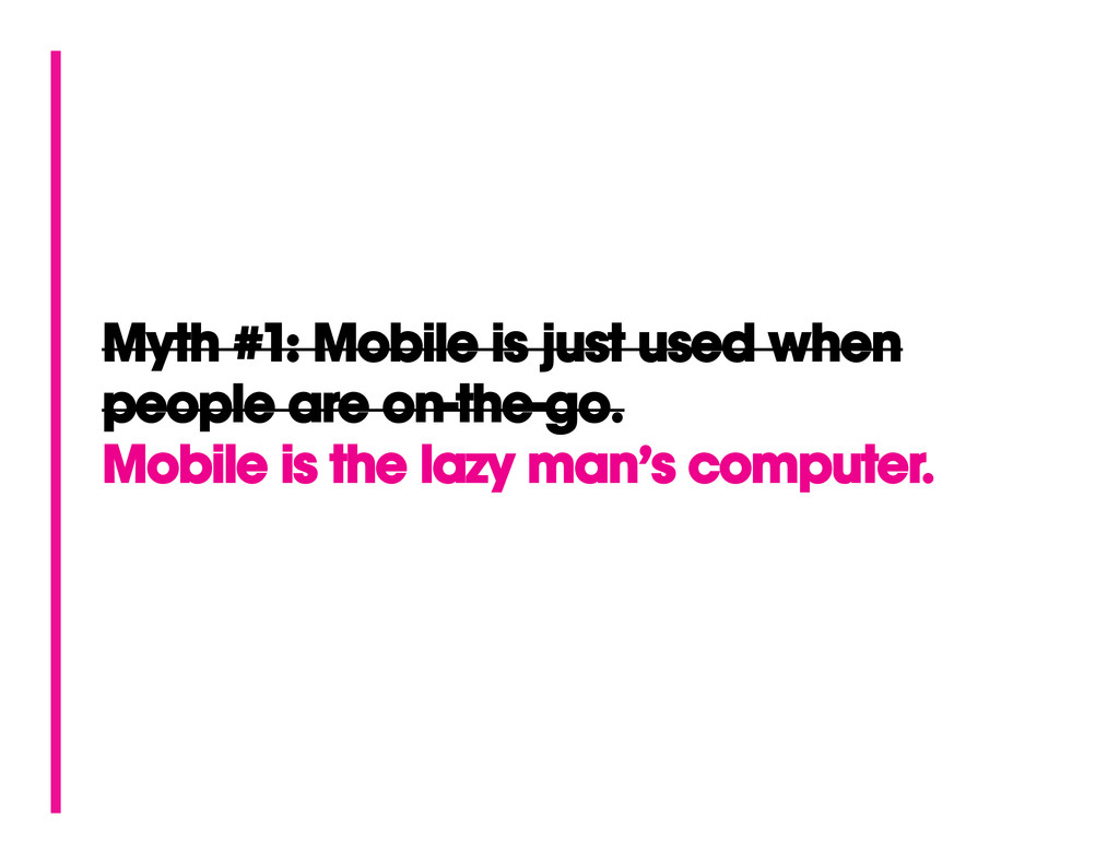
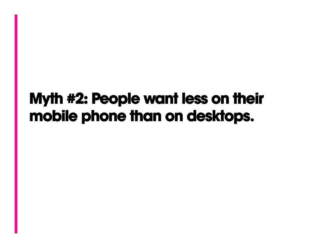
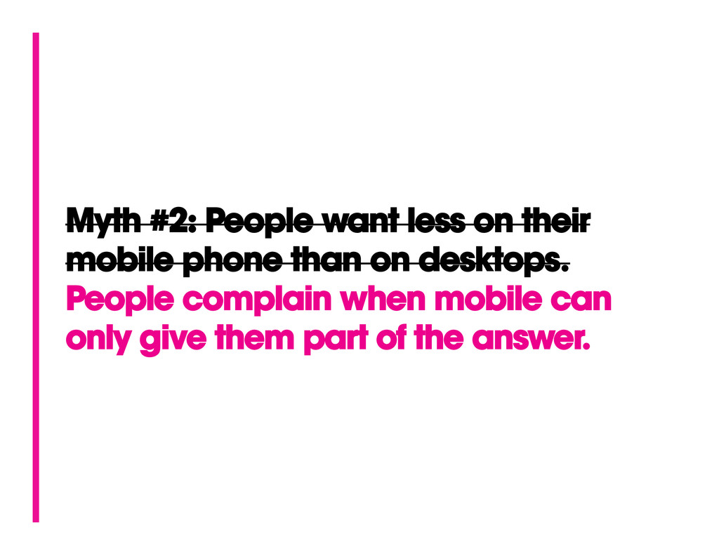
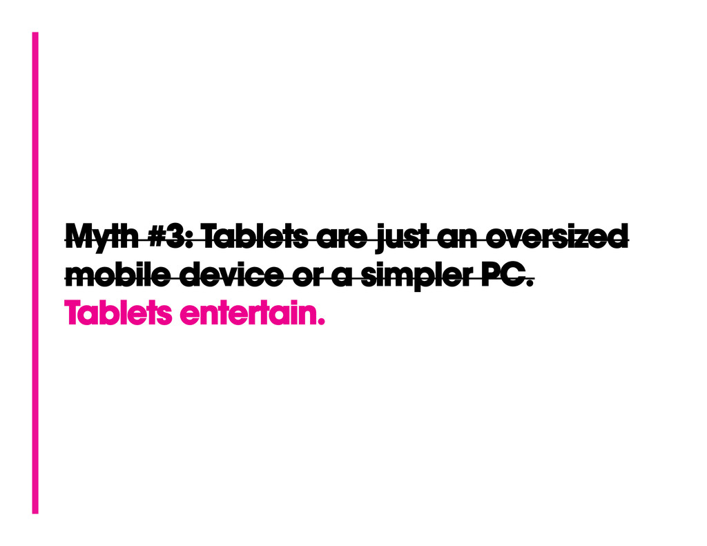
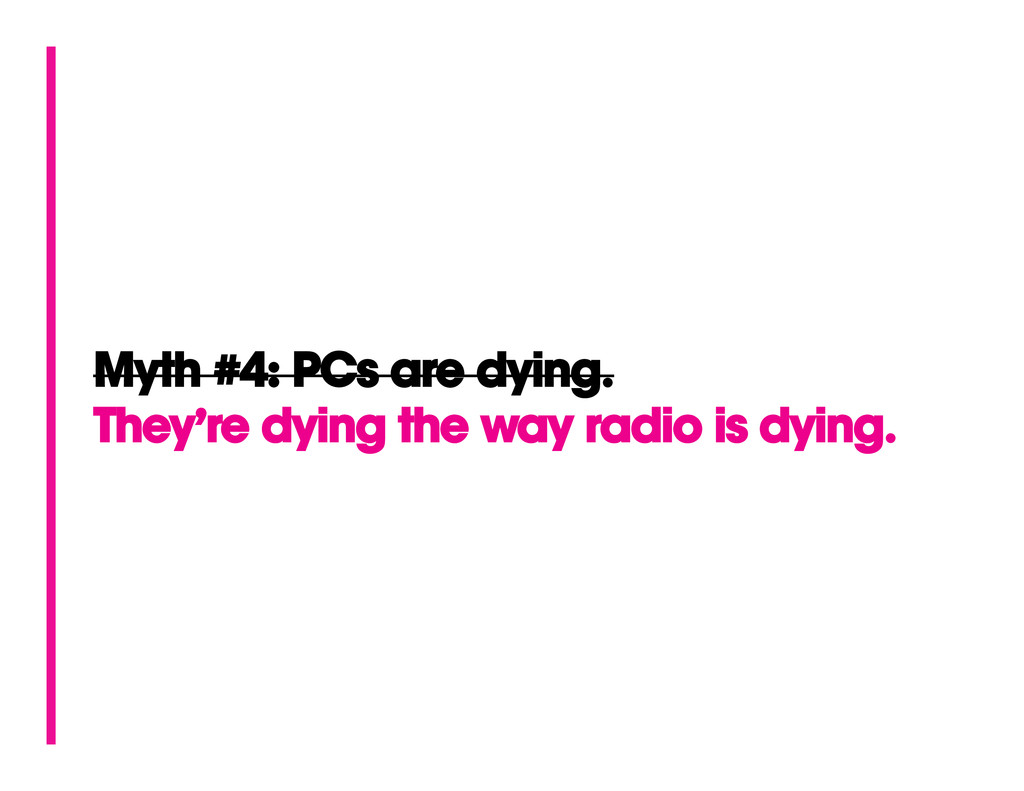
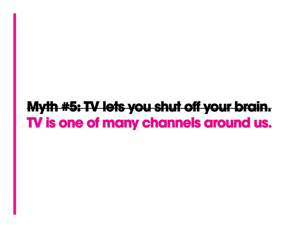
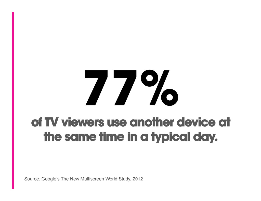
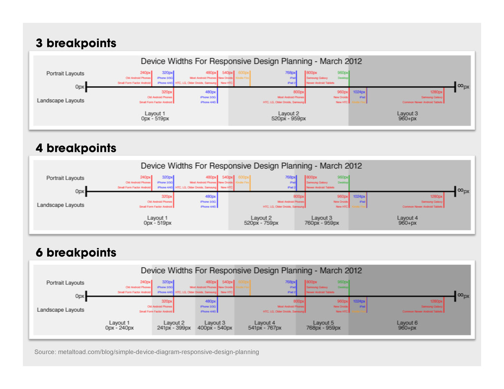
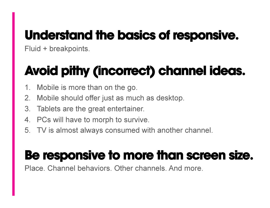
Be responsive to more than screen size. Place. Channel behaviors. Other channels. And more. 1. Mobile is more than on the go. 2. Mobile should offer just as much as desktop. 3. Tablets are the great entertainer. 4. PCs will have to morph to survive. 5. TV is almost always consumed with another channel. Fluid + breakpoints.
 wallowmuddy
 godlingkogami
 takanorip
 uxman
uxman
 kaikou
 baasie
 hiro0218
 vivion
 hypebeans
 littlebusters
 hicard
 kenichiota0711
 ajstarks
 coloredviolet
 samtorres
 aleyda
 bcantrill
 keathley
 eileencodes
 garrettdimon
 katarinadahlin
 stuffmc
 thekraken
 bkeepers