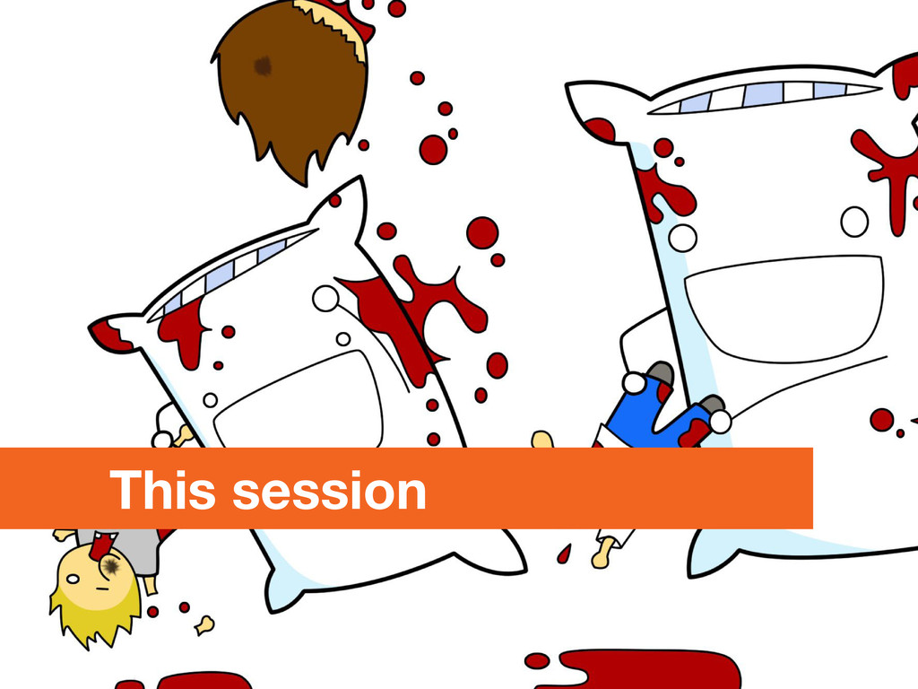
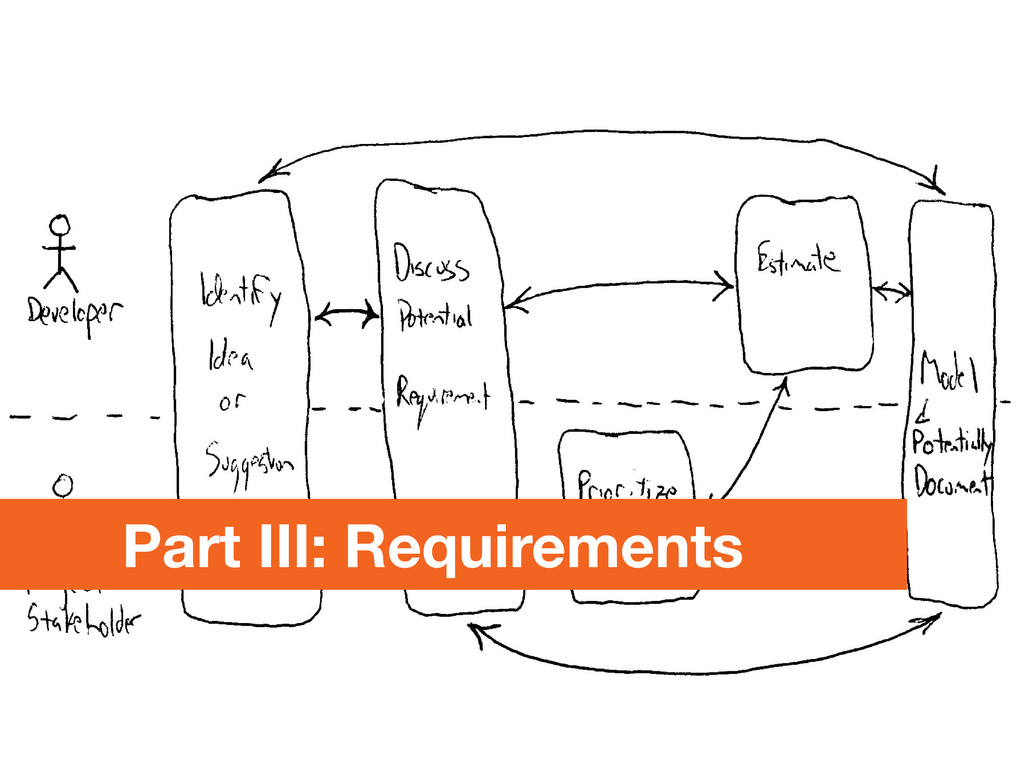
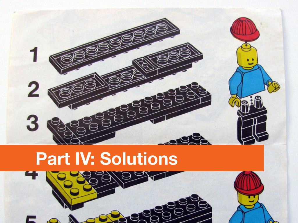
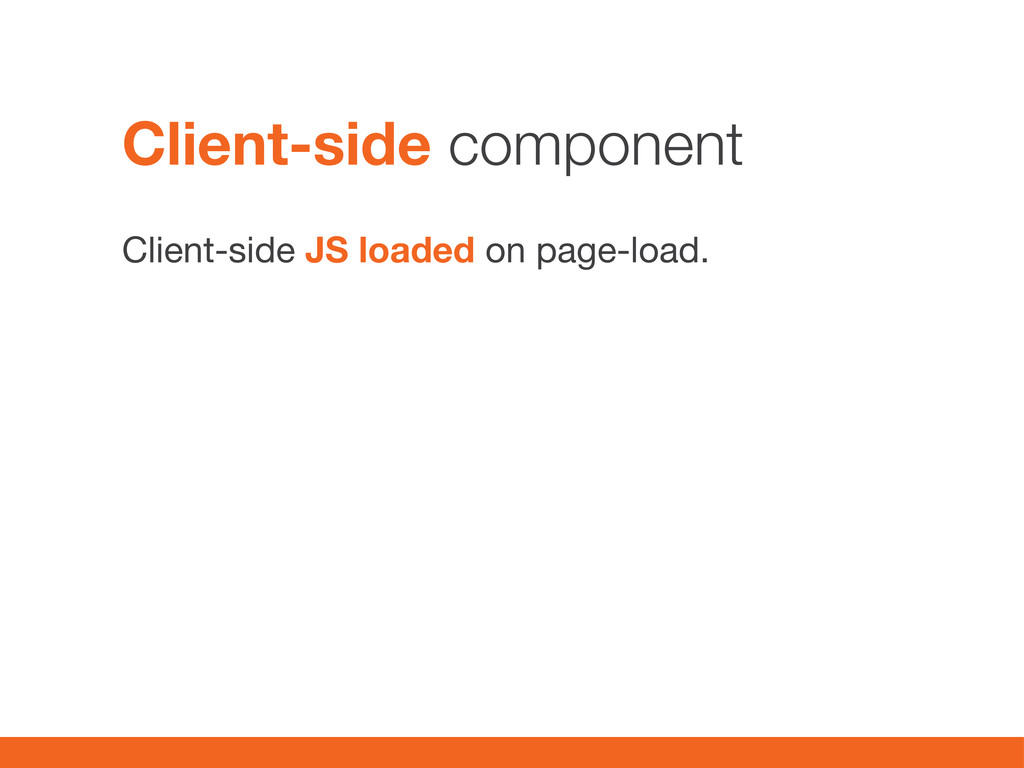
Building Drupal sites mobile first with lazy loading, responsive media and Varnish - without driving anyone insane. A combined session, technical overview, and outlined solution.
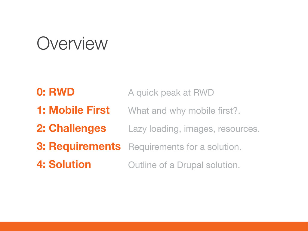
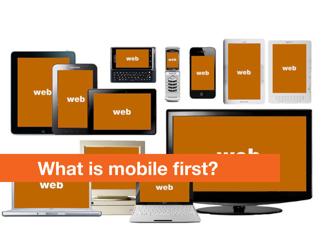
4: Solution A quick peak at RWD What and why mobile first?. Lazy loading, images, resources. Requirements for a solution. Outline of a Drupal solution.
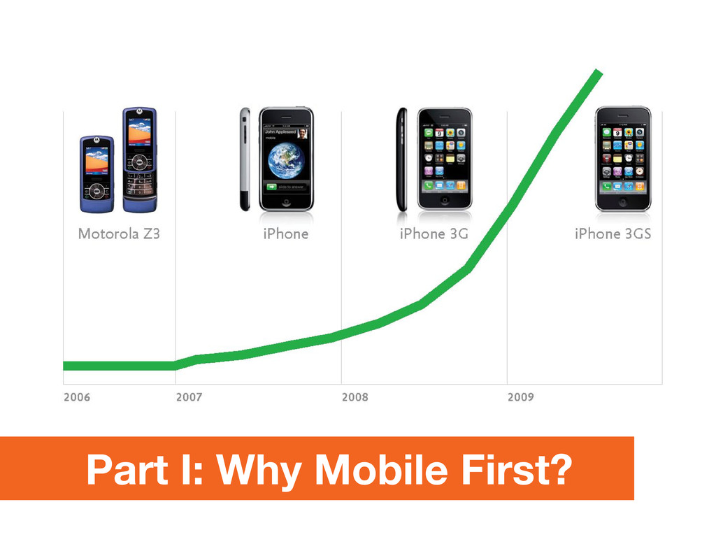
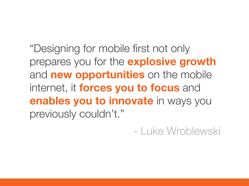
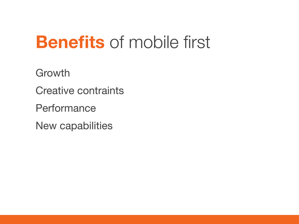
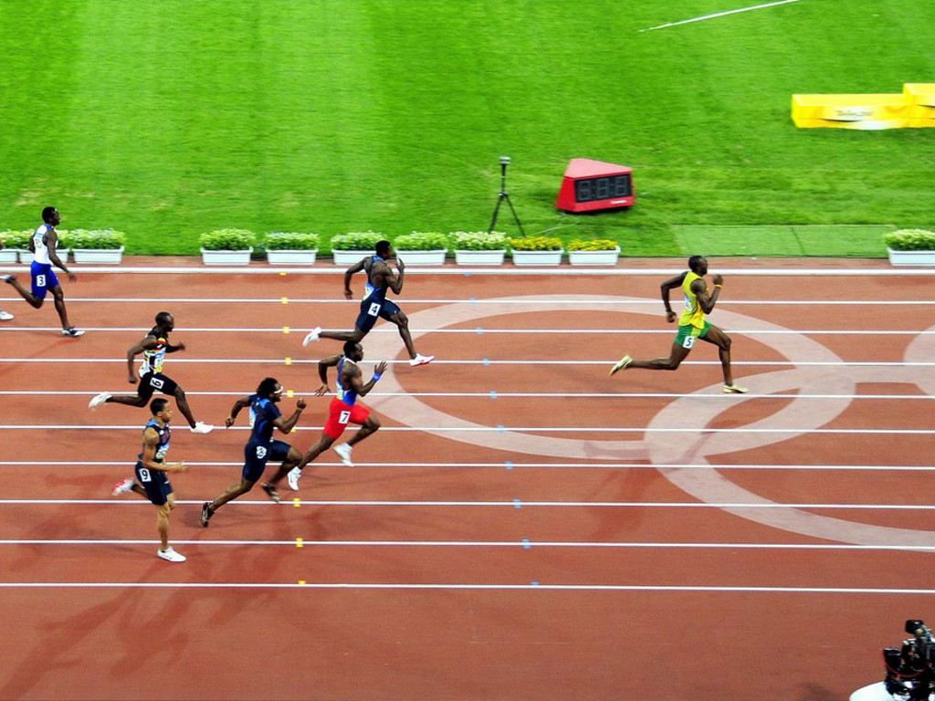
explosive growth and new opportunities on the mobile internet, it forces you to focus and enables you to innovate in ways you previously couldn’t.” - Luke Wroblewski
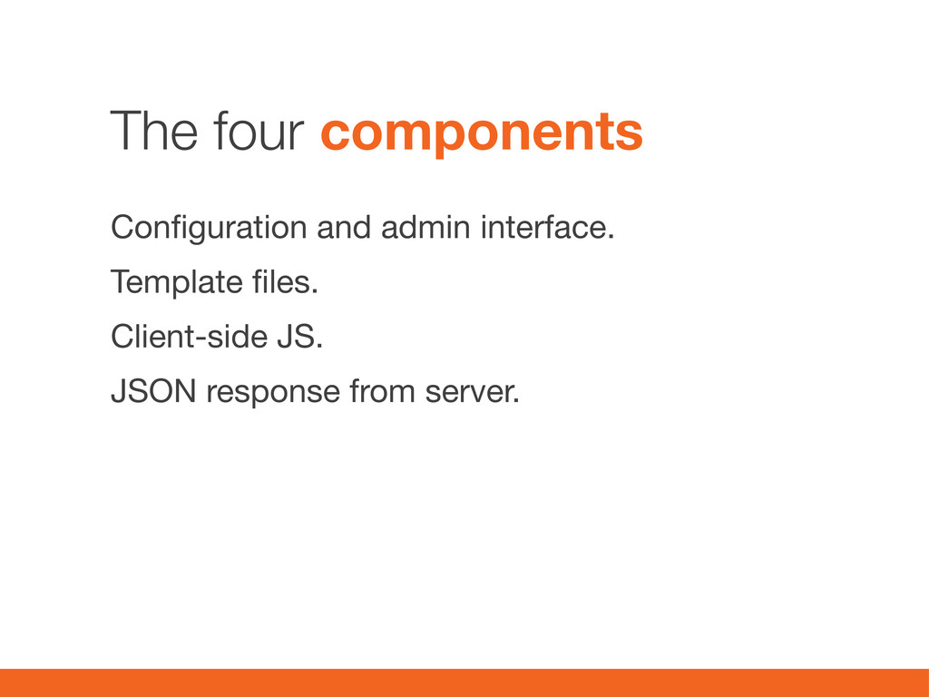
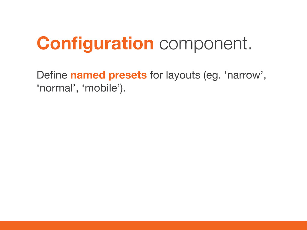
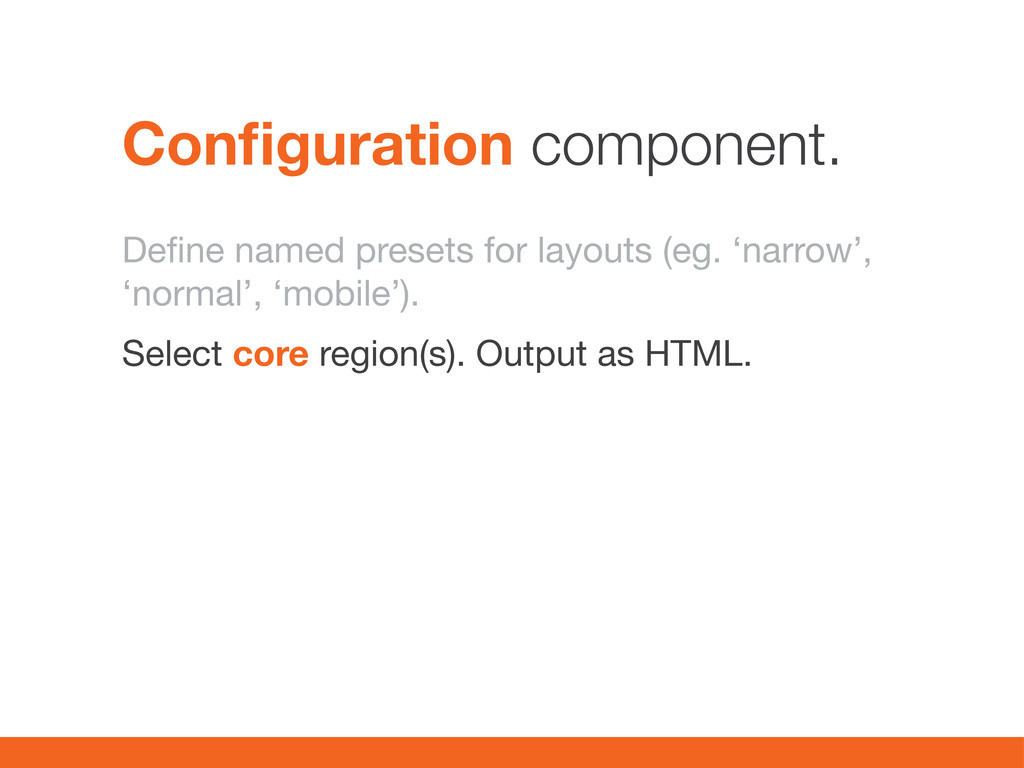
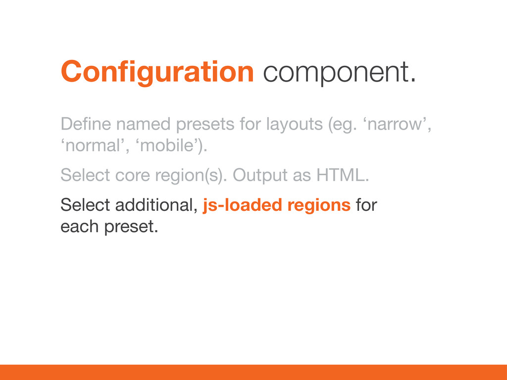
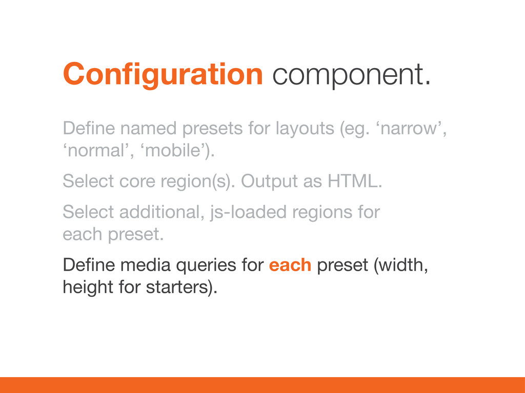
core region(s). Output as HTML. Select additional, js-loaded regions for each preset. Define media queries for each preset (width, height for starters). Configuration component.
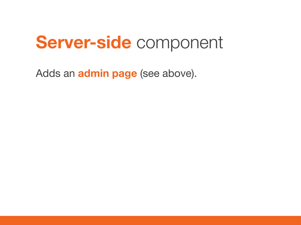
normal. Conditionally set [‘#access’] = FALSE; for optional regions based on query-string in URL in hook_page_alter(). Output optionally include a link to full version. Template component
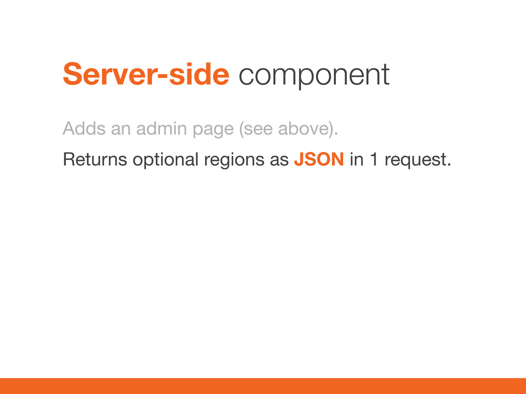
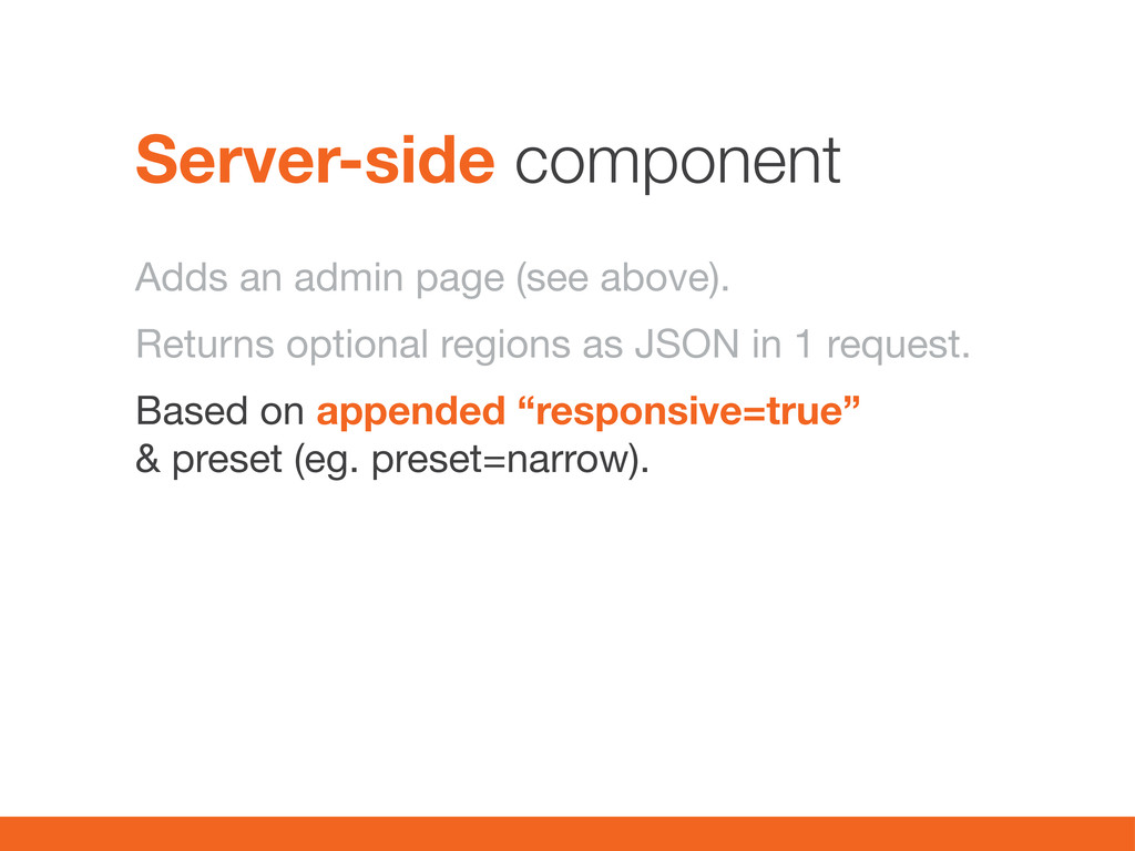
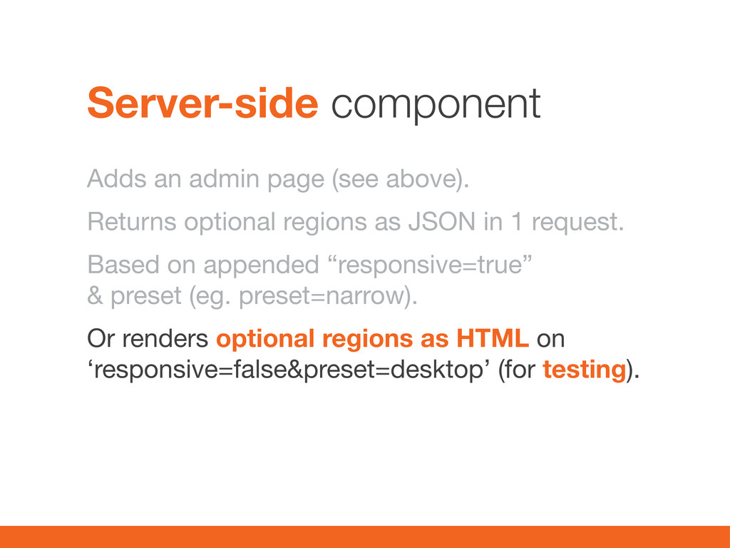
JSON in 1 request. Based on appended “responsive=true” & preset (eg. preset=narrow). Or renders optional regions as HTML on ‘responsive=false&preset=desktop’ (for testing). Server-side component
using drupal_json_output() Include information about target (#siderbar-right) to JSON. Return page with all regions using query Server-side component 2
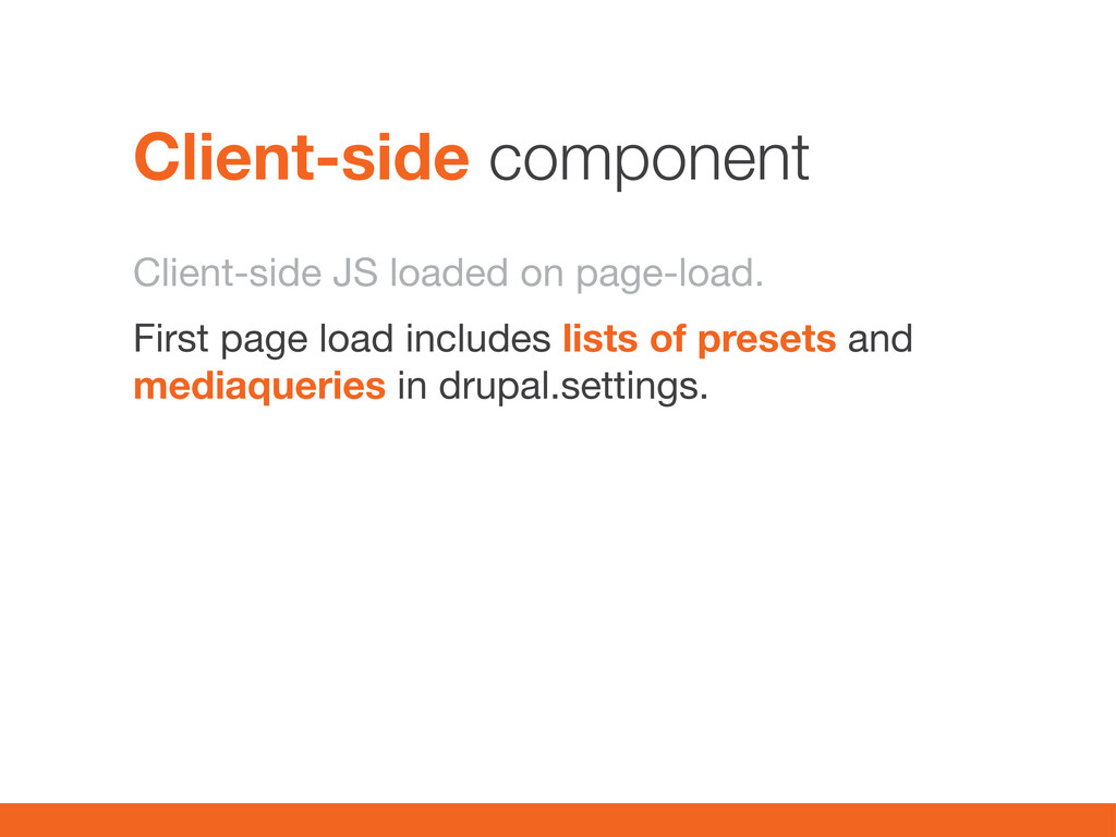
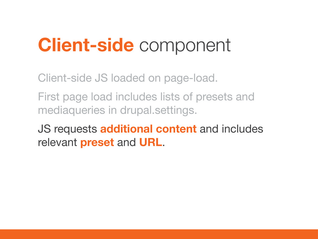
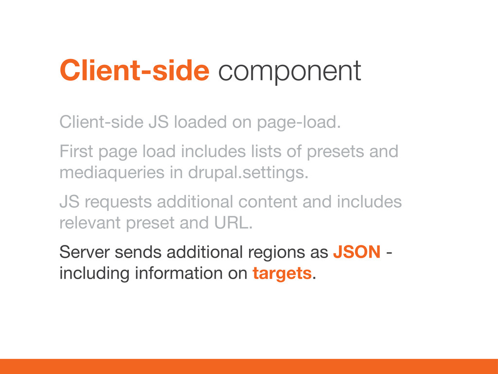
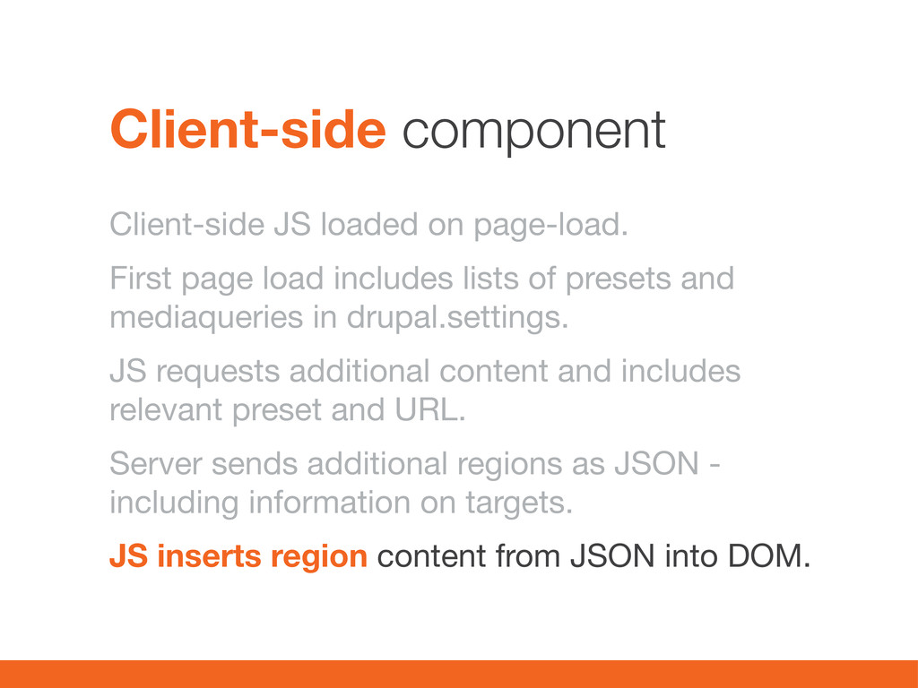
of presets and mediaqueries in drupal.settings. JS requests additional content and includes relevant preset and URL. Server sends additional regions as JSON - including information on targets. Client-side component
of presets and mediaqueries in drupal.settings. JS requests additional content and includes relevant preset and URL. Server sends additional regions as JSON - including information on targets. JS inserts region content from JSON into DOM. Client-side component
 woeldiche
 okana2ki
 nari_ex
 tonkotsuboy_com
 krrrr38
 ueponx
 sugupoko
 bengo4com
 oracle4engineer
 bto
bto
 mtoyoda
 fruitriin
 kawaguti
 aemeredith
 geshan
 cassininazir
 malarkey
 philnash
 aarron
 gurzu
gurzu
 mfonobong
 jcasabona
 jdejongh
 427marketing
 aleyda