Upgrade to Pro — share decks privately, control downloads, hide ads and more …

Typography and its importance in Web Design - Μυρτώ Θεοδώρογλου

Typography and its importance in Web Design - Μυρτώ Θεοδώρογλου

WordCamp Thessaloniki 2019

Η τυπογραφία είναι ένα από τα πιο θεμελιώδη στοιχεία του Web Design, που μπορεί να καταστρέψει κυριολεκτικά ή να δοξάσει έναν ολόκληρο ιστότοπο μαζί με την εμπειρία του χρήστη. Μαθαίνοντας πως να την εξελίσσετε, θα σας οδηγήσει σε έξυπνα και κομψά σχέδια που ξεπερνούν τις βασικές ανάγκες και γίνονται μικρά κομμάτια τέχνης, διασφαλίζοντας ότι οι ιστότοποί σας θα είναι αξέχαστοι για ευχάριστη εμπειρία και αισθητική τους. Μέσω της ομιλίας θα συναντήσουμε όλους τους κανόνες και τα πράγματα που δεν θα κάνουν καταλαβαίνετε και οδηγείτε την τυπογραφία σε οποιοδήποτε είδος σχεδίου ιστού.

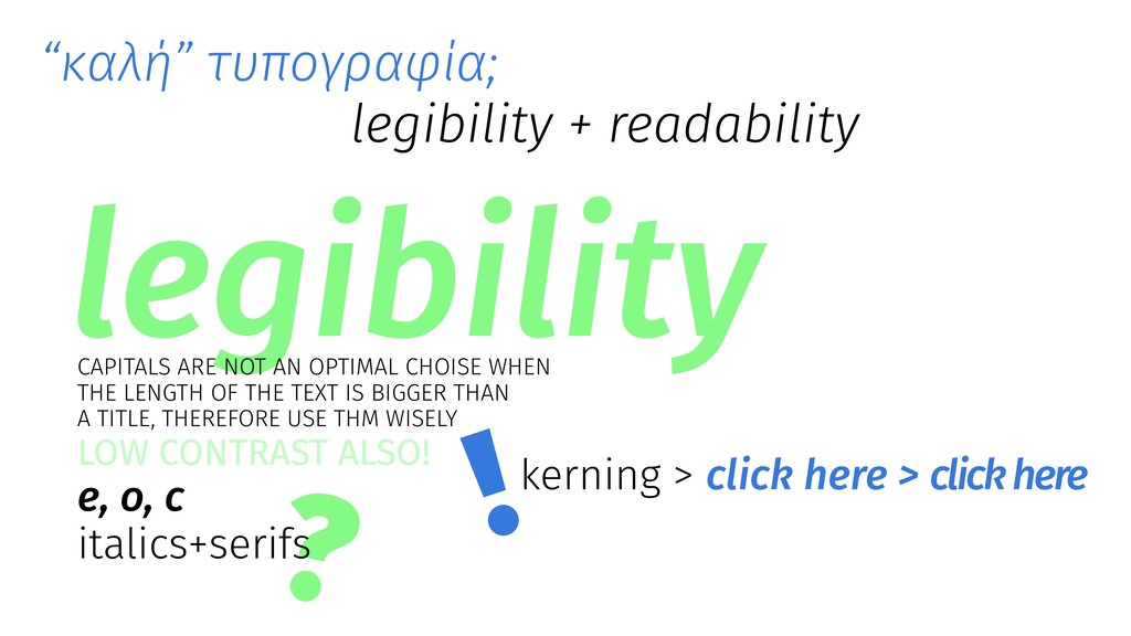
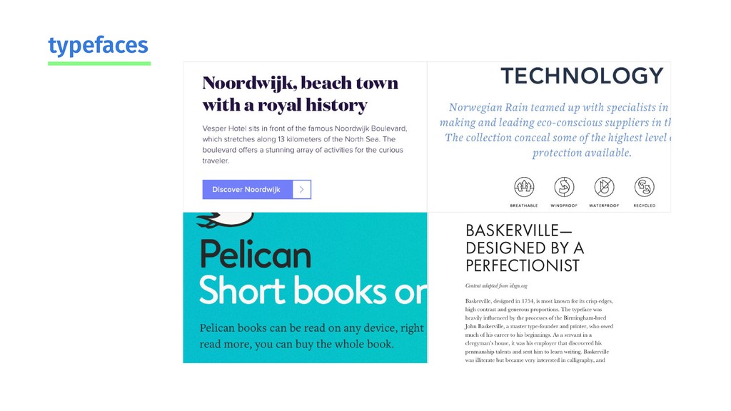
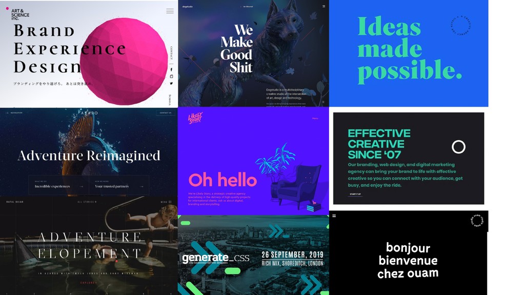
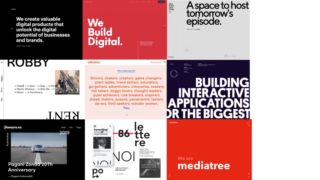
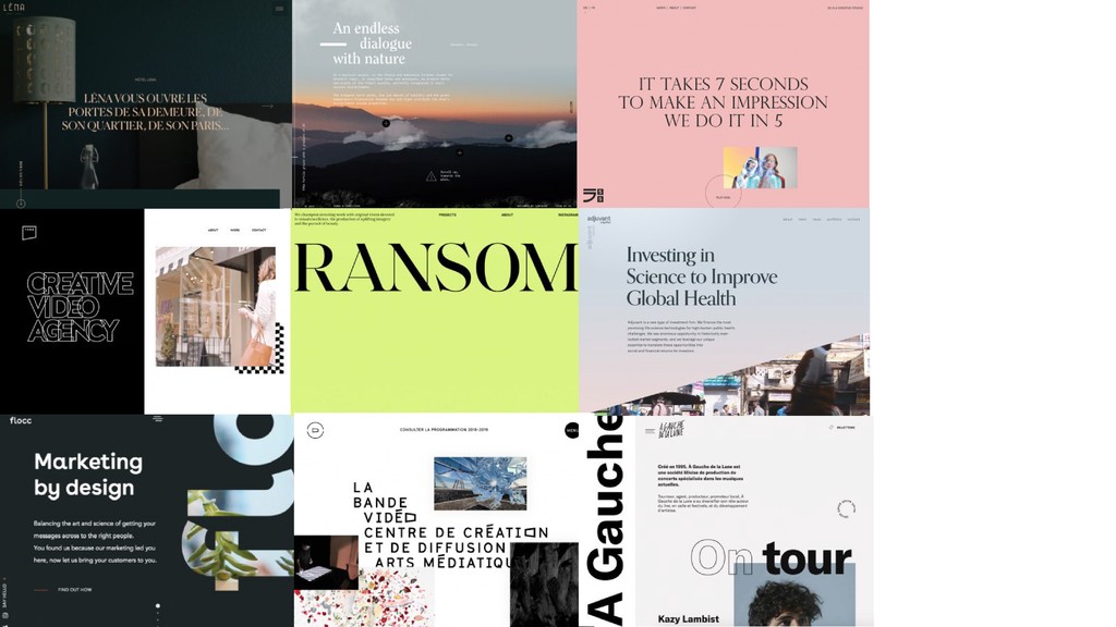
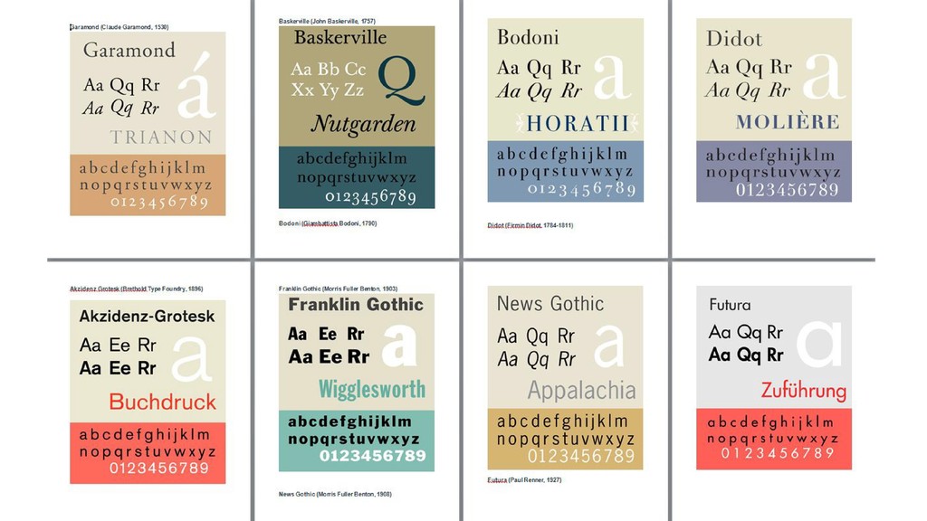
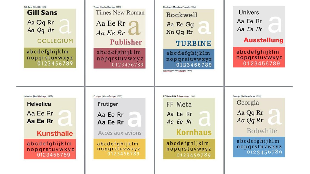
Typography is one of the most fundamental elements in Web Design, it
can literally destroy or glorify a whole website along with the user’s
experience. Learning to master it will lead you to smart and classy
designs that exceed baseline needs and become little pieces of art,
making sure that your websites will be memorable for pleasant experience
and aesthetics.

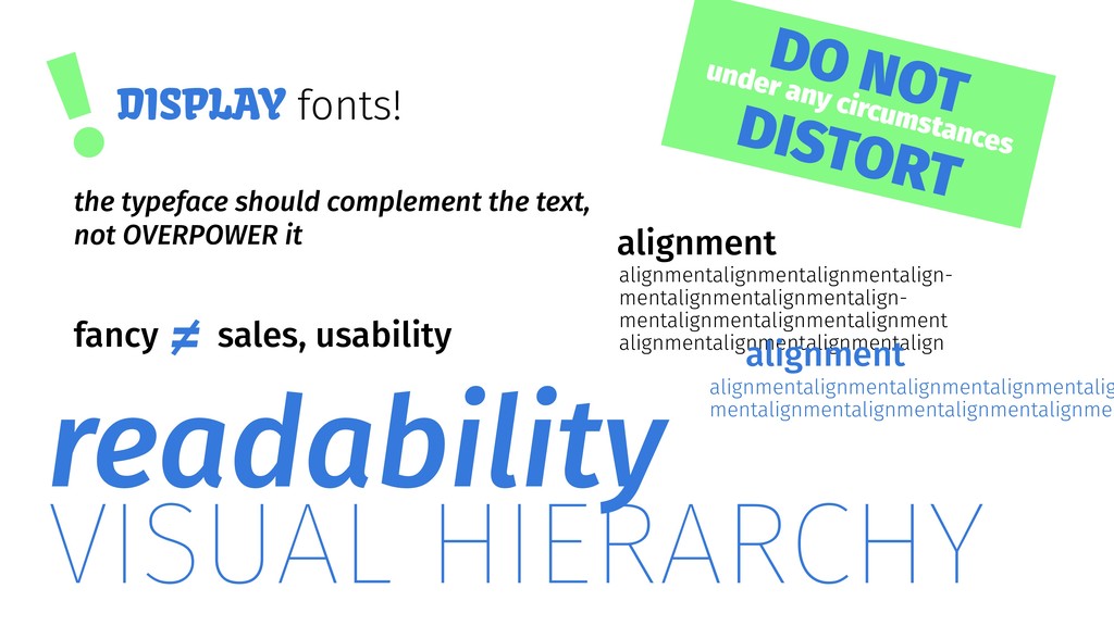
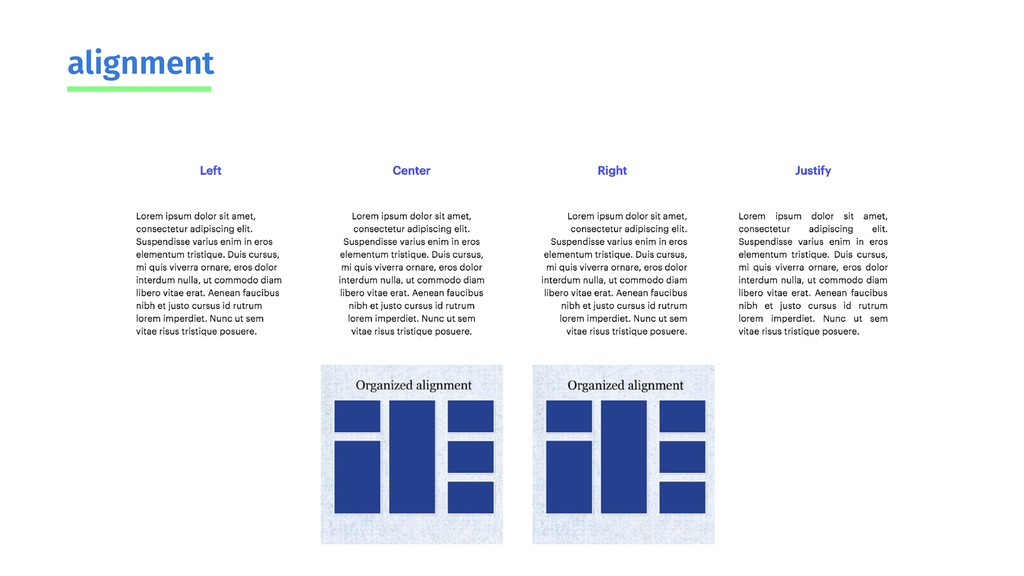
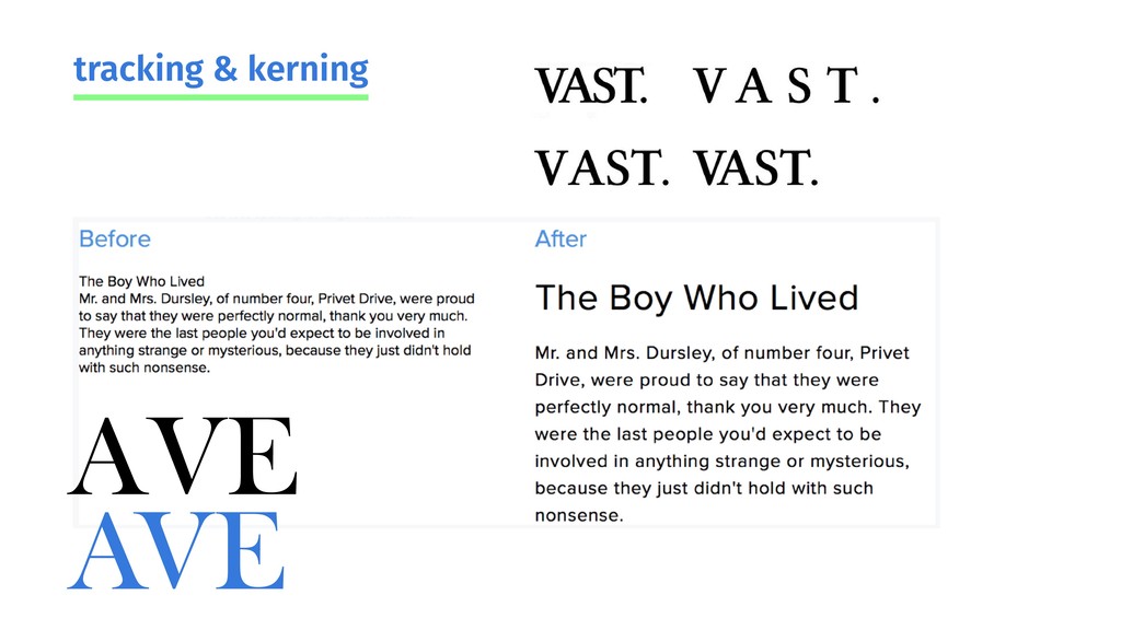
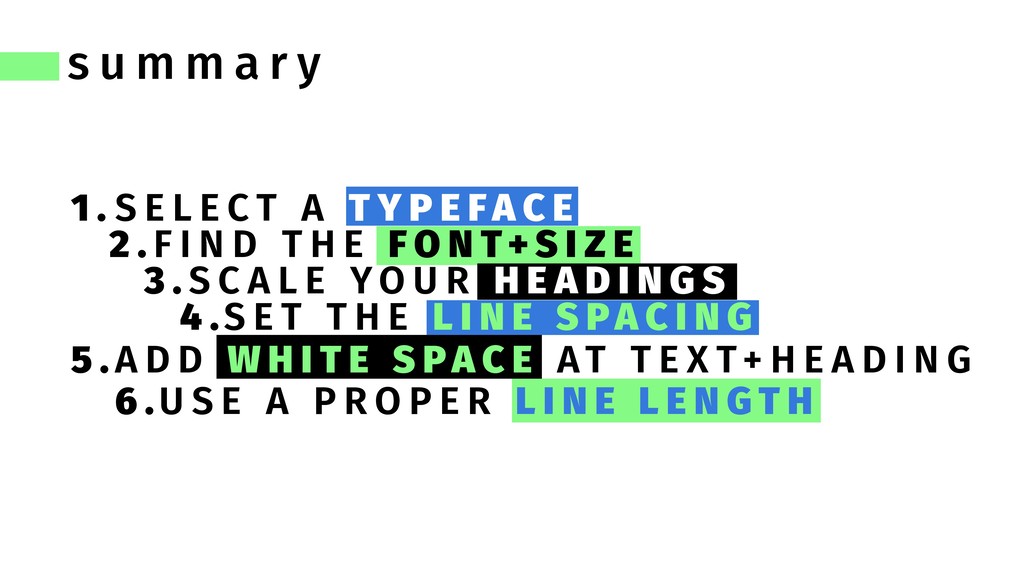
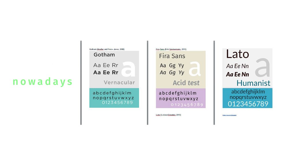
Through the talk we will encounter all the rules and do’s/dont’s that
will make you understand and lead typography in any kind of web design.

WordPress Greek Community

October 12, 2019
Tweet

More Decks by WordPress Greek Community

Other Decks in Technology

Transcript

  1. If there were such a thing as the Web Developer’s

    Dictionary, you’d probably find the word typography defined as “The bane of your existence.” Brenda Barron
  2. Time flies when you’re reading beautiful text brain focus must

    remain on the content, not on the effort required to read it how typography affects conversions Gestalts’ principals DO YOU AGREE? DO YOU AGREE? similarity continuation closure proximity figure&ground Good typography boosts cognitive performance
  3. it’s not only about the looks, typography will set the

    mood try to deconstruct all the elements of a website what you get at the end is text + images it conveys a feeling
  4. γιατί; bad website typography = bad business ποιος που ποτε

    ποιος που ποτε font size weight color shape alignment
  5. Typography must invite the reader into text, reveal the tenor

    and mean- ing of the text, clarify its structure and order and link the text with other existing elements. make him feel cozy in your website Robert Bringhurst major outcome at CRO, session, SEO = =
  6. ! “καλή” τυπογραφία; e, o, c kerning > click here

    > click here legibility legibility + readability ? italics+serifs CAPITALS ARE NOT AN OPTIMAL CHOISE WHEN THE LENGTH OF THE TEXT IS BIGGER THAN A TITLE, THEREFORE USE THM WISELY LOW CONTRAST ALSO!
  7. !DISPLAY fonts! alignment VISUAL HIERARCHY readability DO NOT under any

    circumstances DISTORT alignmentalignmentalignmentalign- mentalignmentalignmentalign- mentalignmentalignmentalignment alignmentalignmentalignmentalign alignmentalignmentalignmentalignmentalig mentalignmentalignmentalignmentalignmen alignment fancy sales, usability ≠ the typeface should complement the text, not OVERPOWER it
  8. learn to look of a web page gets read a

    right typeface should keep people reading typography accounts for over of the design 20% 90% only
  9. reading about typography’s importance at a website with exceptionally bad

    typography the words written on a website are the digital voice of a company or person that funny moment typography maintains the site’s consistency
  10. market research! formal informal larger smaller serif sans serif consistency

    hierarchy alignment point size ≥ 14 pixels font color | contrast >> colorable whitespace (watch out for devices!) links | be able to tell a difference line lenght | 45-80 characters (mobile 30-40) | 10-15 words max 2 fonts | opposites attract NO.BLINKING.TEXT. NO.BLINKING.TEXT. NO.BLINKING.TEXT. ? !
  11. pt. 14 pixels MIN 18-21 pt. optimal! learn to use

    em! avoid placing text on top of busy images (always consider smaller screens!)
  12. Use one typeface in various weights stay away from unreadable

    fonts! typefaces Montserrat Gotham Proxima Nova
  13. s u m m a r y U S E

    A P R O P E R L I N E L E N G T H 1 . 2 . S C A L E Y O U R H E A D I N G S 3 . S E T T H E L I N E S PA C I N G 4 . 5 . 6 . S E L E C T A T Y P E F A C E F I N D T H E F O N T+ S I Z E A D D W H I T E S PA C E A T T E X T+ H E A D I N G