who drive vehicles and may face events that may lead to an accident or an event that may have already caused an accident. The design describes a system monitoring conditions that predict driving anomalies and providing relevant feedback to help prevent an accident or recover from it. 4
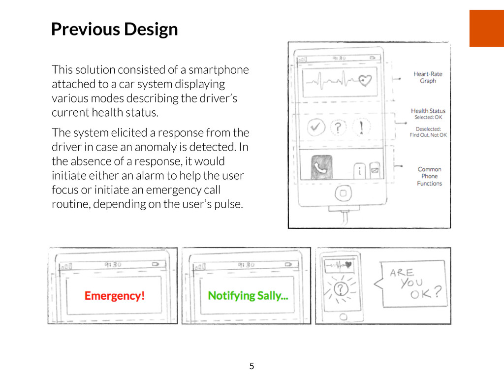
a car system displaying various modes describing the driver’s current health status. The system elicited a response from the driver in case an anomaly is detected. In the absence of a response, it would initiate either an alarm to help the user focus or initiate an emergency call routine, depending on the user’s pulse. 5
the ambient nature of reaction in various situations. The feedback received in evaluation of the design led to restructuring the UI to better support this goal. It was clear that the device was docked in the vehicle’s dashboard. It’s interface displayed the following elements: Pulse Rate Graph, Health Status, and Smartphone Functions used frequently inside a car. This information is extremely important to program the logic for the application, but does not prove very useful to the driver and worse, might distract the user during the journey. Another concern was the quick depletion of the phone battery as this application remains on even if it is in a passive state so that it can sufficiently support the operation of monitoring the driver’s pulse. With this feedback in mind, the user experience goals were refined to help frame the final design. The aim is to allow an unobtrusive experience where the application does not elevate a false sense of fear in minds of the user when there is no real danger. 6
feedback received be visible and consistent at all times. Even if there is voice feedback, visual reproduction of the feedback will provide drivers with a method to confirm that they accurately understood the feedback. When the application is in a passive state, it is important that it allows users to access common smartphone functions like access to the Music Player, Maps and Phone. Providing this functionality within the application would serve a dual purpose: 1. By providing a central dashboard to access common smartphone functions, users have more reason to continue use of this application. 2. Building the common functions inside this app, ensures that application runs in the background even if a secondary application is launched temporarily. The application can thus continue to detect triggered events. Accessing these functions from outside might lead to the application being sent to a paused state, depending on the mobile operating system being supported. The response to the device eliciting a voice response might be confused with another passenger’s voice or sound from the environment. This input mechanism may thus provide mixed results. It is thus important that external controls be less error-prone, specially to prevent inadvertent emergency calls. Visibility, Feedback and Consistency 7
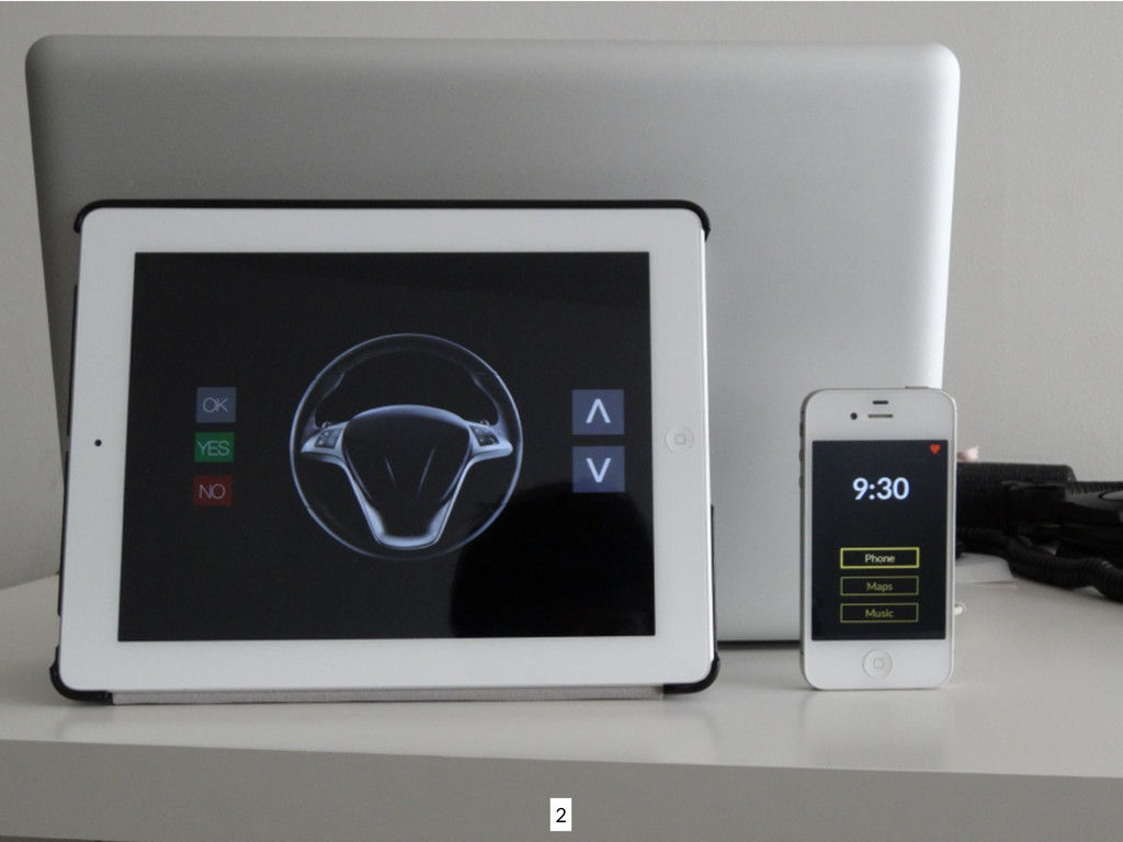
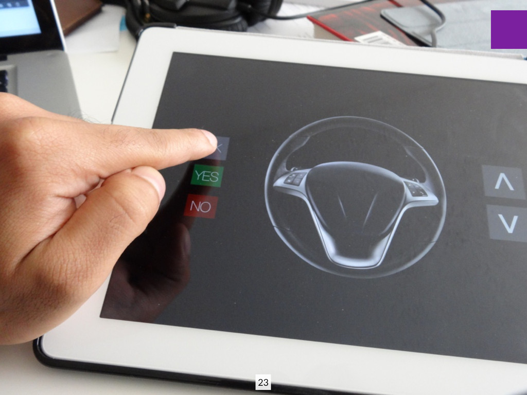
vehicle has sensors and triggers the events directly to the smartphone as in an accident- like situation. The interface exists exists in two parts: input through buttons on a steering wheel and the display/speaker on a smartphone as a visual/auditory aid. The smartphone application now serves as a dashboard for common in-car functionality hiding all information about health shown in the previous design with the exception of an indicator for when the pulse is detected. The smartphone is docked to the car’s dashboard so that it never discharges while in use and can supports the requirement of the application remaining active at all times. The steering wheel is assumed to have 5 buttons to support interacting with the system: Two buttons for Up/Down navigation, Two Buttons for Yes/No selection, An OK button for selecting the current option. System Components PROTOTYPE DESCRIPTION 8
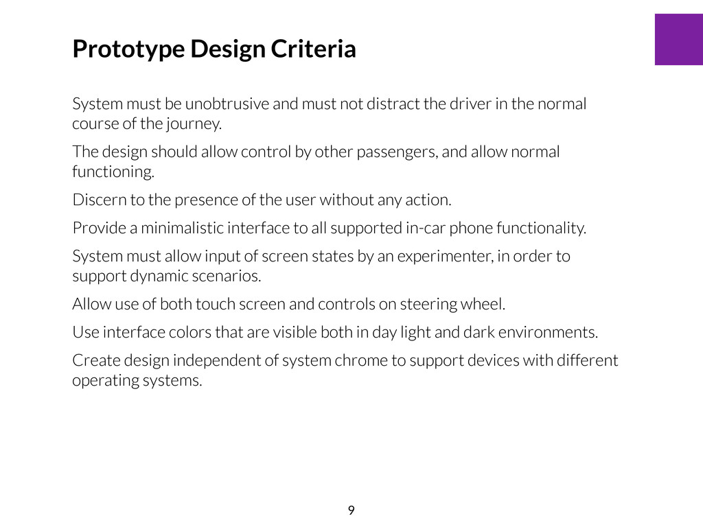
in the normal course of the journey. The design should allow control by other passengers, and allow normal functioning. Discern to the presence of the user without any action. Provide a minimalistic interface to all supported in-car phone functionality. System must allow input of screen states by an experimenter, in order to support dynamic scenarios. Allow use of both touch screen and controls on steering wheel. Use interface colors that are visible both in day light and dark environments. Create design independent of system chrome to support devices with different operating systems. Prototype Design Criteria 9
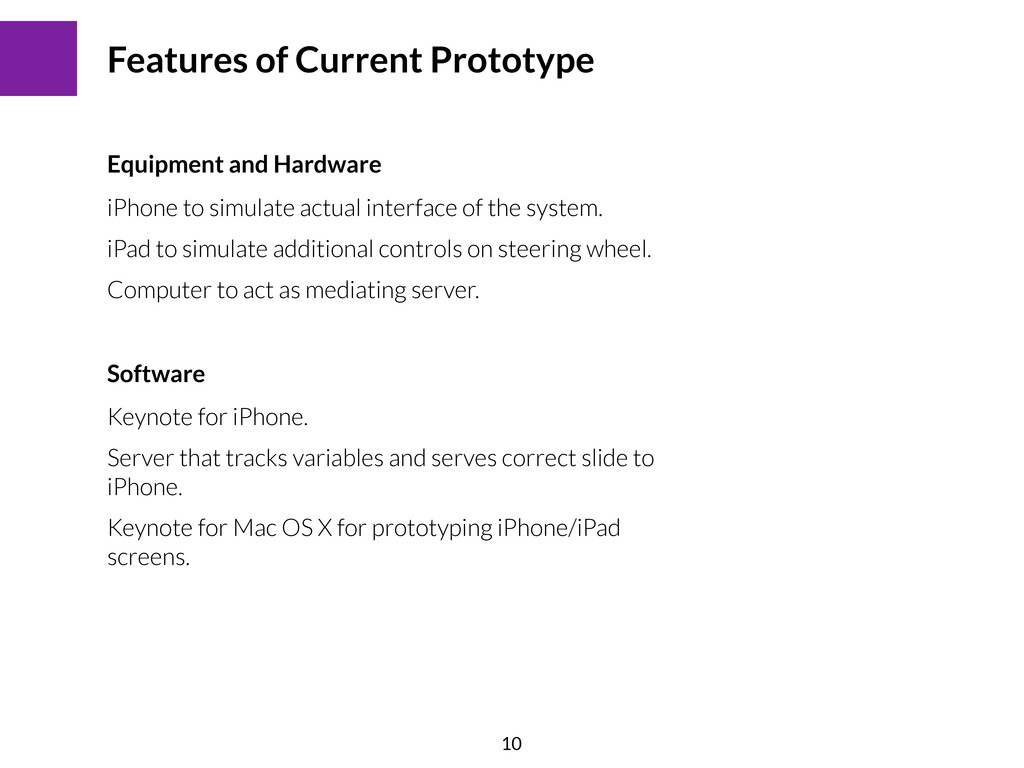
simulate additional controls on steering wheel. Computer to act as mediating server. Features of Current Prototype Equipment and Hardware Keynote for iPhone. Server that tracks variables and serves correct slide to iPhone. Keynote for Mac OS X for prototyping iPhone/iPad screens. Software 10
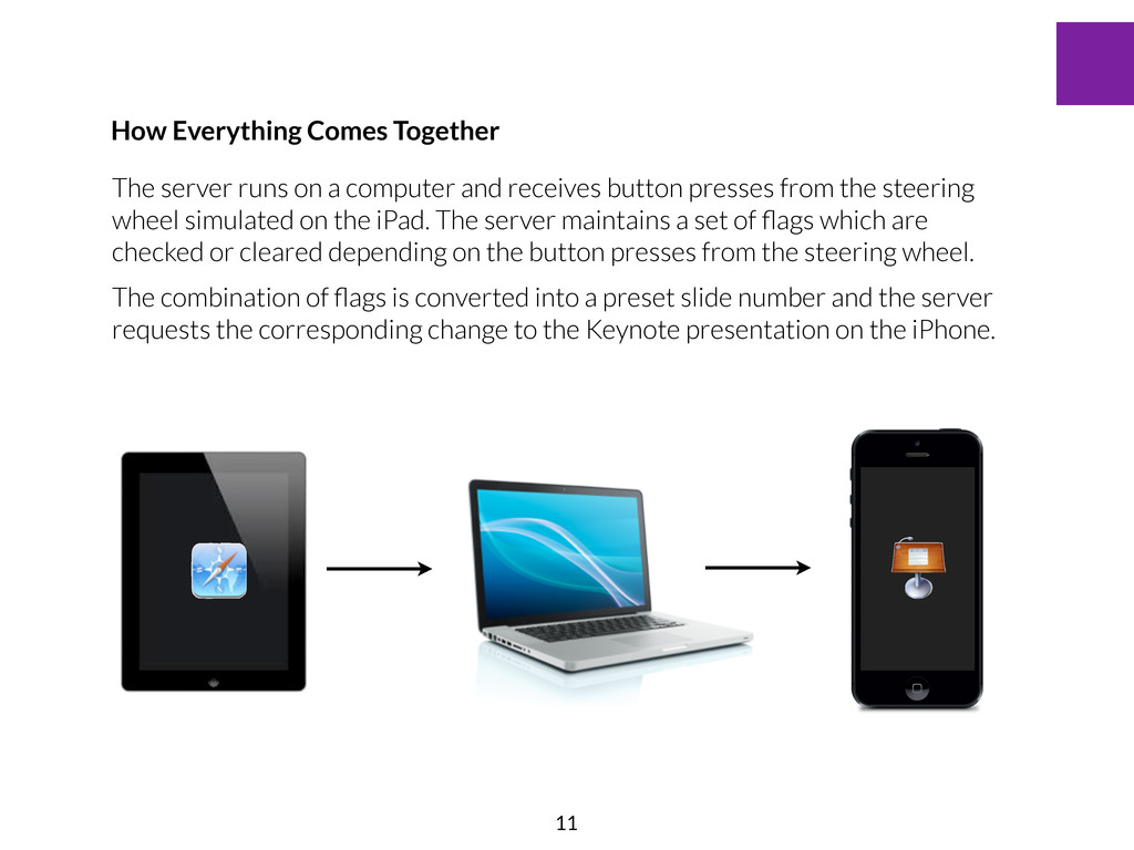
from the steering wheel simulated on the iPad. The server maintains a set of flags which are checked or cleared depending on the button presses from the steering wheel. The combination of flags is converted into a preset slide number and the server requests the corresponding change to the Keynote presentation on the iPhone. How Everything Comes Together 11
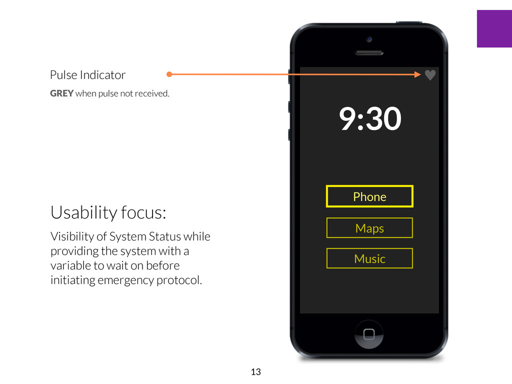
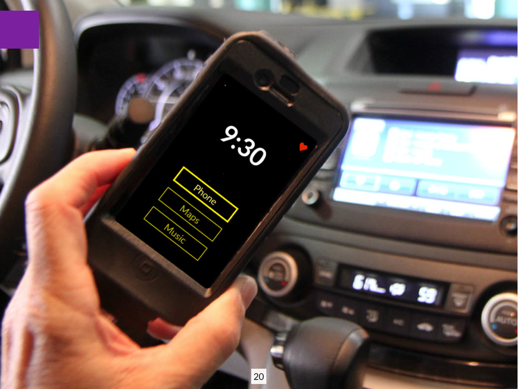
Phone Maps Music Usability focus: Visibility through a reminder that system is functioning correctly. The heart is a real world metaphor for the pulse for clear mapping. Prototype Walkthrough 12
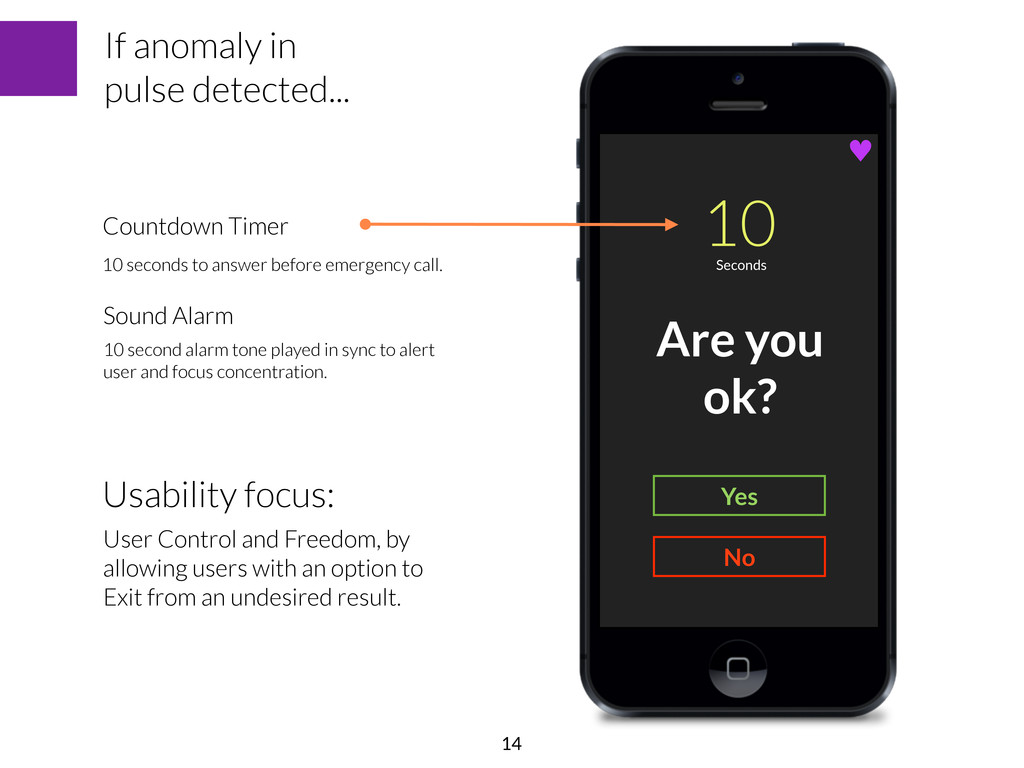
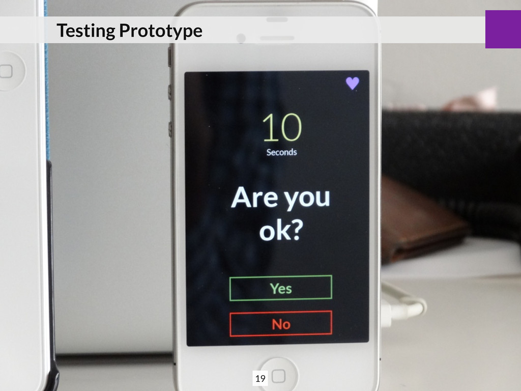
10 seconds to answer before emergency call. If anomaly in pulse detected... Usability focus: User Control and Freedom, by allowing users with an option to Exit from an undesired result. Sound Alarm 10 second alarm tone played in sync to alert user and focus concentration. 14
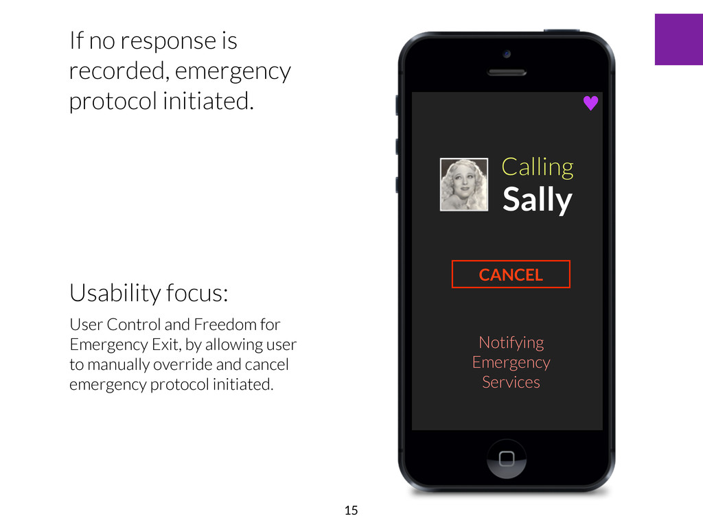
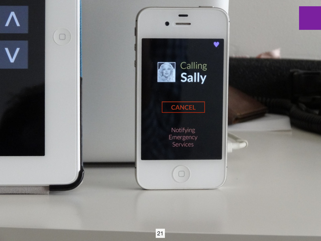
recorded, emergency protocol initiated. CANCEL Usability focus: User Control and Freedom for Emergency Exit, by allowing user to manually override and cancel emergency protocol initiated. 15
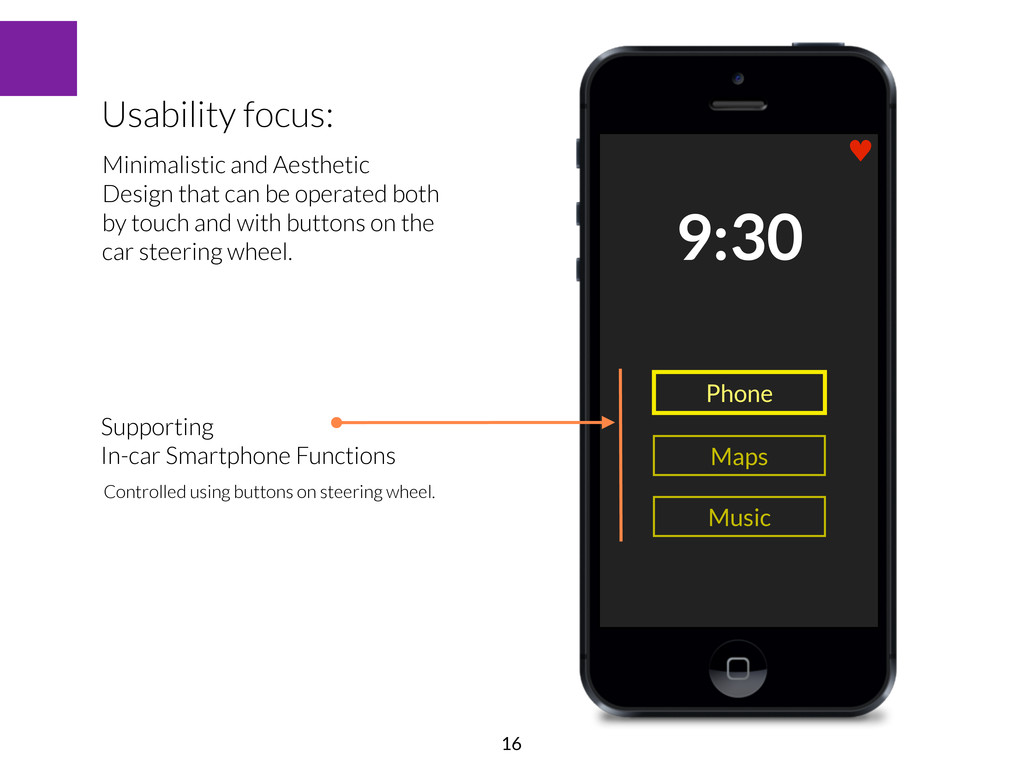
buttons on steering wheel. Music Usability focus: Minimalistic and Aesthetic Design that can be operated both by touch and with buttons on the car steering wheel. 16
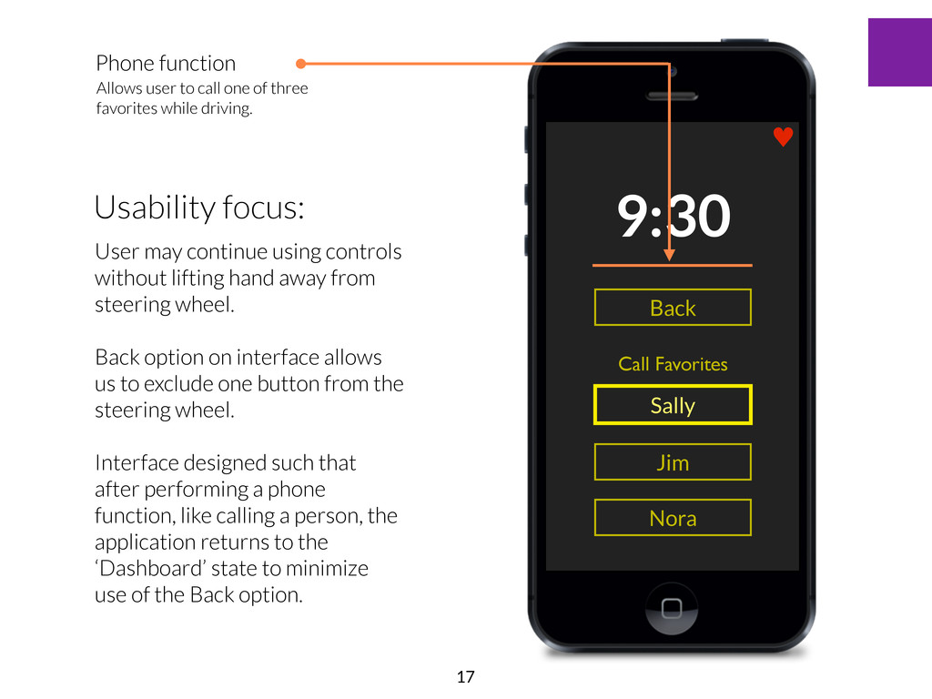
using controls without lifting hand away from steering wheel. Back option on interface allows us to exclude one button from the steering wheel. Interface designed such that after performing a phone function, like calling a person, the application returns to the ‘Dashboard’ state to minimize use of the Back option. Call Favorites Back ♥ Phone function Allows user to call one of three favorites while driving. 17
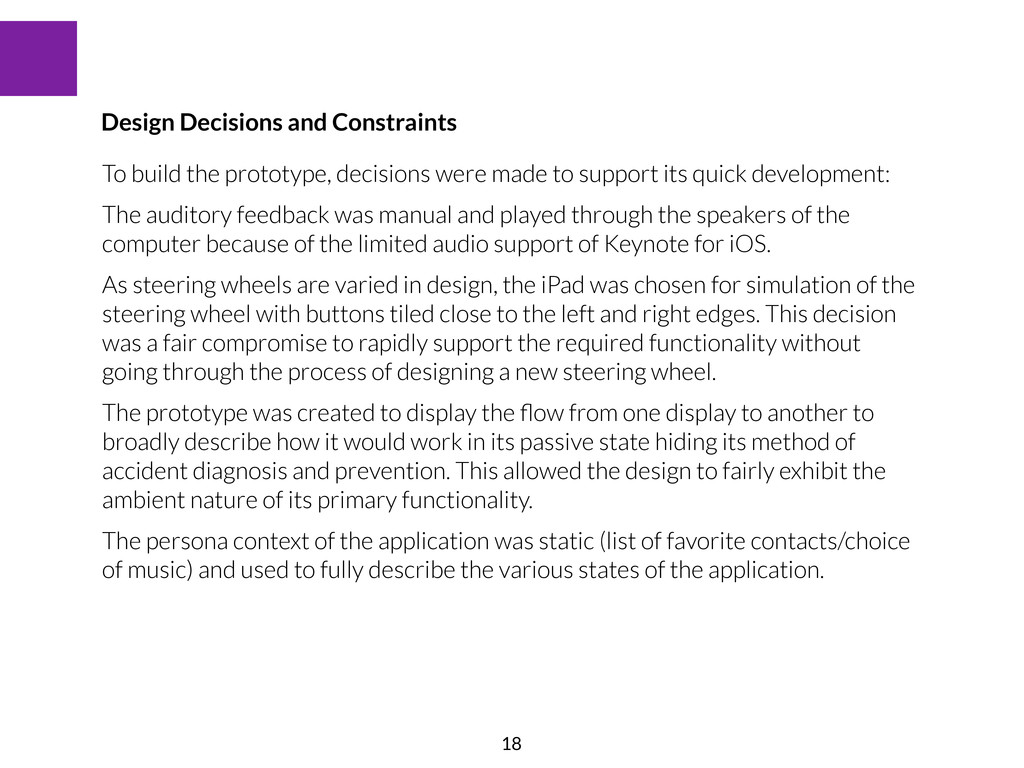
quick development: The auditory feedback was manual and played through the speakers of the computer because of the limited audio support of Keynote for iOS. As steering wheels are varied in design, the iPad was chosen for simulation of the steering wheel with buttons tiled close to the left and right edges. This decision was a fair compromise to rapidly support the required functionality without going through the process of designing a new steering wheel. The prototype was created to display the flow from one display to another to broadly describe how it would work in its passive state hiding its method of accident diagnosis and prevention. This allowed the design to fairly exhibit the ambient nature of its primary functionality. The persona context of the application was static (list of favorite contacts/choice of music) and used to fully describe the various states of the application. Design Decisions and Constraints 18
comparing the various options available for docking smartphones and the iPhone in particular, it became evident that car docking stations are designed to be used primarily in landscape orientation. It may therefore be useful to support both orientations. Car interfaces primary use bright hues of red, green or blue for backlighting buttons and interface elements. The choice of UI color seemed to blend well with a variety of car dashboard displays. Observations on Testing: Smartphone Application Steering wheels on many cars available today have controls for music players on docked smartphones. It might therefore be fairly easy to natively support the buttons from various manufacturers. While pressing the Yes/No button and OK buttons for various operations, it was noticed that the user tried to use the Yes and OK buttons interchangeably. Future designs might therefore condense their functionality into one button. A fundamental test of design ergonomics and practical working of buttons on the steering wheel needs to be supported because of the difference in shape and position of buttons on the iPad and various steering wheels. Observations on Testing: Steering Wheel Simulation 22
previous assignment to describe an interface that can be plugged into an existing car system to support accident recovery routines. The system assumes the vehicle provides the required electrode data to process anomalous driving time behavior and suggest a path either for prevention of or, in the worst case, recovery from an accident. A physical prototype of the steering wheel button interface would allow the system to afford a more immediate, synchronized mode of feedback. The current prototype was helpful in analyzing the intricacies of controlling a display not in direct line of sight, and understanding how the missed communication may be bridged with auditory feedback. This is an increasingly apparent and important problem to solve when the vehicle does not support automatic transmission and additional focus must be given to changing the gears of the car. Transferring control of the interface to the steering wheel is thus a decision that helps most situations. 24