Upgrade to Pro — share decks privately, control downloads, hide ads and more …

Mobile CSS3

ynonperek
October 11, 2011

Mobile CSS3

ynonperek

October 11, 2011
Tweet

More Decks by ynonperek

Other Decks in Programming

Transcript

  1. Think Small Use HTML and CSS to design for small

    screen Sunday, October 9, 2011
  2. Agenda Viewports Media Queries Mobile Layout CSS Mobile-Related Features CSS

    Techniques for Mobile Apps Sunday, October 9, 2011
  3. Ynet on the iPhone page is “zoomed out” so everything

    will fit in. Sunday, October 9, 2011
  4. Viewport Most websites are optimized for 960px, but mobile devices

    usually have less. How will you show “normal” web sites on mobile ? Sunday, October 9, 2011
  5. Viewport Determines how many pixels fit on the page Mobile

    devices “do their best” to fit everything in the viewport - sometimes not optimal This can be controlled with viewports Sunday, October 9, 2011
  6. Viewport use viewport meta tag to prevent zooming <meta name=”viewport”

    content=”width=device- width, user-scalable=no, initial-scale=1”> Sunday, October 9, 2011
  7. Viewport Options Directive Example Value Meaning width width=320 width=device- width

    logical viewport width, in pixels height height=480 height=device- height logical viewport height, in pixels Sunday, October 9, 2011
  8. Viewport Options Directive Example Value Meaning user-scalable user- scalable=no user

    can zoom in/out initial-scale initial-scale=2.0 initial zoom factor maximum-scale minimum-scale maximum- scale=2.5 min/max zoom factors Sunday, October 9, 2011
  9. Viewport When should you use viewport ? Use on desktop

    optimized sites with fluid layout Use on mobile optimized site or app No need on desktop optimized site with fixed layout Sunday, October 9, 2011
  10. Viewport Quiz What does the following mean ? What is

    the recommended value ? initial-scale width user-scalable Sunday, October 9, 2011
  11. Viewport Quiz What does the following mean ? What is

    the recommended value ? initial-scale: initial page zoom factor width: width of the viewport. Use device-width user-scalable: Allow user to scale content Sunday, October 9, 2011
  12. Android Dpi Android devices support variable dpi devices Use target-densitydpi

    to control automatic scaling due to dpi differences Default value: 160 (medium density) Sunday, October 9, 2011
  13. Q & A Viewports Media Queries Mobile Layout Options CSS

    Mobile-Related Features CSS Techniques for Mobile Apps Sunday, October 9, 2011
  14. Media Queries Mobile devices vary in size and capabilities CSS

    Media Queries allow us to use different css properties based on the device Sunday, October 9, 2011
  15. Media Queries The medium density device is delivered a 320x480

    image The high density device is delivered a 480x800 image Sunday, October 9, 2011
  16. Media Queries Example #header { background:url(medium-density-image.png); } @media screen and

    (-webkit-device-pixel-ratio: 1.5) { /* CSS for high-density screens */ #header { background:url(high-density-image.png); } } @media screen and (-webkit-device-pixel-ratio: 0.75) { /* CSS for low-density screens */ #header { background:url(low-density-image.png); } } Sunday, October 9, 2011
  17. Media Queries Example It’s also possible to use completely different

    css files <link rel="stylesheet" media="screen and (-webkit-device-pixel-ratio: 1.5)" href="hdpi.css" /> <link rel="stylesheet" media="screen and (-webkit-device-pixel-ratio: 1.0)" href="mdpi.css" /> <link rel="stylesheet" media="screen and (-webkit-device-pixel-ratio: 0.75)" href="ldpi.css" /> Sunday, October 9, 2011
  18. Media Queries Query device density Query device dimensions Query device

    orientation Query iPad Sunday, October 9, 2011
  19. Query Device Dimensions Smartphones: portrait & landscape @media only screen

    and (min-device-width : 320px) and (max-device-width : 569px ) { /* style goes here */ } Sunday, October 9, 2011
  20. Query Device Dimensions Smartphones: landscape @media only screen and (min-width

    : 321px) and (max- device-width : 569px ) { /* style goes here */ } Sunday, October 9, 2011
  21. Query Device Dimensions Smartphones: portrait @media only screen and (max-width

    : 320px) { /* style goes here */ } Sunday, October 9, 2011
  22. Query Device Dimensions iPads: portraits & landscape @media only screen

    and (min-device-width : 768px) and (max-device-width : 1024px ) { /* style goes here */ } Sunday, October 9, 2011
  23. Query Device Dimensions iPads: landscape @media only screen and (min-device-width

    : 768px) and (max- device-width : 1024px ) and ( orientation : landscape ) { /* style goes here */ } Sunday, October 9, 2011
  24. Query Device Dimensions iPads: portrait @media only screen and (min-device-width

    : 768px) and (max-device- width : 1024px ) and ( orientation : portrait ) { /* style goes here */ } Sunday, October 9, 2011
  25. Media Queries html5 mobile boilerplate provides a ready made empty

    css file with all of the above http://html5boilerplate.com/mobile/ Sunday, October 9, 2011
  26. Q & A Viewports Media Queries Mobile Layout Options CSS

    Mobile-Related Features CSS Techniques for Mobile Apps Sunday, October 9, 2011
  27. Mobile Layout A nav bar at the bottom Dividing to

    pages saves bandwidth Sunday, October 9, 2011
  28. Mobile Layout Facebook keeps a top navigation bar Note the

    single column flow Sunday, October 9, 2011
  29. Mobile Layout Yahoo mobile works with the same single column

    Top navigation bar vertical scroller “twist” Sunday, October 9, 2011
  30. Exercise Implement a blog layout Show a snippet from every

    post Bonus: Have your blog look different on desktop and mobile Sunday, October 9, 2011
  31. Top Navigation Bar use floated list elements for the horizontal

    top menu wrap them in a div for the bar Sunday, October 9, 2011
  32. Design Limitations overflow: scroll is not supported on iPhone &

    Android devices. animated gif is not supported on Android devices position: fixed is not supported on iPhone & Android devices. See http://www.quirksmode.org/m/table.html for more info Sunday, October 9, 2011
  33. Q & A Viewports Media Queries Mobile Layout Options CSS

    Mobile-Related Features CSS Techniques for Mobile Apps Sunday, October 9, 2011
  34. Rounded Corners use -webkit-border- radius to get the effect No

    need to use background images Sample use: -webkit-border-radius: 8px; Sunday, October 9, 2011
  35. Shadows use -webkit-box- shadow to get a shadow effect rgba(0,

    0, 0, 0.6) will work as the shadow color Sample Use: -webkit-box-shadow: 5px 5px 5px rgba(0, 0, 0, 0.6); Sunday, October 9, 2011
  36. Gradients CSS 3.0 added support for gradients use them instead

    of background images to save bandwidth Online gradient generator: http://www.colorzilla.com/ gradient-editor/ Sunday, October 9, 2011
  37. Small Screen Design Use CSS instead of background images wherever

    possible Keep navigation elements visible and large Less is More Sunday, October 9, 2011
  38. Q & A Viewports Media Queries Mobile Layout Options CSS

    Mobile-Related Features CSS Techniques for Mobile Apps Sunday, October 9, 2011
  39. CSS Common Techniques Mobile input types Apple style icon Header

    buttons Transition Effects Sunday, October 9, 2011
  40. Apple Style Icons Take any image and create an apple

    styled icon from it using css This includes: light from top, round corners, shadows Sunday, October 9, 2011
  41. Apple Style Icons Style - container div .icon { zoom:

    5; display: inline-block; text-shadow: rgba(0, 0, 0, 0.5) 2px 2px 2px; color: #000; font: bold 11px helvetica; text-align: center; margin: 8px; } Sunday, October 9, 2011
  42. Apple Style Icons .icon div { -webkit-border-radius: 8px; width: 57px;

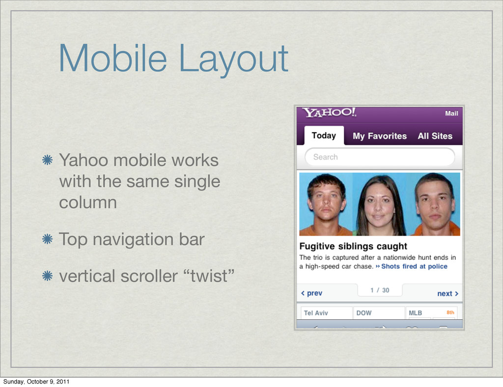
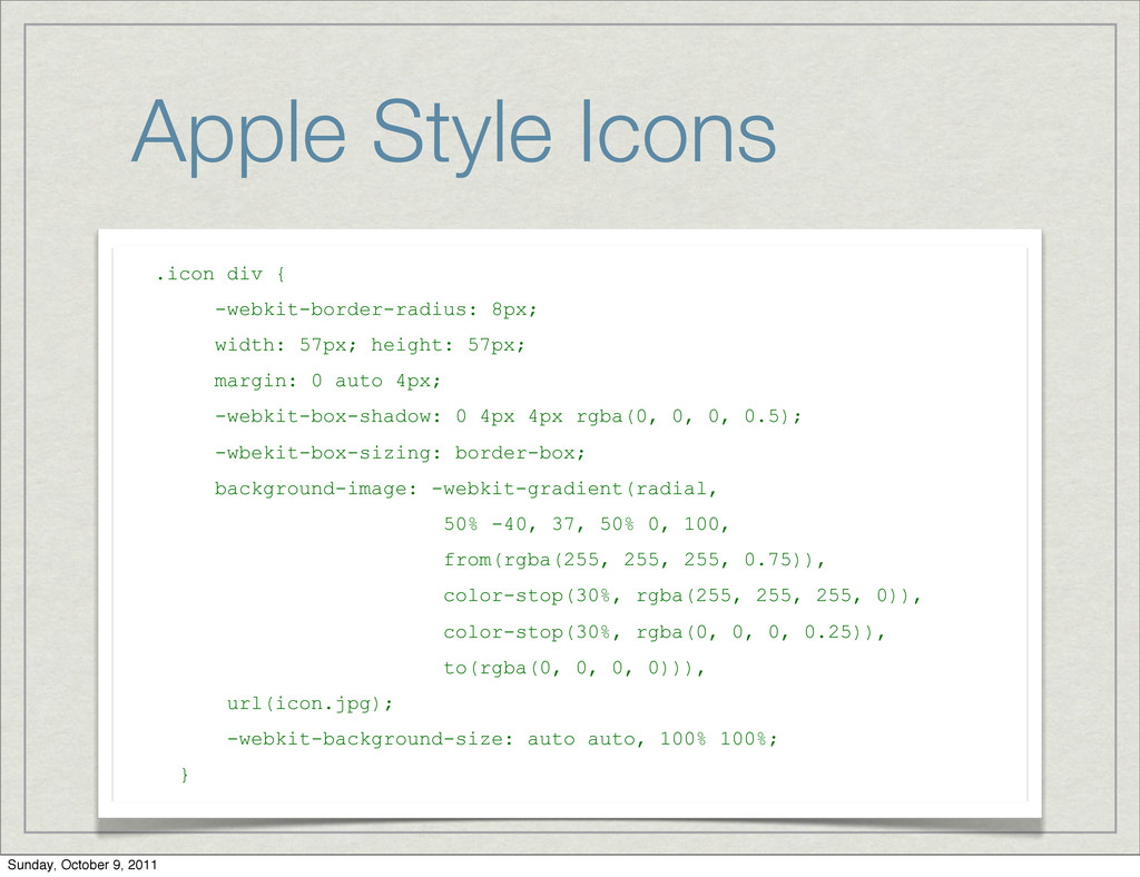
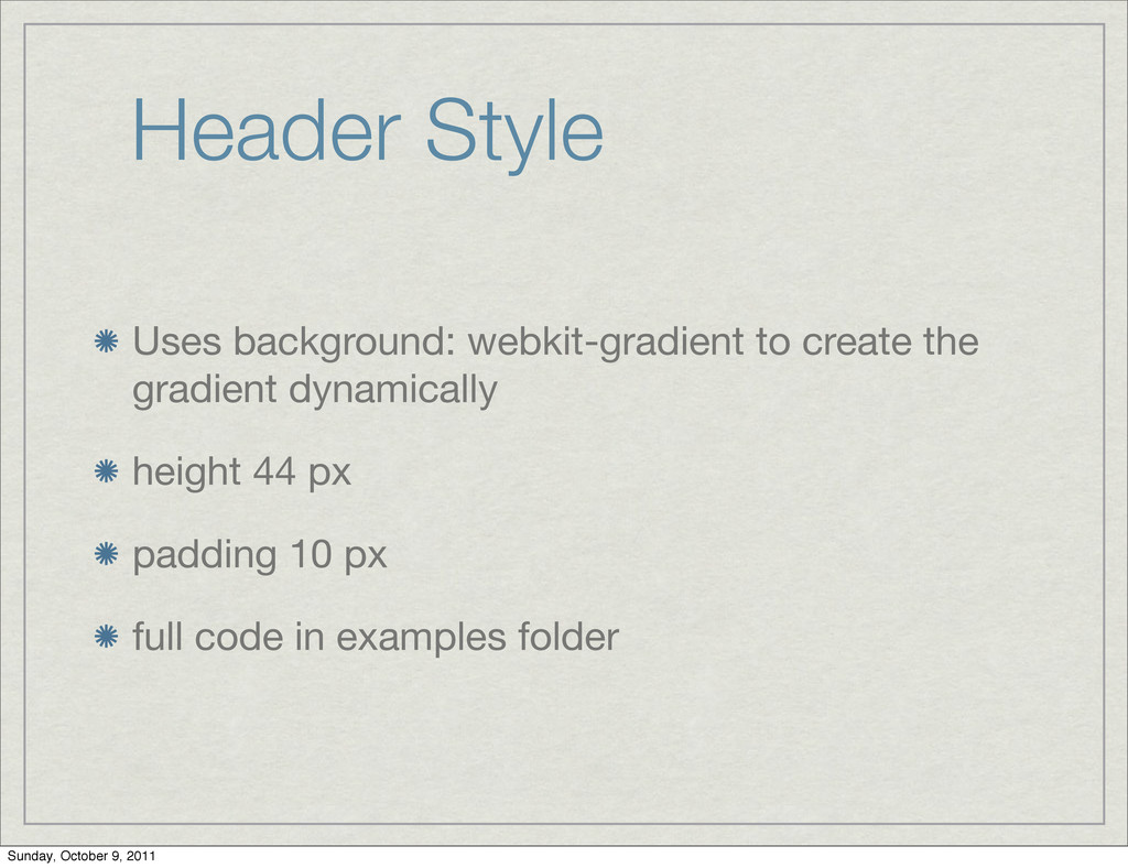
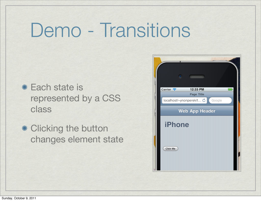
    height: 57px; margin: 0 auto 4px; -webkit-box-shadow: 0 4px 4px rgba(0, 0, 0, 0.5); -wbekit-box-sizing: border-box; background-image: -webkit-gradient(radial, 50% -40, 37, 50% 0, 100, from(rgba(255, 255, 255, 0.75)), color-stop(30%, rgba(255, 255, 255, 0)), color-stop(30%, rgba(0, 0, 0, 0.25)), to(rgba(0, 0, 0, 0))), url(icon.jpg); -webkit-background-size: auto auto, 100% 100%; } Sunday, October 9, 2011
  43. HTML Markup <body> <div class="view"> <div class="header-wrapper"> <h1>Buttons Example</h1> <a

    href="#" class="header-button">Edit</a> <a href="#" class="header-button left">Back</a> </div> </div> </body> Sunday, October 9, 2011
  44. Header Style Uses background: webkit-gradient to create the gradient dynamically

    height 44 px padding 10 px full code in examples folder Sunday, October 9, 2011
  45. Header Button Style position: absolute to fix the position to

    the left or right min-width: 44 px - finger size border radius for the rounded corners full code in examples folder Sunday, October 9, 2011
  46. CSS Common Techniques Mobile input types Apple style icon Header

    buttons Transition Effects Sunday, October 9, 2011
  47. CSS Transition Controls the transition between element states Allows animating

    transitions Uses 3D acceleration Sunday, October 9, 2011
  48. Demo - Transitions Each state is represented by a CSS

    class Clicking the button changes element state Sunday, October 9, 2011
  49. transition-property Almost any property can be animated Use all to

    catch everything Full list at: https://developer.mozilla.org/en/css/ css_transitions Sunday, October 9, 2011
  50. transition-duration How long the property animation should take Use time

    in seconds or ms (can be < 1s) Sunday, October 9, 2011
  51. transition-timing- function Determines the timing function for the animation Live

    demo at: http://www.the-art-of-web.com/css/ timing-function/ Sunday, October 9, 2011
  52. transition delay Delay between value change and animation start Can

    be used to coordinate multiple animating objects Sunday, October 9, 2011
  53. Exercise Implement a yahoo style “top news” section Click next

    to animate to the next image Click prev to animate to the previous image Hint: use a wide background image, animating background- position Sunday, October 9, 2011
  54. Transition Effects Mobile apps usually have some native animations for

    changing screens On the web, we can implement these using css transformations Sunday, October 9, 2011
  55. Slide Effect A slide effect is built of two child

    divs and a parent with overflow:hidden Sliding is achieved by changing the translate- x of the child divs Sunday, October 9, 2011
  56. Flip Effect Two divs take the same position, one is

    rotated 180 deg on the y axis webkit-backface-visibility causes its back to stay hidden A click changes the rotation for both divs Sunday, October 9, 2011