Upgrade to Pro
— share decks privately, control downloads, hide ads and more …
Speaker Deck
Features
Speaker Deck
PRO
Sign in
Sign up for free
Search
Search
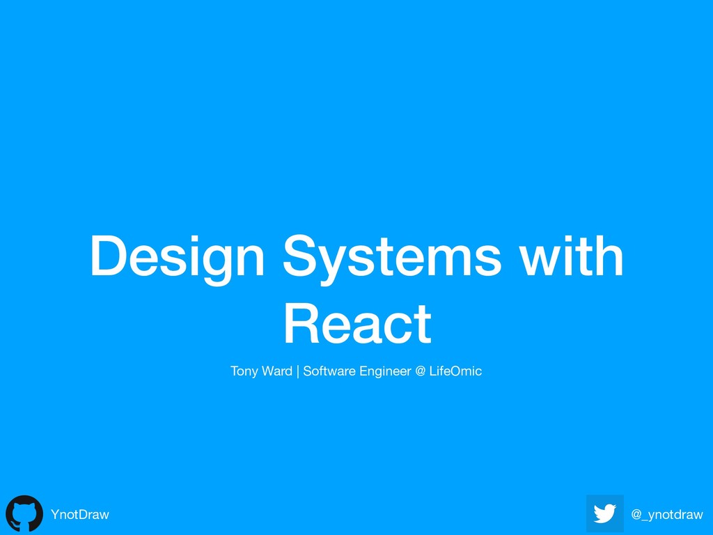
Design Systems with React
Search
Sponsored
·
Ship Features Fearlessly
Turn features on and off without deploys. Used by thousands of Ruby developers.
→
Tony Ward
May 21, 2019
Programming
240
0
Share
Embed
Copy iframe code
Copy JS code
Copy link
Start on current slide
Design Systems with React
I talk at a local meetup about design systems and their advantages
Tony Ward
May 21, 2019
More Decks by Tony Ward
See All by Tony Ward
EmberConf2018: Toyota's Shared Component Library
ynotdraw
0
870
Other Decks in Programming
See All in Programming
Language Server 使ってる? 〜VSCode と Zed の場合〜 / Are you using a Language Server? ~For VS Code and Zed~
handlename
0
820
Webフレームワークの ベンチマークについて
yusukebe
0
190
SLOをサービス品質の共通言語にするために 取り組んできたこと
wakana0222
0
280
Performance Engineering for Everyone
elenatanasoiu
0
250
symfony/aiとlaravel/boost
77web
0
110
作って学ぶ、 JSX (TSX) ランタイムの基本
syumai
7
1.7k
AI駆動開発を妨げる技術的負債の解消アプローチ / ai-refactoring-approach
minodriven
17
8.5k
The Bowling Game - From Imperative to Functional Programming - Part 1
philipschwarz
PRO
0
230
エンジニアにデザインハーネスを 〜デザインプロセスを規定するためのハーネス〜 / Design harness from an engineer's perspective
rkaga
2
590
SREの積み重ねがAI駆動開発のガードレールになった ― 7つの実践/SRE Guardrails The 7
tomoyakitaura
5
850
OS アップデート対応の取り組み方がもっと共有されてほしい
andpad
0
110
どこまでゆるくて許されるのか
tk3fftk
0
300
Featured
See All Featured
XXLCSS - How to scale CSS and keep your sanity
sugarenia
250
1.3M
Marketing to machines
jonoalderson
1
5.5k
Color Theory Basics | Prateek | Gurzu
gurzu
0
380
From π to Pie charts
rasagy
0
230
Raft: Consensus for Rubyists
vanstee
141
7.6k
ラッコキーワード サービス紹介資料
rakko
1
3.8M
Thoughts on Productivity
jonyablonski
76
5.2k
Marketing Yourself as an Engineer | Alaka | Gurzu
gurzu
0
250
How to Create Impact in a Changing Tech Landscape [PerfNow 2023]
tammyeverts
55
3.4k
The Pragmatic Product Professional
lauravandoore
37
7.3k
Connecting the Dots Between Site Speed, User Experience & Your Business [WebExpo 2025]
tammyeverts
11
960
JavaScript: Past, Present, and Future - NDC Porto 2020
reverentgeek
52
6k
Transcript
Design Systems with React YnotDraw @_ynotdraw Tony Ward | Software
Engineer @ LifeOmic
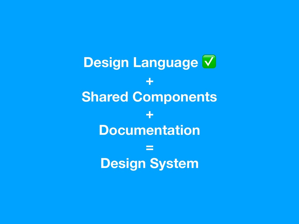
Design Language + Shared Components + Documentation = Design System
Design Language
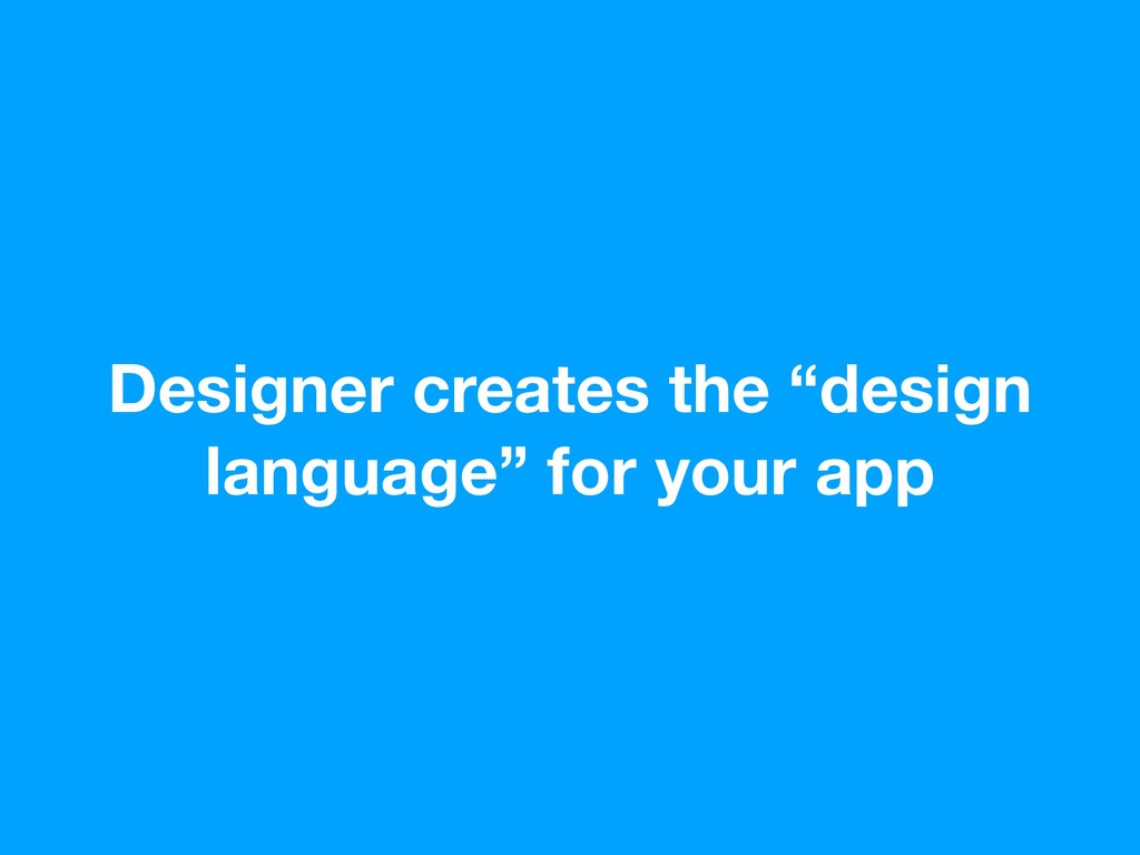
Designer creates the “design language” for your app
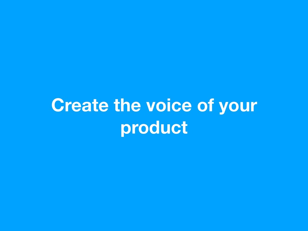
Create the voice of your product
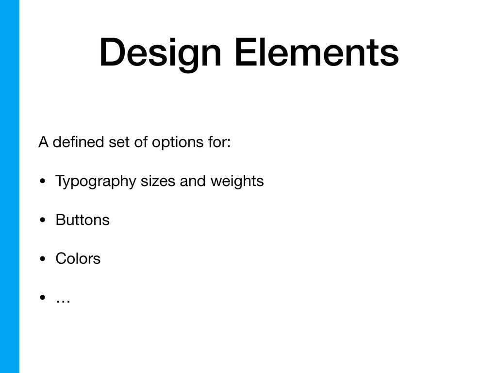
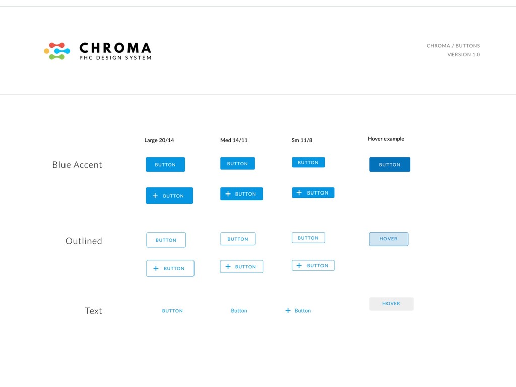
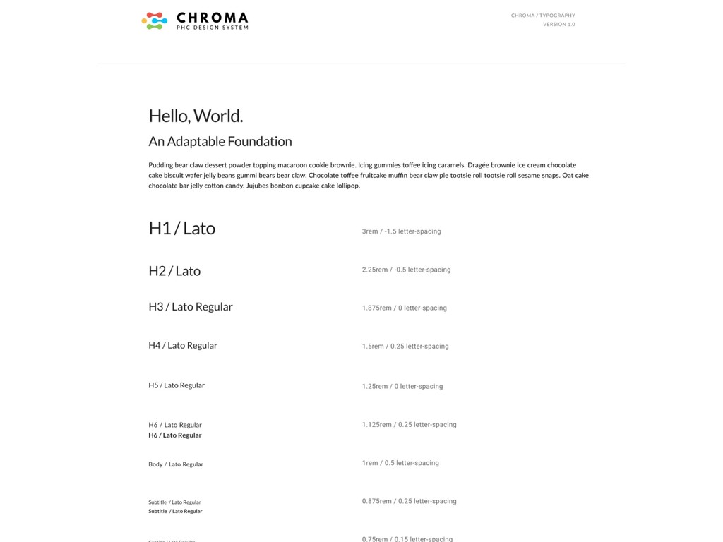
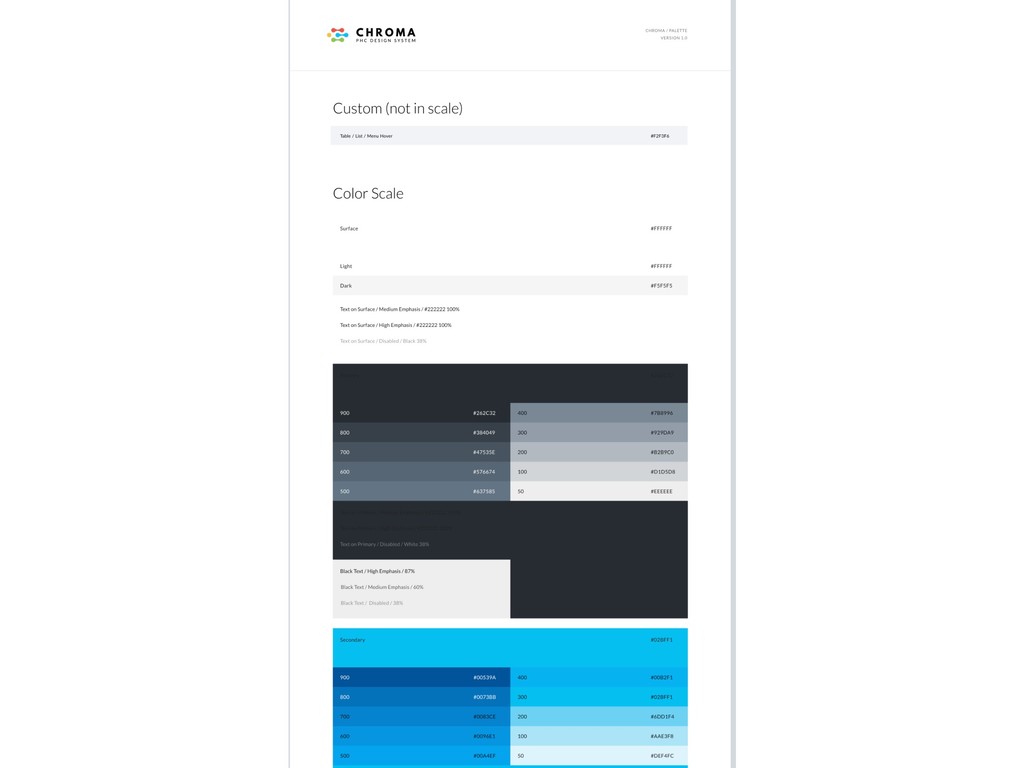
Design Elements A defined set of options for: • Typography
sizes and weights • Buttons • Colors • …
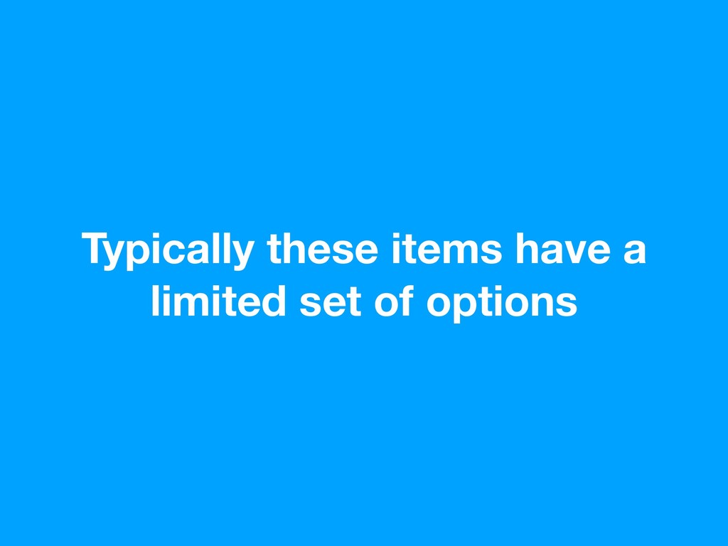
Typically these items have a limited set of options
None
None
None
None
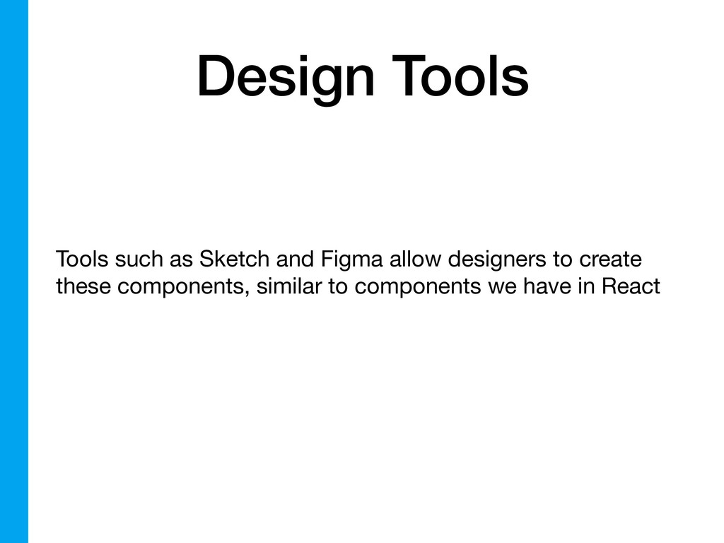
Design Tools Tools such as Sketch and Figma allow designers
to create these components, similar to components we have in React
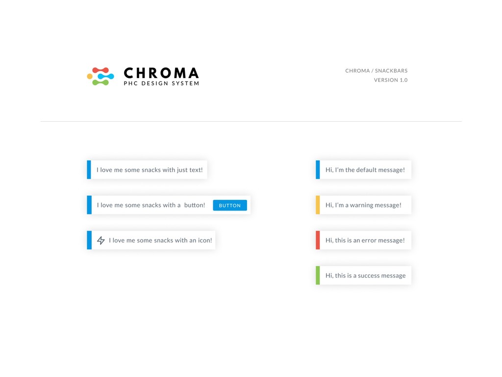
Typically the primitive design elements are composed together to create
other components
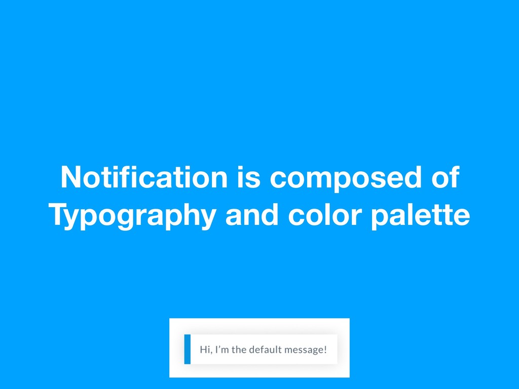
Notification is composed of Typography and color palette
Mockups for a feature/product are created by composing these components
together
Design Language ✅ + Shared Components + Documentation = Design
System
Shared Components
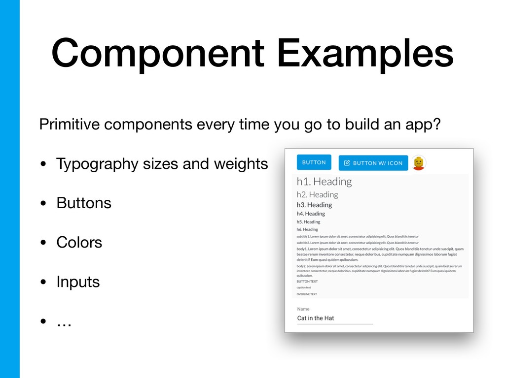
Component Examples Primitive components every time you go to build
an app? • Typography sizes and weights • Buttons • Colors • Inputs • …
Your designer probably already created these as part of their
design language
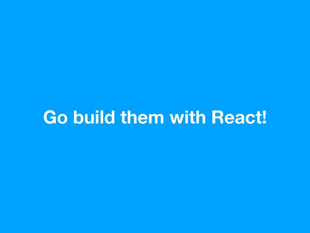
Go build them with React!
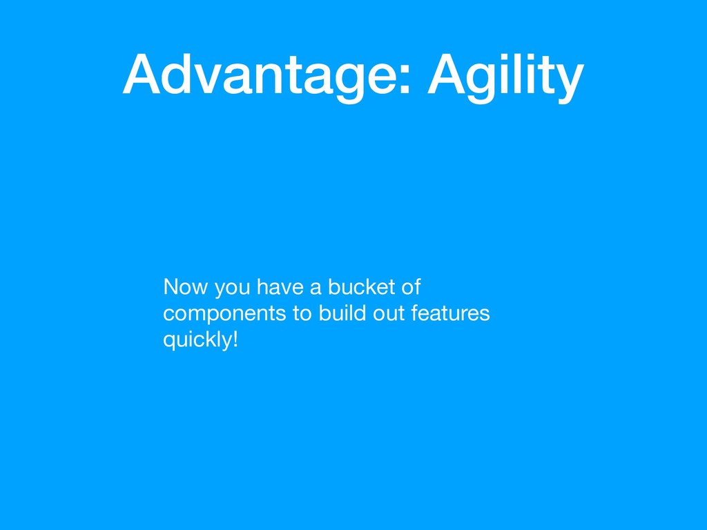
Advantage: Agility Now you have a bucket of components to
build out features quickly!
Separate Apps Do you have separate apps under the same
product, that need to look and feel as though they are the same app? (Now made easier with the primitive components! Each app just imports the package.)
Maybe you want to go one step deeper…
Don’t Reinvent the Wheel Share components, utilities, etc. across product
lines
Your app becomes pages composed of many shared, consistent, and
familiar components
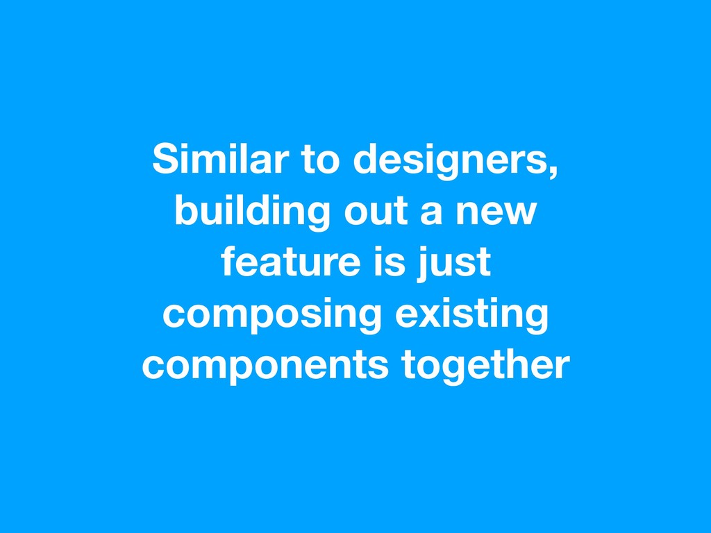
Similar to designers, building out a new feature is just
composing existing components together
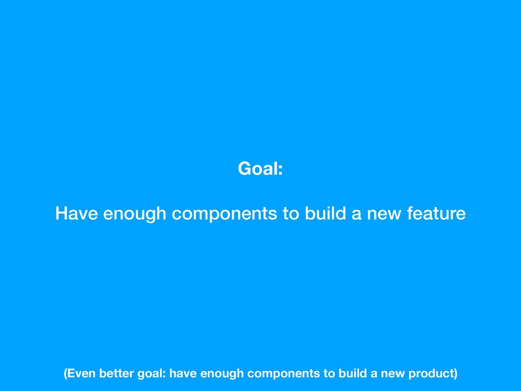
Goal: Have enough components to build a new feature (Even
better goal: have enough components to build a new product)
So you and your designer built a bunch of components,
how do people learn about them?
Design Language ✅ + Shared Components ✅ + Documentation =
Design System
Documentation
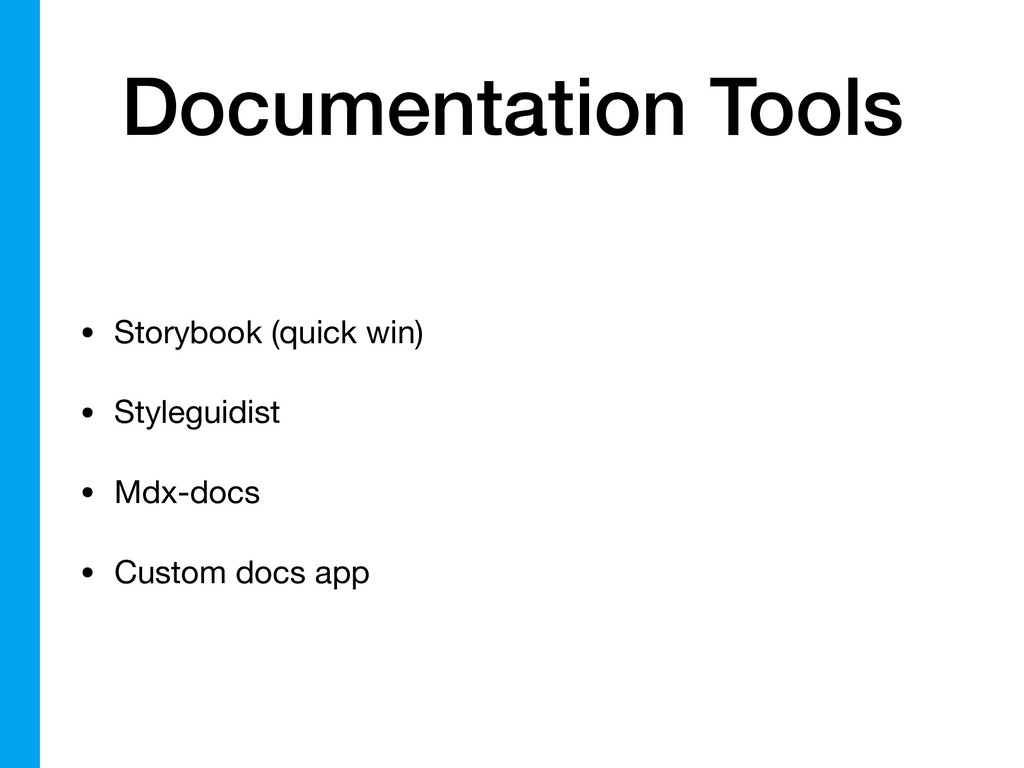
Documentation Tools • Storybook (quick win) • Styleguidist • Mdx-docs
• Custom docs app
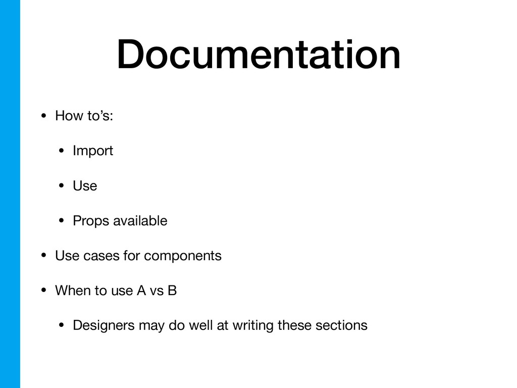
Documentation • How to’s: • Import • Use • Props
available • Use cases for components • When to use A vs B • Designers may do well at writing these sections
Design Language ✅ + Shared Components ✅ + Documentation ✅
= Design System
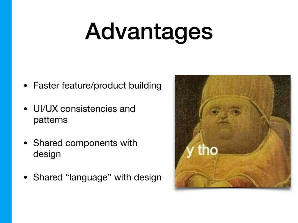
Advantages • Faster feature/product building • UI/UX consistencies and patterns
• Shared components with design • Shared “language” with design
Advantages • Great for onboarding new devs • Well-tested components
working across all browsers
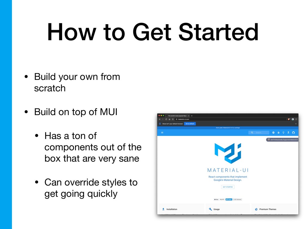
How to Get Started • Build your own from scratch
• Build on top of MUI • Has a ton of components out of the box that are very sane • Can override styles to get going quickly
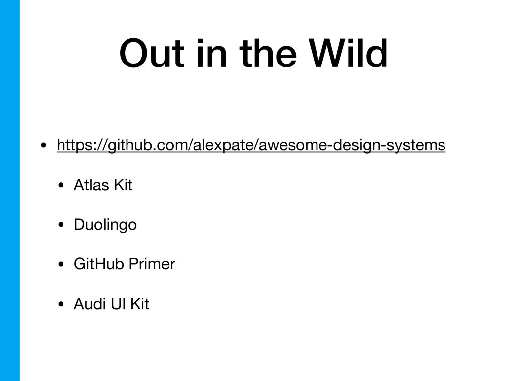
Out in the Wild • https://github.com/alexpate/awesome-design-systems • Atlas Kit •
Duolingo • GitHub Primer • Audi UI Kit
Design Resource
YnotDraw @_ynotdraw Thanks!
 ynotdraw
 handlename
 yusukebe
 wakana0222
 elenatanasoiu
 77web
77web
 syumai
 minodriven
 philipschwarz
 rkaga
rkaga
 tomoyakitaura
 andpad
 tk3fftk
 sugarenia
 jonoalderson
 gurzu
gurzu
 rasagy
 vanstee
 rakko
rakko
 jonyablonski
 tammyeverts
 lauravandoore
 reverentgeek