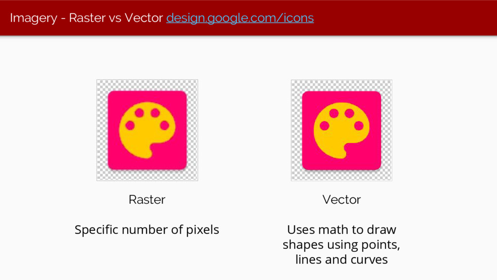
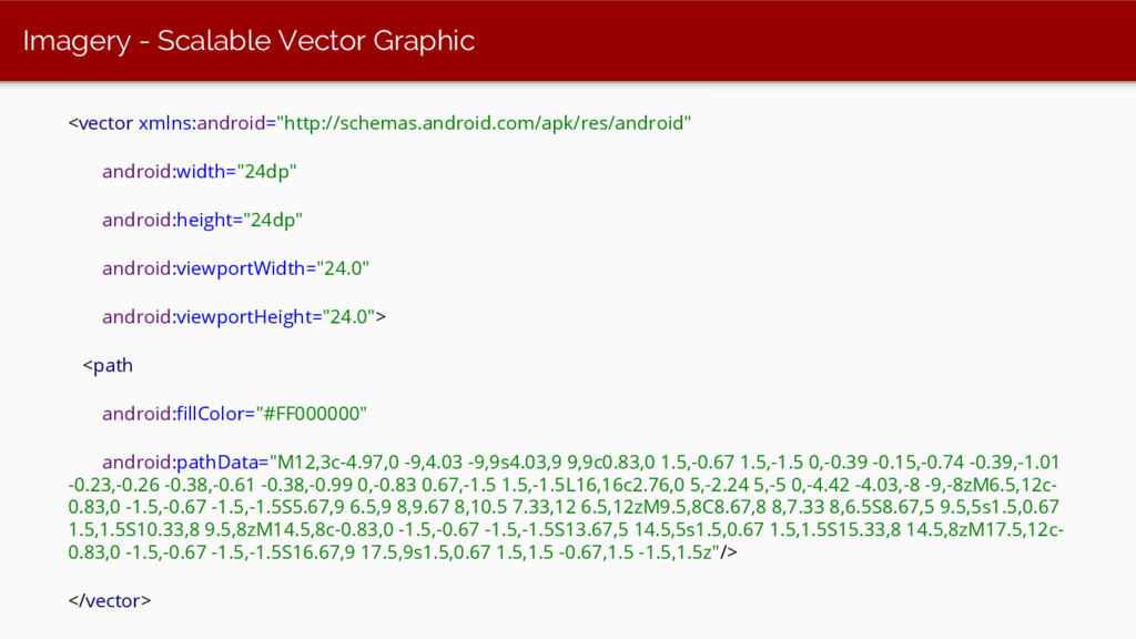
Upgrade to Pro — share decks privately, control downloads, hide ads and more …

AnDevCon Boston 2016

AnDevCon Boston 2016

Yash Prabhu

August 03, 2016
Tweet

More Decks by Yash Prabhu

Other Decks in Technology

Transcript

  1. A Practical Guide to Material
    Design Implementation
    Yash Prabhu
    @yashvprabhu
    github.com/yprabhu
    yprabhu.com
    dramafever.com

    View Slide

  2. We’re hiring! www.jsco.re/8ns9

    View Slide

  3. Slides
    https://goo.gl/17QNFZ
    Demo
    github.com/yprabhu/materialworld

    View Slide

  4. Why?
    ``````````````````
    @yashvprabhu

    View Slide

  5. What is Material Design?
    ``````````````````
    @yashvprabhu

    View Slide

  6. Skeuomorphic vs. Flat vs. Material Design

    View Slide

  7. Glossary
    ★ Screen Size
    ★ Screen density (ldpi, mdpi, hdpi, xhdpi, xxhdpi, xxxhdpi)
    ★ Orientation (landscape/portrait)
    ★ Resolution (physical pixel)
    ★ Density Independent Pixel (virtual pixel)
    px = dp * (dpi / 160)

    View Slide

  8. Components
    Layout
    Animation
    Style
    @yashvprabhu

    View Slide

  9. Style

    View Slide

  10. Style
    Color

    View Slide

  11. Style
    Color
    Theme

    View Slide

  12. Style
    Color
    Theme
    Typography

    View Slide

  13. Style
    Color
    Theme
    Typography
    Imagery

    View Slide

  14. Color
    Primary 500
    Primary Dark 700
    Accent 500
    https://www.google.
    com/design/spec/style/c
    olor.html

    View Slide

  15. Theme
    Theme.Holo & Theme.
    AppCompat

    View Slide

  16. How do I apply a theme?
    <br/><item name="colorPrimary">@color/color_primary</item><br/><item name="colorPrimaryDark">@color/color_primary_dark</item><br/><item name="colorAccent">@color/color_accent</item><br/><item name="android:windowBackground"><br/>@color/window_background </item><br/>
    @yashvprabhu

    View Slide

  17. Material
    Palette
    materialpalette.com

    View Slide

  18. Material Palette

    View Slide

  19. Color & Theme
    Theme.AppCompat
    compile "com.android.
    support:appcompat-v7:
    24.1.1"

    View Slide

  20. Typography
    Use scaled pixels (sp)
    Min 12sp

    View Slide

  21. Custom Fonts
    Google Fonts
    fonts.google.com
    Chris Jenkins’
    Calligraphy Library
    github.
    com/chrisjenx/Calligrap
    hy

    View Slide

  22. Custom Fonts
    // Programmatically defining typefaces
    TextView tv=(TextView)findViewById(R.id.custom); Typeface
    face=Typeface.createFromAsset(getAssets(), "fonts/Verdana.ttf"); tv.
    setTypeface(face);
    // Using Chris Jenkins’ Calligraphy library
    android:layout_width="wrap_content"
    android:layout_height="wrap_content"
    fontPath="fonts/Verdana.ttf"/>

    View Slide

  23. Imagery
    compile
    "com.android.support:
    palette-v7:24.1.1"

    View Slide

  24. Imagery
    Bitmap myBitmap = BitmapFactory.decodeResource(getResources(), R.
    drawable.bulbasaur);
    if (myBitmap != null && !myBitmap.isRecycled()) {
    Palette.from(myBitmap).generate(paletteListener);
    }

    View Slide

  25. Imagery continued.. Palette - Extracting colors from an image
    Palette.PaletteAsyncListener paletteListener = new Palette.PaletteAsyncListener(){
    @Override public void onGenerated(Palette palette) {
    int defColor = 0x000000;
    int vibrant = palette.getVibrantColor(defColor);
    int vibrantLight = palette.getLightVibrantColor(defColor);
    int vibrantDark = palette.getDarkVibrantColor(defColor);
    int muted = palette.getMutedColor(defaultColor);
    int mutedLight = palette.getLightMutedColor(defaultColor);
    int mutedDark = palette.getDarkMutedColor(defaultColor); }}

    View Slide

  26. Imagery continued.. Palette - Extracting colors from an image

    View Slide

  27. Imagery - Raster vs Vector design.google.com/icons
    Raster
    Specific number of pixels
    Vector
    Uses math to draw
    shapes using points,
    lines and curves

    View Slide

  28. Imagery - Adding Vector Assets

    View Slide

  29. Imagery - Adding Vector Assets

    View Slide

  30. Imagery - Scalable Vector Graphic
    android:width="24dp"
    android:height="24dp"
    android:viewportWidth="24.0"
    android:viewportHeight="24.0">
    android:fillColor="#FF000000"
    android:pathData="M12,3c-4.97,0 -9,4.03 -9,9s4.03,9 9,9c0.83,0 1.5,-0.67 1.5,-1.5 0,-0.39 -0.15,-0.74 -0.39,-1.01
    -0.23,-0.26 -0.38,-0.61 -0.38,-0.99 0,-0.83 0.67,-1.5 1.5,-1.5L16,16c2.76,0 5,-2.24 5,-5 0,-4.42 -4.03,-8 -9,-8zM6.5,12c-
    0.83,0 -1.5,-0.67 -1.5,-1.5S5.67,9 6.5,9 8,9.67 8,10.5 7.33,12 6.5,12zM9.5,8C8.67,8 8,7.33 8,6.5S8.67,5 9.5,5s1.5,0.67
    1.5,1.5S10.33,8 9.5,8zM14.5,8c-0.83,0 -1.5,-0.67 -1.5,-1.5S13.67,5 14.5,5s1.5,0.67 1.5,1.5S15.33,8 14.5,8zM17.5,12c-
    0.83,0 -1.5,-0.67 -1.5,-1.5S16.67,9 17.5,9s1.5,0.67 1.5,1.5 -0.67,1.5 -1.5,1.5z"/>

    View Slide

  31. Imagery - Adding Vector Assets
    android:id="@+id/imageButton"
    android:src="@drawable/ic_color_lens_24dp"
    android:layout_width="wrap_content"
    android:layout_height="wrap_content" />

    View Slide

  32. Layout

    View Slide

  33. Layout
    Keylines & Grids

    View Slide

  34. Layout
    Keylines & Grids
    Device Metrics

    View Slide

  35. Layout
    Keylines & Grids
    Device Metrics
    Responsive UI

    View Slide

  36. Layout
    Keylines & Grids
    Device Metrics
    Responsive UI
    Breakpoints

    View Slide

  37. Keylines & Grids

    View Slide

  38. Keyline Pushing
    app for design
    testing
    play.google.
    com/store/apps/details?
    id=com.faizmalkani.
    keylines

    View Slide

  39. Device metrics design.google.com/devices

    View Slide

  40. Responsive UI
    res/layout/main_activity.xml # For handsets
    res/layout-sw600dp/main_activity.xml # For tablets
    @yashvprabhu

    View Slide

  41. Responsive UI
    res/layout/show_activity.xml
    res/layout-w1024dp/show_activity.xml

    View Slide

  42. Breakpoints
    google.com/design/spec/layout/responsive-ui.html#responsive-ui-breakpoints

    View Slide

  43. Animation

    View Slide

  44. Animation
    Surface Reaction

    View Slide

  45. Animation
    Surface Reaction
    Shadow

    View Slide

  46. Ripples & Elevation
    Ripples (indicates touch input)
    ?android:attr/selectableItemBackground
    ?android:attr/selectableItemBackgroundBorderless
    android:colorControlHighlight
    Elevation (lifts to your touch)
    ● Resting 2dp
    ● Raised 8dp
    @yashvprabhu

    View Slide

  47. Components

    View Slide

  48. Components
    Button

    View Slide

  49. Components
    Button
    FloatingActionButton

    View Slide

  50. Components
    Button
    FloatingActionButton
    CardView

    View Slide

  51. Components
    Button
    FloatingActionButton
    CardView
    RecyclerView

    View Slide

  52. Components
    Button
    FloatingActionButton
    CardView
    RecyclerView
    Toolbar & Appbar

    View Slide

  53. Components
    Button
    FloatingActionButton
    CardView
    RecyclerView
    Toolbar & Appbar
    CoordinatorLayout

    View Slide

  54. Demo app
    github.
    com/yprabhu/materialw
    orld
    Forked from
    github.
    com/chrisbanes/cheeses
    quare
    @yashvprabhu

    View Slide

  55. app/build.gradle
    compile "com.android.support:palette-v7:24.1.1"
    compile "com.android.support:design:24.1.1"
    compile "com.android.support:appcompat-v7:24.1.1"
    compile "com.android.support:recyclerview-v7:24.1.1"
    compile "com.android.support:cardview-v7:24.1.1"
    https://source.android.com/source/build-numbers.html

    View Slide

  56. Button
    Flat Raised FloatingActionButton (FAB)

    View Slide

  57. Button Demo

    View Slide

  58. Post-21 (Lollipop)


    android:state_pressed="true"
    android:drawable="@drawable/bg_button_yellow_pressed"/>
    android:drawable="@drawable/bg_button_yellow_normal"/>

    View Slide

  59. Pre-21 (Lollipop) workaround

    xmlns:android="http://schemas.android.com/apk/res/android"
    android:color="?android:colorControlHighlight">


    View Slide

  60. Floating Action Button
    Default Elevation: 6 dp
    Normal size: 56 dp
    Mini size: 40 dp

    View Slide

  61. FAB widget
    android:layout_height="wrap_content"
    android:layout_width="wrap_content"
    android:src="@drawable/ic_discuss"
    android:layout_margin="@dimen/fab_margin"
    android:clickable="true"
    app:fabSize="normal"
    app:layout_anchor="@id/appbar"
    app:layout_anchorGravity="bottom|right|end" />

    View Slide

  62. Cards - compile 'com.android.support:cardview-v7:24.1.1'
    Card resting elevation: 2dp
    Card raised elevation: 8dp
    @yashvprabhu

    View Slide

  63. CardView
    android:layout_height="wrap_content"
    android:layout_margin="@dimen/card_margin">
    android:layout_width="match_parent"
    android:layout_height="wrap_content"
    android:background="?android:selectableItemBackground">
    …..


    View Slide

  64. Lists & Grids -
    RecyclerView
    compile
    'com.android.support:
    recyclerview-v7:24.1.1'

    View Slide

  65. Under the hood
    Recycler View
    Layout Manager
    Adapter Dataset
    Item Animator

    View Slide

  66. Add RecyclerView to your layout
    android:id="@+id/my_recycler_view"
    android:scrollbars="vertical"
    android:layout_width="match_parent"
    android:layout_height="match_parent"/>

    View Slide

  67. View Item
    android:layout_width="match_parent"
    android:layout_height="wrap_content"
    android:orientation="vertical"
    android:gravity="center">
    android:id="@+id/avatar"
    android:layout_width="wrap_content"
    android:layout_height="wrap_content"
    tools:src="@drawable/bulbasaur"/>
    android:id="@+id/text"
    android:layout_width="match_parent"
    android:layout_height="wrap_content"
    android:gravity="center"
    tools:textColor="@color/black"
    tools:text="Bulbasaur"
    tools:textAppearance="?attr/textAppearanceListItem"/>

    View Slide

  68. Set LayoutManager & Adapter
    // Set either of these layout managers
    recyclerView.setLayoutManager(new LinearLayoutManager(context));
    recyclerView.setLayoutManager(new GridLayoutManager(context,
    GRID_SPAN));
    recyclerView.setLayoutManager(new StaggeredGridLayoutManager
    (STAGGERED_GRID_SPAN, StaggeredGridLayoutManager.VERTICAL));
    // Set adapter on recycler view
    recyclerView.setAdapter(new GridRecyclerViewAdapter(activity);

    View Slide

  69. Appbar, Toolbar, ActionBar?

    View Slide

  70. Common Pattern

    View Slide

  71. Common Pattern
    Coordinator
    Layout

    View Slide

  72. Common Pattern - Coordinator Layout
    @yashvprabhu

    View Slide

  73. Common Pattern
    CoordinatorLayout
    -- AppBarLayout
    -- Toolbar
    -- TabLayout
    -- ViewPager
    -- FloatingActionButton
    @yashvprabhu

    View Slide

  74. Scrolling behaviors
    CoordinatorLayout
    xmlns:app="http://schemas.android.com/apk/res-auto"
    Toolbar
    app:layout_scrollFlags="scroll|enterAlways|snap"
    ViewPager
    app:layout_behavior="@string/appbar_scrolling_view_behavior"
    Resource: guides.codepath.com/android/Handling-Scrolls-with-
    CoordinatorLayout

    View Slide

  75. Common Pattern

    View Slide

  76. Common Pattern
    CoordinatorLayout
    -- AppBarLayout
    -- CollapsingToolbarLayout
    -- ImageView
    -- Toolbar
    -- NestedScrollView
    -- LinearLayout
    -- CardView
    -- Button
    -- FloatingActionButton
    @yashvprabhu

    View Slide

  77. Scrolling behaviors
    CoordinatorLayout
    xmlns:app="http://schemas.android.com/apk/res-auto"
    CollapsingToolbarLayout
    app:layout_scrollFlags="scroll|exitUntilCollapsed"
    NestedScrollView
    app:layout_behavior="@string/appbar_scrolling_view_behavior"
    Resource: guides.codepath.com/android/Handling-Scrolls-with-
    CoordinatorLayout

    View Slide

  78. Style
    Color
    Theme
    Typography
    Imagery
    Recap

    View Slide

  79. Layout
    Keylines & Grids
    Device Metrics
    Responsive UI
    Breakpoints
    Recap

    View Slide

  80. Animation Surface Reaction
    Shadow
    Recap

    View Slide

  81. Components
    Button
    FloatingActionButton
    CardView
    RecyclerView
    Toolbar & Appbar
    CoordinatorLayout
    Recap

    View Slide

  82. Resources
    Udacity - Material Design for
    Android Developers
    Android Developer Docs - Material
    Design
    Google Material Design Guidelines
    Material Doc
    Codepath
    Google IO 2016 Codelabs
    Plaid app by Nick Butcher
    MaterialWorld (Cheesesquare)

    View Slide

  83. Image Credit
    Windows Phone - Flat design
    iOS Phone - Skeuomorphic design
    Android - Material Design
    PokemonDB
    Android Design Docs
    Android Developer docs

    View Slide

  84. @yashvprabhu
    github.com/yprabhu/materialworld
    yprabhu.com
    dramafever.com
    We’re hiring! www.jsco.re/8ns9
    Q&A
    Slides: https://goo.gl/17QNFZ

    View Slide