$30 off During Our Annual Pro Sale. View Details »

DroidCon NYC 2016 - A Material Design guide for Android developers

Yash Prabhu
September 29, 2016

DroidCon NYC 2016 - A Material Design guide for Android developers

Yash Prabhu

September 29, 2016
Tweet

More Decks by Yash Prabhu

Other Decks in Technology

Transcript

  1. A Material Design Guide for
    Android Developers
    Yash Prabhu
    @yashvprabhu github.com/yprabhu dramafever.com

    View Slide

  2. Why?

    View Slide

  3. What is Material Design?

    View Slide

  4. Skeuomorphism Flat Material
    @yashvprabhu

    View Slide

  5. Terminology
    Screen Size - small, normal, large, xlarge
    Screen density - ldpi, mdpi, hdpi, xhdpi, xxhdpi, xxxhdpi
    Orientation - landscape/portrait
    Resolution - physical pixel
    Density Independent Pixel - virtual pixel
    px = dp * (dpi / 160)
    Example: 240 dp screen, 1 dp = 1.5 px

    View Slide

  6. Style
    Layout
    Animation
    Components
    Patterns

    View Slide

  7. Style

    View Slide

  8. Color

    View Slide

  9. Color
    Theme

    View Slide

  10. Color
    Theme
    Typography

    View Slide

  11. Color
    Theme
    Typography
    Imagery

    View Slide

  12. Color
    Primary 500
    Primary Dark 700
    Accent 500
    https://material.google.com/style/color
    .html

    View Slide

  13. Material Palette
    materialpalette.com

    View Slide

  14. View Slide

  15. Theme
    Theme.Holo &
    Theme.AppCompat

    View Slide

  16. How do I apply a theme?
    <br/><item name="colorPrimary">@color/color_primary</item><br/><item name="colorPrimaryDark">@color/color_primary_dark</item><br/><item name="colorAccent">@color/color_accent</item><br/><item name="android:windowBackground"><br/>@color/window_background </item><br/>

    View Slide

  17. Color & Theme
    Theme.AppCompat
    compile
    "com.android.support:appcompat-v7:2
    4.2.1"
    http://developer.android.com/training/
    material/theme.html#StatusBar
    @yashvprabhu

    View Slide

  18. Typography
    Use scaled pixels (sp)
    Min 12sp

    View Slide

  19. Custom Fonts
    Google Fonts
    fonts.google.com
    Chris Jenkins’ Calligraphy Library
    github.com/chrisjenx/Calligraphy
    @yashvprabhu

    View Slide

  20. Custom Fonts
    // Programmatically defining typefaces
    TextView tv= (TextView) findViewById(R.id.custom);
    Typeface face=Typeface.createFromAsset(getAssets(), "fonts/Verdana.ttf");
    tv.setTypeface(face);
    // Using Chris Jenkins’ Calligraphy library
    android:layout_width="wrap_content"
    android:layout_height="wrap_content"
    fontPath="fonts/Verdana.ttf"/>

    View Slide

  21. Imagery - Palette API
    For extracting colors from an image
    compile
    "com.android.support:palette-v7:24.2.1"
    @yashvprabhu

    View Slide

  22. Palette API
    Bitmap myBitmap = BitmapFactory.decodeResource(getResources(),
    R.drawable.chicago);
    if (myBitmap != null && !myBitmap.isRecycled()) {
    Palette.from(myBitmap).generate(paletteListener);
    }

    View Slide

  23. Palette API
    Palette.PaletteAsyncListener paletteListener = new Palette.PaletteAsyncListener(){
    @Override public void 
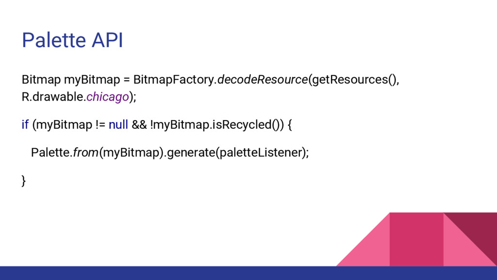
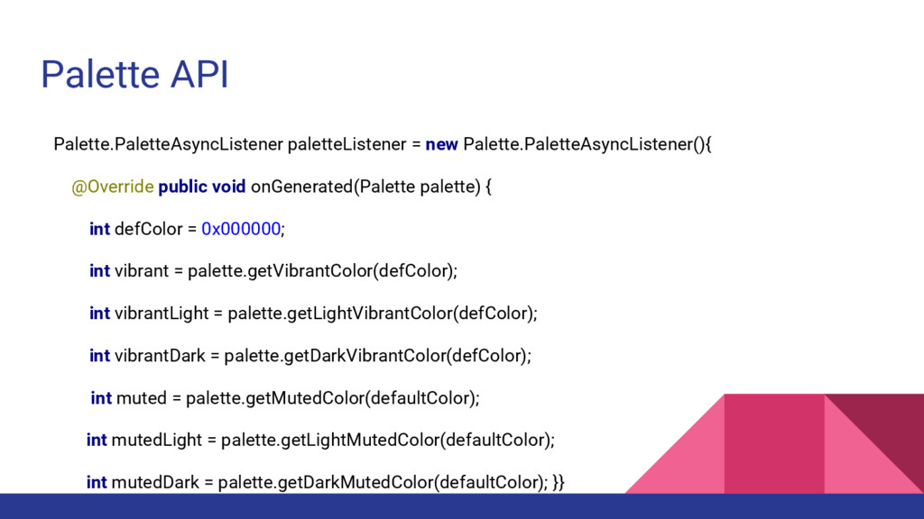
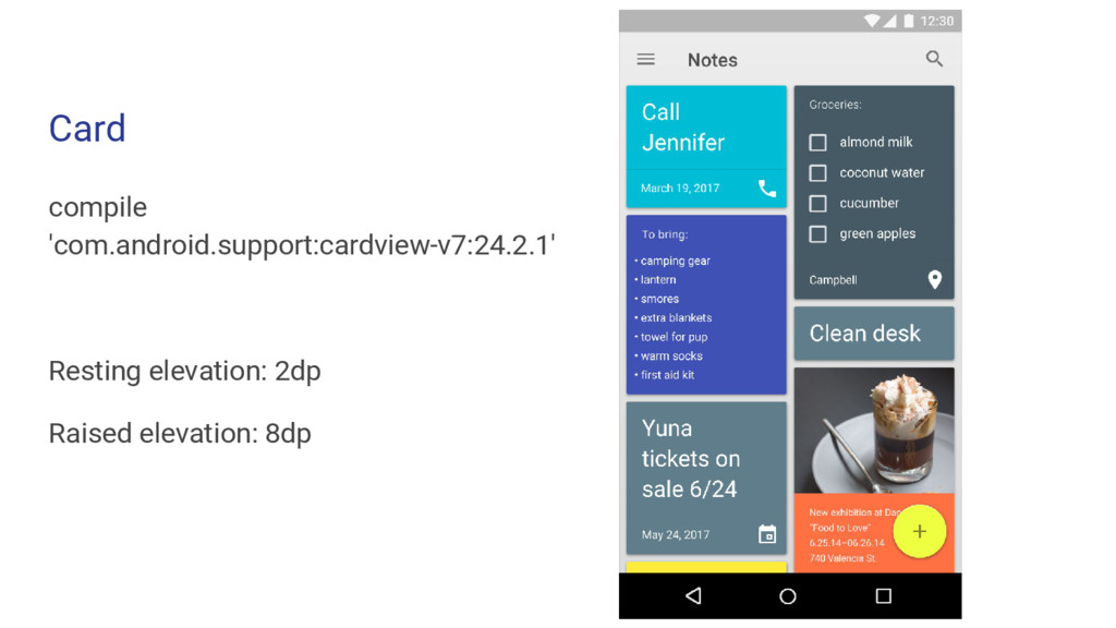
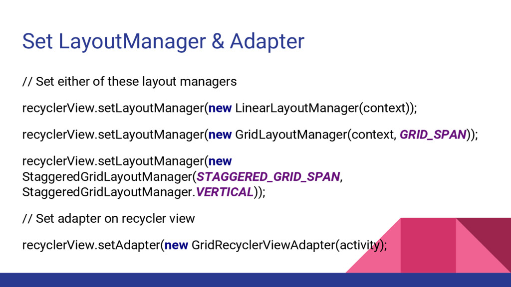
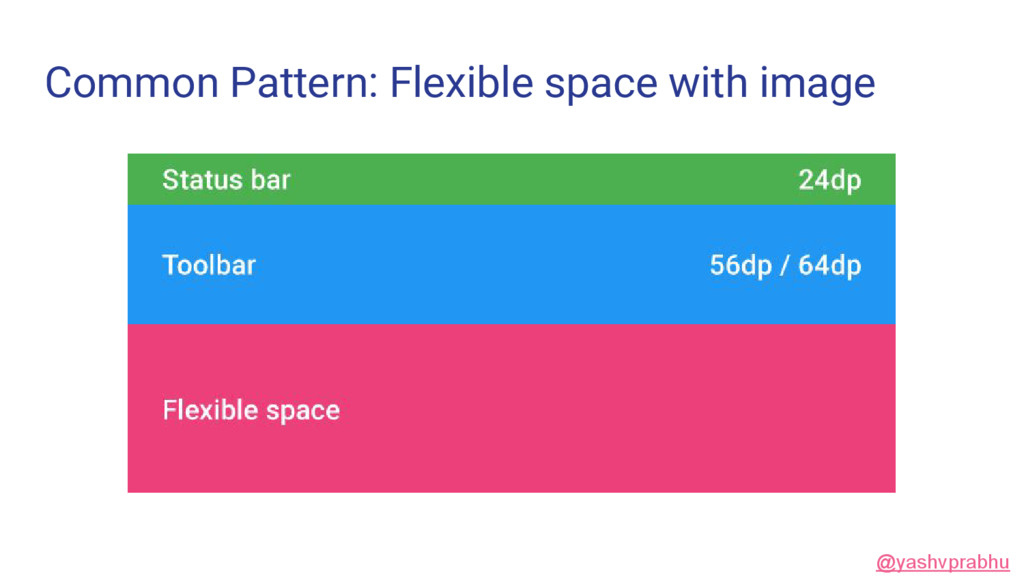
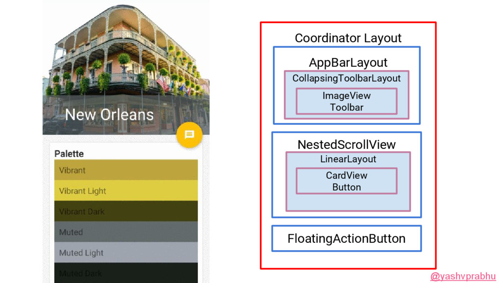
onGenerated(Palette palette) {
    int defColor = 0x000000;
    int vibrant = palette.getVibrantColor(defColor);
    int vibrantLight = palette.getLightVibrantColor(defColor);
    int vibrantDark = palette.getDarkVibrantColor(defColor);
    int muted = palette.getMutedColor(defaultColor);
    int mutedLight = palette.getLightMutedColor(defaultColor);
    int mutedDark = palette.getDarkMutedColor(defaultColor); }}

    View Slide

  24. View Slide

  25. Imagery - Raster & Vector
    Specific number of pixels Uses math to draw shapes using
    points, lines and curves
    @yashvprabhu

    View Slide

  26. Imagery - Adding Vector assets

    View Slide

  27. View Slide

  28. Imagery - Scalable Vector Graphic (svg)
    android:width="24dp"
    android:height="24dp"
    android:viewportWidth="24.0"
    android:viewportHeight="24.0">
    android:pathData="M12,3c-4.97,0 -9,4.03 -9,..."/>

    View Slide

  29. Imagery - Adding Vector Assets
    android:id="@+id/imageButton"
    android:src="@drawable/ic_color_lens_24dp"
    android:layout_width="wrap_content"
    android:layout_height="wrap_content" />

    View Slide

  30. Layout

    View Slide

  31. Keylines & Grids

    View Slide

  32. Keylines & Grids
    Device Metrics

    View Slide

  33. Keylines & Grids
    Device Metrics
    Responsive UI

    View Slide

  34. Keylines & Grids
    Device Metrics
    Responsive UI
    Breakpoints

    View Slide

  35. Keylines & Grids
    8dp baseline grid
    4dp typography grid

    View Slide

  36. Design Testing apps
    Keyline Pushing
    Material Cue
    @yashvprabhu

    View Slide

  37. Device metrics design.google.com/devices

    View Slide

  38. Responsive UI
    res/layout/main_activity.xml # For handsets
    res/layout-sw600dp/main_activity.xml # For tablets

    View Slide

  39. Responsive UI
    layout-w1024dp/show_activity.xml

    View Slide

  40. Breakpoints
    @yashvprabhu

    View Slide

  41. Animation

    View Slide

  42. Surface Reaction

    View Slide

  43. Surface Reaction
    Shadow

    View Slide

  44. Surface Reaction
    Ripples (indicates touch input)
    ?android:attr/selectableItemBackground
    ?android:attr/selectableItemBackgroundBor
    derless
    android:colorControlHighlight

    View Slide

  45. Shadow
    Elevation (lifts to your touch)
    ● Resting 2dp
    ● Raised 8dp

    View Slide

  46. Components

    View Slide

  47. Button

    View Slide

  48. Button
    Card

    View Slide

  49. Button
    Card
    Grid & List

    View Slide

  50. Button
    Card
    Grid & List
    Snackbar

    View Slide

  51. Demo
    github.com/yprabhu/materialworld
    Forked from
    github.com/chrisbanes/cheesesquare
    @yashvprabhu

    View Slide

  52. app/build.gradle
    compile "com.android.support:palette-v7:24.2.1"
    compile "com.android.support:design:24.2.1"
    compile "com.android.support:appcompat-v7:24.2.1"
    compile "com.android.support:recyclerview-v7:24.2.1"
    compile "com.android.support:cardview-v7:24.2.1"

    View Slide

  53. Buttons
    Flat Raised FAB

    View Slide

  54. View Slide

  55. Post-21 (Lollipop)


    android:state_pressed="true"
    android:drawable="@drawable/bg_button_yellow_pressed"/>
    android:drawable="@drawable/bg_button_yellow_normal"/>

    View Slide

  56. Pre-21 (Lollipop) workaround

    xmlns:android="http://schemas.android.com/apk/res/android"
    android:color="?android:colorControlHighlight">


    View Slide

  57. FloatingActionButton (FAB)
    Default Elevation: 6 dp
    Normal size: 56 dp, Mini size: 40 dp

    View Slide

  58. FAB Widget
    android:layout_height="wrap_content"
    android:layout_width="wrap_content"
    android:src="@drawable/ic_discuss"
    android:layout_margin="@dimen/fab_margin"
    android:clickable="true"
    app:fabSize="normal"
    app:layout_anchor="@id/appbar"
    app:layout_anchorGravity="bottom|right|end" />

    View Slide

  59. Card
    compile
    'com.android.support:cardview-v7:24.2.1'
    Resting elevation: 2dp
    Raised elevation: 8dp

    View Slide

  60. CardView
    android:layout_height="wrap_content"
    android:layout_margin="@dimen/card_margin">
    android:layout_width="match_parent"
    android:layout_height="wrap_content"
    android:background="?android:selectableItemBackground">

    View Slide

  61. Lists & Grids
    compile
    'com.android.support:recyclerview-v7:24.2.1'

    View Slide

  62. RecyclerView - Under the hood
    Recycler View
    Layout Manager
    Adapter Dataset
    Item Animator
    @yashvprabhu

    View Slide

  63. Add RecyclerView to your layout
    android:id="@+id/my_recycler_view"
    android:scrollbars="vertical"
    android:layout_width="match_parent"
    android:layout_height="match_parent"/>

    View Slide

  64. Add RecyclerView item
    android:layout_width="match_parent"
    android:layout_height="wrap_content"
    android:orientation="vertical"
    android:gravity="center">
    android:id="@+id/avatar"
    android:layout_width="wrap_content"
    android:layout_height="wrap_content"
    tools:src="@drawable/newyork"/>
    android:id="@+id/text"
    android:layout_width="match_parent"
    android:layout_height="wrap_content"
    android:gravity="center"
    tools:textAppearance=
    "?attr/textAppearanceListItem"/>

    View Slide

  65. Set LayoutManager & Adapter
    // Set either of these layout managers
    recyclerView.setLayoutManager(new LinearLayoutManager(context));
    recyclerView.setLayoutManager(new GridLayoutManager(context, GRID_SPAN));
    recyclerView.setLayoutManager(new
    StaggeredGridLayoutManager(STAGGERED_GRID_SPAN,
    StaggeredGridLayoutManager.VERTICAL));
    // Set adapter on recycler view
    recyclerView.setAdapter(new GridRecyclerViewAdapter(activity);

    View Slide

  66. Snackbar
    ● Swipeable, can have actions
    ● Single-line snackbar height: 48dp
    ● Multi-line snackbar height: 80dp
    ● Text: Roboto Regular 14sp
    ● Action button: Roboto Med 14sp, all-caps
    ● Default background fill: #323232 100%

    View Slide

  67. Snackbar
    Snackbar.make(view, "Archived", Snackbar.LENGTH_SHORT)
    .setAction(R.string.undo_string, new UndoListener());
    .show();

    View Slide

  68. Patterns

    View Slide

  69. @yashvprabhu

    View Slide

  70. Appbar, Toolbar, ActionBar?
    @yashvprabhu

    View Slide

  71. Appbar, Toolbar, ActionBar?
    @yashvprabhu

    View Slide

  72. Common Pattern: Tabs
    @yashvprabhu

    View Slide

  73. CoordinatorLayout
    AppBarLayout
    ToolBarLayout
    TabLayout
    ViewPager
    FloatingActionButton
    @yashvprabhu

    View Slide

  74. Scrolling Behaviors
    CoordinatorLayout
    xmlns:app="http://schemas.android.com/apk/res-auto"
    Toolbar
    app:layout_scrollFlags="scroll|enterAlways|snap"
    ViewPager
    app:layout_behavior="@string/appbar_scrolling_view_behavior"
    @yashvprabhu

    View Slide

  75. Common Pattern: Flexible space with image
    @yashvprabhu

    View Slide

  76. Coordinator Layout
    AppBarLayout
    CollapsingToolbarLayout
    NestedScrollView
    FloatingActionButton
    ImageView
    Toolbar
    LinearLayout
    CardView
    Button
    @yashvprabhu

    View Slide

  77. Scrolling Behaviors
    CoordinatorLayout
    xmlns:app="http://schemas.android.com/apk/res-auto"
    CollapsingToolbarLayout
    app:layout_scrollFlags="scroll|exitUntilCollapsed"
    NestedScrollView
    app:layout_behavior="@string/appbar_scrolling_view_behavior"
    @yashvprabhu

    View Slide

  78. Style
    Layout
    Animation
    Components
    Patterns

    View Slide

  79. Image Credit
    Windows Phone - Flat design
    iOS Phone - Skeuomorphic design
    Android - Material Design
    Android Design Docs
    Android Developer docs
    City images
    @yashvprabhu

    View Slide

  80. Resources
    Udacity - Material Design for Android Developers
    Android Developer 
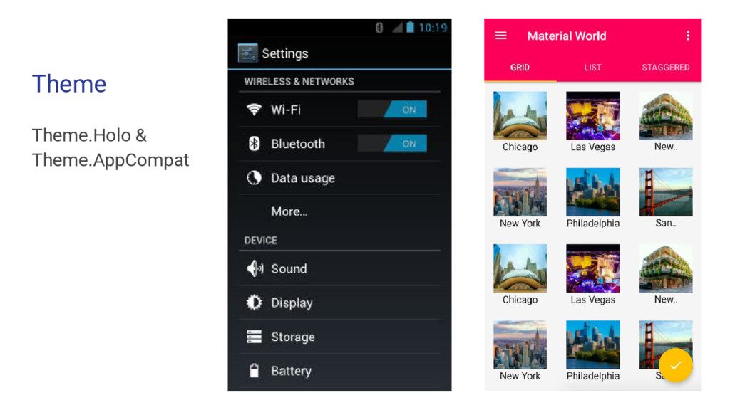
Docs - Material Design
    Google Material Design Guidelines
    Plaid app by Nick Butcher
    MaterialWorld (Cheesesquare by Chris Banes)
    Tutorials: Material Doc, Codepath, Google IO 2016 Codelabs
    @yashvprabhu

    View Slide

  81. A Practical Guide to Material
    Design Implementation
    Yash Prabhu
    @yashvprabhu github.com/yprabhu dramafever.com
    We’re hiring! www.jsco.re/8ns9

    View Slide