Upgrade to Pro — share decks privately, control downloads, hide ads and more …

Building a production-ready Chat SDK with Jetpack Compose (Droidcon Berlin 2021)

Marton Braun
October 20, 2021
680

Building a production-ready Chat SDK with Jetpack Compose (Droidcon Berlin 2021)

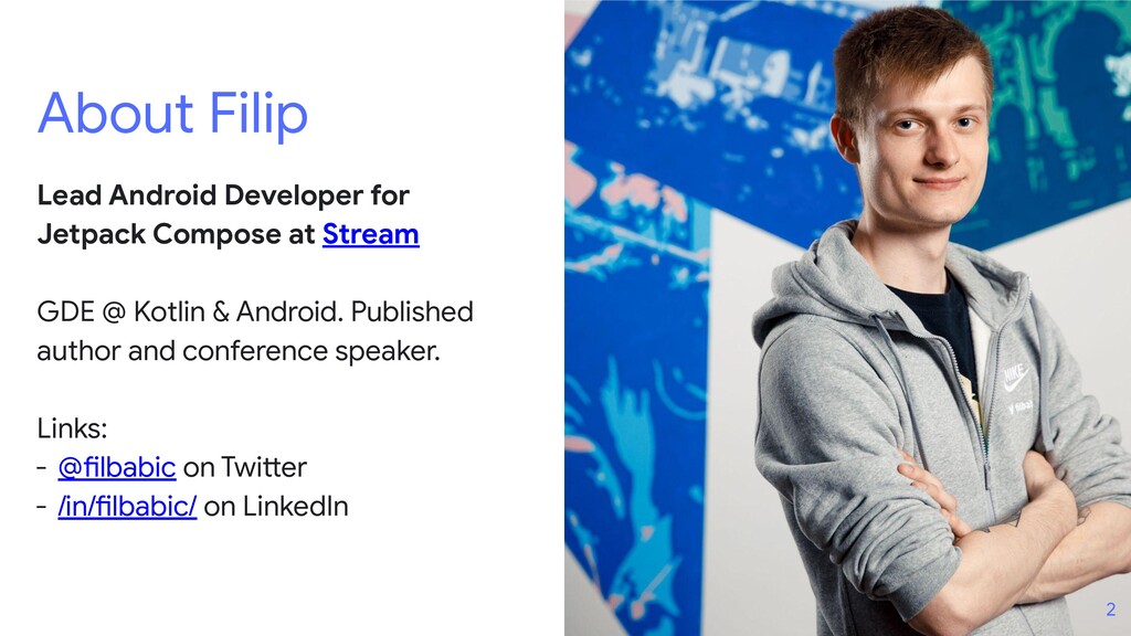
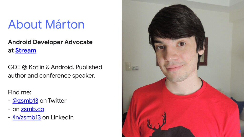
🎤🎤 This is a joint talk with Filip Babić.

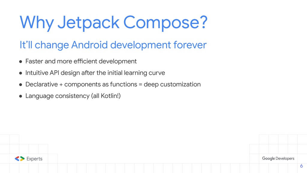
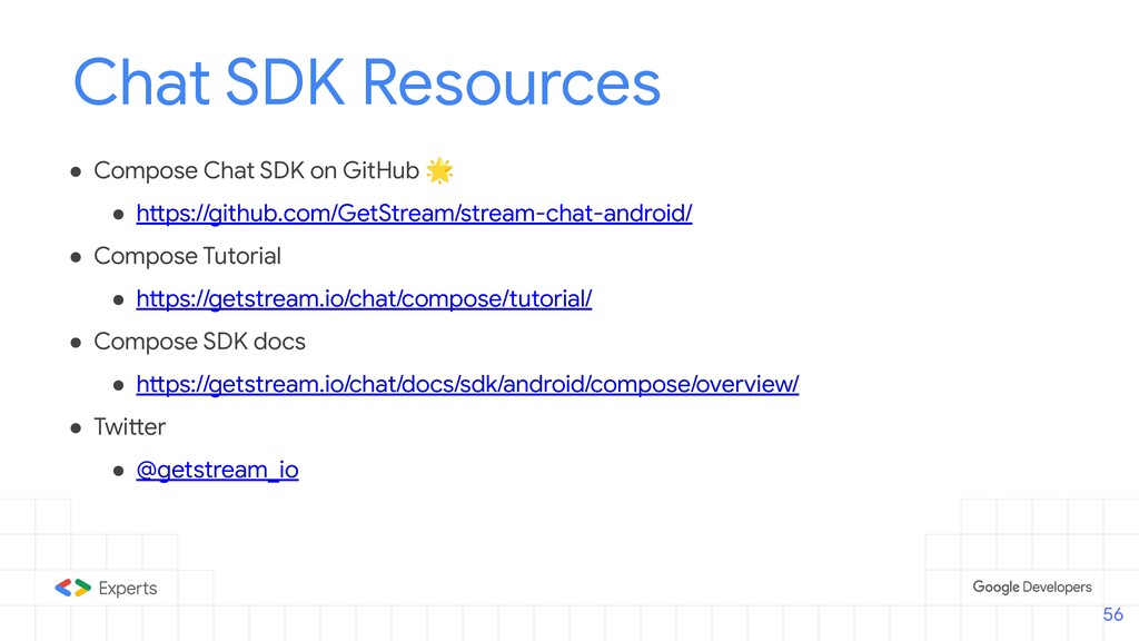
In this session, we talk about how we built the world's first Jetpack Compose Chat SDK, what challenges we met along the way, and why put so much trust into a technology that only recently became stable.

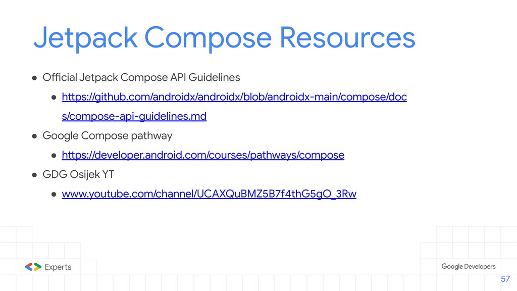
We also talk about the API design and what decisions we've made to allow for both quick-to-integrate default behavior and UI, as well as a rich set of customization options to make the SDK fit your needs.

More details: https://zsmb.co/appearances/droidcon-berlin-2021-compose/

Marton Braun

October 20, 2021
Tweet

Transcript

  1. Building a production-ready
    Chat SDK with Jetpack
    Compose
    Filip Babić
    Jetpack Compose Lead
    @filbabic
    Márton Braun
    Android Dev Advocate
    @zsmb13
    1

    View Slide

  2. About Filip
    Lead Android Developer for
    Jetpack Compose at Stream
    GDE @ Kotlin & Android. Published
    author and conference speaker.
    Links:
    - @filbabic on Twitter
    - /in/filbabic/ on LinkedIn
    2

    View Slide

  3. About Márton
    Android Developer Advocate
    at Stream
    GDE @ Kotlin & Android. Published
    author and conference speaker.
    Find me:
    - @zsmb13 on Twitter
    - on zsmb.co
    - /in/zsmb13 on LinkedIn
    3

    View Slide

  4. Contents
    ● Why Jetpack Compose?
    ● Compose in production?
    ● Our component design system
    ● Common pitfalls & concerns
    ● Component readability
    ● Customization
    4

    View Slide

  5. Why Jetpack
    Compose?
    5

    View Slide

  6. Why Jetpack Compose?
    It’ll change Android development forever
    ● Faster and more efficient development
    ● Intuitive API design after the initial learning curve
    ● Declarative + components as functions = deep customization
    ● Language consistency (all Kotlin!)
    6

    View Slide

  7. Why Jetpack Compose for Stream?
    Meet users where they are
    ● Provide easy-to-use, “idiomatic” APIs
    ● Great match for our SDK’s customization needs
    ○ Theming
    ○ Slot APIs
    7

    View Slide

  8. Compose in
    production?
    8

    View Slide

  9. Compose in production?
    It’s been pretty stable for many months now - since the first betas.
    The core API is stable and secure, but there are some parts of the API that need more work.
    For the most part, you can avoid these experimental APIs in your day-to-day.
    9

    View Slide

  10. API to watch out for
    ● Accompanist libraries
    ● Some lazy APIs
    ● Sticky headers, Grids
    ● Some modifiers
    ● Some Material Components
    (e.g. clickable Card and Surface)
    10

    View Slide

  11. Using experimental APIs
    11
    zsmb.co/opt-in-annotations/

    View Slide

  12. With all that, we can say that Compose is
    prod-ready and here to stay! :]
    12

    View Slide

  13. Component design
    system
    13

    View Slide

  14. Component design system
    We provide three component types
    ● Screen components: Out-of-the-box solutions with limited customization.
    ● Bound components: OoB solutions for a portion of the screen. More customizable.
    ● Stateless components: State-driven components offering full customization.
    14

    View Slide

  15. override fun onCreate(savedInstanceState: Bundle?) {
    super.onCreate(savedInstanceState)
    setContent {
    ChatTheme {
    MessagesScreen(
    channelId = channelId,
    messageLimit = 30,
    onBackPressed = { finish() },
    onHeaderActionClick = {}
    )
    }
    }
    }
    Screen components
    15

    View Slide

  16. @Composable
    public fun MessagesScreen(
    channelId: String,
    messageLimit: Int = 30,
    showHeader: Boolean = true,
    onBackPressed: () -> Unit = {},
    onHeaderActionClick: () -> Unit = {},
    )
    Screen components
    16

    View Slide

  17. @Composable
    public fun MessagesScreen(
    channelId: String,
    messageLimit: Int = 30,
    showHeader: Boolean = true,
    onBackPressed: () -> Unit = {},
    onHeaderActionClick: () -> Unit = {},
    )
    Screen components
    17

    View Slide

  18. // Rest of your UI / setContent
    MessageList(
    modifier = Modifier
    .background(ChatTheme.colors.appBackground)
    .fillMaxSize(),
    viewModel = listViewModel,
    onThreadClick = { message ->
    // Handle clicks
    }
    )
    Bound components
    18

    View Slide

  19. @Composable
    public fun MessageList(
    viewModel: MessageListViewModel,
    modifier: Modifier = Modifier,
    onThreadClick: (Message) -> Unit = { viewModel.openMessageThread(it) },
    onLongItemClick: (Message) -> Unit = { viewModel.selectMessage(it) },
    onMessagesStartReached: () -> Unit = { viewModel.loadMore() },
    onScrollToBottom: () -> Unit = { viewModel.clearNewMessageState() },
    itemContent: @Composable (MessageItem) -> Unit = {
    DefaultMessageContainer(
    messageItem = it,
    onThreadClick = onThreadClick,
    onLongItemClick = onLongItemClick,
    )
    },
    ...
    )
    Bound components
    19

    View Slide

  20. @Composable
    public fun MessageList(
    viewModel: MessageListViewModel,
    modifier: Modifier = Modifier,
    onThreadClick: (Message) -> Unit = { viewModel.openMessageThread(it) },
    onLongItemClick: (Message) -> Unit = { viewModel.selectMessage(it) },
    onMessagesStartReached: () -> Unit = { viewModel.loadMore() },
    onScrollToBottom: () -> Unit = { viewModel.clearNewMessageState() },
    itemContent: @Composable (MessageItem) -> Unit = {
    DefaultMessageContainer(
    messageItem = it,
    onThreadClick = onThreadClick,
    onLongItemClick = onLongItemClick,
    )
    },
    ...
    )
    Bound components
    20

    View Slide

  21. @Composable
    public fun MessageList(
    viewModel: MessageListViewModel,
    modifier: Modifier = Modifier,
    onThreadClick: (Message) -> Unit = { viewModel.openMessageThread(it) },
    onLongItemClick: (Message) -> Unit = { viewModel.selectMessage(it) },
    onMessagesStartReached: () -> Unit = { viewModel.loadMore() },
    onScrollToBottom: () -> Unit = { viewModel.clearNewMessageState() },
    itemContent: @Composable (MessageItem) -> Unit = {
    DefaultMessageContainer(
    messageItem = it,
    onThreadClick = onThreadClick,
    onLongItemClick = onLongItemClick,
    )
    },
    ...
    )
    Bound components
    21

    View Slide

  22. 22

    View Slide

  23. @Composable
    public fun Messages(
    messagesState: MessagesState,
    onMessagesStartReached: () -> Unit,
    onLastVisibleMessageChanged: (MessageItem) -> Unit,
    onScrollToBottom: () -> Unit,
    modifier: Modifier = Modifier,
    itemContent: @Composable (MessageItem) -> Unit,
    )
    Stateless components
    23

    View Slide

  24. public data class MessagesState(
    val isLoading: Boolean = true,
    val isLoadingMore: Boolean = false,
    val endOfMessages: Boolean = false,
    val messageItems: List = emptyList(),
    val selectedMessage: Message? = null,
    val currentUser: User? = null,
    val newMessageState: NewMessageState? = null,
    val parentMessageId: String? = null,
    val unreadCount: Int = 0,
    )
    Stateless components
    Loading & Pagination state
    24

    View Slide

  25. public data class MessagesState(
    val isLoading: Boolean = true,
    val isLoadingMore: Boolean = false,
    val endOfMessages: Boolean = false,
    val messageItems: List = emptyList(),
    val selectedMessage: Message? = null,
    val currentUser: User? = null,
    val newMessageState: NewMessageState? = null,
    val parentMessageId: String? = null,
    val unreadCount: Int = 0,
    )
    Stateless components
    25

    View Slide

  26. public data class MessagesState(
    val isLoading: Boolean = true,
    val isLoadingMore: Boolean = false,
    val endOfMessages: Boolean = false,
    val messageItems: List = emptyList(),
    val selectedMessage: Message? = null,
    val currentUser: User? = null,
    val newMessageState: NewMessageState? = null,
    val parentMessageId: String? = null,
    val unreadCount: Int = 0,
    )
    Stateless components
    Empty and Loaded states
    26

    View Slide

  27. public data class MessagesState(
    val isLoading: Boolean = true,
    val isLoadingMore: Boolean = false,
    val endOfMessages: Boolean = false,
    val messageItems: List = emptyList(),
    val selectedMessage: Message? = null,
    val currentUser: User? = null,
    val newMessageState: NewMessageState? = null,
    val parentMessageId: String? = null,
    val unreadCount: Int = 0,
    )
    Stateless components
    27

    View Slide

  28. public data class MessagesState(
    val isLoading: Boolean = true,
    val isLoadingMore: Boolean = false,
    val endOfMessages: Boolean = false,
    val messageItems: List = emptyList(),
    val selectedMessage: Message? = null,
    val currentUser: User? = null,
    val newMessageState: NewMessageState? = null,
    val parentMessageId: String? = null,
    val unreadCount: Int = 0,
    )
    Stateless components
    Overlay (selected message)
    Thread mode
    Unread message indicator
    28

    View Slide

  29. public data class MessagesState(
    val isLoading: Boolean = true,
    val isLoadingMore: Boolean = false,
    val endOfMessages: Boolean = false,
    val messageItems: List = emptyList(),
    val selectedMessage: Message? = null,
    val currentUser: User? = null,
    val newMessageState: NewMessageState? = null,
    val parentMessageId: String? = null,
    val unreadCount: Int = 0,
    )
    Stateless components
    29

    View Slide

  30. Common Pitfalls
    30

    View Slide

  31. ● Thinking imperatively - you can’t “update” the UI or set listeners.
    ● Hardcoding customization - using modifiers too much in internal code.
    ● Migrating everything - just like with Kotlin, you should migrate slowly.
    ● Lack of examples - there aren’t too many examples out there to guide you.
    Common pitfalls/issues in Compose
    Things you’ll probably run into
    31

    View Slide

  32. Common Concerns
    32

    View Slide

  33. ● Dynamic sized components (Avatar)
    ● Message List optimizations (Optimistic updates)
    ● Deep customization (e.g. attachments, colors, typography…)
    Common Concerns
    Things we were worried about
    33

    View Slide

  34. Component
    Readability
    34

    View Slide

  35. Component Readability
    Avoid falling into the trap of component hell
    Most declarative UI frameworks suffer from the issue of deep component nesting.
    For readability, we suggest moving to a “flat structure” if possible for your high-level
    components, as well as logically decoupling components.
    35

    View Slide

  36. @Composable
    public fun MessagesScreen(...) {
    Box(modifier = Modifier.fillMaxSize()) {
    Scaffold(
    modifier = Modifier.fillMaxSize(),
    topBar = { if (showHeader) MessageListHeader(...) },
    bottomBar = { MessageComposer() }
    ) {
    MessageList()
    }
    }
    }
    36

    View Slide

  37. @Composable
    public fun MessagesScreen(...) {
    Box(modifier = Modifier.fillMaxSize()) {
    Scaffold(...) {
    MessageList()
    }
    if (selectedMessage != null) SelectedMessageOverlay()
    if (isShowingAttachments) AttachmentsPicker()
    val deleteAction = messageActions.firstOrNull { it is Delete }
    if (deleteAction != null) SimpleDialog()
    }
    }
    37

    View Slide

  38. 38

    View Slide

  39. Box(modifier = Modifier.fillMaxSize()) {
    BottomDrawer(drawerContent = {
    AnimatedVisibility(visible = isShowingAttachments) {
    AttachmentsPicker(...)
    }
    }) {
    Scaffold(topBar = { ... },
    bottomBar = { ... }) {
    MessageList(itemContent = {
    })
    }
    }
    if (messageActions.any { it is Delete }){
    }
    } 39

    View Slide

  40. Customization
    mindset
    40

    View Slide

  41. Customization Mindset
    Give out-of-the-box solutions, allow customization
    ● Provide a modifier in components people will use - Jetpack Compose API Guidelines.
    ● Think about exposing content parameters where appropriate - Slot APIs.
    ● Think about theming and building a design system.
    ● Provide customization for state and action handlers.
    41

    View Slide

  42. State
    Action handlers
    UI & Slot APIs
    Component parameters
    @Composable
    public fun MessageComposer(
    viewModel: MessageComposerViewModel,
    onSendMessage: (Message) -> Unit = { viewModel.sendMessage(it) },
    onAttachmentsClick: () -> Unit = {},
    onValueChange: (String) -> Unit = { viewModel.setMessageInput(it) },
    onAttachmentRemoved: (Attachment) -> Unit = { viewModel.removeSelectedAttachment(it) },
    onCancelAction: () -> Unit = { viewModel.dismissMessageActions() },
    modifier: Modifier = Modifier,
    integrations: @Composable RowScope.() -> Unit = {
    DefaultComposerIntegrations(onAttachmentsClick)
    },
    label: @Composable () -> Unit = { DefaultComposerLabel() },
    input: @Composable RowScope.() -> Unit = {
    MessageInput(
    modifier = Modifier
    .fillMaxWidth()
    .weight(1f),
    label = label,
    value = viewModel.input,
    attachments = viewModel.selectedAttachments,
    activeAction = viewModel.activeAction,
    onValueChange = onValueChange,
    onAttachmentRemoved = onAttachmentRemoved
    )
    },
    )
    42

    View Slide

  43. State
    @Composable
    public fun MessageComposer(
    viewModel: MessageComposerViewModel,
    )
    43

    View Slide

  44. @Composable
    public fun MessageComposer(
    value: String,
    attachments: List,
    activeAction: MessageAction?,
    )
    State
    @Composable
    public fun MessageComposer(
    viewModel: MessageComposerViewModel,
    )
    44

    View Slide

  45. Action handlers
    @Composable
    public fun MessageComposer(
    onSendMessage: (Message) -> Unit = { viewModel.sendMessage(it) },
    onAttachmentsClick: () -> Unit = {},
    onValueChange: (String) -> Unit = { viewModel.setMessageInput(it) },
    onAttachmentRemoved: (Attachment) -> Unit = { viewModel.removeSelectedAttachment(it) },
    onCancelAction: () -> Unit = { viewModel.dismissMessageActions() },
    )
    45

    View Slide

  46. Action handlers
    @Composable
    public fun MessageComposer(
    onSendMessage: (Message) -> Unit = { viewModel.sendMessage(it) },
    onAttachmentsClick: () -> Unit = {},
    onValueChange: (String) -> Unit = { viewModel.setMessageInput(it) },
    onAttachmentRemoved: (Attachment) -> Unit = { viewModel.removeSelectedAttachment(it) },
    onCancelAction: () -> Unit = { viewModel.dismissMessageActions() },
    )
    MessageComposer(
    viewModel = composerViewModel,
    onSendMessage = { message ->
    message.text = message.text.replace("XML", "Jetpack Compose")
    composerViewModel.sendMessage(message)
    }
    )
    46

    View Slide

  47. Action handlers
    @Composable
    public fun MessageComposer(
    onSendMessage: (Message) -> Unit = { viewModel.sendMessage(it) },
    onAttachmentsClick: () -> Unit = {},
    onValueChange: (String) -> Unit = { viewModel.setMessageInput(it) },
    onAttachmentRemoved: (Attachment) -> Unit = { viewModel.removeSelectedAttachment(it) },
    onCancelAction: () -> Unit = { viewModel.dismissMessageActions() },
    )
    MessageComposer(
    viewModel = composerViewModel,
    onSendMessage = { message ->
    message.text = message.text.replace("XML", "Jetpack Compose")
    composerViewModel.sendMessage(message)
    }
    )
    47

    View Slide

  48. @Composable
    public fun MessageComposer(
    integrations: @Composable RowScope.() -> Unit = {
    DefaultComposerIntegrations(onAttachmentsClick)
    },
    label: @Composable () -> Unit = { DefaultComposerLabel() },
    input: @Composable RowScope.() -> Unit = {
    MessageInput(
    modifier = Modifier.fillMaxWidth().weight(1f),
    label = label,
    value = viewModel.input,
    attachments = viewModel.selectedAttachments,
    activeAction = viewModel.activeAction,
    onValueChange = onValueChange,
    onAttachmentRemoved = onAttachmentRemoved
    )
    },
    )
    Slot APIs
    48

    View Slide

  49. @Composable
    public fun MessageComposer(
    integrations: @Composable RowScope.() -> Unit = {
    DefaultComposerIntegrations(onAttachmentsClick)
    },
    label: @Composable () -> Unit = { DefaultComposerLabel() },
    input: @Composable RowScope.() -> Unit = {
    MessageInput(
    modifier = Modifier.fillMaxWidth().weight(1f),
    label = label,
    value = viewModel.input,
    attachments = viewModel.selectedAttachments,
    activeAction = viewModel.activeAction,
    onValueChange = onValueChange,
    onAttachmentRemoved = onAttachmentRemoved
    )
    },
    )
    Slot APIs
    49

    View Slide

  50. @Composable
    public fun MessageComposer(
    integrations: @Composable RowScope.() -> Unit = {
    DefaultComposerIntegrations(onAttachmentsClick)
    },
    label: @Composable () -> Unit = { DefaultComposerLabel() },
    input: @Composable RowScope.() -> Unit = {
    MessageInput(
    modifier = Modifier.fillMaxWidth().weight(1f),
    label = label,
    value = viewModel.input,
    attachments = viewModel.selectedAttachments,
    activeAction = viewModel.activeAction,
    onValueChange = onValueChange,
    onAttachmentRemoved = onAttachmentRemoved
    )
    },
    )
    Slot APIs
    50

    View Slide

  51. @Composable
    public fun MessageComposer(
    integrations: @Composable RowScope.() -> Unit = {
    DefaultComposerIntegrations(onAttachmentsClick)
    },
    label: @Composable () -> Unit = { DefaultComposerLabel() },
    input: @Composable RowScope.() -> Unit = {
    MessageInput(
    modifier = Modifier.fillMaxWidth().weight(1f),
    label = label,
    value = viewModel.input,
    attachments = viewModel.selectedAttachments,
    activeAction = viewModel.activeAction,
    onValueChange = onValueChange,
    onAttachmentRemoved = onAttachmentRemoved
    )
    },
    )
    Slot APIs
    51

    View Slide

  52. @Composable
    public fun ChatTheme(
    isInDarkMode: Boolean = isSystemInDarkTheme(),
    colors: StreamColors = if (isInDarkMode) StreamColors.defaultDarkColors() else StreamColors.defaultColors(),
    typography: StreamTypography = StreamTypography.default,
    shapes: StreamShapes = StreamShapes.default,
    attachmentFactories: List = StreamAttachmentFactories.defaultFactories,
    reactionTypes: Map = defaultReactionTypes,
    content: @Composable () -> Unit,
    ) {
    CompositionLocalProvider(
    LocalColors provides colors,
    LocalTypography provides typography,
    LocalShapes provides shapes,
    LocalAttachmentFactories provides attachmentFactories,
    LocalReactionTypes provides reactionTypes,
    ) {
    content()
    }
    }
    52

    View Slide

  53. @Composable
    public fun ChatTheme(
    isInDarkMode: Boolean = isSystemInDarkTheme(),
    colors: StreamColors = if (isInDarkMode) StreamColors.defaultDarkColors() else StreamColors.defaultColors(),
    typography: StreamTypography = StreamTypography.default,
    shapes: StreamShapes = StreamShapes.default,
    attachmentFactories: List = StreamAttachmentFactories.defaultFactories,
    reactionTypes: Map = defaultReactionTypes,
    content: @Composable () -> Unit,
    ) {
    CompositionLocalProvider(
    LocalColors provides colors,
    LocalTypography provides typography,
    LocalShapes provides shapes,
    LocalAttachmentFactories provides attachmentFactories,
    LocalReactionTypes provides reactionTypes,
    ) {
    content()
    }
    }
    53

    View Slide

  54. @Composable
    public fun ChatTheme(
    isInDarkMode: Boolean = isSystemInDarkTheme(),
    colors: StreamColors = if (isInDarkMode) StreamColors.defaultDarkColors() else StreamColors.defaultColors(),
    typography: StreamTypography = StreamTypography.default,
    shapes: StreamShapes = StreamShapes.default,
    attachmentFactories: List = StreamAttachmentFactories.defaultFactories,
    reactionTypes: Map = defaultReactionTypes,
    content: @Composable () -> Unit,
    ) {
    CompositionLocalProvider(
    LocalColors provides colors,
    LocalTypography provides typography,
    LocalShapes provides shapes,
    LocalAttachmentFactories provides attachmentFactories,
    LocalReactionTypes provides reactionTypes,
    ) {
    content()
    }
    }
    54

    View Slide

  55. public data class StreamColors(
    public val textHighEmphasis: Color,
    public val textLowEmphasis: Color,
    public val disabled: Color,
    public val borders: Color,
    public val inputBackground: Color,
    public val appBackground: Color,
    public val barsBackground: Color,
    public val linkBackground: Color,
    public val primaryAccent: Color,
    public val errorAccent: Color,
    public val infoAccent: Color,
    public val highlight: Color,
    )
    55

    View Slide

  56. Chat SDK Resources
    ● Compose Chat SDK on GitHub 🌟
    ● https://github.com/GetStream/stream-chat-android/
    ● Compose Tutorial
    ● https://getstream.io/chat/compose/tutorial/
    ● Compose SDK docs
    ● https://getstream.io/chat/docs/sdk/android/compose/overview/
    ● Twitter
    ● @getstream_io
    56

    View Slide

  57. Jetpack Compose Resources
    ● Official Jetpack Compose API Guidelines
    ● https://github.com/androidx/androidx/blob/androidx-main/compose/doc
    s/compose-api-guidelines.md
    ● Google Compose pathway
    ● https://developer.android.com/courses/pathways/compose
    ● GDG Osijek YT
    ● www.youtube.com/channel/UCAXQuBMZ5B7f4thG5gO_3Rw
    57

    View Slide

  58. Questions?
    Filip Babić
    Jetpack Compose Lead
    @filbabic
    Márton Braun
    Android Dev Advocate
    @zsmb13
    58

    View Slide