Upgrade to Pro — share decks privately, control downloads, hide ads and more …

Interface Design Bootcamp

Aarron Walter
April 30, 2012

Interface Design Bootcamp

Whether you are designing a web app or a website, following best practices and standard design methodologies will help ensure your interfaces are usable and engaging. In this workshop, we'll explore the design process in detail including user research, wireframing, prototyping, and visual design. Through real world examples you'll see how an idea can evolve into an interface.

Aarron Walter

April 30, 2012
Tweet

More Decks by Aarron Walter

Other Decks in Design

Transcript

  1. deploy release APPROVAL AGILE METHOD design deploy develop define design

    deploy develop define design deploy develop define Monday, April 30, 12
  2. School of Hard Knocks Small teams can work faster, be

    more agile, and require less entropy of communication and management Diverse skill sets keep you flexible and on time Process and documentation are helpful, but remember what you’re really trying to accomplish Think modular, reusable, flexible Monday, April 30, 12
  3. Inside MailChimp UX Only 6 people that combine research and

    front- end development Close, respectful relationship with developers Keep in close contact with support and customers Post ideas in common space and invite conversation Dedicated to interface consistency Monday, April 30, 12
  4. Project Goals Help conference attendees connect before, during and after

    the event Bring people together by helping them learn about other attendees and the activities of events Monday, April 30, 12
  5. Who do I talk to? Stakeholders: who do you think

    your users are? Customer Advocate: People who speak to customers directly Customers: real people using the product Usage Stats: Google Analytics, etc. Someone You Know: A person you know fits the target profile (validate your findings) Monday, April 30, 12
  6. Research Methods User Interviews: one-on-one conversations (in- person or remote)

    Contextual Inquiry: on-site visit with participants (in-person) Surveys: multiple choice questions (remote) Focus Groups: group discussion (in-person) Monday, April 30, 12
  7. Types of User Research In Lab Testing Focus Groups Online

    Surveys QUALITATIVE BEHAVIOR QUANTITATIVE ATTITUDE Web Analytics Monday, April 30, 12
  8. What’s In a Persona? A photo (it can be stock)

    Name A short bio Age Location Occupation Other optional info Monday, April 30, 12
  9. persona My internship provided me with the opportunity to work

    in Times Square. I just love all of the lights, action, and excitement! Julia has been taking Spanish since high school and is excited to study abroad in Buenos Aires next spring. She’s traveled a little in the past—to Great Britain for a vacation with her family and to Mexico for a missions trip—but this is her rst time going abroad alone. Though she has other friends who also plan to study abroad, she wanted to go at a di erent time so she would be forced to make friends with the locals and truly immerse herself in the culture. She’s heard from friends that the maturity level of some of the students plummets the moment they step on the plane to study abroad. She hopes they don’t make her look like a “stupid American.” She’s also heard that the dorms in Buenos Aires aren’t great, which solidi ed her decision to do a homestay. However, she’s concerned about commuting to classes, which she hopes to take at the NYU campus as well as a local university—if the credits transfer. She doesn’t have a lot of extra cash and is interested in a work study to pay for souvenirs and some travel around Argentina. Speaking Spanish on the job would also be great practice, but she isn’t sure what sort of opportunities there are, or even if she’s allowed to work. Julia Age: 19 - 22; Sophomore; Journalism & Communications Goals: Get a “Big City College” education, cosmopolitan experience; Build resume with internship; Take new/di erent courses; Make new/di erent friends; Experience di erent cultures Pain Points: Limited courses o ered; Costs; Organization (too much or not enough); Advantages are hidden; Challenging to transfer credits Knowledge Lifecycle THE INFLUENCER TECHNOLOGY DOMAIN EXPERIENCE 1 2 3 4 5 NOV OCT SEP AUG JUL JUN MAY APR MAR FEB JAN DEC Monday, April 30, 12
  10. design studio souvenirs and some travel around Argentina. Speaking Spanish

    on the job would also be great practice, but she isn’t sure what sort of opportunities there are, or even if she’s allowed to work. Activities and Interest Knowledge Lifecycle Influencers INTERNSHIPS FULFILLING CREDITS TAKING ELECTIVES EXPLORING SOCIALIZING NYU TRIAL RUN SPECIALIZED COURSES CLASS OFFERINGS INTERNSHIP FINANCIAL AID NYC EXPERIENCE FULFILLING CREDITS PARENTAL SUPPORT NYU REPUTATION TECHNOLOGY DOMAIN EXPERIENCE 1 2 3 4 5 1 2 3 4 5 NOV OCT SEP AUG JUL JUN MAY APR MAR FEB JAN DEC Monday, April 30, 12
  11. Activity: Personas Create small teams Interview stakeholders for the event

    app Identify user needs, motivations, and business goals Create two to three personas describing archetypal users of your app Monday, April 30, 12
  12. Design Persona Brand Traits Voice Personality Map Overview unfriendly friendly

    dominant submissive MailChimp Freddie Von Chimpenhiemer IV is the face of the MailChimp, and the embodiment of the brand personality. Freddie's stout frame communicates the power of the application, and his always on the go posture let's people know this brand means business. Freddie always has a kind smile that welcomes users and makes them feel comfortable and at home. The cartoon style lets people know that MailChimp offers a fun, and informal experience. Freddie likes to crack witty jokes, but when the situation is serious, the funny business is out the window. MailChimp often surprises users with a funny easter egg, or a link to a goofy YouTube video. Fun is around every corner, but never in the way of the workflow. The voice of MailChimp is familiar, friendly, and above all human. The personalities of the people behind the brand shines through with honesty. The voice of MailChimp cracks jokes (ones you could share with your momma), tells stories, and communicates with the folksy tone that might be used with an old friend. MailChimp uses contractions like "don't" instead of "do no" because that's how real humans speak to one another. MailChimp uses sound effects like, “hmmmmm....” to make it sound like youʼre thinking hard, or “Blech, thatʼs awful!” to make it sound like you empathize. Or is it sympathize? Hmm, too lazy to Google it. Bah, you get the gist. Text for form and button labels are kept lowercase to reinforce the informality of the brand. MailChimp likes to start blog posts and other longer copy blocks with a quick story, like “I remember when...” Everybody likes stories. When people get upset, or make a mistake, MailChimp is always compassionate and sympathetic, and the feedback messages reflect that. 1 Author: Aarron Walter Fun, but not not childish Funny, but not goofy Powerful, but not complicated Hip, but not alienating Easy, but not simplistic Trustworthy, but not stodgy Informal, but not sloppy Monday, April 30, 12
  13. Voice Hi, Bob. You could be a part-time model. Oops!

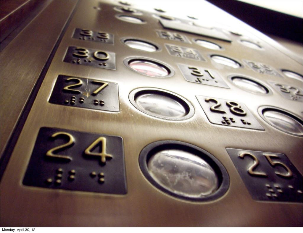
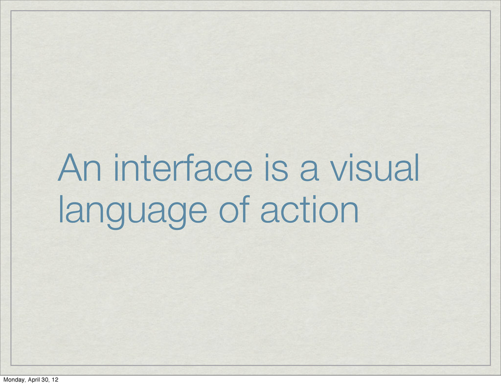
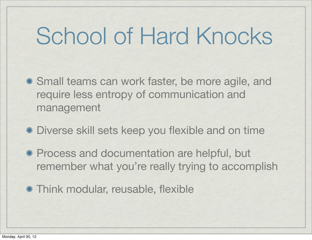
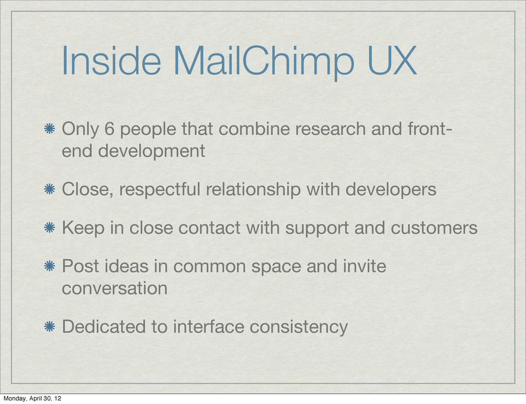
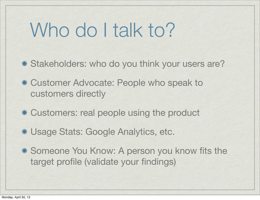
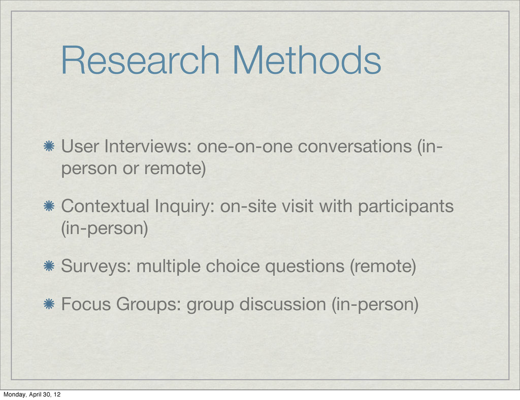
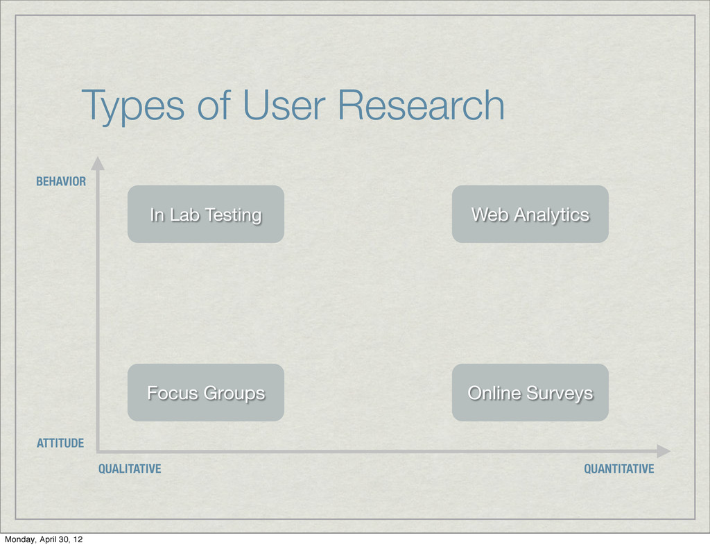
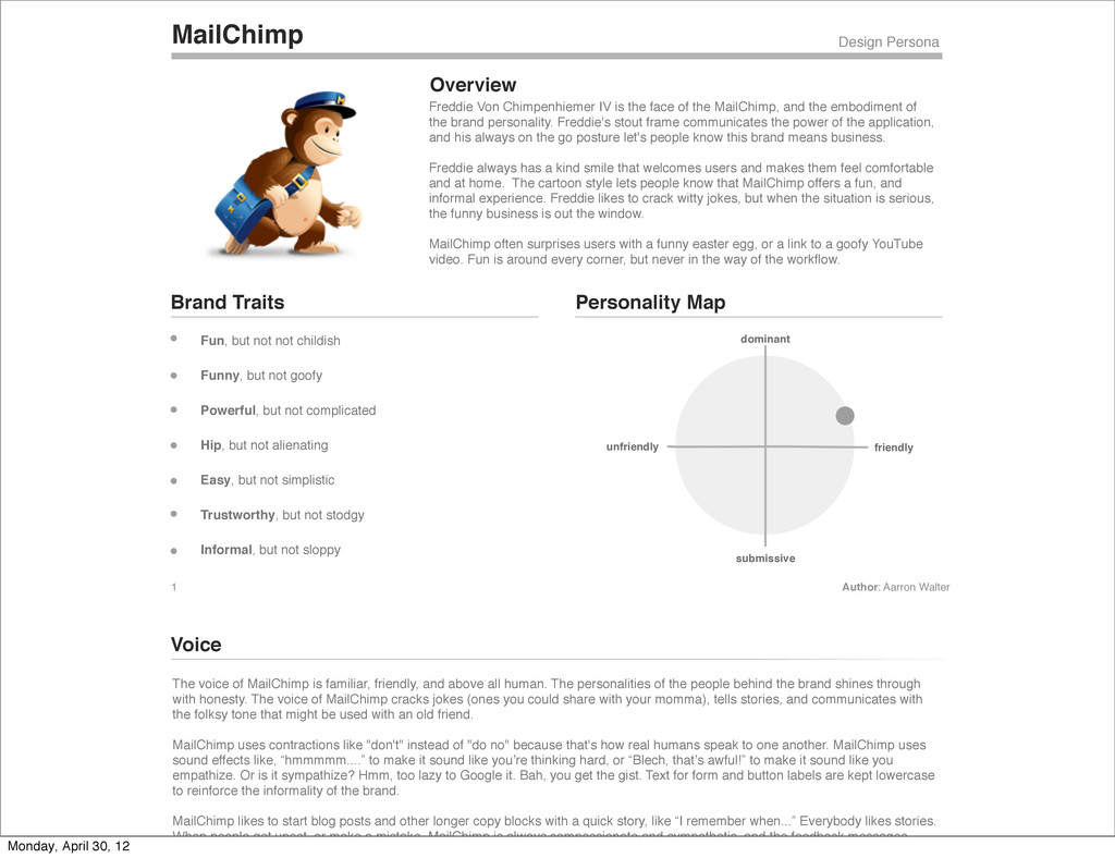
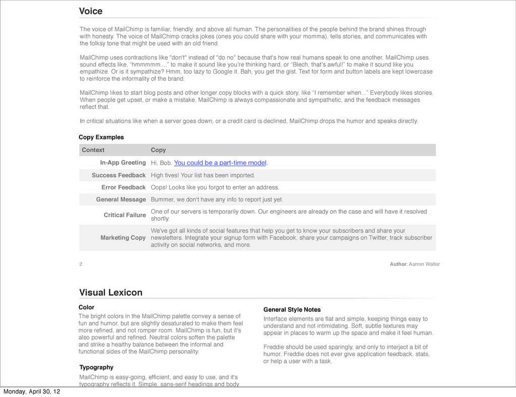
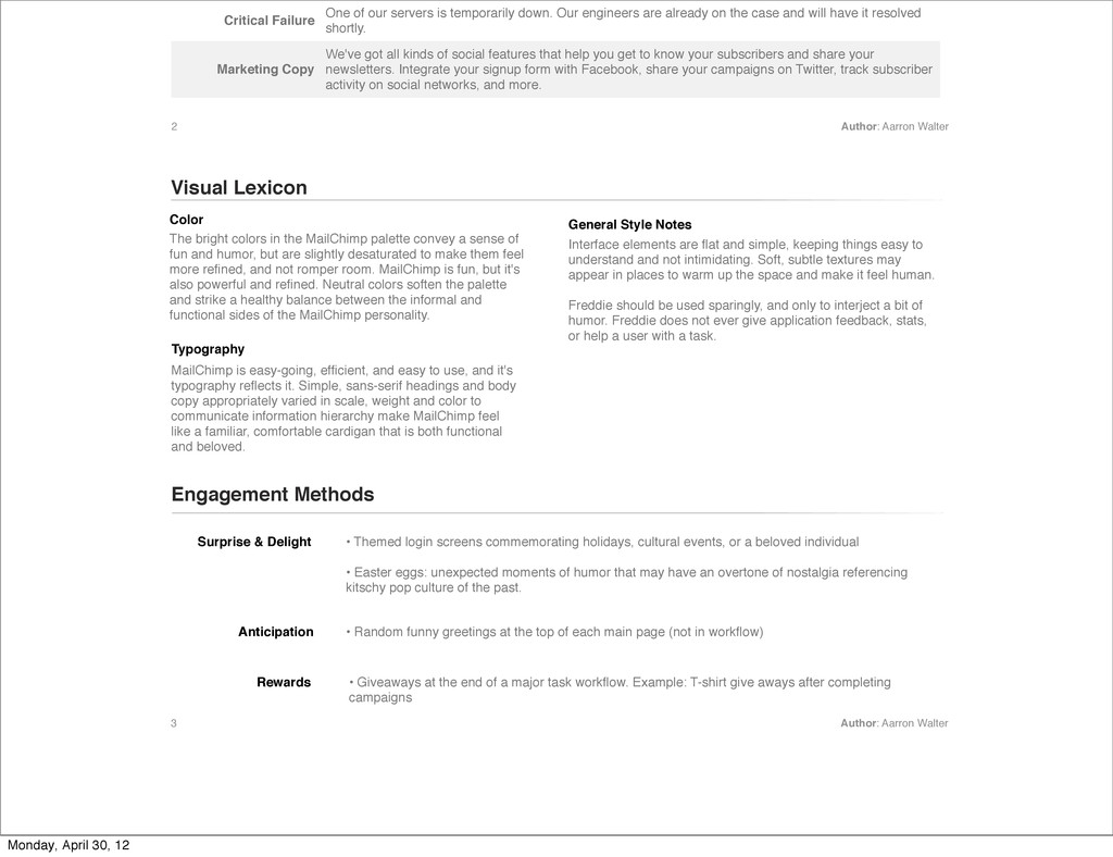
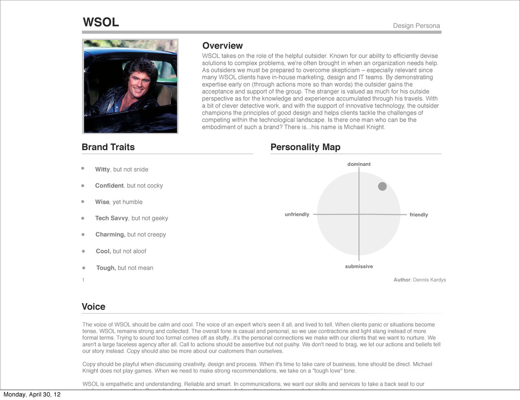
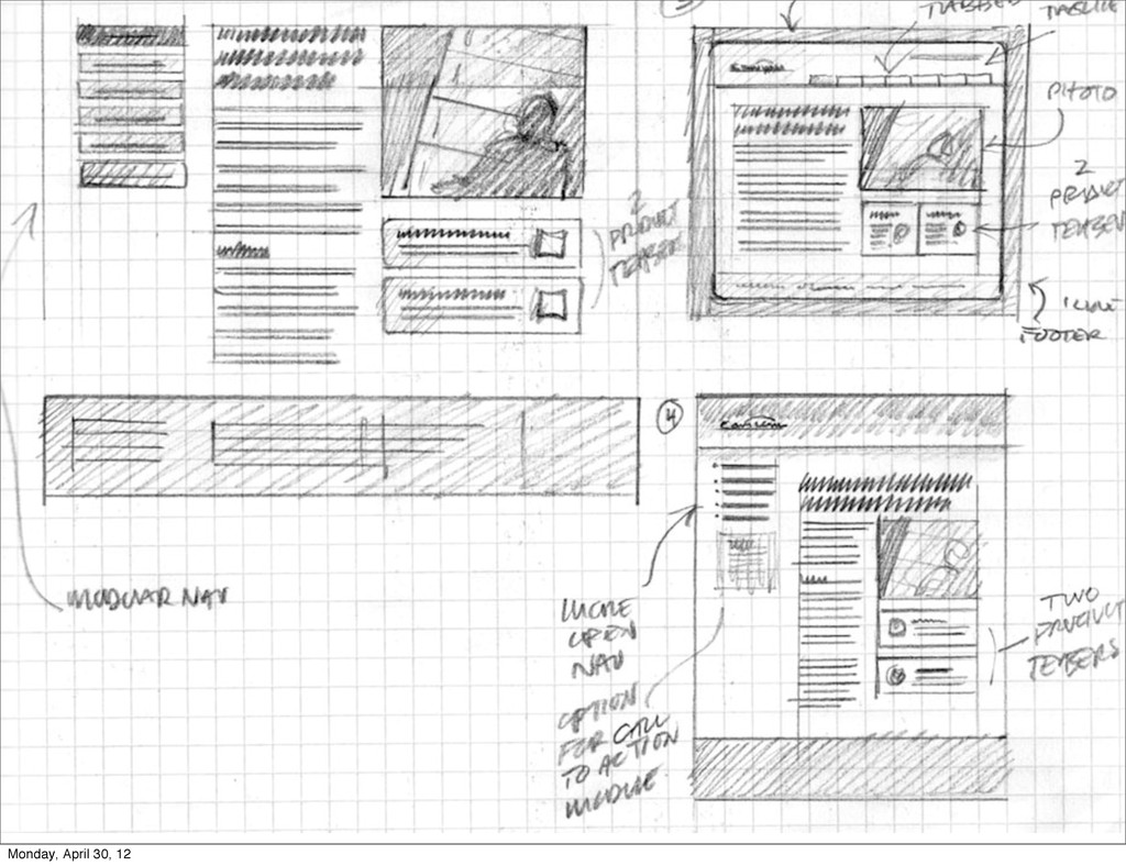
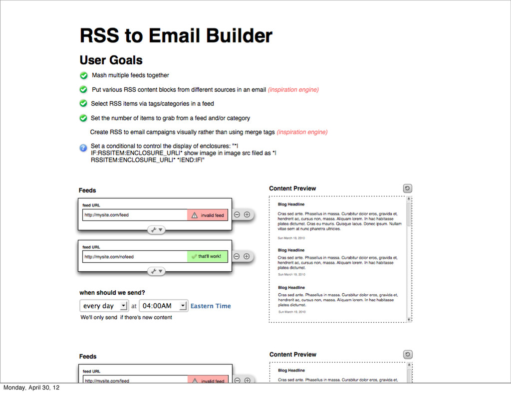
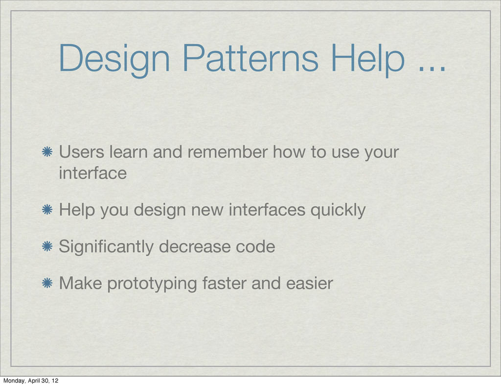
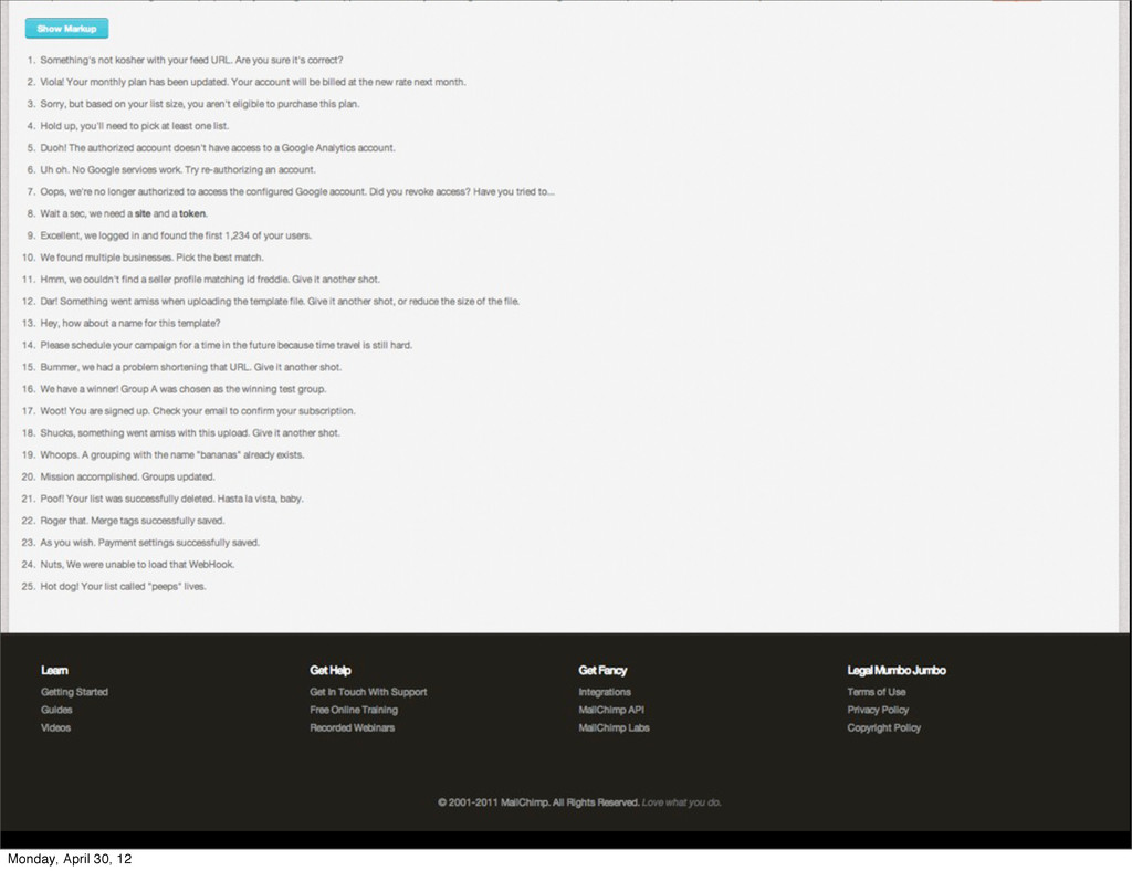
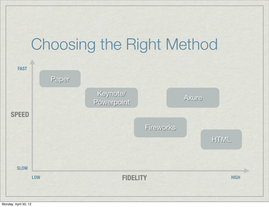
    Looks like you forgot to enter an address. High fives! Your list has been imported. One of our servers is temporarily down. Our engineers are already on the case and will have it resolved shortly. Success Feedback Error Feedback General Message Copy In-App Greeting Context We've got all kinds of social features that help you get to know your subscribers and share your newsletters. Integrate your signup form with Facebook, share your campaigns on Twitter, track subscriber activity on social networks, and more. Marketing Copy Bummer, we don't have any info to report just yet. Critical Failure Visual Lexicon The bright colors in the MailChimp palette convey a sense of fun and humor, but are slightly desaturated to make them feel more refined, and not romper room. MailChimp is fun, but it's also powerful and refined. Neutral colors soften the palette and strike a healthy balance between the informal and functional sides of the MailChimp personality. The voice of MailChimp is familiar, friendly, and above all human. The personalities of the people behind the brand shines through with honesty. The voice of MailChimp cracks jokes (ones you could share with your momma), tells stories, and communicates with the folksy tone that might be used with an old friend. MailChimp uses contractions like "don't" instead of "do no" because that's how real humans speak to one another. MailChimp uses sound effects like, “hmmmmm....” to make it sound like youʼre thinking hard, or “Blech, thatʼs awful!” to make it sound like you empathize. Or is it sympathize? Hmm, too lazy to Google it. Bah, you get the gist. Text for form and button labels are kept lowercase to reinforce the informality of the brand. MailChimp likes to start blog posts and other longer copy blocks with a quick story, like “I remember when...” Everybody likes stories. When people get upset, or make a mistake, MailChimp is always compassionate and sympathetic, and the feedback messages reflect that. In critical situations like when a server goes down, or a credit card is declined, MailChimp drops the humor and speaks directly. Copy Examples Color MailChimp is easy-going, efficient, and easy to use, and it's typography reflects it. Simple, sans-serif headings and body copy appropriately varied in scale, weight and color to Typography Interface elements are flat and simple, keeping things easy to understand and not intimidating. Soft, subtle textures may appear in places to warm up the space and make it feel human. Freddie should be used sparingly, and only to interject a bit of humor. Freddie does not ever give application feedback, stats, or help a user with a task. General Style Notes 2 Author: Aarron Walter Monday, April 30, 12
  14. One of our servers is temporarily down. Our engineers are

    already on the case and will have it resolved shortly. We've got all kinds of social features that help you get to know your subscribers and share your newsletters. Integrate your signup form with Facebook, share your campaigns on Twitter, track subscriber activity on social networks, and more. Marketing Copy Critical Failure Visual Lexicon The bright colors in the MailChimp palette convey a sense of fun and humor, but are slightly desaturated to make them feel more refined, and not romper room. MailChimp is fun, but it's also powerful and refined. Neutral colors soften the palette and strike a healthy balance between the informal and functional sides of the MailChimp personality. Color MailChimp is easy-going, efficient, and easy to use, and it's typography reflects it. Simple, sans-serif headings and body copy appropriately varied in scale, weight and color to communicate information hierarchy make MailChimp feel like a familiar, comfortable cardigan that is both functional and beloved. Typography Interface elements are flat and simple, keeping things easy to understand and not intimidating. Soft, subtle textures may appear in places to warm up the space and make it feel human. Freddie should be used sparingly, and only to interject a bit of humor. Freddie does not ever give application feedback, stats, or help a user with a task. General Style Notes Engagement Methods Surprise & Delight • Themed login screens commemorating holidays, cultural events, or a beloved individual • Easter eggs: unexpected moments of humor that may have an overtone of nostalgia referencing kitschy pop culture of the past. Anticipation • Random funny greetings at the top of each main page (not in workflow) Rewards • Giveaways at the end of a major task workflow. Example: T-shirt give aways after completing campaigns 2 Author: Aarron Walter 3 Author: Aarron Walter Monday, April 30, 12
  15. Design Persona Brand Traits Voice Personality Map Overview unfriendly friendly

    dominant submissive WSOL WSOL takes on the role of the helpful outsider. Known for our ability to efficiently devise solutions to complex problems, we're often brought in when an organization needs help. As outsiders we must be prepared to overcome skepticism – especially relevant since many WSOL clients have in-house marketing, design and IT teams. By demonstrating expertise early on (through actions more so than words) the outsider gains the acceptance and support of the group. The stranger is valued as much for his outside perspective as for the knowledge and experience accumulated through his travels. With a bit of clever detective work, and with the support of innovative technology, the outsider champions the principles of good design and helps clients tackle the challenges of competing within the technological landscape. Is there one man who can be the embodiment of such a brand? There is...his name is Michael Knight. The voice of WSOL should be calm and cool. The voice of an expert who's seen it all, and lived to tell. When clients panic or situations become tense, WSOL remains strong and collected. The overall tone is casual and personal, so we use contractions and light slang instead of more formal terms. Trying to sound too formal comes off as stuffy...it's the personal connections we make with our clients that we want to nurture. We aren't a large faceless agency after all. Call to actions should be assertive but not pushy. We don't need to brag, we let our actions and beliefs tell our story instead. Copy should also be more about our customers than ourselves. Copy should be playful when discussing creativity, design and process. When it's time to take care of business, tone should be direct. Michael Knight does not play games. When we need to make strong recommendations, we take on a "tough love" tone. WSOL is empathetic and understanding. Reliable and smart. In communications, we want our skills and services to take a back seat to our wisdom and perspective. Speak first about why we do things, before discussing how or what we do. 1 Author: Dennis Kardys Witty, but not snide Confident, but not cocky Wise, yet humble Tech Savvy, but not geeky Charming, but not creepy Cool, but not aloof Tough, but not mean Monday, April 30, 12
  16. Activity: Design Personas Work in small teams Consider the brand

    you’re designing for Create a Design Persona to guide the voice of your app Monday, April 30, 12
  17. Sketchboards Are ... Collaborative, they let you bring in the

    whole team early on Fast, you can iterate through ideas quickly with little time invested The big picture, they help you see a broader process Monday, April 30, 12
  18. Sketchboards Include ... Steps in a process Information about your

    users Simple sketches of interface templates Notes and ideas Monday, April 30, 12
  19. How to Work Through Ideas Move quickly using the 2-up

    template Evaluate then combine the best ideas into one interface in a 1-up template Monday, April 30, 12
  20. Activity: Sketchboard Round up the troops Create a sketchboard to

    flesh out tasks, process flow, and interface concepts for your app Consider lessons learned from stakeholder interviews & personas Monday, April 30, 12
  21. Wireframes Are ... Low resolution, they struggle to simulate interaction

    Not about aesthetics, they communicate hierarchy, elements, organization, and design patterns Supposed to be fast so you can iterate on ideas quickly Monday, April 30, 12
  22. Design Patterns Help ... Users learn and remember how to

    use your interface Help you design new interfaces quickly Significantly decrease code Make prototyping faster and easier Monday, April 30, 12
  23. Can Be Created With ... Paper HTML, CSS, JavaScript Powerpoint

    or Keynote Fireworks Specialty tools like Axure Monday, April 30, 12
  24. Choosing the Right Method Paper Keynote/ Powerpoint Fireworks HTML LOW

    FAST HIGH SLOW SPEED FIDELITY Axure Monday, April 30, 12
  25. Make Prototyping Easier By ... Creating a simple TextMate bundle,

    Dreamweaver plugin, etc. with core prototype elements Create a common library of icons, JavaScript tools, CSS layout framework Monday, April 30, 12
  26. Activity: Prototype Assemble your posse Create a paper, Keynote, or

    HTML prototype of your app Complete one key section, move on to other sections as time permits Monday, April 30, 12
  27. The Krug Method Test 3 users in house Feed them

    nice snacks Invite management, head honchos, and other decision makers to the tests to help them understand users Test about once a month, but keep it feasible for your schedule Monday, April 30, 12
  28. Remote Testing Method Setup a GoToMeeting.com account Put the call

    out on Twitter or Facebook for test participants Create permission forms and a screener questionnaire with Wufoo.com Record test session with Silverback (silverbackapp.com) Monday, April 30, 12
  29. Testing In-House Setup prototype or refined interface on a machine

    Screen users Get them to sign a permission form Record test session with Silverback Monday, April 30, 12