Upgrade to Pro — share decks privately, control downloads, hide ads and more …

Adding a Touch of glitr

Aaron
September 19, 2023

Adding a Touch of glitr

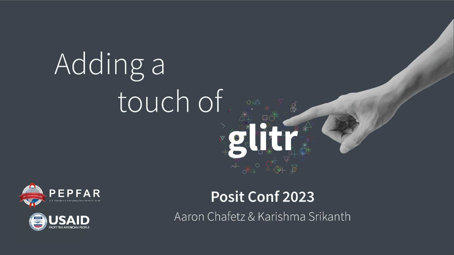
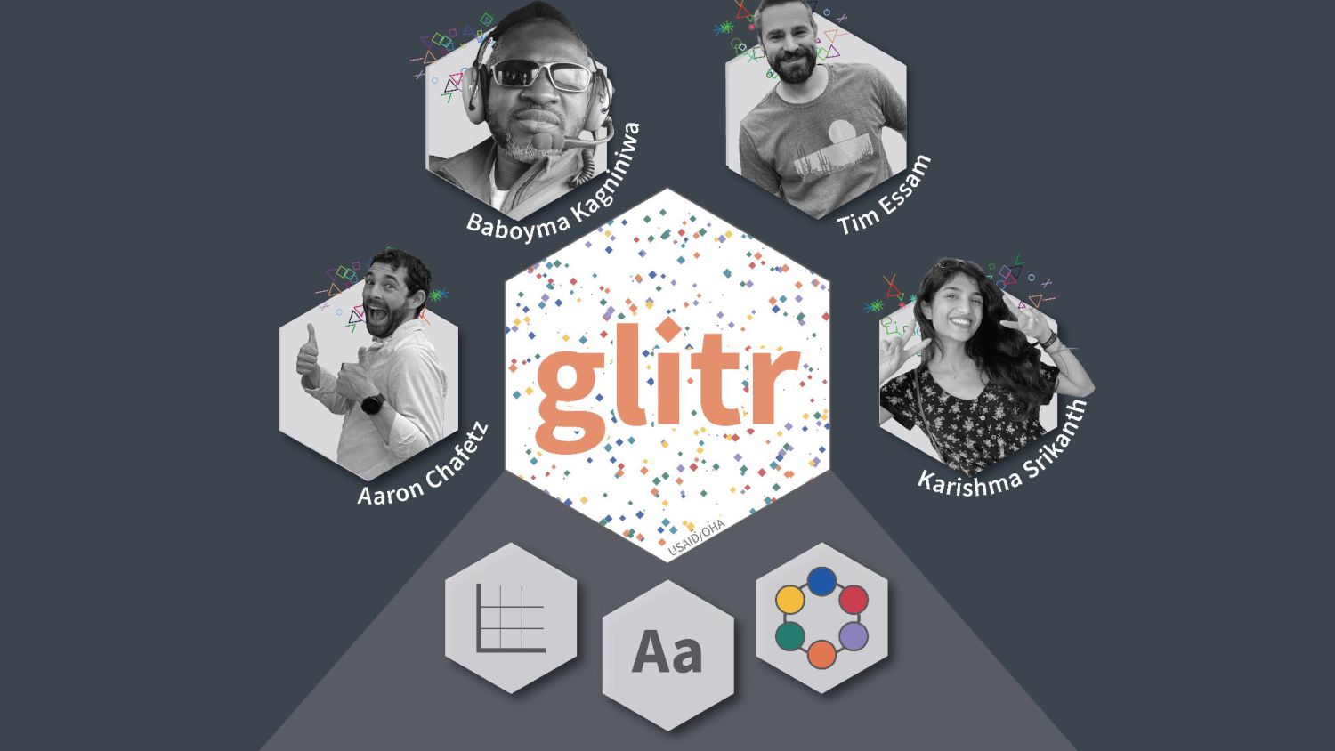
Adding a Touch of glitr: Developing a Package of Themes on Top of ggplot
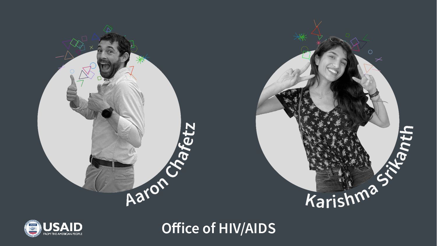
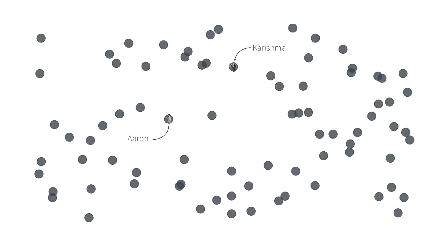
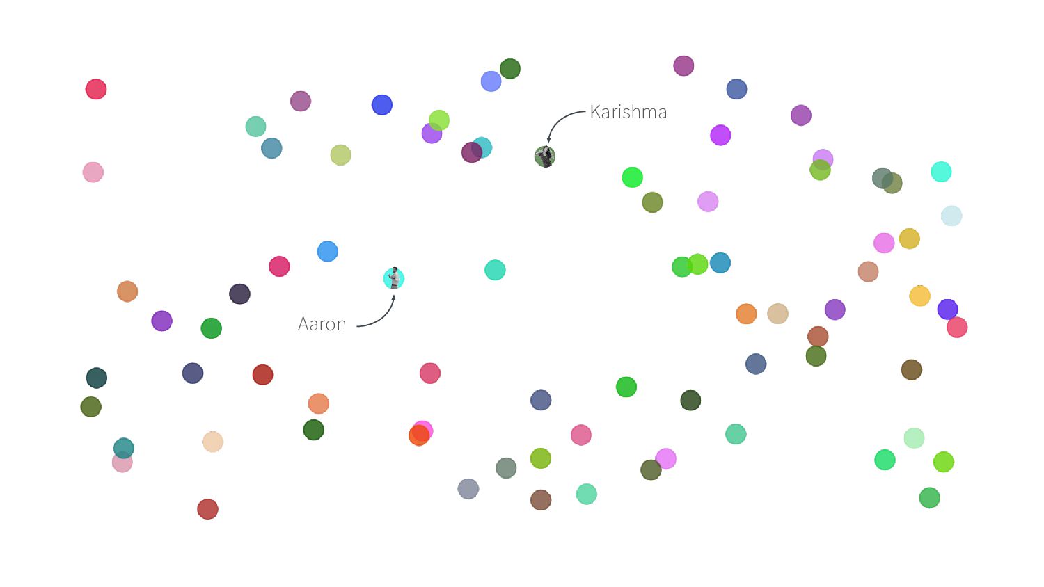
Aaron Chafetz & Karishma Srikanth
Posit Conf 2023 | Chicago

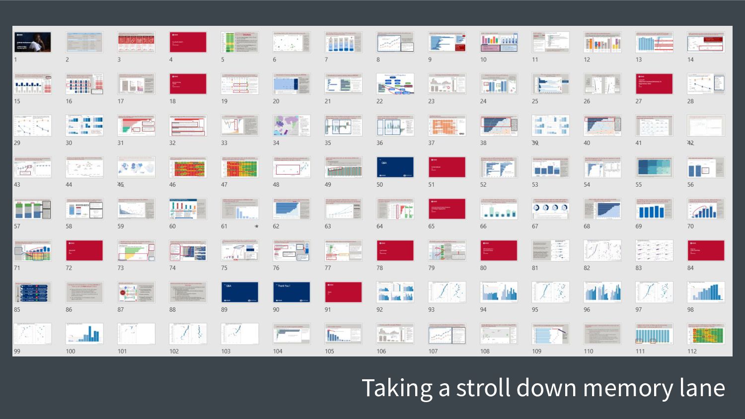
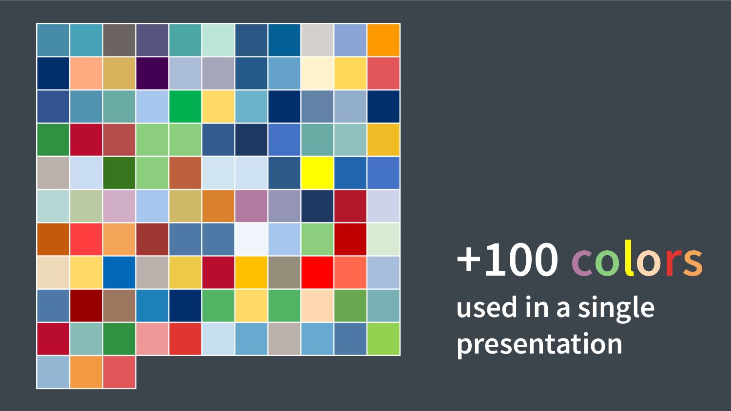
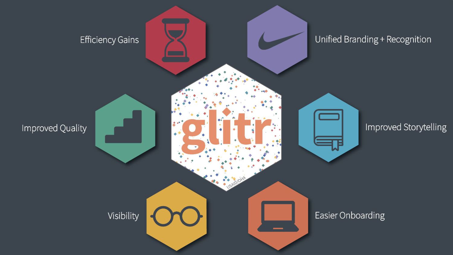
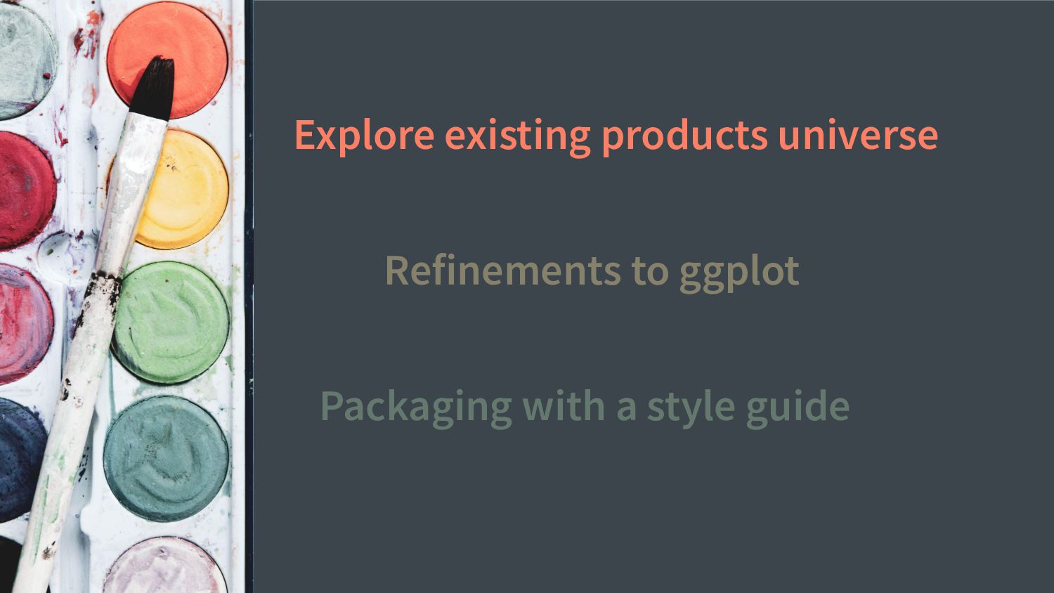
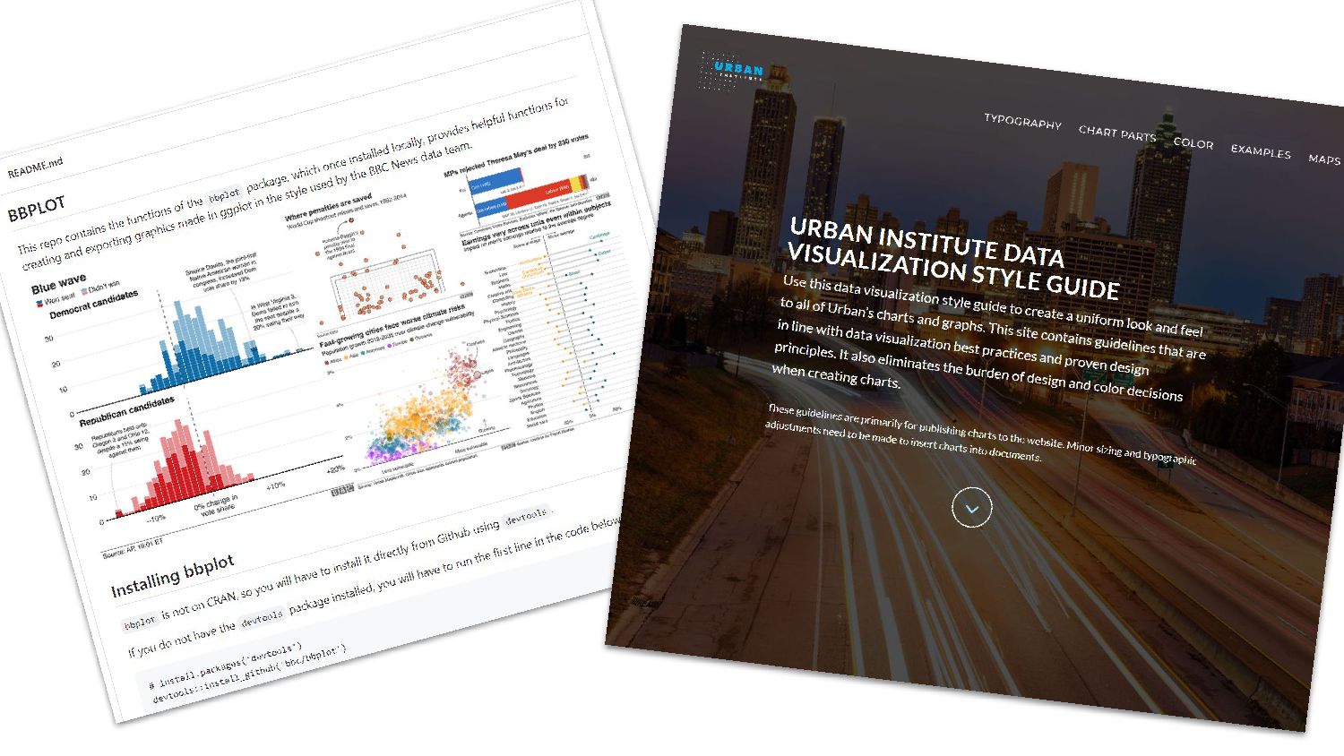
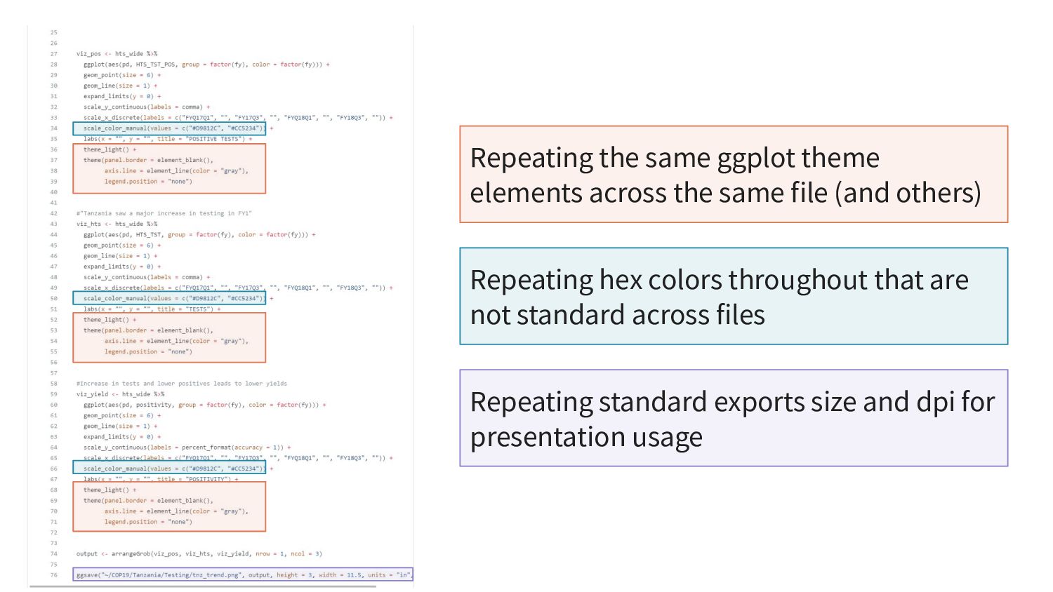
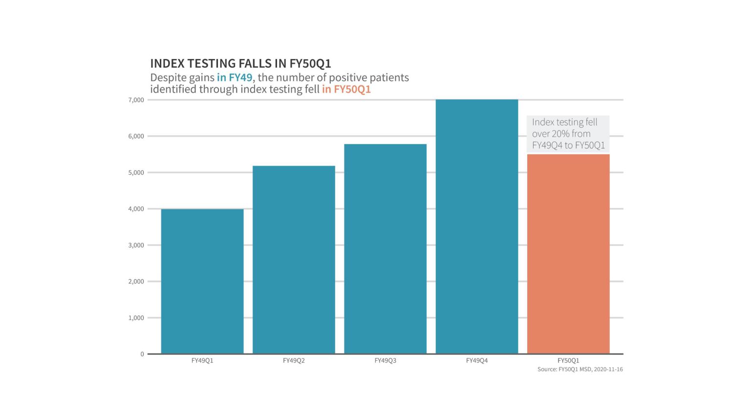
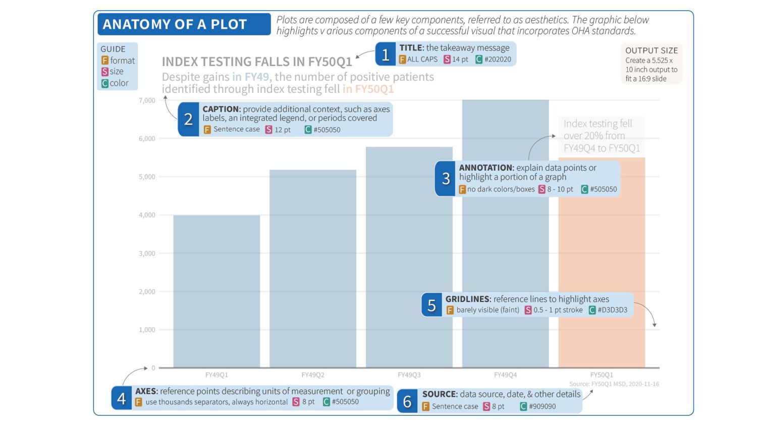
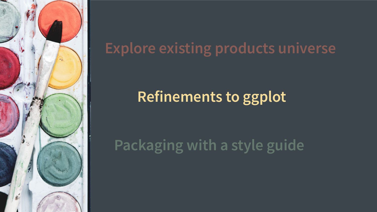
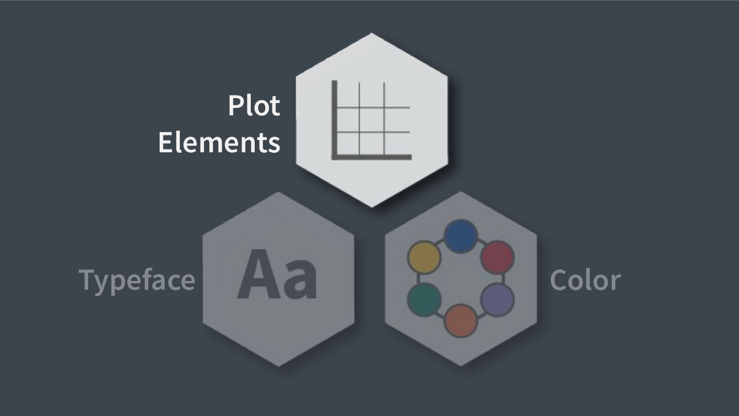
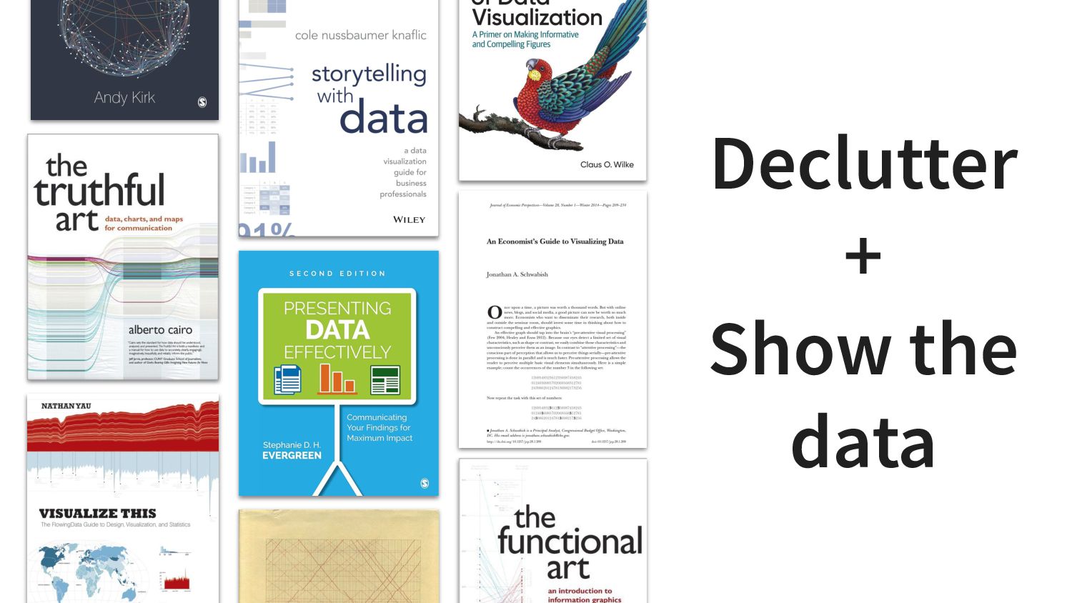
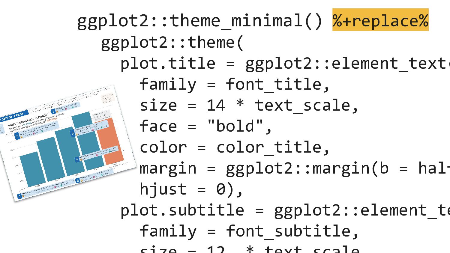
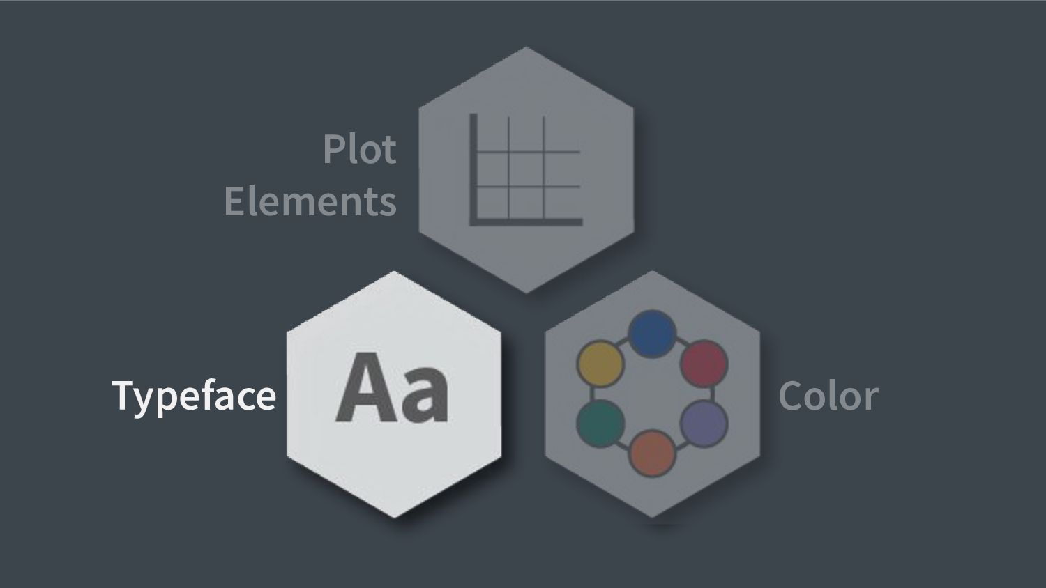
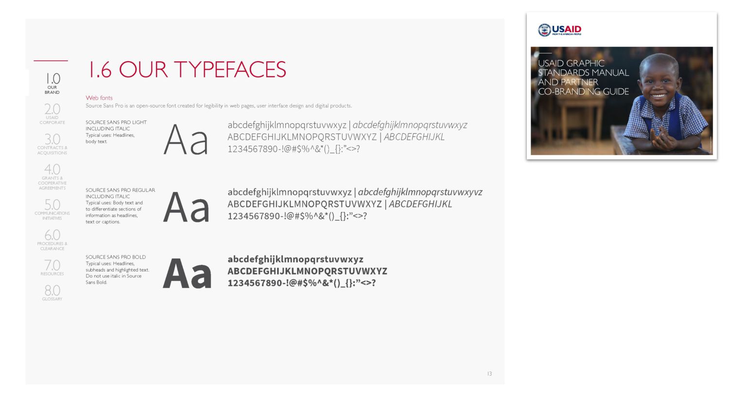
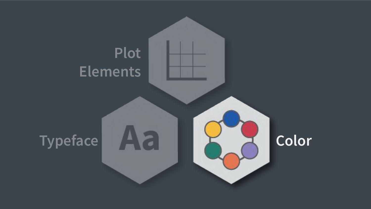
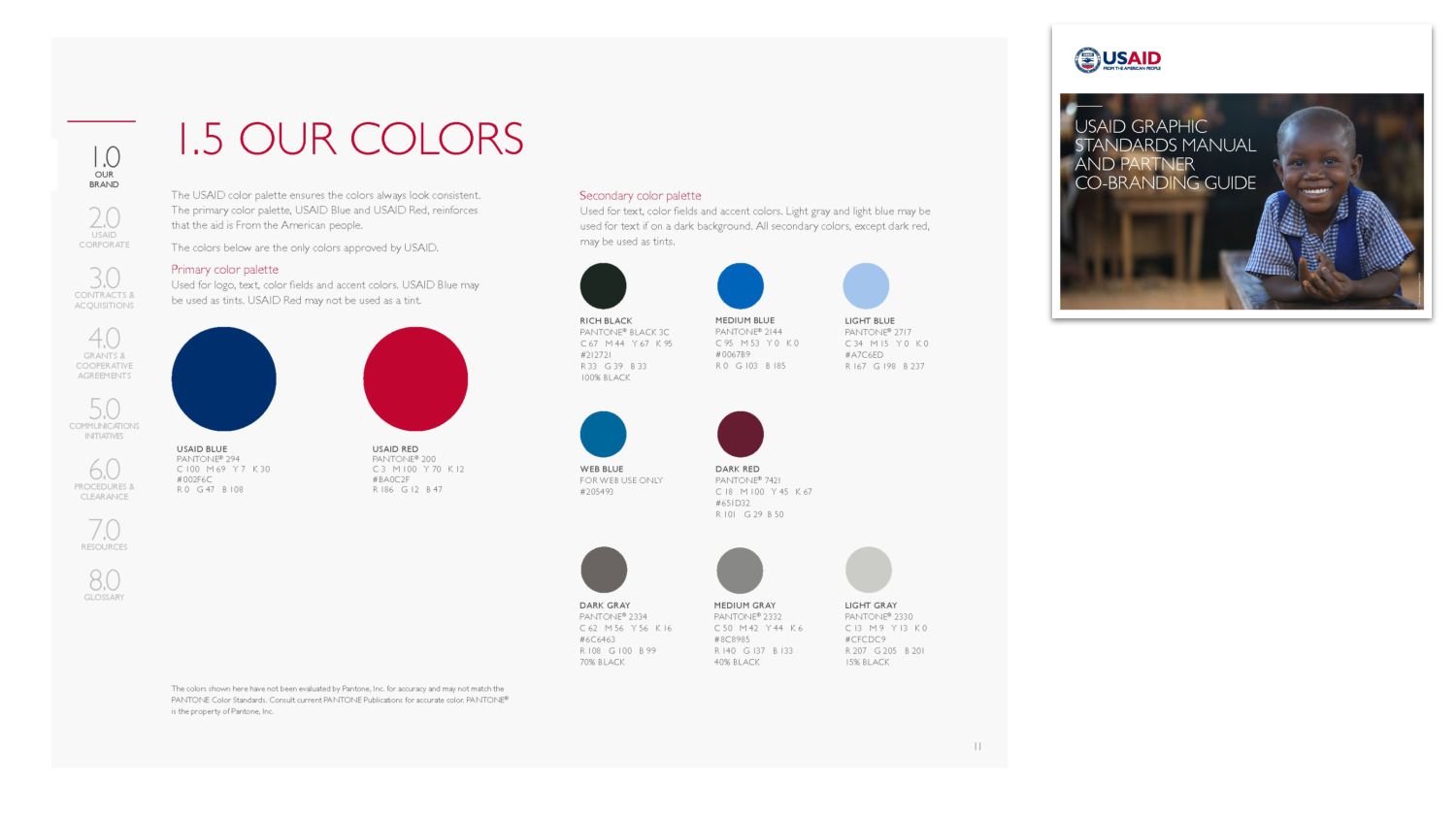
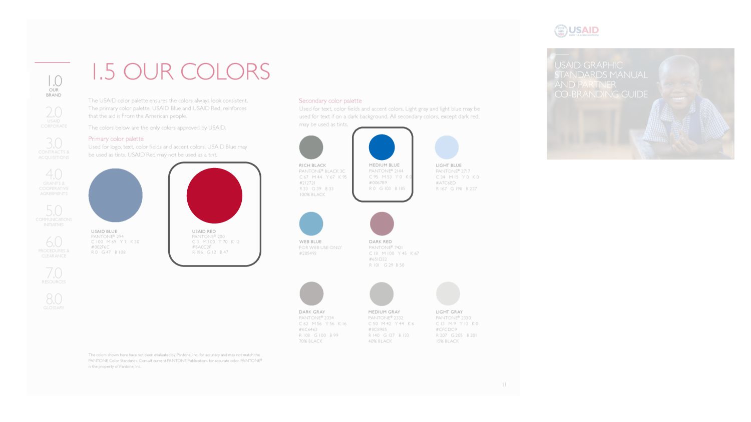
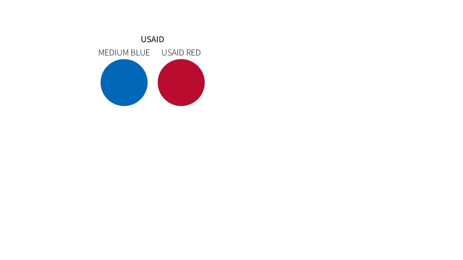
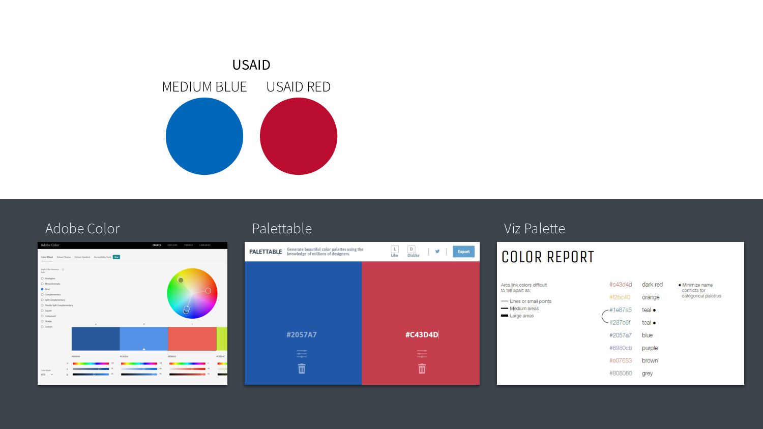
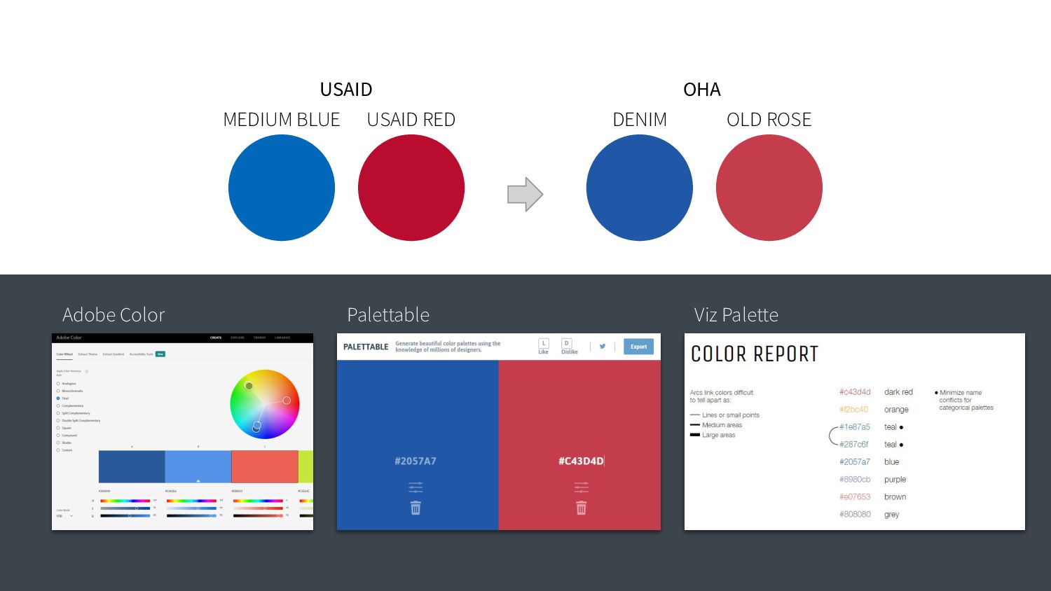
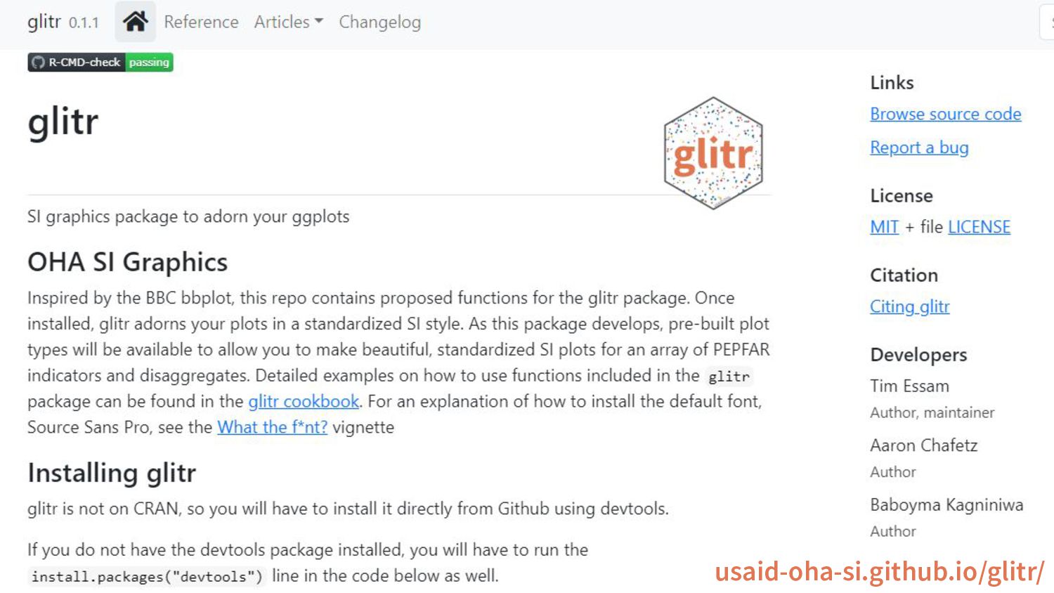
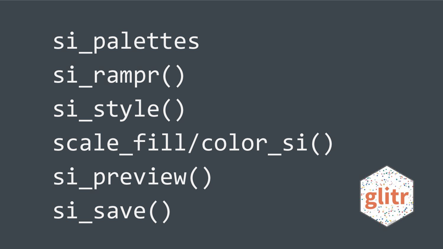
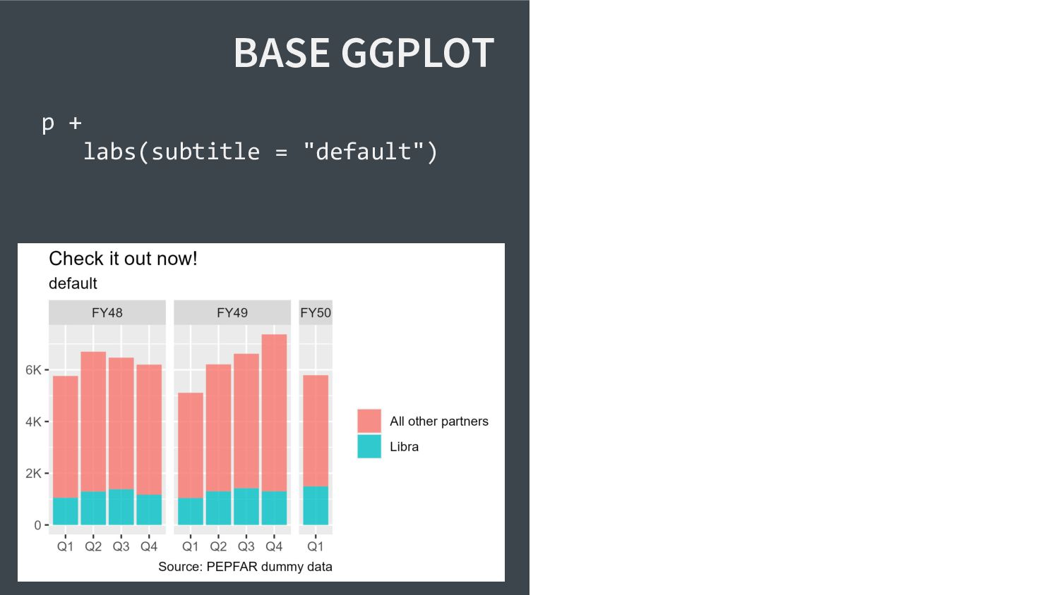
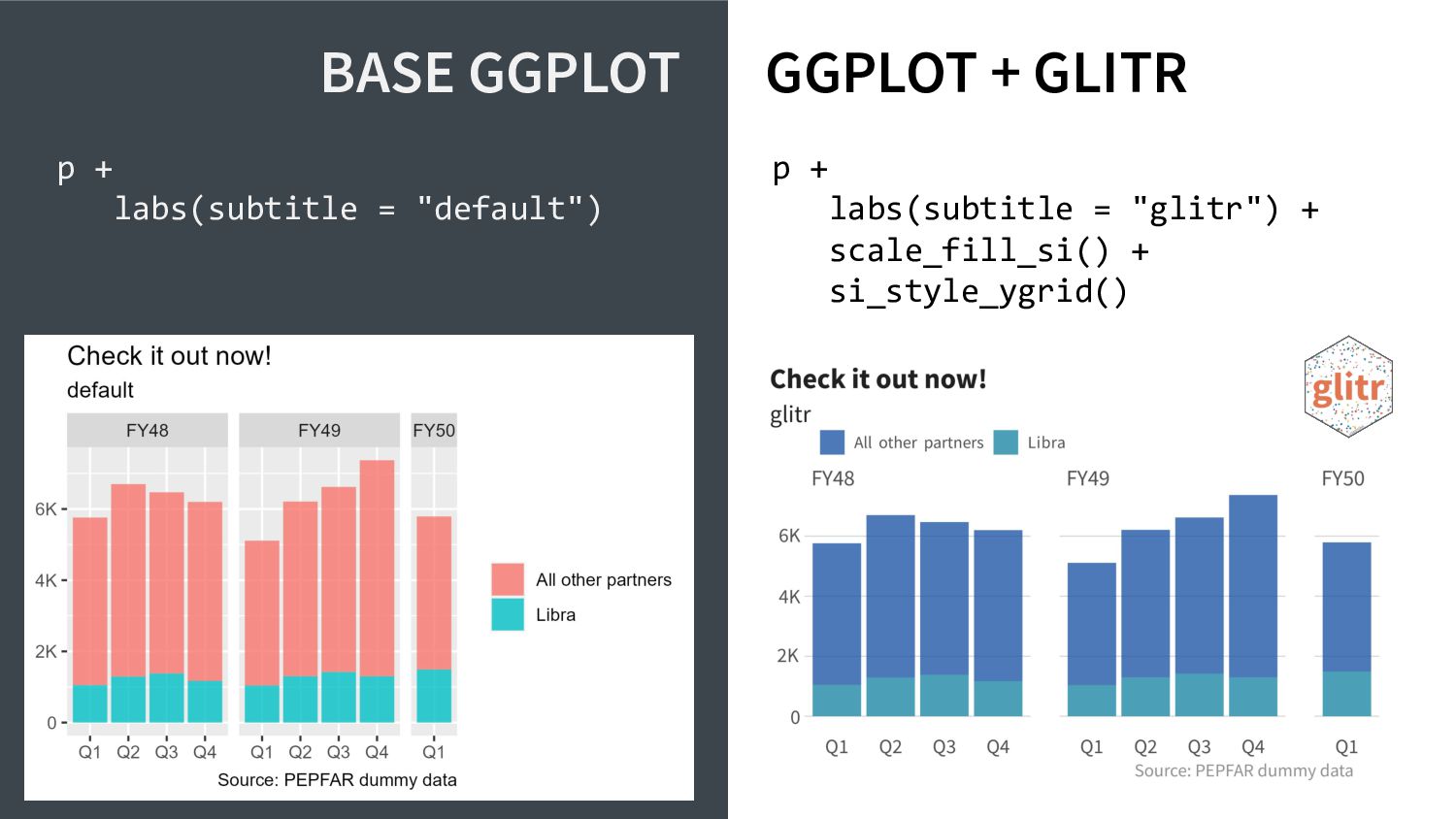
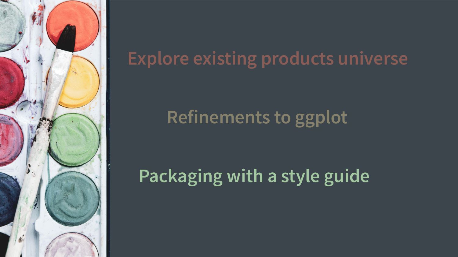
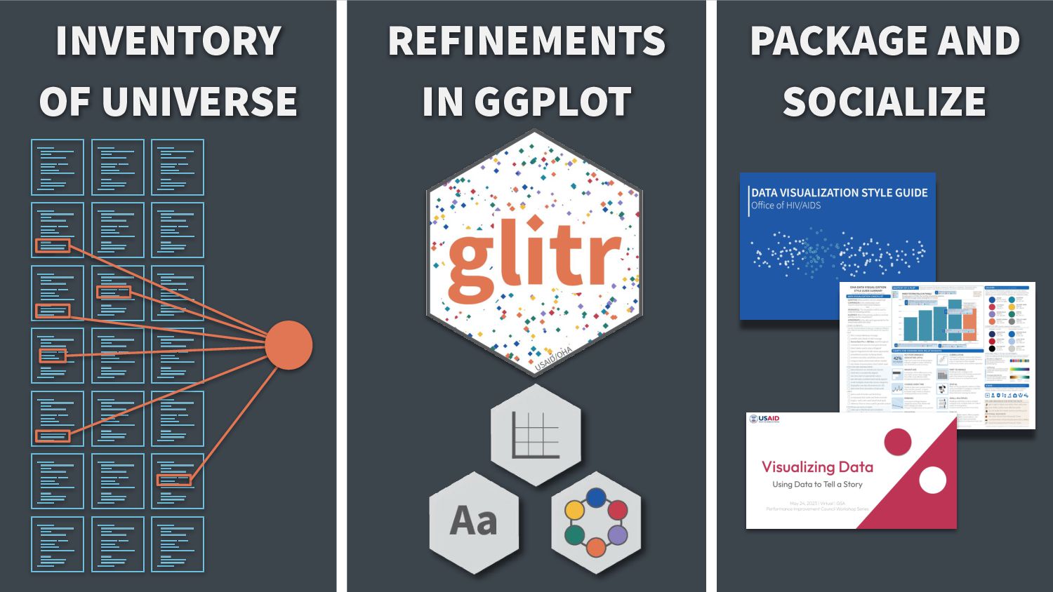
How do you create brand cohesion across your large team when it comes to data viz? My colleague and I, inspired by the BBC's bbplot, developed a package on top of ggplot2 to create a common look and feel for our team's products. This effort improved not just the cohesiveness of our work, but also trustworthiness. By creating this package, we reduced the reliance on using defaults and the time spent on each project customizing numerous graphic elements. More importantly, this package provided an easier on-ramp for new teammates to adopt R. We would like to share our journey within a federal agency developing a style guide, to guide and inspire other organizations who could benefit from developing their own branding package and guidance.

Links
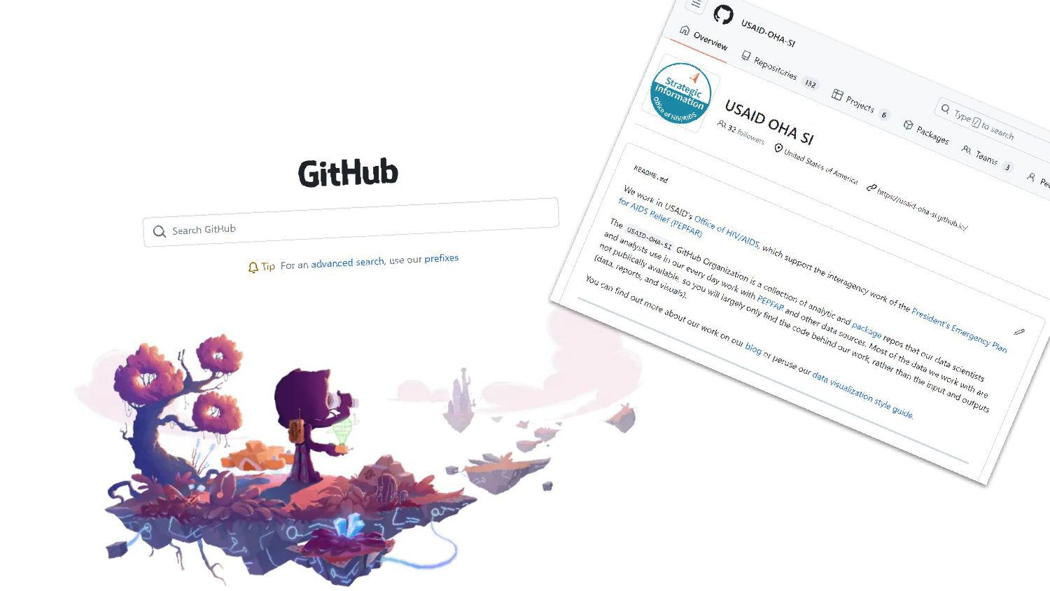
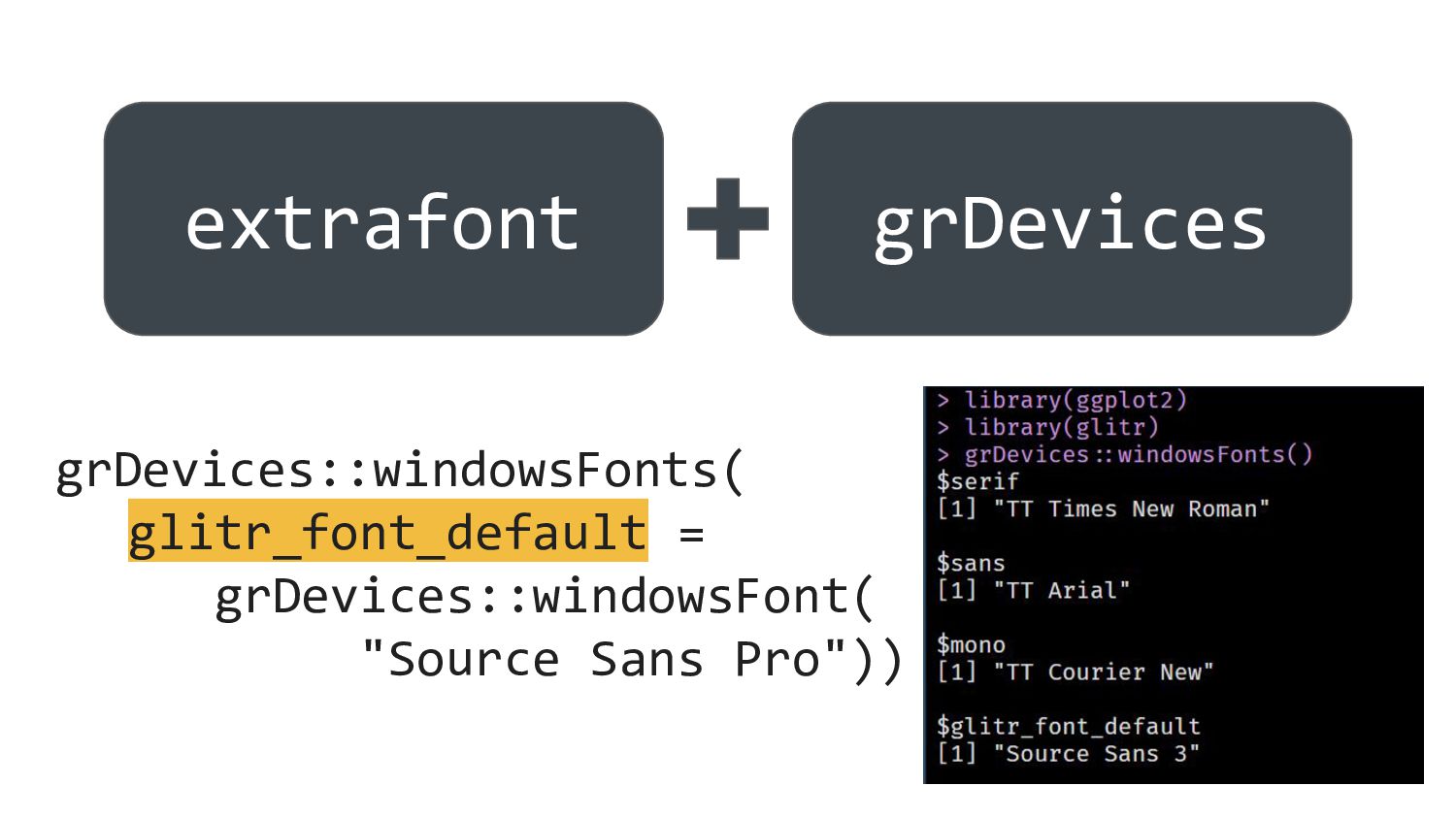
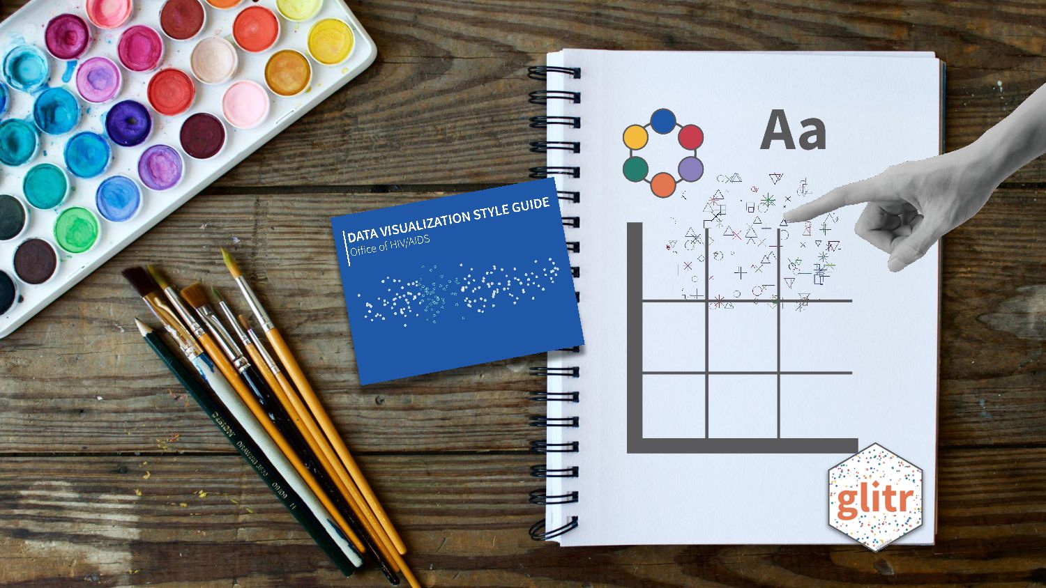
glitr R package - https://github.com/USAID-OHA-SI/glitr
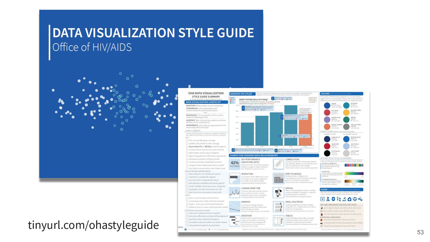
OHA Data Visualization Style Guide - https://issuu.com/achafetz/docs/oha_styleguide

Aaron

September 19, 2023
Tweet

More Decks by Aaron

Other Decks in Design

Transcript

  1. 2 This presentation was made possible by the support of

    the American people through the United States Agency for International Development (USAID) under the U.S. President's Emergency Plan for AIDS Relief (PEPFAR). The contents in this presentation are the sole responsibility of the authors, and do not necessarily reflect the views of USAID, PEPFAR or the United States Government.
  2. Repeating the same ggplot theme elements across the same file

    (and others) Repeating hex colors throughout that are not standard across files Repeating standard exports size and dpi for presentation usage
  3. ggplot2::theme_minimal() %+replace% ggplot2::theme( plot.title = ggplot2::element_text( family = font_title, size

    = 14 * text_scale, face = "bold", color = color_title, margin = ggplot2::margin(b = half hjust = 0), plot.subtitle = ggplot2::element_te family = font_subtitle, ggplot2::theme_minimal()
  4. p + labs(subtitle = "default") p + labs(subtitle = "glitr")

    + scale_fill_si() + si_style_ygrid() BASE GGPLOT GGPLOT + GLITR
  5. 49 “PEPFAR has prioritized, and made significant progress toward, transitioning

    a substantial majority of our funding by agency to local partners”
  6. 50 “PEPFAR has prioritized, and made significant progress toward, transitioning

    a substantial majority of our funding by agency to local partners”
  7. 51 Sorted Colors Clutter Title Labels Axes Four operating units

    achieved USAIDʼs 70% goal Local partner share of budget 70% goal All of these operating units fell short of the 70% of goal. “PEPFAR has prioritized, and made significant progress toward, transitioning a substantial majority of our funding by agency to local partners”
  8. Links to Resources • Git/Github ◦ Happy with Git and

    GitHub for the useR (Bryan) ◦ USAID-OHA-SI Organizational GitHub • Plot Elements ◦ ggplot2 GitHub (Posit) ◦ glitr GitHub (Essam et al, USAID) • Color ◦ Adobe Color ◦ Viz Palette (Meeks and Lu) ◦ Color in Data Viz (Muth, Data Wrapper) • Package ◦ R Packages (Wickham and Bryan) ◦ Writing an R package from scratch (Westlake) ◦ Getting down with pkgdown (Richardson) ◦ Your first R package in 1 hour (Pileggi) • Style Guide ◦ OHA Data Visualization Style Guide (Chafetz and Essam) ◦ City Intelligence Data Design (Brondbjerg) ◦ Urban Institute Data Visualization Style Guide (Chartoff and Schwabish) ◦ Style Guide collection
  9. Notes and Attribution • Prepared for Posit Conf 2023 in

    Chicago [September 19, 2023] ◦ Aaron Chafetz, Senior Economist, USAID/Office of HIV/AIDS ◦ Karishma Srikanth, Data Analyst, USAID/Office of HIV/AIDS ◦ Support and feedback from: Josh Davis, Tim Essam, Jessica Hoehner, Baboyma Kagniniwa, and Amanda Makulec • USAID Graphics Standards Manual and Partner Co-Branding (2020) • Lisa Charlotte Muth Datawrapper Blog • PEPFAR Annual Report to Congress (2022) • Aaron Chafetz and Tim Essam “Data Visualization Style Guide” Office of HIV/AIDS (2020) • Aaron Chafetz and Tim Essam “Visualizing Data: Using Data to Tell a Story” (2023) • Image sources ◦ “A man hand pointing or touching screen” indysystem [Adobe Stock] ◦ “Paint brushes nex to drawing book and water color palette” Tim Arerbury [Unsplash] ◦ “Person looking at painting” Antenna [Unsplash] ◦ Nike Logo [Wikipedia] ◦ “Person standing in front of trees” Andrew Neel [Unsplash] ◦ “White paint palette with paint brush” Glen Carrie [Unsplash] ◦ “A large grid of pins connected with string” ink drop [Adobe Stock] ◦ “person holding white dandelion flower” Ivan Dostal [Unsplash] ◦ “Painting by numbers with acrylics on cotton canvas is a hobby for practicing at home” Anna Huchak [Adobe Stock] ◦ “Echo” wandering echos [Unsplash] • Icon sourced from the Noun Project - Stairs by Setyo Ari Wibowo, hourglass by Mello, Laptop by Emmanuel Garcia Frias, Book by Abner Ignatius, Glasses by Nico Ilk