the American people through the United States Agency for International Development (USAID) under the U.S. President's Emergency Plan for AIDS Relief (PEPFAR). The contents in this presentation are the sole responsibility of the authors, and do not necessarily reflect the views of USAID, PEPFAR or the United States Government.
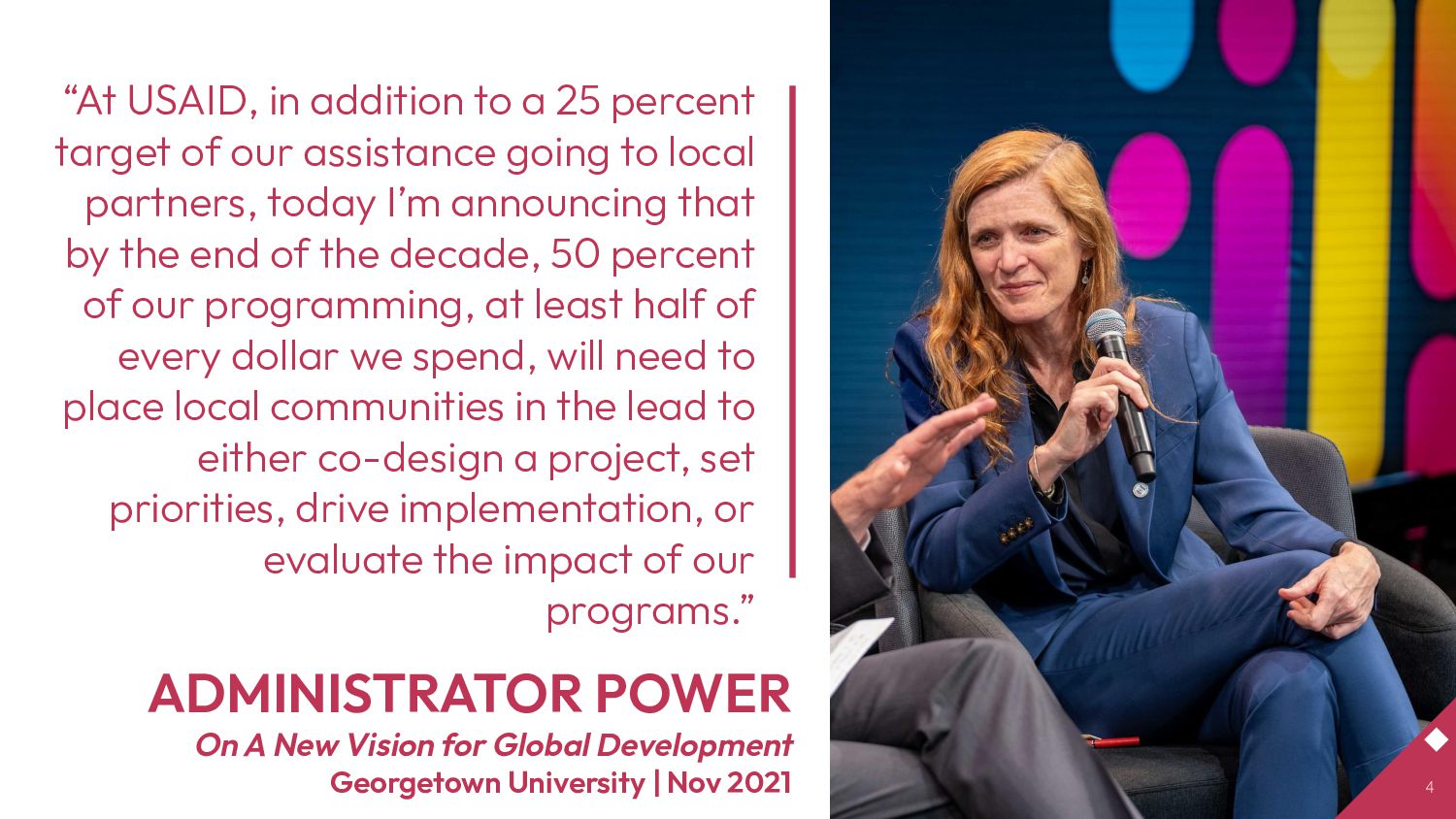
Georgetown University | Nov 2021 “At USAID, in addition to a 25 percent target of our assistance going to local partners, today I’m announcing that by the end of the decade, 50 percent of our programming, at least half of every dollar we spend, will need to place local communities in the lead to either co-design a project, set priorities, drive implementation, or evaluate the impact of our programs.” 4
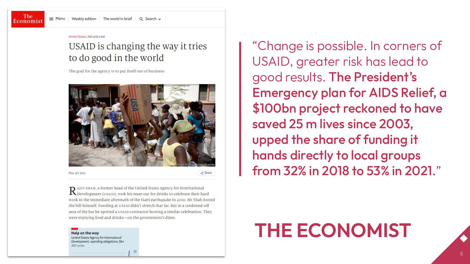
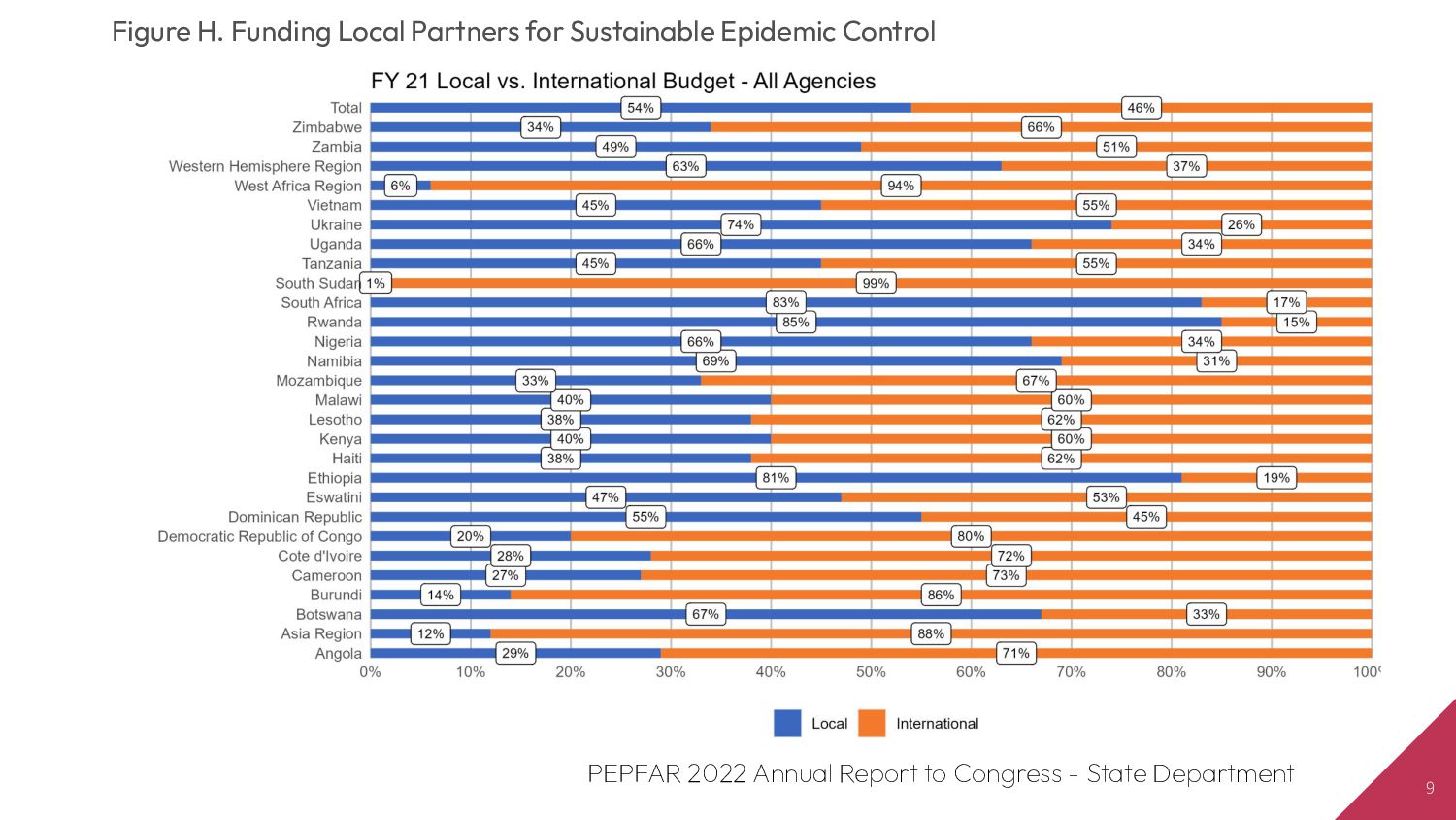
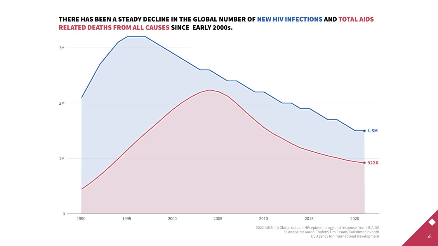
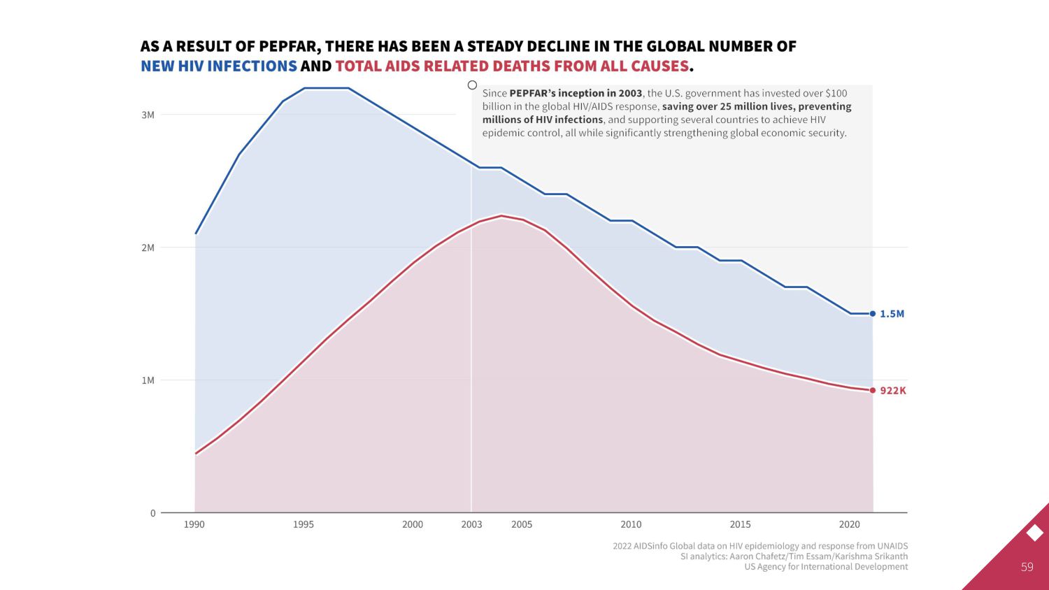
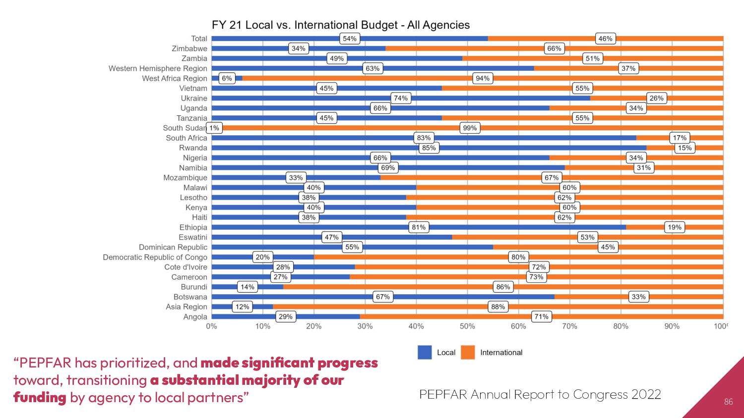
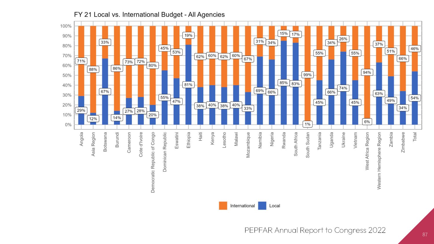
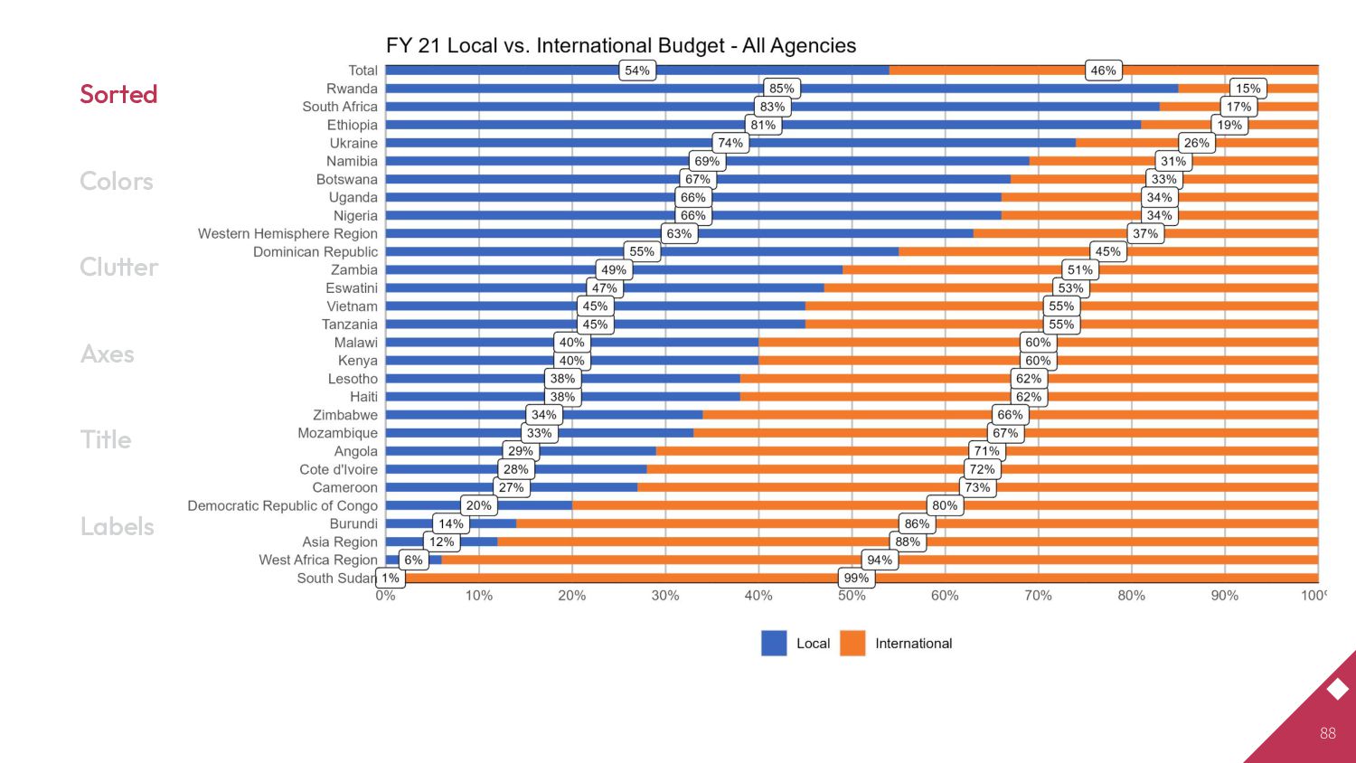
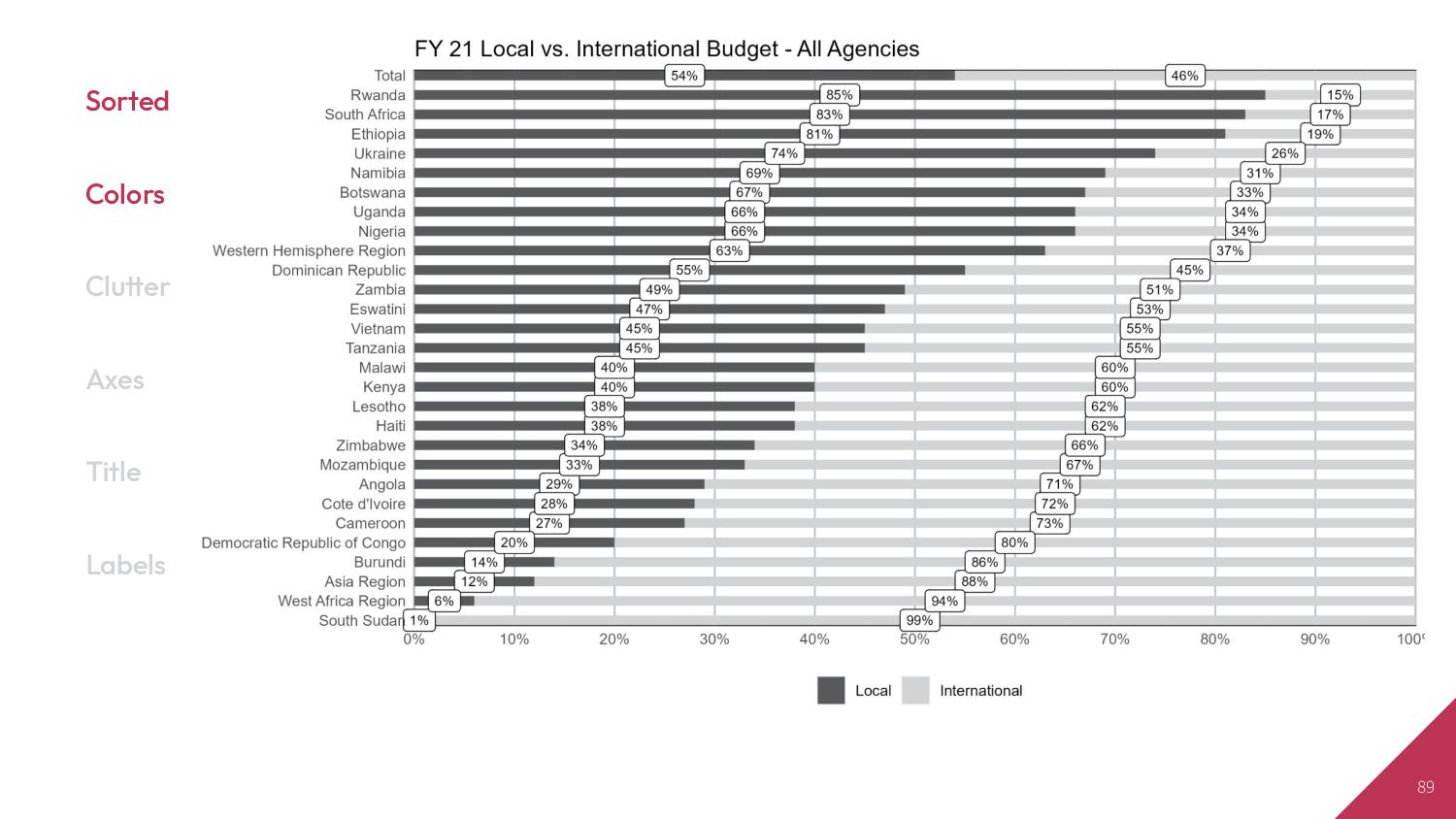
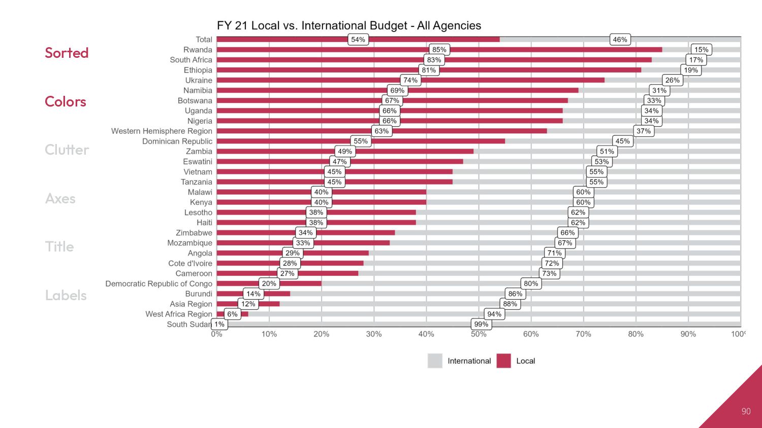
greater risk has lead to good results. The President’s Emergency plan for AIDS Relief, a $100bn project reckoned to have saved 25 m lives since 2003, upped the share of funding it hands directly to local groups from 32% in 2018 to 53% in 2021.”
Senior Data Scientist [email protected] US Agency for International Development Bureau for Global Health | Office of HIV/AIDS | Strategic Information Branch
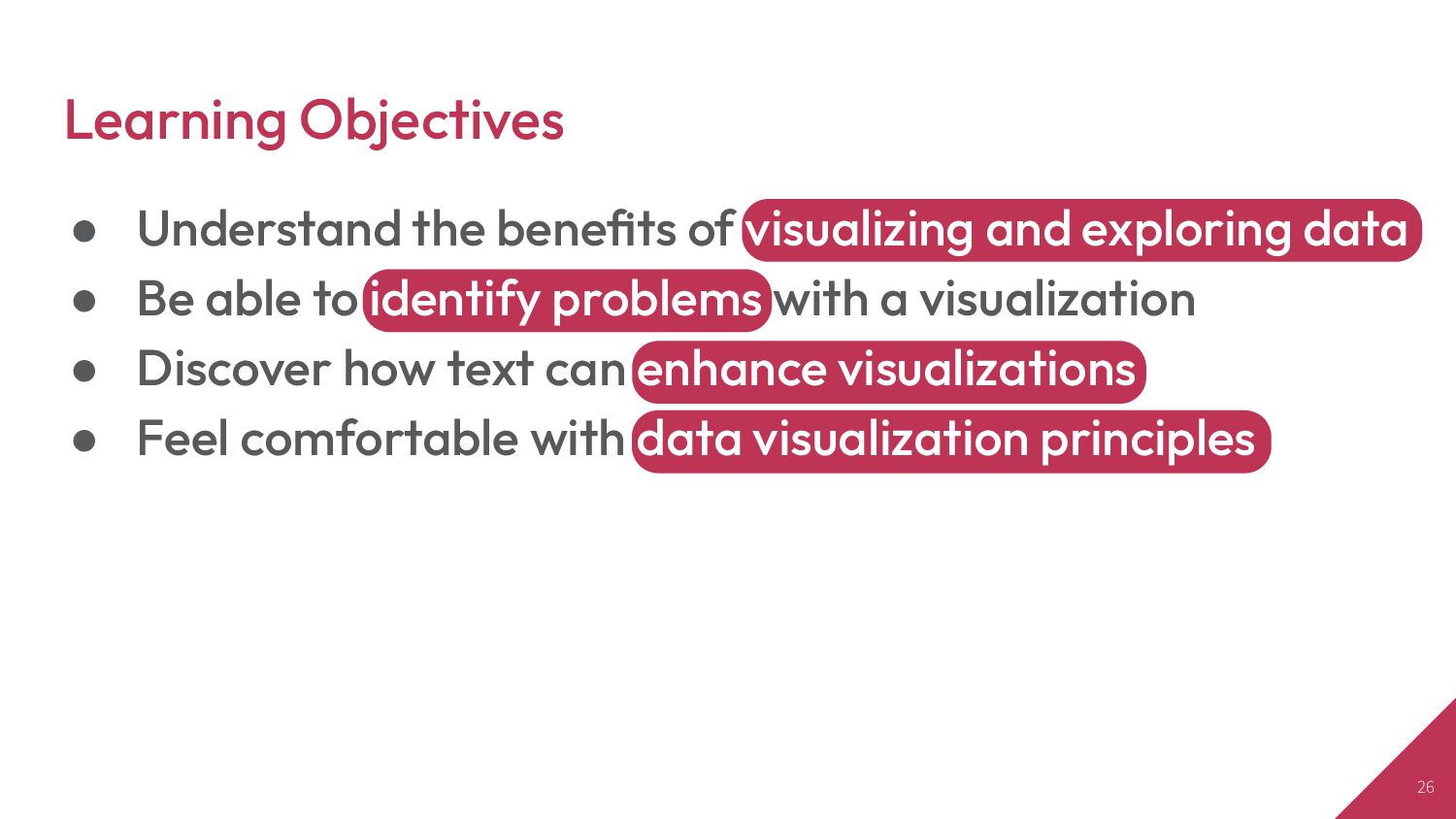
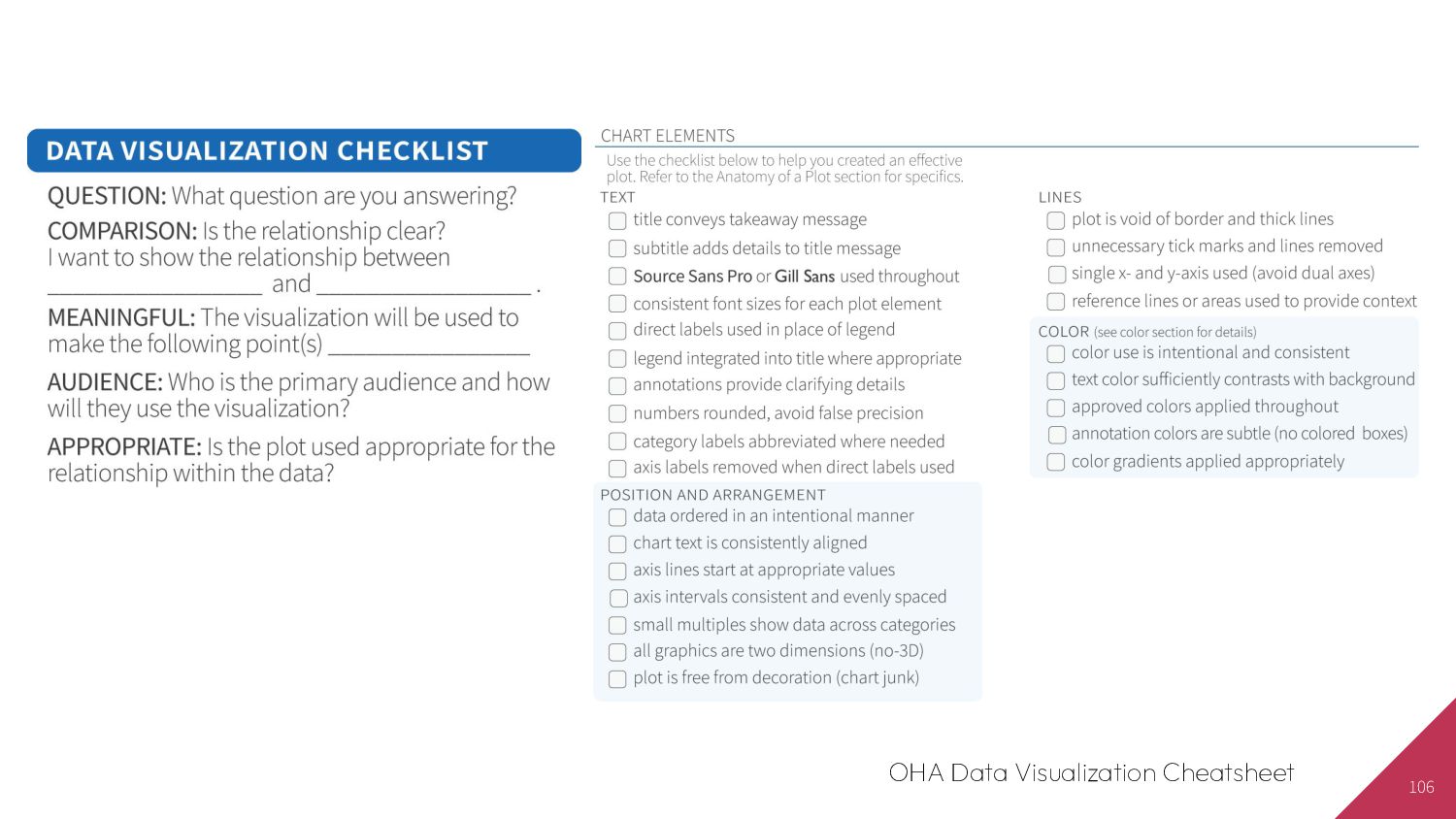
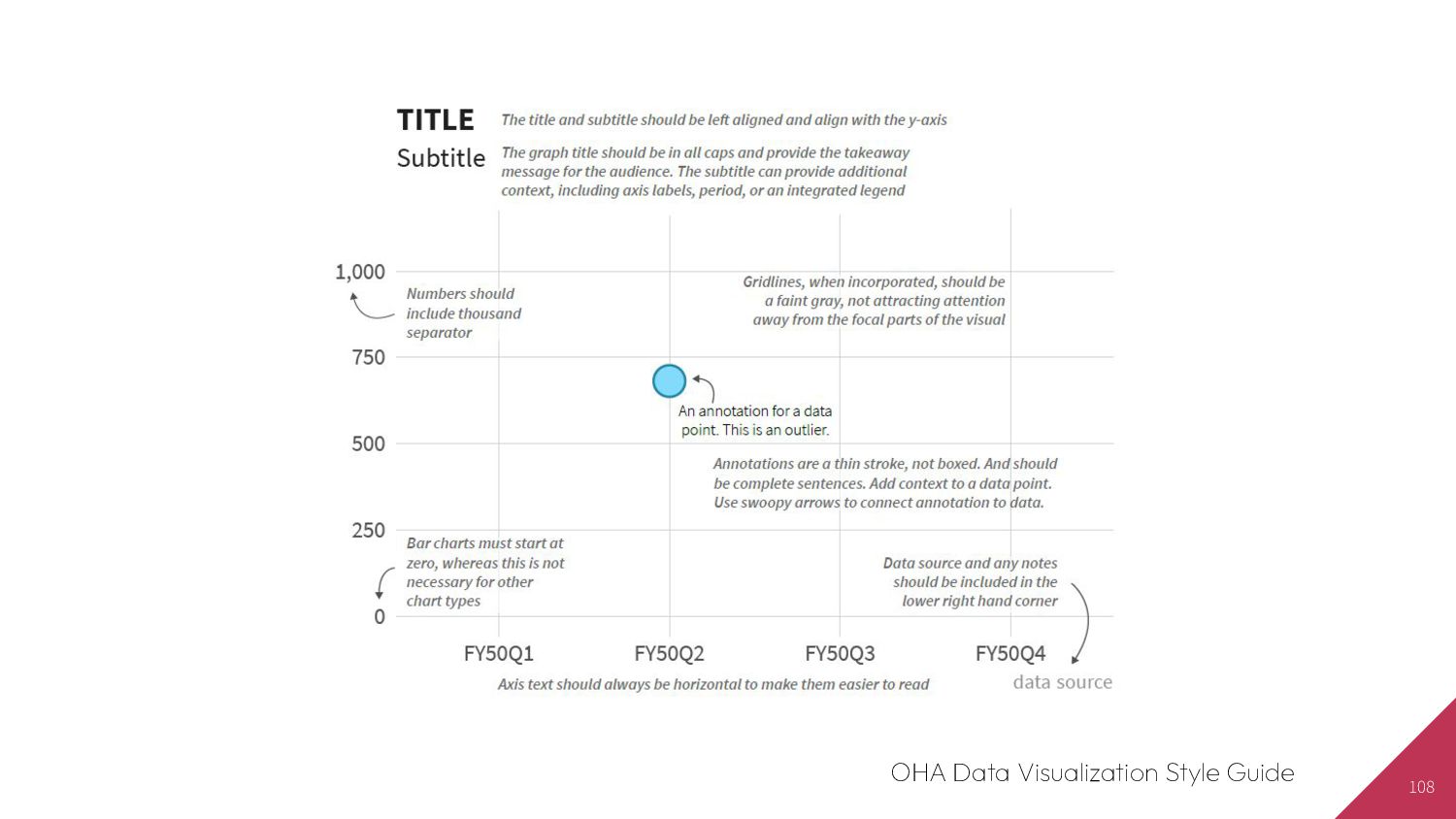
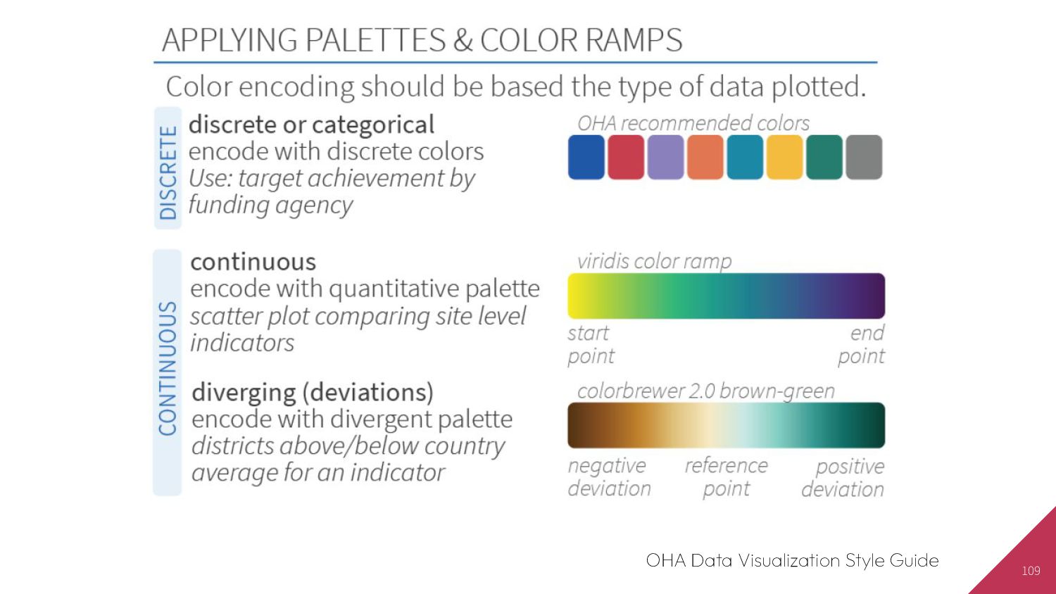
exploring data • Be able to identify problems with a visualization • Discover how text can enhance visualizations • Feel comfortable with data visualization principles
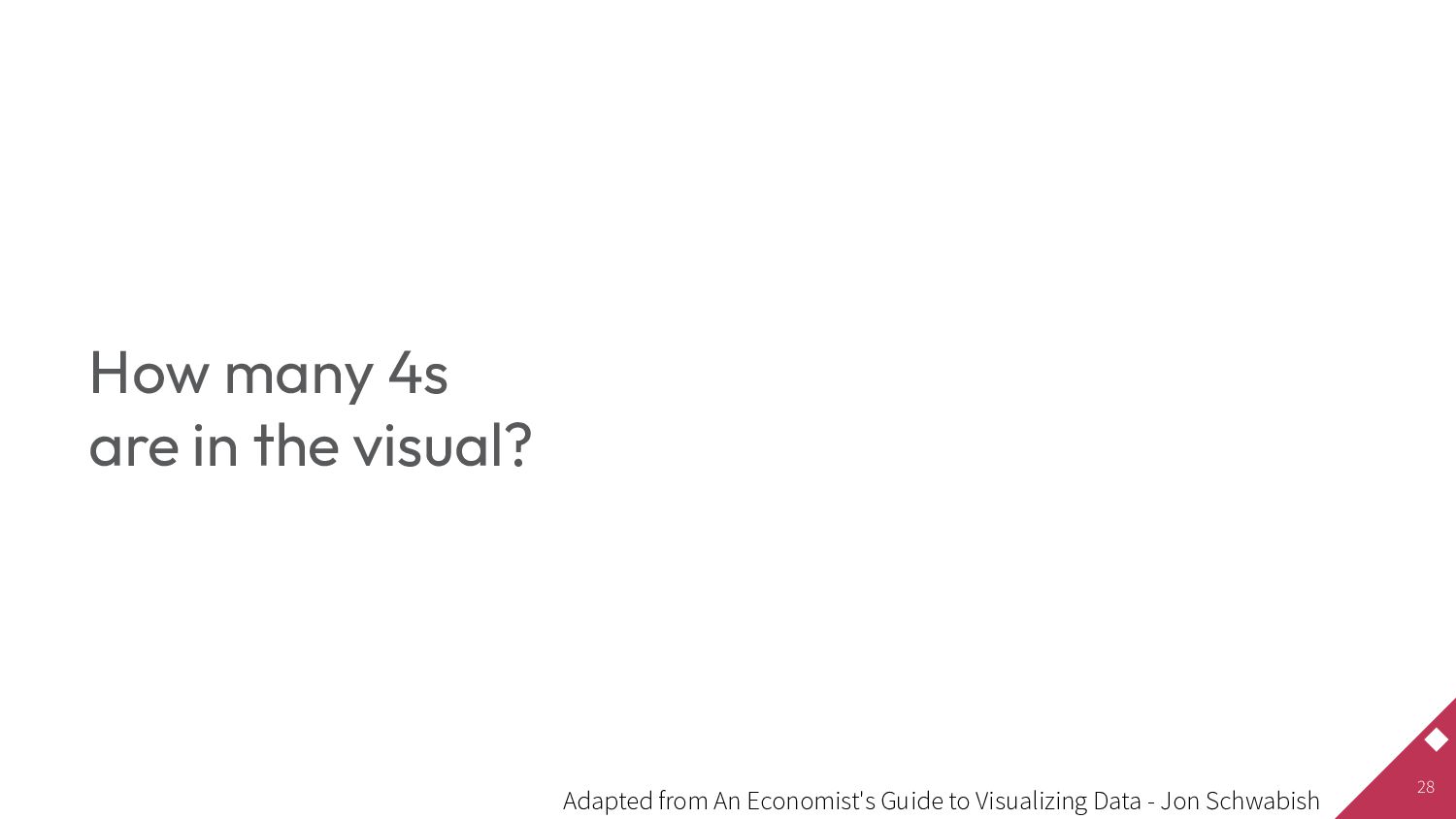
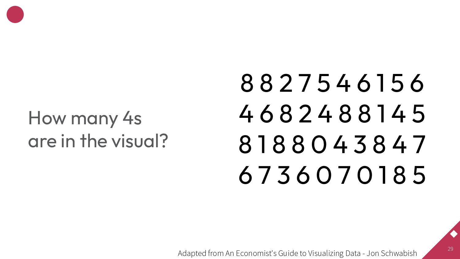
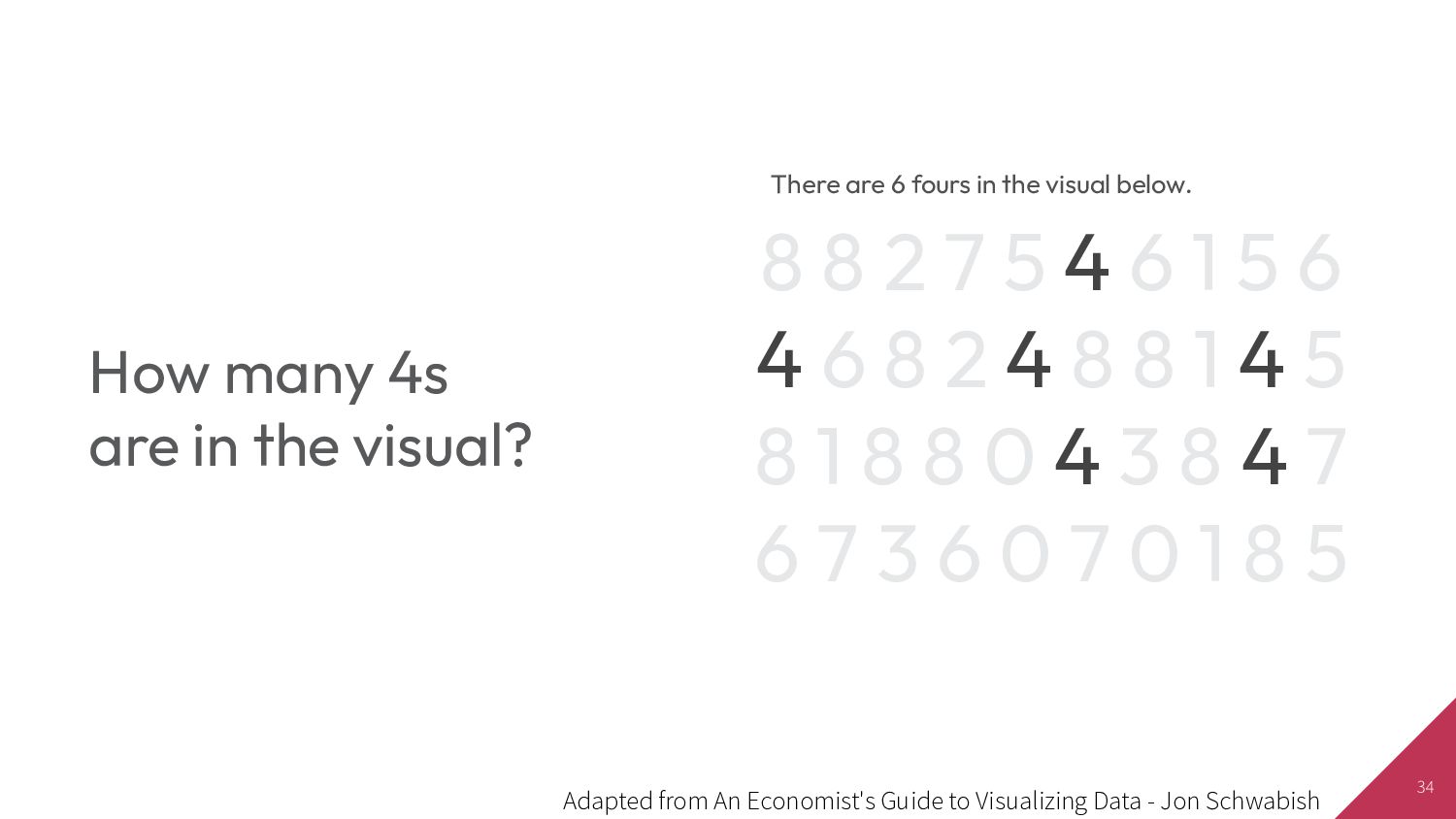
6 4 6 8 2 4 8 8 1 4 5 8 1 8 8 0 4 3 8 4 7 6 7 3 6 0 7 0 1 8 5 How many 4s are in the visual? Adapted from An Economist's Guide to Visualizing Data - Jon Schwabish
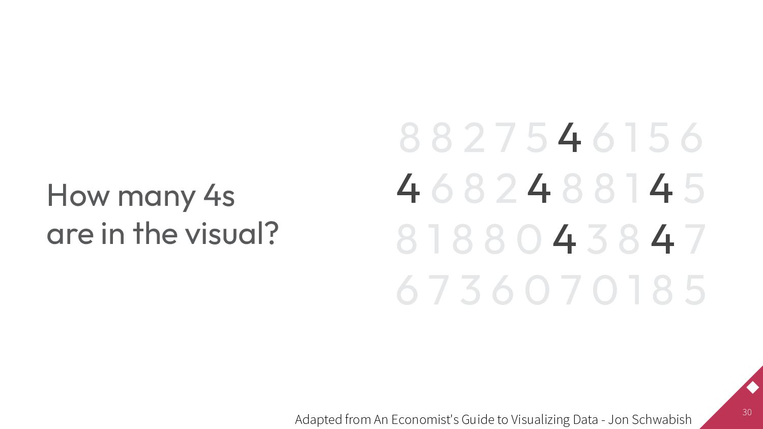
6 4 6 8 2 4 8 8 1 4 5 8 1 8 8 0 4 3 8 4 7 6 7 3 6 0 7 0 1 8 5 How many 4s are in the visual? Adapted from An Economist's Guide to Visualizing Data - Jon Schwabish
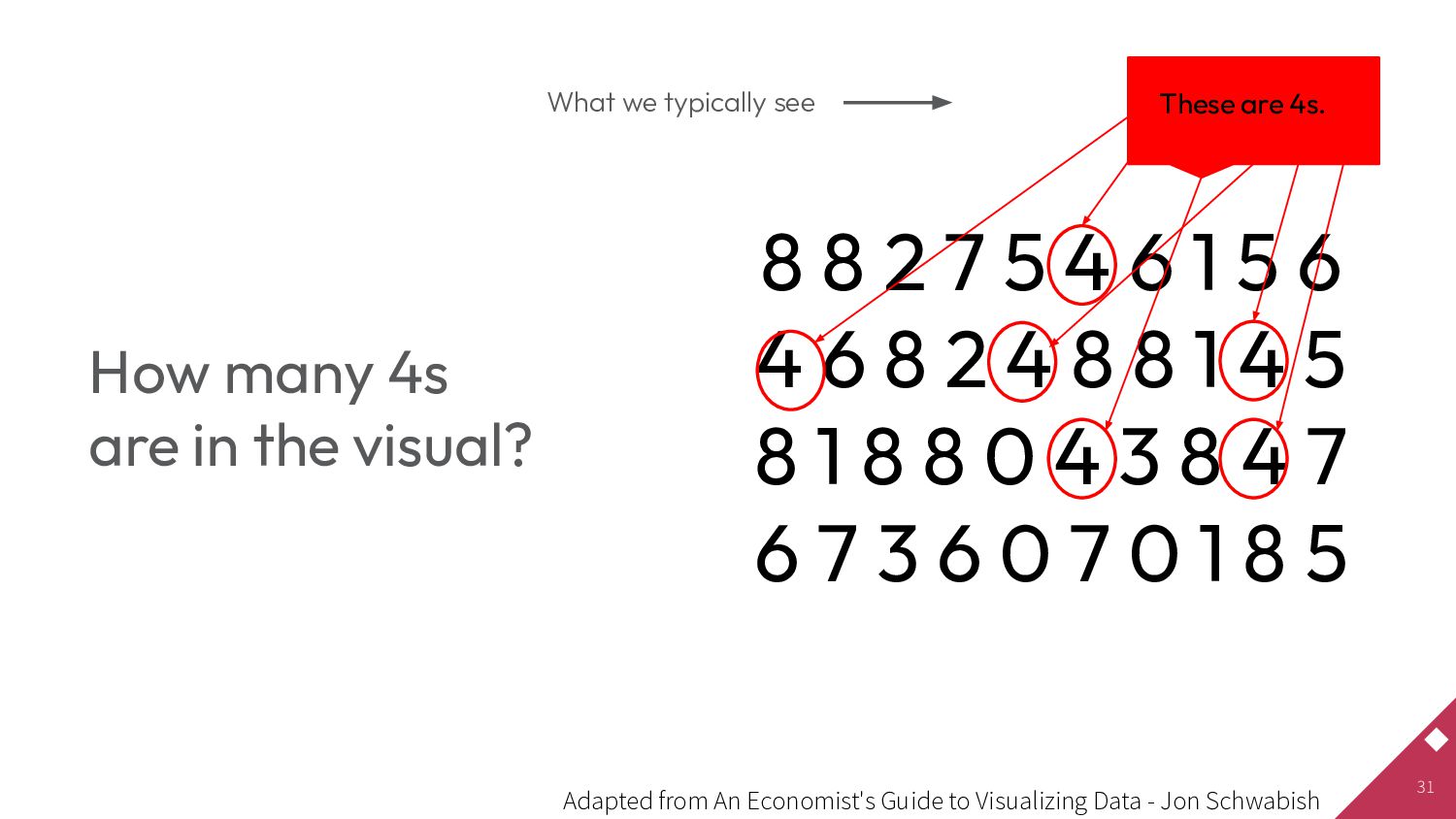
6 4 6 8 2 4 8 8 1 4 5 8 1 8 8 0 4 3 8 4 7 6 7 3 6 0 7 0 1 8 5 These are 4s. What we typically see How many 4s are in the visual? Adapted from An Economist's Guide to Visualizing Data - Jon Schwabish
6 4 6 8 2 4 8 8 1 4 5 8 1 8 8 0 4 3 8 4 7 6 7 3 6 0 7 0 1 8 5 There are 6 fours in the visual below. How many 4s are in the visual? Adapted from An Economist's Guide to Visualizing Data - Jon Schwabish
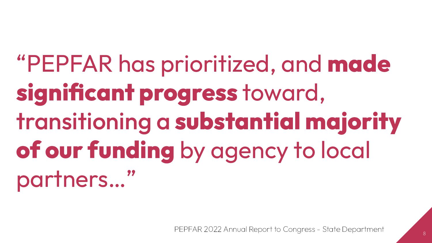
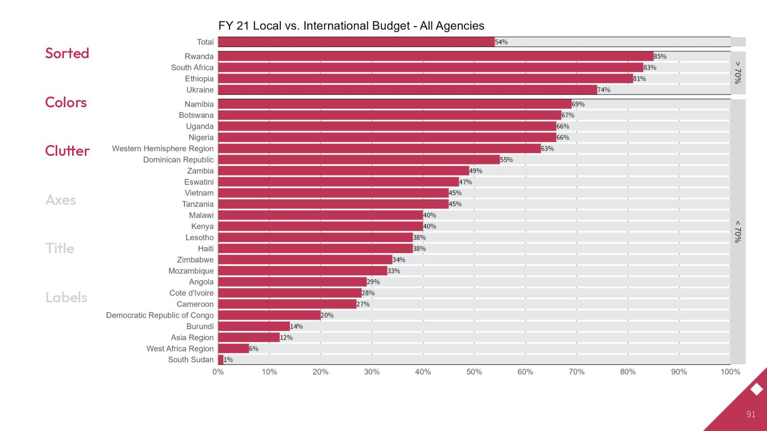
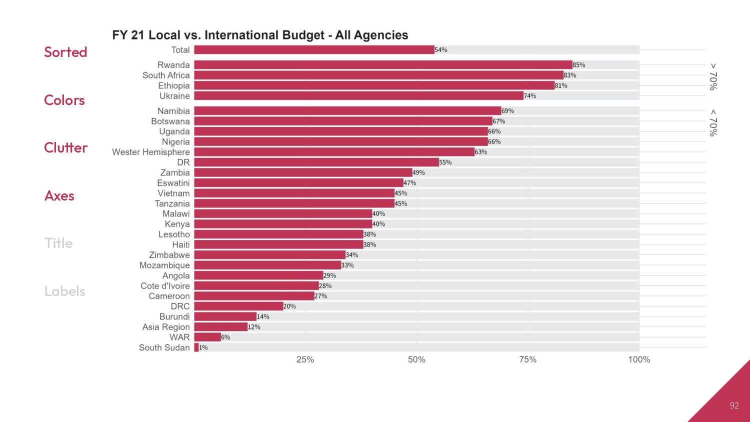
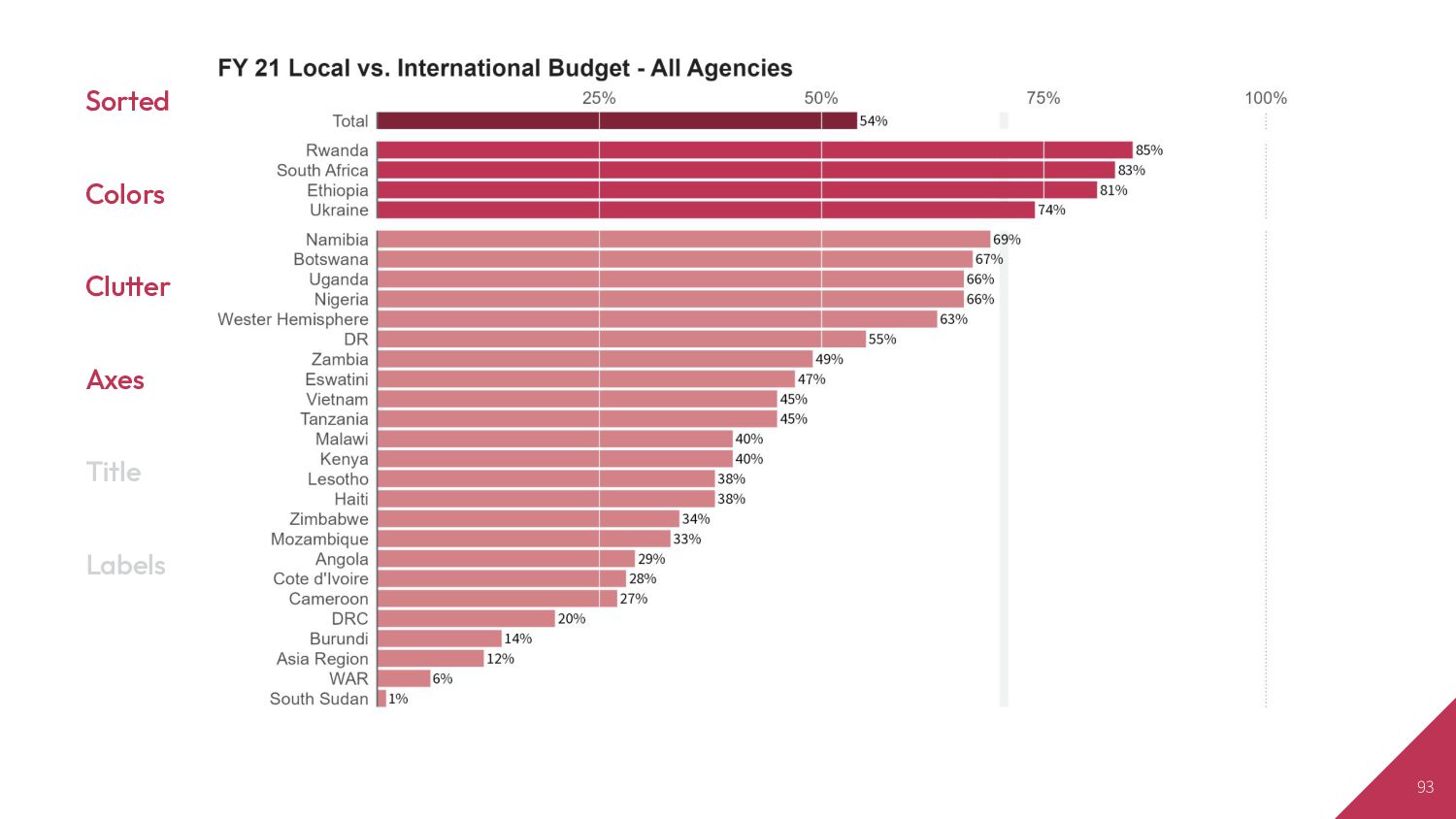
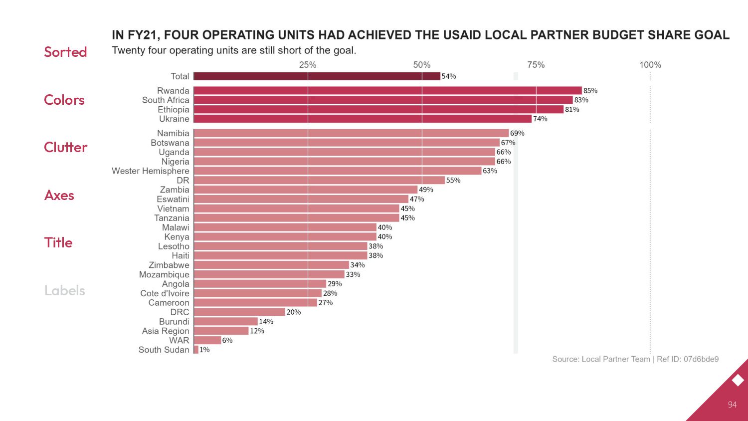
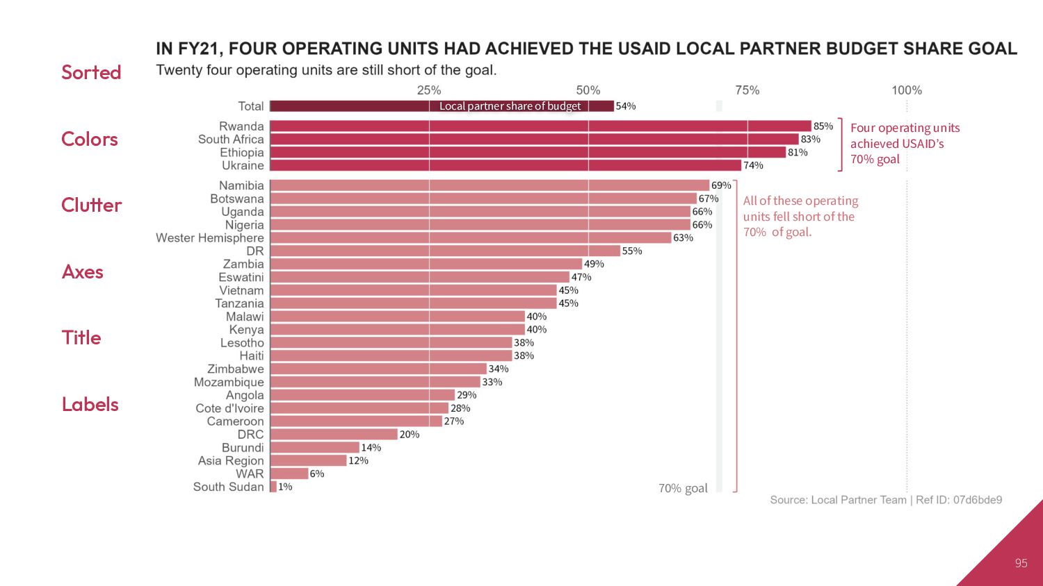
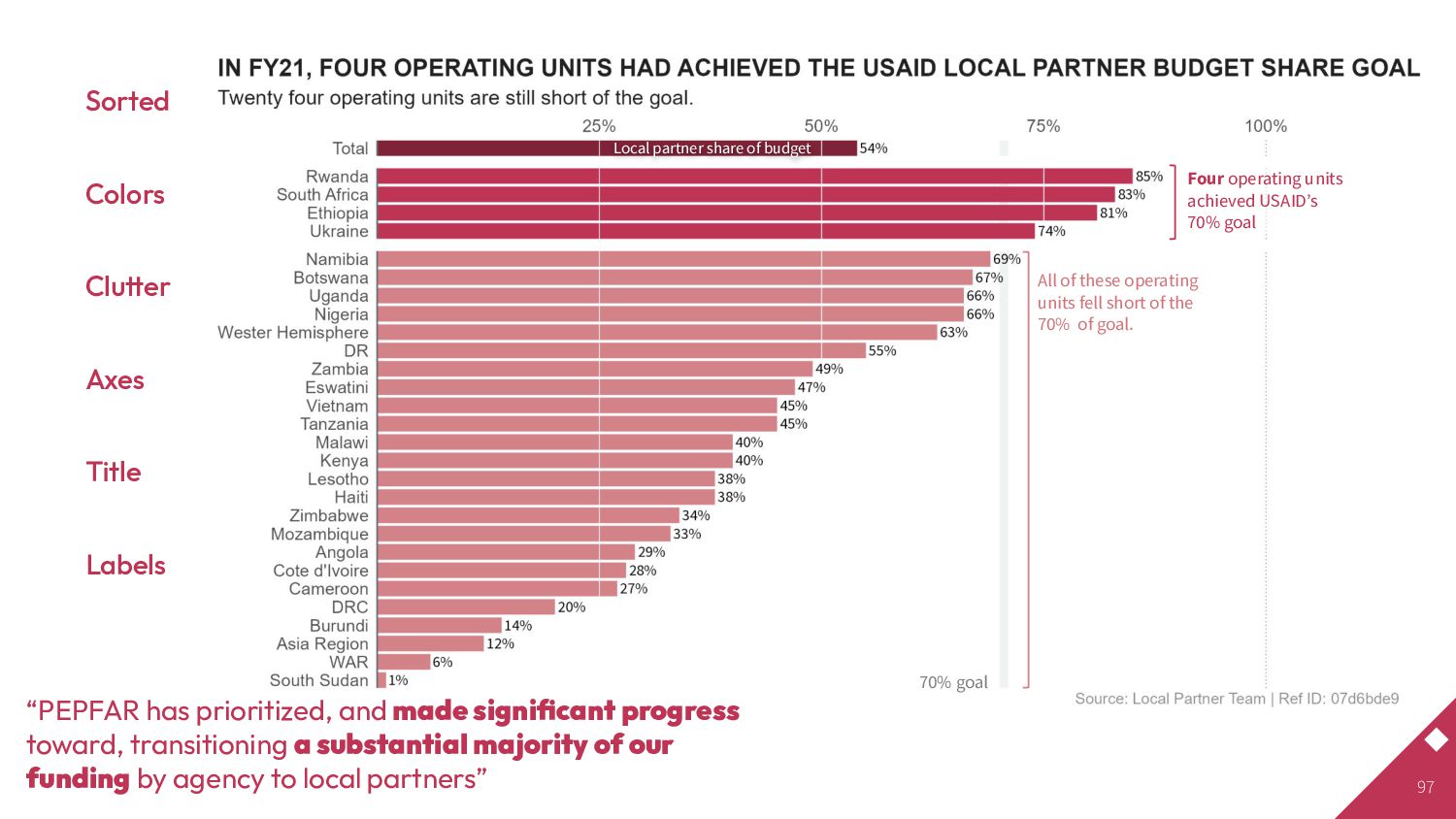
achieved USAIDʼs 70% goal Local partner share of budget 70% goal All of these operating units fell short of the 70% of goal. “PEPFAR has prioritized, and made significant progress toward, transitioning a substantial majority of our funding by agency to local partners”
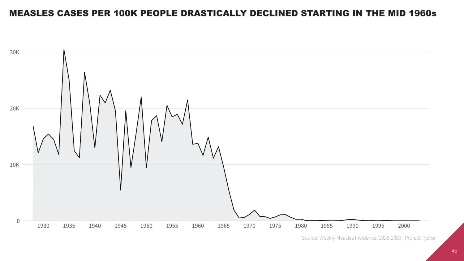
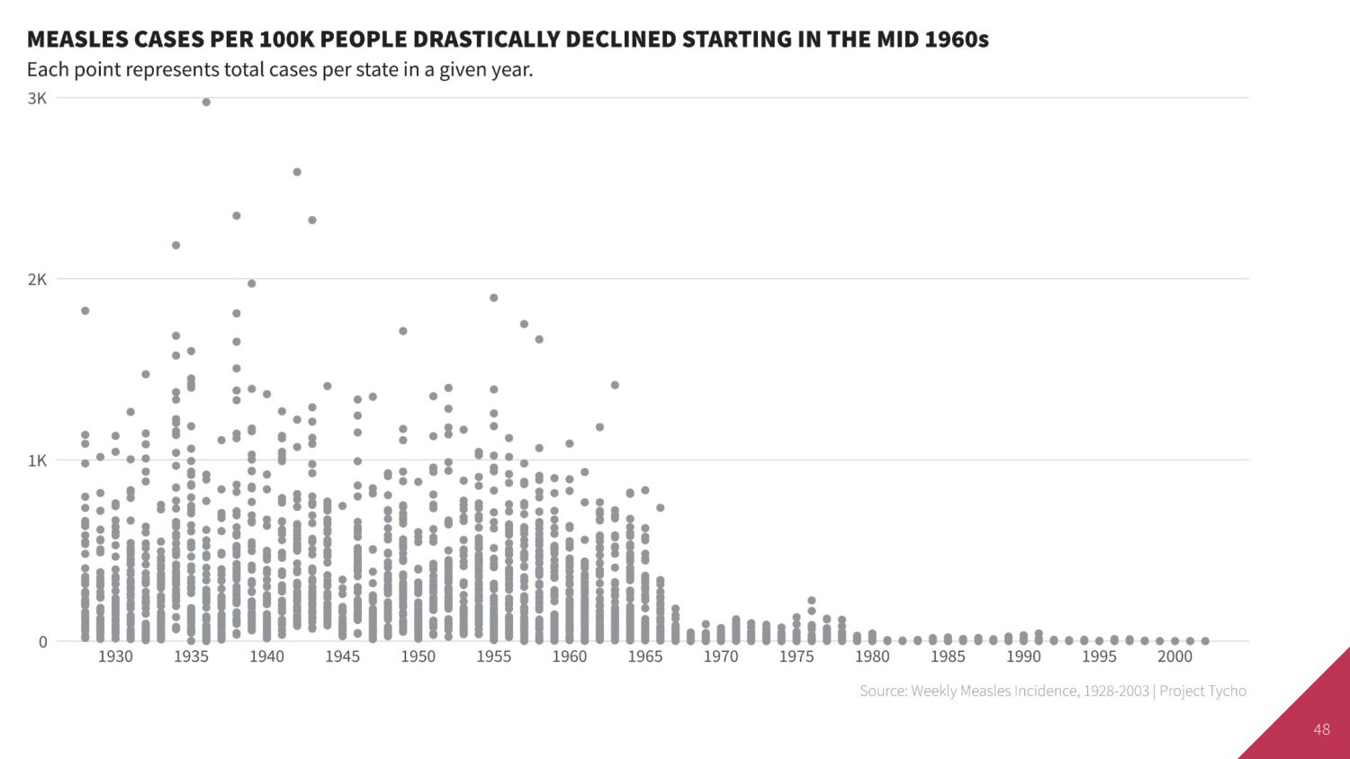
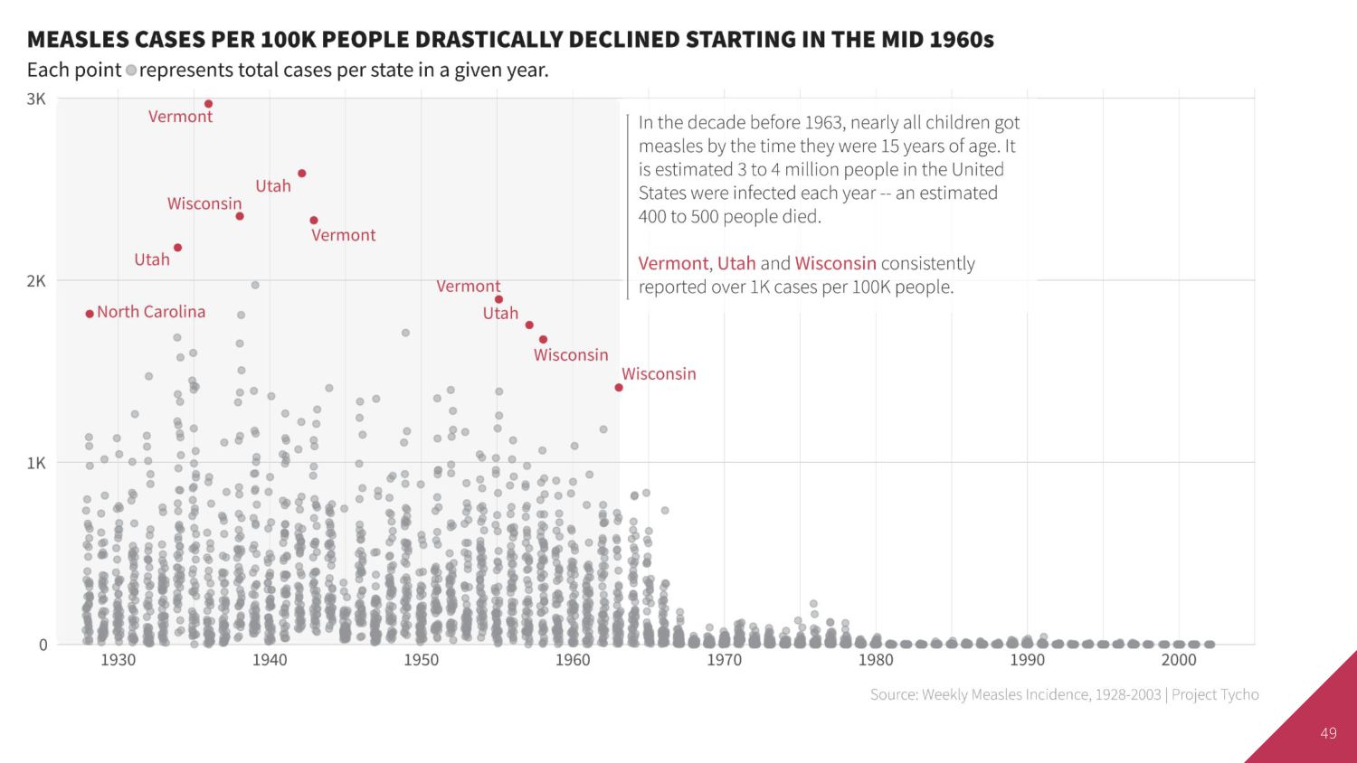
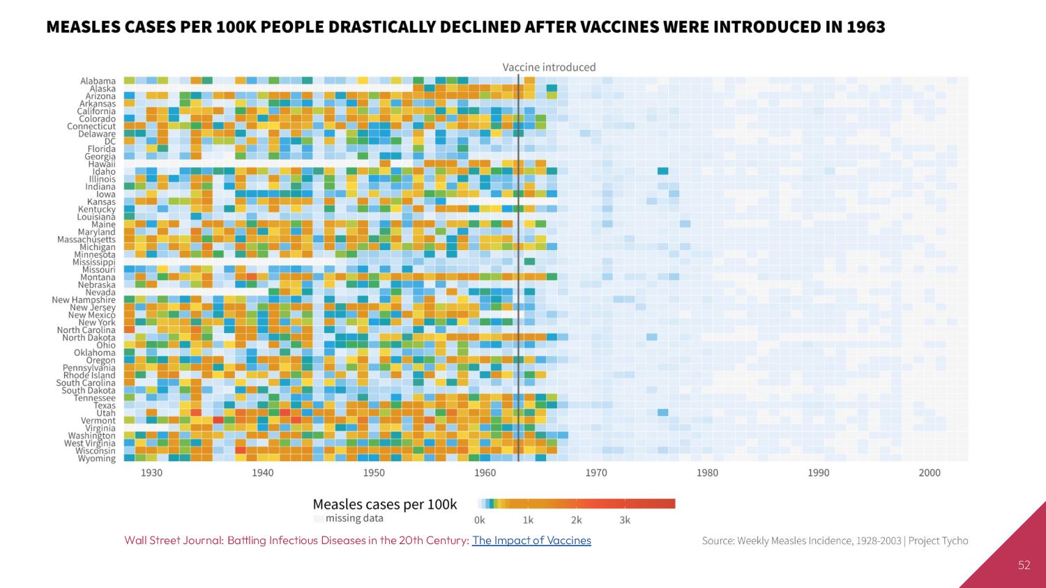
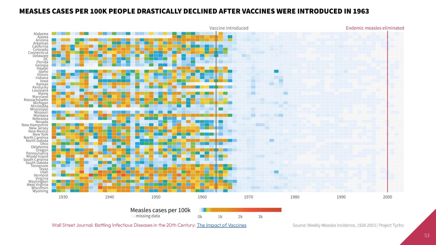
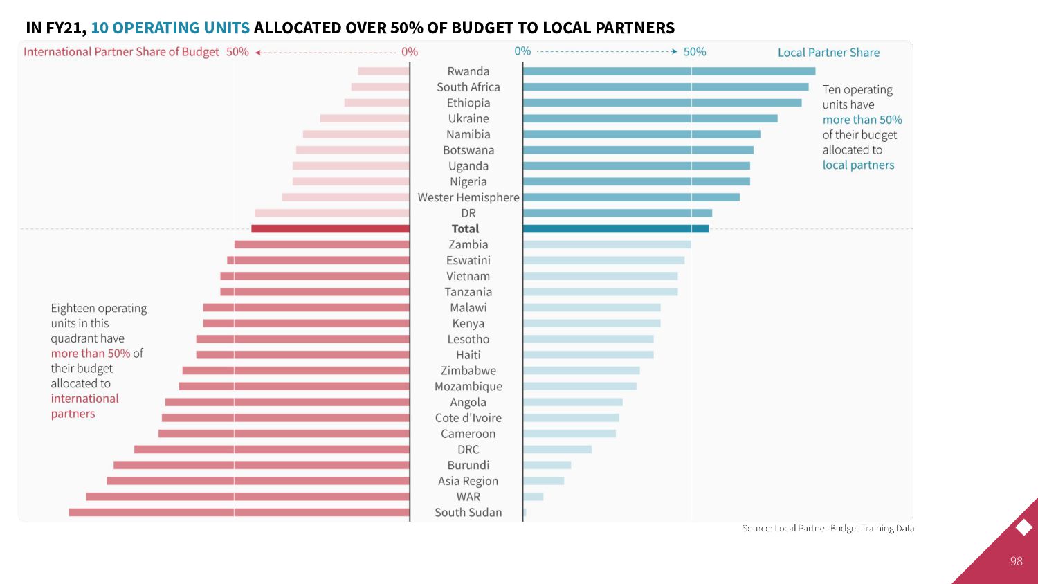
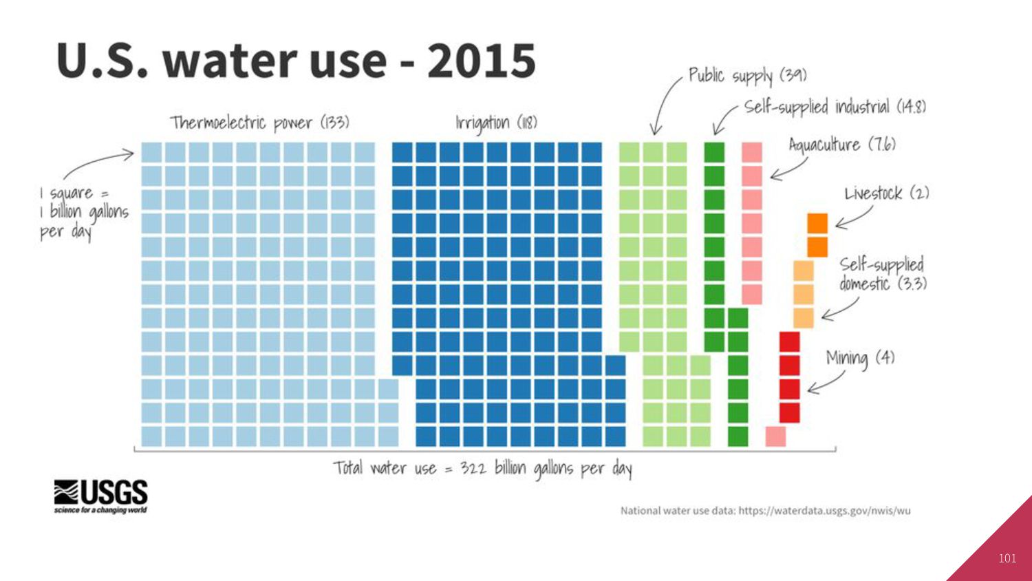
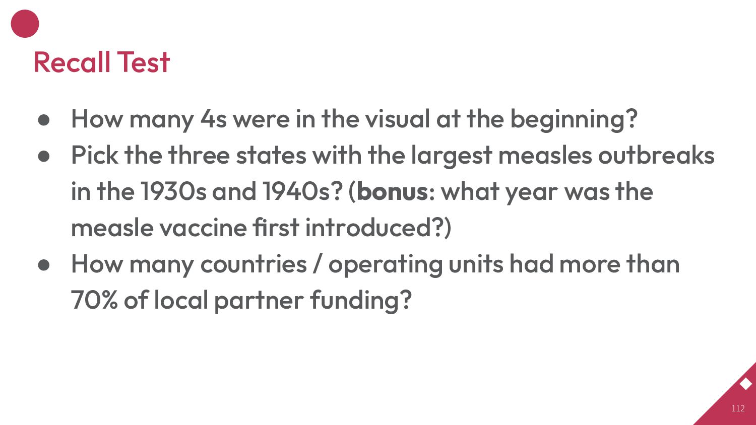
at the beginning? • Pick the three states with the largest measles outbreaks in the 1930s and 1940s? (bonus: what year was the measle vaccine first introduced?) • How many countries / operating units had more than 70% of local partner funding? 112
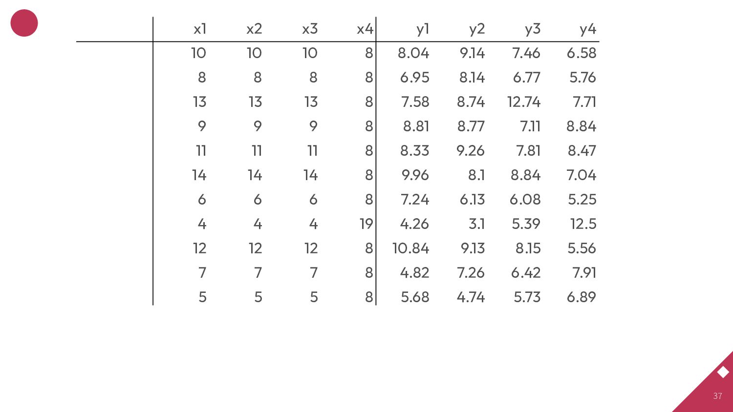
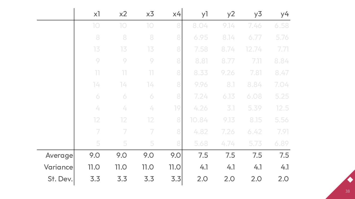
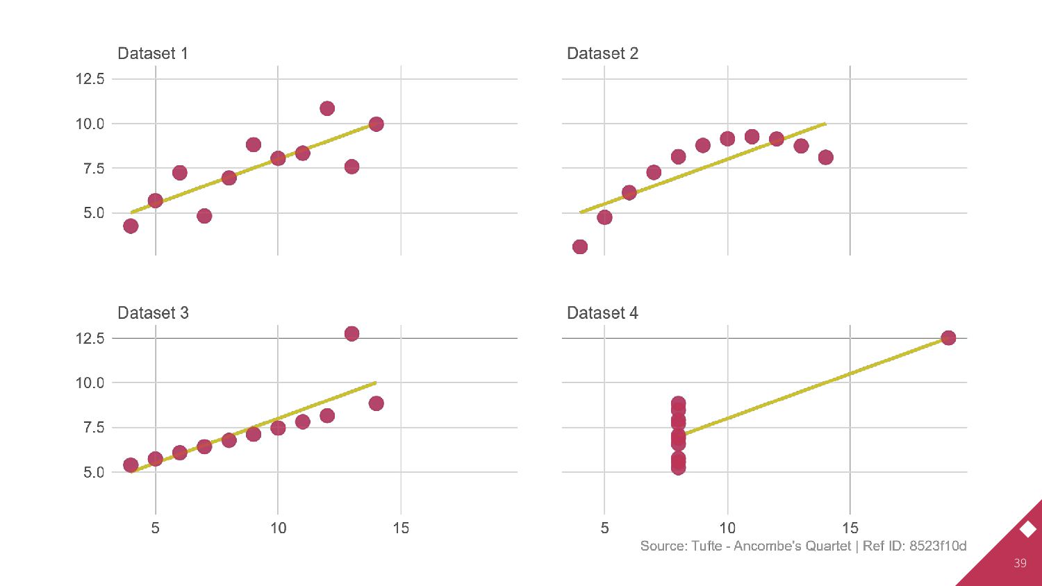
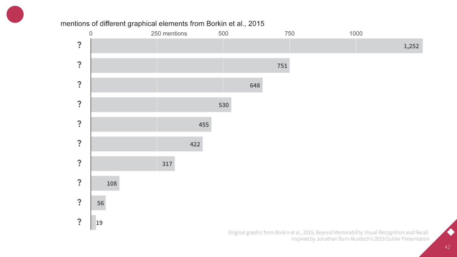
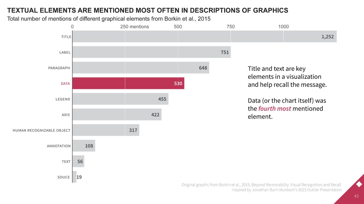
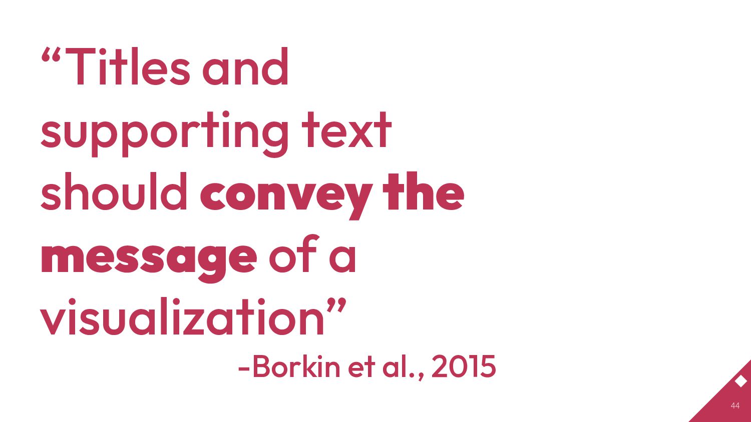
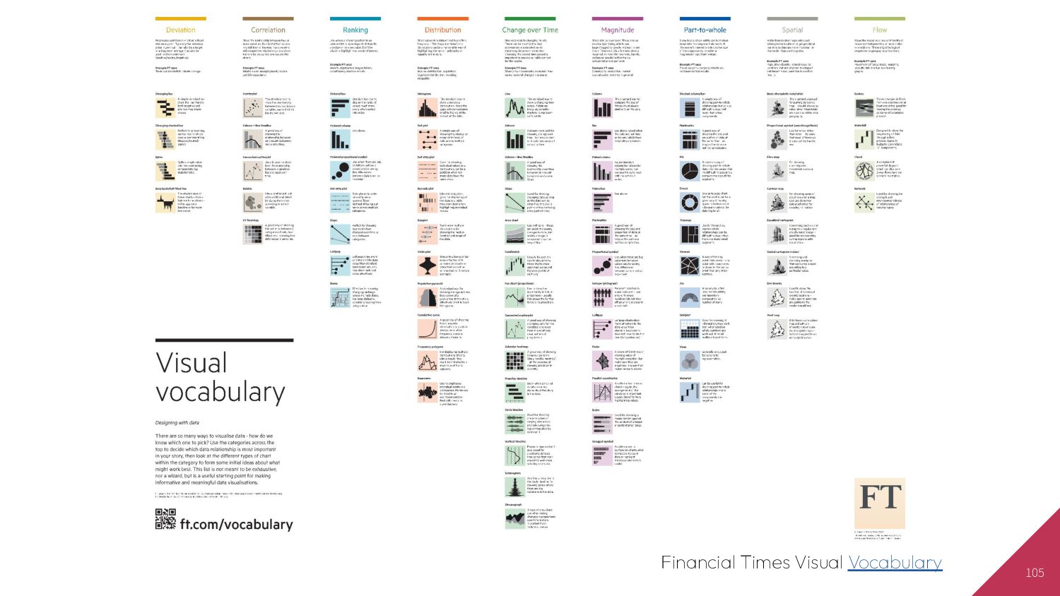
1.3.3 Gestalt rules from Kieran Healy's Data Visualization - https://socviz.co/lookatdata.html • DatasauRus Package - https://cran.r-project.org/web/packages/datasauRus/vignettes/Datasaurus.html • What Questions to Ask When Creating Charts - https://blog.datawrapper.de/better-charts/ • How We’ve Learned Data Viz, and Why You May Want To Do It Differently - https://medium.com/nightingale/how-weve-learned-data-viz-and-why-you-may-want-to-do-it-differently-ec1267bd39b2 • PEPFAR Annual Report to Congress - https://www.state.gov/wp-content/uploads/2022/05/PEPFAR2022.pdf • Graphic design has rules, and they work … - https://twitter.com/MR_RO_BO_T/status/1533517961377587201 • #RotateTheDamnPlot - https://twitter.com/ikashnitsky/status/1521960898440613889?s=20&t=rxuGq6l-O8BMdYDG-zzw9A • bar charts and dot plots and line graphs, oh my! - https://www.storytellingwithdata.com/blog/bar-charts-and-dot-plots-and-line-graphs-oh-my • Examples from: Three Simple Flexible tools for Empowered Data Visualization - https://www.youtube.com/watch?v=W02ZlvulHSY • OHA Style Guide - https://issuu.com/achafetz/docs/oha_styleguide • Better Visualizations - Jon Schwabish • Covid response hampered by population data glitches - Oliver Barnes & John Burn-Murdoch - https://www.ft.com/content/125fbaf8-175a-4e2e-852a-9995ca5176b2 • M. A. Borkin et al., "Beyond Memorability: Visualization Recognition and Recall," in IEEE Transactions on Visualization and Computer Graphics, vol. 22, no. 1, pp. 519-528, 31 Jan. 2016, doi: 10.1109/TVCG.2015.2467732. • Franconeri, S. L., Padilla, L. M., Shah, P., Zacks, J. M., & Hullman, J. (2021). The Science of Visual Data Communication: What Works. Psychological Science in the Public Interest, 22(3), 110–161. • Ajani K, Lee E, Xiong C, Knaflic CN, Kemper W, Franconeri S. Declutter and Focus: Empirically Evaluating Design Guidelines for Effective Data Communication. IEEE Trans Vis Comput Graph. 2022 Oct;28(10):3351-3364. doi: 10.1109/TVCG.2021.3068337. Epub 2022 Sep 1. PMID: 33760737.
![SESSION PRESENTERS 21 AARON Chafetz Senior Economist [email protected] TIM Essam](https://files.speakerdeck.com/presentations/80836f0460154b5a82bd9f2485ee079d/slide_20.jpg)
![71 Truth Truth Truth @visualizevalue [2022-05-09]](https://files.speakerdeck.com/presentations/80836f0460154b5a82bd9f2485ee079d/slide_70.jpg)