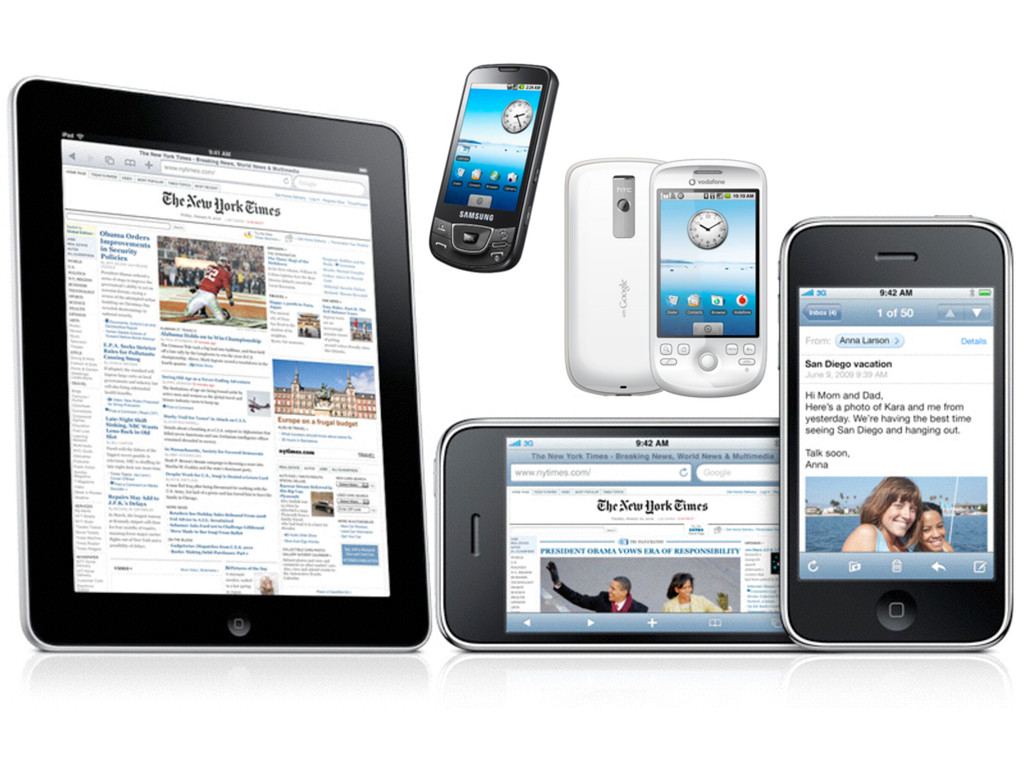
is universality. The Web should be usable by people with disabilities. It must work with any form of information, be it a document or a point of data, and information of any quality—from a silly tweet to a scholarly paper. And it should be accessible from any kind of hardware that can connect to the Internet: stationary or mobile, small screen or large. —Tim Berners-Lee Long Live the Web “ ”
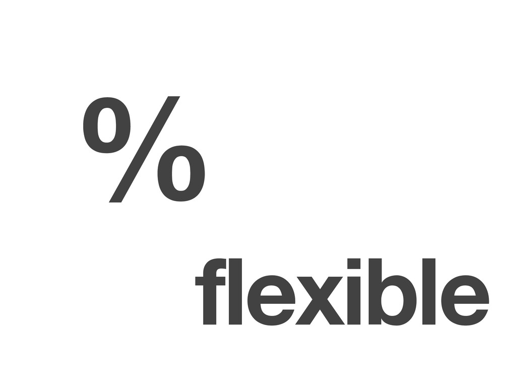
often desire in the web medium, is simply a function of the limitation of the printed page. We should embrace the fact that the web doesn’t have the same constraints, and design for this flexibility.” —John Allsopp A Dao of Web Design “
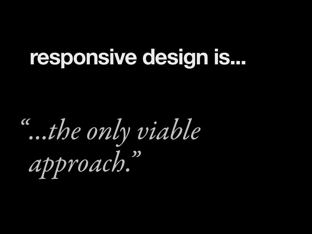
number of web devices, we can treat them as facets of the same experience. We can design for an optimal viewing experience, but embed standards-based technologies into our designs to make them not only more flexible, but more adaptive to the media that renders them.” —Ethan Marcotte Responsive Web Design “
layouts for the web – whatever the device – we need to shed the notion that we create layouts from a canvas in. We need to flip it on its head, and create layouts from the content out.” —Mark Boulton A Richer Canvas “
 adactio
 lynteo
 calpin
 hikarutakase
 rezaline
 baasie
 terencebasart
 hypebeans
 webnaut
 godlingkogami
 ashapiro
 hiromimaeo
 hiro93n
 szymonslowik
 katiecoart
 erikaheidi
 takai
takai
 marketingsoph
 aleyda
 csswizardry
 jcasabona
 shpigford
 portentint