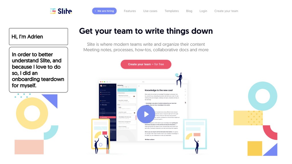
because I love to do so, I did an onboarding teardown for myself. Please consider it as part of a my ‘’cover letter’’. Hope you’ll enjoy it. Shall we start ?
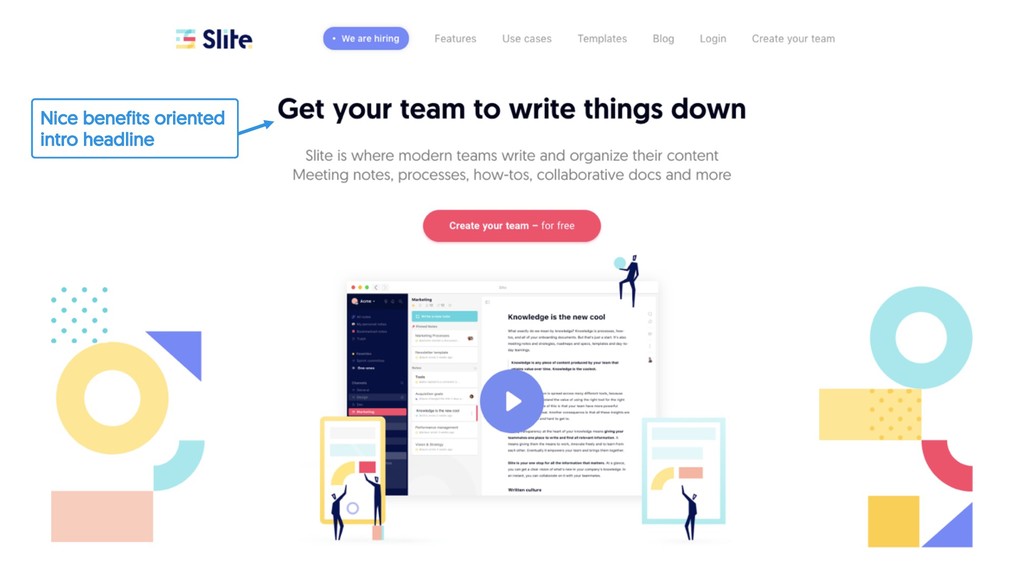
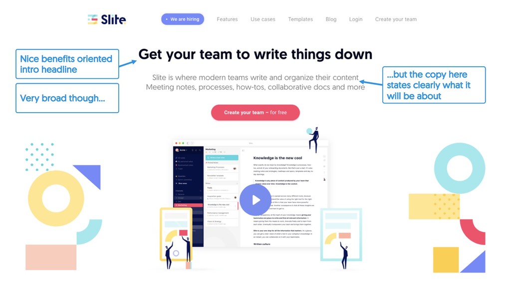
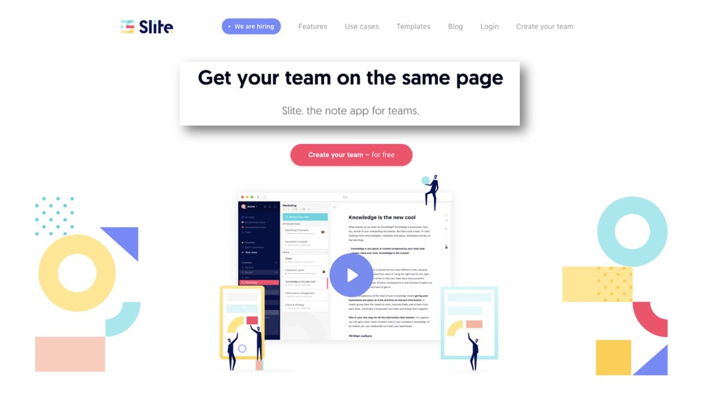
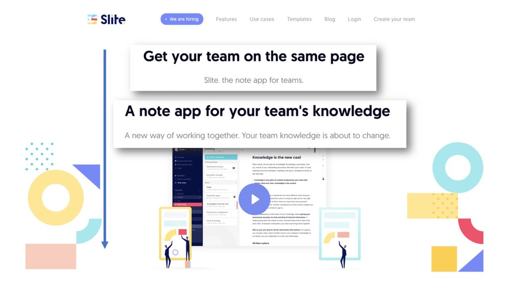
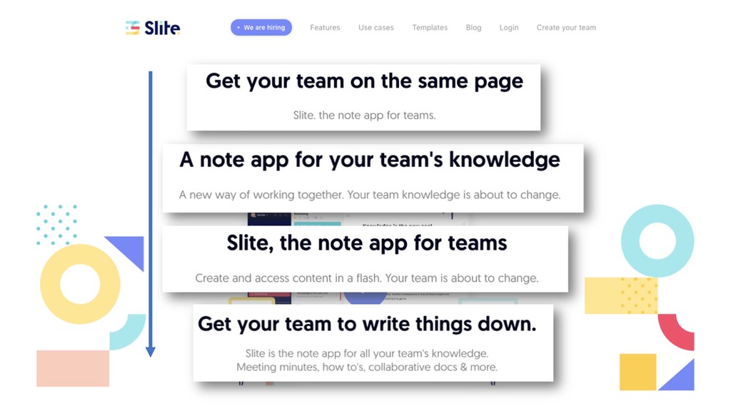
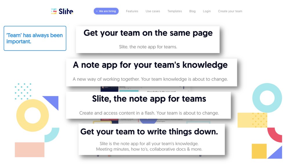
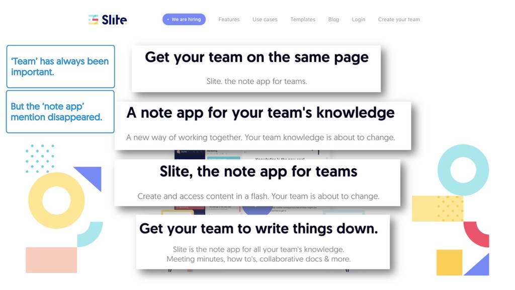
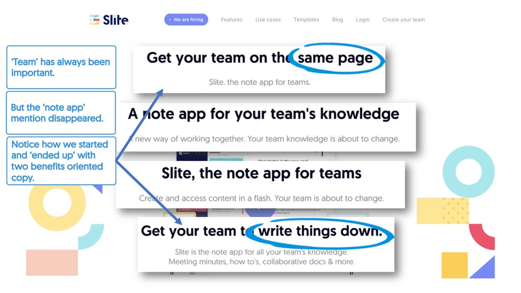
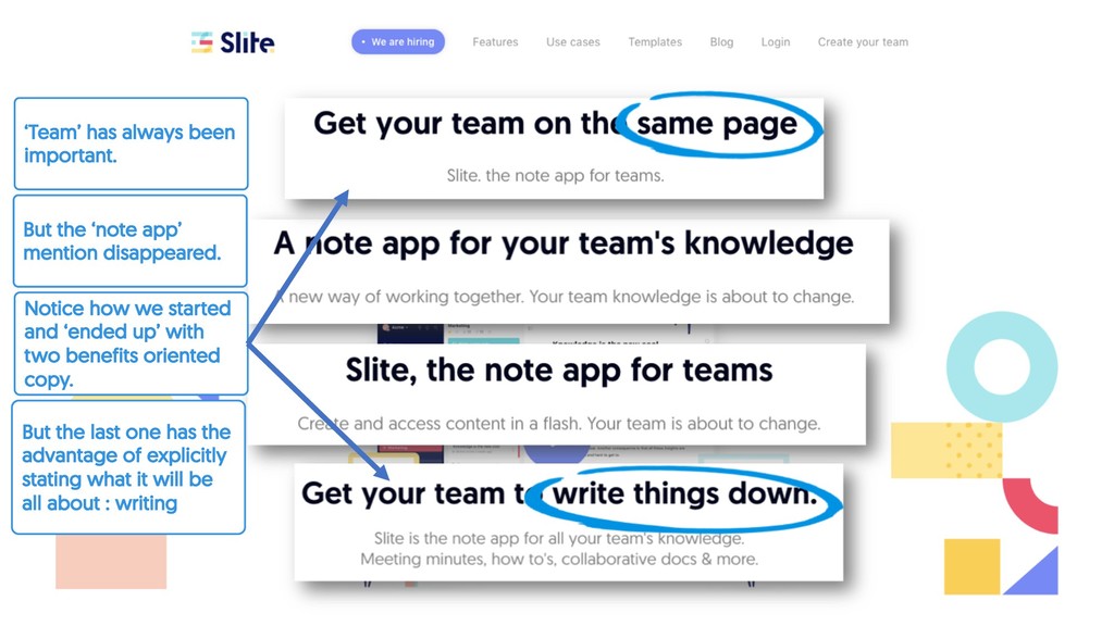
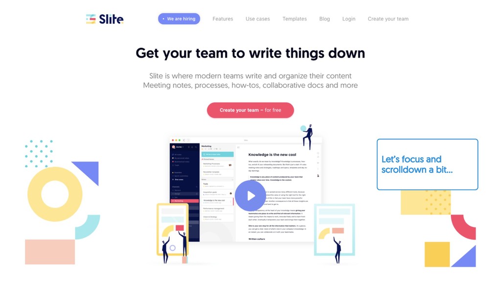
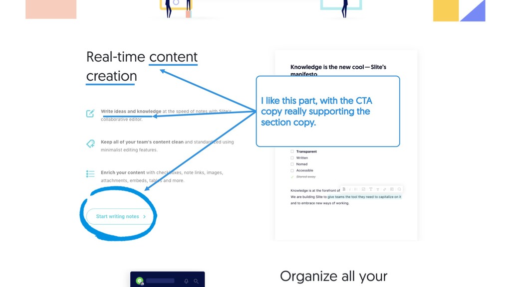
disappeared. Notice how we started and ‘ended up’ with two benefits oriented copy. But the last one has the advantage of explicitly stating what it will be all about : writing
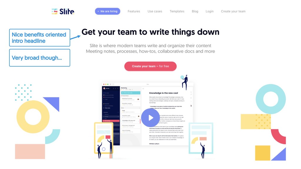
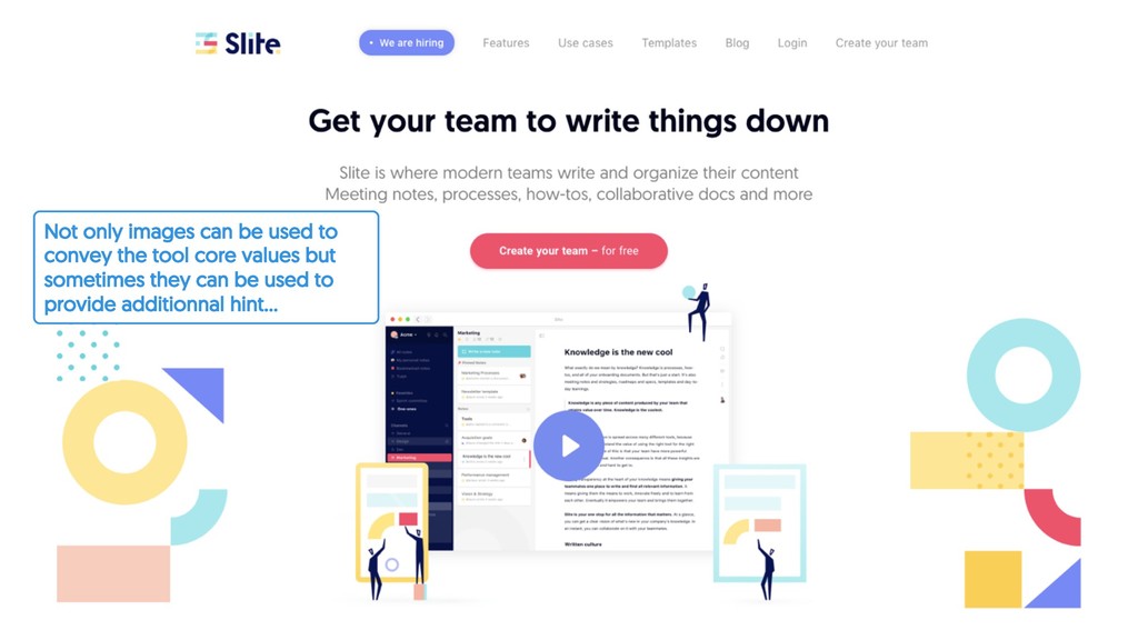
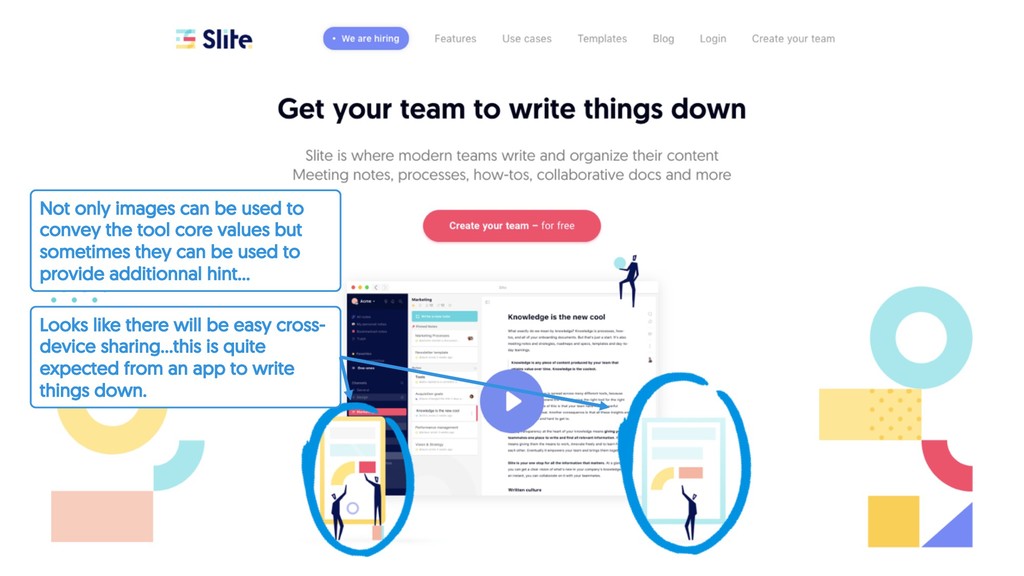
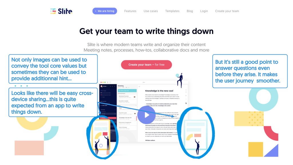
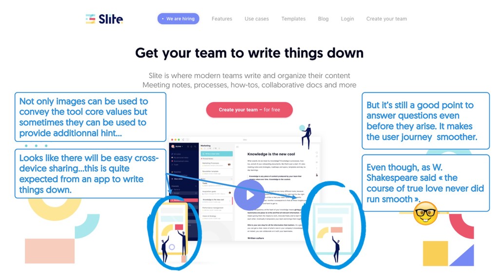
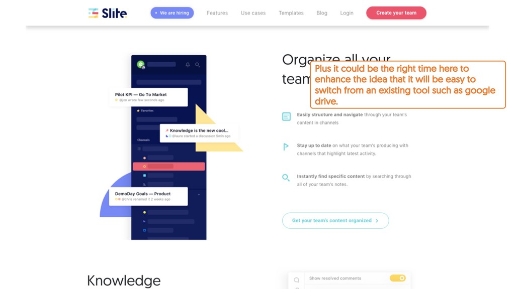
core values but sometimes they can be used to provide additionnal hint… Looks like there will be easy cross- device sharing…this is quite expected from an app to write things down.
core values but sometimes they can be used to provide additionnal hint… Looks like there will be easy cross- device sharing…this is quite expected from an app to write things down. But it’s still a good point to answer questions even before they arise. It makes the user journey smoother.
core values but sometimes they can be used to provide additionnal hint… Looks like there will be easy cross- device sharing…this is quite expected from an app to write things down. But it’s still a good point to answer questions even before they arise. It makes the user journey smoother. Even though, as W. Shakespeare said « the course of true love never did run smooth ». !
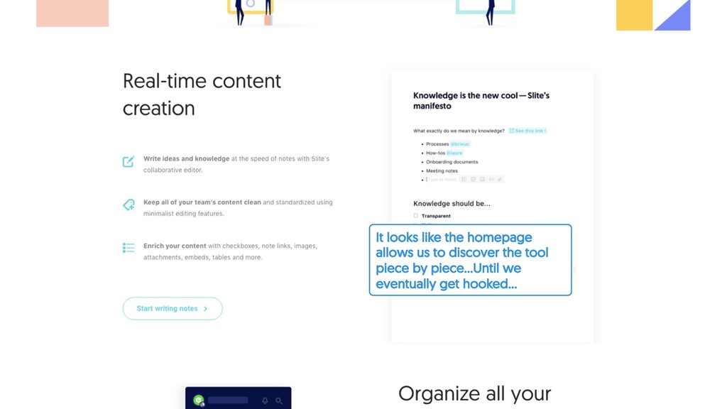
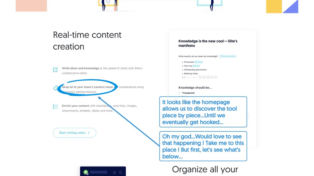
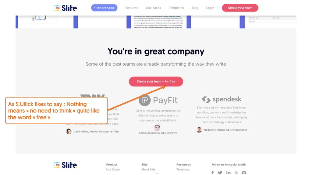
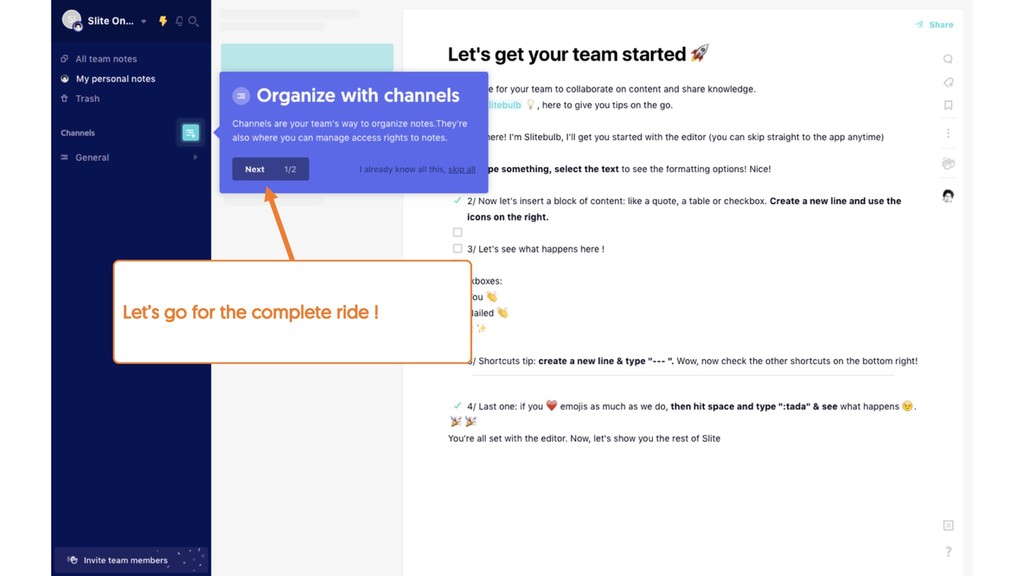
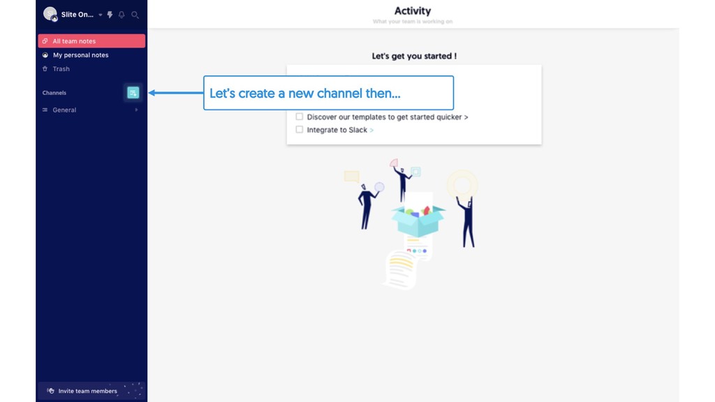
tool piece by piece…Until we eventually get hooked… Oh my god…Would love to see that happening ! Take me to this place ! But first, let’s see what’s below…
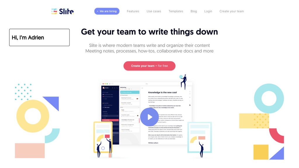
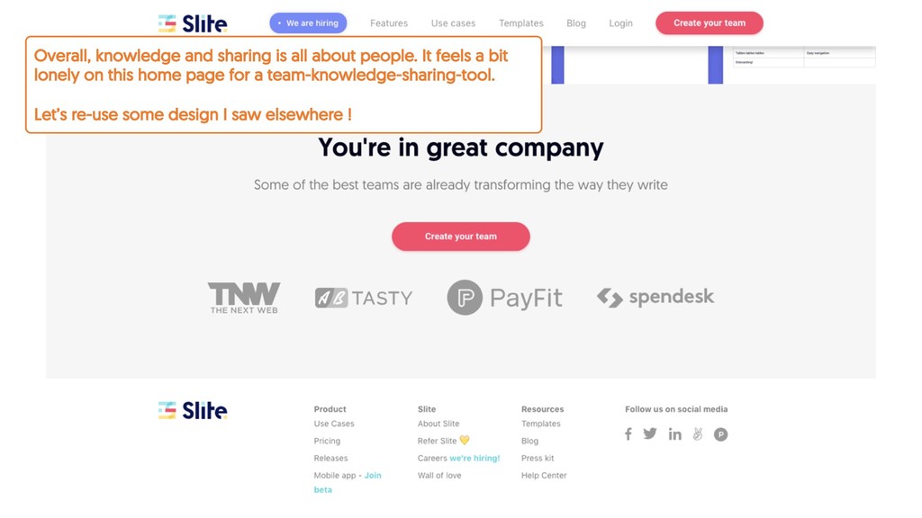
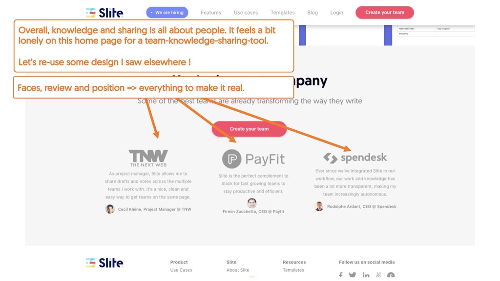
a bit lonely on this home page for a team-knowledge-sharing-tool. Let’s re-use some design I saw elsewhere ! Faces, review and position => everything to make it real.
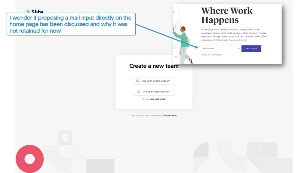
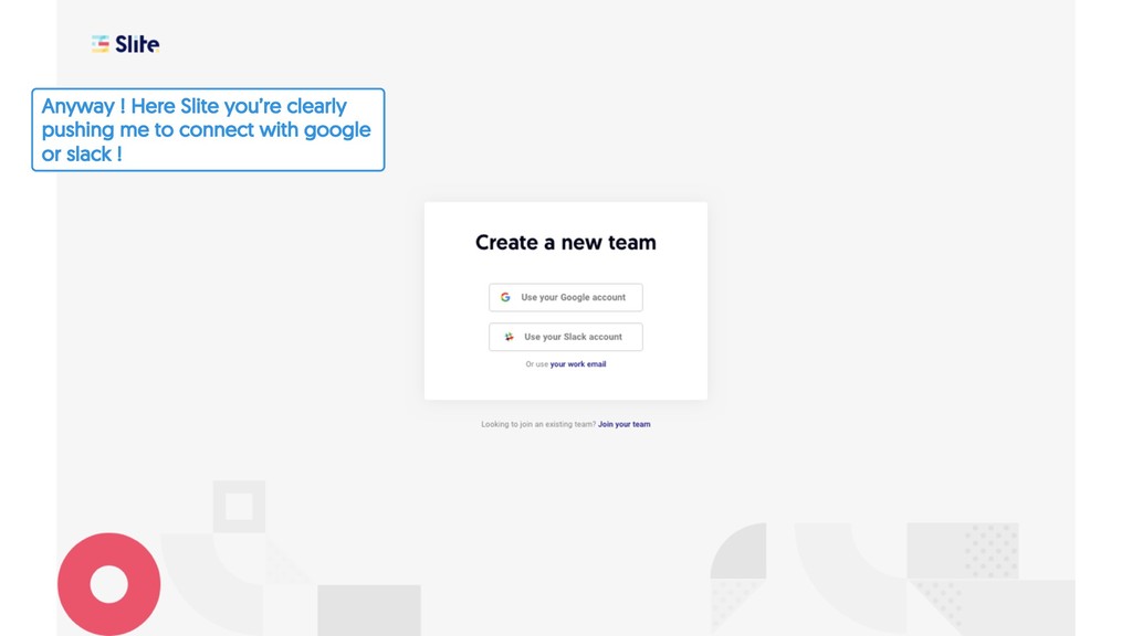
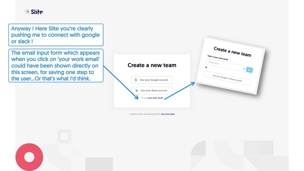
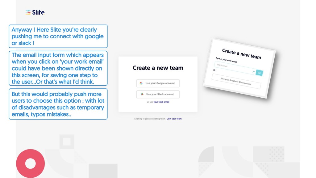
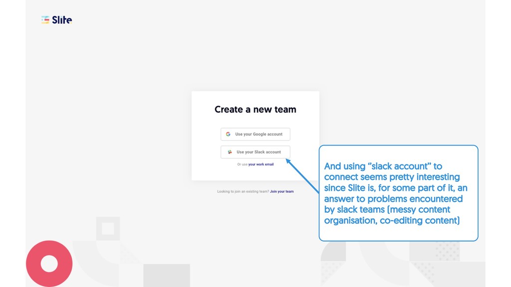
‘your work email’ could have been shown directly on this screen, for saving one step to the user…Or that’s what I’d think. Anyway ! Here Slite you’re clearly pushing me to connect with google or slack !
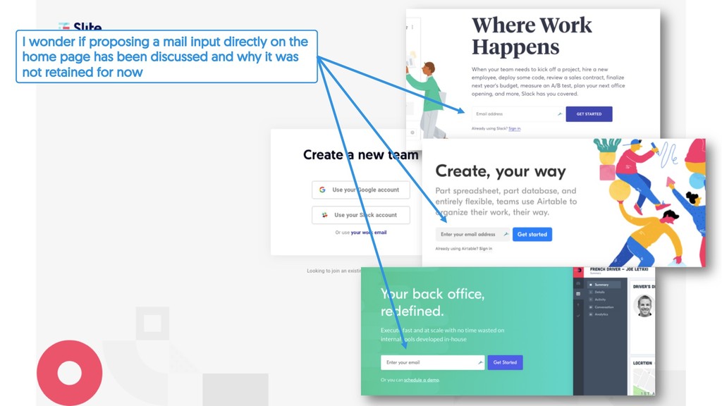
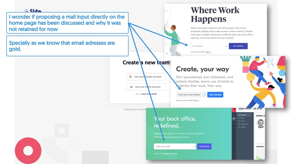
option : with lot of disadvantages such as temporary emails, typos mistakes.. The email input form which appears when you click on ‘your work email’ could have been shown directly on this screen, for saving one step to the user…Or that’s what I’d think. Anyway ! Here Slite you’re clearly pushing me to connect with google or slack !
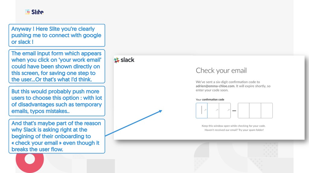
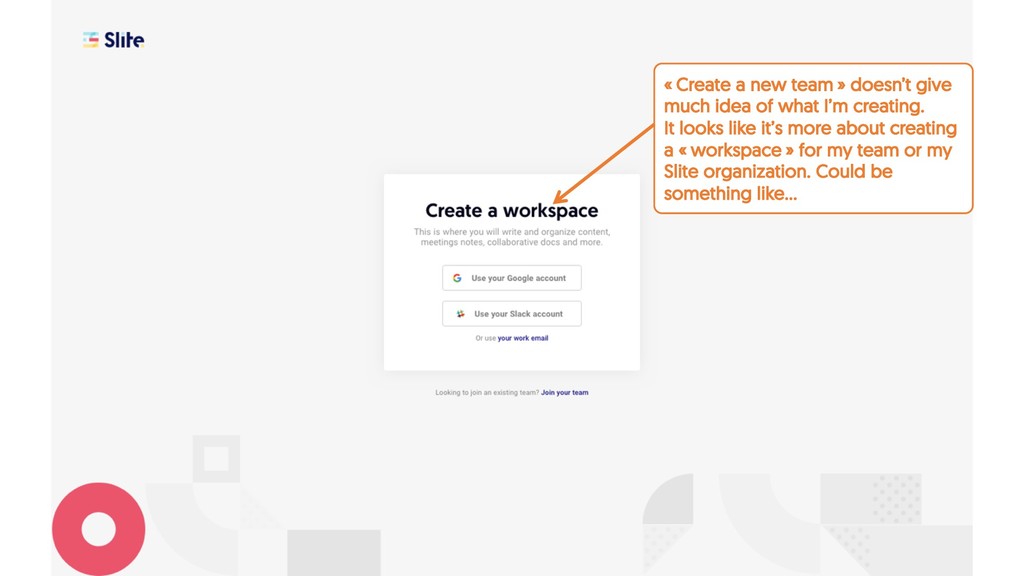
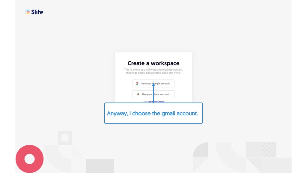
asking right at the begining of their onboarding to « check your email » even though it breaks the user flow. But this would probably push more users to choose this option : with lot of disadvantages such as temporary emails, typos mistakes.. The email input form which appears when you click on ‘your work email’ could have been shown directly on this screen, for saving one step to the user…Or that’s what I’d think. Anyway ! Here Slite you’re clearly pushing me to connect with google or slack !
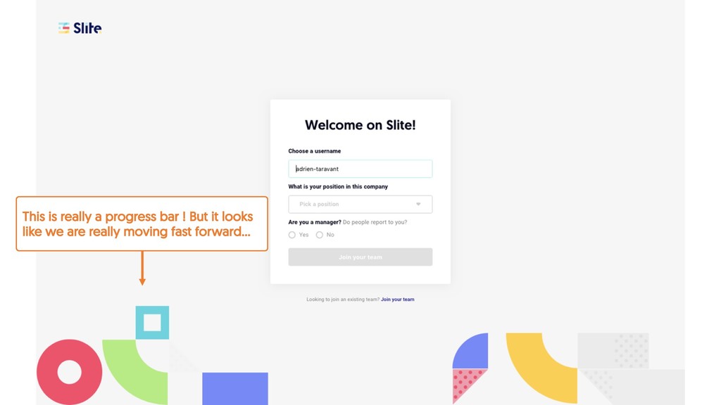
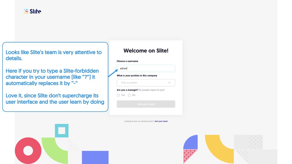
if you try to type a Slite-forbidden character in your username (like ’’?’’) it automatically replaces it by ’’-’’ Love it, since Slite don’t supercharge its user interface and the user learn by doing
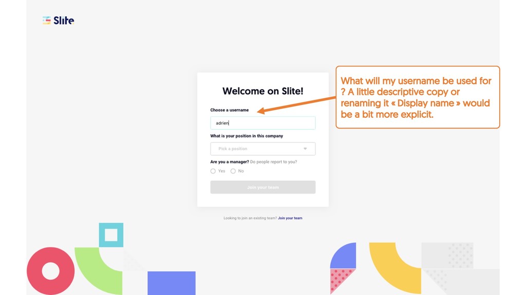
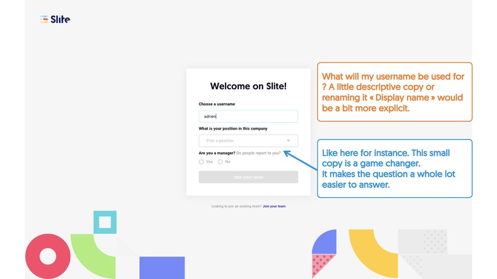
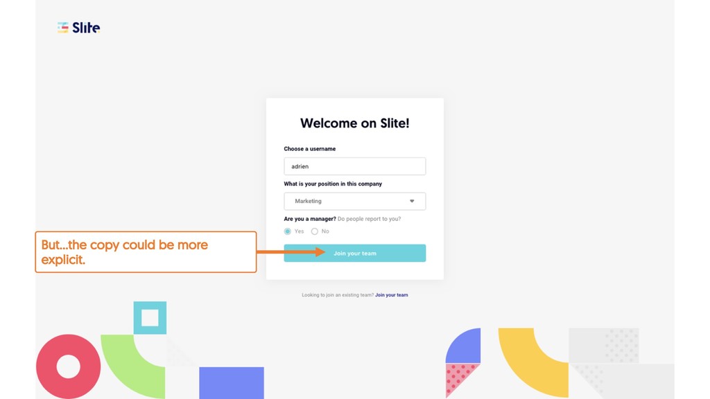
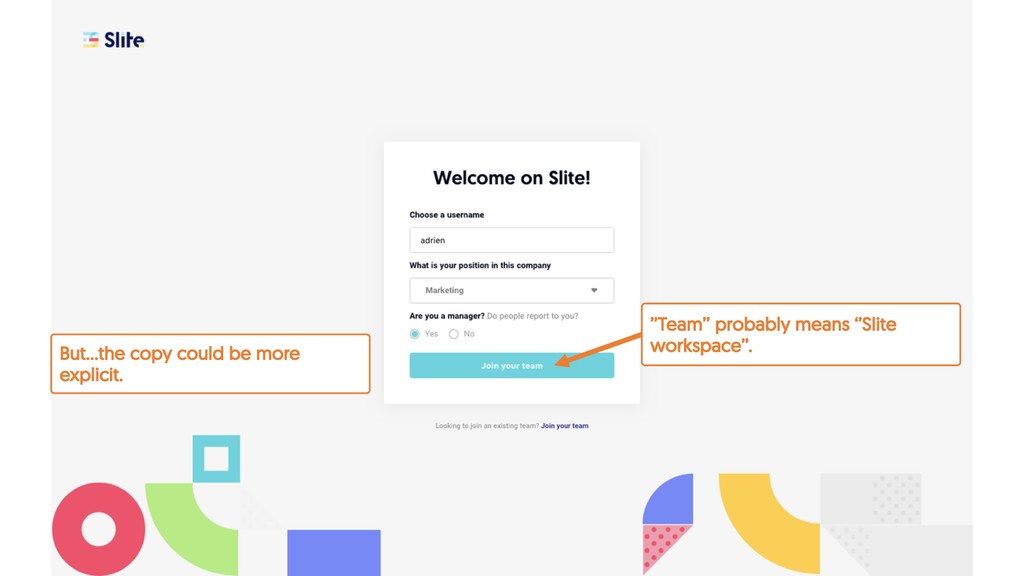
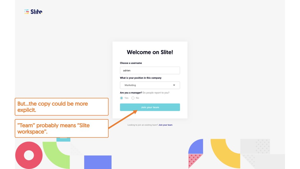
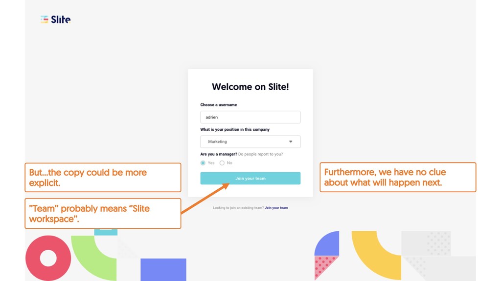
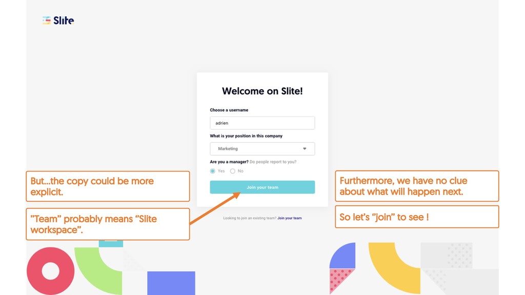
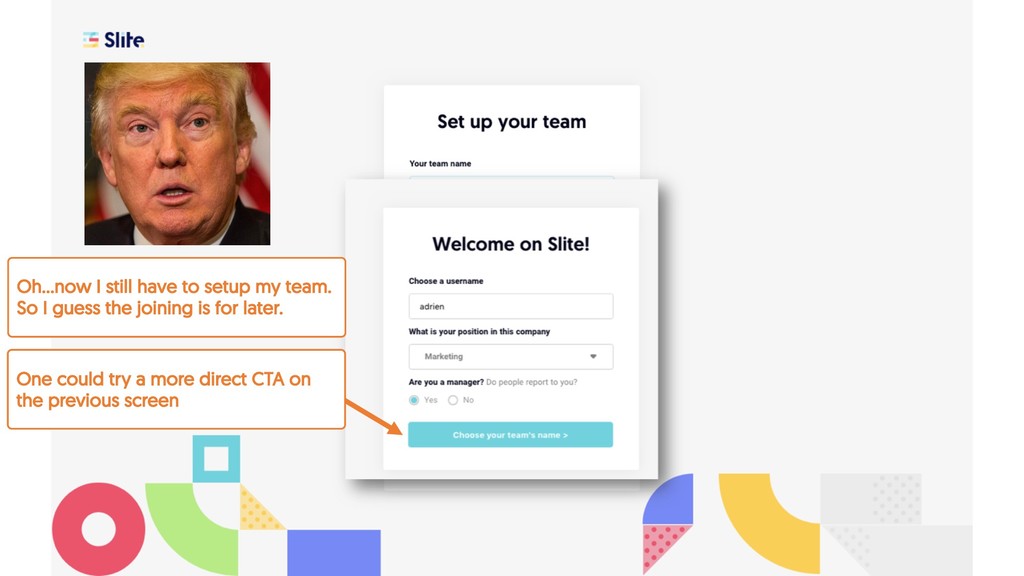
changer. It makes the question a whole lot easier to answer. What will my username be used for ? A little descriptive copy or renaming it « Display name » would be a bit more explicit.
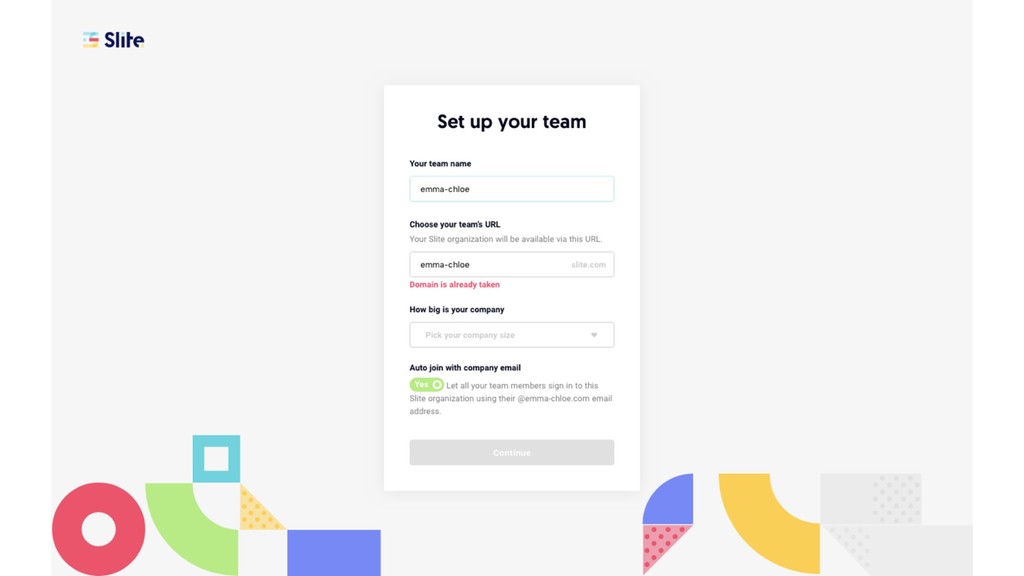
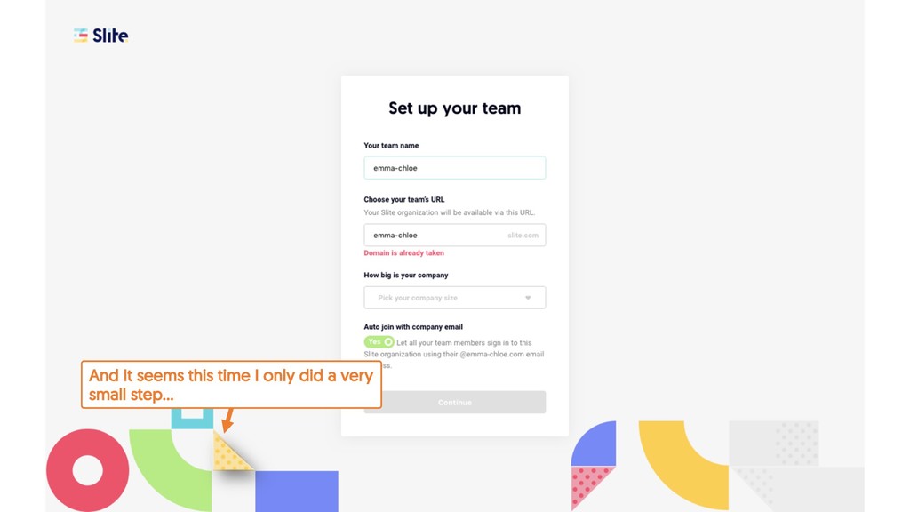
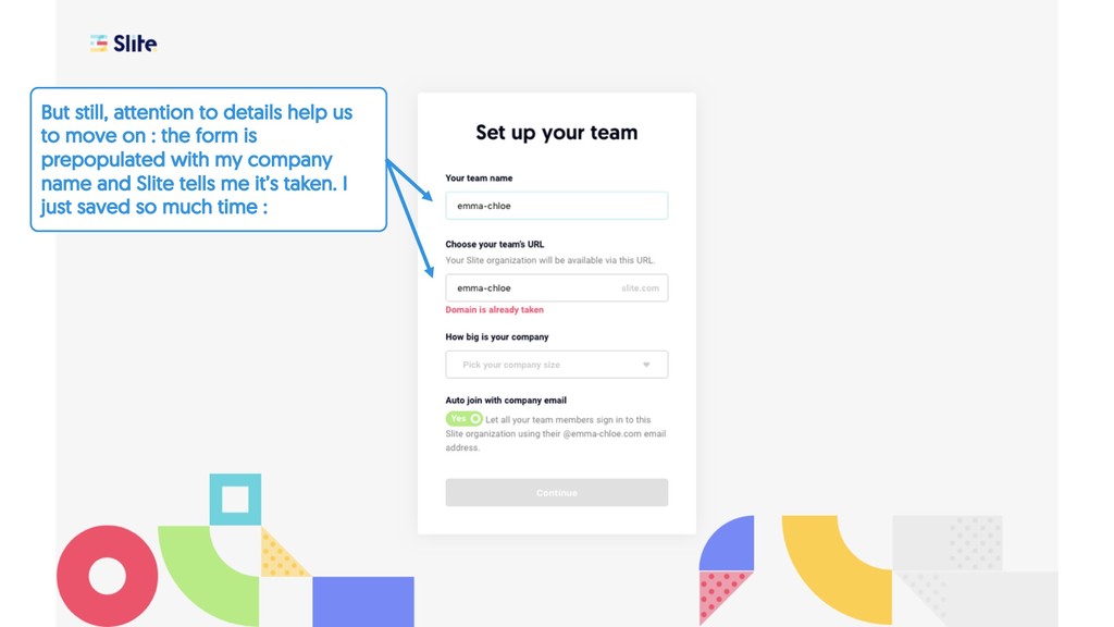
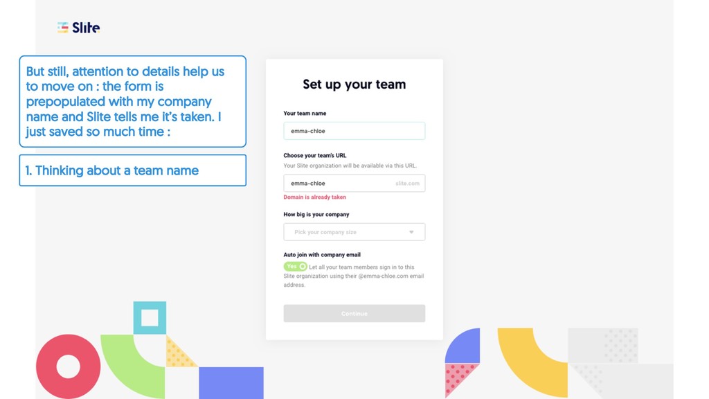
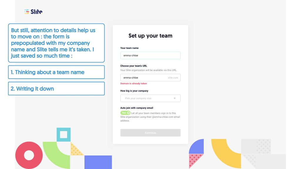
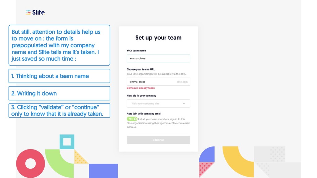
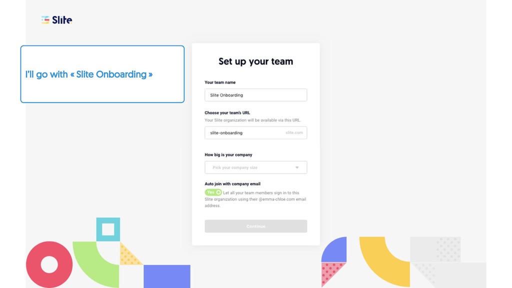
But still, attention to details help us to move on : the form is prepopulated with my company name and Slite tells me it’s taken. I just saved so much time :
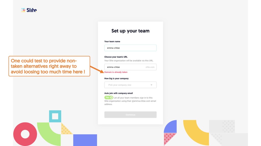
3. Clicking ’’validate’’ or ‘’continue’’ only to know that it is already taken. But still, attention to details help us to move on : the form is prepopulated with my company name and Slite tells me it’s taken. I just saved so much time :
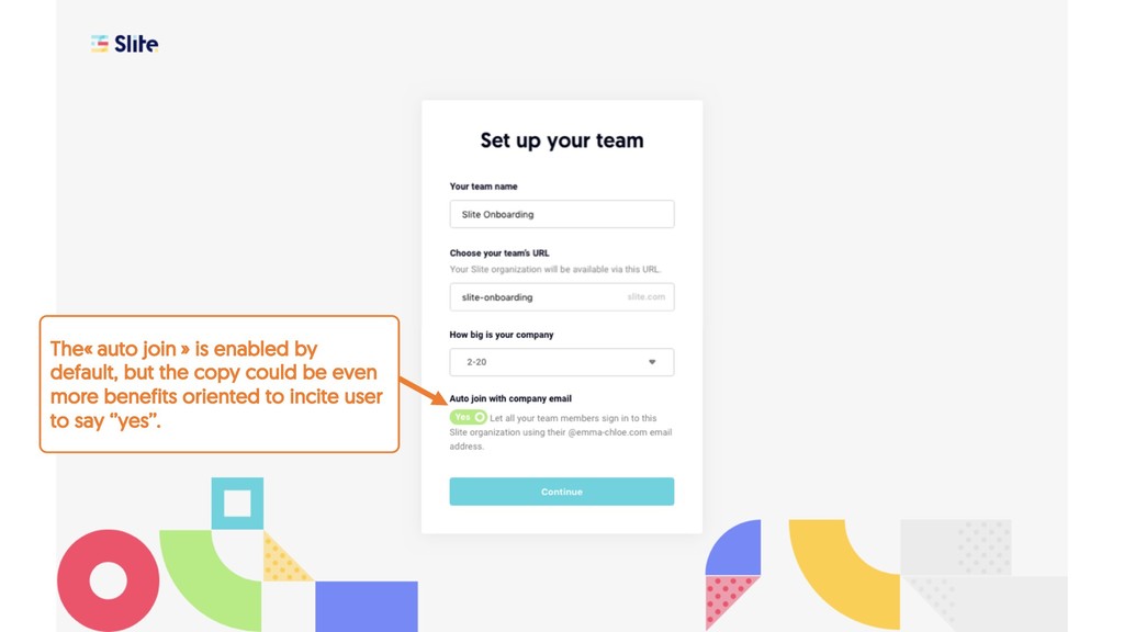
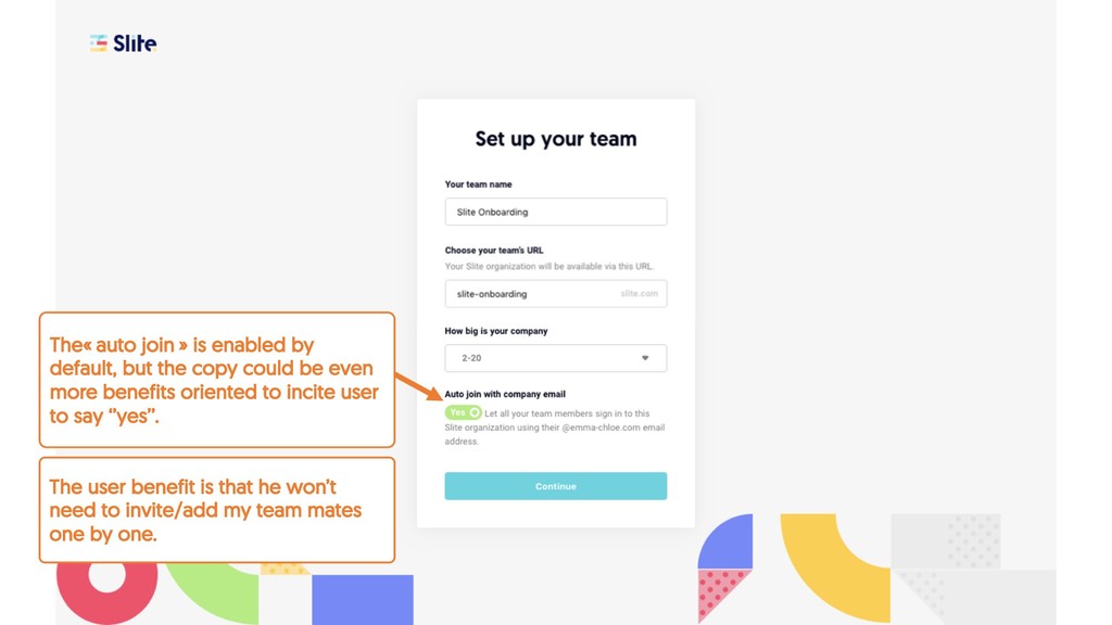
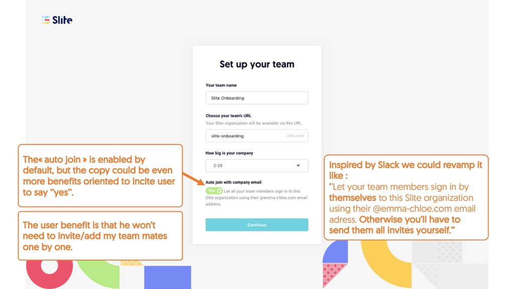
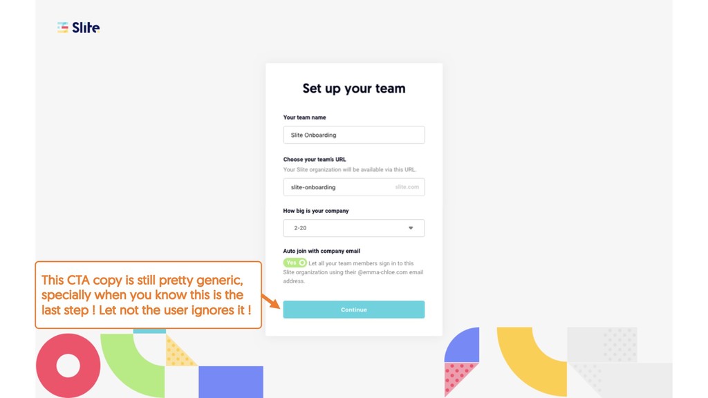
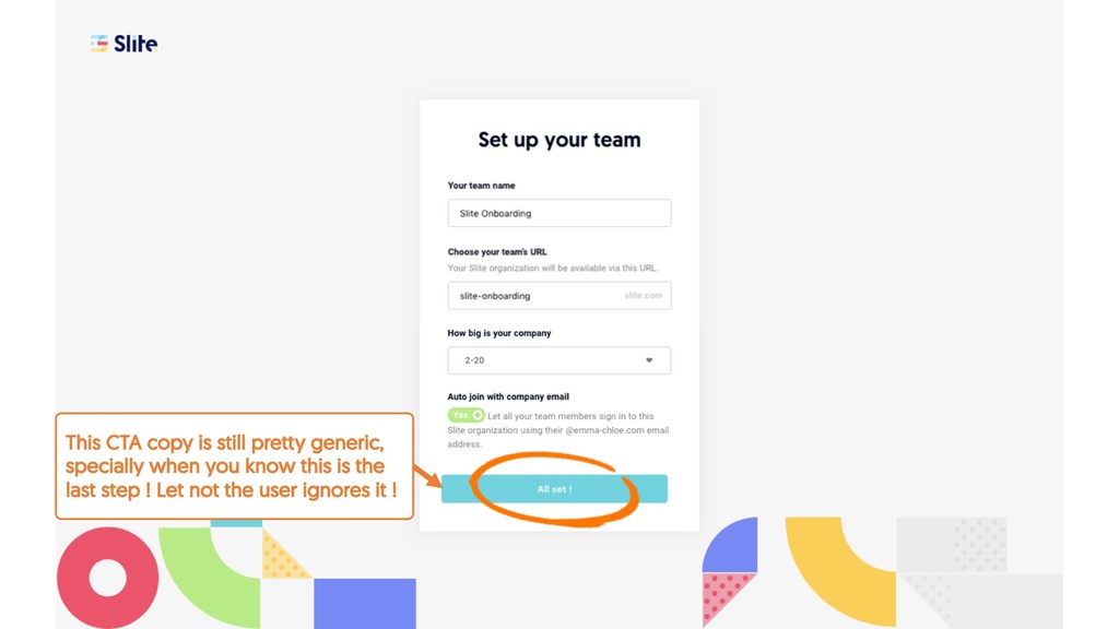
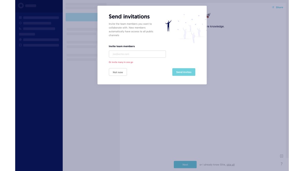
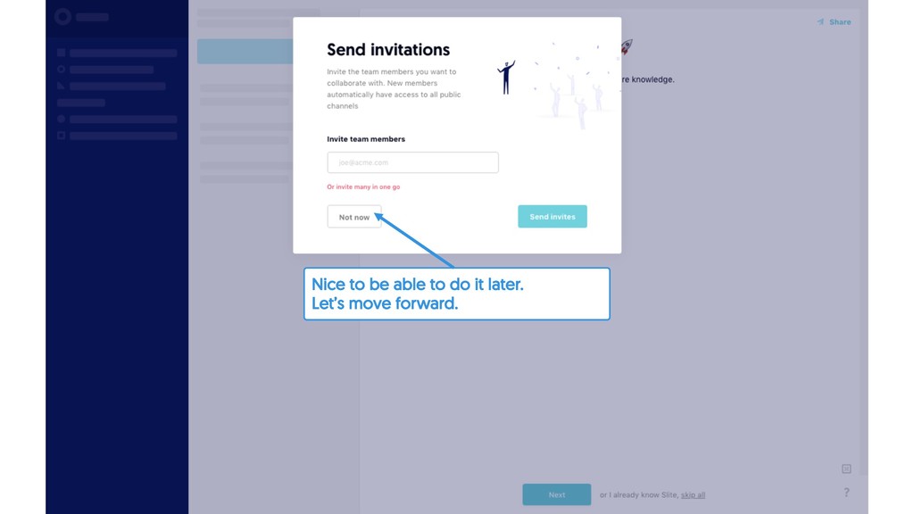
your team members sign in by themselves to this Slite organization using their @emma-chloe.com email adress. Otherwise you’ll have to send them all invites yourself.’’ The user benefit is that he won’t need to invite/add my team mates one by one. The« auto join » is enabled by default, but the copy could be even more benefits oriented to incite user to say ‘’yes’’.
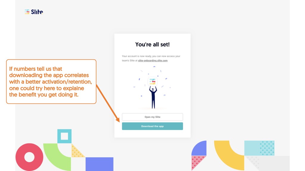
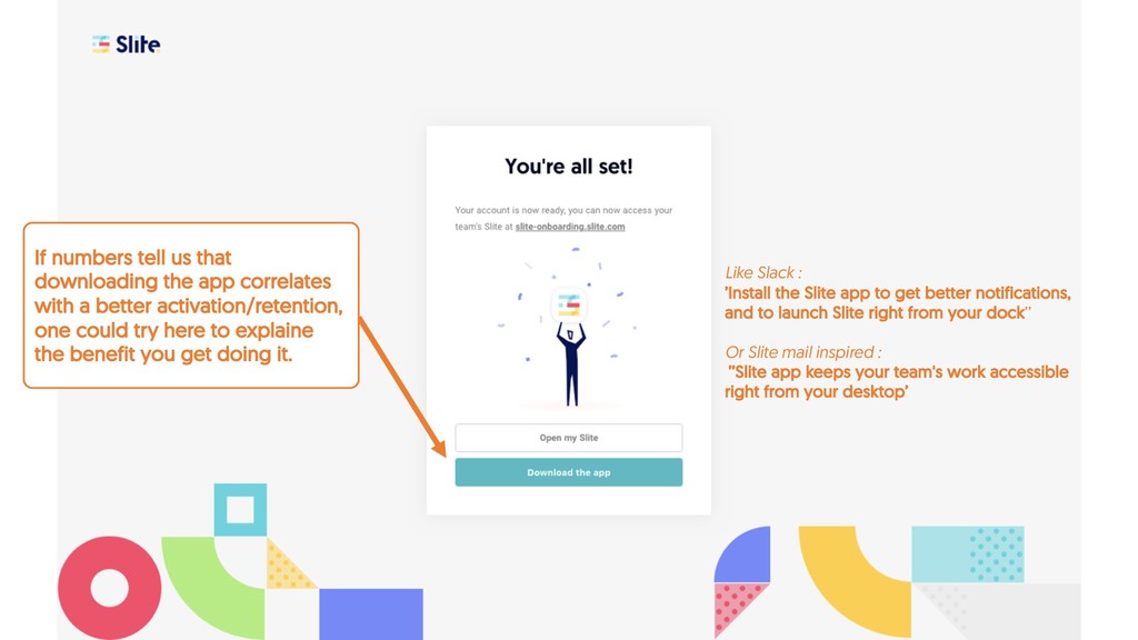
a better activation/retention, one could try here to explaine the benefit you get doing it. Like Slack : ’Install the Slite app to get better notifications, and to launch Slite right from your dock’’ Or Slite mail inspired : ’’Slite app keeps your team's work accessible right from your desktop’
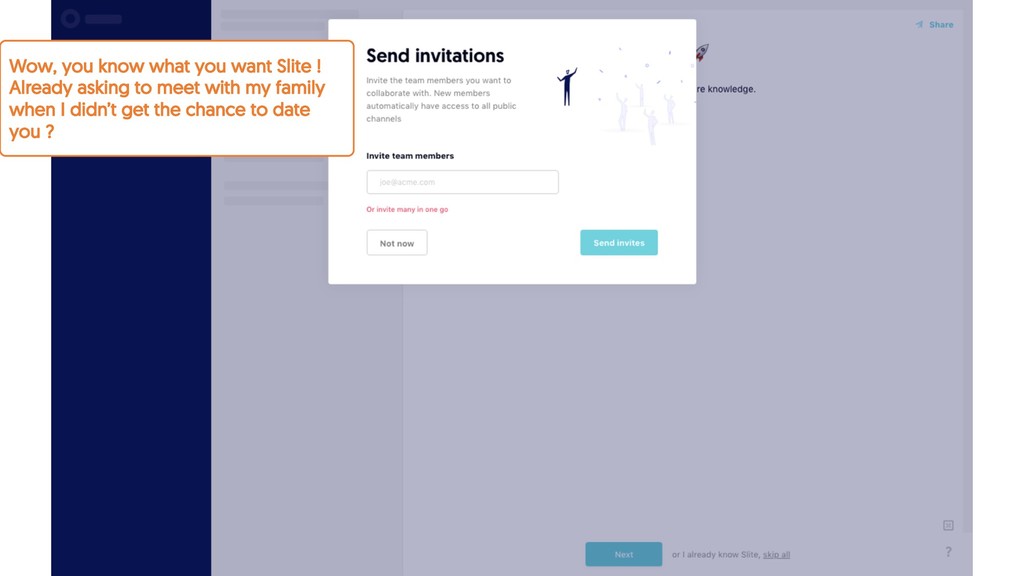
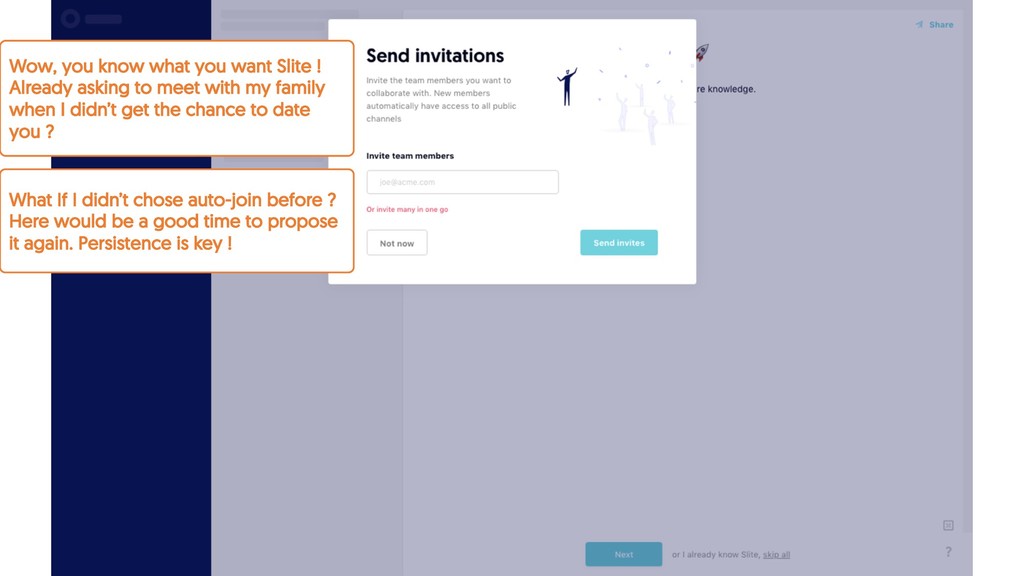
to meet with my family when I didn’t get the chance to date you ? What If I didn’t chose auto-join before ? Here would be a good time to propose it again. Persistence is key !
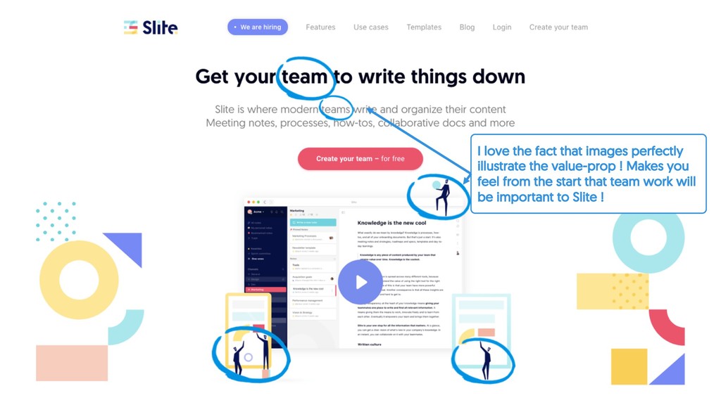
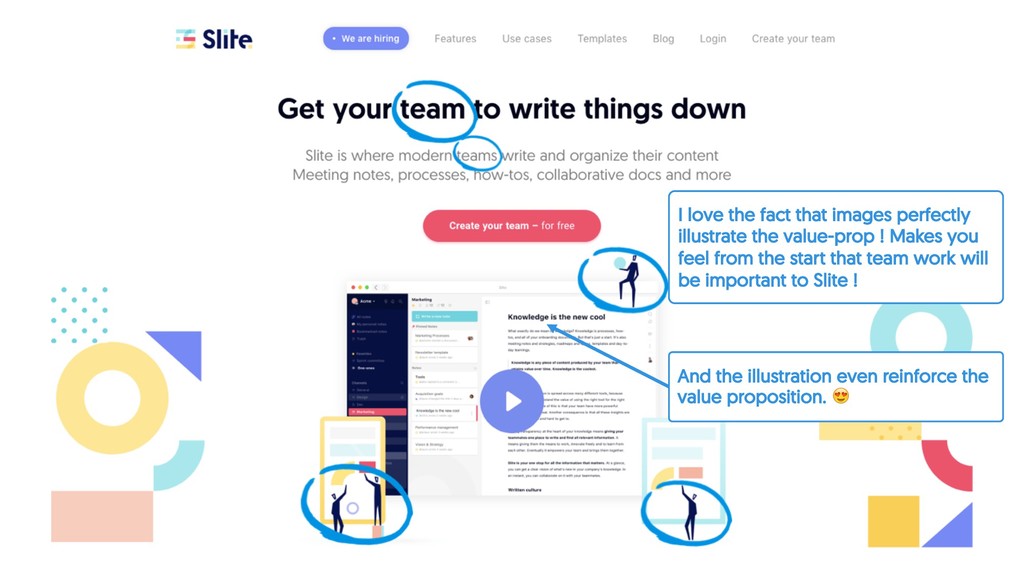
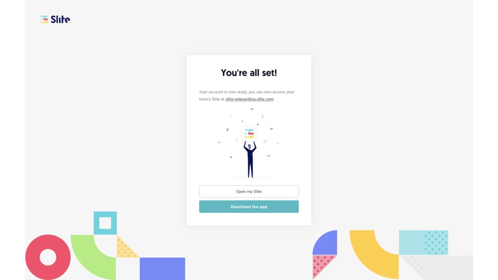
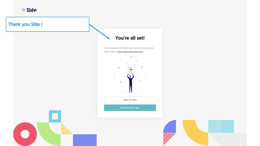
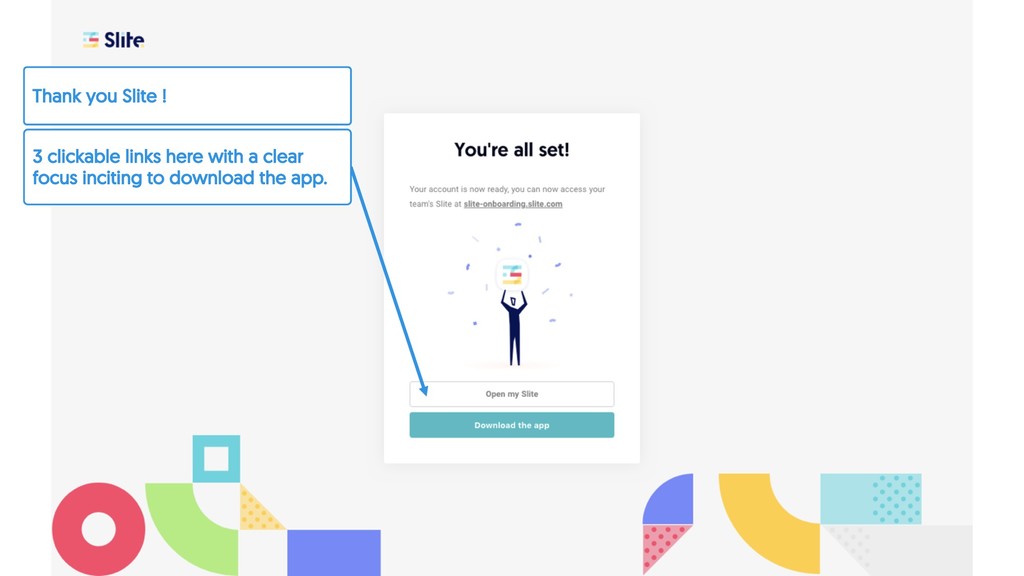
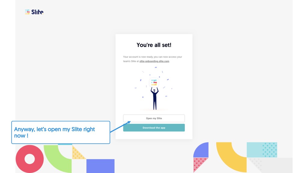
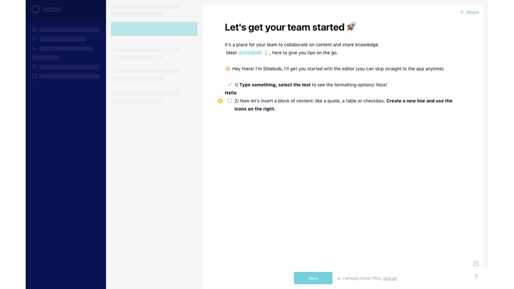
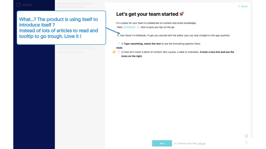
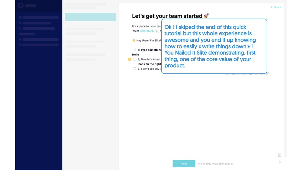
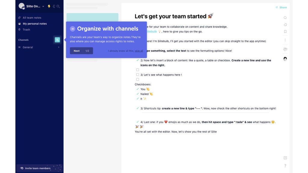
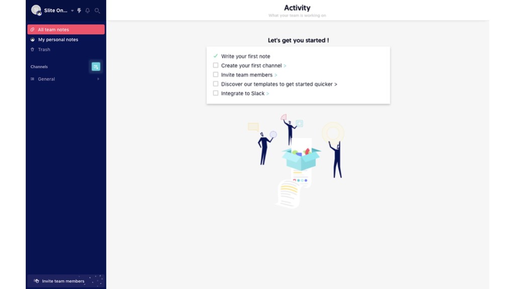
but this whole experience is awesome and you end it up knowing how to easily « write things down » ! You Nailed It Slite demonstrating, first thing, one of the core value of your product.
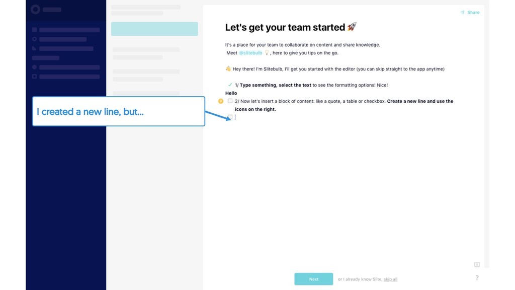
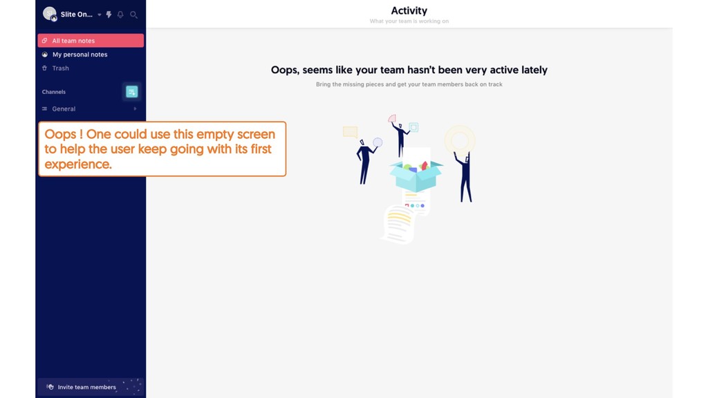
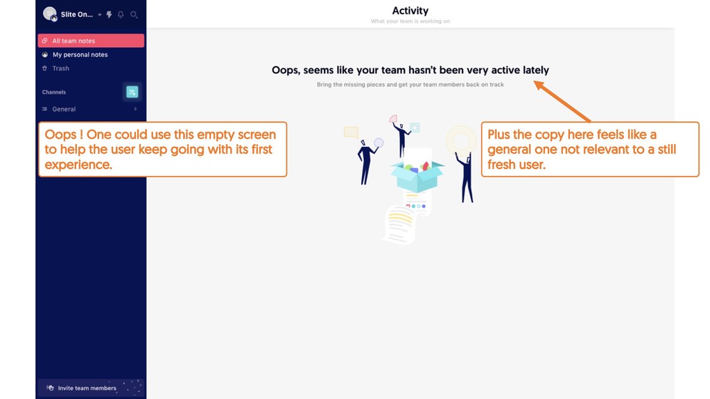
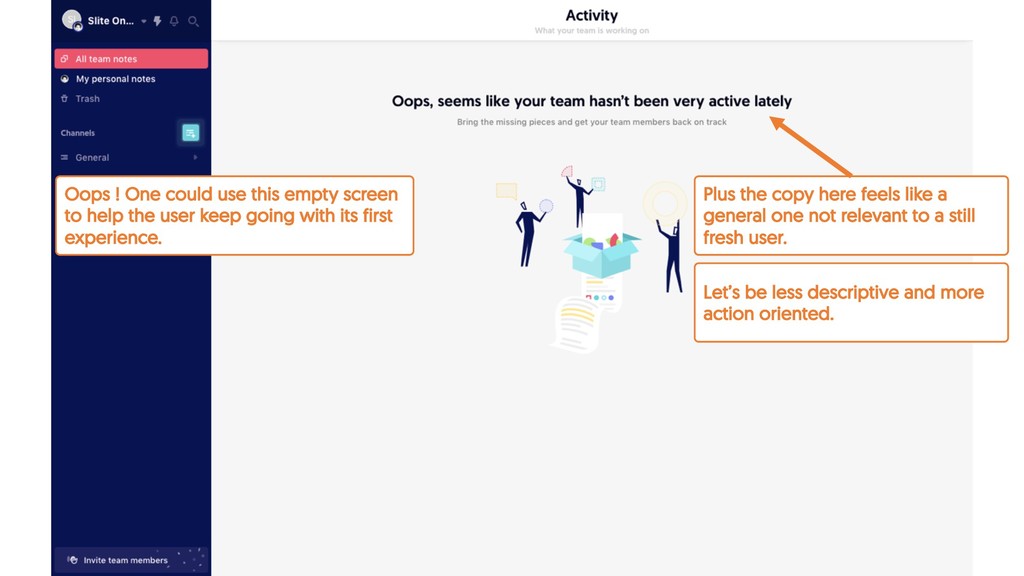
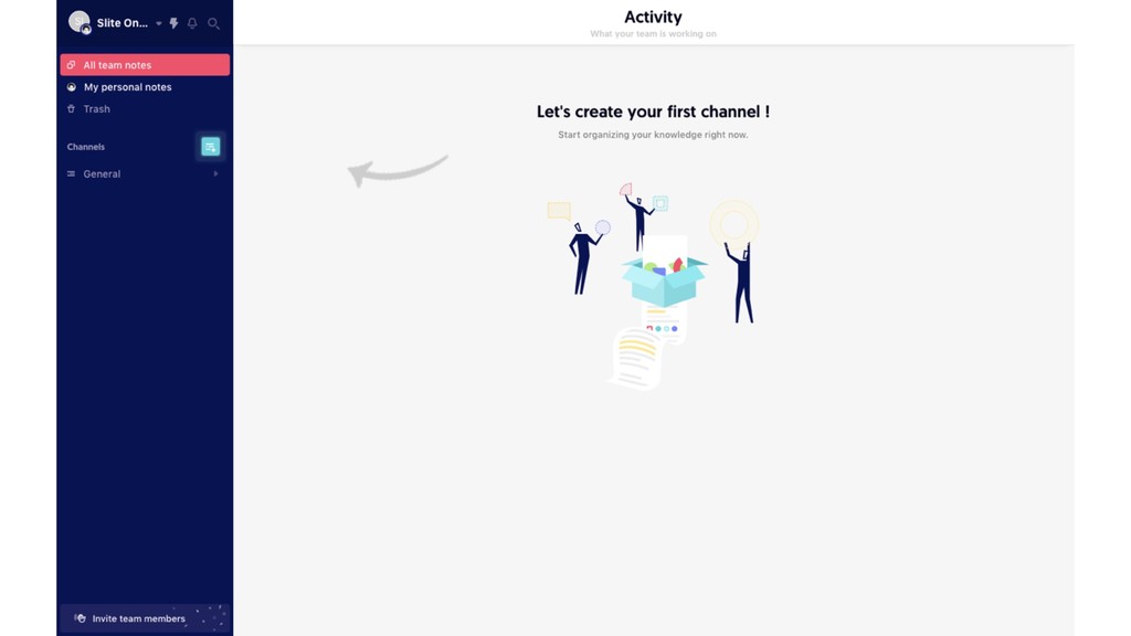
relevant to a still fresh user. Oops ! One could use this empty screen to help the user keep going with its first experience. Let’s be less descriptive and more action oriented.
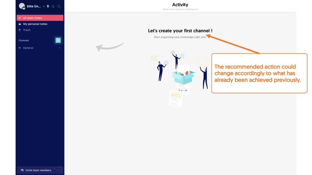
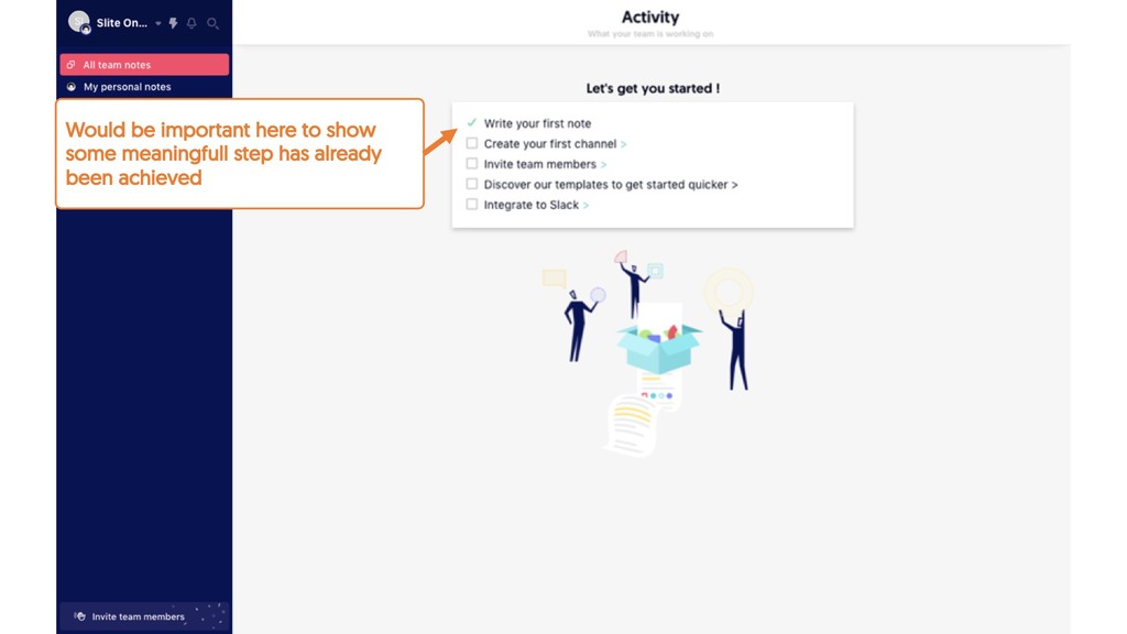
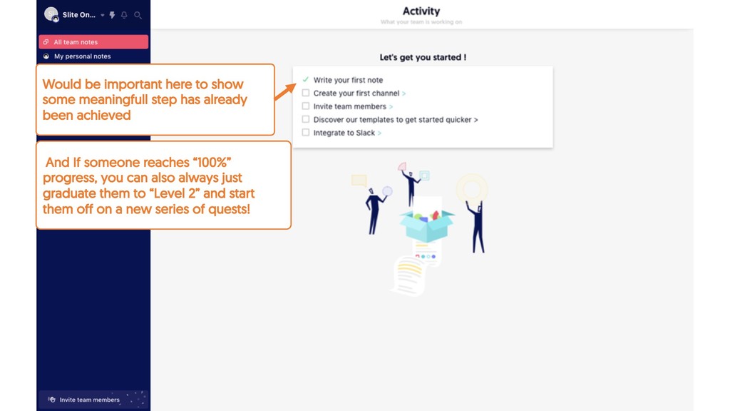
already been achieved And If someone reaches “100%” progress, you can also always just graduate them to “Level 2” and start them off on a new series of quests!
already been achieved And If someone reaches “100%” progress, you can also always just graduate them to “Level 2” and start them off on a new series of quests!
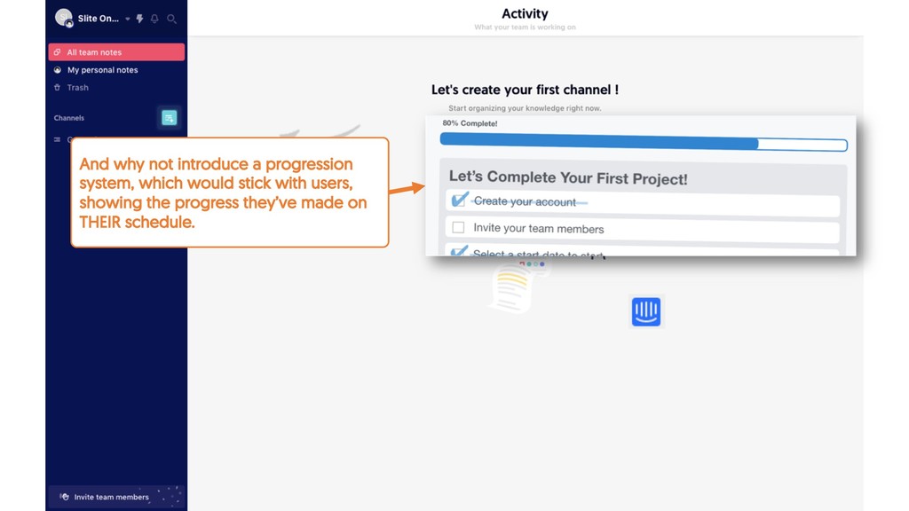
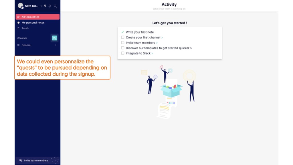
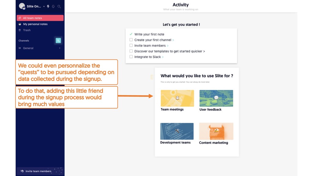
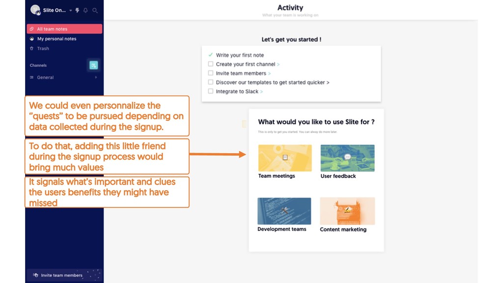
on data collected during the signup. It signals what’s important and clues the users benefits they might have missed To do that, adding this little friend during the signup process would bring much values
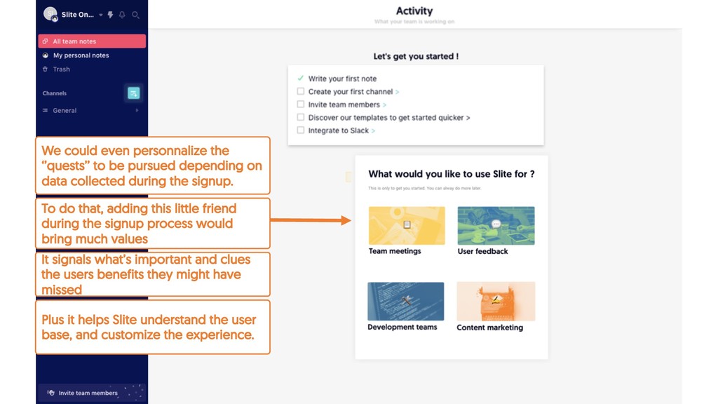
on data collected during the signup. Plus it helps Slite understand the user base, and customize the experience. It signals what’s important and clues the users benefits they might have missed To do that, adding this little friend during the signup process would bring much values
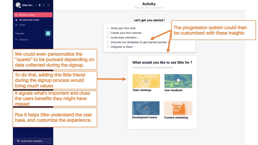
on data collected during the signup. Plus it helps Slite understand the user base, and customize the experience. It signals what’s important and clues the users benefits they might have missed To do that, adding this little friend during the signup process would bring much values The progression system could then be customized with these insights
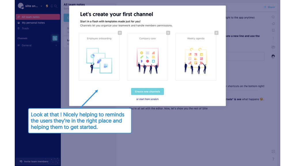
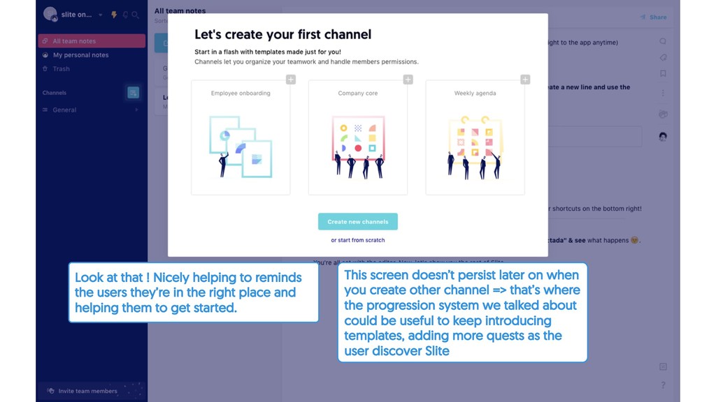
they’re in the right place and helping them to get started. This screen doesn’t persist later on when you create other channel => that’s where the progression system we talked about could be useful to keep introducing templates, adding more quests as the user discover Slite